Visualization for Machine Learning
Spring 2024
What is Information Visualization? Why Use It?
“The use of computer-supported, interactive, visual representations of abstract data to amplify cognition.”
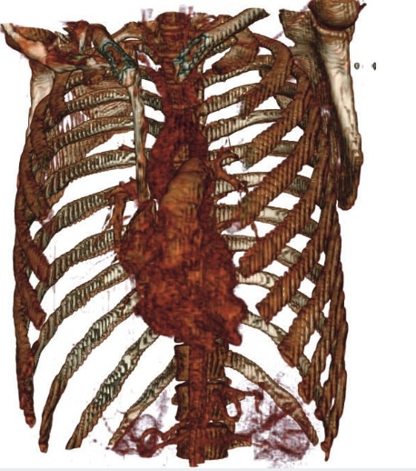
Abstract Data
Data with no obvious/natural visual representation
Abstract Data
Data with no obvious/natural visual representation
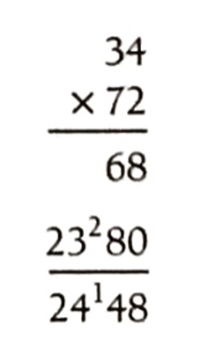
Cognitive artifacts: tools that help us think!
- Try to multiply 34 x 72 using exclusively your mind …
- … now do it again using pen and paper.
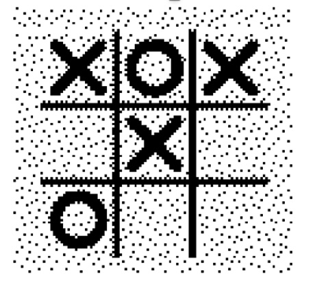
Let’s play a different game: tic-tac-toe
Players alternately place an O or a X in one of nine spaces arranged in a rectangular array. Once a space has been taken, it cannot be changed by either player. The first player to get three symbols in a straight line wins. Suppose player A is X and B is O, and the game has reached the state on the right.
Question 2: Suppose you are now to step in and play an O for B. What move would you make?
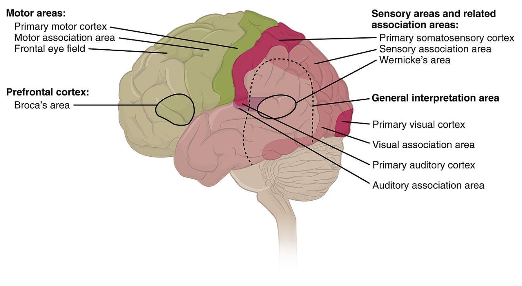
Why use a graphical representation?
- Large parts of our brain are devoted to spatial processing
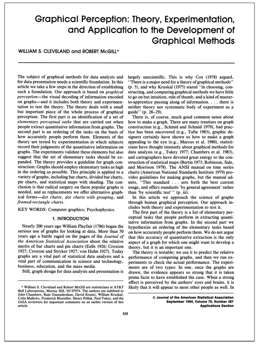
Digression: Graphical Perception
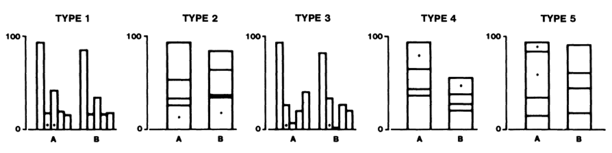
Graphical Perception Experiment
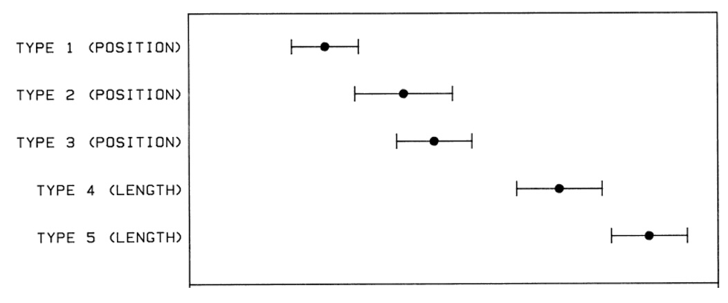
Graphical Perception Results
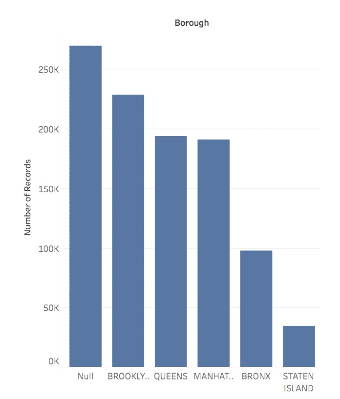
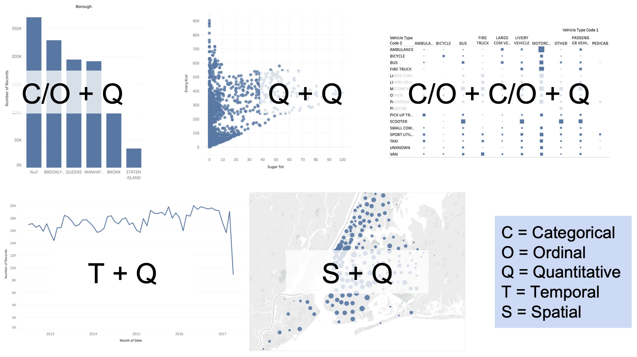
Bar Chart
- Visualize how a quantity distributes across a set of categories.
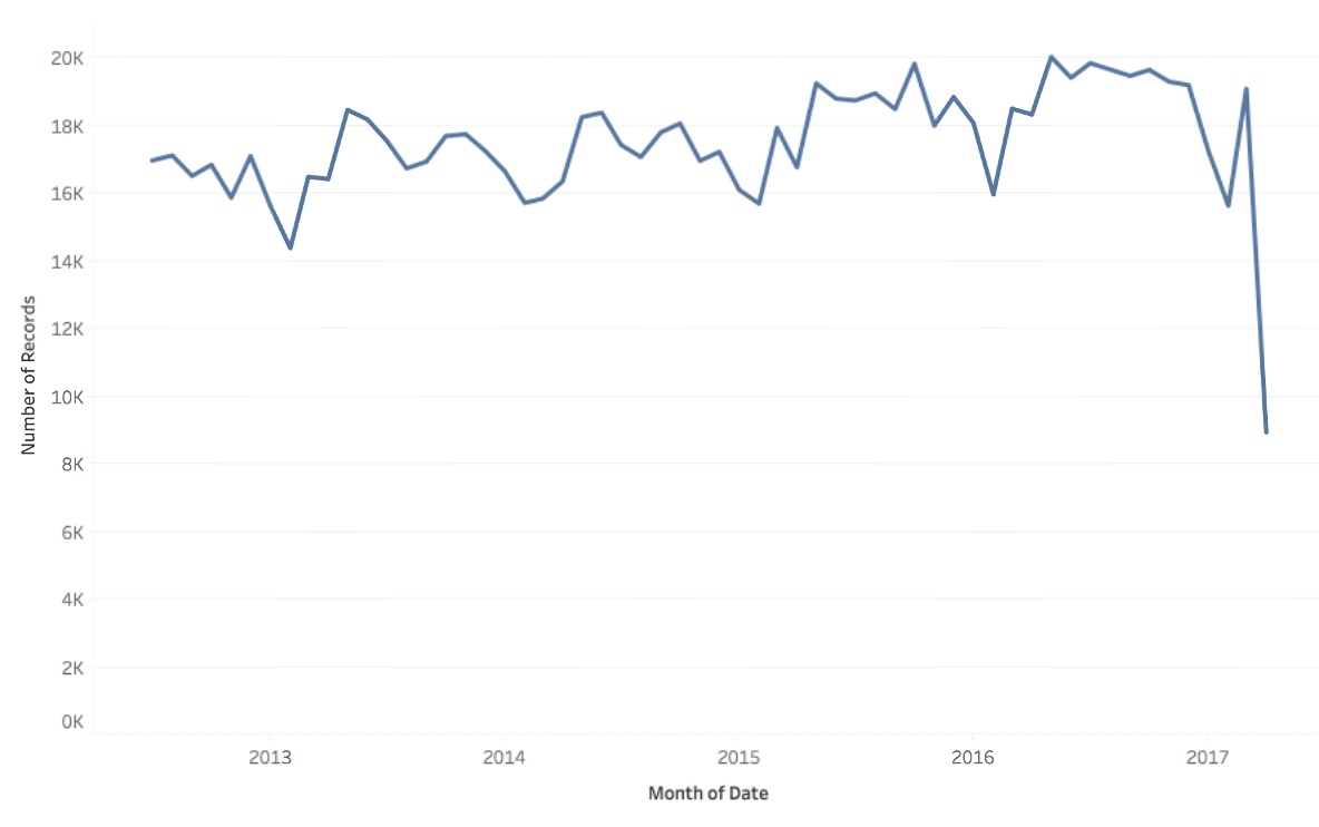
Line Chart
- Visualize how a quantity changes in relation to another quantity (typically time).
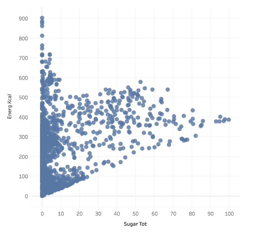
Scatter Plot
- Visualize how a quantity relate to another quantity.
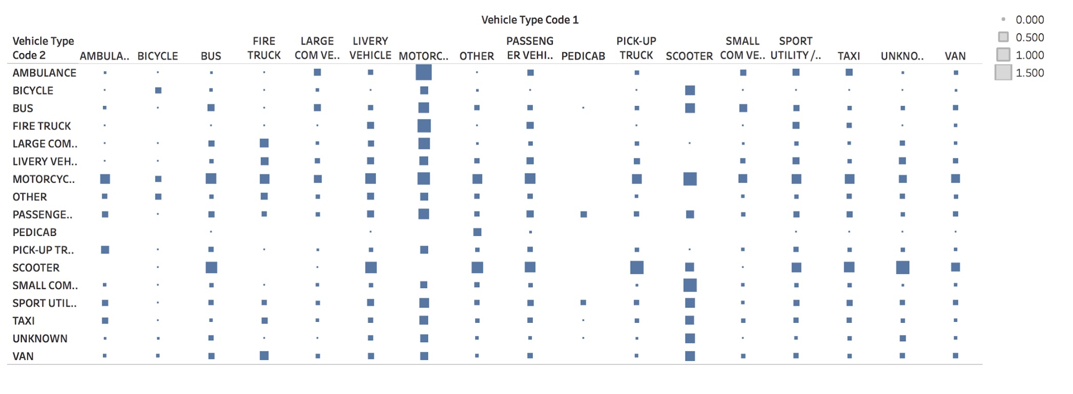
Matrix
- Visualize how a quantity distributes across two categories.
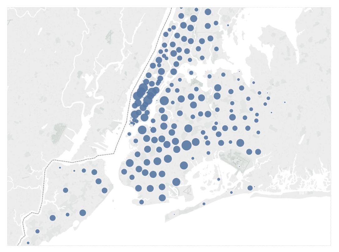
Symbol Map
- Visualize how a quantity distributes across two spatial coordinates.
Fundamental Graphs Summary
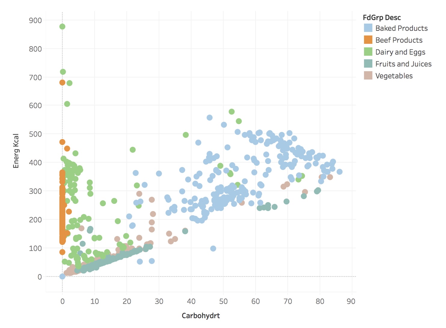
Scatter Plots + Faceting (without)
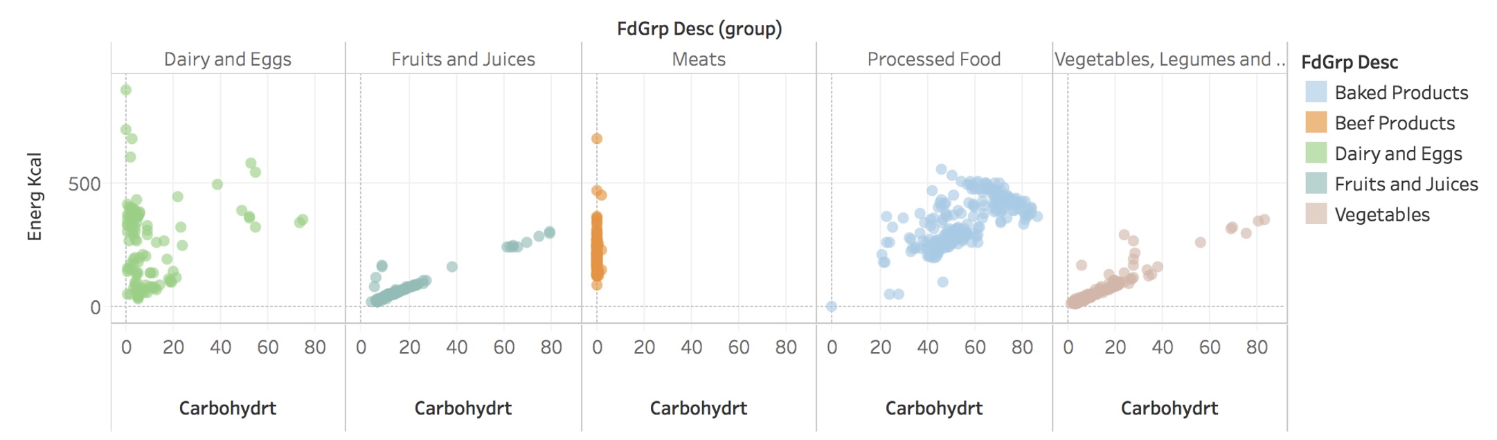
Scatter Plots + Faceting (with)
Tidy Data
- Goal: organizing data to make visualization easier
Tidy Data
Tidy Data
Tidy Data
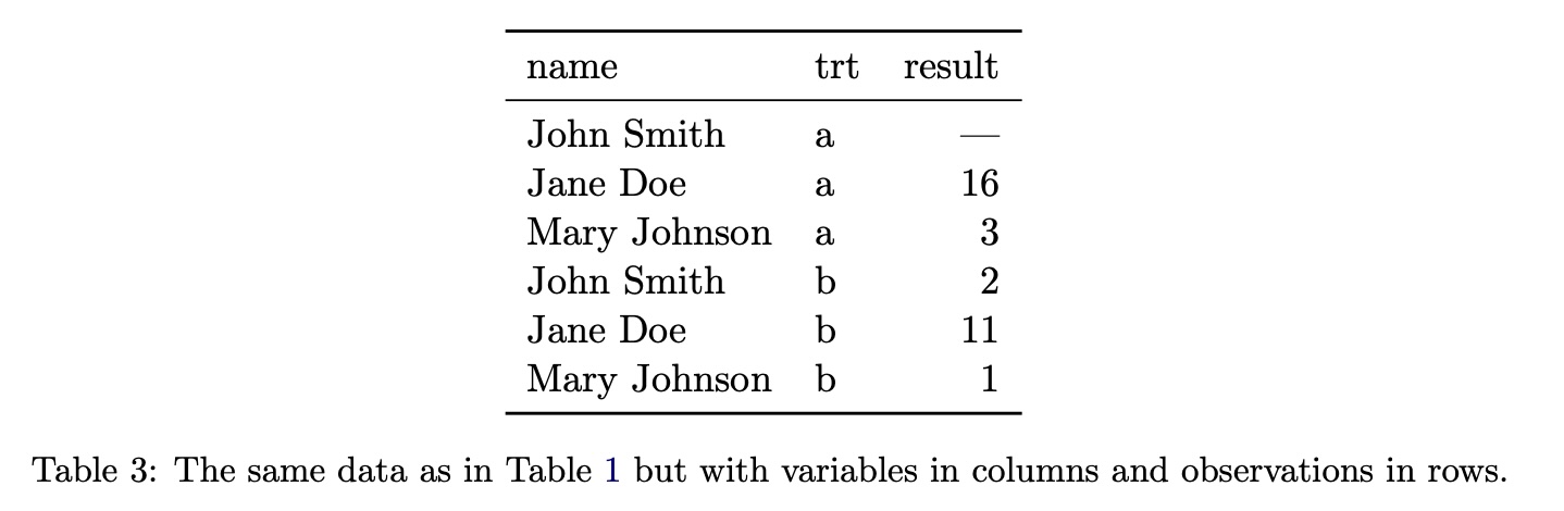
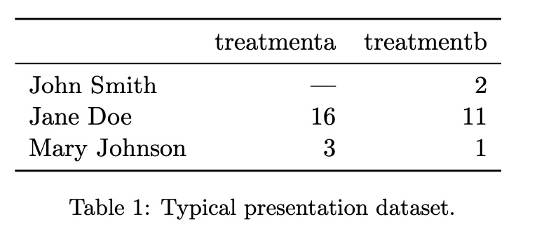
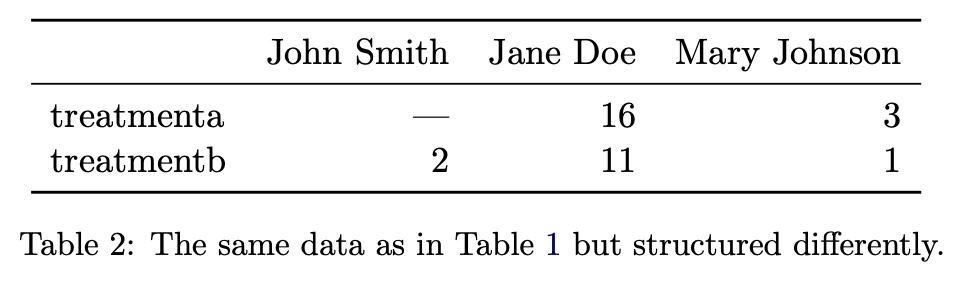
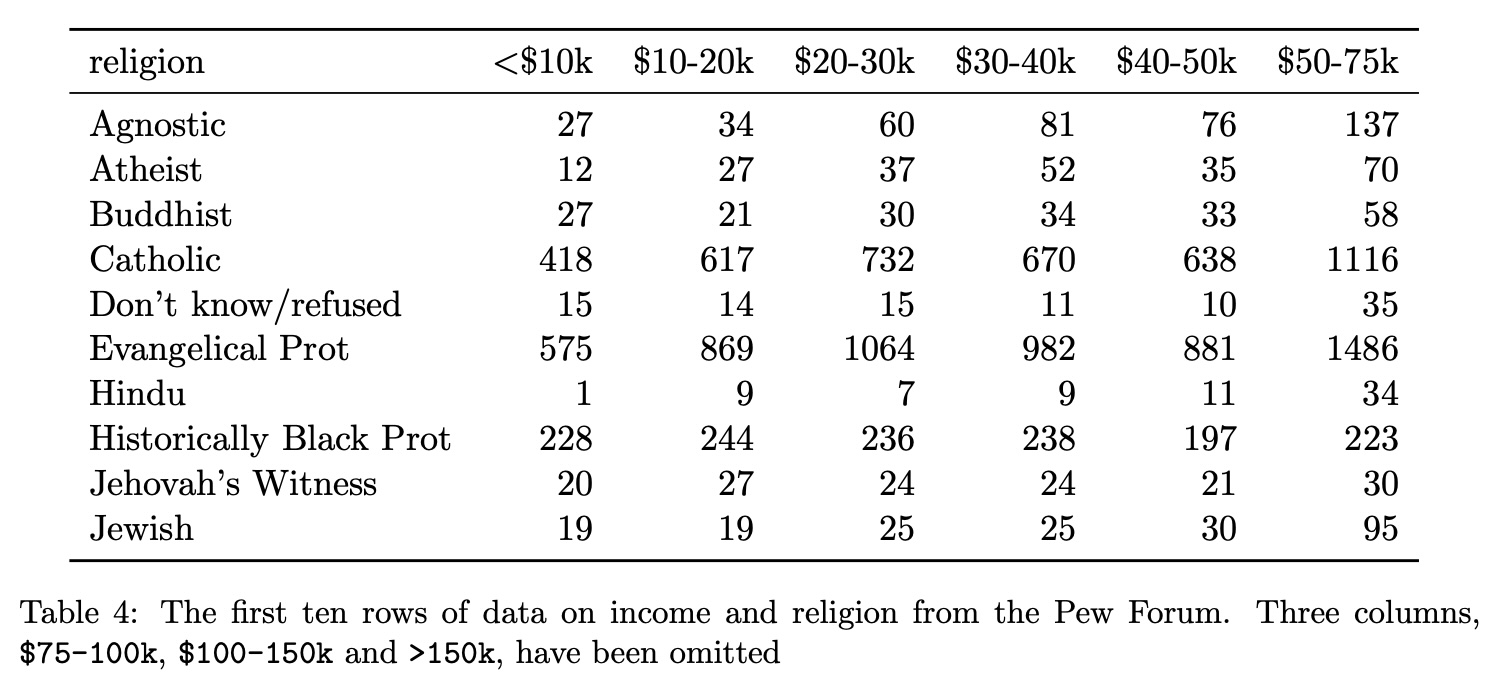
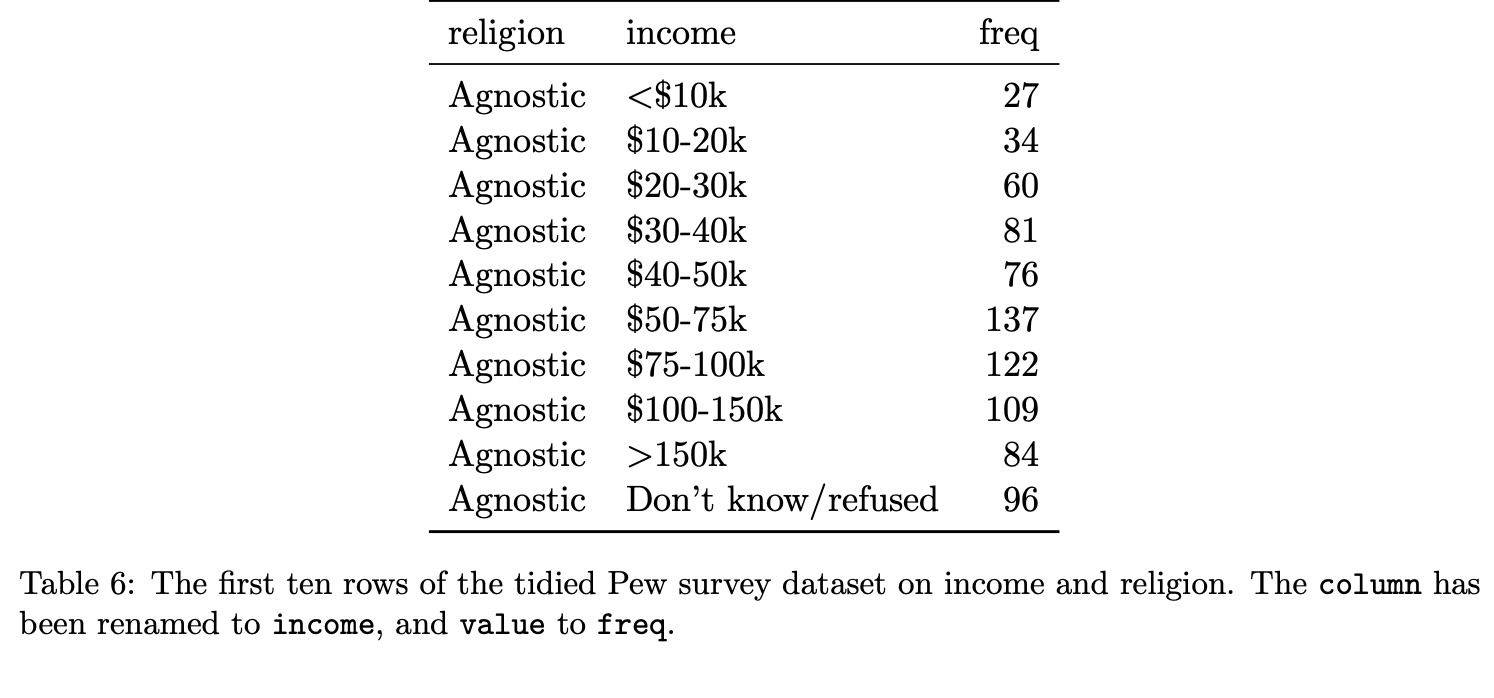
Tidy Data: Example #1
Tidy Data
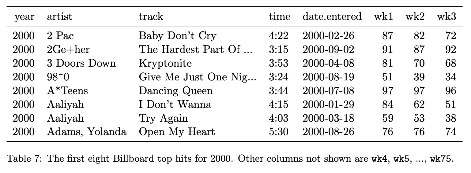
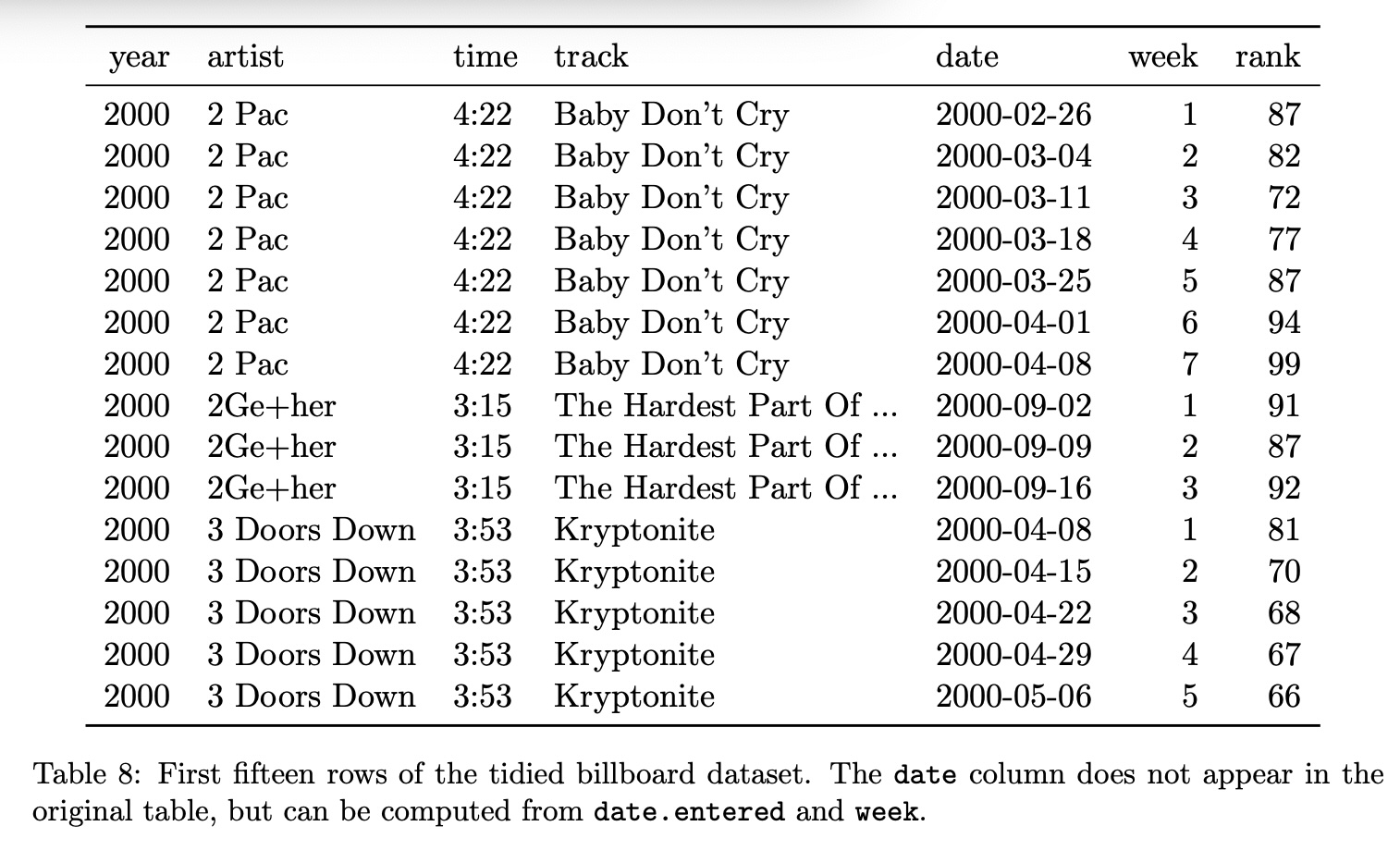
Tidy Data: Example #2
Tidy Data
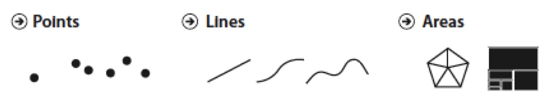
Graphical Marks
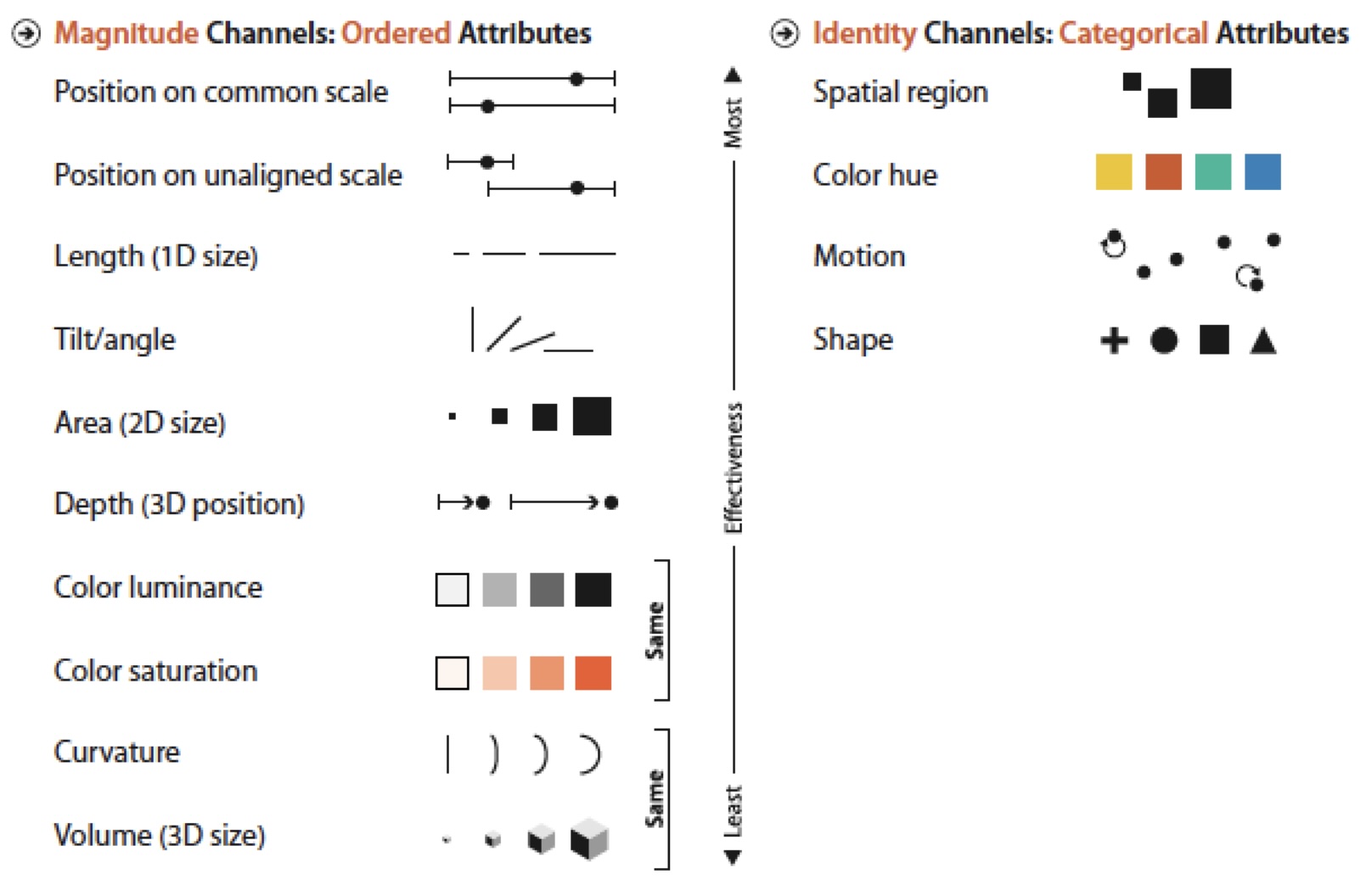
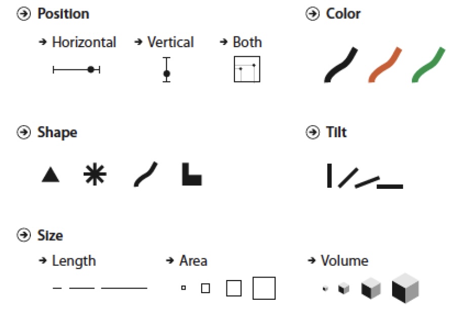
Visual Encoding Channels
Examples
Effectiveness Effect