Visualization for Machine Learning
## What is Information Visualization? Why Use It? ::: columns ::: {.column width="50%"} “The use of computer-supported, interactive, visual representations of abstract data to amplify cognition.” ::: ::: {.column width="40%"}  ::: ::: ::: footer Slides based on material from Prof. Enrico Bertini ::: ## Key Concepts * Computer-Based * Visual Representation * Abstract Data * Interactive * Amplify Cognition ::: footer Slides based on material from Prof. Enrico Bertini ::: ## Abstract Data ::: columns ::: {.column width="50%"} Data with no obvious/natural visual representation ::: ::: {.column width="50%"}   ::: ::: ::: footer Slides based on material from Prof. Enrico Bertini ::: ## Abstract Data ::: columns ::: {.column width="50%"} Data with no obvious/natural visual representation ::: ::: {.column width="40%"}  ::: ::: ::: footer Slides based on material from Prof. Enrico Bertini ::: ## Interactive Users can change what is visualized and how it is visualized. ::: footer Slides based on material from Prof. Enrico Bertini ::: --- ## Amplify Cognition ::: incremental * Solve problems with data with less effort, in a shorter time, and more accurately. * … or even be able to do things it would be impossible to do without a computer and a graphical representation. ::: ::: footer Slides based on material from Prof. Enrico Bertini ::: ## Cognitive artifacts: tools that help us think! ::: incremental * Try to multiply 34 x 72 using exclusively your mind ... * … now do it again using pen and paper. - 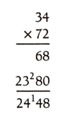 ::: ::: footer Slides based on material from Prof. Enrico Bertini ::: ## Why is it easier? ::: incremental * … because we can store intermediary results in the paper rather than keeping the information in mind. That is, part of the memory is in the world rather than in your head. ::: ::: footer Slides based on material from Prof. Enrico Bertini ::: ## Let’s play the “game of 15” ... ::: incremental * The "pieces" for the game are the nine digits: 1, 2, 3, 4, 5, 6, 7, 8, 9. Each player takes a digit in turn. Once a digit is taken, it cannot be used by the other player. The first player to get three digits that sum to 15 wins. * Here is a sample game: Player A takes 8. Player B takes 2. Then A takes 4, and B takes 3. A takes 5. * Question 1: Suppose you are now to step in and play for B. What move would you make? ::: ::: footer Slides based on material from Prof. Enrico Bertini ::: ## Let's play a different game: tic-tac-toe ::: columns ::: {.column width="70%"} Players alternately place an O or a X in one of nine spaces arranged in a rectangular array. Once a space has been taken, it cannot be changed by either player. The first player to get three symbols in a straight line wins. Suppose player A is X and B is O, and the game has reached the state on the right. Question 2: Suppose you are now to step in and play an O for B. What move would you make? ::: ::: {.column width="20%"} 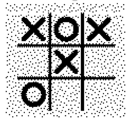 ::: ::: ::: footer Slides based on material from Prof. Enrico Bertini ::: ## Problem Isomorphs [Herbert Simon](https://en.wikipedia.org/wiki/Herbert_A._Simon) ::: incremental * The two problems are equivalent! ::: ::: footer Slides based on material from Prof. Enrico Bertini ::: ## Why use visualization? * Explanatory visualization * Exploratory visualization * Confirmatory visualization ::: footer Slides based on material from Prof. Enrico Bertini ::: ## Great Explanatory Visualizations * NYT: https://flowingdata.com/tag/new-york-times/ * Washington Post: http://postgraphics.tumblr.com/ * Gregor Aisch: https://driven-by-data.net/ * Nicky Case/Explorable Explanations: http://explorabl.es/ * Polygraph: http://polygraph.cool/ & https://pudding.cool/ * ProPublica: https://www.propublica.org/ ::: footer Slides based on material from Prof. Enrico Bertini ::: ## Why use a graphical representation? * Large parts of our brain are devoted to spatial processing 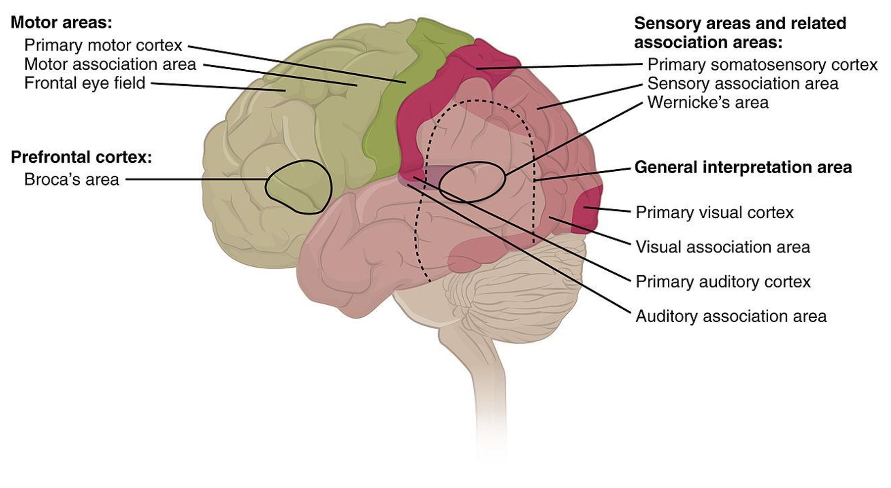 ::: footer Via Wikipedia, By OpenStax College - Anatomy & Physiology, Connexions Web site., Jun 19, 2013., CC BY 3.0 ::: ## Why use a computer to visualize data? ::: footer Slides based on material from Prof. Enrico Bertini ::: ## Why use interaction? * Each visualization can only answer a subset of questions. * With interaction the user can change what is visualized and how to answer a multitude of questions. * Also one cannot visualize everything at once. ::: footer Slides based on material from Prof. Enrico Bertini ::: ## How do you assess the quality of a visualization? * Isn’t it subjective? Some people like A, whereas some others like B. ::: incremental * Some visual representations are better than others at solving particular problems ... ::: ::: footer Slides based on material from Prof. Enrico Bertini ::: ## Digression: Graphical Perception ::: columns ::: {.column width="50%"}  ::: ::: {.column width="50%"}  ::: ::: ::: footer Slides based on material from Prof. Enrico Bertini ::: ## Graphical Perception Experiment 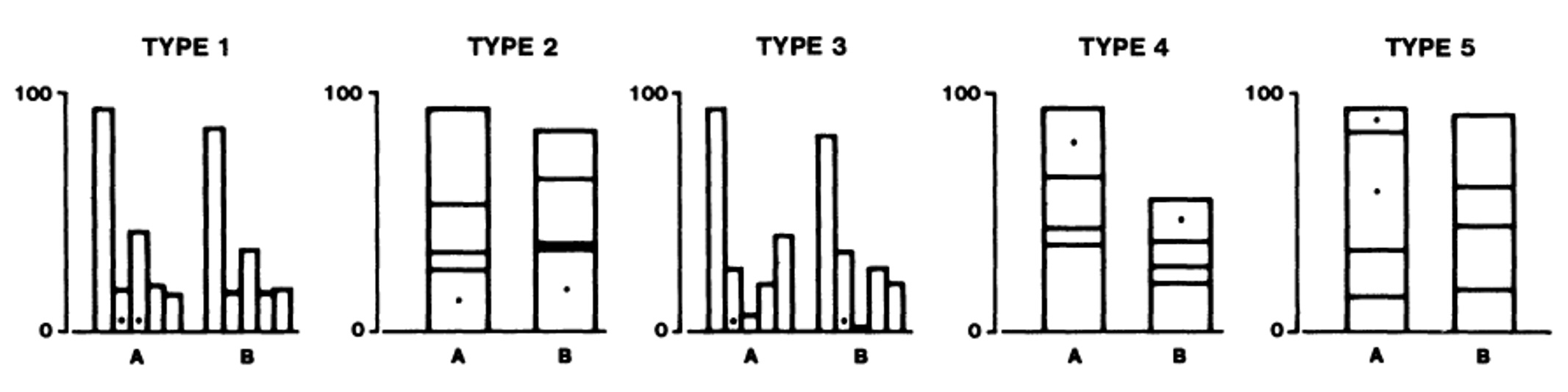 ::: footer Slides based on material from Prof. Enrico Bertini ::: ## Graphical Perception Results  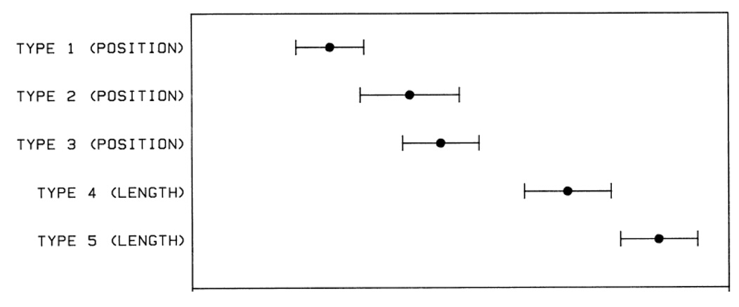 ::: footer Slides based on material from Prof. Enrico Bertini ::: ## Designing effective visualizations requires ::: incremental * Knowing the design space * Being able to compare the solutions * … in turn comparing the solutions requires understanding human perception. ::: ::: footer Slides based on material from Prof. Enrico Bertini ::: ## Data Types * The first ingredient in effective visualization is the input data. Data values can represent different forms of measurement. * What kinds of comparisons do those measurements support? * What kinds of visual encodings then support those comparisons? ::: footer Slides based on material from Prof. Jeffrey Heer [link](https://observablehq.com/@uwdata/data-types-graphical-marks-and-visual-encoding-channels) ::: ## Nominal (N) or Categorical (C) * Nominal data — also called categorical data — consist of category names. * With nominal data we can compare the equality of values: is value A the same or different than value B? (A = B), supporting statements like “A is equal to B” or “A is not equal to B”. * When visualizing nominal data we should readily perceive if values are the same or different: position, color hue (blue, red, green, etc.), and shape are all reasonable options. ::: footer Slides based on material from Prof. Jeffrey Heer [link](https://observablehq.com/@uwdata/data-types-graphical-marks-and-visual-encoding-channels) ::: ## Ordinal (O) * Ordinal data consist of values that have a specific ordering. * With ordinal data we can compare the rank-ordering of values: does value A come before or after value B? (A < B), supporting statements like “A is less than B” or “A is greater than B”. * When visualizing ordinal data, we should perceive a sense of rank-order. Position, size, or color value (brightness) might be appropriate, whereas color hue (which is not perceptually ordered) would be less appropriate. ::: footer Slides based on material from Prof. Jeffrey Heer [link](https://observablehq.com/@uwdata/data-types-graphical-marks-and-visual-encoding-channels) ::: ## Quantitative (Q) * With quantitative data we can measure numerical differences among values. * There are multiple sub-types of quantitative data: - For interval data we can measure the distance between points: (A - B). - For ratio data we can also measure proportions or scale factors: (A / B). * Quantitative values can be visualized using position, size, or color value, among other channels. An axis with a zero baseline is essential for proportional comparisons of ratio values, but can be safely omitted for interval comparisons. ::: footer Slides based on material from Prof. Jeffrey Heer [link](https://observablehq.com/@uwdata/data-types-graphical-marks-and-visual-encoding-channels) ::: ## Temporal (T) * Temporal values measure time points or intervals. This type is a special case of quantitative values (timestamps) with rich semantics and conventions (i.e., the Gregorian calendar). * Example temporal values include date strings such as “2019-01-04” and “Jan 04 2019”, as well as standardized date-times such as the ISO date-time format: “2019-01-04T17:50:35.643Z”. There are no temporal values in our global development dataset above, as the year field is encoded as an integer. ::: footer Slides based on material from Prof. Jeffrey Heer [link](https://observablehq.com/@uwdata/data-types-graphical-marks-and-visual-encoding-channels) ::: ## Spatial (S) * Data that can be shown in a map * Also known as geospatial data, refers to information that identifies the geographic location and characteristics of natural or constructed features and boundaries on the Earth. [https://atlan.com/spatial-data/](https://atlan.com/spatial-data/) ## Data Types Summary * These data types are not mutually exclusive, but rather form a hierarchy: ordinal data support nominal (equality) comparisons, while quantitative data support ordinal (rank-order) comparisons. * Moreover, these data types do not provide a fixed categorization. For example, just because a data field is represented using a number doesn't mean we have to treat it as a quantitative type! We might interpret a set of ages (10 years old, 20 years old, etc.) as nominal (underage or overage), ordinal (grouped by year), or quantitative (calculate average age). ::: footer Slides based on material from Prof. Jeffrey Heer [link](https://observablehq.com/@uwdata/data-types-graphical-marks-and-visual-encoding-channels) ::: ## Fundamental Charts * Widely adopted, effective, useful. * Solve very large percentage of vis problems. * Training ground for more sophisticated graphs. ::: footer Slides based on material from Prof. Enrico Bertini ::: ## Bar Chart ::: columns ::: {.column width="40%"} * Visualize how a quantity distributes across a set of categories. ::: ::: {.column width="60%"} 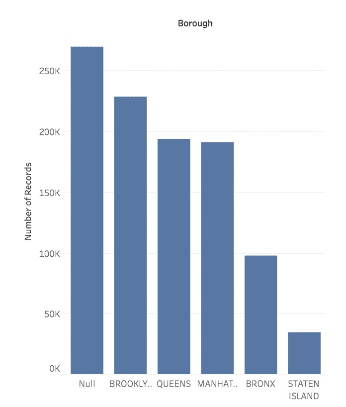 ::: ::: ::: footer Slides based on material from Prof. Enrico Bertini ::: ## Line Chart * Visualize how a quantity changes in relation to another quantity (typically time). 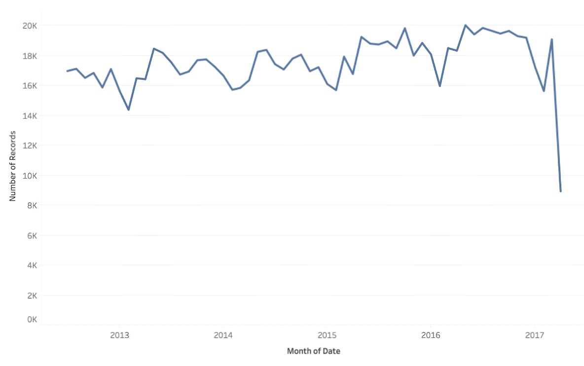 ::: footer Slides based on material from Prof. Enrico Bertini ::: ## Scatter Plot ::: columns ::: {.column width="40%"} * Visualize how a quantity relate to another quantity. ::: ::: {.column width="60%"} 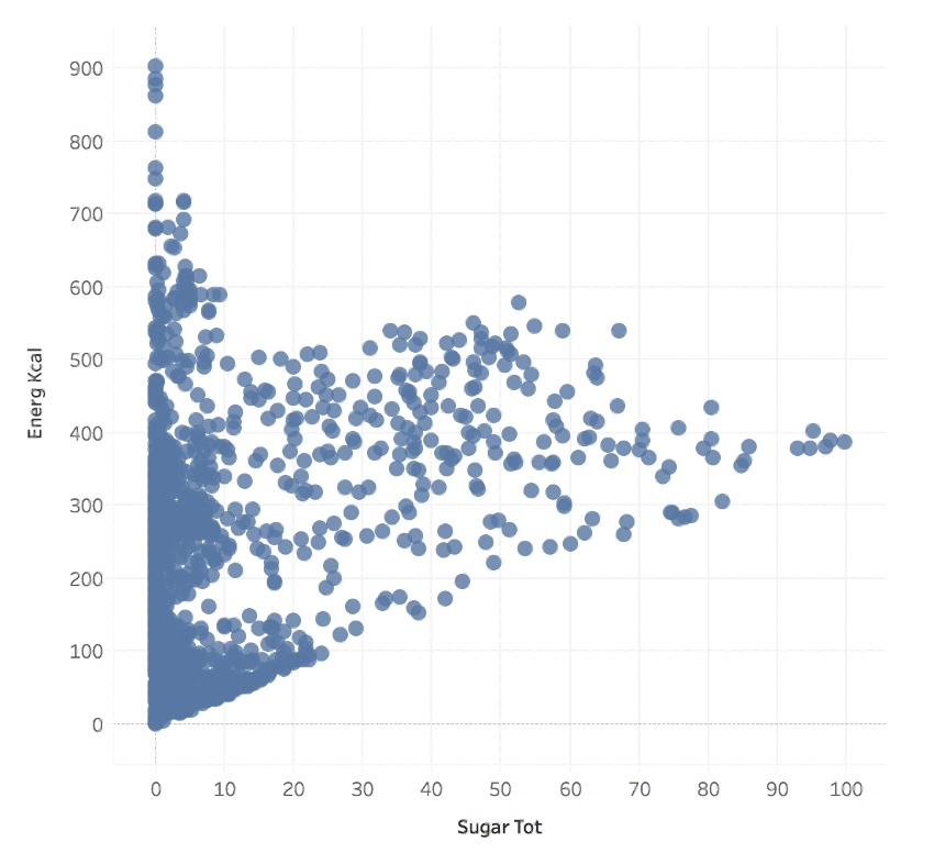 ::: ::: ::: footer Slides based on material from Prof. Enrico Bertini ::: ## Matrix * Visualize how a quantity distributes across two categories. 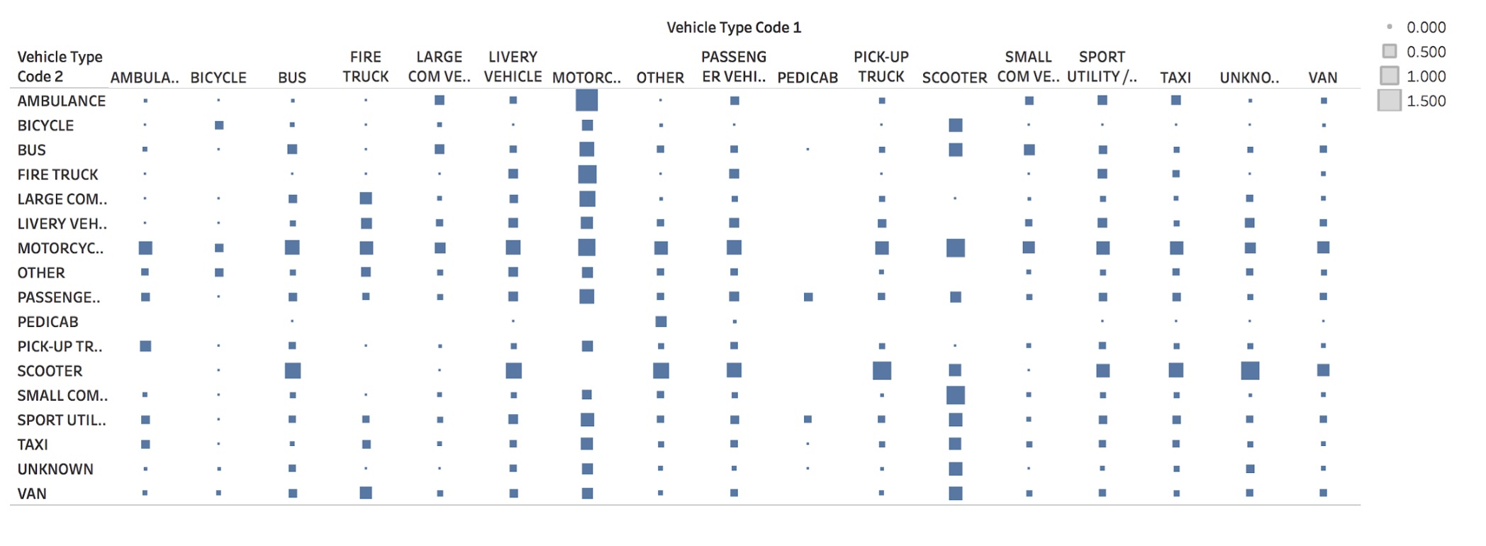 ::: footer Slides based on material from Prof. Enrico Bertini ::: ## Symbol Map ::: columns ::: {.column width="40%"} * Visualize how a quantity distributes across two spatial coordinates. ::: ::: {.column width="60%"} 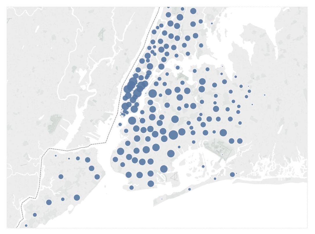 ::: ::: ::: footer Slides based on material from Prof. Enrico Bertini ::: ## Fundamental Graphs Summary 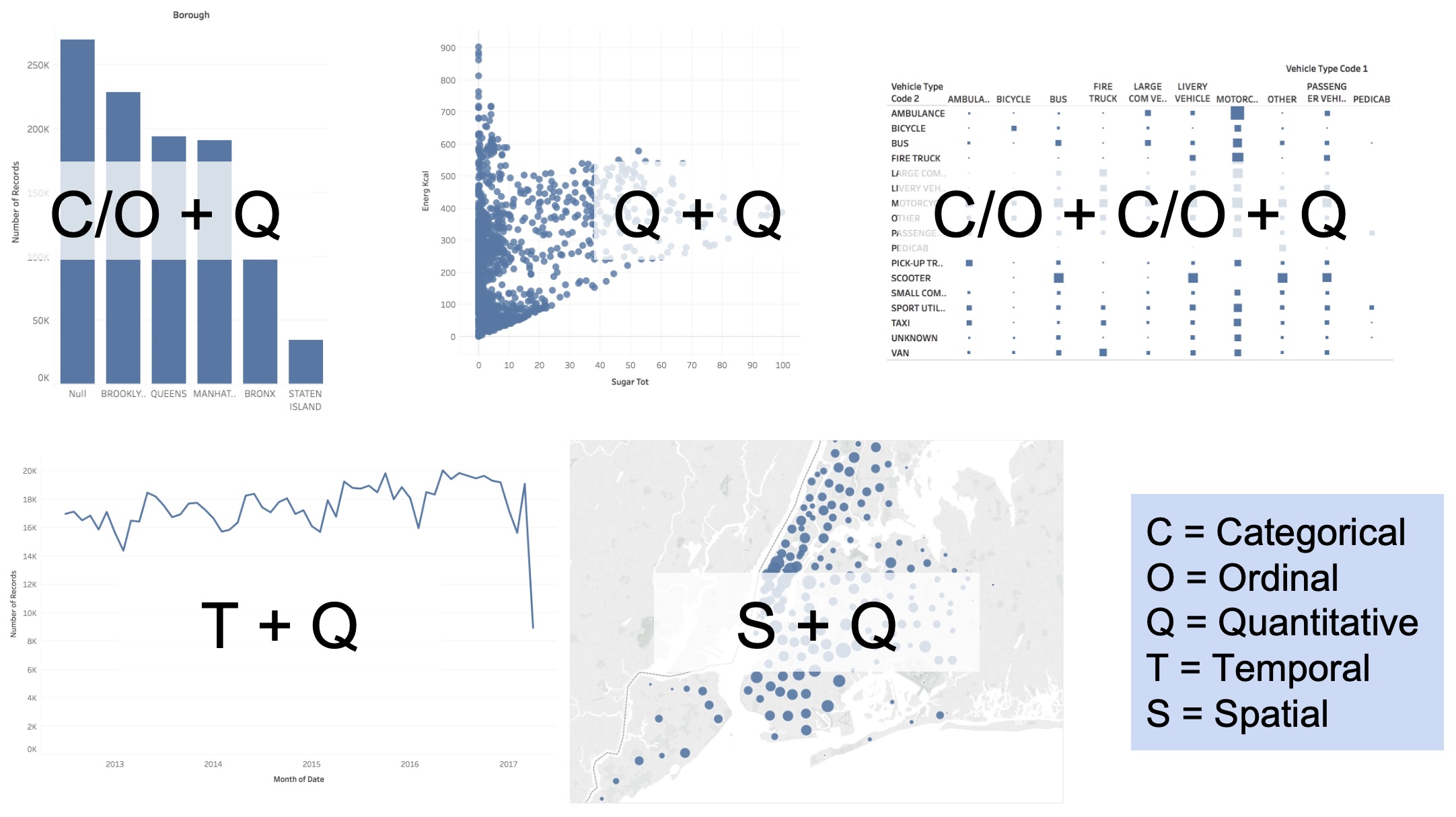 ::: footer Slides based on material from Prof. Enrico Bertini ::: ## Scatter Plots + Faceting (without) 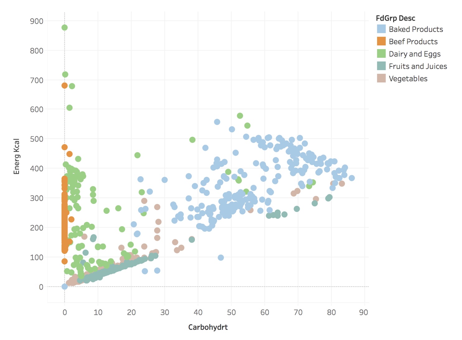 ::: footer Slides based on material from Prof. Enrico Bertini ::: ## Scatter Plots + Faceting (with) 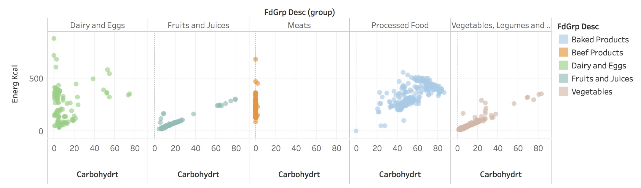 ::: footer Slides based on material from Prof. Enrico Bertini ::: ## Tidy Data * Goal: organizing data to make visualization easier 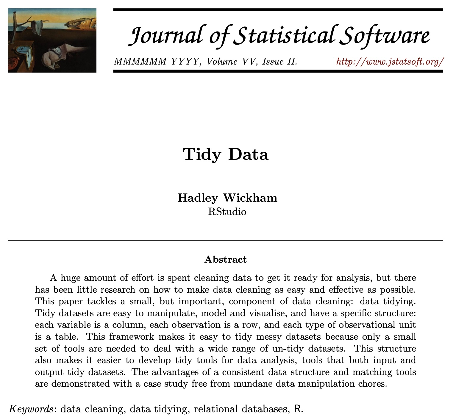 [link to paper](https://vita.had.co.nz/papers/tidy-data.pdf) ::: footer Slides based on material from Hadley Wickham ::: ## Tidy Data 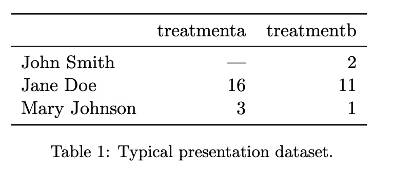 ::: footer Slides based on material from Hadley Wickham ::: ## Tidy Data 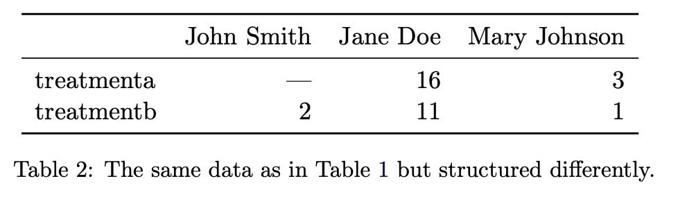 ::: footer Slides based on material from Hadley Wickham ::: ## Tidy Data 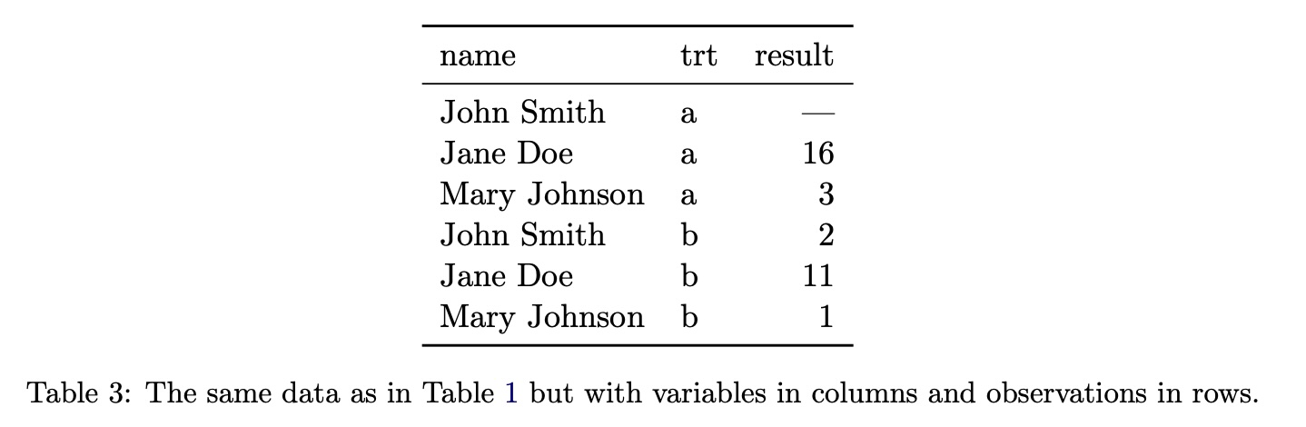 ::: footer Slides based on material from Hadley Wickham ::: ## Tidy Data: Definition In tidy data: * Each variable forms a column. * Each observation forms a row. * Each type of observational unit forms a table. ::: footer Slides based on material from Hadley Wickham ::: ## Tidy Data: Example #1 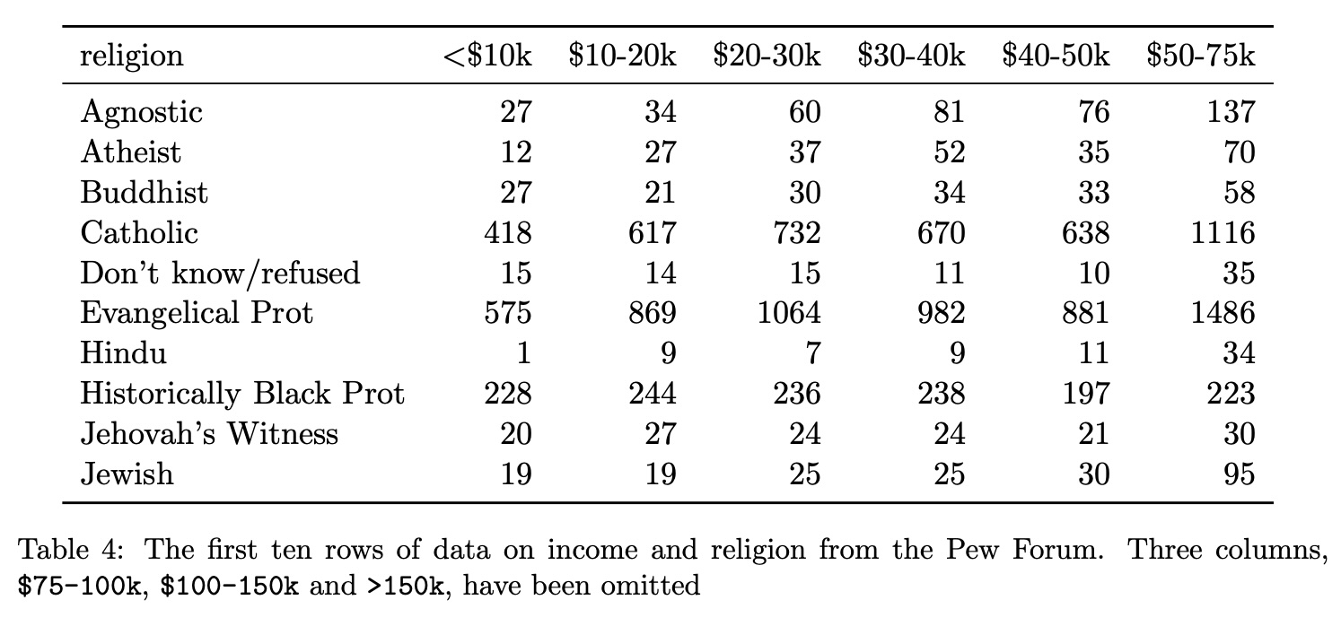 ::: footer Slides based on material from Hadley Wickham ::: ## Tidy Data 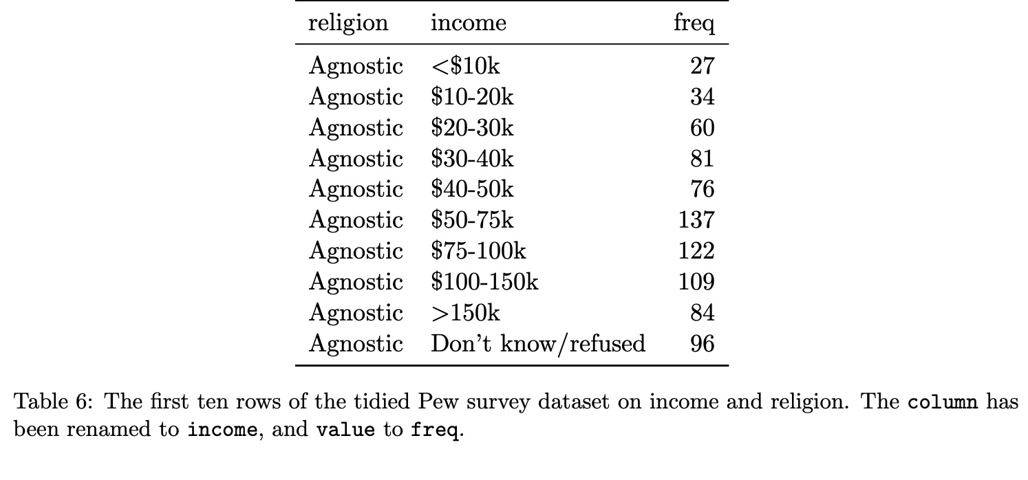 ::: footer Slides based on material from Hadley Wickham ::: ## Tidy Data: Example #2 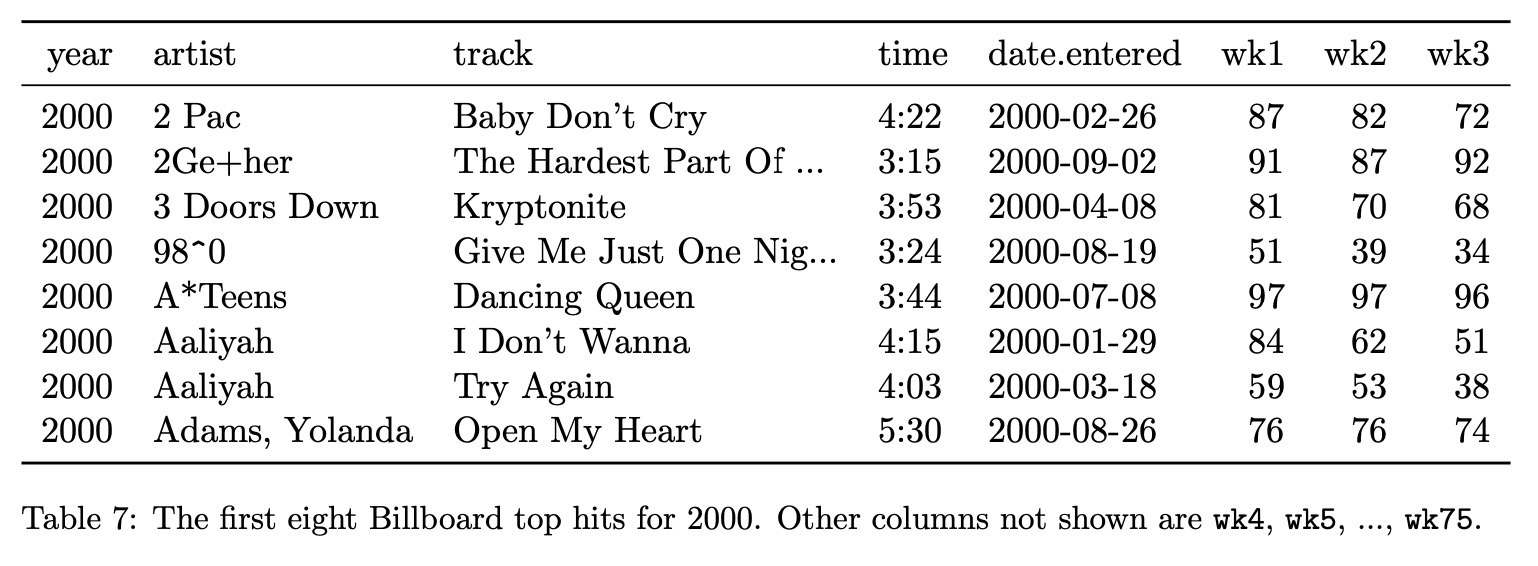 ::: footer Slides based on material from Hadley Wickham ::: ## Tidy Data 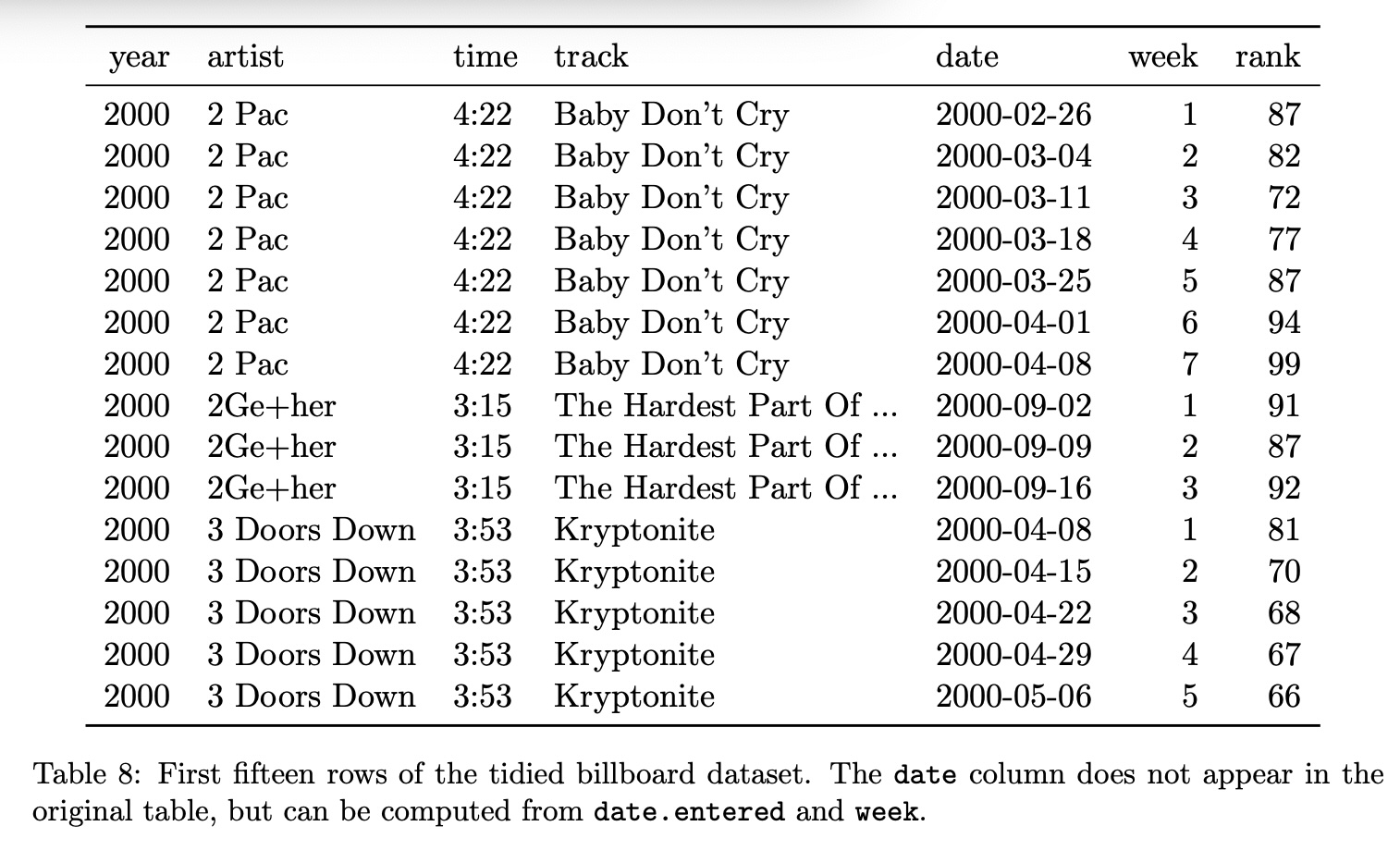 ::: footer Slides based on material from Hadley Wickham ::: ## Graphical Encoding Every visualization can be described in terms of: * its basic graphical components * mapping strategy between data and graphics * more precisely, a set of mappings between: - data items --- visual marks - data attributes --- visual channels ::: footer Slides based on material from Hadley Wickham ::: ## Graphical Marks 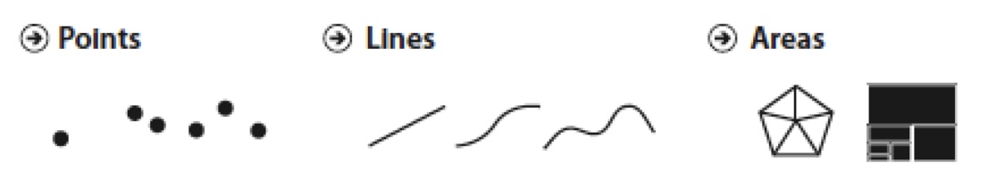 ::: footer Slides based on material from Prof. Enrico Bertini ::: ## Visual Encoding Channels 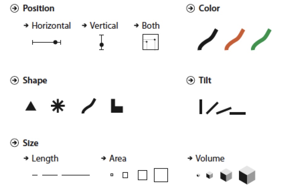 ::: footer Slides based on material from Prof. Enrico Bertini ::: ## Visualization Decoding * Marks --- Data Items * Channels --- Data Attributes ::: footer Slides based on material from Prof. Enrico Bertini ::: ## Examples 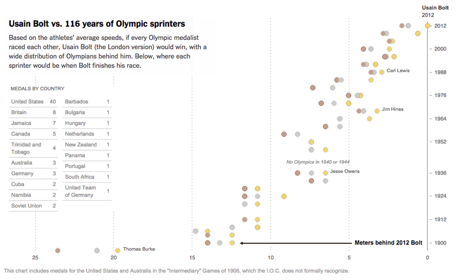 [NYT link](http://www.nytimes.com/interactive/2012/08/05/sports/olympics/the-100-meter-dash-one-race-every-medalist-ever.html?_r=0) ::: footer Slides based on material from Prof. Enrico Bertini ::: ## Expressiveness Principle The visual representation should express the type of information that exists in the data. * Ordered data should not appear as unordered. * Unordered data should not appear as ordered. ## Effectiveness Principle Relevance of information should match the effectiveness of the channels used. - Represent important information with more effective channels ## Effectiveness Effect 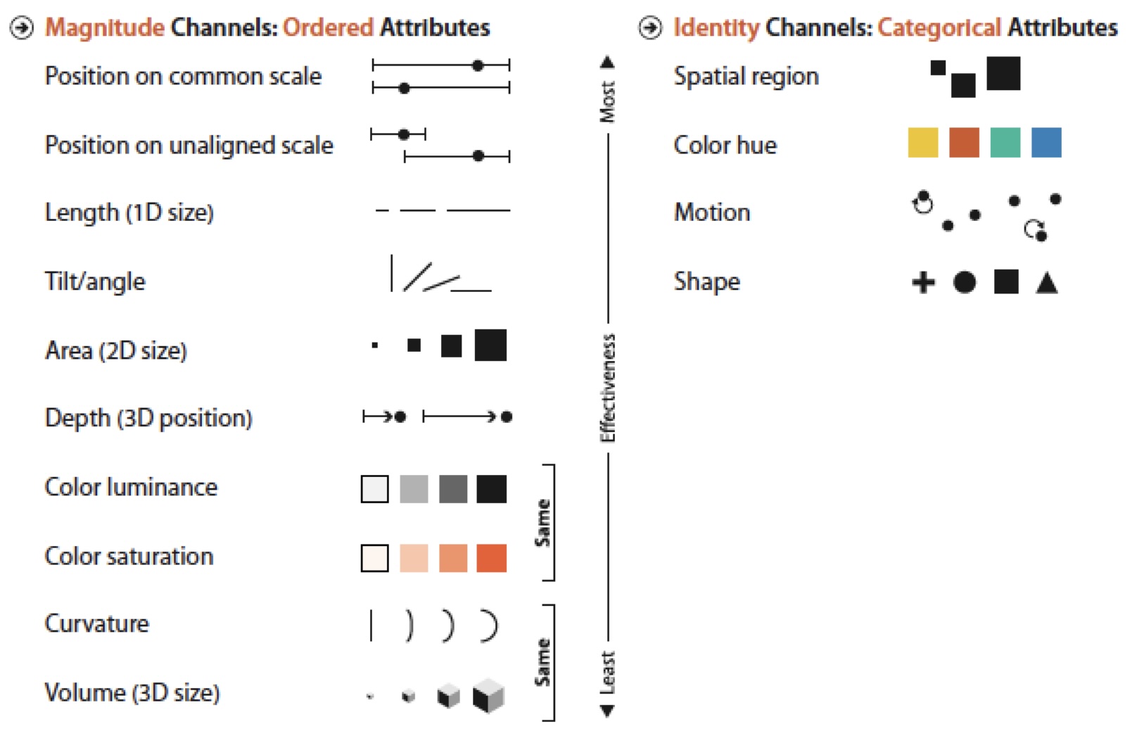 ## Summary * Visual Encoding/Decoding * Graphical Marks and Channels * Expressiveness and Effectiveness * Channels Appropriateness and Ranking * Evaluation and Design * Contextual Components - Labels, legends and annotations - Axes, grids and trend lines ::: footer Slides based on material from Prof. Enrico Bertini ::: ## Neo: Interactive Confusion Matrices Great example of research in VisML! [video link](https://www.youtube.com/watch?v=LmsJJDHfGlI) ---