We already imported the raw data from ex_data_1@4.csv into raw_data, without type-casting the data.
Goal: Use native JavaScript Array.map() to typecast the features in our raw data into the following:
date: JavaScript Date() type
temperature: Float type
humidity: Integer type
co2: Integer type
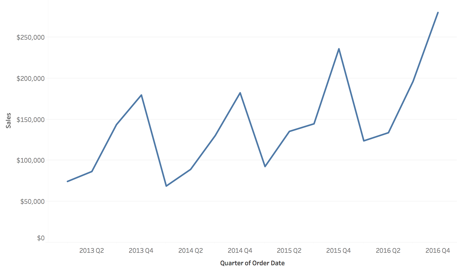
Let’s Try: Basic Time Series Line Chart
Practice: Plotting Line Data [15min]
You’ve been given a set of interactable elements. They output to a dims object. You must use this dims object to help you plot a dynamic line chart.
Once you plot the chart, play around with the chart’s aspect ratio. Which aspect ratio seems to be the best for each y-axis feature?
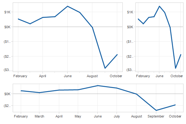
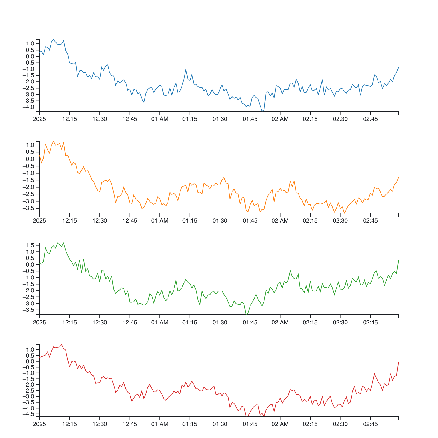
Solving Spaghetti Plots
One solution: Small Multiples
Small Multiples - Implementation
Core Idea: Split the data into series or groups of data. Then visualize that data in separaet plots.
Many ways to achieve this in programming.
Individually plotting each chart by hand.
Using fancy libraries to auto-separate the plots.
Automating the process of generating charts.
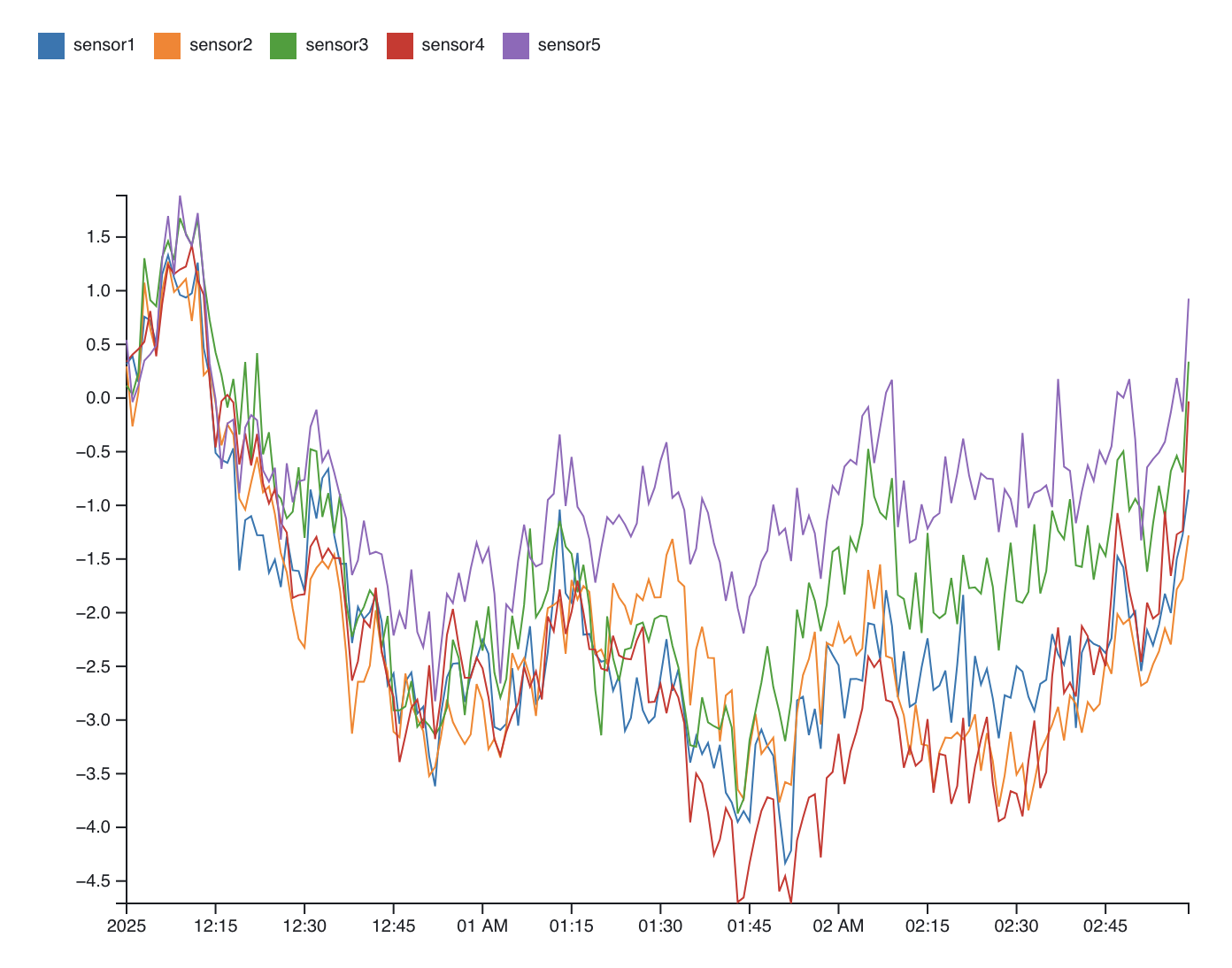
How Do Small Multiples? Let’s Think
A Possible Solution:
Let’s Try: Solving Spaghetti Plots
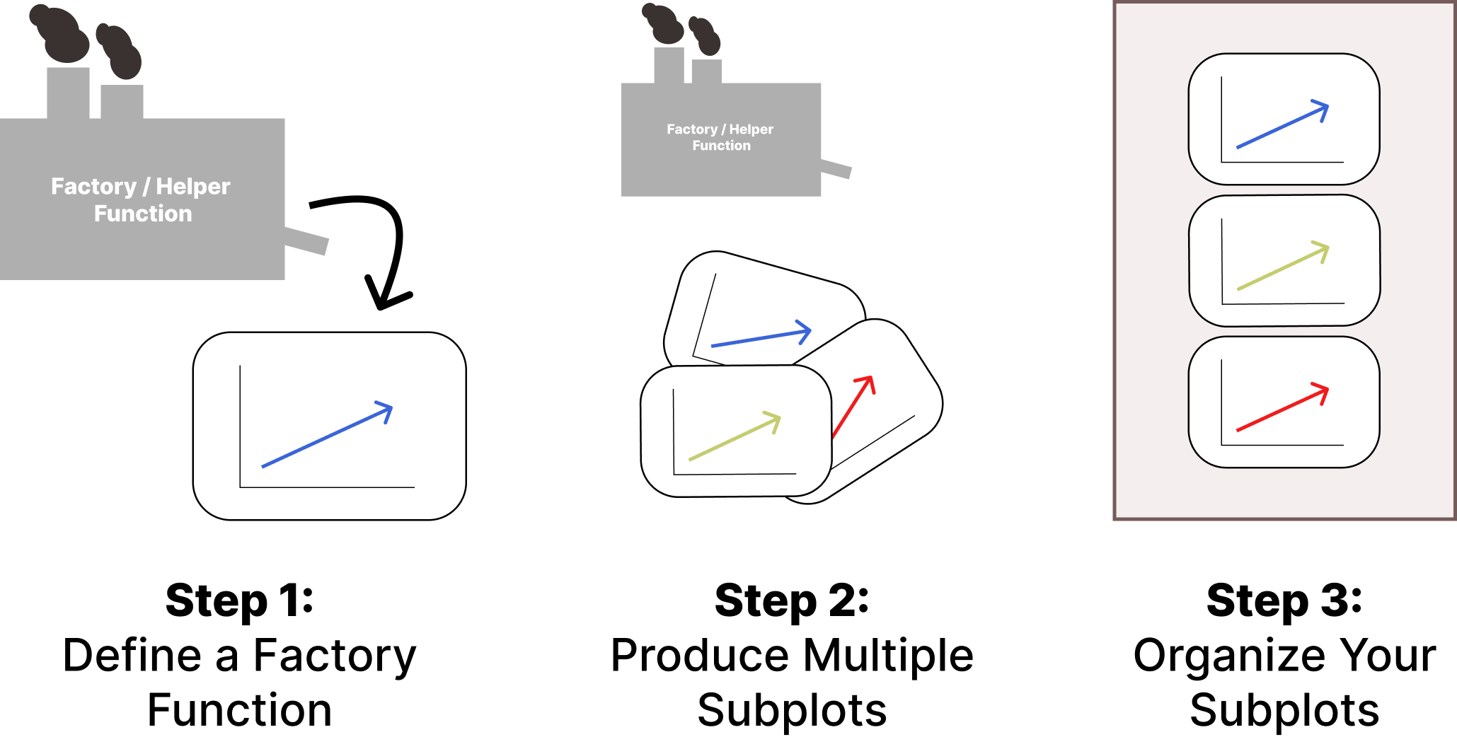
Practice: Creating our Factory Function [10min]
Let’s create a factory function to help us generate a single subplot. Your job is to create this create_subplot() factory function with the following parameters:
parent: The parent element - usually svg.
sensor: An element from sensors.
x_scale: The scale used for our x-axis. Must be generated prior.
c_scale: The color scale. Must be generated prior.
width: The width of this subplot.
height: The height of this subplot.
x_pos: The x-position of this chart relative to the parent.
y_pos: The y-position of this chart relative to the parent.
If succcessful, the function should append a new chart with all our data already plotted inside it and sized based on our parameters, alongside our axes and so on.
Let’s Try: Solving Spaghetti Plots
Practice: Organizing our Subplots [10min]
Once we have create_subplot() created, then we can see if it works.
Combine the scaffolded code we gave you with create_subplot(). Keep in mind that you need to calculate the position of each chart manually, given the provided SVG parameters!
If successful, you should see our solution plot to the right.