Week 3 Lab: Fundamental Graphs and Visual Encoding
CS-GY 6313 - Information Visualization
Ryan Kim
New York University
2025-09-19
Week 3 Lab Overview
Today’s Lab Activities
- Warm up: Practice with Scenarios & Choices
- Mutli-View Composition
- Partner Activity: Chart Exploration
Recall Today’s Main Topics:
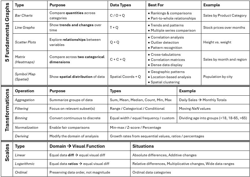
- 5 Fundamental Graphs: Bar Charts, Line Graphs, Scatter Plots, Matrix, Symbol Maps
- Principles: Expressiveness & Effectiveness
- Transformation Types: Aggregation, Filtering, Binning, Deriving, Normalization
- Domains & Scales: Linear, Log, Ordinal
Part 1: Warm Up - Thinking about Design Choices (~5-10 mins)
Our Task:
- What we’re given: A data scenario & a goal in mind
- Our task: Answer, collectively, the optimal way to:
- Identify the data domains [Q, C, O, T, Spatial (S)]
- Graph the data [Bar, Line, Scatter, Matrix, Symbol]
Exercise 1
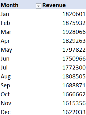
- What we’re given: Monthly sales revenue ($) over the past 12 months for a retail store.
- Goal: Identify trends over time.
- StrawPoll
Exercise 2
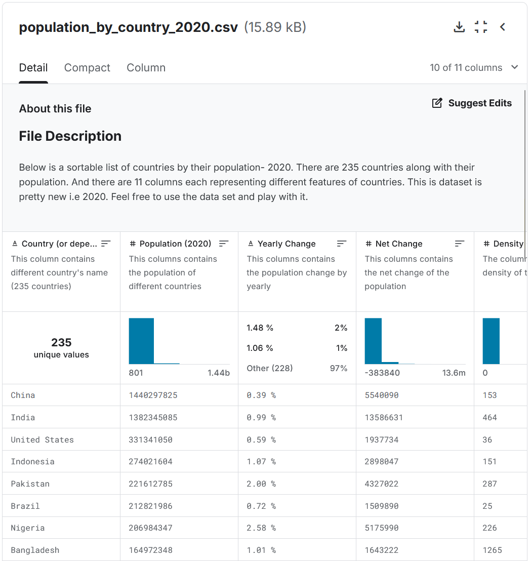
- What we’re given: Population size of different countries.
- Goal: Compare country population sizes
- StrawPoll
Exercise 3
- What we’re given: Product ratings from 1 to 5 stars collected from customer feedback.
- Goal: Show frequency of each rating.
- StrawPoll
Exercise 4
- What we’re given: Test scores (0%-100%) of students plotted against hours studied.
- Goal: Determine the correlation between study time and performance.
- StrawPoll
Exercises - Answers
Exercise 1: Monthly Sale Revenues
- Data domains: Monthly Sales (Q) over 12 months (T/O)
- Graph: Line or Bar
Exercise 2: Population Sizes
- Data domains: Population Size (Q) by Country (S)
- Graph: Symbol Map (via GeoData)
Exercise 3: Product Ratings
- Data domains: A collection (Q) of Product Ratings (O)
- Graph: Bar Chart
Exercise 4: Test Scores
- Data domains: Test scores (Q) vs. hours studied (Q)
- Graph: Scatter Plot
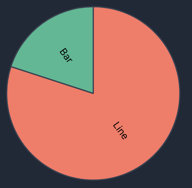
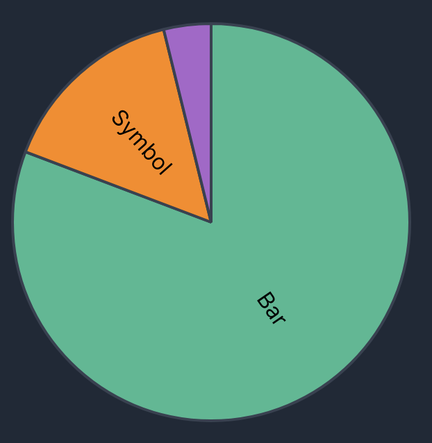
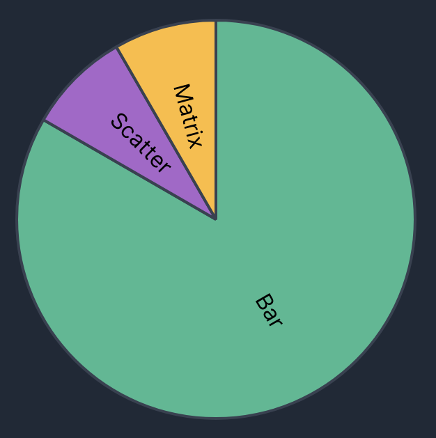
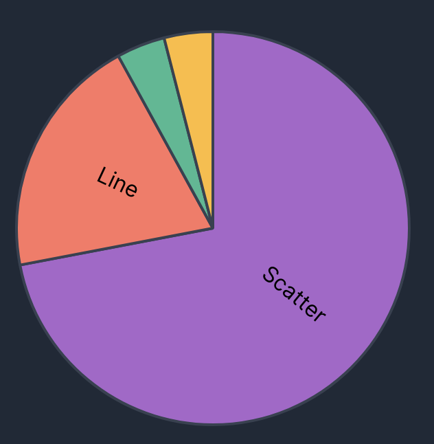
Poll Results from Class (Sep. 19, 2025)
Exercise #1: ![]()
Exercise #2: ![]()
Exercise #3: ![]()
Exercise #4: ![]()
Core Idea: Meaning-Making: Data -> Information
As engineers, designers, and researchers, we must do the work to find meaning within the raw data and interpret them for the benefit of others.
There are many ways to generate viable alternatives charts!
Part 2: Facets and Multiple Views
Context:
In prior labs and exercises, we touched upon the idea of “facets”, or multiple views within a single chart. Facets allow us to divide visualizations based on a categorical feature as a 3rd dimension.
In this part, we’ll really get deep into generating multi-view compositions.
Concepts Covered:
- layer: place compatible charts directly on top of each other,
- facet: partition data into multiple charts, organized in rows or columns,
- concatenate: position arbitrary charts within a shared layout, and
- repeat: take a base chart specification and apply it to multiple data fields.
Largely inspired by UW Data Lab Summary: Multi-View Composition. Follow this notebook, then return here for Part 3.
Part 3: Multiple Chart Types in Vega-Lite
Documentation
We’ve already covered several plot types, but Vega-Lite provides a very wide variety of different chart types.
Changes to our Approach
- Moving away from specifying “answer” graphs
- Instead, moving more towards prompt-based questions and analysis.
Part 3 Exercises: Answering Prompts (~20-30 mins)
Your Task:
IN PAIRS OF TWO:
For each scenario prompt, take the data and attempt to generate a visualization of your choice that shows something unique about that dataset. At the end of this exercise, we will have volunteers show their graphs for each scenario and provide a narrative for what the graph is telling them.
- You are allowed to use any visualization.
- Feel free to use any filters, calculations, or multi-view compositions.
- Use the cheatsheet to help you identify optimal graphs, scales, and transformations.
- Try to avoid the common pitfalls.
- Keep it simple!
End of Lab
- Exercise #3 will be posted no later than September 20, 2025.
- Exercise #3 is due on September 25th, 2025 @ 11:59pm!
- Where do I ask questions?
- TA Office Hours:
- Our course Discord!