Week 2: Analytical Questions and Data Transformation
CS-GY 6313 Information Visualization
2025-09-12
What Is Data?
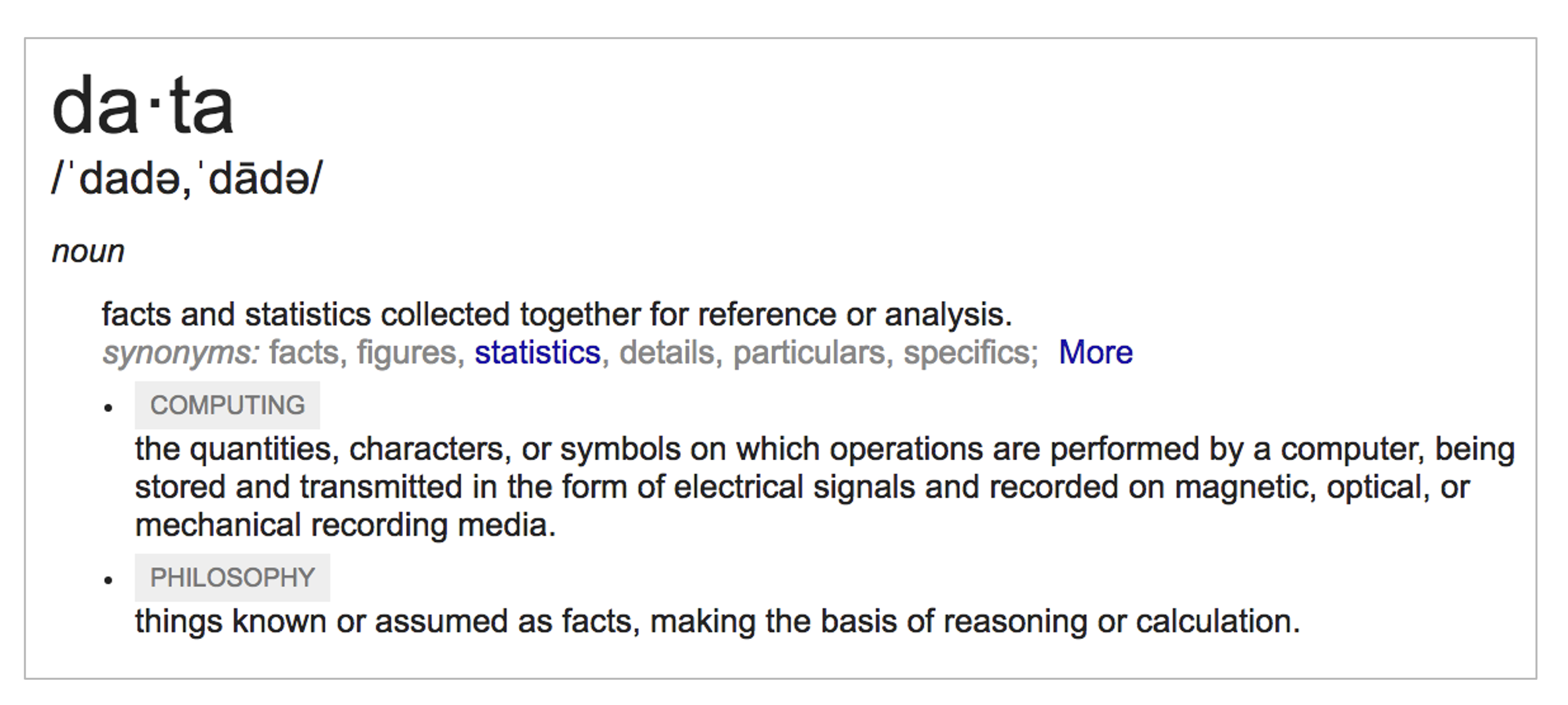
- Definition: Facts and statistics collected together for reference or analysis
- Examples: Census data, stock prices, sensor readings, survey responses, click streams
- Characteristics: Can be structured/unstructured, quantitative/qualitative, temporal/static
Data in Visualization
The Visualization Pipeline (Card et al., 1999)
- Collection: Raw data from various sources
- Transformation: Data tables, cleaning, structuring, aggregations etc
- Visualization: Visual structures and views
From Reality to Representation
- Real-world phenomena: Events, objects, processes
- Measurements/observations: Sensors, surveys, records
- Abstract data model: Tables, networks, fields
- Visualization encoding: Visual mappings and representations
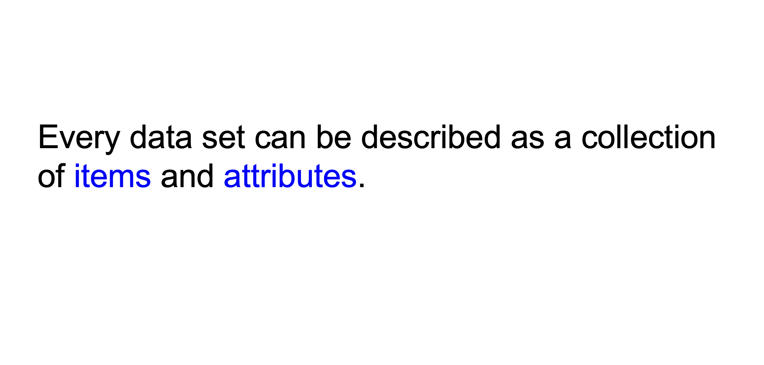
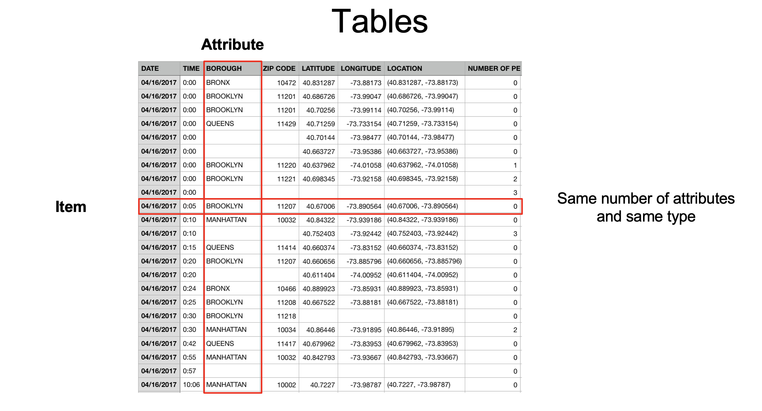
Datasets = Items + Attributes
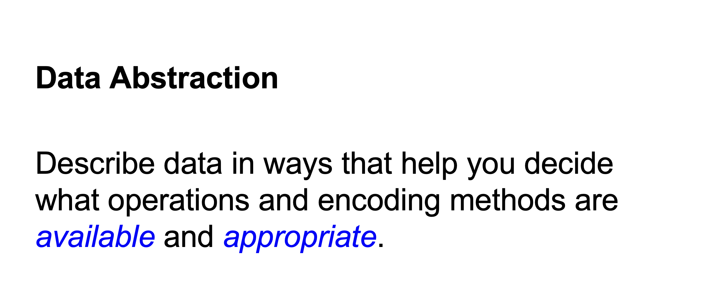
Complete the Framework
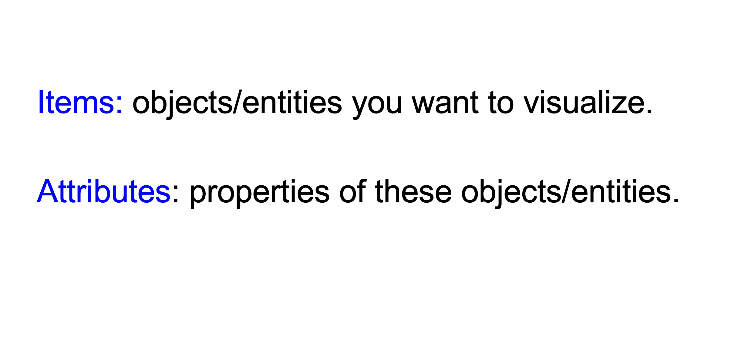
Items (also called records, cases, objects): - Definition: Objects/entities you want to visualize - Examples:
Attributes (also called variables, features, fields): - Definition: Properties of these objects/entities - Examples:
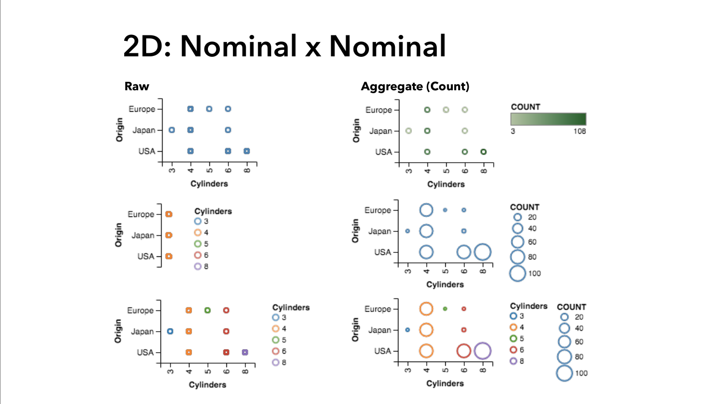
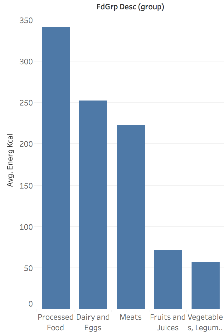
Visualization Examples by Attribute Type
Line Charts: Appropriate for Ordered Data
Categorical Data: Arbitrary Sorting
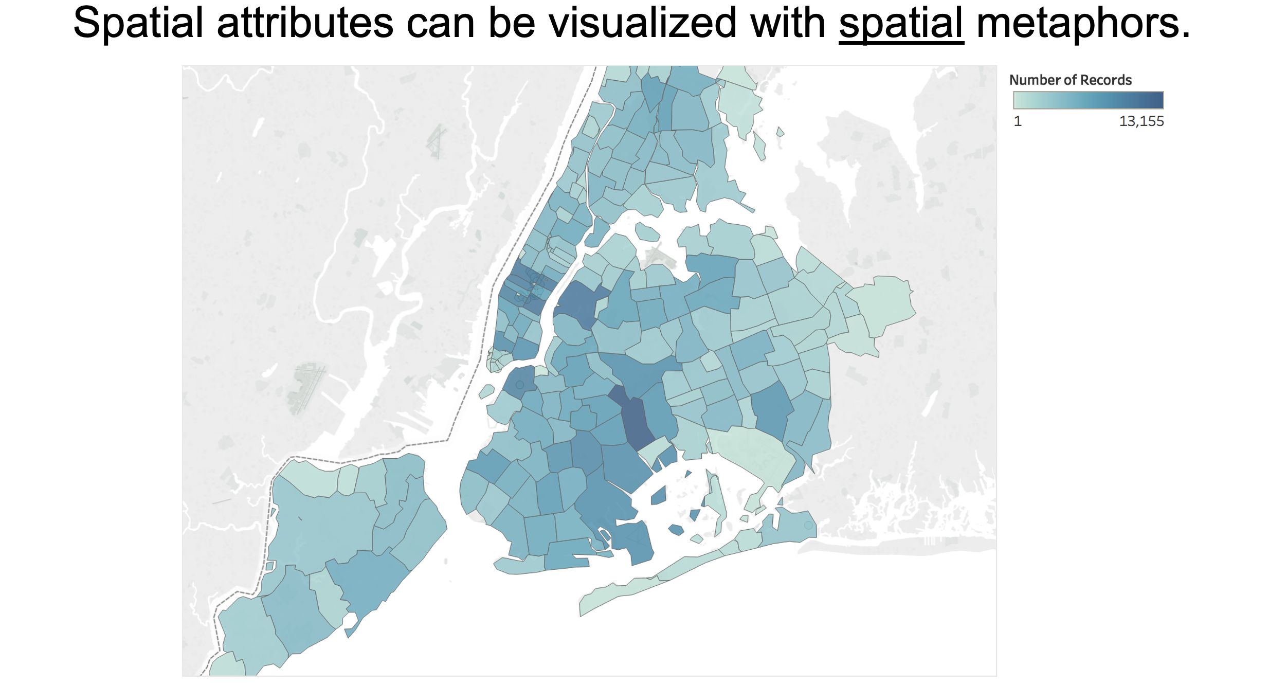
Spatial Attributes: Use Spatial Metaphors
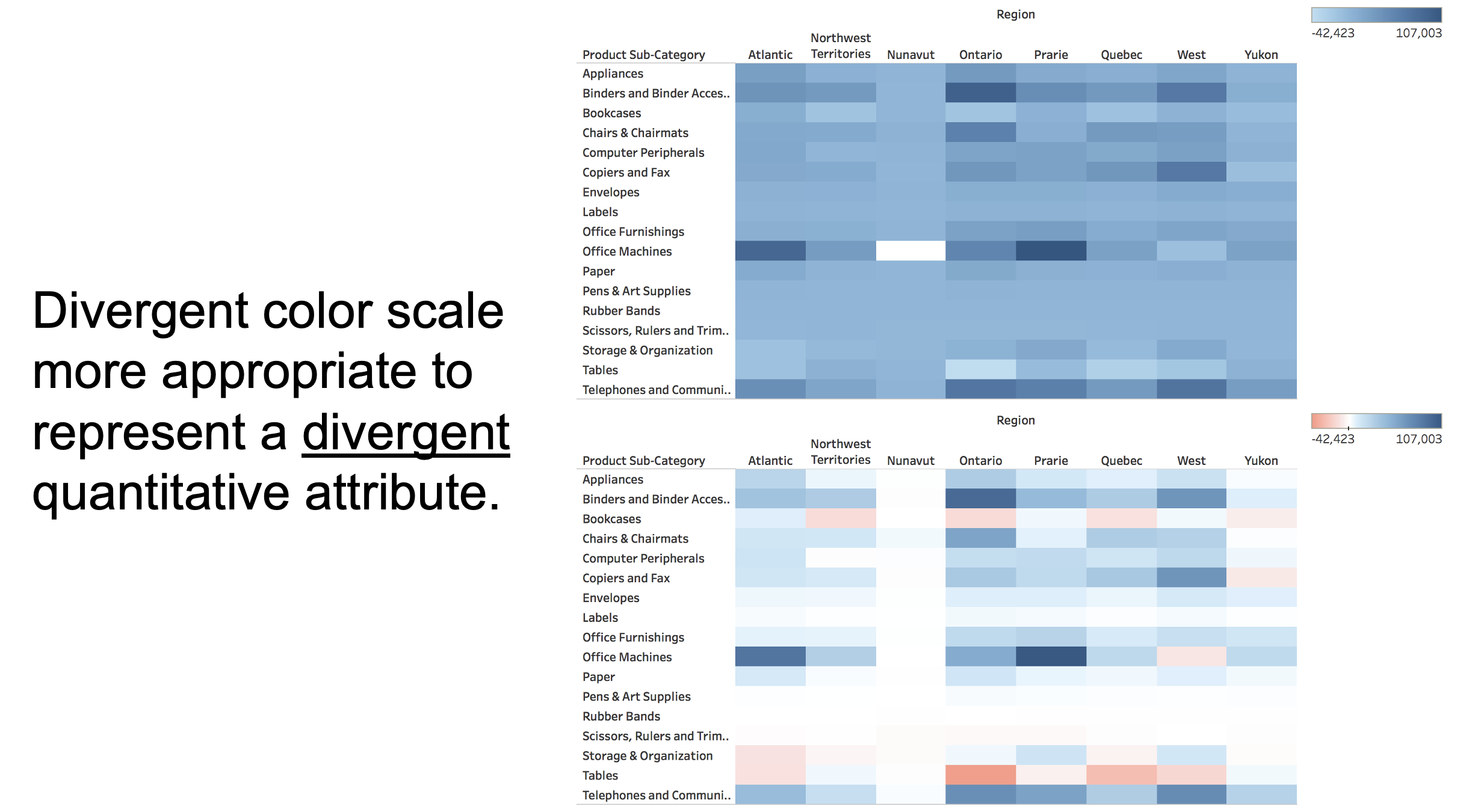
Quantitative Data: Divergent Color Scales
Visualization as a Tool to Answer Questions with Data
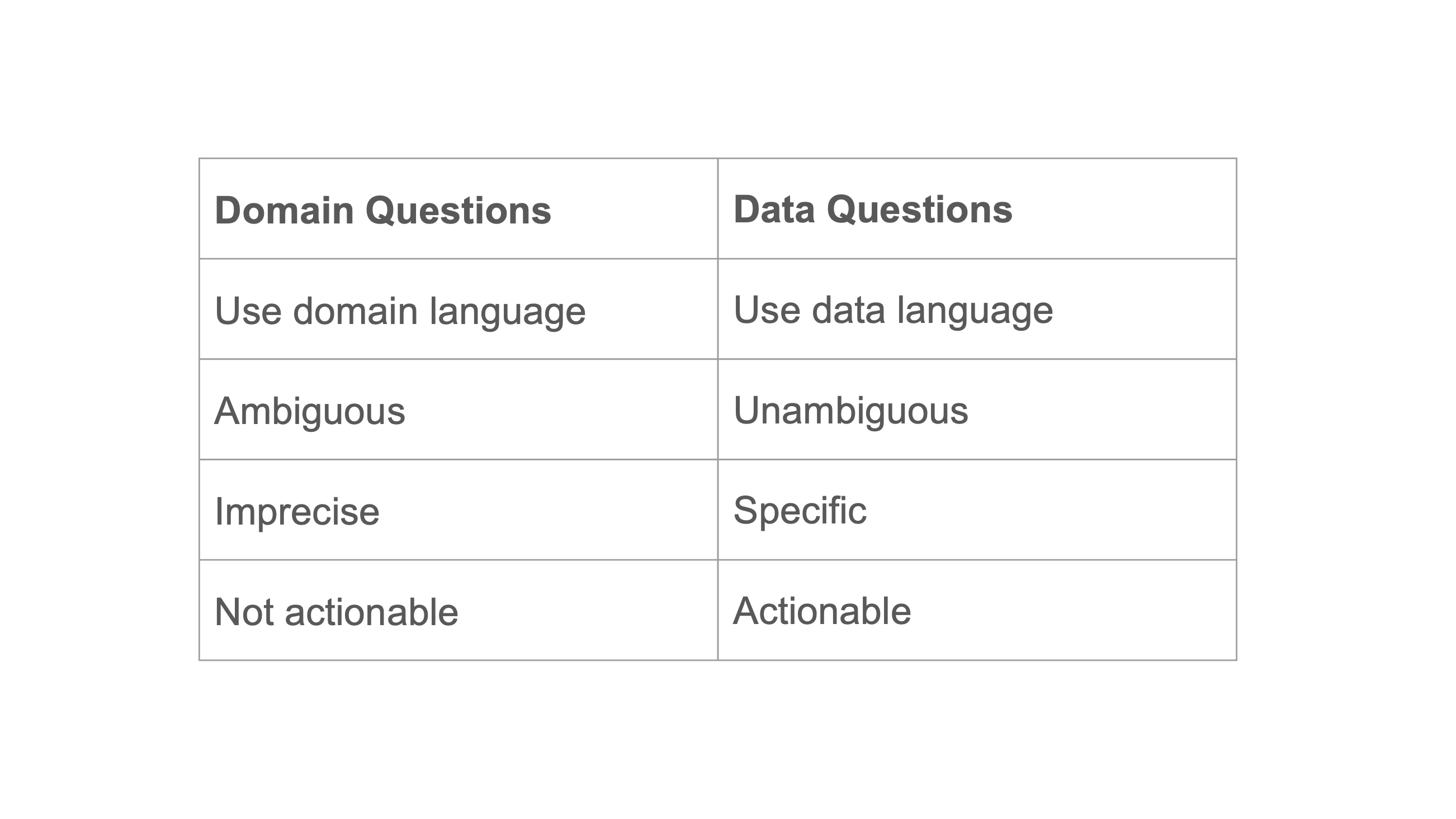
Domain Questions vs. Data Questions
From Domain to Data Questions

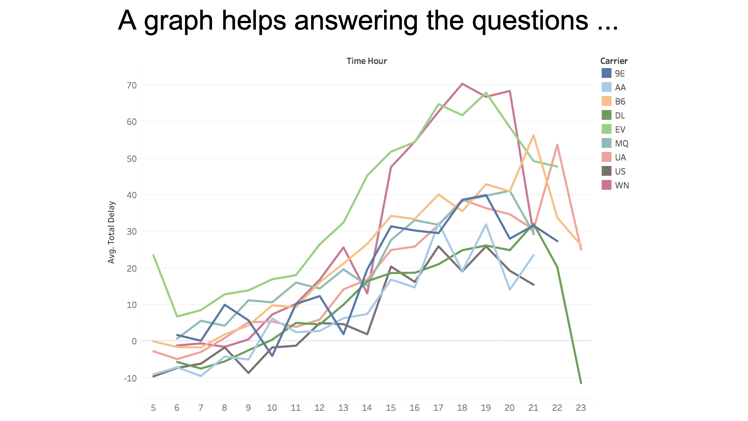
Example: NYC Flight Delays Data

Domain Questions: Flight Data
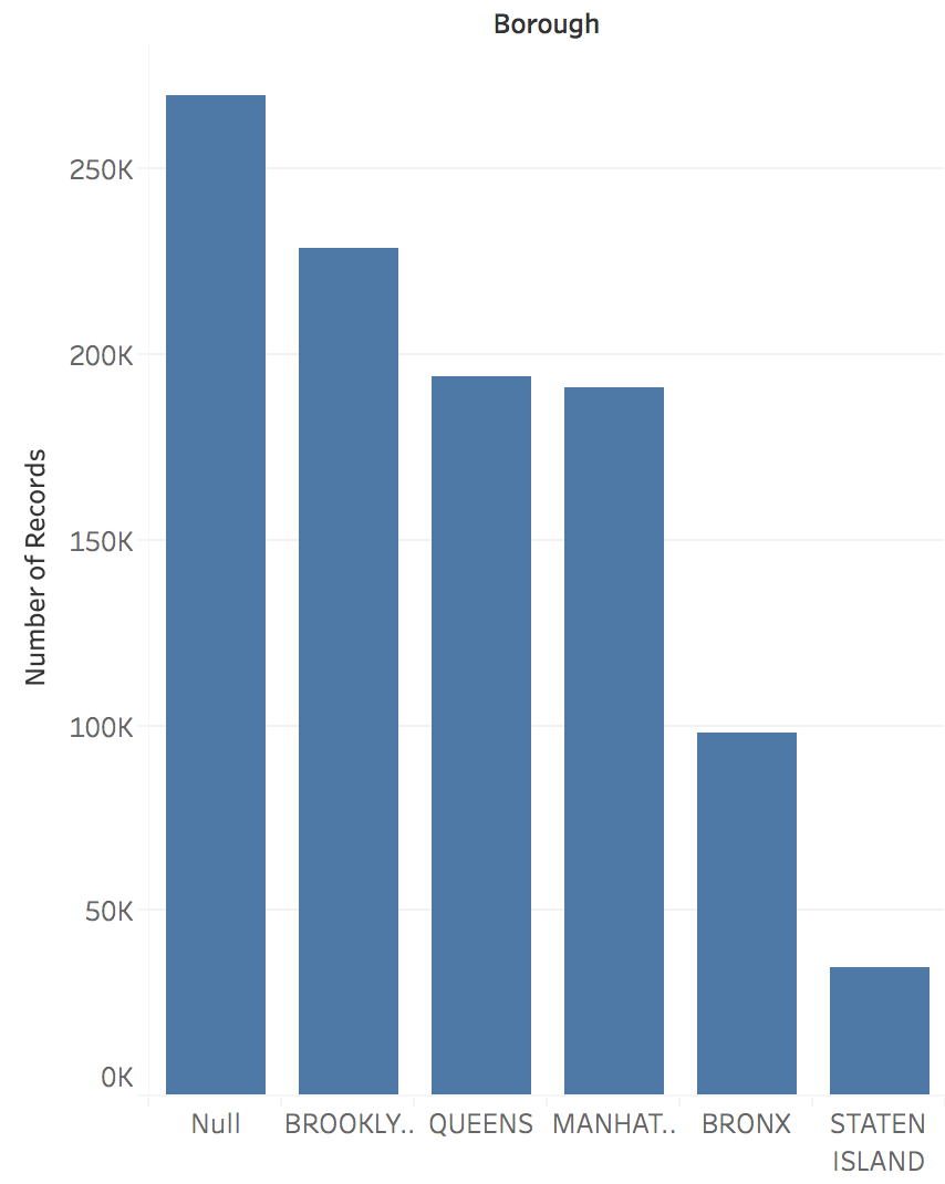
Visualization Answers All Questions
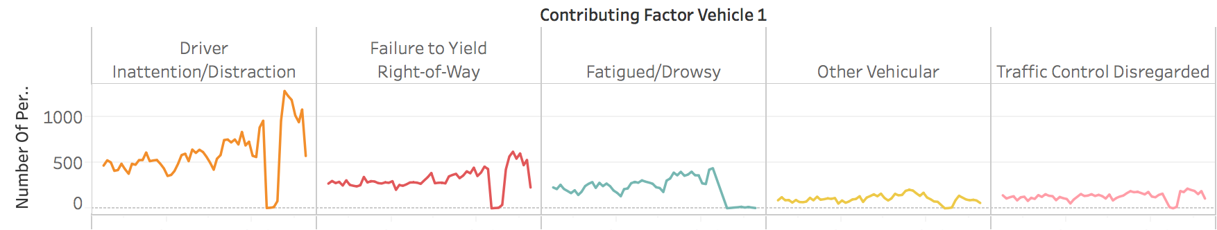
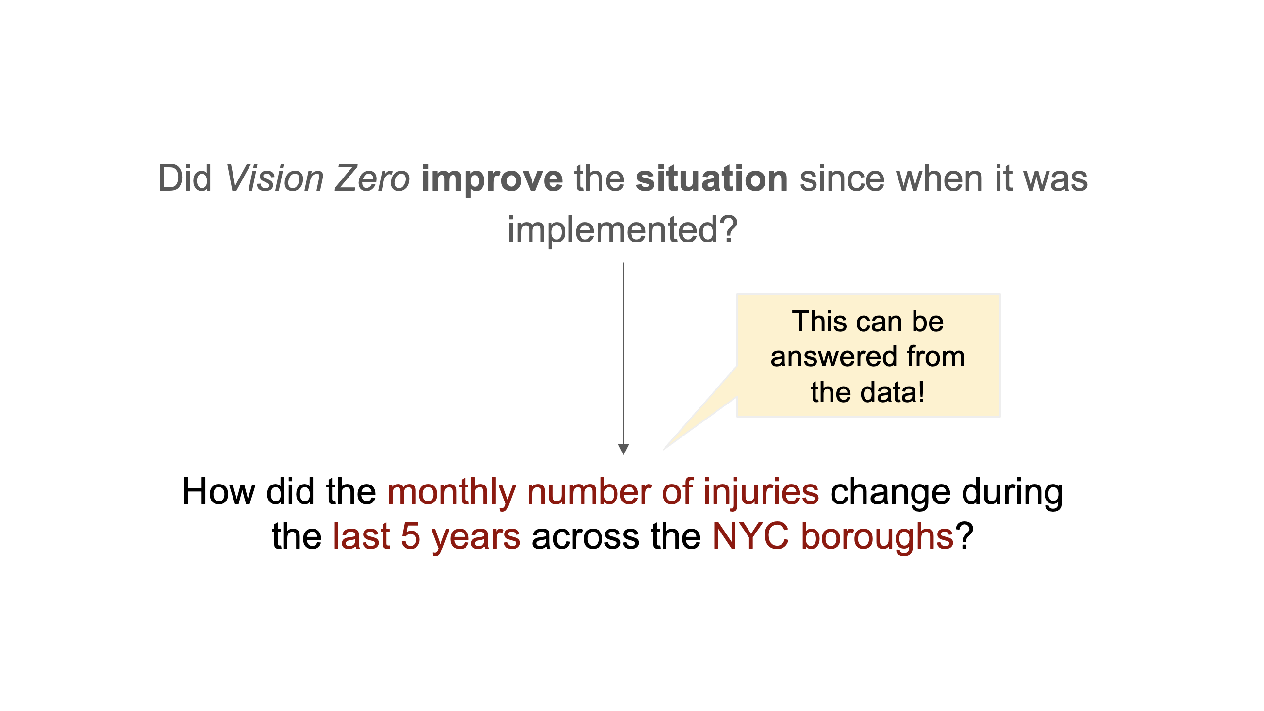
Example: Vision Zero Initiative
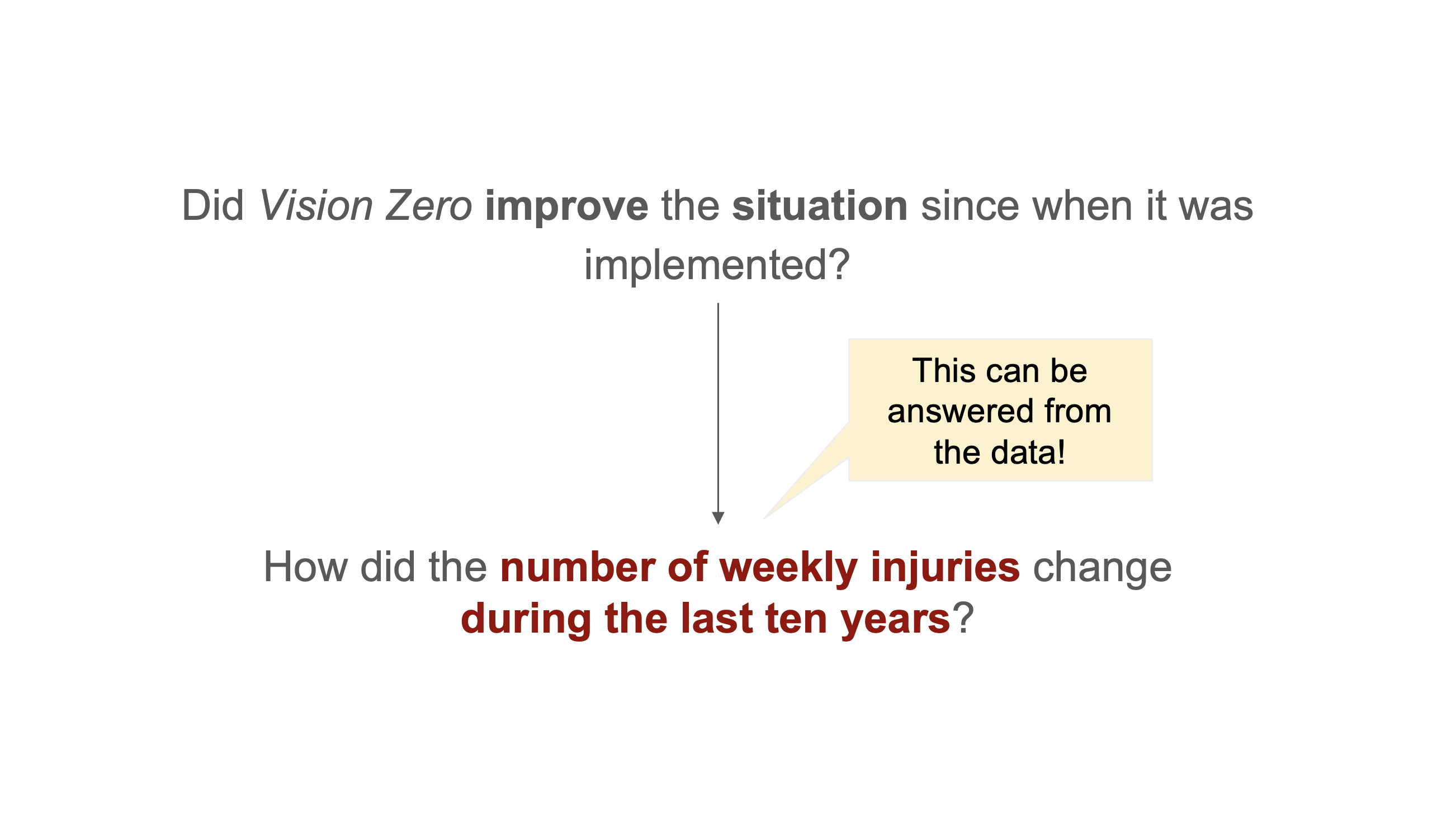
Multiple Data Questions from One Domain Question
Key Characteristics
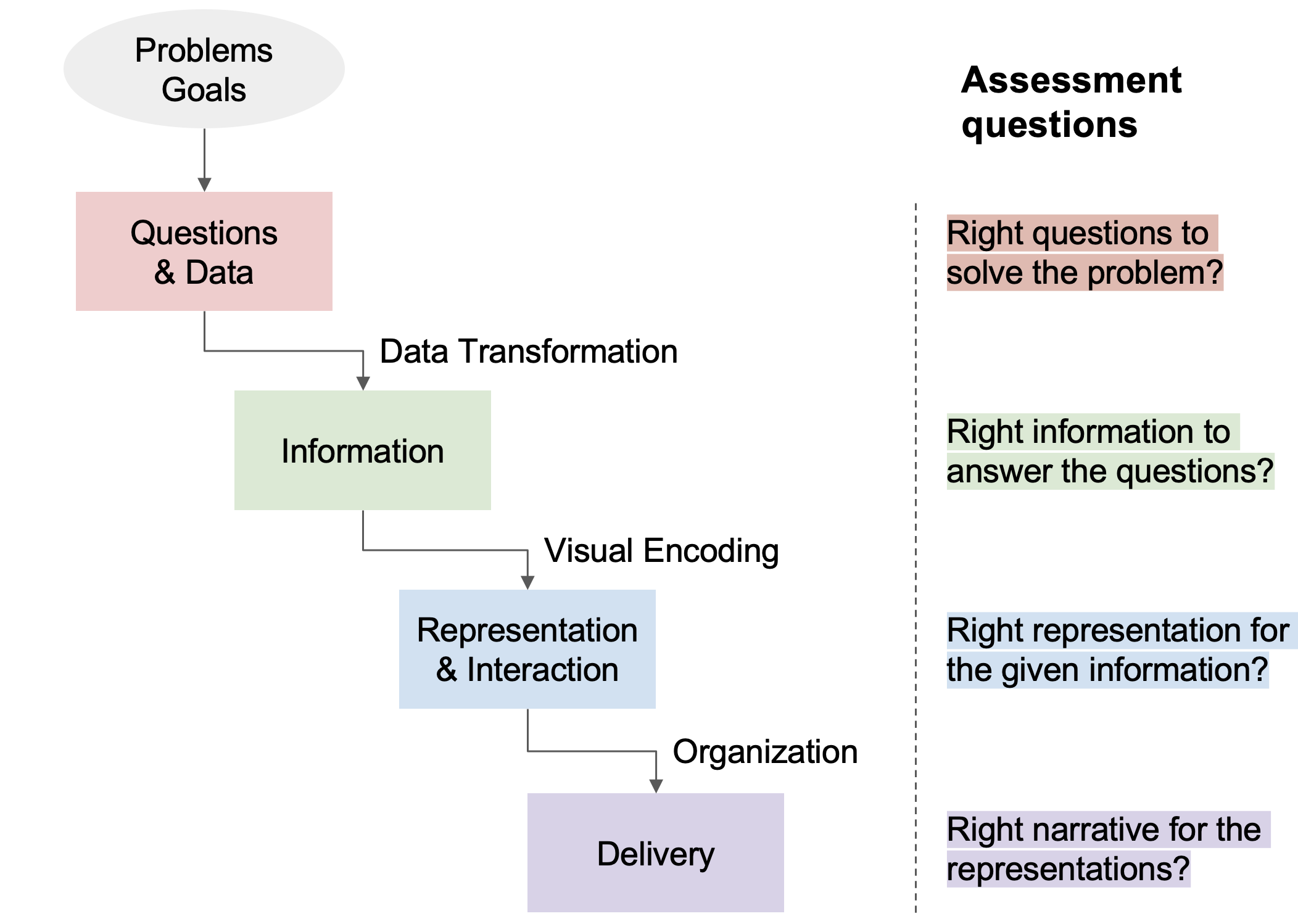
Assessment Questions Throughout the Pipeline
Data Wrangling Pipeline

Transformation Pipeline Example
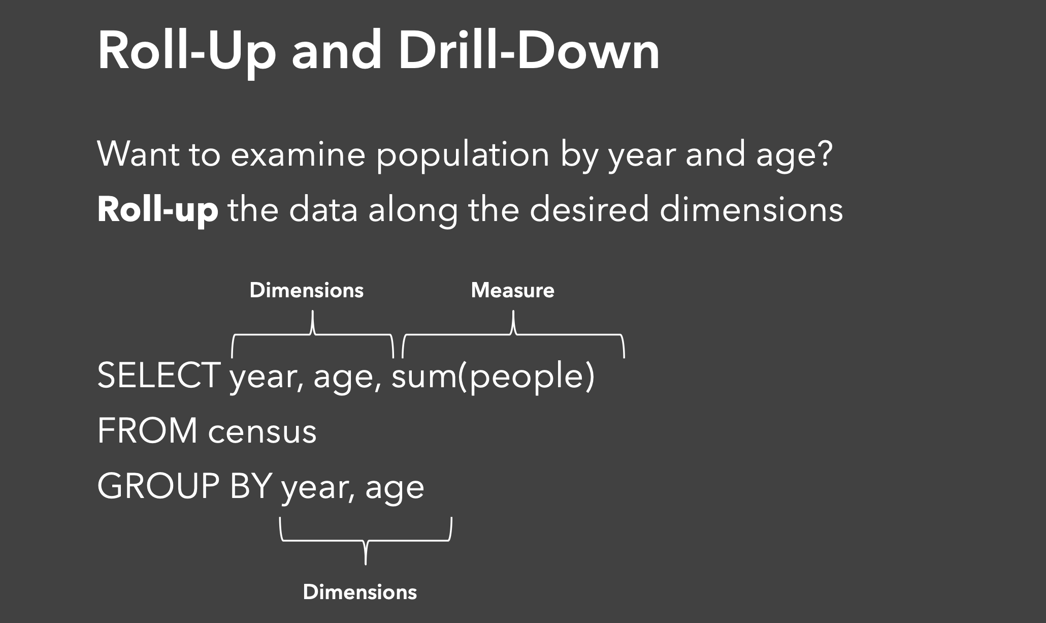
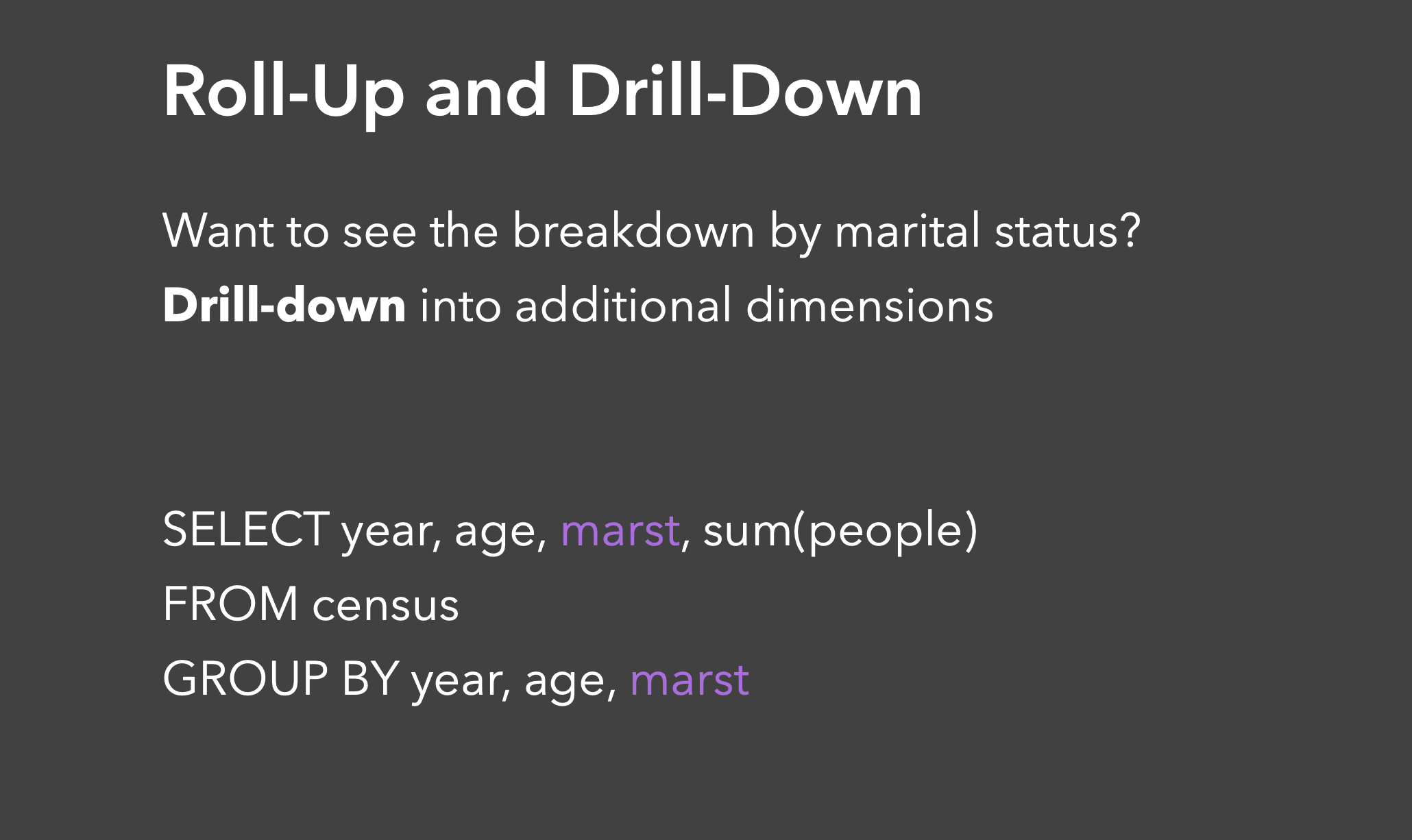
Roll-Up and Drill-Down
Roll-Up and Drill-Down: Adding Dimensions
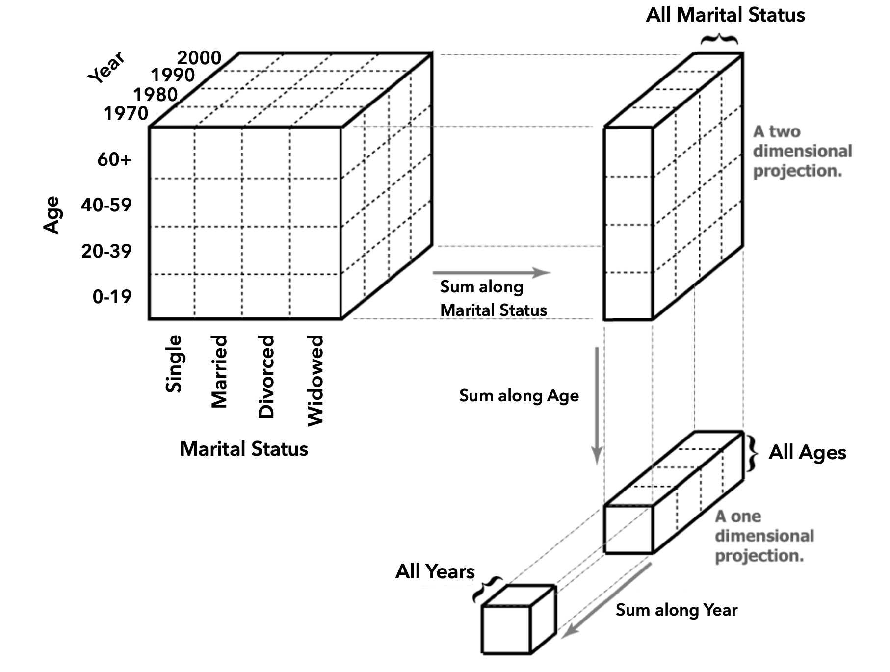
Data Cube Visualization: Aggregation Operations
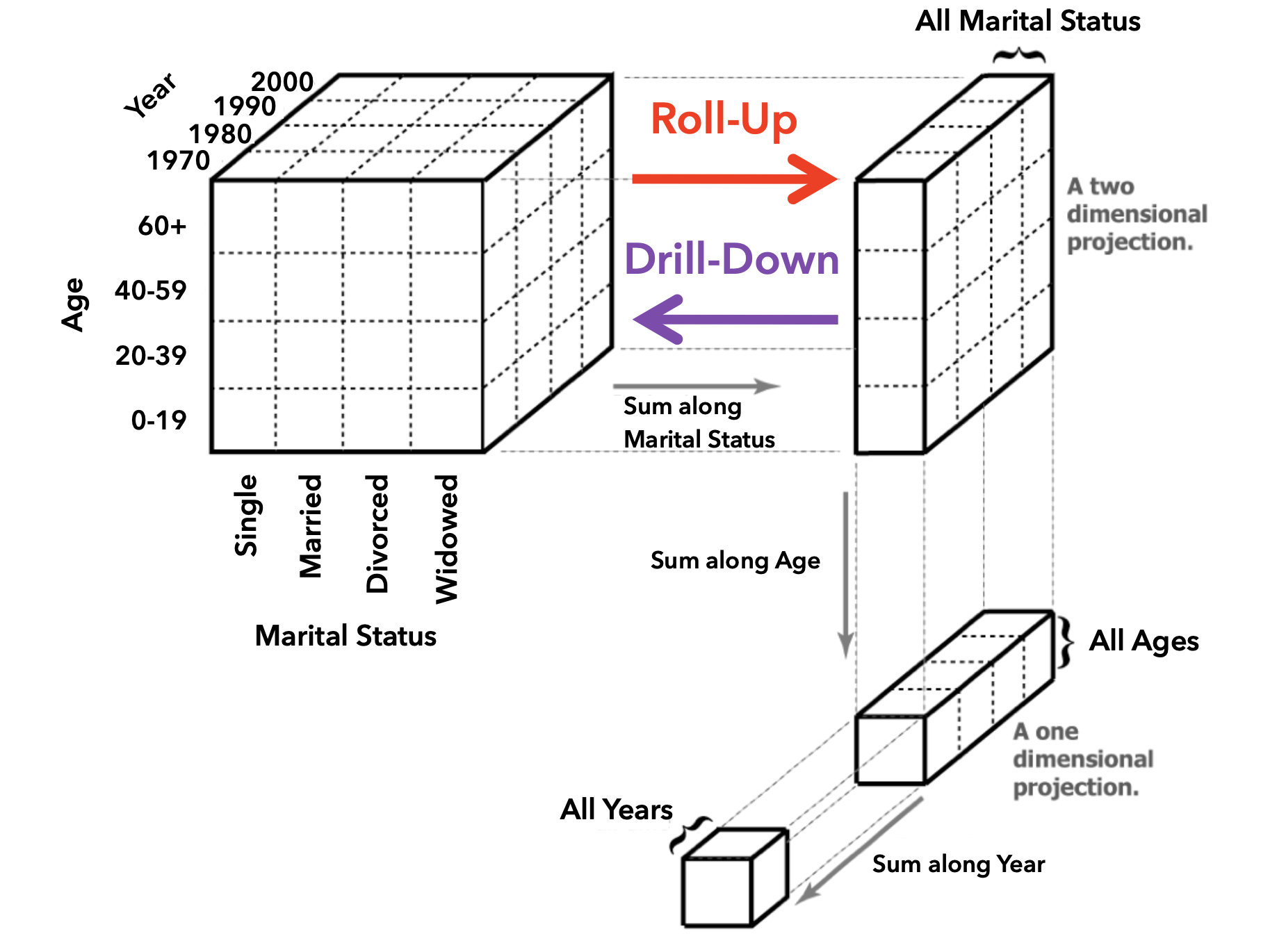
Roll-Up vs. Drill-Down Operations
Tidy Data: Organizing Data for Visualization
Goal: Structuring data to make visualization and analysis easier
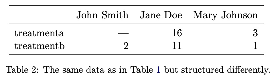
Alternative Data Structures
The Tidy Data Solution
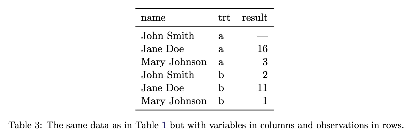
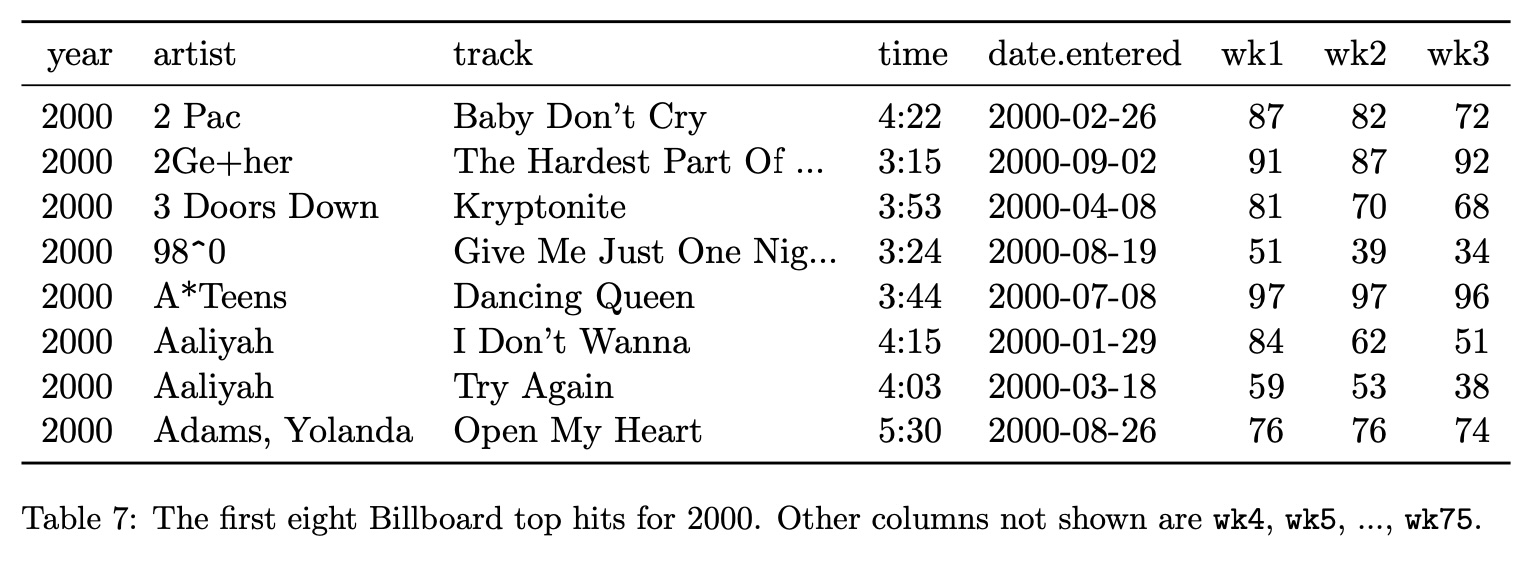
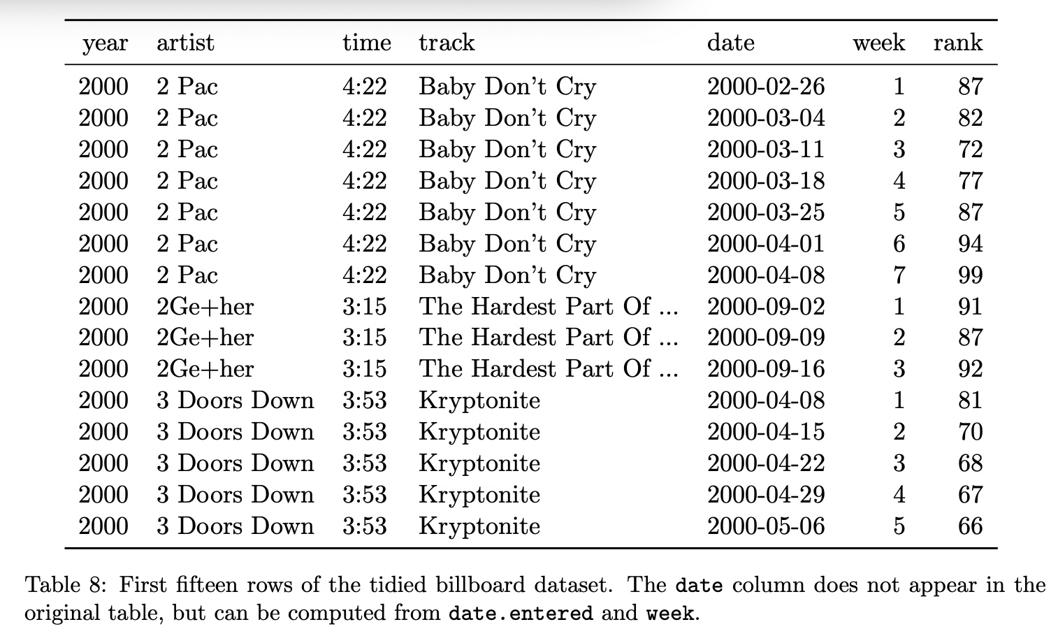
Tidy Data Example #1
Transforming to Tidy Format
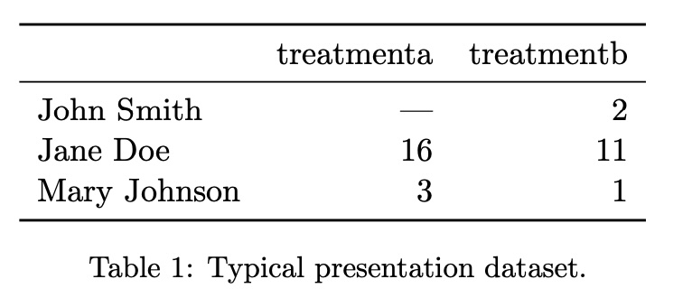
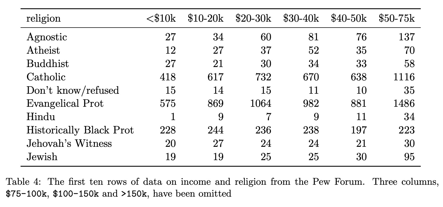
Tidy Data Example #2: Before
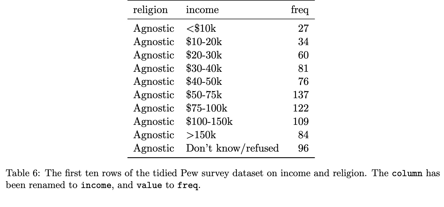
Tidy Data Example #2: After
Data to Visualization Examples
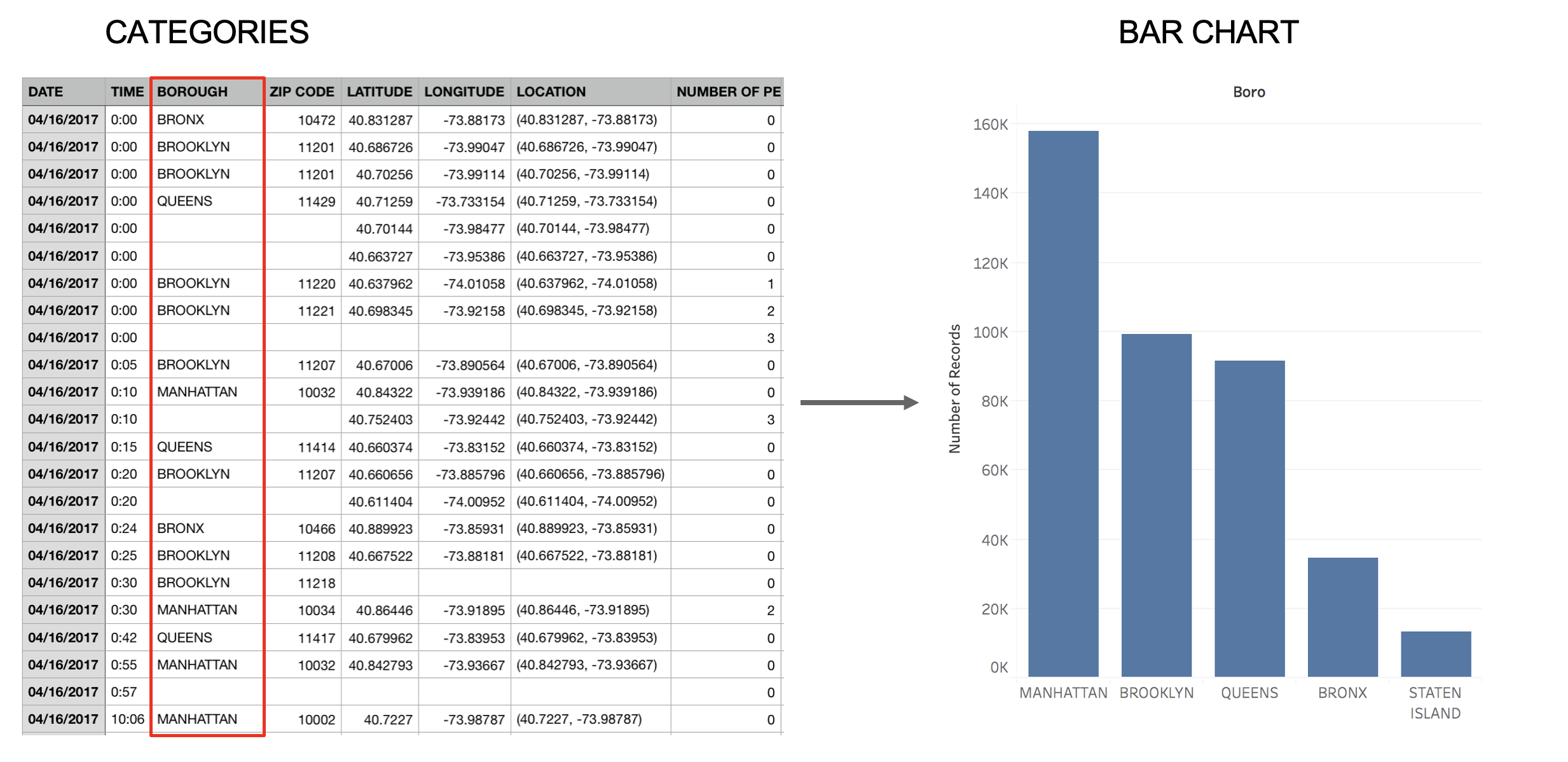
Categories → Bar Chart
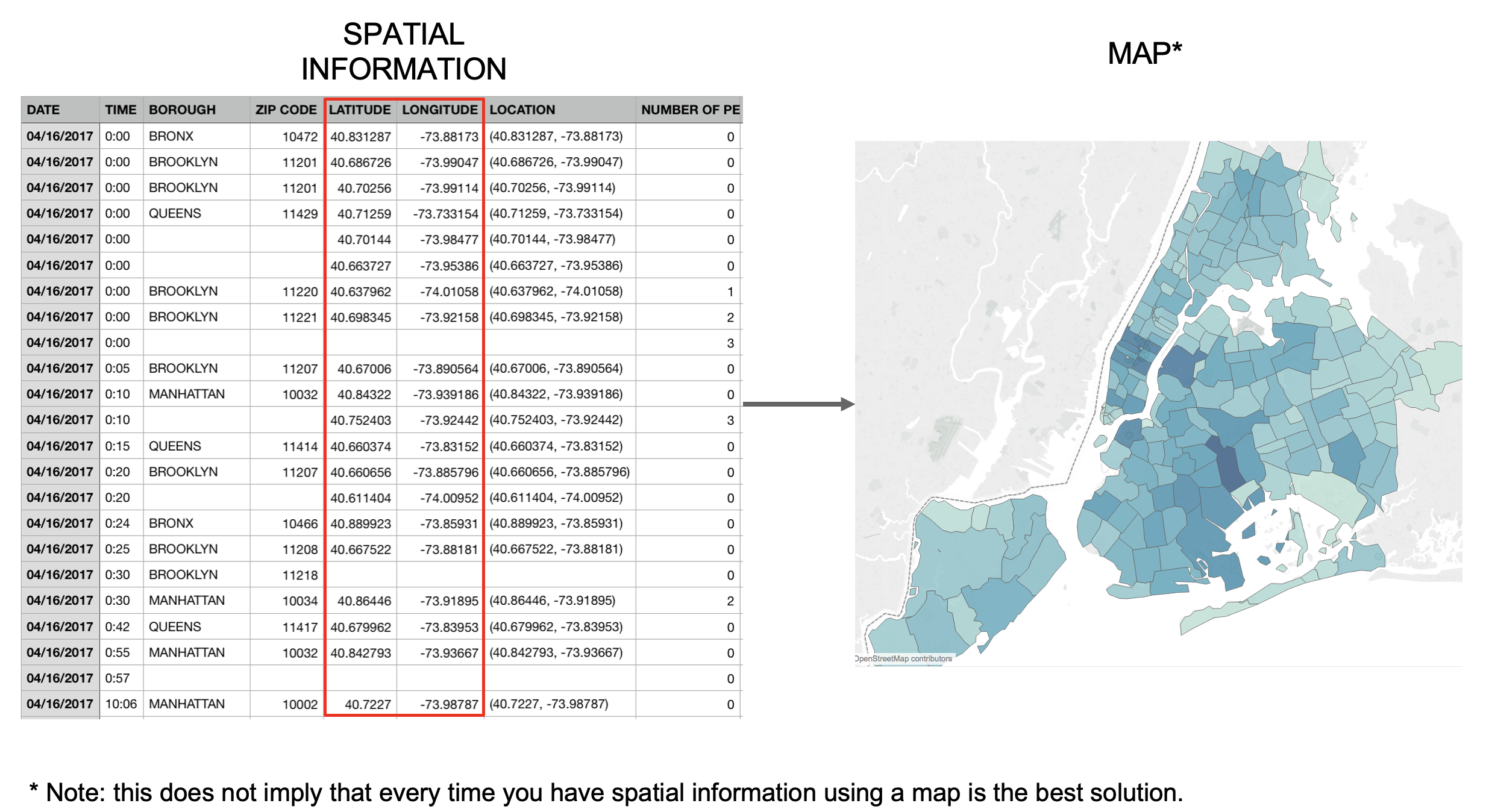
Spatial Information → Map