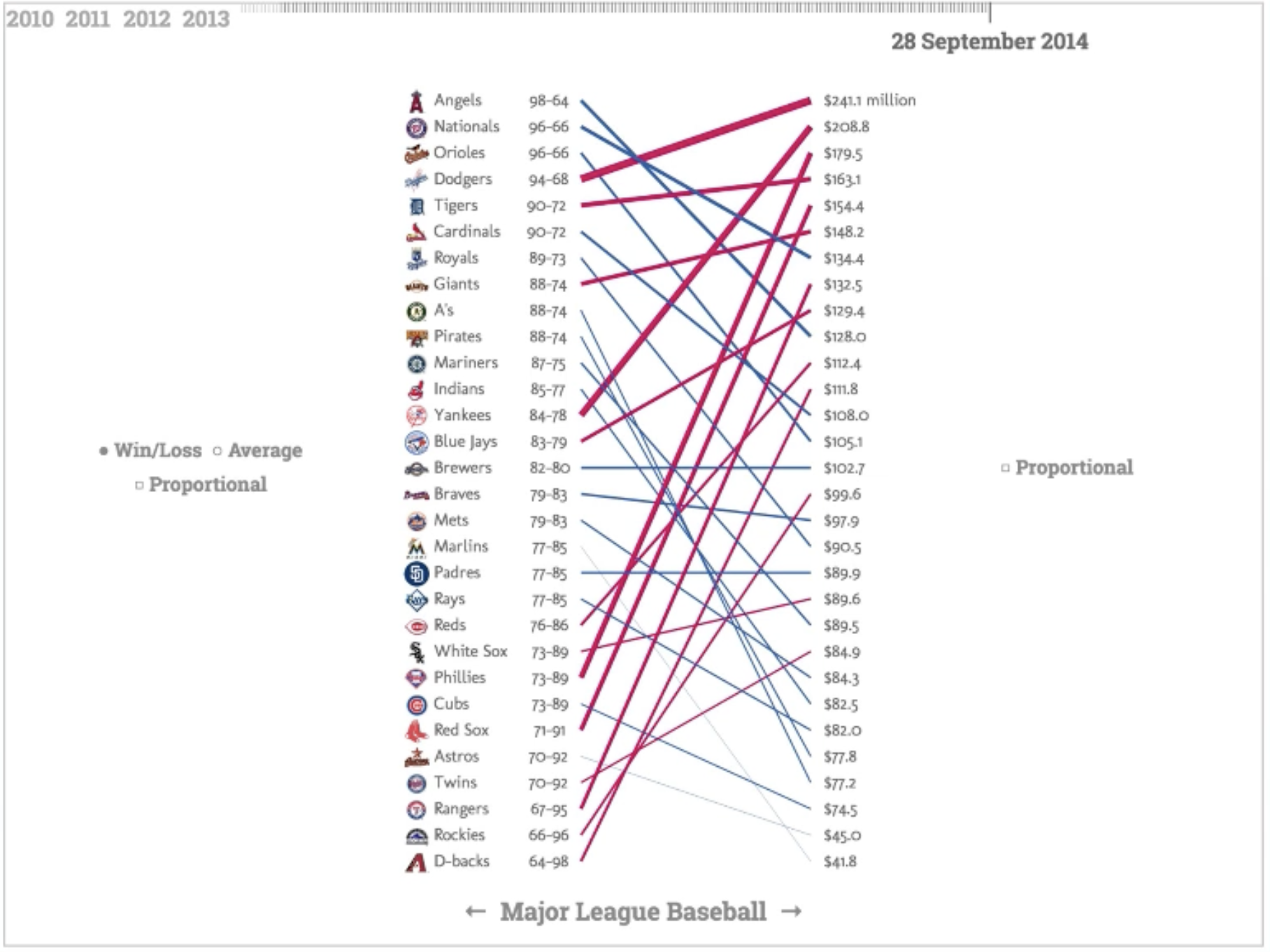
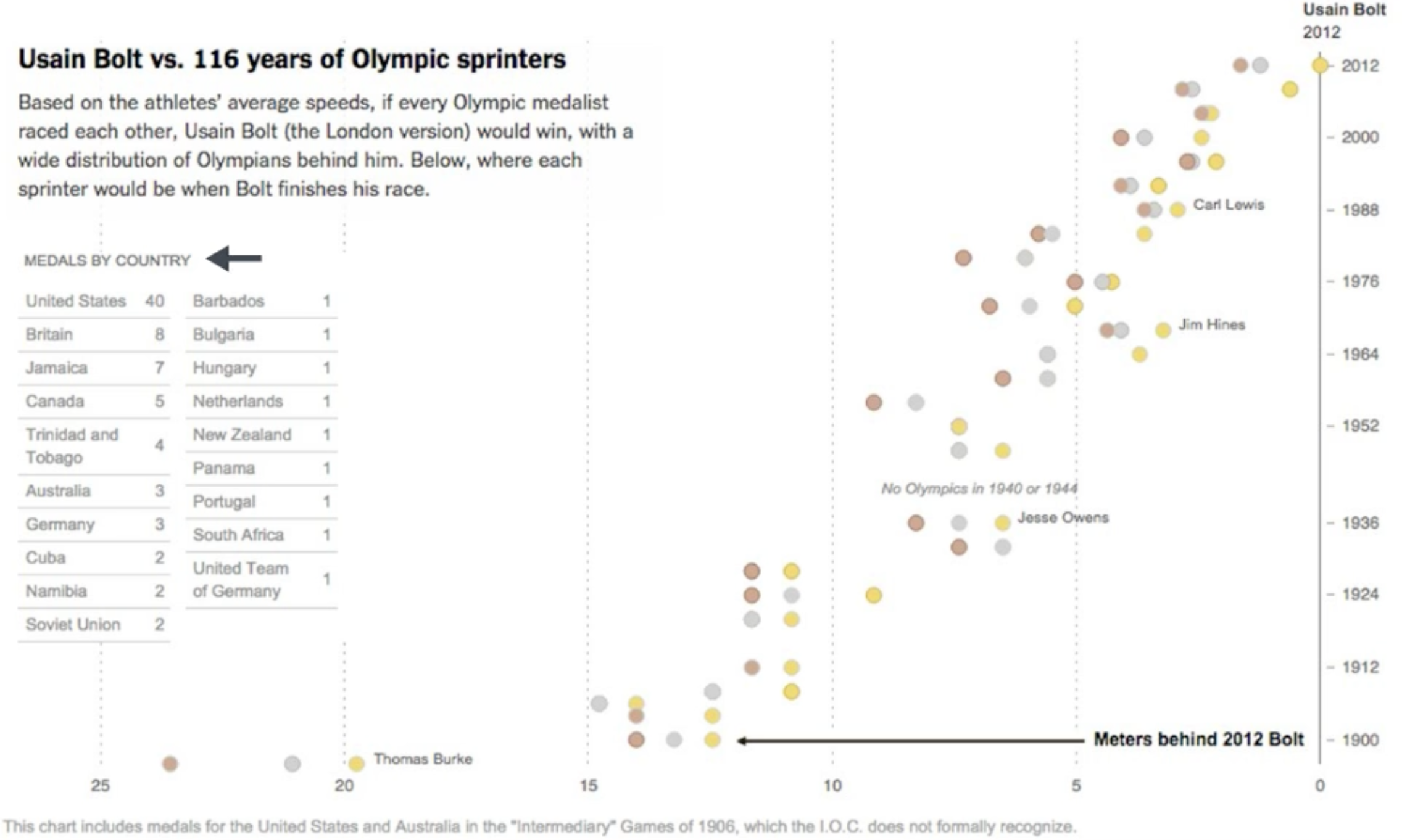
Slope charts can be an alternative to scatter plots
Fundamental Graphs and Visual Encoding
CS-GY 6313 - Information Visualization - Fall 2025
2025-09-12
The Chart Selection Challenge
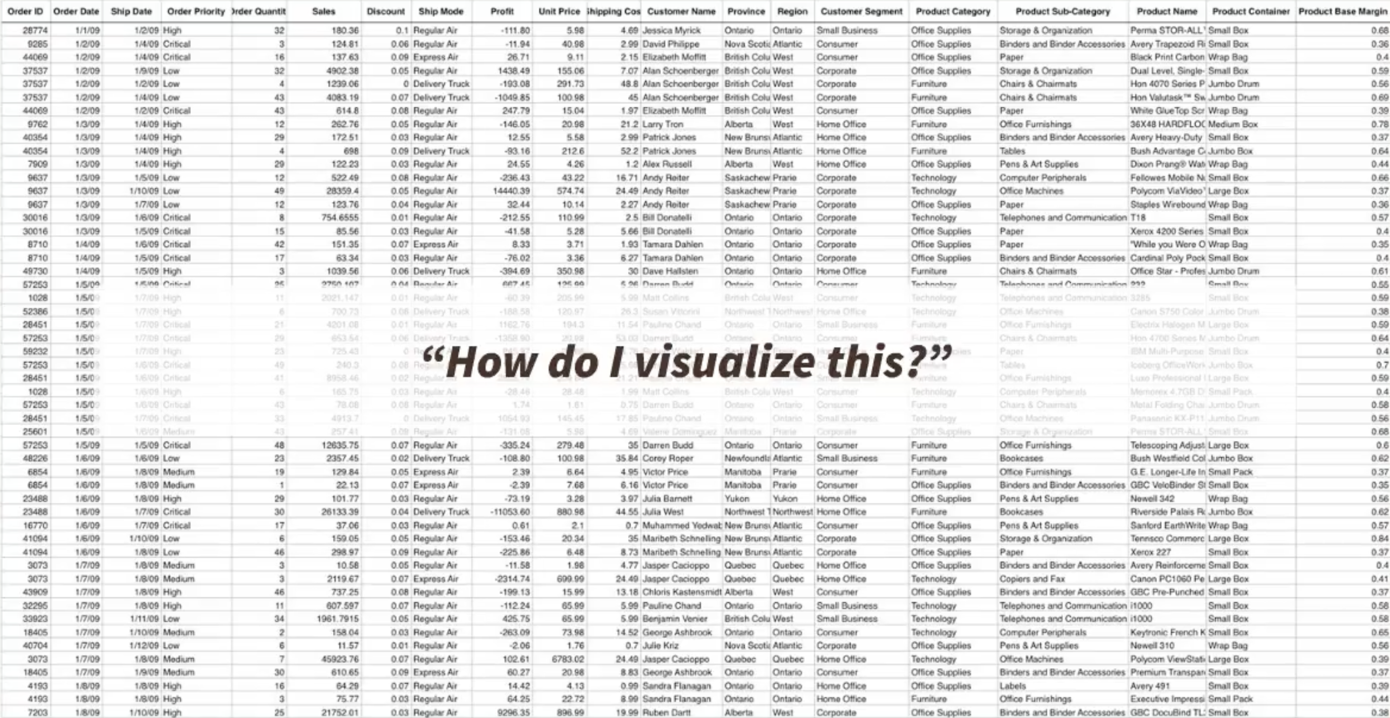
The central question: Given data and a task, which visualization technique will be most effective?
- Chart type (bar, line, scatter, etc.)
- Visual encoding (position, color, size)
- Design choices (scales, axes, layout)
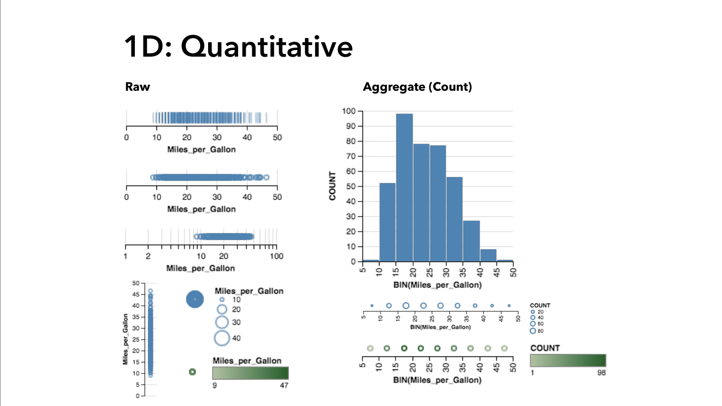
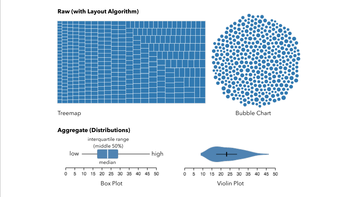
Data Types Drive Design
Understanding your data:
- Categorical (nominal, ordinal)
- Quantitative (continuous, discrete)
- Temporal (time-based ordering)
- Spatial (geographic coordinates)
The type determines suitable encodings
Same Data, Multiple Options
Design decisions:
- Which visual channels best represent your data?
- How do you map data attributes to visual properties?
- What design choices enhance clarity?
- How do you avoid misleading representations?
Chart selection: The attribute types can guide the chart selection!
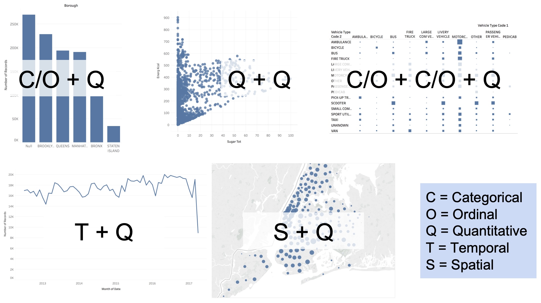
The Five Fundamental Graphs
Bar Chart:
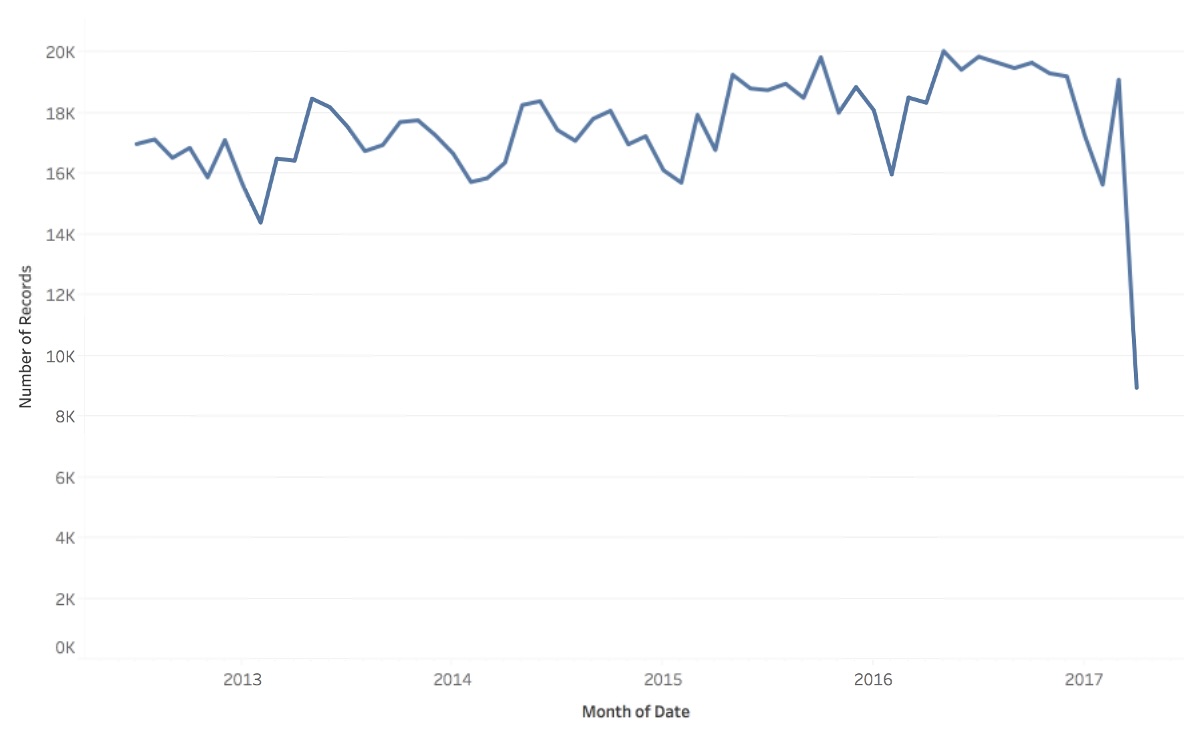
Line Chart:
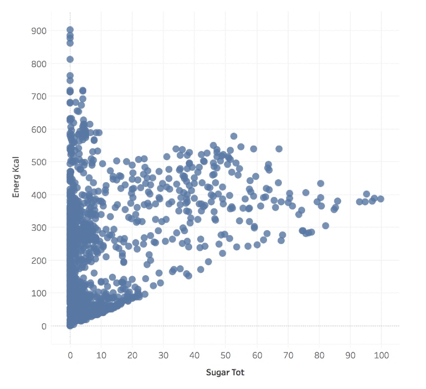
Scatterplot:
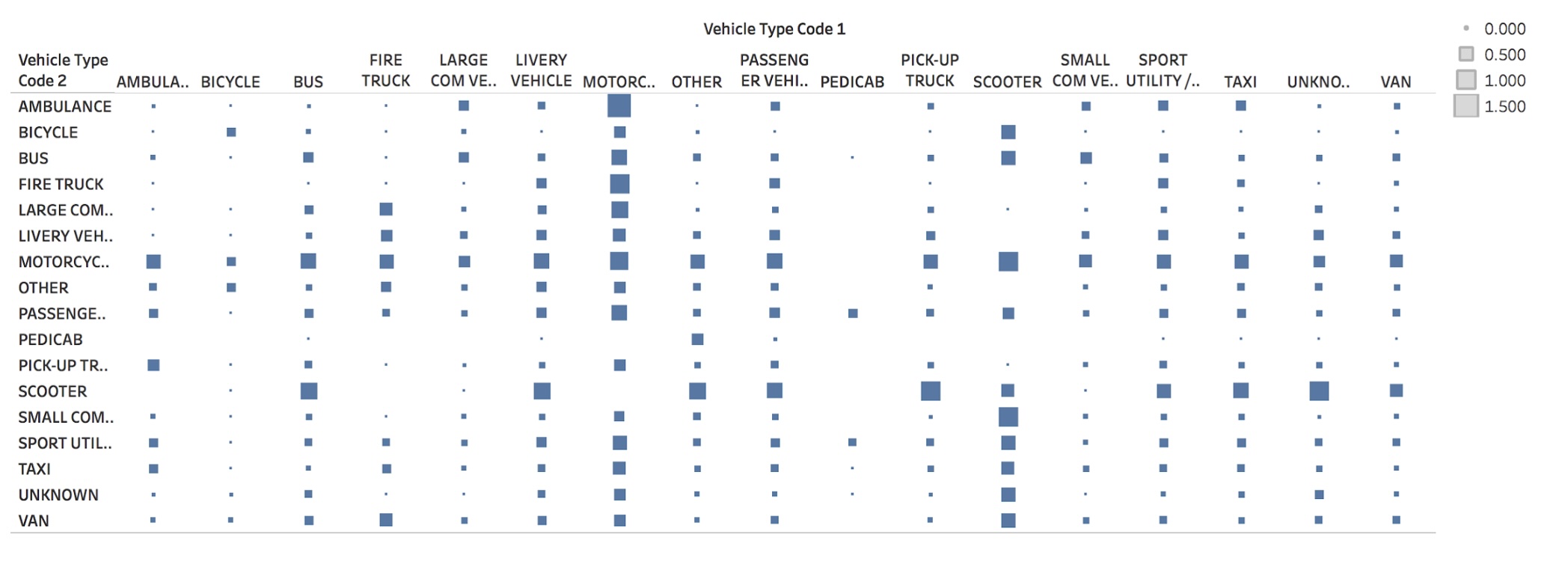
Matrix Chart:
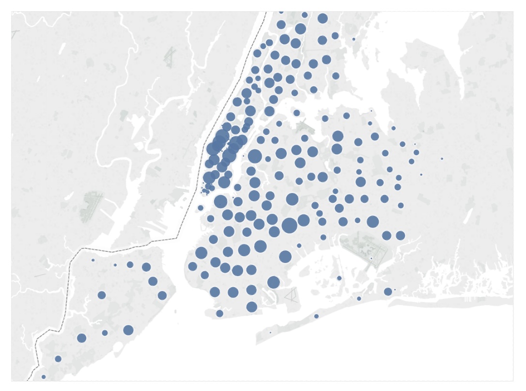
Symbol Map:
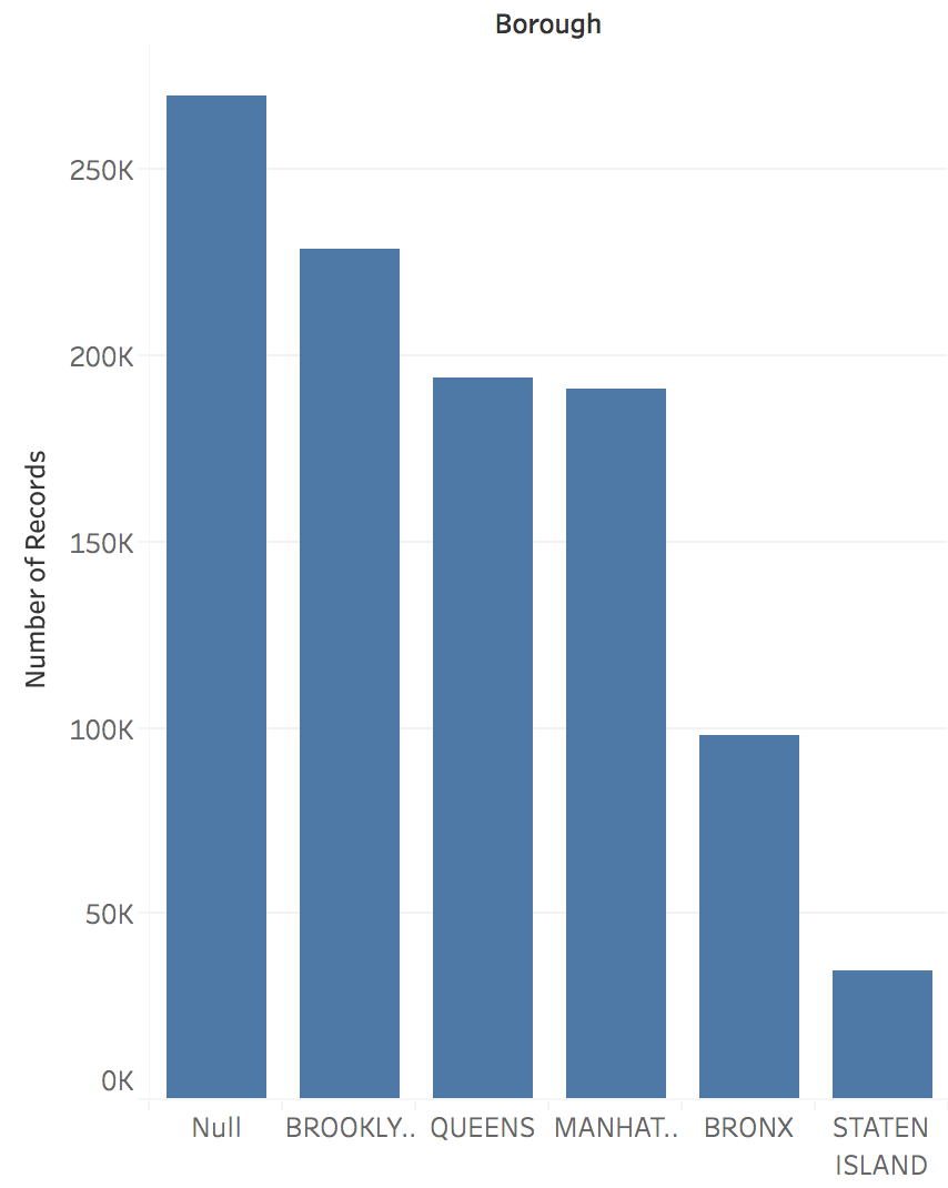
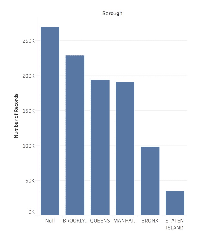
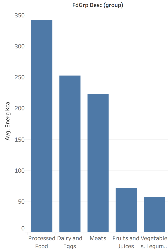
Bar Chart: Categorical Comparisons
Purpose: Compare quantities across categories
Data Types: - Categorical/Ordinal + Quantitative - Example: Sales by product category
Best For: - Rankings and comparisons - Part-to-whole relationships
Line Chart: Trends Over Time
Purpose: Show trends and changes over time
Data Types: - Temporal + Quantitative - Example: Stock prices over months
Best For: - Trends and patterns - Multiple series comparison
Scatter Plot: Relationships
Purpose: Explore relationships between variables
Data Types: - Quantitative + Quantitative - Example: Height vs. weight
Best For: - Correlation analysis - Outlier detection - Pattern recognition
Matrix (Heatmap): Two-Way Comparisons
Purpose: Compare across two categorical dimensions
Data Types: - Categorical + Categorical + Quantitative - Example: Sales by month and region
Best For: - Cross-tabulations - Correlation matrices - Dense data display
Symbol Map: Spatial Distribution
Purpose: Show spatial distribution of data
Data Types: - Spatial coordinates + Quantitative - Example: Population by city
Best For: - Geographic patterns - Location-based analysis - Spatial clustering
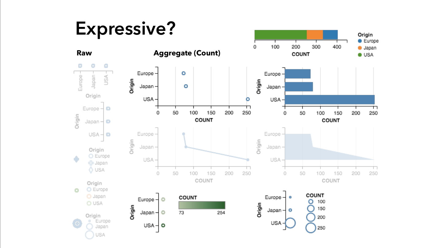
Alternate representations
Question: Is it possible to create different representations of the same data? It is. However, some representations might not follow the best design guidelines
Decomposing a chart: Marks and Channels
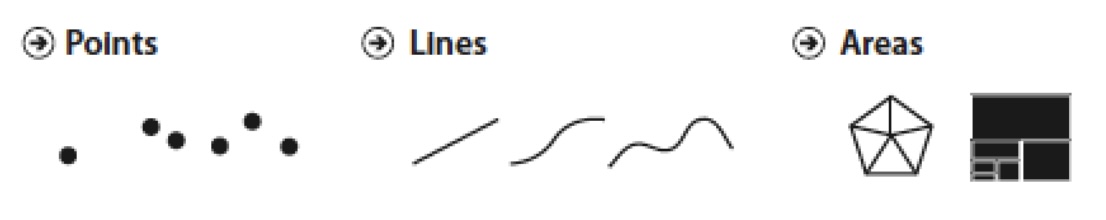
Marks:
- Marks are the geometric primitives we use in a visualization
- They are used to represent the itens of a dataset
Decomposing a chart: Marks and Channels
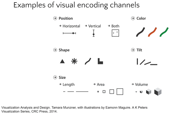
Channels:
- Channels are the appearance of the marks
- They are used to represent the attributes of a dataset
Expressiveness Violations
Problem: Ordered visual channel (line) with unordered data
Problem: Arbitrary ordering implies non-existent relationship
Effectiveness: A Quick Experiment
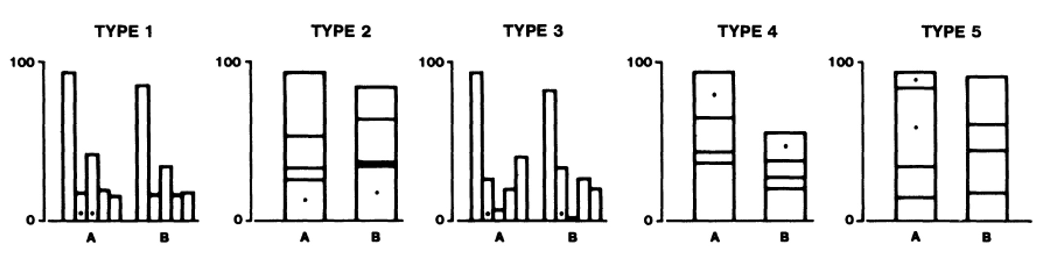
Which value is larger?
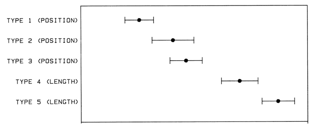
Which value is larger?
Result: Length comparison is faster and more accurate than color comparison
Channel Effectiveness Rankings
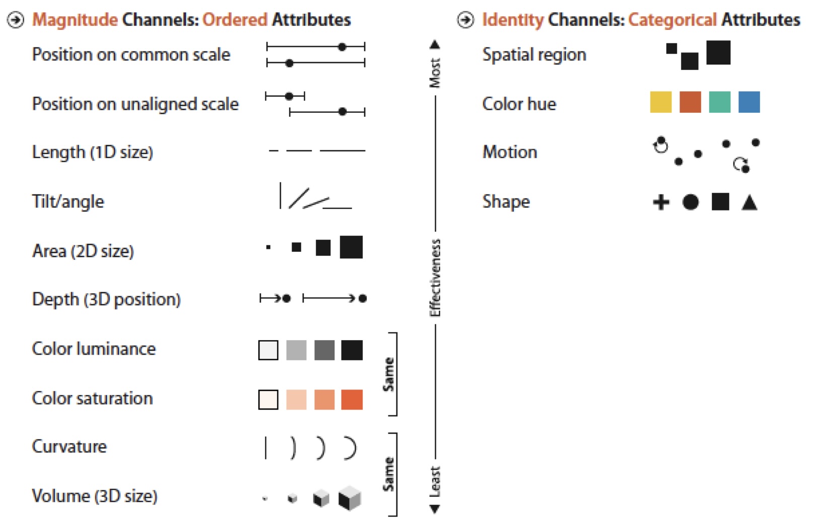
Ranking of visual channels by data type
Key principle: Use the most effective channel for your most important data
Applying Channel Rankings
More Effective:
Position encoding enables accurate comparison
Less Effective:
Area and angle are harder to compare accurately
Exercise
- What are the marks?
- Bars
- What are the channels?
- Size
- Horizontal position
Linear vs. Logarithmic Scales
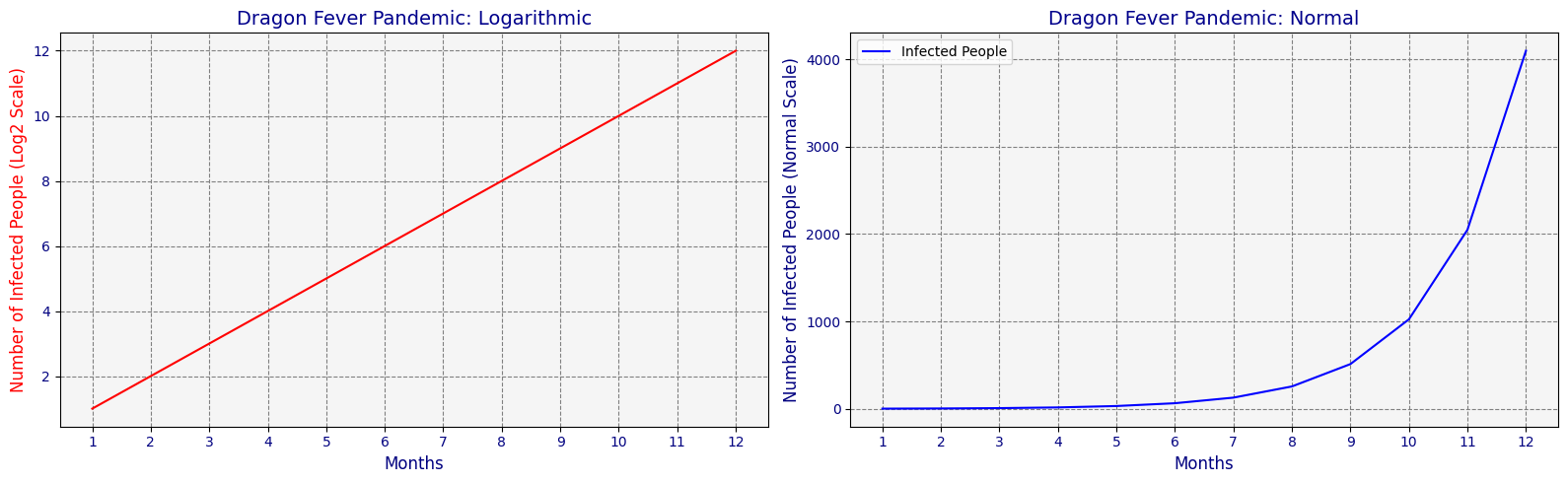
Linear Scale: - Absolute differences - Additive changes - Most common choice
Logarithmic Scale: - Relative differences - Multiplicative changes - Wide data ranges
The Zero Baseline Rule
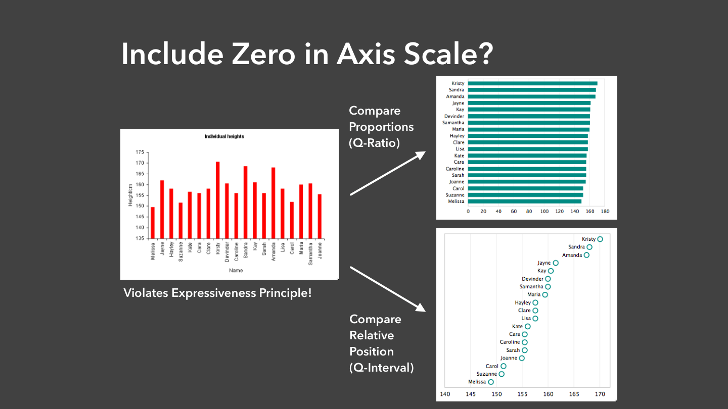
Truncated Axis: Exaggerates small differences
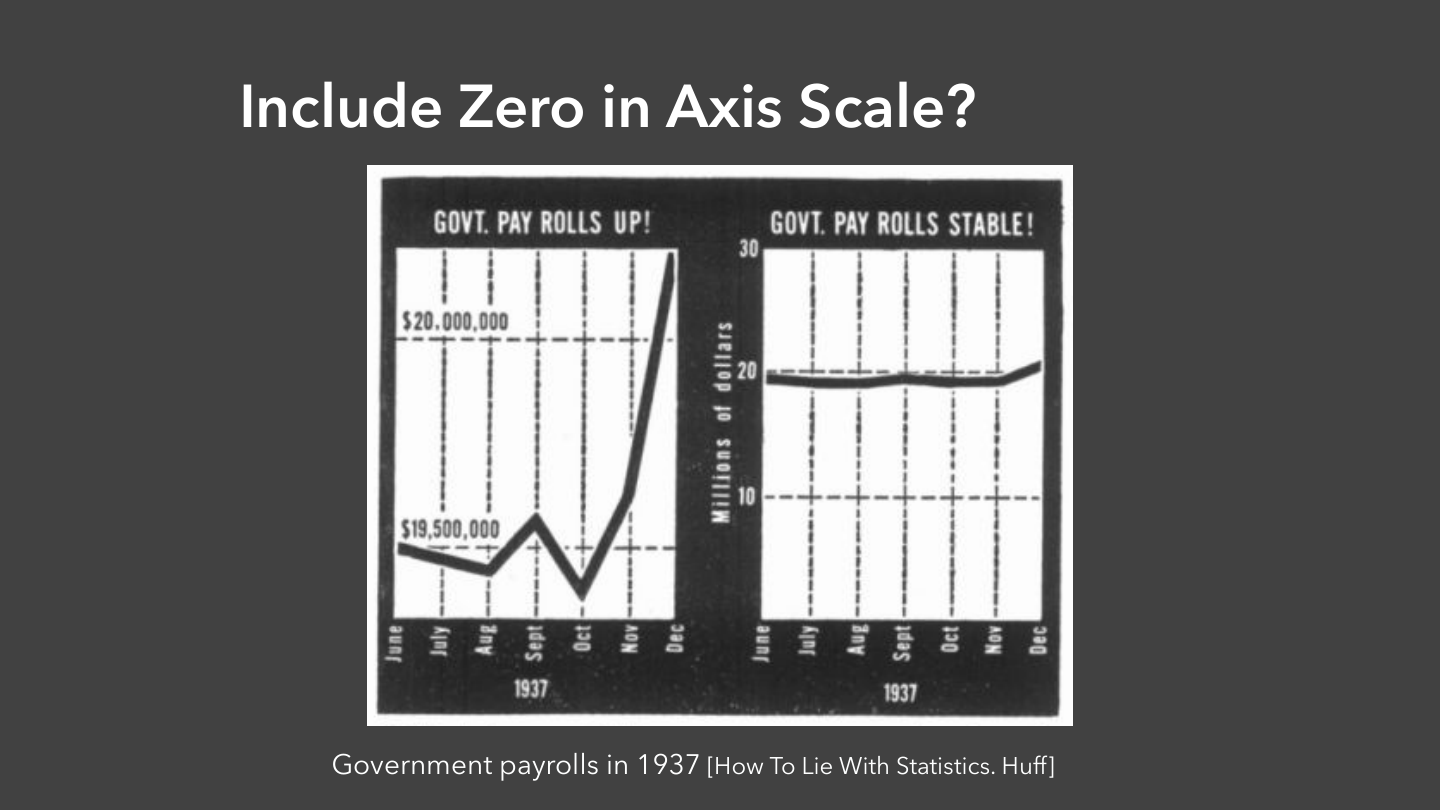
Zero Baseline: Accurate magnitude representation
When to Break the Rules
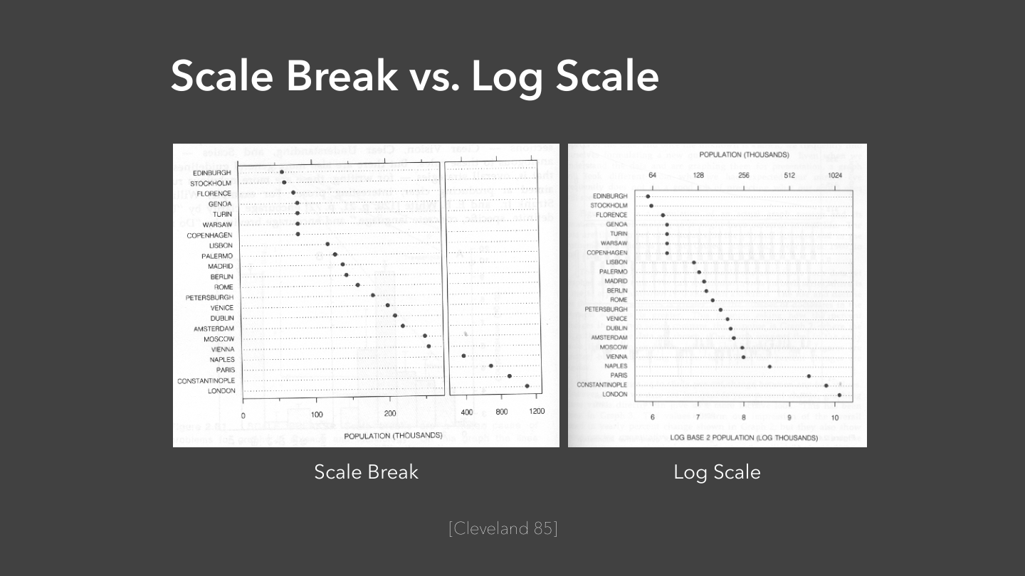
Log scales instead of zero baseline: - Data spans multiple orders of magnitude - Ratios matter more than absolute values
Truncated axes for line charts: - Small changes in large values - When trend matters more than magnitude
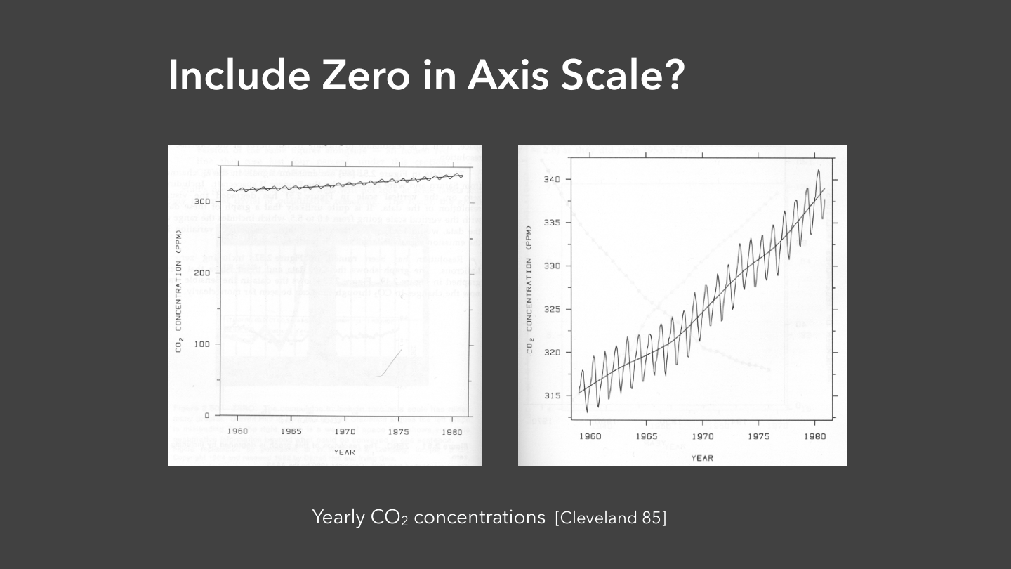
Context determines when breaking rules is acceptable
Putting It All Together
The Visualization Design Process:
- Understand your question
- Transform data appropriately
- Choose effective visual encodings
- Select appropriate scales
- Test and iterate
Workflow: Question → Transform → Encode → Scale → Iterate
Specific Pitfalls to Avoid

Specific Pitfalls to Avoid
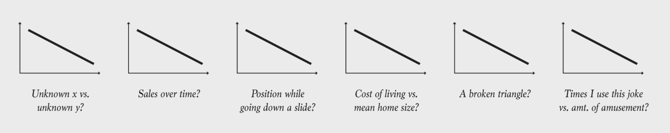
Chart decoding
Questions & Discussion
Think about: - What visualization challenges do you face in your work/research? - How might these principles apply to your domain? - What questions do you have about applying these techniques?
Next class: Interactive visualization techniques and advanced encodings