Information Visualization Fundamentals
CS-GY 9223 - Visualization for Machine Learning - Fall 2025
2025-09-08
What is Information Visualization? Why Use It?
“The use of computer-supported, interactive, visual representations of abstract data to amplify cognition.”
Abstract Data
Data with no obvious/natural visual representation
Abstract Data
Data with no obvious/natural visual representation
Cognitive artifacts: tools that help us think!
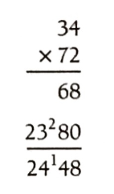
- Try to multiply 34 x 72 using exclusively your mind …
- … now do it again using pen and paper.
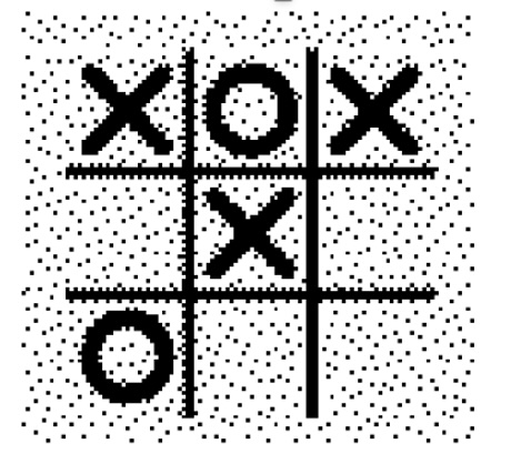
Let’s play a different game: tic-tac-toe
Players alternately place an O or a X in one of nine spaces arranged in a rectangular array. Once a space has been taken, it cannot be changed by either player. The first player to get three symbols in a straight line wins. Suppose player A is X and B is O, and the game has reached the state on the right.
Question 2: Suppose you are now to step in and play an O for B. What move would you make?
Problem Isomorphs
Herbert Simon’s Insight
- The two problems are isomorphic - structurally identical!
- Same problem, different representation
- The tic-tac-toe representation makes the solution obvious
- Key insight: The right representation can dramatically simplify problem solving

Pioneer in cognitive psychology, artificial intelligence, and decision-making
The Power of Visualization: Discovery
John Snow’s Cholera Map (1854)
- Mapped cholera deaths in London
- Revealed cluster around Broad Street water pump
- Visual evidence stopped the outbreak
Tip
Takeaway: Visualization is a powerful tool for discovery and finding patterns invisible in raw data.

The Power of Visualization: Storytelling
Charles Minard’s Map of Napoleon’s March (1869)
- Widely considered one of the best statistical graphics ever created
- Shows six variables simultaneously:
- Army size
- Location & direction
- Temperature
- Distance & time
Tip
Takeaway: Visualization is a powerful medium for dense, high-impact storytelling.

The Power of Visualization: Exploration
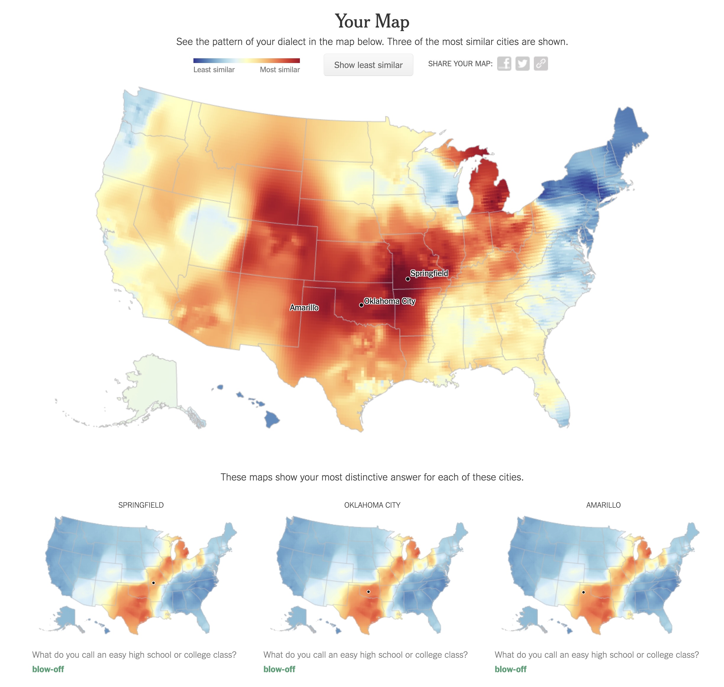
NYT: “How Y’all, Youse and You Guys Talk” (2013)
- Modern, interactive visualization
- Built with web technologies (like D3.js!)
- Allows personal exploration of dialect data
- Engages users through personalized results
Try it yourself: NYT Dialect Quiz
Tip
Takeaway: Visualization can be a dynamic interface for personal data exploration.
Why use a graphical representation?
- Large parts of our brain are devoted to spatial processing
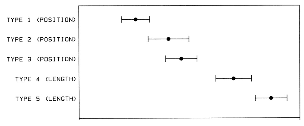
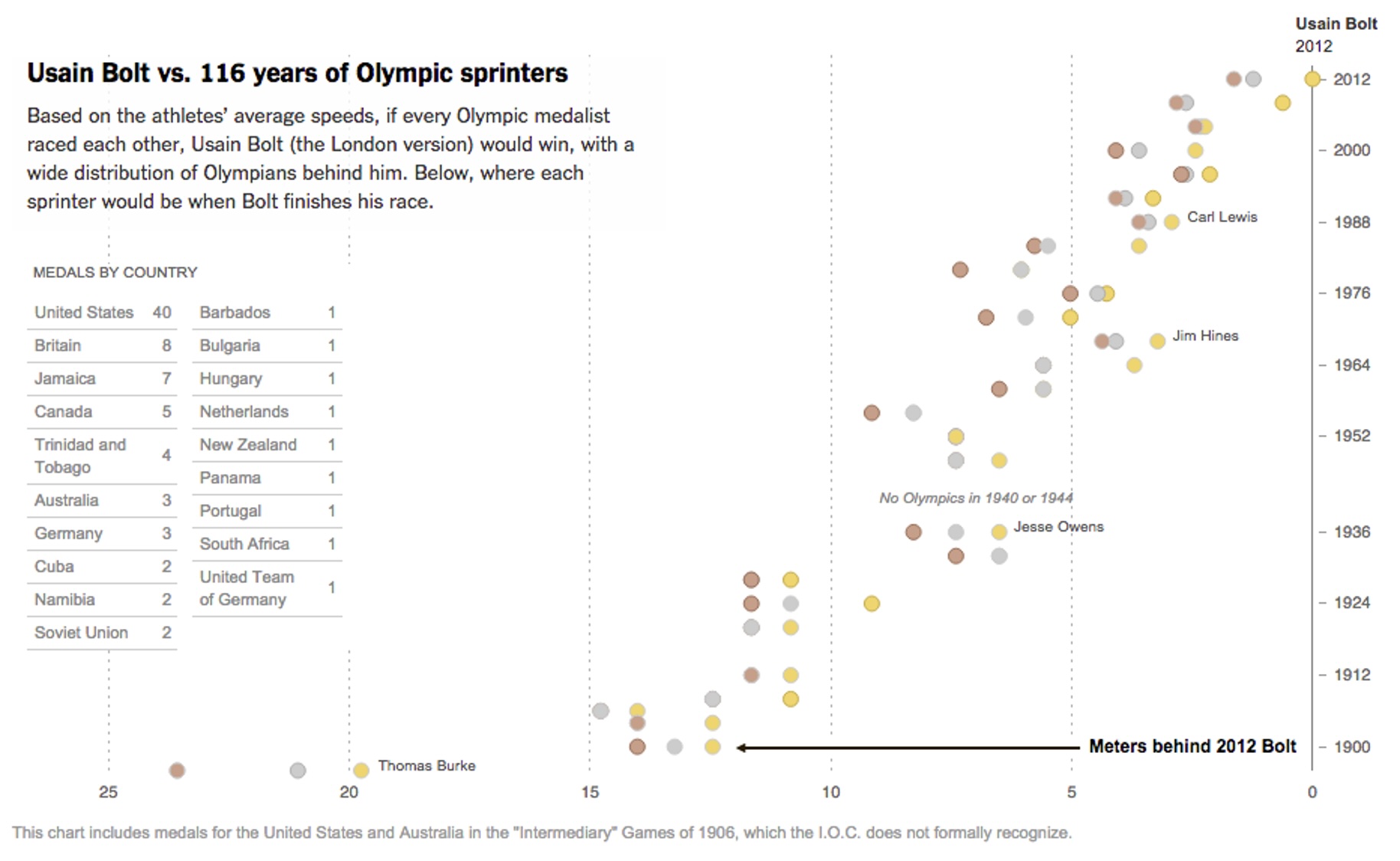
Digression: Graphical Perception
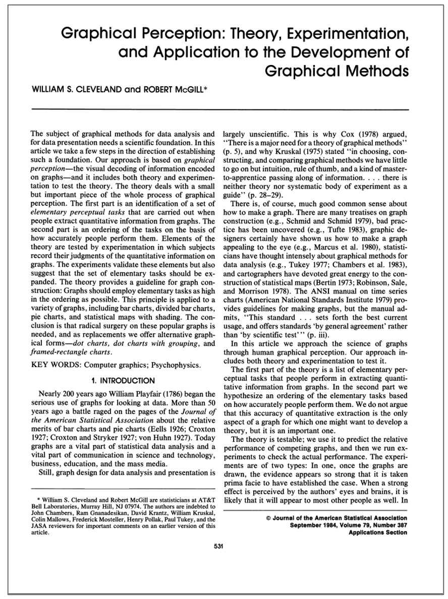
Graphical Perception Experiment
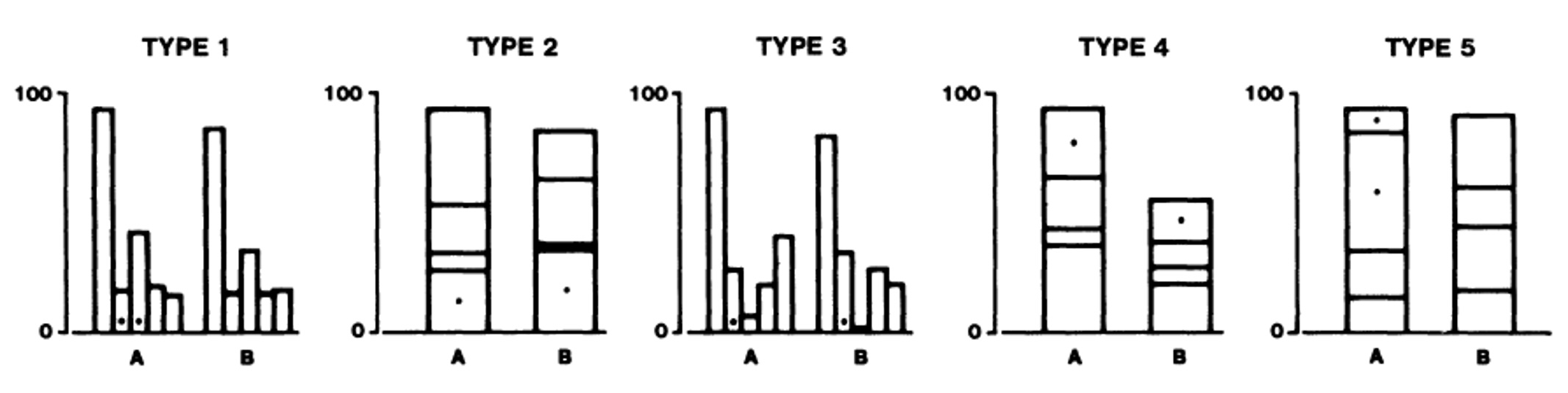
Graphical Perception Results
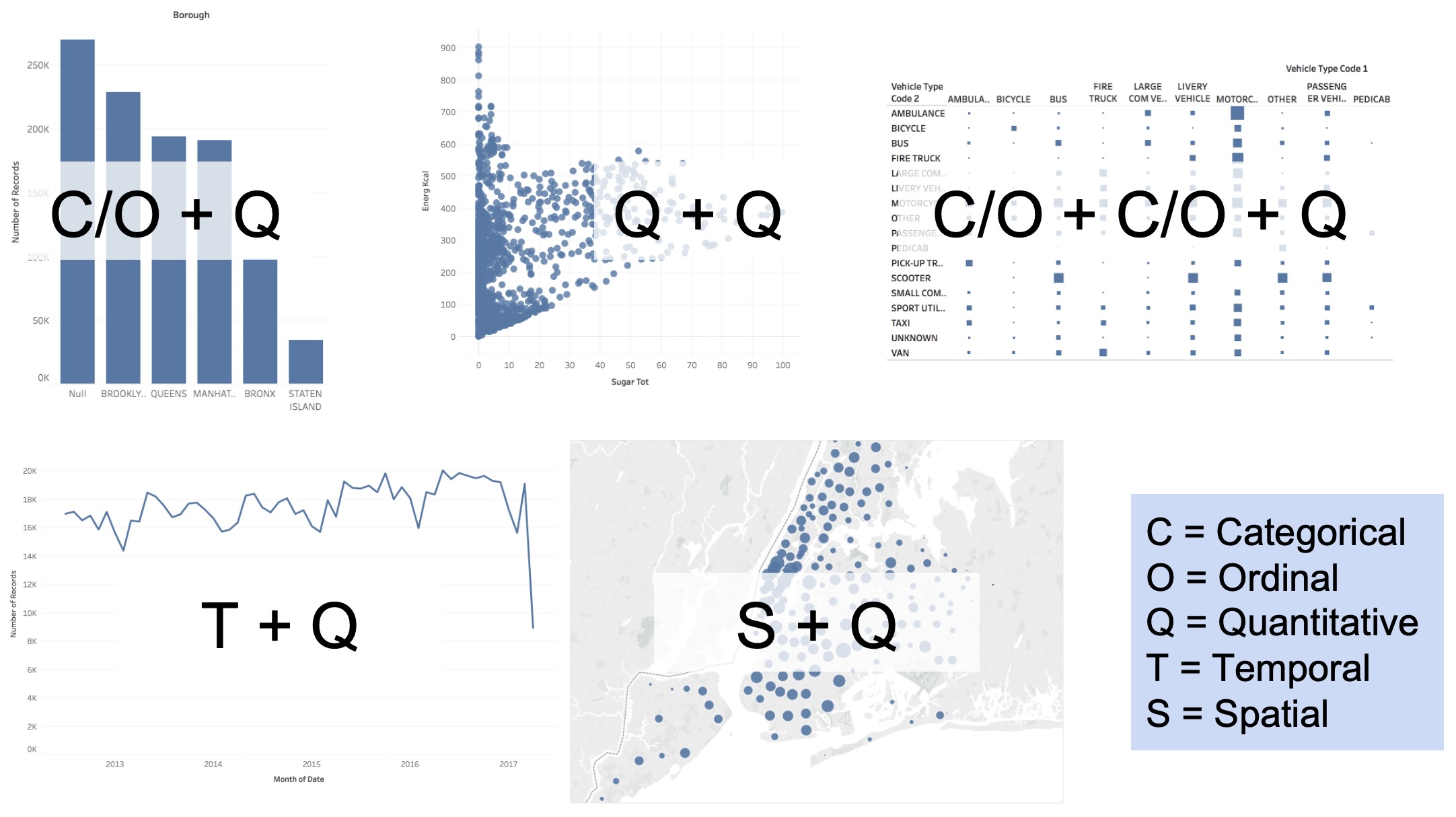
Bar Chart
📊 Definition
Visualizes how a quantity distributes across categories
When to Use
- Compare values across groups
- Show rankings or order
- Display part-to-whole relationships
Key Features
- Length encodes value
- Categories on one axis
- Best for 5-20 categories
Line Chart
📈 Definition
Shows how quantities change in relation to another variable (typically time)
When to Use
- Track trends over time
- Compare multiple time series
- Identify patterns and cycles
Key Features
- Position encodes value
- Lines connect data points
- Emphasizes continuity
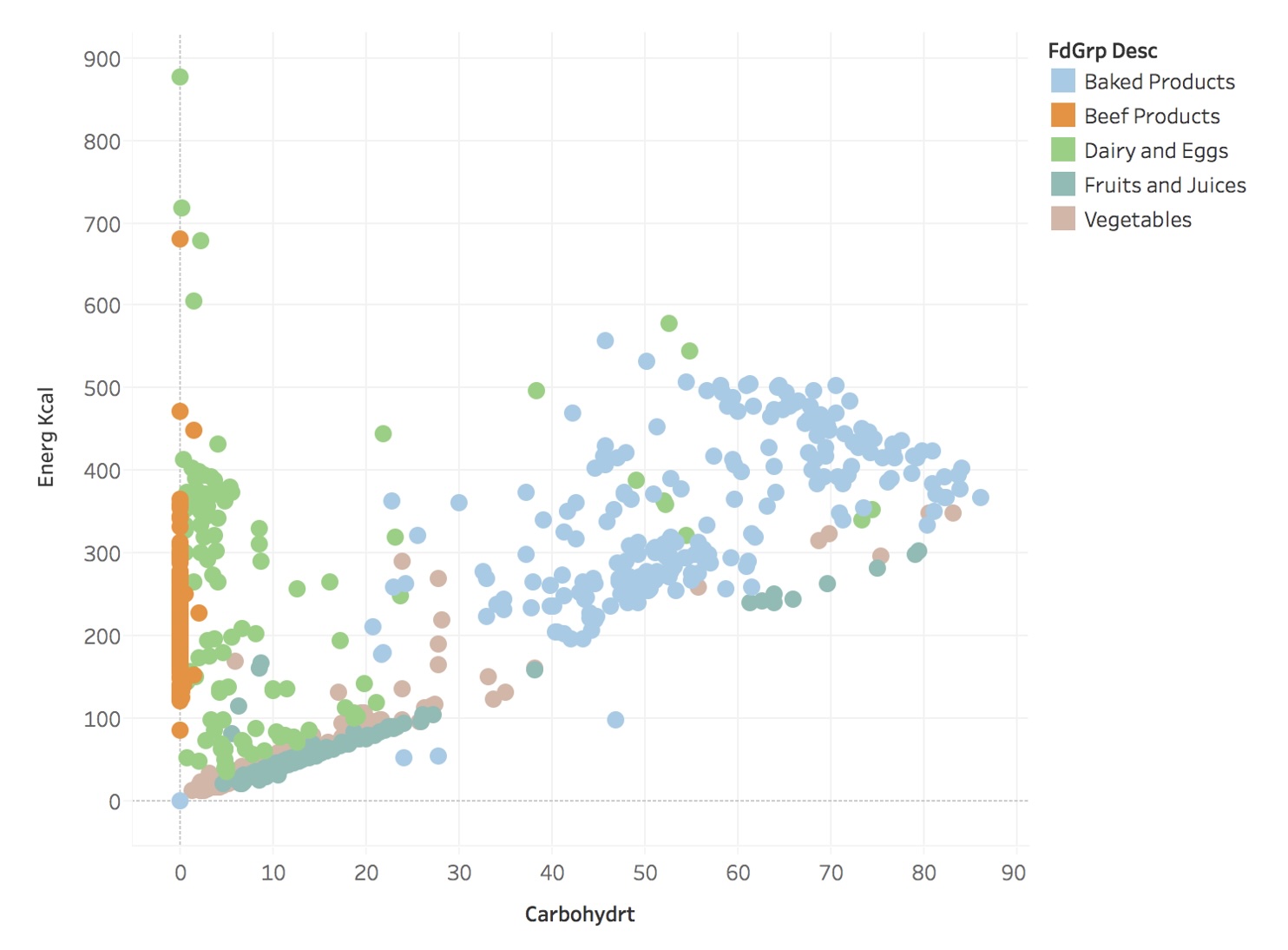
Scatter Plot
🔵 Definition
Shows how one quantity relates to another quantity
When to Use
- Show correlations
- Identify clusters or outliers
- Compare distributions
Key Features
- X/Y position encode values
- Each point = one observation
- Reveals patterns in data
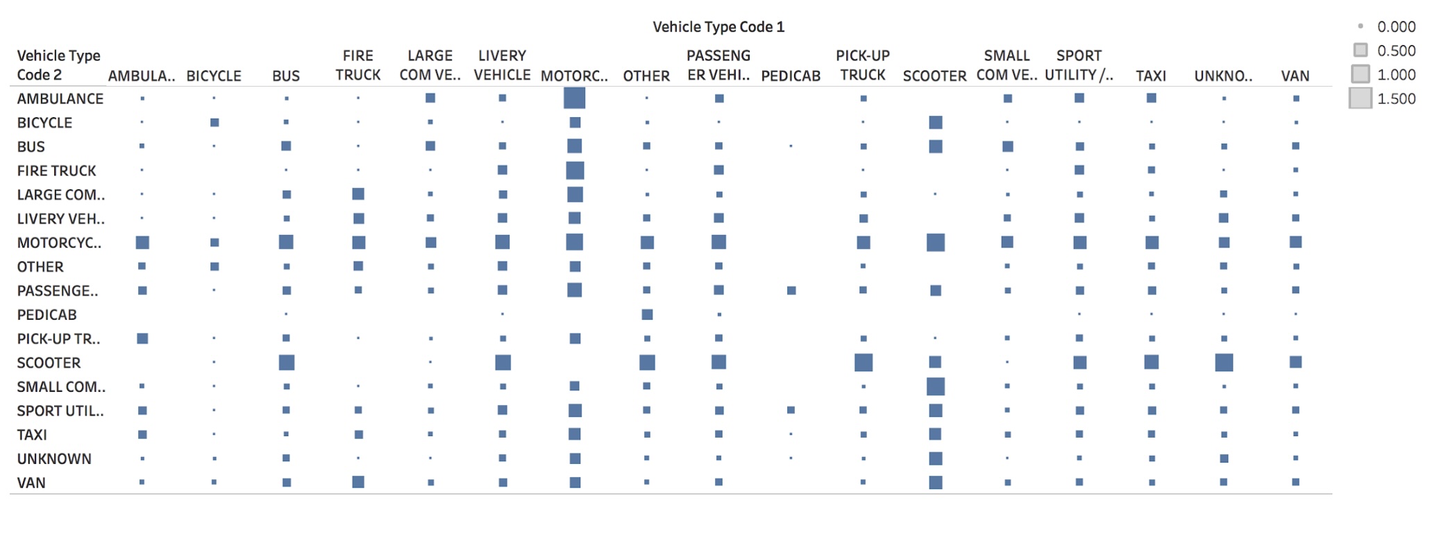
Matrix
🔲 Definition
Shows how quantities distribute across two categories
When to Use
- Show relationships between categories
- Display correlation matrices
- Visualize adjacency/similarity
Key Features
- Color/size encode values
- Row/column structure
- Compact representation
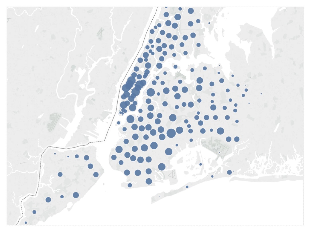
Symbol Map
📍 Definition
Shows how quantities distribute across spatial coordinates
When to Use
- Display geographic data
- Show spatial distributions
- Compare locations
Key Features
- Position = location
- Size/color = magnitude
- Geographic context
Fundamental Graphs Summary
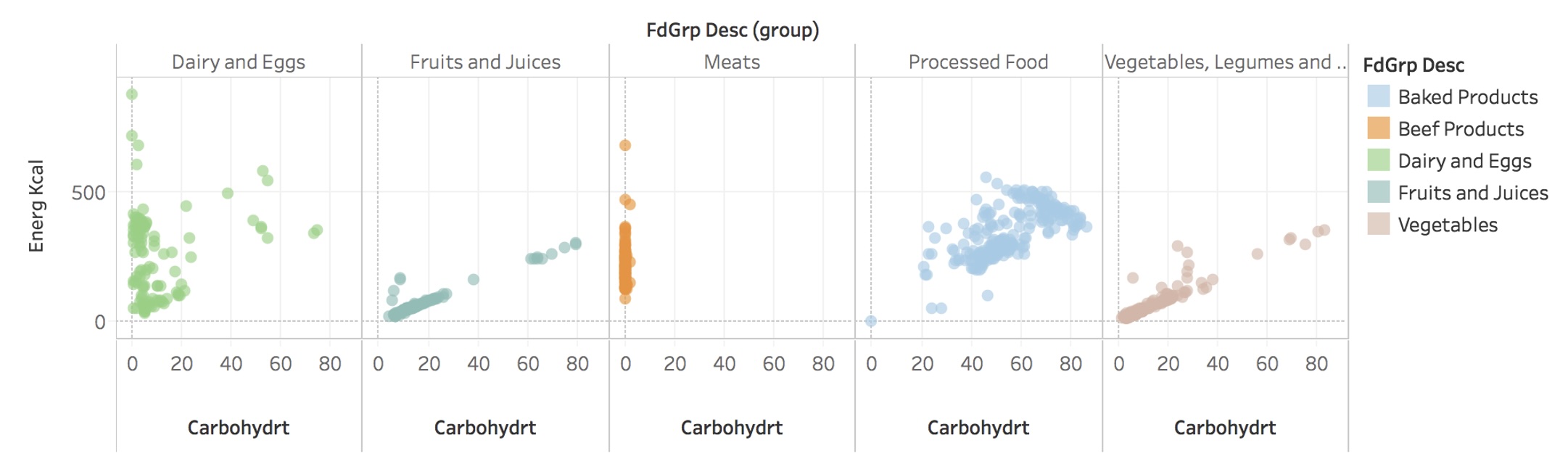
Scatter Plots + Faceting (without)
Scatter Plots + Faceting (with)
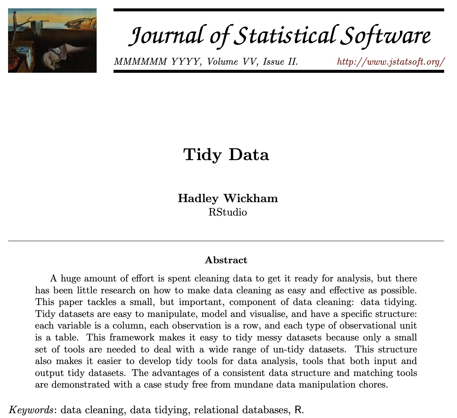
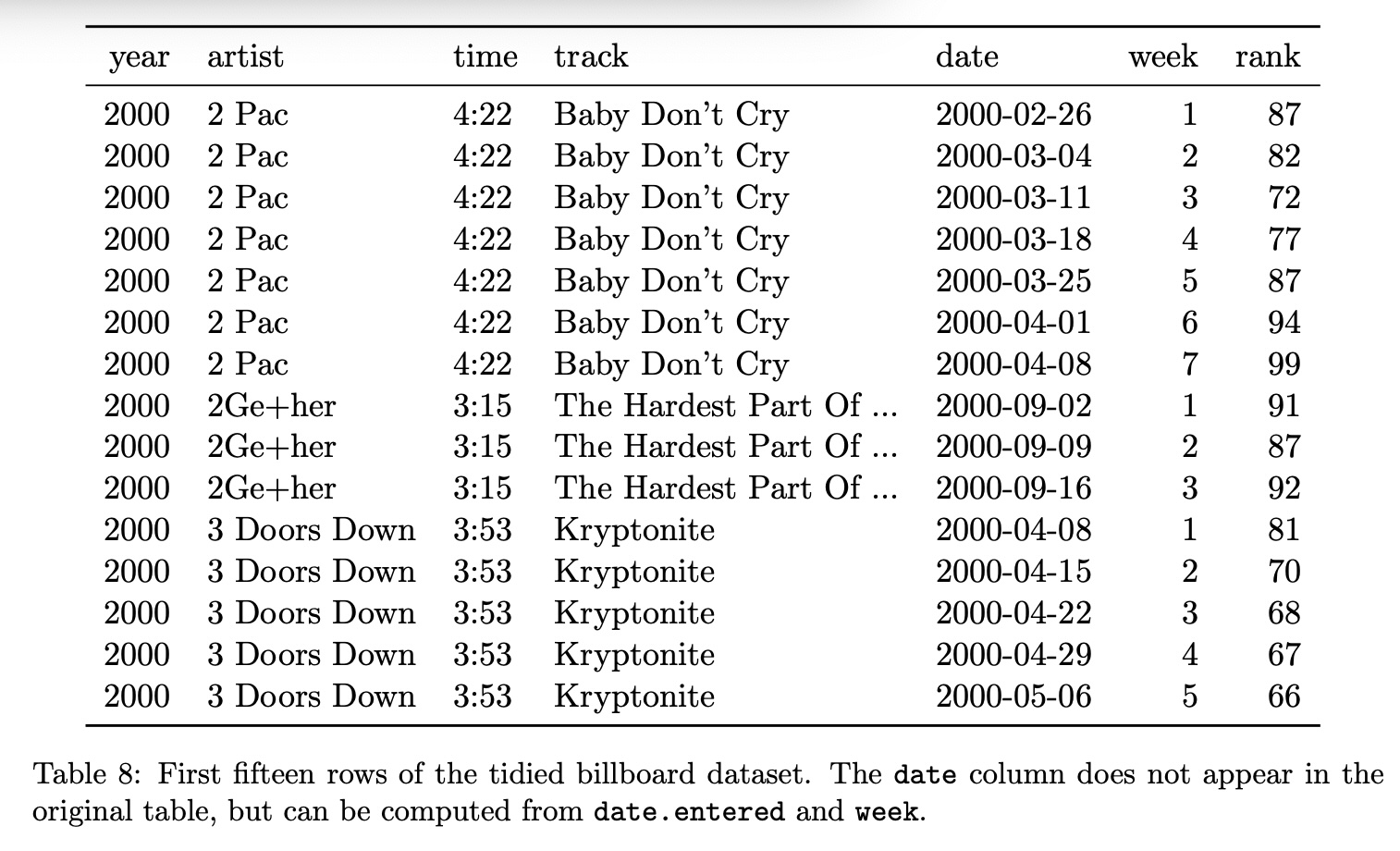
Tidy Data
Goal: organizing data to make visualization easier
Tidy Data
Tidy Data
Tidy Data
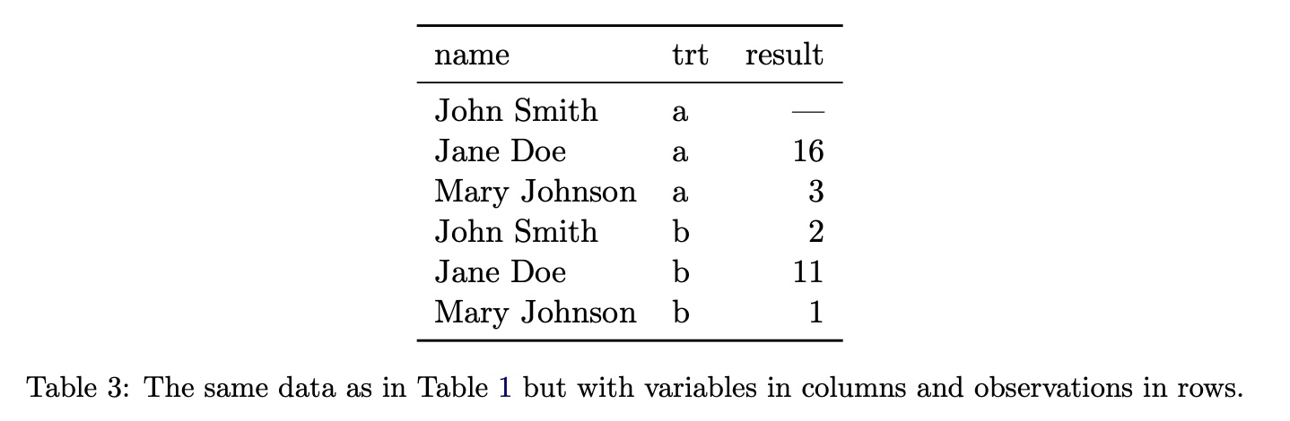
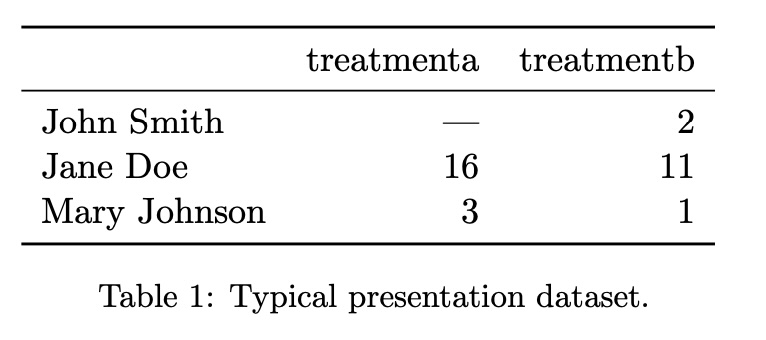
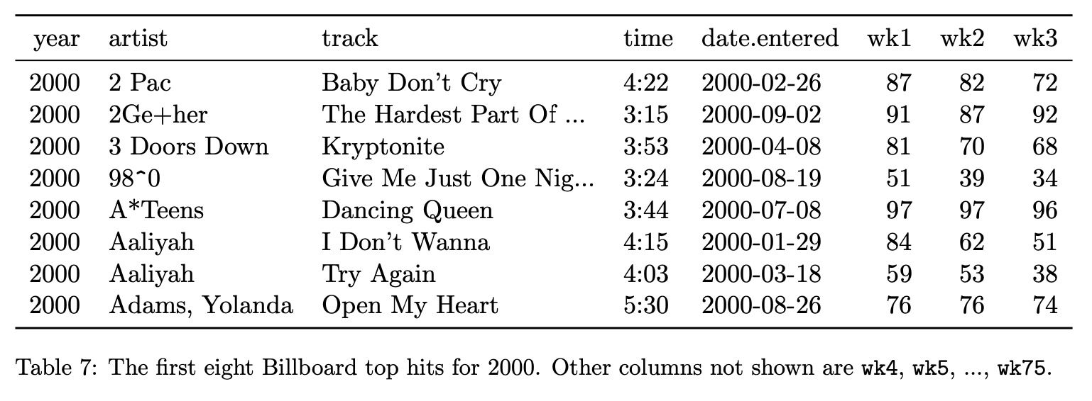
Tidy Data: Example #1
Tidy Data
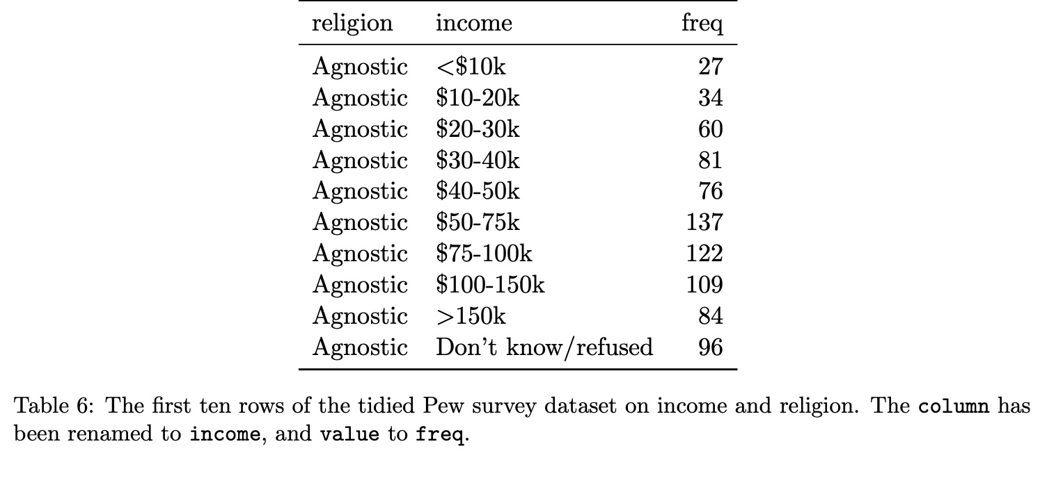
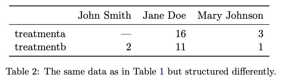
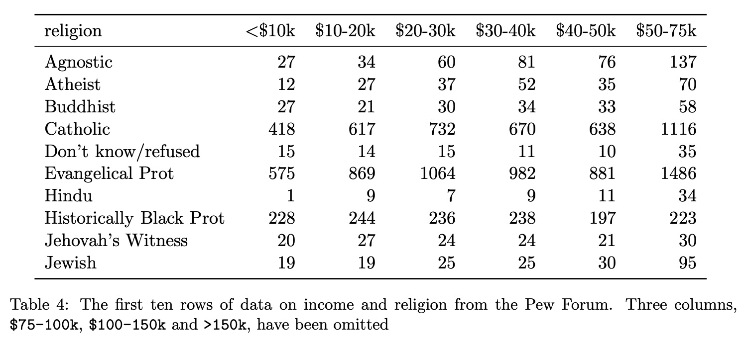
Tidy Data: Example #2
Tidy Data
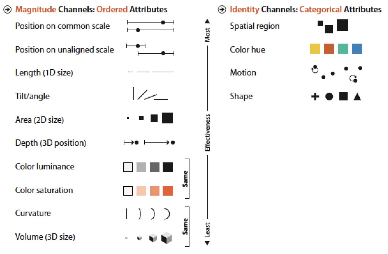
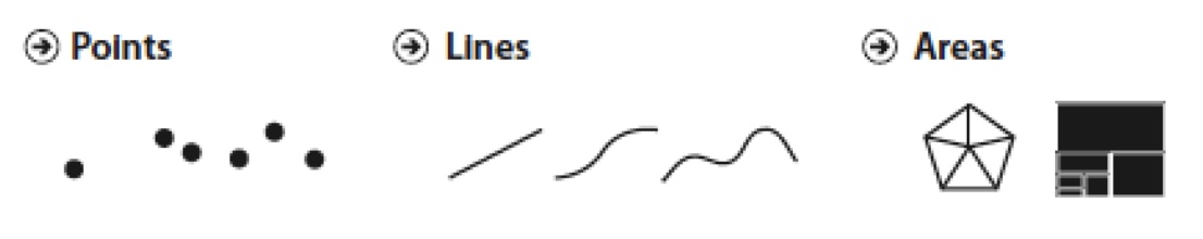
Graphical Marks
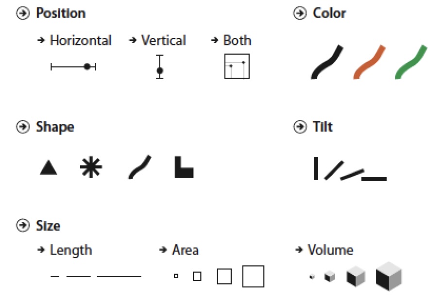
Visual Encoding Channels
Examples
Effectiveness Effect