## Week 12 Lab Overview ### Today's Lab Activities Today we will be a exploring the following topics: 1. Group and Mini Projects: Reminders 2. Group Project Evaluation 1. What makes a Good Project? 2. Evaluation Criteria 3. Exercise: Evaluating Existing Dashboards ## Group and Mini Projects: Reminders | **Assignment** | **Due Date** | **Details** | |---------------|--------------|-------------| | **Milestone #4: Second Draft** | Dec. 1st | Refined narrative and polished visualizations | | **Mini-Project #3** | Dec. 4th | Network data visualization | | **Final Project Presentations** | Dec. 5th | Good luck! | ## Group Project Milestone #4: Deliverables Transform your notebook into a **complete article** with: * **Title** - Clear and informative * **Introduction** - Problem, background, motivation, overview of findings * **Data Description** - Sources, collection methods, attributes used * **Questions and Findings** - For each question: - Clear question statement - Polished D3 visualization - Analysis and interpretation - Insights and implications * **Conclusion** - Summary of findings, recommendations, limitations **Focus on narrative flow** - someone unfamiliar with your project should be able to read and understand it. ::: {.notes} This is where you transition from "a bunch of charts" to "a coherent story." The introduction sets up the problem and tells readers what to expect. Each section builds on the previous one. The conclusion ties it all together and explains what it means. This is also when you polish your visualizations: fix labels, improve colors, refine interactions, add annotations. Think about it like writing a blog post or article for a technical audience. What would they need to know? What order makes sense? ::: # Group Project Evaluation **What makes a Good Project?** **Evaluation Criteria** ## What Makes a Good Project? :::{.columns2} ::::{.column width="50%"} 1. **Clear Problem Statement** - Specific, focused, and well-motivated - Explains why this matters :::: ::::{.column width="50%"} 2. **Rich Dataset(s)** - Accessible, complete, and appropriate - Multiple attributes to explore - Temporal and/or spatial dimensions :::: ::: :::{.columns2} ::::{.column width="50%"} 3. **Coherent Questions** - Form a logical progression (a story) - Can be answered with visualizations - Build toward insights :::: ::::{.column width="50%"} 4. **Appropriate Visualizations** - Match the data and questions - Well-designed and clearly labeled - Interactive where it adds value :::: ::: --- ### The best projects: :::{.columns2} ::::{.column width="50%"} - **Tell a story**: - Explore a compelling problem - Use appropriate data to explore it - ask questions that build on each other - reveal insights that matter. :::: ::::{.column width="50%"} - **Avoid:** - "Let's visualize this data" without clear questions. - Questions that are too broad ("what patterns exist?") or too narrow ("what was the value on Tuesday?"). :::: :::
#### Think about what a reader would learn from your project and why they should care.
## Evaluation Criteria :::: {.columns} ::: {.column width="50%"} **Technical Implementation (35%)** - D3 code quality and correctness - Appropriate use of D3 features - Interactivity implementation - Code organization and documentation **Visualization Design (30%)** - Appropriate chart types - Effective visual encodings - Clear labels and legends - Color and layout choices - Accessibility considerations ::: ::: {.column width="50%"} **Analysis & Insights (20%)** - Question quality and coherence - Depth of analysis - Insight generation - Interpretation accuracy **Communication (10%)** - Narrative flow - Writing clarity - Presentation quality - Professional polish **Teamwork (5%)** - Equal contribution - Coordination evidence ::: :::: ::: {.notes} Technical implementation and visualization design together are 65% of your grade - execution matters! We're checking: Does your D3 code work correctly? Did you choose appropriate visualizations? Are they well-designed? Analysis and insights are 20% - you need to actually interpret your visualizations and derive meaningful findings. Communication is 10% - can someone else understand your work? Teamwork is 5% but we may adjust individual grades if contributions are very unequal. Document who did what in your final submission. ::: --- 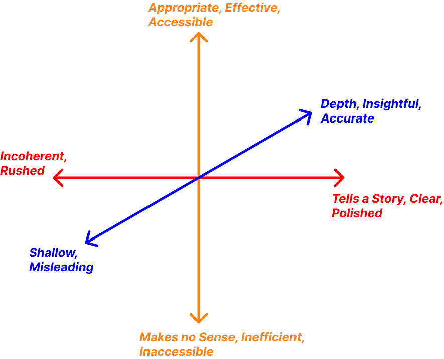{width="100%" fig-align="center"} # Lab Exercises:
Evaluating Existing Dashboards **Our Goal**: Look at various examples of implementations, and argue how they fit within our standards ## For each example: 1. Try to understand the purpose behind the dashboard 2. Answer the linked questions 3. Let's Discuss! Approx. **~5mins for each example.** ## Example #1: Wealth shown to scale - **URL:** - **Google Form:** ## Example #2: WTF Happened In 1971 - **URL:** - **Google Form:** ## Example #3: Locomotion Vault - **URL:** - **Google Form:**: ## Example #4: after babylon - **URL:** - **Google Form:** ## Example 5: Love Songs - **URL:** - **Google Form:** ## Example 6: Coronavirus Tracked - **URL:** - **Google Form:** # Final Reminders ## Resources for You - - - ## Group and Mini Projects: Reminders | **Assignment** | **Due Date** | **Details** | |---------------|--------------|-------------| | **Milestone #4: Second Draft** | Dec. 1st | Refined narrative and polished visualizations | | **Mini-Project #3** | Dec. 4th | Network data visualization | | **Final Project Presentations** | Dec. 5th | Good luck! | **REMINDER:** Legislative Friday! - Next class is on the Nov. 26th! - No Lab! 