
Week 2 Lab: Intro to Vega-Lite DataTtransformations, Working with Real Datasets
Published:
### Features/Columns: :::: {.columns} ::: {.column width="25%"} - `Title` - `US_Gross` - `Worldwide_Gross` - `US_DVD_Sales` ::: ::: {.column width="25%"} - `Production_Budget` - `Release_Date` - `MPAA_Rating` - `Running_Time_min` ::: ::: {.column width="25%"} - `Distributor` - `Source` - `Major_Genre` - `Creative_Type` ::: ::: {.column width="25%"} - `Director` - `Rotten_Tomatoes_Rating` - `IMDB_Rating` - `IMDB_Votes` ::: :::: ## Review: 4 Major Data Transformations * ### Aggregation - **Purpose**: Summarize groups of data - **Methods**: Sum, mean, median, count, min, max - **Example**: Daily sales → Monthly totals * ### Filtering - **Purpose**: Focus on relevant subset - **Types**: Range, categorical, conditional * ### Binning - **Purpose**: Convert continuous to discrete - **Methods**: Equal width, equal frequency, custom _ **Example**: Dividing age into groups (<18, 18-65, >65) * ### Normalization - **Purpose**: Enable fair comparison - **Methods**: Min-max, z-score, percentage ## Step 1: Binning ::: {.incremental} - Grouping **continuous** data into **discrete** groups. - What are some common examples? - Age groups - NYC Boroughs - Years - Grades/Scores - Any kind of continuous data can be binned, in theory. - We lose a bit of data in the meantime, but by doing so we increase the probability of deriving new meaning. ::: --- ### Rotten Tomatoes v.s. IMDb Ratings ::::{.incremental} ::: {.fragment} To better understand the importance of aggregation, let's look at raw, unaggregated data of movie ratings across Rotten Tomatoes and IMDb. We'll use **Vega-Lite** to produce a scatter plot using the `circle` mark. ::: - **[TO-DO]:** Generate a scatter plot with the `circle` marker, with the X-axis representing the Rotten Tomatoes ratings (`Rotten_Tomatoes_Rating`) and IMDb ratings (`IMDB_Rating`). :::{.fragment} ```javascript vl.markCircle() .data(movies) .encode( vl.x().fieldQ("Rotten_Tomatoes_Rating"), vl.y().fieldQ("IMDB_Rating") ) .render() ``` ::: :::: :::{.fragment} 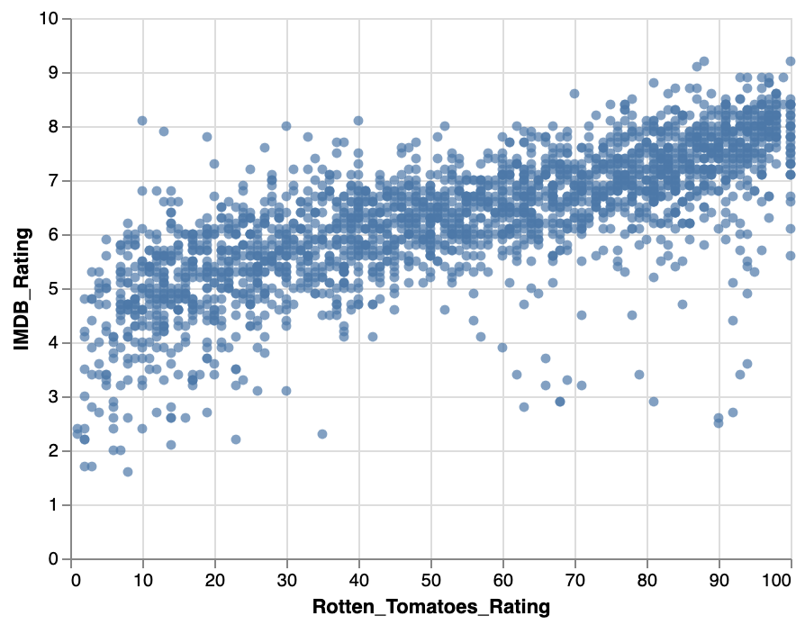{width="35%"} ::: --- ### Your Turn (~5 min): In the Lab 2 notebook, complete Step 1, from 1b to 1d. You should eventually end up with the following two histograms: ::::{.columns} :::{.column width="50%"} #### Rotten Tomatoes Counts per Rating (Binned) 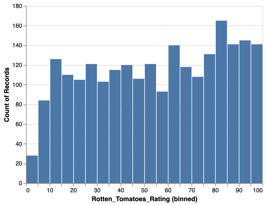{width="100%"} ::: :::{.column width="50%"} #### IMDb Counts per Rating (Binned) 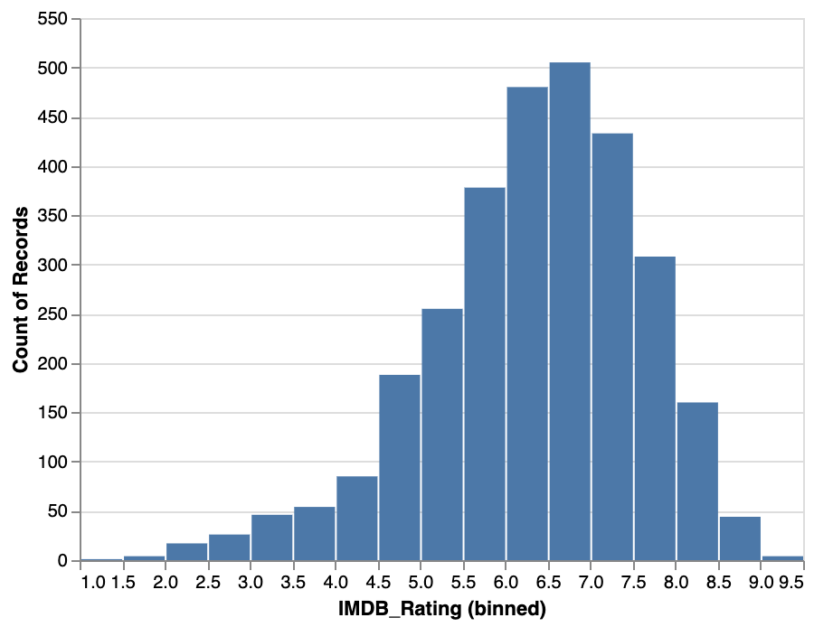{width="100%"} ::: :::: --- ### Common Problem: Overplotting ::::{.columns} :::{.column width="50%"} ```javascript vl.markCircle() .data(movies) .encode( vl.x().fieldQ('Rotten_Tomatoes_Rating').bin({maxbins: 20}), vl.y().fieldQ('IMDB_Rating').bin({maxbins: 20}) ) .render() ``` Plotting too much data can make it hard to actually understand what's going on with the data. ::: :::{.column width="50%"} 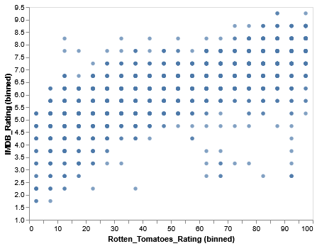{width="100%"} ::: :::: --- ### Benefits of Bins ::::{.columns} :::{.column width="50%"} 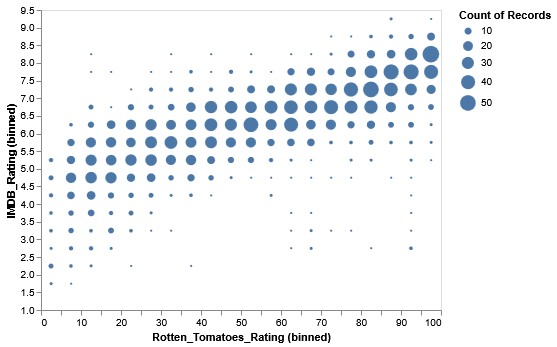{width="100%"} ::: :::{.column width="50%"} 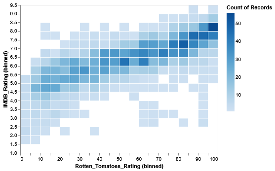{width="100%"} ::: :::: - Bins aren't just restricted to histograms. _They are compatible with other chart types_ - Bins can _alleviate overplotting_ issues. - Bins can _emphasize outliers_ in data distributions. ## Step 2: Aggregation Another data transformation that's common is **aggregation**. We use aggregation to _summarize groups of data_ (i.e. mean, median, min/max). The Vega-Lite documentation includes the [full set of available aggregation functions](https://vega.github.io/vega-lite/docs/aggregate.html#ops), which may be worth reading through. --- ### Averages (Mean) Across Genres ::::{.incremental} :::{.fragment} ```javascript vl.markBar() .data(movies) .encode( vl.x().average('Rotten_Tomatoes_Rating'), vl.y().fieldN('Major_Genre') ) .render() ``` ::: :::{.fragment} ::::{.columns} :::{.column width="50%"} 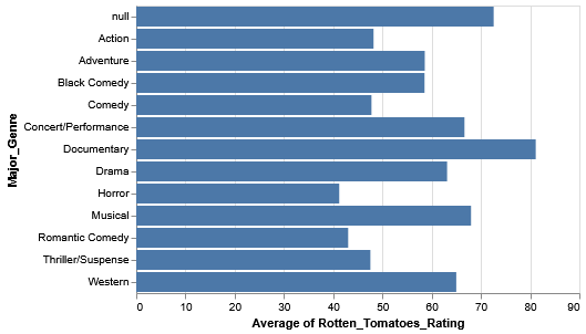{width="100%"} ::: :::{.column width="50%"}
There may be some interesting variation, but _it's mentally tasking to try to understand overall rankings across genres._ ::: :::: ::: :::: --- ### Sorting ::::{.incremental} :::{.fragment} Rather than sort the genres alphabetically, let's try to sort them in _descending order_ of rating (i.e. the genres with the higher ratings are at the top, while the genres with the lower ratings are at the bottom). ::: :::{.fragment} 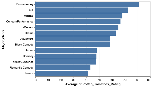{width="50%"} ::: :::{.fragment} ```javascript vl.markBar() .data(movies) .encode( vl.x().average('Rotten_Tomatoes_Rating'), vl.y().fieldN('Major_Genre') .sort(vl.average('Rotten_Tomatoes_Rating').order('descending')) ) .render() ``` ::: :::: ## Food 4 Thought: Averages (Mean) vs. Median ::::{.increment} :::{.fragment} #### Two Questions: - What's the difference between _Averages (Mean)_ and _Median_? - Why does it matter? ::: :::{.fragment} ::::{.columns} :::{.column width="50%"} 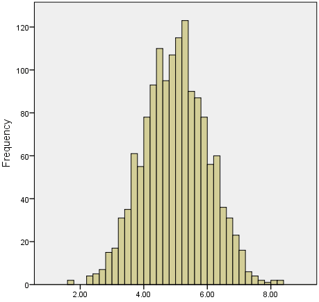{width="70%"} ::: :::{.column width="50%"} 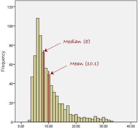{width="70%"} ::: :::: _Img source: [https://statistics.laerd.com/statistical-guides/measures-central-tendency-mean-mode-median.php](https://statistics.laerd.com/statistical-guides/measures-central-tendency-mean-mode-median.php)_ ::: :::: ## From Mean to Median ::::{.incremental} :::{.fragment} ```javascript vl.markBar() .data(movies) .encode( vl.x().median('Rotten_Tomatoes_Rating'), vl.y().fieldN('Major_Genre') .sort(vl.median('Rotten_Tomatoes_Rating').order('descending')) ) .render() ``` ::: :::{.fragment} ::::{.columns} :::{.column width="50%"} 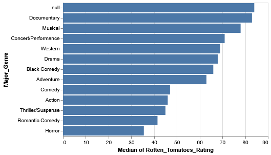{width="100%"} ::: :::{.column width="50%"}
Even with this data, we should still be a bit skeptical. What if, within the genres themselves, there's some skew caused by outliers and such? Observing the variation within each genre is a good way to extend our analysis. ::: :::: ::: :::: ## Inter-Quartile Range (IQR) ::::{.columns} :::{.column width="50%"} Let's add some _nuance_ to our bar chart by considering the [**"Inter-Quartile Range (IQR)"**](https://en.wikipedia.org/wiki/Interquartile_range) of each genre. The _IQR_ is a special range across a set of values that represents where the _middle half_ of the data resides in. A _quartile_ represents 25% of data values. The IQR therefore represents the two middle quartiles, or the middle 50% of data.
_Img. src: [https://en.wikipedia.org/wiki/Interquartile_range](https://en.wikipedia.org/wiki/Interquartile_range)_ ::: :::{.column width="50%"} 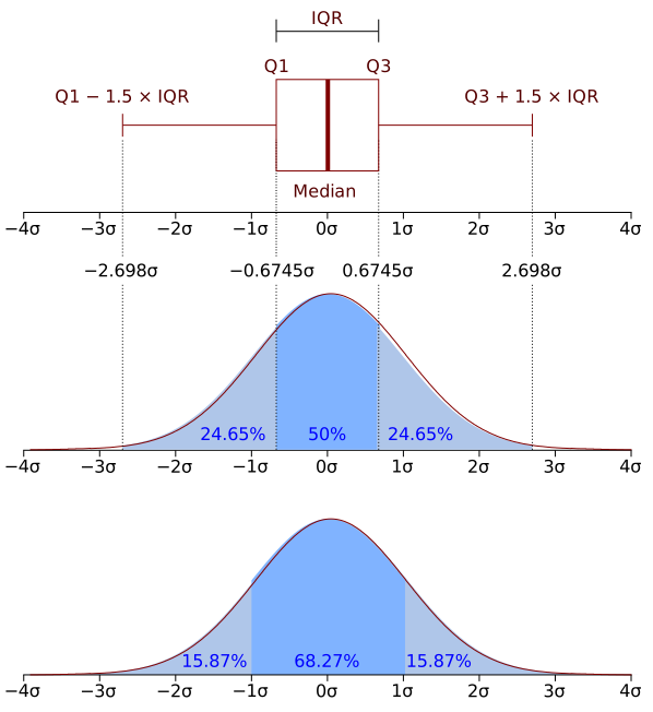{width="100%"} ::: :::: ## Your Turn (~5 min): In the Lab 2 notebook, complete Step 2d and 2e. You should eventually end up with the following two histograms:
::::{.columns} :::{.column width="50%"} #### IQR of Rotten Tomatoes Ratings, by Genres {width="100%"} ::: :::{.column width="50%"} #### IQR of IMDb Ratings, by Genres 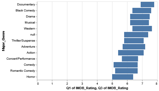{width="100%"} ::: :::: ## Core Concepts of Data Transformations ::::{.columns} :::{.column width="50%"} ### We Covered in the Lab: * #### Aggregation - **Purpose**: Summarize groups of data - **Methods**: Sum, mean, median, count, min, max - **Example**: Daily sales → Monthly totals * #### Binning - **Purpose**: Convert continuous to discrete - **Methods**: Equal width, equal frequency, custom - **Example**: Dividing age into groups (<18, 18-65, >65) ::: :::{.column width="50%"} ### Covered in Assignment #2: * #### Filtering - **Purpose**: Focus on relevant subset - **Types**: Range, categorical, conditional * #### Normalization - **Purpose**: Enable fair comparison - **Methods**: Min-max, z-score, percentages ::: :::: ## End of Lab - Assignment #2 will be posted no later than **September 13, 2025**. - Assignment #2 is due on **September 18th, 2025 @ 11:59pm**! - Where do I ask questions? - TA Office Hours: - Physical Location: Wednesdays @ 2PM-3PM, 8th floor common area @ 370 Jay Street, Brooklyn - Online Zoom: ([https://nyu.zoom.us/j/92815268504](https://nyu.zoom.us/j/92815268504)) - Our course Discord!