## Week 3 Lab Overview |User Interface|Graphics Library|Notebook|Zoom| |:--|:--|:--|:--| |[observablehq.com](https://observablehq.com)|[Vega-Lite](https://vega.github.io/vega-lite/)|[Week 3 Lab Notebook](https://observablehq.com/@rk2546/2025-infovis-cse_week-3-lab)|[Zoom Meeting](https://nyu.zoom.us/j/98539408719)| ### Today's Lab Activities 1. Warm up: Practice with Scenarios & Choices 2. Mutli-View Composition 3. Partner Activity: Chart Exploration ## Recall Today's Main Topics: ::::{.incremental} - **5 Fundamental Graphs**: Bar Charts, Line Graphs, Scatter Plots, Matrix, Symbol Maps - **Principles**: Expressiveness & Effectiveness - **Transformation Types**: Aggregation, Filtering, Binning, Deriving, Normalization - **Domains & Scales**: Linear, Log, Ordinal :::: --- 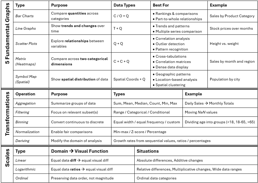{width="80%"} (_Available via the [Week 3 Lab Notebook](https://observablehq.com/@rk2546/2025-infovis-cse_week-3-lab)_) ## Part 1: Warm Up - Thinking about Design Choices (~5-10 mins) ### Our Task: ::::{.incremental} - **What we're given**: A data scenario & a goal in mind - **Our task**: Answer, collectively, the optimal way to: 1. Identify the data domains [Q, C, O, T, Spatial (S)] 2. Graph the data [Bar, Line, Scatter, Matrix, Symbol] :::: --- ### Exercise 1 ::::{.columns} :::{.column width="50%"} - **What we're given:** Monthly sales revenue ($) over the past 12 months for a retail store. - **Goal:** Identify trends over time. - [_**StrawPoll**_](https://strawpoll.com/2ayLQBb1en4) ::: :::{.column width="50%"} 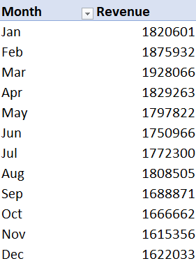{width="75%"} (Source: [dataamir](https://github.com/dataamir/Monthly-sales-performance-trends.git)) ::: :::: --- ### Exercise 2 ::::{.columns} :::{.column width="50%"} - **What we're given:** Population size of different countries. - **Goal:** Compare country population sizes - [_**StrawPoll**_](https://strawpoll.com/3RnYX9DYAye) ::: :::{.column width="50%"} 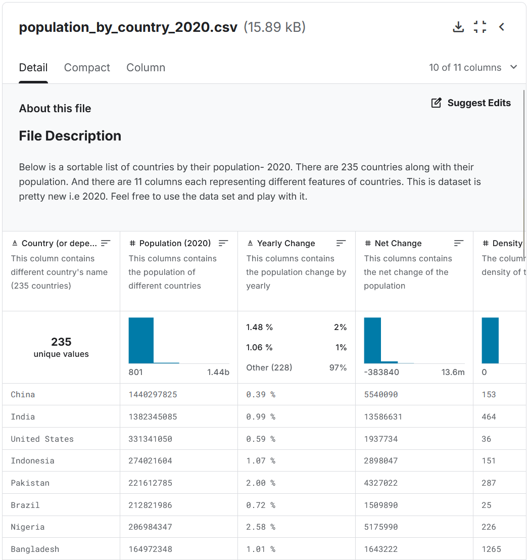{width="100%"} (Source: [Kaggle: Population by Country - 2020](https://www.kaggle.com/datasets/tanuprabhu/population-by-country-2020)) ::: :::: --- ### Exercise 3 ::::{.columns} :::{.column width="50%"} - **What we're given:** Product ratings from 1 to 5 stars collected from customer feedback. - **Goal:** Show frequency of each rating. - [_**StrawPoll**_](https://strawpoll.com/QrgewEm7Lyp) ::: :::{.column width="50%"} 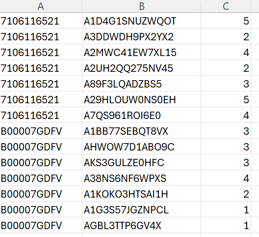{width="100%"} (Source: [openbigdata.org](https://openbigdata.org/resource/amazon-product-reviews/)) ::: :::: --- ### Exercise 4 - **What we're given:** Test scores (0%-100%) of students plotted against hours studied. - **Goal:** Determine the correlation between study time and performance. - [_**StrawPoll**_](https://strawpoll.com/NMnQNDWVdg6) ## Exercises - Answers ::::{.incremental} ### Exercise 1: Monthly Sale Revenues - **Data domains**: _Monthly Sales_ (Q) over _12 months_ (T/O) - **Graph**: _Line_ or _Bar_ ### Exercise 2: Population Sizes - **Data domains**: _Population Size_ (Q) by _Country_ (S) - **Graph**: _Symbol Map_ (via GeoData) ### Exercise 3: Product Ratings - **Data domains**: A _collection_ (Q) of _Product Ratings_ (O) - **Graph**: _Bar Chart_ ### Exercise 4: Test Scores - **Data domains**: _Test scores_ (Q) vs. _hours studied_ (Q) - **Graph**: _Scatter Plot_ :::: ## Poll Results from Class (Sep. 19, 2025) ::::{.columns} :::{.column width="25%"} **Exercise #1**: 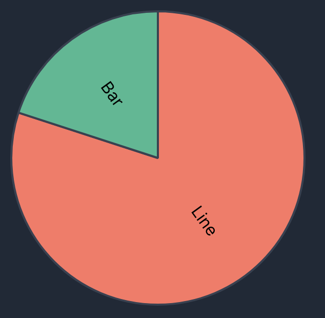{width="100%"} ::: :::{.column width="25%"} **Exercise #2**: 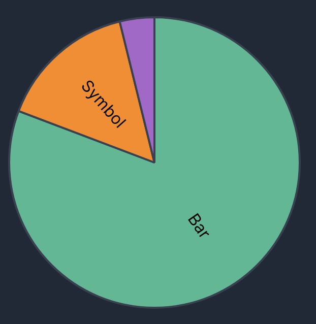{width="100%"} ::: :::{.column width="25%"} **Exercise #3**: 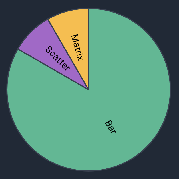{width="100%"} ::: :::{.column width="25%"} **Exercise #4**: 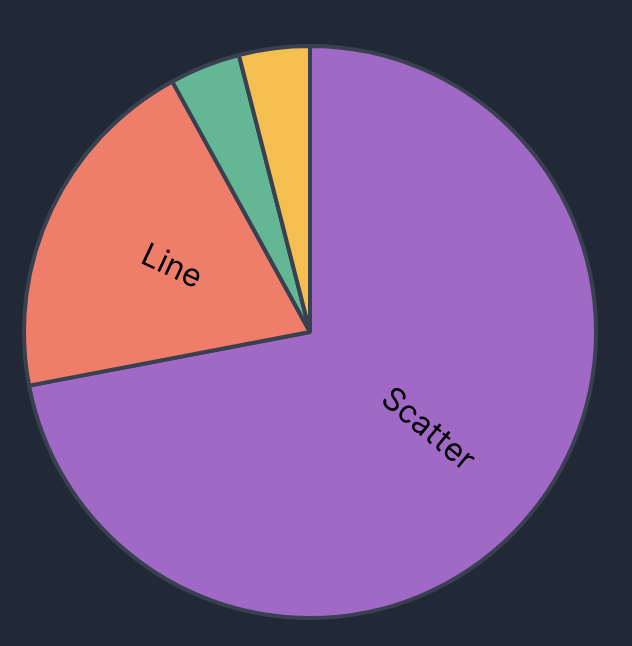{width="100%"} ::: ::::
### Core Idea: Meaning-Making: Data -> Information > As engineers, designers, and researchers, we must do the work to **find meaning within the raw data** and **interpret them for the benefit of others**. There are many ways to generate viable alternatives charts! ## Part 2: Facets and Multiple Views ### Context: In prior labs and exercises, we touched upon the idea of "_facets_", or multiple views within a single chart. Facets allow us to divide visualizations based on a categorical feature as a 3rd dimension. In this part, we'll really get deep into generating **multi-view compositions**.
### Concepts Covered: - _layer_: place compatible charts directly on top of each other, - _facet_: partition data into multiple charts, organized in rows or columns, - _concatenate_: position arbitrary charts within a shared layout, and - _repeat_: take a base chart specification and apply it to multiple data fields. _Largely inspired by [UW Data Lab Summary: Multi-View Composition](https://observablehq.com/@uwdata/multi-view-composition?collection=@uwdata/visualization-curriculum)_. Follow this notebook, then return here for Part 3. ## Part 3: Multiple Chart Types in Vega-Lite ### Documentation We've already covered several plot types, but Vega-Lite provides a very wide variety of [different chart types](https://vega.github.io/vega-lite/examples/).
### Changes to our Approach - Moving away from specifying "answer" graphs - Instead, moving more towards prompt-based questions and analysis. ## Part 3 Exercises: Answering Prompts (~20-30 mins) ### Your Task: **IN PAIRS OF TWO:** > For each scenario prompt, take the data and attempt to generate a visualization of your choice that shows something unique about that dataset. > At the end of this exercise, we will have volunteers show their graphs for each scenario and provide a narrative for what the graph is telling them. - You are allowed to use any visualization. - Feel free to use any filters, calculations, or multi-view compositions. - Use the cheatsheet to help you identify optimal graphs, scales, and transformations. - Try to avoid the common pitfalls. - Keep it simple! ## End of Lab - Exercise #3 will be posted no later than **September 20, 2025**. - Exercise #3 is due on **September 25th, 2025 @ 11:59pm**! - Where do I ask questions? - TA Office Hours: - Physical Location: Wednesdays @ 2PM-3PM, 8th floor common area @ 370 Jay Street, Brooklyn - Online Zoom: ([https://nyu.zoom.us/j/92815268504](https://nyu.zoom.us/j/92815268504)) - Our course Discord! 