## Week 5 Lab Overview |User Interface|Graphics Library|Notebook| |:--|:--|:--| |[observablehq.com](https://observablehq.com)|[D3](https://d3js.org/)|[Week 5 Lab Notebook](https://observablehq.com/@rk2546/2025-infovis-cse_week-5-lab)| ### Today's Lab Activities Today we will be a coding-heavy lab where we will practice with color scales and geodata. The lab will be divided into these sessions: 1. Intro to Scale Types & Color 2. Coding Session 1: Scales and color scales (scatter plot) 3. Geodata: Example 4. Coding Session 2: Choropleth map + Color Scale 5. Color Accessibility Session: Categorical palettes & colorblind Test 6. Wrap up & Sharing ## D3 Scales: Mapping Data to Pixels - D3 scales map data domain → screen range - Common types: - `d3.scaleLinear()` → for numeric data - `d3.scaleLog()` → for skewed data (e.g. income) - `d3.scaleTime()` → for time/date axes ````js linear_scale_example = d3.scaleLinear() .domain([0,10]) .range([0, 100]) // linear_scale_example(5) → 50 // linear_scale_example(3) → 30 ```` ````js log_scale_example = d3.scaleLog() .domain([1,100000]) .range([0, 100]) // log_scale_example(3233) → 70.19211409223112 ```` ````js time_scale_example = d3.scaleTime() .domain([new Date(2025, 0, 1), new Date(2025, 11, 31)]) // Jan 1 to Dec 31, 2025 .range([0, 100]) // time_scale_example(new Date(2025, 7, 12)) → 61.25228937728938 ```` ## Sequential Color Scales: Numeric Data We can use `d3.scaleSequential()` with numeric, continuous data to generate gradients: ````js d3.scaleSequential(d3.interpolateBlues) ```` {width="100%"} ```js d3.scaleSequential(['blue', 'yellow', 'red']) ``` {width="100%"} This is generally good for: - Choropleth maps - Population density - Continuous metrics ## Categorical Color Scales: Ordinal/Nominal Data Use `d3.scaleOrdinal() + d3.schemeCategory10`, as an example. ````js d3.scaleOrdinal(d3.schemeCategory10) ```` Other categorical schemes provided [here](https://d3js.org/d3-scale-chromatic/categorical). Categorical scale are good for: - Regions (geodata) - Categories like continent, gender, etc. ## Coding Session #1: Scatter Plots, Scales, and Colors [~ 10mins] ### Your Task: In this coding session, you will be practicing with producing a scatter plot based on health data from different countries/regions. This session uses the gapminder data. ### Starter Code: An initialized chart with titles, but it's missing the axes and data. ### Goal(s): - Explore different quantitative scales (`d3.scaleLinear()`, `d3.scaleLog()`) - Explore different coloration scales - Practice with `domain()` and `range()` when setting up plot axes. - Practice with data binding from raw datasets to D3 plots. ## Choropleth Maps :::{.columns} ::::{.column width="50%"} What is a **Choropleth Map?** - A map where regions are colored based on data. - Works best with sequential scales across geographical regions. _Example Src: [D3](https://observablehq.com/@d3/choropleth)_ :::: ::::{.column width="50%"} 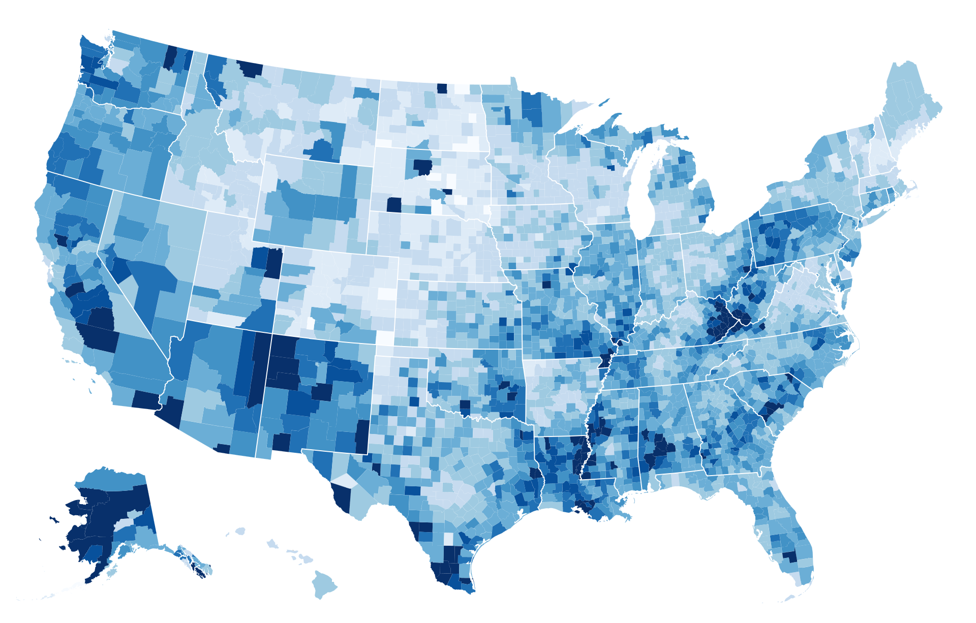{width="100%"} :::: ::: ## Coding Session #2: GeoMaps and Colors [~ 25mins] ### Your Task: In the example, we plotted a simple Mercator map. In this coding session, we will make it more interesting by binding the geodata to another dataset: `population`. If you recall in [_Week 3 Exercise_](https://observablehq.com/@rk2546/2025-infovis-cse_exercise-3),, we generated the geomap of USA counties and their population data. To achieve this, we needed to link the population data to the geodata by some common feature. In that case, we joined the two datasets based on an id feature that was basically the zip codes of each USA county. In this coding session, we will do something similar, but in D3 and using a world map instead of the USA counties map. We have provided the basic code for the Mercator map both in the example above and in this code session's starter code. It's your job to color the countries of the map to show their population sizes. ### Starter Code: The barebones code for the Mercator map. ### Goals: - Create a JavaScript `Map()` to act as a lookup dictionary when mapping countries to populations. - Practice with color scales - Practice with rendering geodata. ## Color & Accessibility - Approx. 1 in 12 people have color vision deficiency - Avoid red/green without contrast - Use tools to test ([Coblis](https://www.color-blindness.com/coblis-color-blindness-simulator/), [Colorblind Testers](https://bioapps.byu.edu/colorblind_image_tester)) _Image src: ["Color Advice for Data Visualization with D3.js" by Elijah Meeks](https://medium.com/@Elijah_Meeks/color-advice-for-data-visualization-with-d3-js-33b5adc41c90)_ :::{.coluumns} ::::{.column width="50%"} 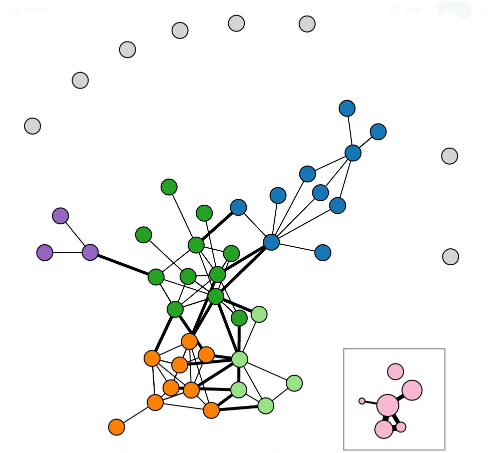{width="600"} :::: ::::{.column width="50%"} 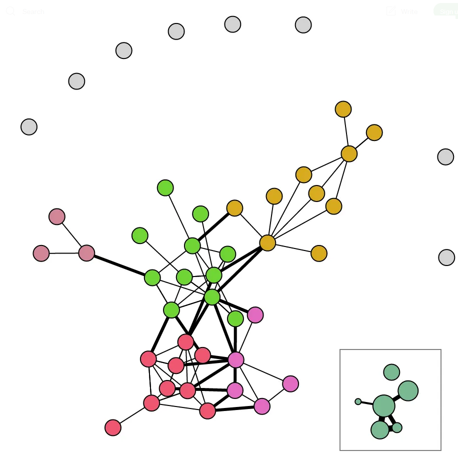{width="600"} :::: ::: ## Coding Session #3: Color Accessibility Session [~ 5-10min] ### Some Context In this section, we'll be copying the scatter plot data used in Coding Session #1 but with some different twists. In the first coding session, you were tasked with using either `d3.sequentialBlues` for the health data or `d3.schemeCategory10` for the categorical region data. However, many of these pre-determined schema can be hard to visually parse for people with ocular deficiencies such as color blindness. To simulate the different variations of color blindness, you can go to [_this website_](https://www.color-blindness.com/coblis-color-blindness-simulator/). This is a very useful simulator that alters a sample image to let you see what certain ocular conditions look like. ### Your Task: For this coding session, you will copy-paste your code from Coding Session #1 and modify it to use a color scheme that aims to make the coloration accessible to people with **Deuteranopia** (green-blindness). One way we can do this is to use ColorBrewer palettes. For more information, look at [_this repository_](https://observablehq.com/@d3/working-with-color) of different color palettes and search for "ColorBrewer". Once you have what you believe is an acceptable color visualization, hop over to [https://bioapps.byu.edu/colorblind_image_tester](https://bioapps.byu.edu/colorblind_image_tester) and upload a PNG of your plot to receive a rating of whether it's friendly or not to people with Deuteranopia. ## End of Lab - Exercise #5 will be posted no later than **October 5th, 2025**. - Exercise #5 is due on **October 9th, 2025 @ 11:59pm**! - Where do I ask questions? - TA Office Hours: - Physical Location: Wednesdays @ 2PM-3PM, 8th floor common area @ 370 Jay Street, Brooklyn - Online Zoom: [https://nyu.zoom.us/j/92815268504](https://nyu.zoom.us/j/92815268504) - Grader TA Office Hours: - Online Zoom: [https://nyu.zoom.us/j/2817596431](https://nyu.zoom.us/j/2817596431) - Our course Discord! 