CS-GY 6313: Information Visualization

Fall 2026 - Course Introduction & Syllabus

Claudio Silva

New York University

2026-09-04

Welcome to Information Visualization!

CS-GY 6313

  • Instructor: Claudio Silva (csilva@nyu.edu)
  • Time: Fridays 11:00 AM - 1:30 PM
  • Location: Jacobs Hall, 6 MetroTech Center, Room 315
  • Office Hours: TBD

Teaching Team

  • TA (Labs): TBA
  • Grader: TBD
  • Discord: Invite link to be posted

About Me

Claudio Silva

  • Institute Professor at NYU
  • Research in visualization, data science, and urban computing
  • Previously taught this course and VisML

Contact

Course Prerequisites

Essential Requirements

  • Proficiency in programming (comfortable with extensive coding)
  • JavaScript experience helpful but not required
  • We will learn D3.js and web technologies together

What We’ll Use

  • JavaScript & D3.js
  • Vega-Lite
  • Observable notebooks
  • Web technologies (HTML, CSS, SVG)
  • Git/GitHub
  • Modern web browser
  • Text editor/IDE

Warning

If you are not comfortable with extensive programming, please contact me before proceeding with the course.

Why Visualization?

The Power of Visual Representation

“The purpose of visualization is insight, not pictures.” - Ben Shneiderman

Amplify Cognition

  • Process large amounts of data quickly
  • Identify patterns and outliers
  • Support decision making

Enable Discovery

  • Explore unknown datasets
  • Generate hypotheses
  • Communicate findings

Course Learning Objectives

After this course, you will be able to:

  1. Design & Evaluate effective visualizations using design principles and perception theory
  2. Analyze & Critique existing visualizations and propose improvements
  3. Build & Implement interactive web-based visualizations with Vega-Lite and D3.js
  4. Apply Domain Knowledge for geographic, temporal, and network data
  5. Practice Ethical Design and handle uncertainty appropriately
  6. Optimize Performance for scalable visualizations and dashboards

Course Structure

Weekly Format (2.5 hours)

Lecture (90 minutes)

  • Theory and concepts
  • Design principles
  • Case studies
  • Research papers

Lab (60 minutes)

  • Hands-on practice
  • Coding exercises
  • Individual help
  • Peer collaboration

Tip

Labs provide immediate application of concepts with instructor and TA support

Assessment Overview

No Midterm or Final Exam!

Exercises

35%

8 weekly assignments

Mini-Projects

35%

3 domain-specific projects

Group Project

25%

Team of 2-3 students

Participation

5%

Quizzes & engagement

Grading Breakdown

Grade Distribution

Component Weight Details
Exercises 35% 8 assignments throughout semester
Mini-Projects 35% Geographic, Temporal, Network visualizations
Group Project 25% Team project with milestones
Quizzes & Participation 5% Weekly quizzes and class engagement

Extra Credit

  • Up to 6 points on final grade through mini-project extensions
  • Each mini-project has optional advanced components

Grading Scale

Grade Minimum %
A 95
A- 90
B+ 87
B 84
B- 80
C+ 77
Grade Minimum %
C 73
C- 70
D+ 67
D 63
F < 63

Important Policies

Re-submission Policy ✅

  • Re-submit exercises and mini-projects after feedback
  • Earn back up to 75% of lost points
  • Must request within 1 week of grade release

Late Submission Policy ⏰

Days Late Penalty
1-2 days No penalty
2-7 days 25% reduction
> 7 days 50% reduction
No submission 2 points off final grade

Important

Late submissions after solutions are discussed have unfair advantage

Exercises (35%)

Weekly Assignments

  1. Visualization critique & Vega-Lite basics
  2. Data transformations
  3. Chart design & encodings
  4. Misleading vs. honest visualizations
  1. Perception-based design + D3
  2. Color design with D3 scales
  3. Interactive transitions
  4. Uncertainty visualization

Purpose

  • Build foundational skills progressively
  • Apply theory to practice
  • Get regular feedback

Mini-Projects (35%)

Three Domain-Specific Projects

Geographic

  • Interactive maps
  • Spatial patterns
  • Choropleths
  • Point distributions

Temporal

  • Time series
  • Temporal patterns
  • Animations
  • Event sequences

Network

  • Graph layouts
  • Social networks
  • Infrastructure systems
  • Hierarchies

Each includes optional extra credit components (+2 points each)

Group Project (25%)

Team-Based Exploration

Structure

  • Teams of 2-3 students
  • Choose your own topic
  • Multiple milestones
  • Final presentation

Timeline

  • Week 3: Team formation
  • Throughout: Milestones
  • Weeks 14-15: Presentations

Learning Goals

  • Collaborate on complex visualization
  • Apply full visualization pipeline
  • Present and defend design choices

Course Schedule - Part 1

Week Date Topic
1 Sept 4 Introduction & Evaluation
2 Sept 11 Analytical Questions & Data Transformation
3 Sept 18 Fundamental Graphs & Visual Encoding
4 Sept 25 Visual Perception & D3 Foundations
5 Oct 2 Color Theory & D3 Scales
6 Oct 9 Group Projects & Design Ethics
7 Oct 16 Interaction in Visualization

Course Schedule - Part 2

Week Date Topic
8 Oct 23 Foundations of Geovisualization: 2D Maps
9 Oct 30 Urban Visualization I: Flows & Interactivity
10 Nov 6 Urban Visualization II: 3D Form & Simulation
11 Nov 13 Visualizing Time-Oriented Data
12 Nov 20 Clustering & Dimensionality Reduction
- Nov 27 Thanksgiving Recess - No Class

Course Schedule - Part 3

Week Date Topic
13 Dec 4 Visualizing Network Data
14 Dec 11 Final Project Presentations & Wrap-up

Key Dates to Remember

  • First Class: September 4
  • Thanksgiving Recess: November 26-27 (no class Nov 27)
  • Last Class: December 11
  • Project Presentations: December 11

Tools We’ll Use

Vega-Lite

  • High-level grammar
  • Quick prototyping
  • Declarative specs
  • First half focus

D3.js

  • Full control
  • Custom interactions
  • Advanced features
  • Second half focus

Observable

  • Interactive notebooks
  • Live coding
  • Data exploration
  • Sharing work

Getting Started

  1. Create Observable account
  2. Review JavaScript basics
  3. Explore D3 gallery

Course Resources

Primary Resources

Recommended Books (Optional)

  • Munzner - Visualization Analysis and Design
  • Ware - Information Visualization: Perception for Design
  • Murray - Interactive Data Visualization for the Web
  • Wattenberger - Fullstack Data Visualization with D3

Academic Integrity

Expectations

  • Submit your own original work
  • Cite all sources and references
  • Note any collaboration on assignments

What’s Allowed ✅

  • Discuss concepts with classmates
  • Use online resources with citation
  • Ask for help from instructors/TAs

What’s Not Allowed ❌

  • Copy code from others
  • Submit others’ work as your own
  • Use solutions from previous semesters

AI Policy

We embrace AI as a tool, not a replacement

Allowed Uses ✅

  • Learning concepts
  • Debugging assistance
  • Code suggestions
  • With disclosure and understanding

Requirements ⚠️

  • Disclose AI usage
  • Understand all code you submit
  • Be able to explain your work
  • You’re responsible for errors

Note

AI is a tool like Stack Overflow - use it wisely, but know that technical interviews won’t have it

Accessibility & Support

Moses Center for Students with Disabilities

  • Contact: mosescsd@nyu.edu
  • Phone: 212-998-4980
  • Location: 726 Broadway, 2nd floor
  • Register for accommodations if needed

Getting Help

  • Office Hours: TBD
  • Discord: Quick questions and discussions
  • Email: For private matters
  • Lab Time: Immediate hands-on help

Questions?

Any questions about the course?

  • Course structure
  • Grading policies
  • Prerequisites
  • Tools and technologies
  • Schedule

End of Course Logistics

  • Any questions?

BREAK

  • 5 minutes

Self Introduction for InfoVis 2026

slides

Introduction to Visualization

What is Information Visualization? Why Use It?

“The use of computer-supported, interactive, visual representations of abstract data to amplify cognition.”
The Power of Visualization: Discovery

John Snow’s Cholera Map (1854)

  • Mapped cholera deaths in London
  • Revealed cluster around Broad Street water pump
  • Visual evidence stopped the outbreak

Tip

Takeaway: Visualization is a powerful tool for discovery and finding patterns invisible in raw data.

John Snow's Cholera Map

John Snow’s Cholera Map

The Power of Visualization: Storytelling

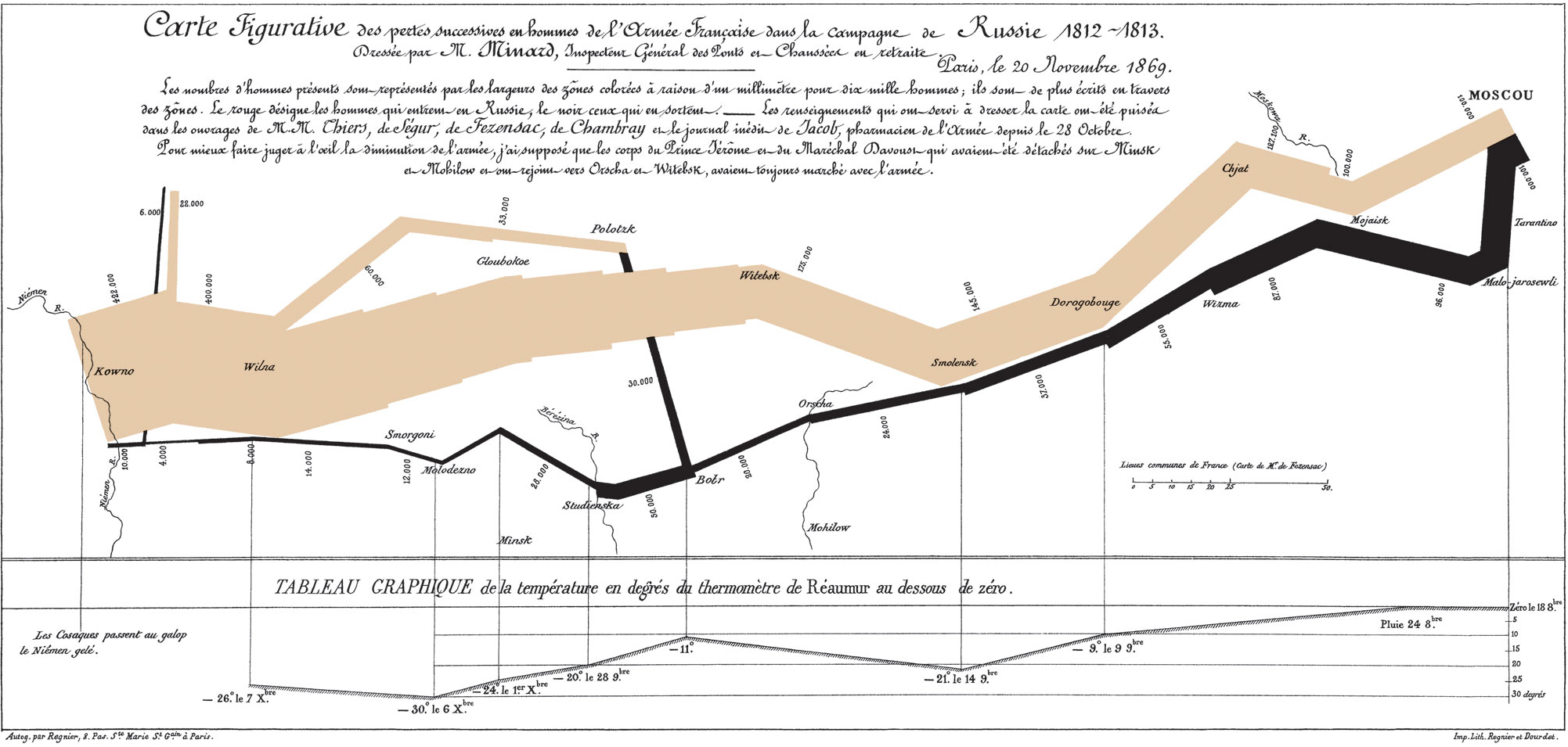
Charles Minard’s Map of Napoleon’s March (1869)

  • Widely considered one of the best statistical graphics ever created
  • Shows six variables simultaneously:
    • Army size
    • Location & direction
    • Temperature
    • Distance & time

Tip

Takeaway: Visualization is a powerful medium for dense, high-impact storytelling.
Charles Minard's Map of Napoleon's March

Charles Minard’s Map of Napoleon’s March

The Power of Visualization: Exploration

NYT: “How Y’all, Youse and You Guys Talk” (2013)

  • Modern, interactive visualization
  • Built with web technologies (like D3.js!)
  • Allows personal exploration of dialect data
  • Engages users through personalized results

Try it yourself: NYT Dialect Quiz

Tip

Takeaway: Visualization can be a dynamic interface for personal data exploration.
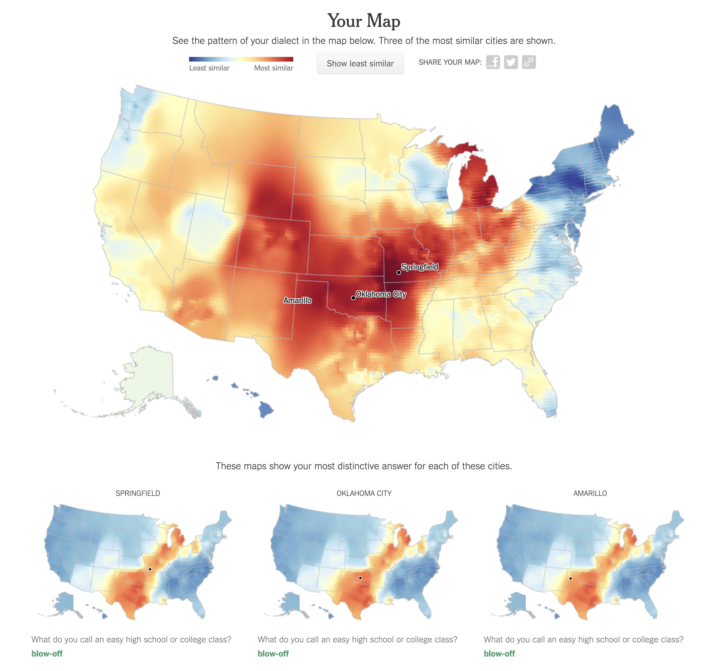
New York Times Dialect Map

NYT Dialect Map

Key Concepts

  • Computer-Based
  • Visual Representation
  • Abstract Data
  • Interactive
  • Amplify Cognition

Abstract Data

Data with no obvious/natural visual representation
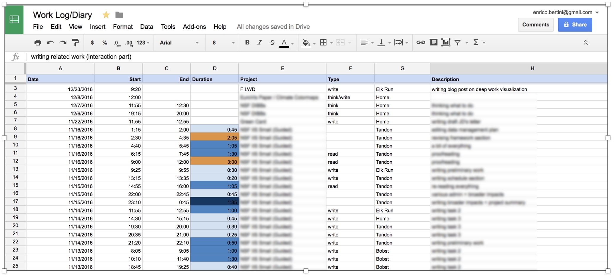
Abstract Data

Data with no obvious/natural visual representation
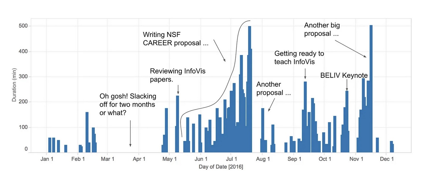
Interactive

Users can change what is visualized and how it is visualized.

Amplify Cognition

  • Solve problems with data with less effort, in a shorter time, and more accurately.
  • … or even be able to do things it would be impossible to do without a computer and a graphical representation.

Cognitive artifacts: tools that help us think!

  • Try to multiply 34 x 72 using exclusively your mind …
  • … now do it again using pen and paper.
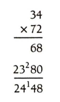
Why is it easier?

  • … because we can store intermediary results in the paper rather than keeping the information in mind. That is, part of the memory is in the world rather than in your head.

Let’s play the “game of 15” …

  • The “pieces” for the game are the nine digits: 1, 2, 3, 4, 5, 6, 7, 8, 9. Each player takes a digit in turn. Once a digit is taken, it cannot be used by the other player. The first player to get three digits that sum to 15 wins.
  • Here is a sample game: Player A takes 8. Player B takes 2. Then A takes 4, and B takes 3. A takes 5.
  • Question 1: Suppose you are now to step in and play for B. What move would you make?

Let’s play a different game: tic-tac-toe

Players alternately place an O or a X in one of nine spaces arranged in a rectangular array. Once a space has been taken, it cannot be changed by either player. The first player to get three symbols in a straight line wins. Suppose player A is X and B is O, and the game has reached the state on the right.

Question 2: Suppose you are now to step in and play an O for B. What move would you make?
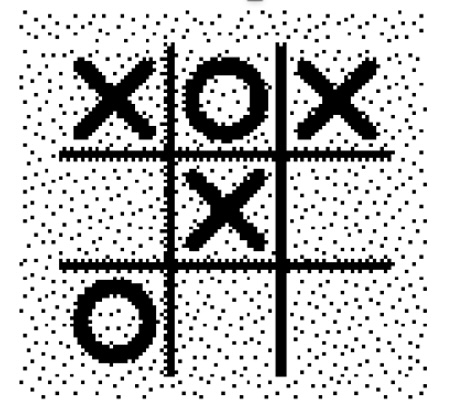
Problem Isomorphs Herbert Simon

  • The two problems are equivalent!

Why use visualization?

  • Explanatory visualization
  • Exploratory visualization
  • Confirmatory visualization

Great Explanatory Visualizations

  • NYT: https://flowingdata.com/tag/new-york-times/
  • Washington Post: http://postgraphics.tumblr.com/
  • Gregor Aisch: https://driven-by-data.net/
  • Nicky Case/Explorable Explanations: http://explorabl.es/
  • Polygraph: http://polygraph.cool/ & https://pudding.cool/
  • ProPublica: https://www.propublica.org/

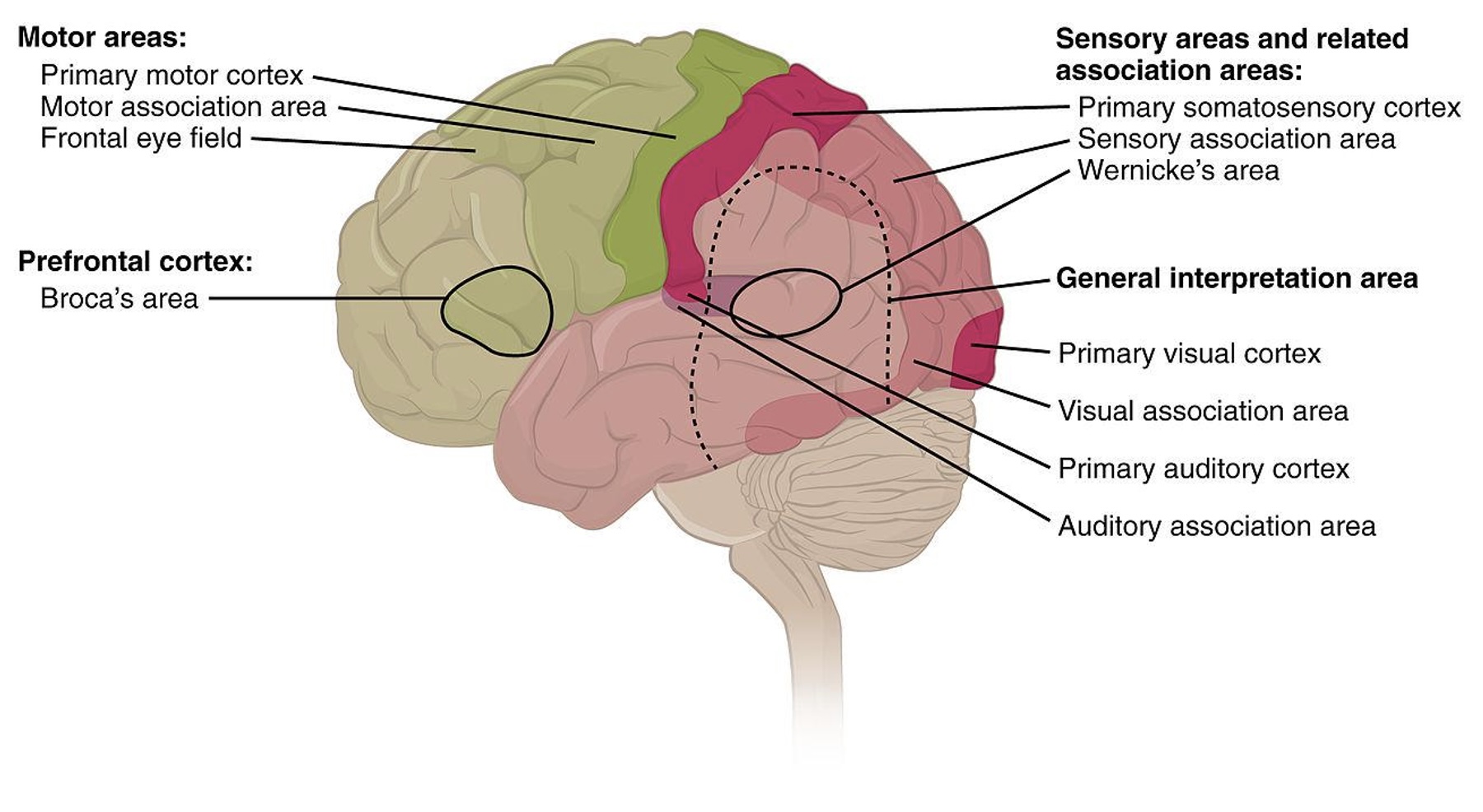
Why use a graphical representation?

  • Large parts of our brain are devoted to spatial processing
Why use interaction?

  • Each visualization can only answer a subset of questions.
  • With interaction the user can change what is visualized and how to answer a multitude of questions.
  • Also one cannot visualize everything at once.

How do you assess the quality of a visualization?

  • Isn’t it subjective? Some people like A, whereas some others like B.
  • Some visual representations are better than others at solving particular problems …

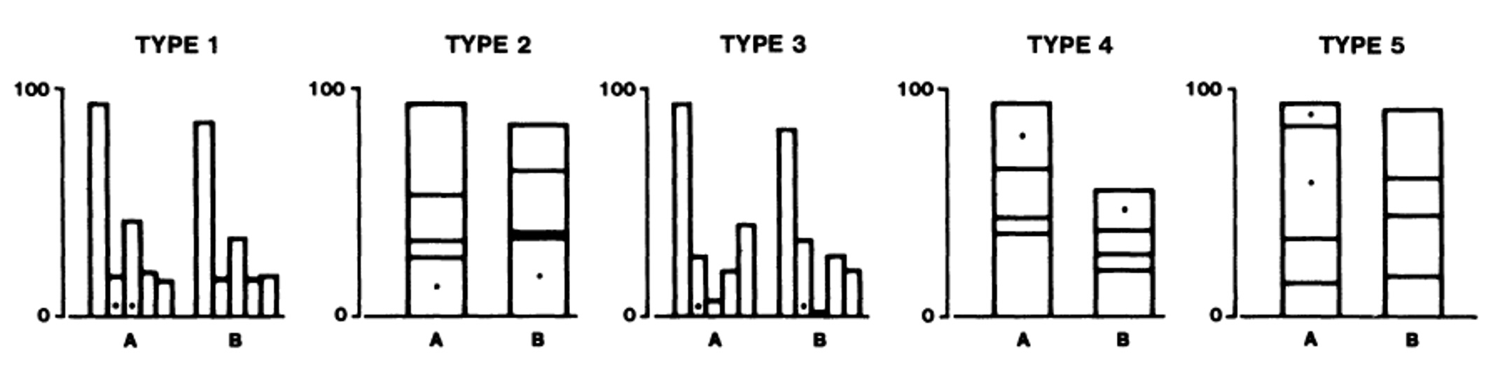
Digression: Graphical Perception

Graphical Perception Experiment
Graphical Perception Results
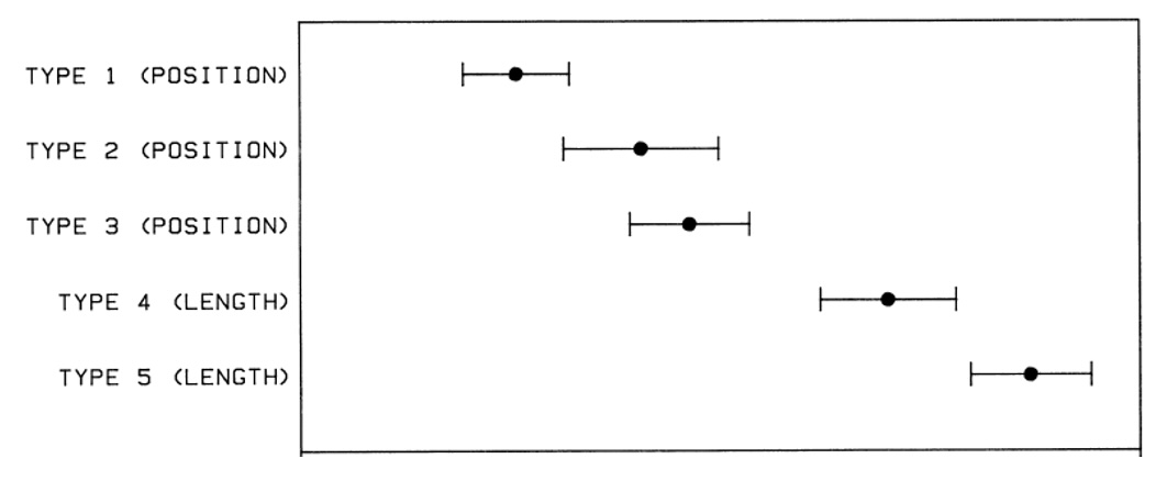
Designing effective visualizations requires

  • Knowing the design space
  • Being able to compare the solutions
  • … in turn comparing the solutions requires understanding human perception.

Data Types

  • The first ingredient in effective visualization is the input data. Data values can represent different forms of measurement.
  • What kinds of comparisons do those measurements support?
  • What kinds of visual encodings then support those comparisons?

Nominal (N) or Categorical (C)

  • Nominal data — also called categorical data — consist of category names.
  • With nominal data we can compare the equality of values: is value A the same or different than value B? (A = B), supporting statements like “A is equal to B” or “A is not equal to B”.
  • When visualizing nominal data we should readily perceive if values are the same or different: position, color hue (blue, red, green, etc.), and shape are all reasonable options.

Ordinal (O)

  • Ordinal data consist of values that have a specific ordering.
  • With ordinal data we can compare the rank-ordering of values: does value A come before or after value B? (A < B), supporting statements like “A is less than B” or “A is greater than B”.
  • When visualizing ordinal data, we should perceive a sense of rank-order. Position, size, or color value (brightness) might be appropriate, whereas color hue (which is not perceptually ordered) would be less appropriate.

Quantitative (Q)

  • With quantitative data we can measure numerical differences among values.
  • There are multiple sub-types of quantitative data:
    • For interval data we can measure the distance between points: (A - B).
    • For ratio data we can also measure proportions or scale factors: (A / B).
  • Quantitative values can be visualized using position, size, or color value, among other channels. An axis with a zero baseline is essential for proportional comparisons of ratio values, but can be safely omitted for interval comparisons.

Temporal (T)

  • Temporal values measure time points or intervals. This type is a special case of quantitative values (timestamps) with rich semantics and conventions (i.e., the Gregorian calendar).
  • Example temporal values include date strings such as “2019-01-04” and “Jan 04 2019”, as well as standardized date-times such as the ISO date-time format: “2019-01-04T17:50:35.643Z”.

Spatial (S)

  • Data that can be shown in a map
  • Also known as geospatial data, refers to information that identifies the geographic location and characteristics of natural or constructed features and boundaries on the Earth.

Data Types Summary

  • These data types are not mutually exclusive, but rather form a hierarchy: ordinal data support nominal (equality) comparisons, while quantitative data support ordinal (rank-order) comparisons.
  • Moreover, these data types do not provide a fixed categorization. For example, just because a data field is represented using a number doesn’t mean we have to treat it as a quantitative type! We might interpret a set of ages (10 years old, 20 years old, etc.) as nominal (underage or overage), ordinal (grouped by year), or quantitative (calculate average age).

Next: Lab Session

Transition to Lab

  • The TA will now lead the lab session
  • We’ll cover Observable setup and Vega-Lite basics
  • Time for hands-on practice with support

See you next week!

  • Complete Exercise 1 (due Sept 11)
  • Join the Discord channel
  • Check Brightspace for materials