# Introduction Based on materials by Enrico Bertini enrico.bertini@nyu.edu NYU Tandon School of Engineering ::: notes **LECTURE TIMING GUIDANCE (150 min total)** This is a PACKED lecture with lots of content. Suggested timing: **Core Material (90-100 min):** MUST COVER - Intro + Temporal Data Fundamentals (15 min): Types, structures, aggregation - Line Charts + Aspect Ratio + Banking to 45° (20 min): Cleveland's research - Multiple Lines + Spaghetti Plots + Solutions (15 min): Critical problem - Small Multiples transition to Interaction (20 min): Zoom, brushing & linking - Area Charts + Baseline Bias (10 min): Another critical limitation - Event Data + Gantt Charts (10 min): Practical techniques **Important but Optional (30-40 min):** COVER IF TIME PERMITS - Heat Maps + WSJ Vaccine Example (15 min): Famous example, worth showing - Calendar Visualizations (10 min): Students will use these - Radial Layout Warnings (5 min): Important cautionary note **Advanced/Optional (20-30 min):** READING ASSIGNMENT IF SHORT ON TIME - Spiral Plots (5 min) - Horizon Charts (15 min): Complex technique, needs slow walkthrough - Sparklines (5 min) - Alternative Encodings (5 min) **Strategy if running short:** 1. Skip Spiral Plots entirely 2. Show Horizon Charts as "further reading" 3. Make sure to cover Banking to 45°, Spaghetti Plots, Baseline Bias (core perceptual issues) ::: --- ## What is Temporal Data? **Definition**: Data in which values depend on time and time is explicitly recorded. In other words: we track **when** things happened or **what values were** at specific points in time ::: notes - This is a fundamental concept - time is not just an attribute, it's THE organizing dimension - **START WITH THIS QUESTION**: "What datasets have you used or seen that have time in them?" - Get 3-4 student examples on the board - For each example, ask: "How is time recorded? What's the granularity?" - Emphasize that temporal data requires explicit time recording - not just "ordered" data - Common misconception: Students often think any sequential data is temporal (e.g., ranking lists) - Key distinction: Temporal data has meaningful time stamps/intervals, not just ordering ::: --- ## Example: Temporal Dataset Structure 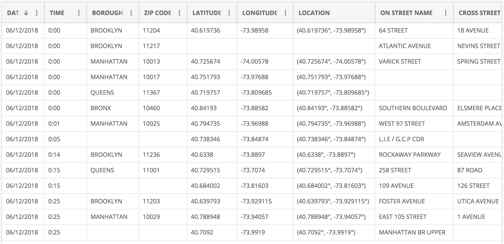 **Why is this temporal data?** - **DAT** and **TIME** columns explicitly record when events occurred - Each row represents an **incident/event** at a specific location and time - Can analyze patterns: when, where, and how frequently events happen ::: notes - This appears to be crime or incident data - good real-world example - **PHYSICALLY POINT** to the DAT and TIME columns on screen with mouse/pointer - "See these columns? This is what makes this temporal data - explicit timestamps" - Make sure image is zoomed/large enough for back row to see - Note the other attributes (location, type) that we might want to analyze over time - Questions to pose: "What patterns might we want to find? Daily patterns? Seasonal? Hot spots over time?" - Wait for answers - students might suggest: "crime by hour of day", "seasonal trends", "geographic patterns over time" - This is event data (discrete occurrences) rather than continuous measurements ::: --- ## Application Domains - Business - Natural Phenomena - Behaviors/Movement - Traffic/Mobility - Medical/Healthcare - Finance ::: notes - Temporal data is EVERYWHERE - this is one of the most common data types - Ask students to give specific examples for each domain: - Business: Sales trends, customer activity, website traffic - Natural Phenomena: Weather, earthquakes, climate change - Behaviors/Movement: GPS tracks, social media activity, eye tracking - Traffic/Mobility: Vehicle flow, public transit usage, flight patterns - Medical: Patient vitals, disease progression, treatment outcomes - Finance: Stock prices, trading volume, economic indicators - Emphasize: Different domains have different temporal characteristics (irregular vs regular sampling, event-based vs continuous) ::: --- ## Type 1: Event Data **Time + Object (Attributes)** "Something happened at time T" Examples: Tweet, Email, Alarm ::: notes - CRITICAL distinction: Event data represents discrete occurrences at points in time - Events often have irregular timing - they happen when they happen (not sampled at regular intervals) - Each event is an object with attributes (who, what, where, why) - Examples to emphasize: - Tweet: timestamp + user + text + location - Email: sent time + sender + recipient + subject - Alarm: trigger time + sensor + type + severity - Key visualization challenge: How do we show when events occurred and their attributes? - Often visualized as dots, marks, or bars on a timeline ::: --- ## Type 2: Measurement Data **Time + Measure(s)** "This is the value at time T" Examples: Temperature, revenue, stock value ::: notes - **EXPLICIT CONTRAST WITH TYPE 1**: "Remember Event Data? Tweet, Email, Alarm - something just *happened*. Measurement data is different - we're recording a *value* at each time point." - Measurement data: Continuous or regularly sampled values over time - Unlike events (which happen irregularly), measurements are typically taken at regular intervals - Each measurement records one or more quantitative values at a timestamp - **Side-by-side comparison to emphasize**: - Event: "Email sent at 3:42 PM" (binary - it happened) - Measurement: "Temperature was 72°F at 3:42 PM" (quantitative value) - Examples to discuss: - Temperature: Recorded every hour → time series of temperature values - Revenue: Daily sales figures → continuous tracking of performance - Stock value: Price sampled every second during trading hours - Key difference from events: We care about the VALUE at each time point, not just that something occurred - Primary visualization: Line charts, area charts - showing how values change over time - This is what most people think of as "time series data" ::: --- ## Temporal Information Components **Time = Position + Interval + Granularity** - **Position**: When did it occur? (specific timestamp) - **Interval**: For how long? (duration) - **Granularity**: At what scale? (seconds, hours, days, years) **Example**: A meeting starts at 2:00 PM (position), lasts 90 minutes (interval), measured in minutes (granularity) ::: notes - These three components help us fully characterize temporal data - **Position (When)**: The anchor point in time - can be absolute (Jan 1, 2025, 3:00 PM) or relative (3 hours ago) - **Interval (Duration)**: How long something lasted - critical for event data with duration (meetings, system outages, sessions) - Point events have duration ≈ 0 - Interval events have meaningful duration - **Granularity (Scale)**: The resolution at which we're measuring/recording time - Affects what patterns we can see (hourly data can't show minute-level patterns) - Choice of granularity is a design decision - finer = more detail but more data - Example: "Meeting from 2:00-3:30 PM" has position (2:00 PM), interval (90 min), granularity (minutes) - These components influence visualization choices ::: --- ## Time Structures Three key structures for temporal data: 1. **Sequential** - Linear progression over time 2. **Cyclic** - Repeating patterns (daily, weekly, seasonal) 3. **Hierarchical** - Nested time resolutions (year/month/day) **Key insight**: Most real temporal data has ALL THREE structures simultaneously! ::: notes - These are the three fundamental ways time can be structured in data - **Sequential**: Time flows in one direction - useful for showing trends, growth, changes - Example: Company revenue from 2015-2025 - **Cyclic**: Patterns repeat on a regular basis - reveals rhythms and regularities - Example: Traffic by hour of day, sales by day of week, temperature by season - Natural cycles: daily, weekly, monthly, yearly - **Hierarchical**: Multiple nested time scales - enables drill-down and multi-resolution analysis - Example: Years contain quarters contain months contain weeks contain days - **EMPHASIZE THIS POINT**: "Most real temporal data has ALL THREE structures simultaneously!" - Example: Website traffic has sequential trends (growing over years), cyclic patterns (weekday vs weekend), and hierarchical structure (hour/day/week/month) - You choose which structure to visualize based on your question - Visualization choice depends on which structure you want to emphasize ::: --- ## Sequential and Cyclic Patterns ::: {.columns} ::: {.column width="50%"} **Sequential** (Jan 1, … , Dec 31) ::: ::: {.column width="50%"} **Cyclic** (S, M, T, W, T, F, S) ::: ::: --- ## Hierarchical Time Resolutions **Multiple Resolutions** - Years - Months - Weeks - Days - Hours --- ## Linking Data Types to Time Structures ::: {.columns} ::: {.column width="50%"} **Event Data** Time + Object (Attributes) - Sequential: Transaction logs over years - Cyclic: User logins by day of week - Hierarchical: System alerts by hour/day/month ::: ::: {.column width="50%"} **Measurement Data** Time + Measure(s) - Sequential: Stock prices over time (line charts) - Cyclic: Temperature patterns by season - Hierarchical: Revenue by year/quarter/month ::: ::: **Key Insight**: Data type + time structure → visualization choice ::: notes - **NOW we can synthesize**: You've seen Event vs Measurement AND Sequential/Cyclic/Hierarchical - This slide connects the two fundamental concepts: data types AND time structures - Both event and measurement data can have sequential, cyclic, or hierarchical patterns - The combination determines the best visualization approach - Sequential structure → line charts, area charts (show progression) - Cyclic structure → radial layouts, calendars (emphasize repetition) - Hierarchical structure → multi-scale views, drill-down interactions - Ask students: "If you have daily website traffic, what structures might you see?" (Answer: Sequential trend over months, cyclic pattern by day of week, hierarchical hour/day/week) ::: --- ## Aggregation Trade-offs ::: {.columns} ::: {.column width="50%"} **Benefits of Aggregation** - Reduces noise - Shows overall trends - Manageable data size - Clearer patterns *Example*: Daily → Monthly averages reveals seasonal trends ::: ::: {.column width="50%"} **Risks of Aggregation** - Masks short-term events - Loses extreme values - Can hide critical peaks - **Simpson's Paradox** *Example*: A 1-hour server outage disappears in monthly view ::: ::: **Design principle**: Choose granularity based on the questions you need to answer **Warning**: This is Simpson's Paradox for temporal data - aggregation can completely reverse or hide patterns! ::: notes - **CRITICAL SLIDE** - This is Simpson's paradox for temporal data! - Aggregation is necessary (can't show raw data at finest granularity) BUT dangerous - Benefits are obvious - reduced noise, clearer trends, manageable visualization - But risks are severe - can completely hide important events - **Real example to share**: Netflix outage for 1 hour affects millions, but disappears in daily/weekly aggregates - **Another example**: Daily COVID cases show spikes, but monthly averages smooth them out - which matters for policy? - The "right" aggregation depends on your analytical question: - Looking for long-term trends? → Aggregate more - Looking for anomalies/outliers? → Aggregate less - Best practice: Provide interactive controls to change aggregation level - Mention multi-resolution techniques (coming later): horizon charts, overview+detail ::: --- ## Example: Sales Over Time - Sequential View Sequential: "How did our sales change over the years?" 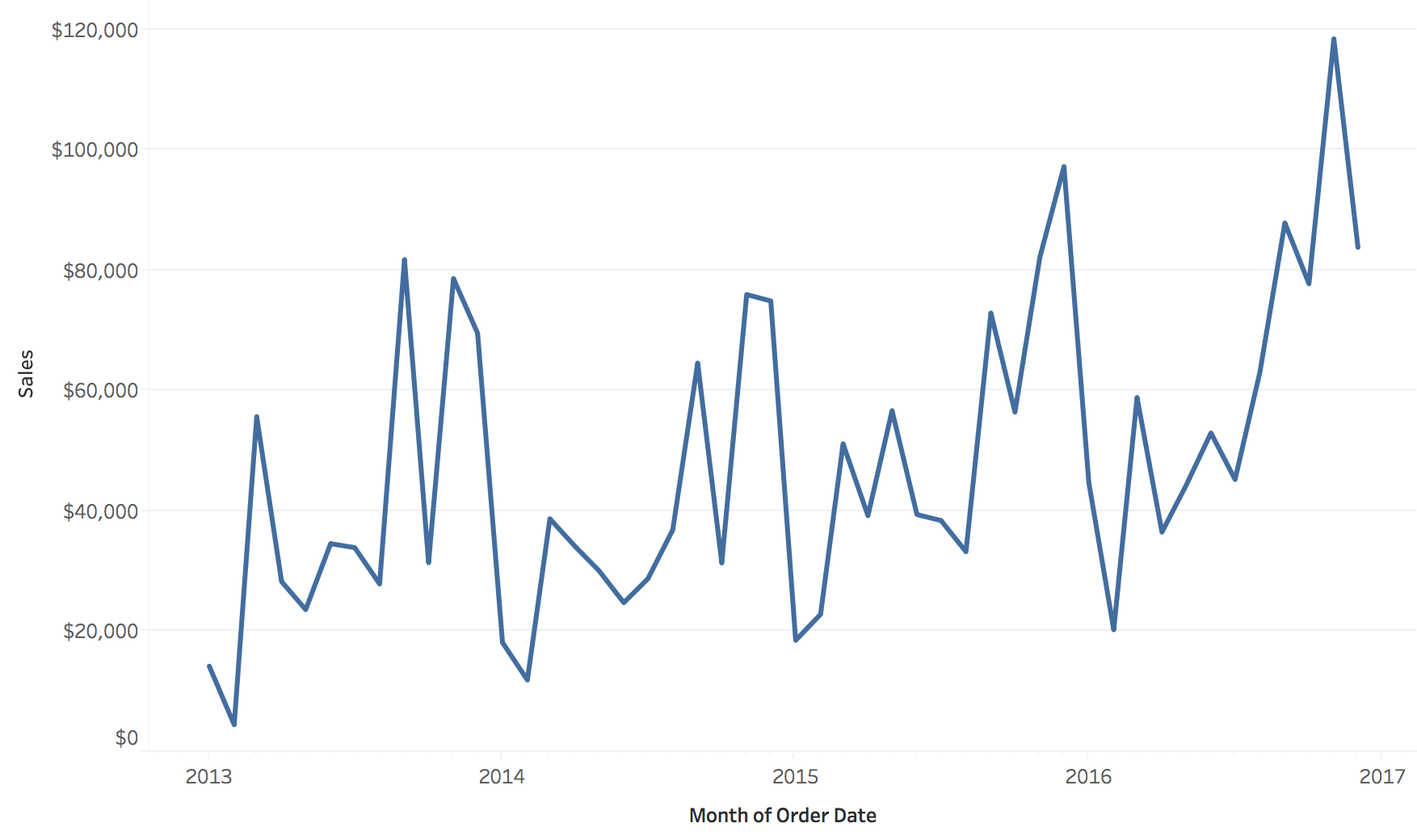 --- ## Example: Sales Over Time - Cyclic View "How does the number of orders change by day of the week?" 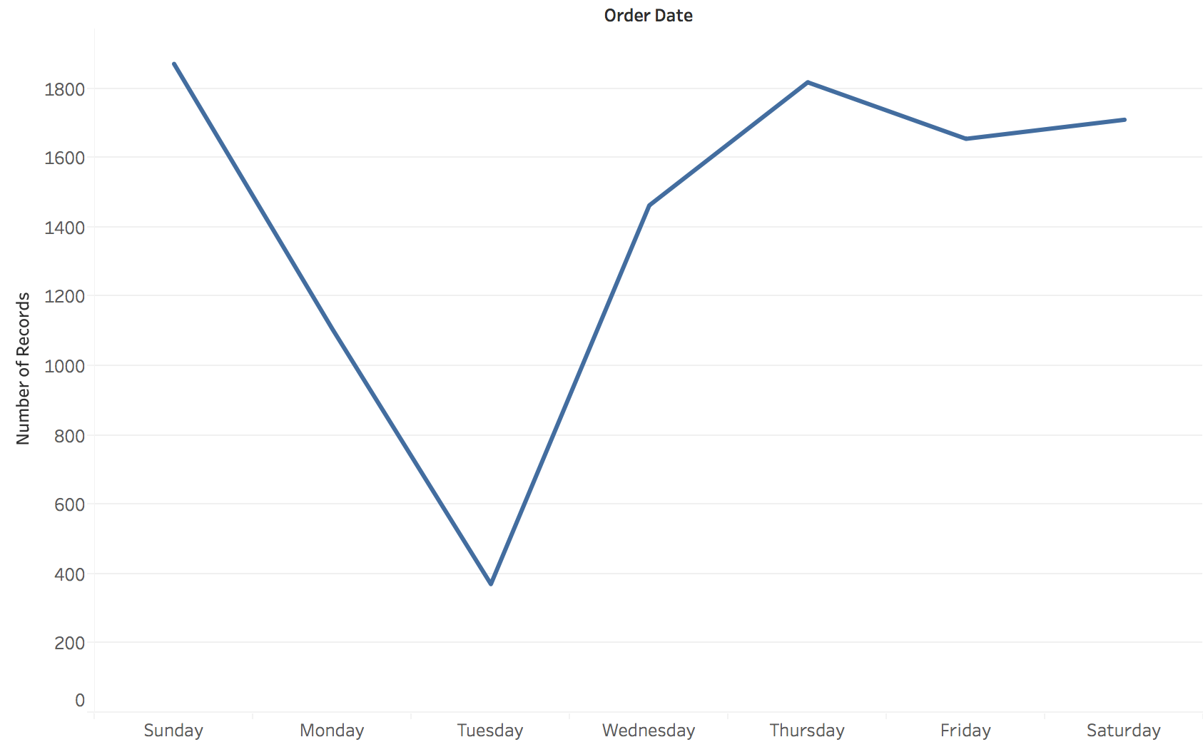 --- ## Hierarchical Structure and Resolution Combining multiple time resolutions in one view --- ## Time Resolution: Sequential Views Different temporal granularities reveal different patterns in sequential data 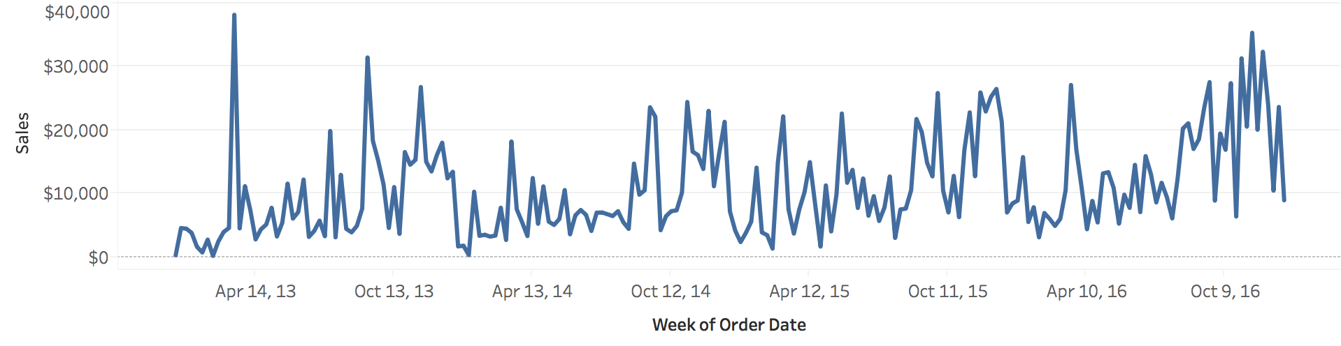 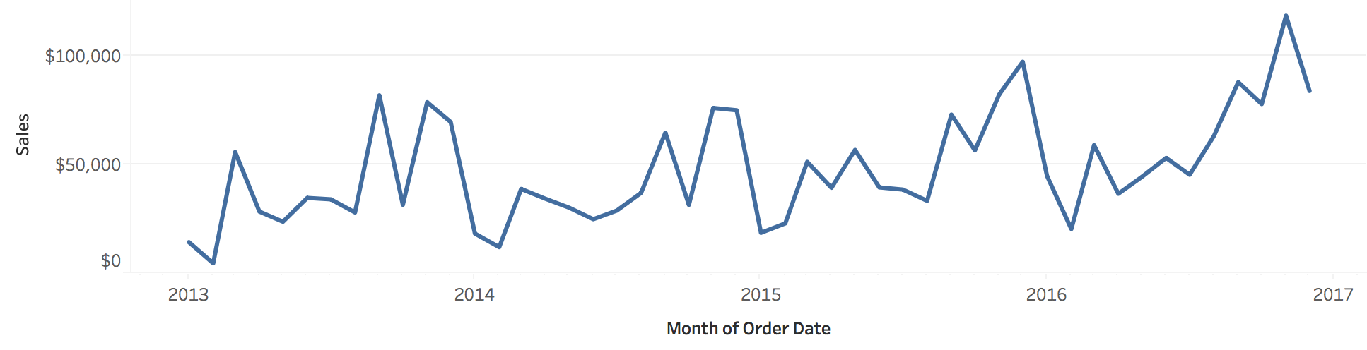 --- ## Time Resolution: Cyclic Views Choosing the right resolution (hourly, daily, weekly) affects what patterns emerge 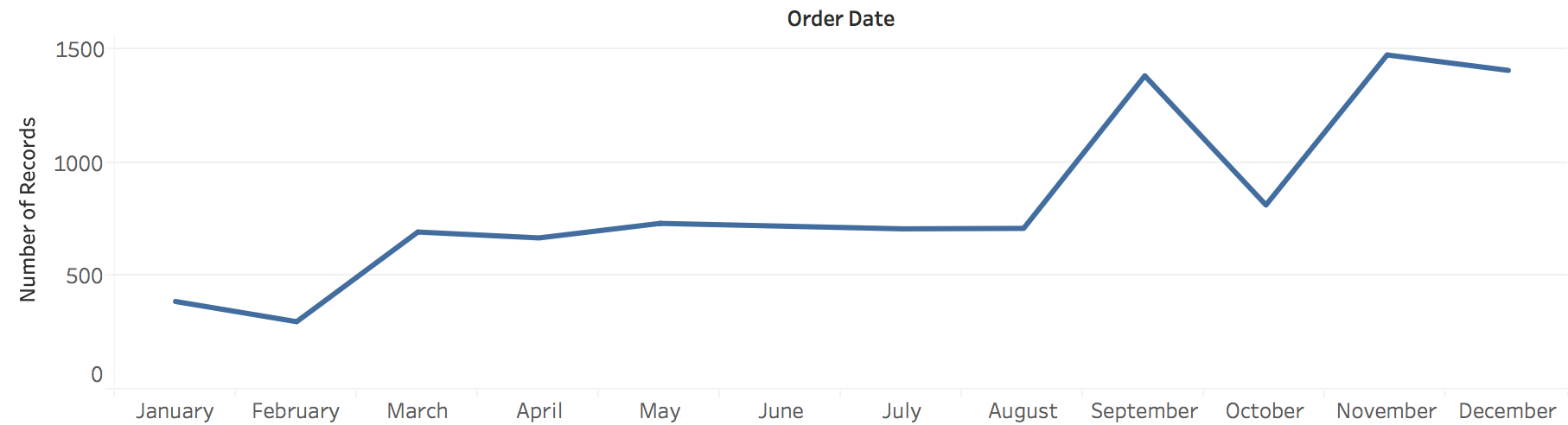 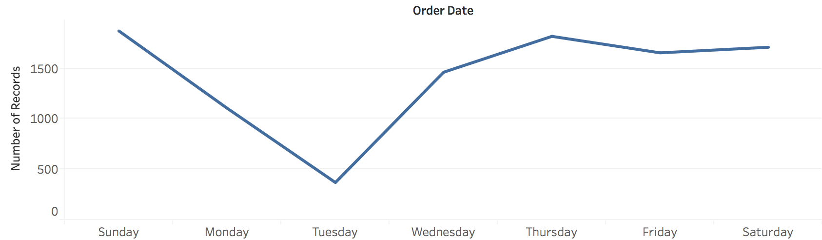 --- ## Example: Nesting Cyclic (Day) within Sequential (Year) Each row = one year, columns = days of week, showing how daily patterns evolve annually 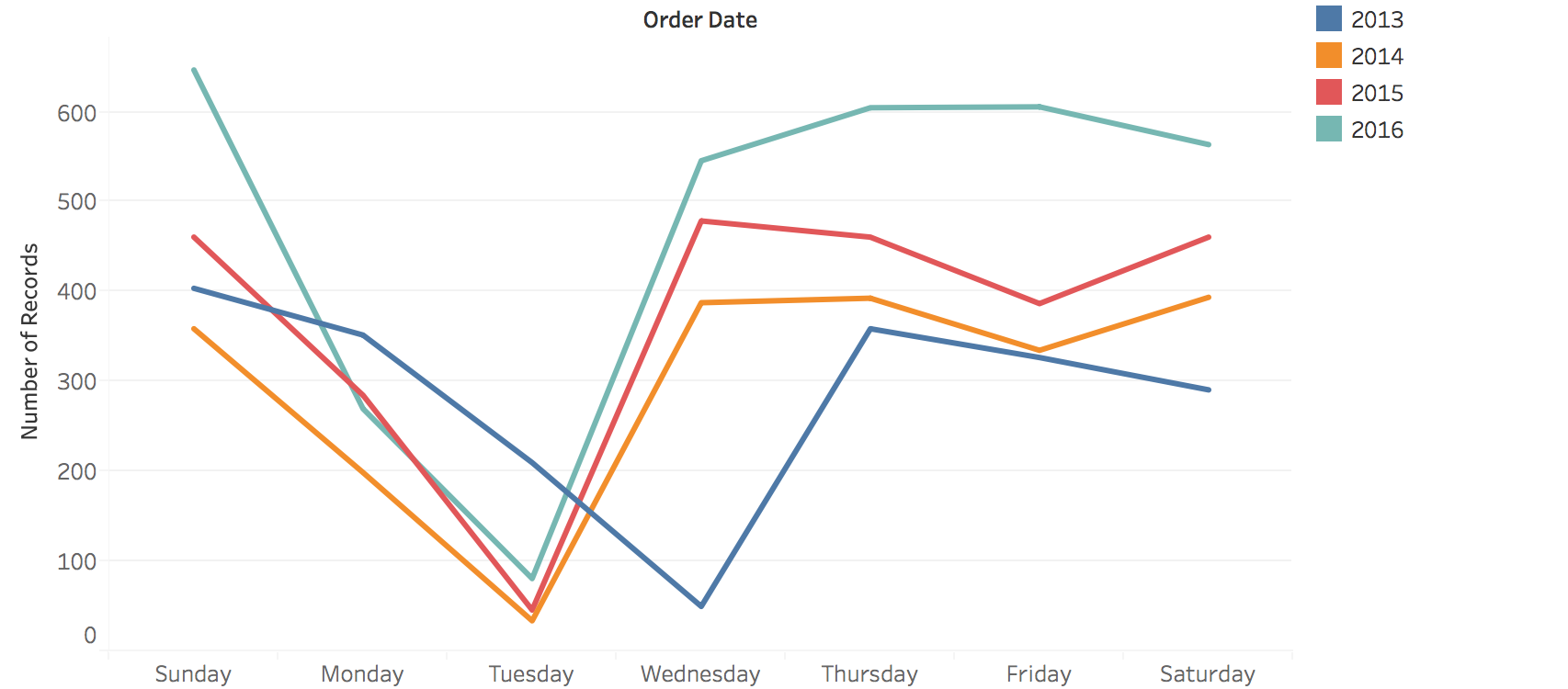 --- ## Example: Nested Time Patterns (Quarterly) Days within weeks within quarters - revealing both micro and macro patterns 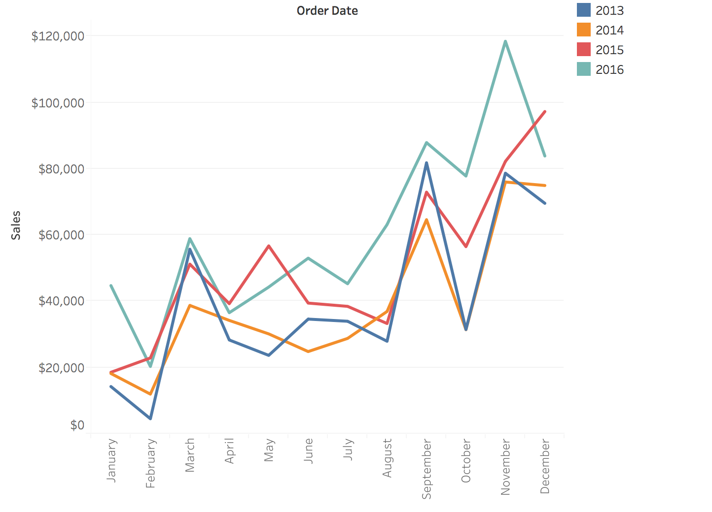 --- # Visualization Methods Line charts, area charts, and their variations --- ## Line Charts: Time + Quantity The fundamental temporal visualization: position encodes both time (x) and values (y) 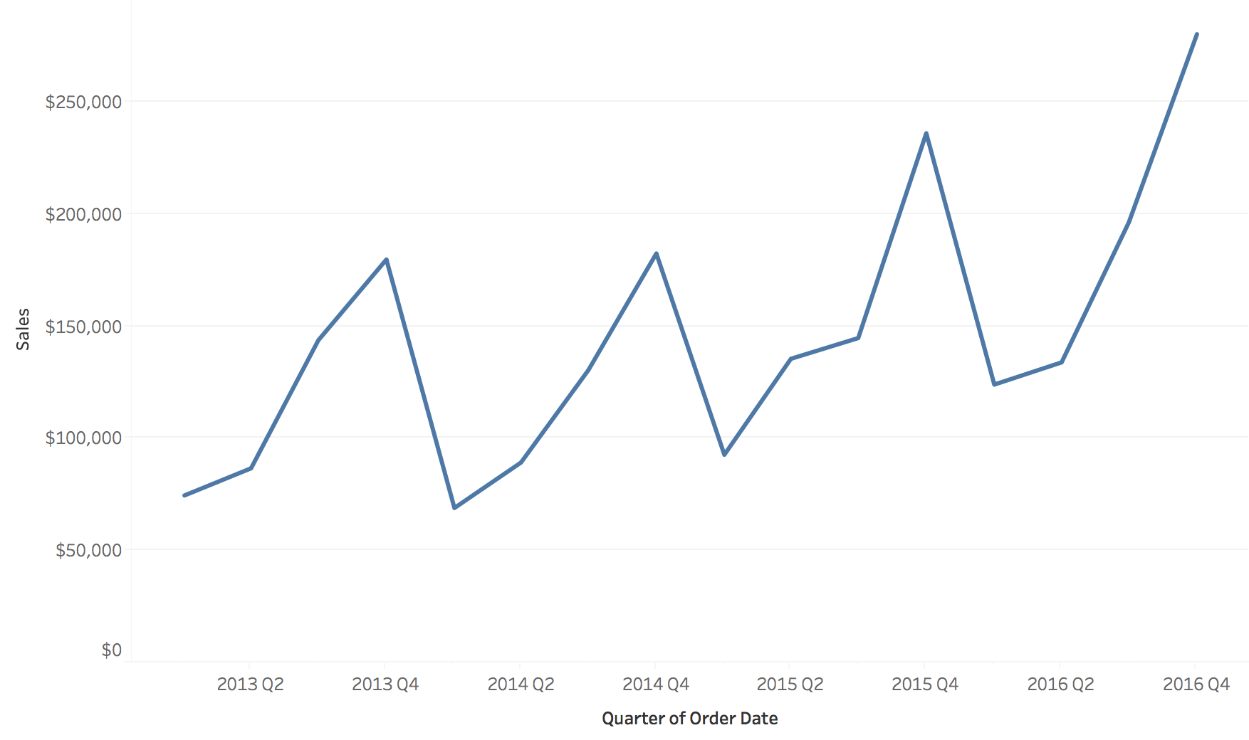 # Aspect Ratio How chart dimensions affect perception **Definition**: Aspect Ratio = Width / Height --- ## Impact on Trend Visibility Different ratios make trends more or less visible 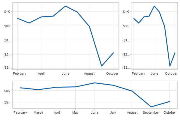 --- ## Perceptual Principle: Slope Judgment **Key finding**: Humans judge slopes most accurately at 45° - Too shallow (<< 45°): Hard to distinguish small differences - Too steep (>> 45°): Also difficult to compare - **Optimal: ~45°** - Maximum perceptual sensitivity This principle guides aspect ratio selection ::: notes - **Fundamental perceptual principle** from Cleveland & McGill's research - Our visual system is optimized for judging slopes near 45 degrees - Demo: Show how very flat lines (<10°) make it hard to see if trend is up or down - Demo: Show how very steep lines (>80°) also make comparison difficult - This isn't arbitrary - it's based on empirical perceptual experiments - Practical implication: Don't just use default aspect ratios from your plotting library! - The aspect ratio is a design parameter that affects what viewers perceive - Ask: "Which stock would you invest in based on this chart?" - then show same data with different aspect ratio revealing different impression ::: --- ## Banking to 45° **Method**: Set aspect ratio so that the average slope is 45° Ensures trends are perceptually salient and comparable :::footer Cleveland, W. S., McGill, M. E., & McGill, R. (1988). [*The shape parameter of a two-variable graph*](https://doi.org/10.1080/01621459.1988.10478613). JASA. ::: --- ## Example: Banking to 45° Comparison Same data, different aspect ratios - which reveals patterns best? 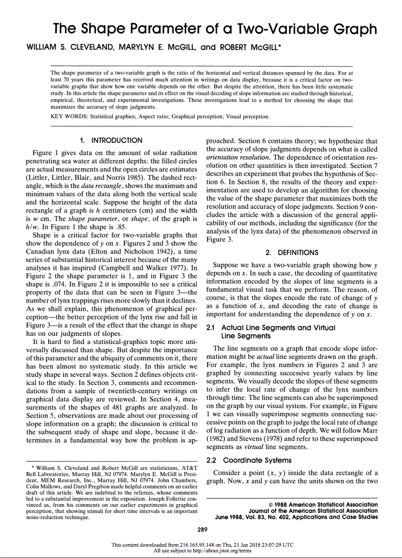 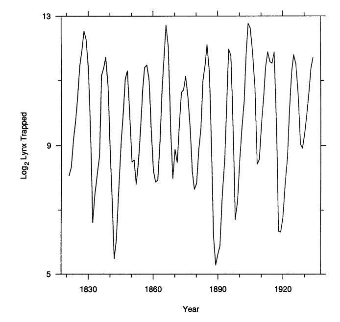 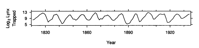 --- ## Best Practice **Rule of thumb**: Always test different aspect ratios to see which one best conveys your message --- --- ## Multiple Line Charts: Adding Categories Encoding categorical data with color/line style to compare multiple time series 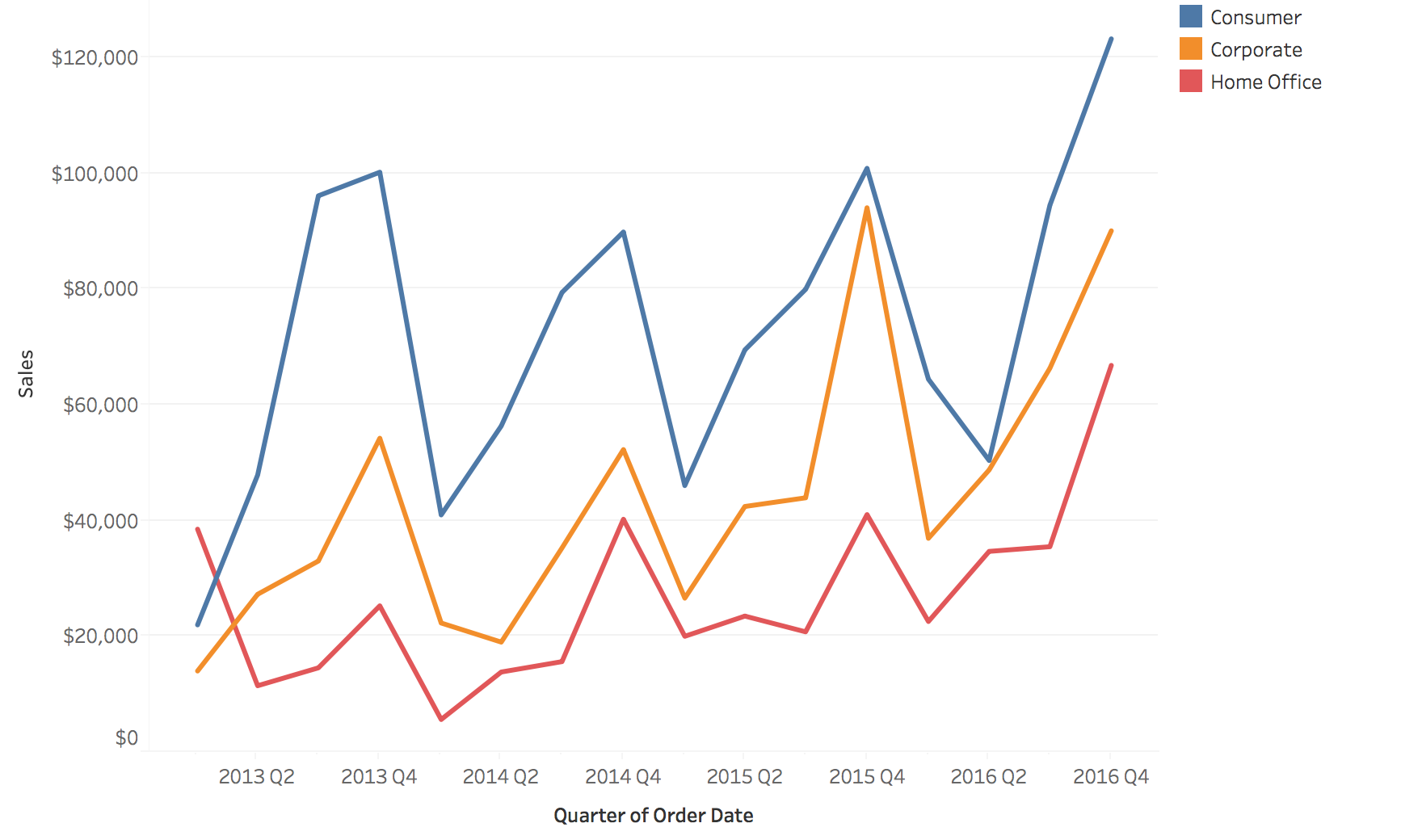 --- ## The "Spaghetti Plot" Problem It does not scale! 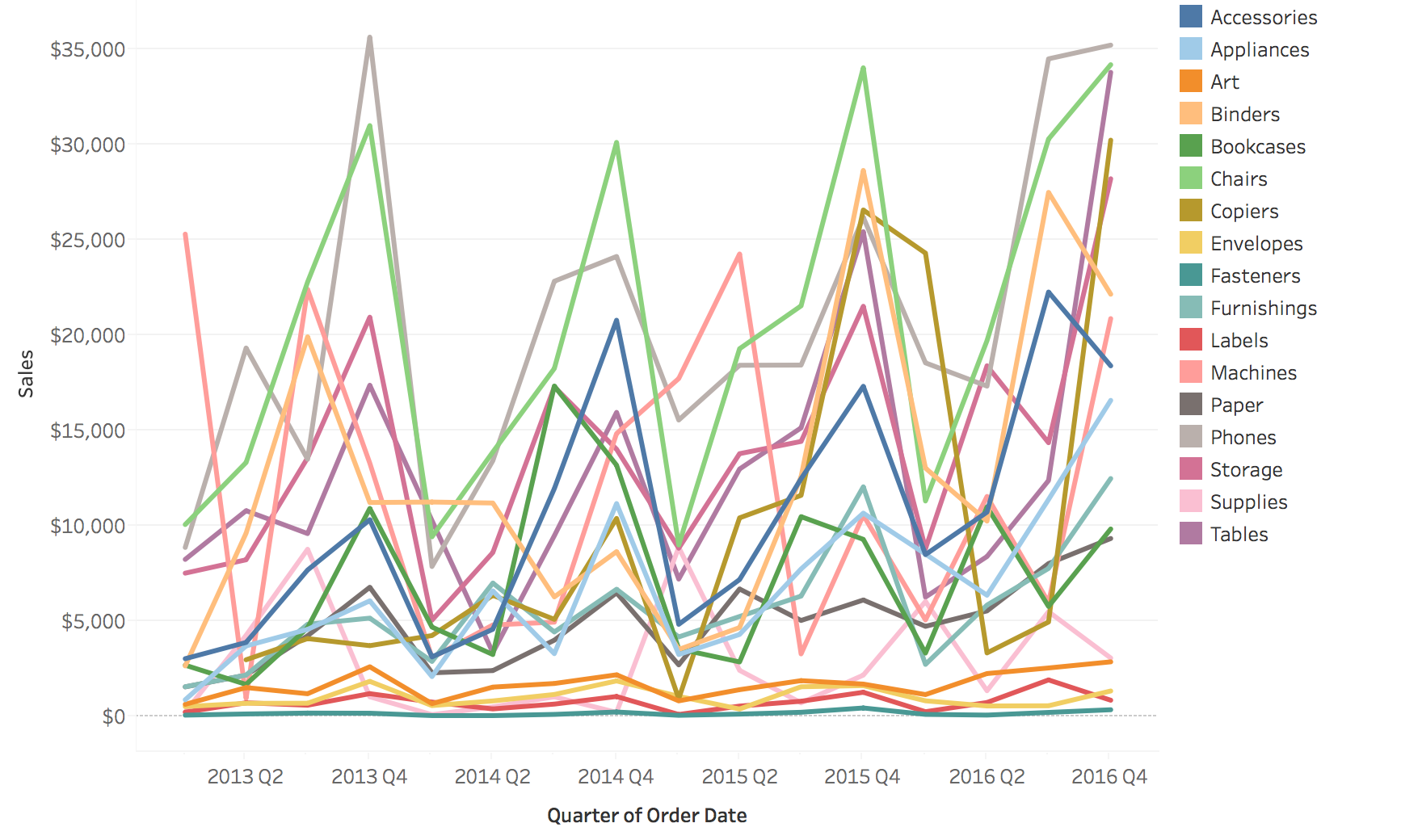 ::: notes - Classic problem in temporal visualization - too many lines creates visual chaos - With 50+ lines, you can't distinguish individual series - Lines occlude each other - can't see what's underneath - Colors become indistinguishable - limited palette - Called "spaghetti plot" because it looks like tangled pasta! - Ask students: "Have you seen plots like this? What questions CAN you answer? What can't you answer?" - Can answer: Overall envelope, outliers, general trend - Cannot answer: Specific values for individual series, comparisons between specific pairs - This motivates the solutions on next slides: grouping, filtering, highlighting, small multiples - Real-world example: Stock market with hundreds of stocks - spaghetti plot is useless ::: --- ## Solutions for Multiple Lines Possible Solutions ... 1. Grouping 2. Filtering/Focus 3. Highlighting --- ## Comparison: Grouping, Filtering, Highlighting ::: {.columns} ::: {.column width="50%"} **Original** 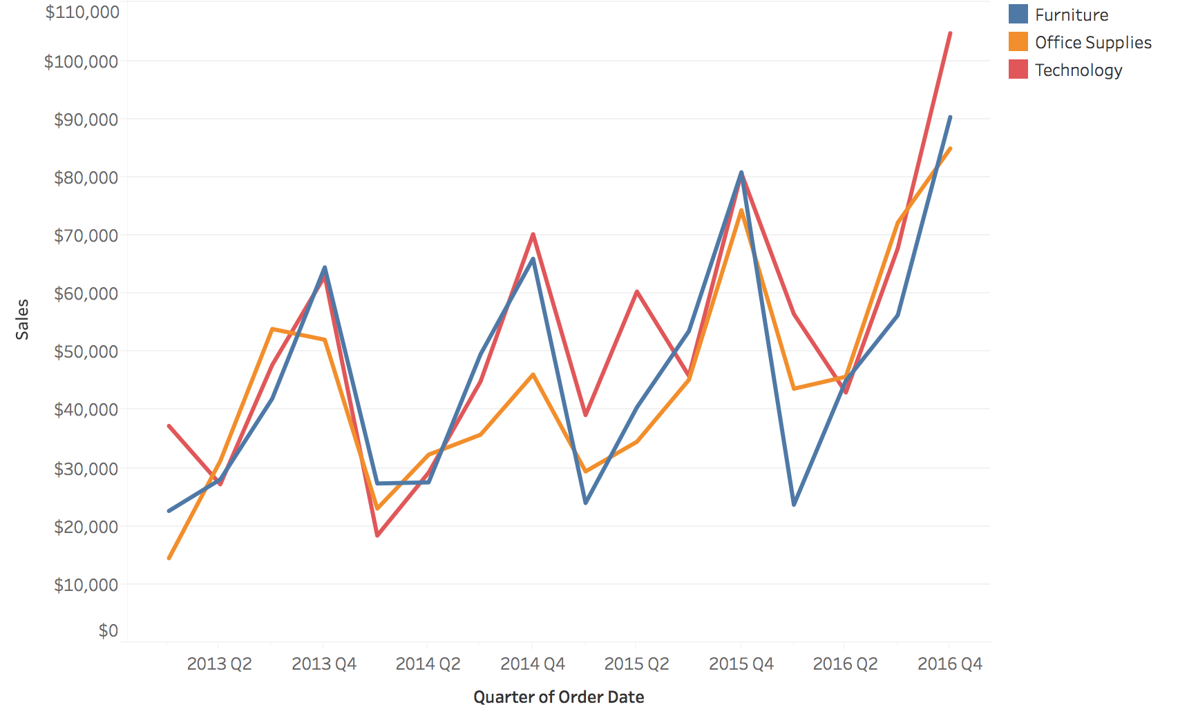 **Filtering** 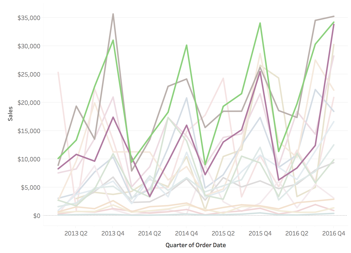 ::: ::: {.column width="50%"} **Grouping** 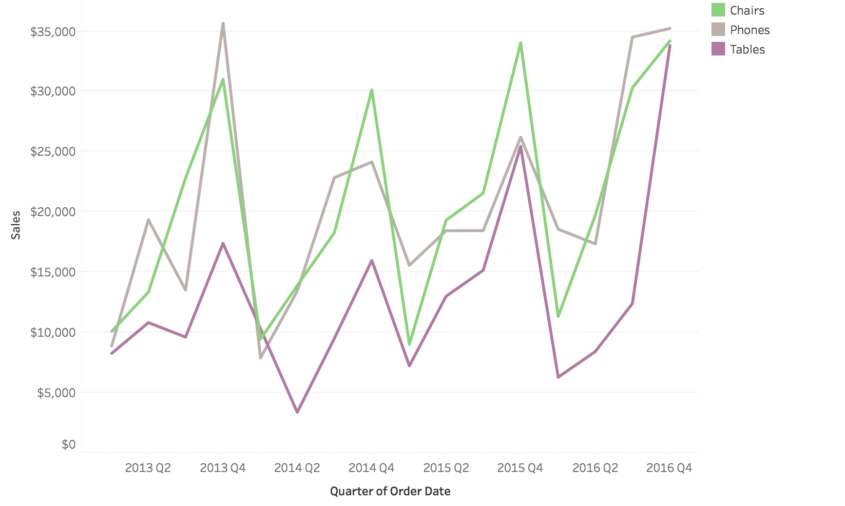 **Highlighting** 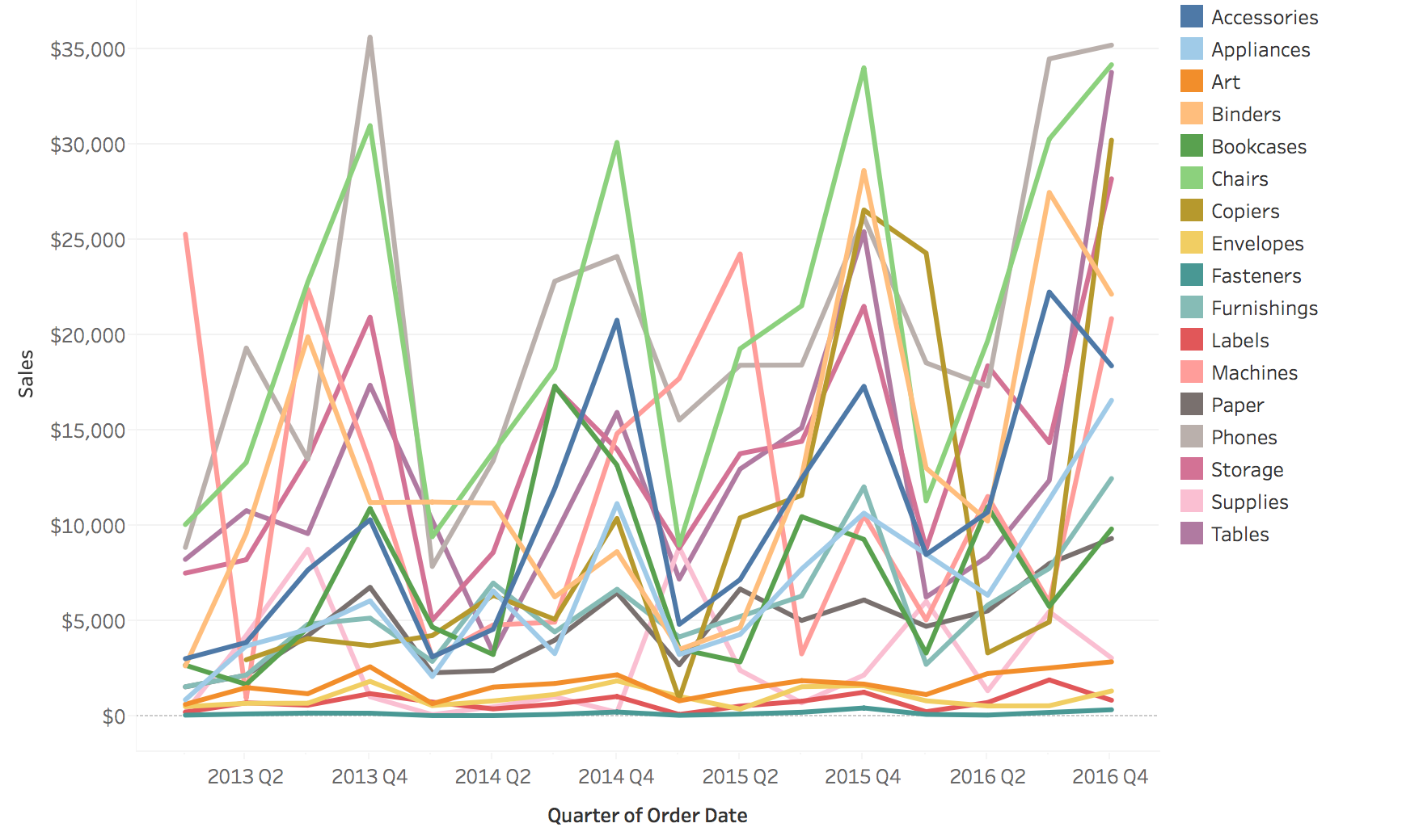 ::: ::: --- ## Small Multiples Small Multiple Line Charts and Area Charts ::: notes - Small multiples = static solution to spaghetti plots - But note: Filtering and Highlighting are often INTERACTIVE techniques - This leads us to the next major topic: Interaction - **Transition**: "We've seen static solutions - but in practice, filtering and highlighting are interactive. Let's talk about interaction techniques for temporal data..." ::: --- ## Example: Small Multiple Line Charts Separate panels for each series - easier to see individual patterns 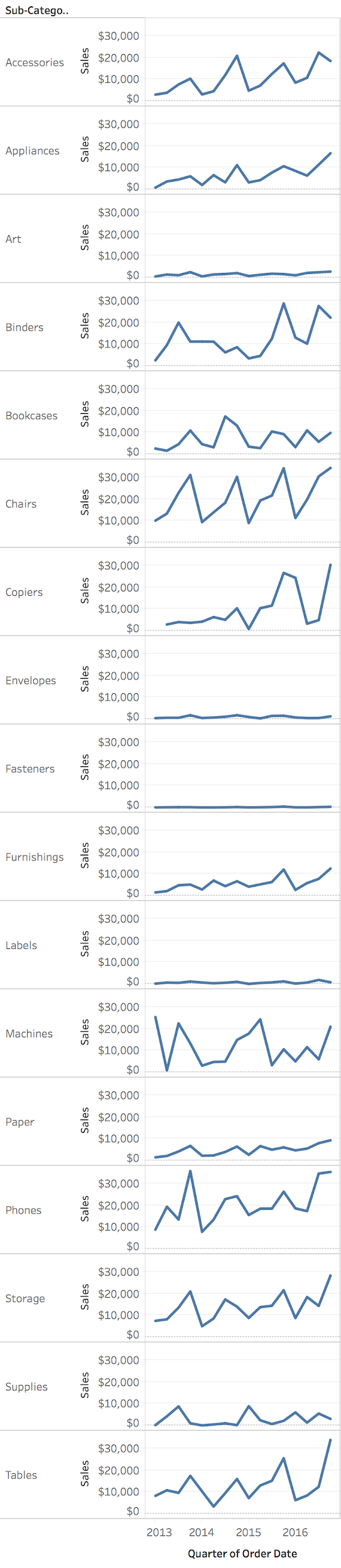 --- ## Example: Small Multiple Area Charts Area encoding helps emphasize magnitude while maintaining separate views 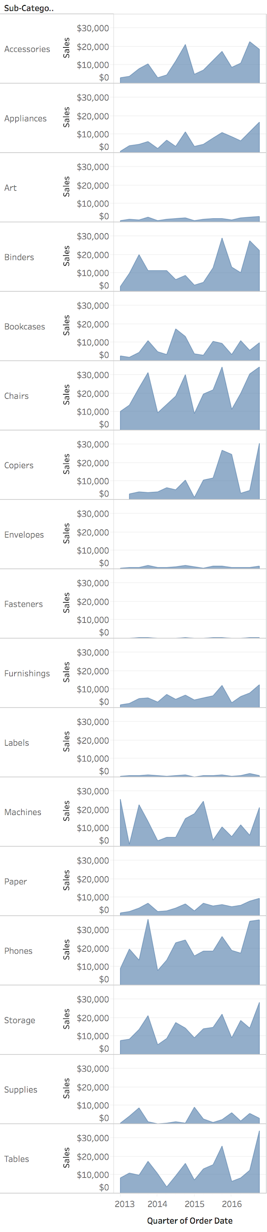 --- ## Area Charts for Proportions Useful to depict proportion changes over time 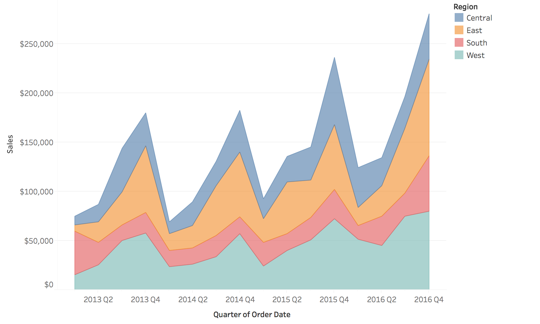 --- ## Stacked Area Charts: Limitations **"Baseline Bias"** - only the baseline layer is easy to read accurately Problem: Temporal trends for upper layers are hard to interpret because they don't share a common baseline 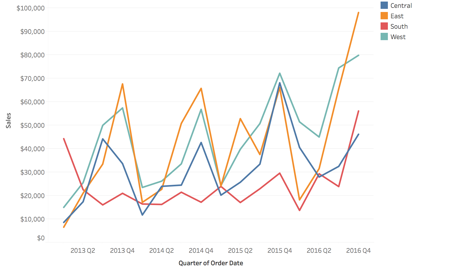 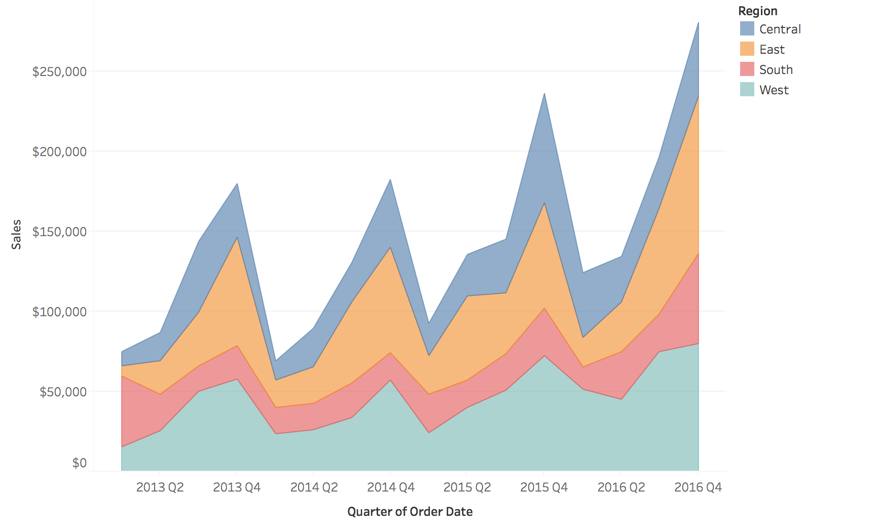 ::: notes - **IMPORTANT PERCEPTUAL LIMITATION** - students often misuse stacked area charts - The bottom layer (touching x-axis) is easy to read - it has a stable baseline - But upper layers "float" on changing baselines - very hard to judge their values or trends - **INTERACTIVE DEMO**: Point to an upper layer (e.g., green category) and ask: - "Did this category increase or decrease between these two time points?" - "Can anyone tell me the actual value for this category in Q3?" - Students will struggle - this proves the baseline bias! - Then show: Only the bottom layer can be read accurately - The total height is easy to read, but individual layer trends are ambiguous - Example: If bottom layer increases sharply, upper layers appear to go up even if their actual values are flat - When to use: When you care about total AND composition, and bottom layer is most important - When NOT to use: When you need to compare trends across all categories - Better alternatives: Small multiples (separate charts), normalized stacked (next slide), or just don't stack - Real example: COVID dashboards with stacked areas - very misleading for comparing different variants ::: --- ## Normalized Stacked Area Charts 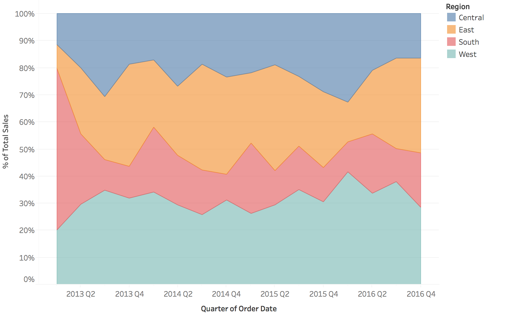 --- # Interaction Techniques Critical for exploring temporal data --- ## Why Interaction Matters for Temporal Data **Challenge**: Time series data is often too large or complex to understand in a single static view **Solution**: Interactive techniques allow users to: - Navigate through time (zoom, pan) - Focus on specific patterns or events - Link multiple views for comparison - Dynamically adjust aggregation levels --- ## Zoom and Pan **Purpose**: Navigate dense sequential time series ::: {.columns} ::: {.column width="50%"} **Semantic Zoom** - Change level of detail - Hourly → Daily → Monthly - Preserve context ::: ::: {.column width="50%"} **Geometric Zoom** - Magnify visual space - See more detail - Focus + context techniques ::: ::: **Example**: Stock chart with overview + detail panes ::: notes - Two fundamentally different types of zoom - students often confuse these! - **LINK BACK**: "Remember our Aggregation Trade-offs slide? Semantic zoom is interactive aggregation!" - **Semantic Zoom** = change aggregation level (connect back to earlier aggregation slide) - Zoom out: Hourly → Daily (aggregate 24 hours into 1 point) - Zoom in: Daily → Hourly (show finer resolution) - Data actually changes - different level of detail - **This lets you explore different aggregation levels interactively** rather than committing to one upfront - Example: Google Maps showing cities vs streets vs buildings - **Geometric Zoom** = magnify the view (like a magnifying glass) - Same data points, just bigger - Doesn't change aggregation, just visual scale - Example: Zoom into a region of a line chart to see fluctuations better - Best practice: Combine both - overview + detail where overview provides context - Example to show: Stock charts with small overview at bottom + zoomed detail above - Interaction: Brushing in overview selects region shown in detail ::: --- ## Filtering and Brushing **Filtering**: Show/hide data based on criteria - Time range selection - Category filtering (e.g., show only certain products) - Threshold filtering (e.g., values > X) **Brushing**: Select data in one view, highlight in others - **Temporal brushing**: Select time range, see corresponding events - **Linked views**: Brush on map → highlight in timeline --- ## Brushing & Linking Example ::: {.columns} ::: {.column width="50%"} **View 1**: Geographic map User brushes (selects) a region ::: ::: {.column width="50%"} **View 2**: Time series Corresponding temporal data highlights automatically ::: ::: **Power**: Discover spatio-temporal patterns (e.g., "Sales peak in Region A during Q4") ::: notes - **LIVE DEMO OPPORTUNITY**: If you have a prepared D3 example, Tableau dashboard, or Observable notebook, SHOW THIS LIVE - Static images can't convey the interactivity - Seeing the linking happen in real-time is 100x more impactful - Even a simple example (brush a time range, see map update) will make this memorable - If no live demo available: At minimum, verbally walk through the interaction - "Imagine I click and drag on the map to select this region..." - "...instantly, the time series highlights just those data points" - "Now I can see: this region has a spike every December" - This is the payoff of brushing & linking - cross-view pattern discovery ::: --- ## Dynamic Aggregation **Interactive granularity control** Users adjust time resolution on-the-fly: - Slider: "Show me data aggregated by: Hour / Day / Week / Month" - Drill-down: Click on a month → see daily breakdown - Roll-up: Aggregate noisy hourly data to daily averages **Advanced**: Time-series bagging, dynamic binning for very long series --- ## Time Warping and Distortion **Fisheye/distortion**: - Focus region shows detail - Context regions compressed - Maintains overview while examining specifics **Time-warping**: - Align periodic patterns despite phase shifts - Dynamic time warping (DTW) for comparing similar patterns - Useful for comparing multiple time series with lag --- ## Best Practices for Interaction Design 1. **Provide overview first**: Show full temporal extent 2. **Progressive disclosure**: Start simple, reveal detail on demand 3. **Maintain context**: Always show where you are in time 4. **Link multiple views**: Connect temporal, spatial, and categorical views 5. **Smooth transitions**: Animate changes to maintain mental model 6. **Direct manipulation**: Let users interact with the visualization itself --- # Event Data Visualization Visualizing discrete events and durations --- ## Types of Event Data **Timestamp + Event Properties** - Incidents - Activity Logs - Messages (Emails, Chats, etc.) --- ## Example: Dot Plot for Events Each dot = one event, position = time, rows = categories 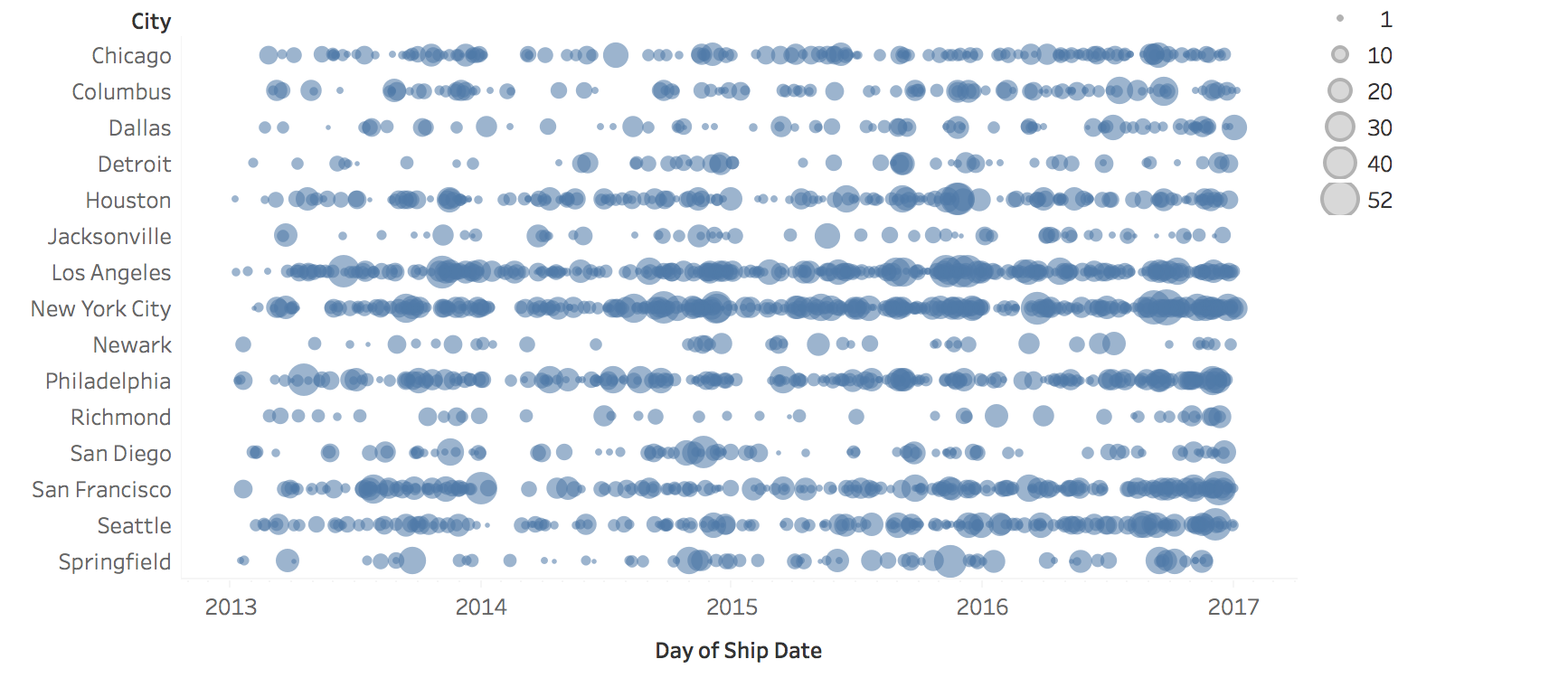 --- ## Example: Proportional Symbols Symbol size encodes additional attributes (e.g., event magnitude or importance) 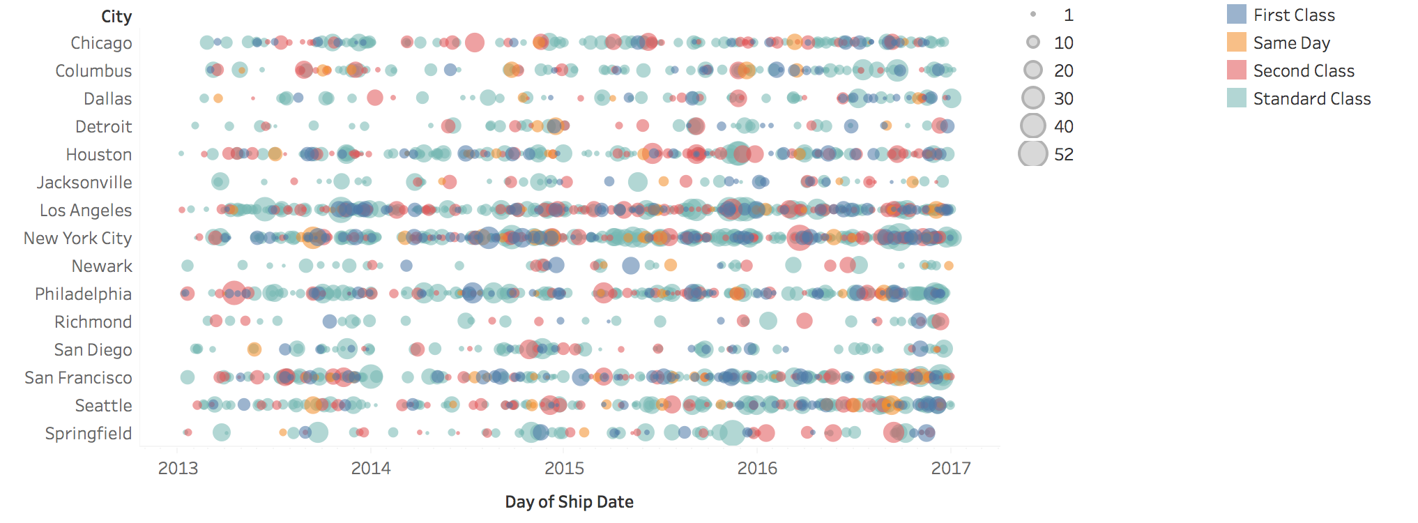 --- ## Events with Duration How do you visualize events that have duration? --- ## Gantt Charts Horizontal bars show event start, duration, and end times  ::: notes - **CONNECT BACK TO EVENT DATA**: "Remember our Event Data definition? Events with duration? Gantt charts are THE classic visualization for this." - **Origin story**: Named after Henry Gantt (1910s) - originally invented for project management - Shows tasks, dependencies, timelines - Still dominates project management software (MS Project, Asana, Jira, etc.) - **Modern applications** have expanded far beyond projects: - Server/system activity monitoring (next slides) - Resource allocation (people, machines, rooms) - Manufacturing schedules - Any scenario with concurrent activities over time - Key visual features: - Time on x-axis - Tasks/resources on y-axis - Bars show start, duration, end - Can show dependencies with arrows ::: --- ## Example: Gantt Chart Project management: showing task dependencies and overlaps  --- ## Example: System Activity Monitoring Tape drives and servers: visualizing concurrent processes and resource usage  --- # Alternative Visualizations Heat maps and real-world examples --- ## Heat Maps for Temporal Data **Matrix representation**: Time units as rows/columns, color encodes values **Think of it as**: A table where one axis is time, the other is categories, and color shows the value **Benefits**: Compact, shows patterns across multiple dimensions  ::: notes - **Explicit mapping**: Heat map = fancy table - Rows: Time units (hours, days, weeks, months) - Columns: Categories (states, products, sensors) - Cell color: The value at that time/category combination - This is a 2D visualization of 3D data (time × category × value) - Students often confuse heat maps with other color-based visualizations - Key advantage: Can see patterns across BOTH dimensions simultaneously - Temporal patterns (when are values high?) - Categorical patterns (which categories have high values?) - Interactions (does Category A peak at different times than Category B?) ::: --- ## Example: WSJ Vaccine Impact Visualization 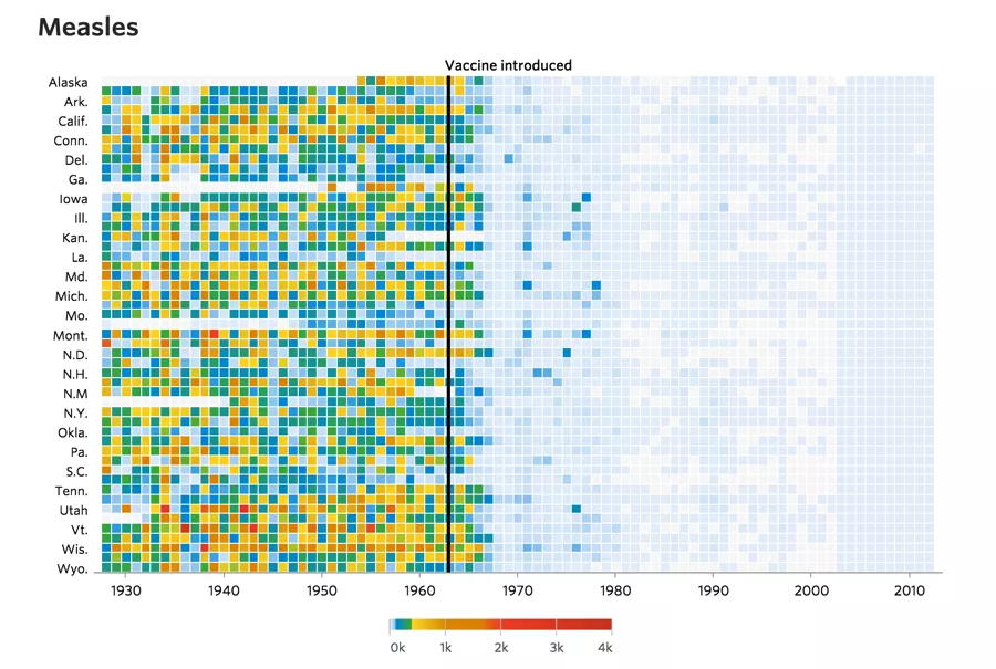 :::footer Wall Street Journal (2015). [*Battling Infectious Diseases in the 20th Century: The Impact of Vaccines*](http://graphics.wsj.com/infectious-diseases-and-vaccines/) ::: ::: notes - **FAMOUS EXAMPLE** - one of the most impactful data visualizations of 2015 - Shows measles cases by state (rows) over decades (columns) - Color: disease incidence rate (darker = more cases) - **The dramatic pattern**: Clear vertical line when vaccine was introduced - cases drop to nearly zero - Powerfully communicates vaccine effectiveness without words - Design choices worth noting: - Sorted states by total cases (puts high-burden states at top) - Color scale emphasizes the contrast (before/after) - Vertical line marks vaccine introduction - Impact: Widely shared during vaccine debates, changed minds - Ask: "What does this visualization communicate that a line chart couldn't?" - Answer: Spatial patterns (which states), temporal patterns (when), and magnitude (how many) simultaneously - This is heat maps at their best - revealing multidimensional patterns at a glance ::: --- ## Detail View Zooming in reveals granular patterns in measles cases by state over decades 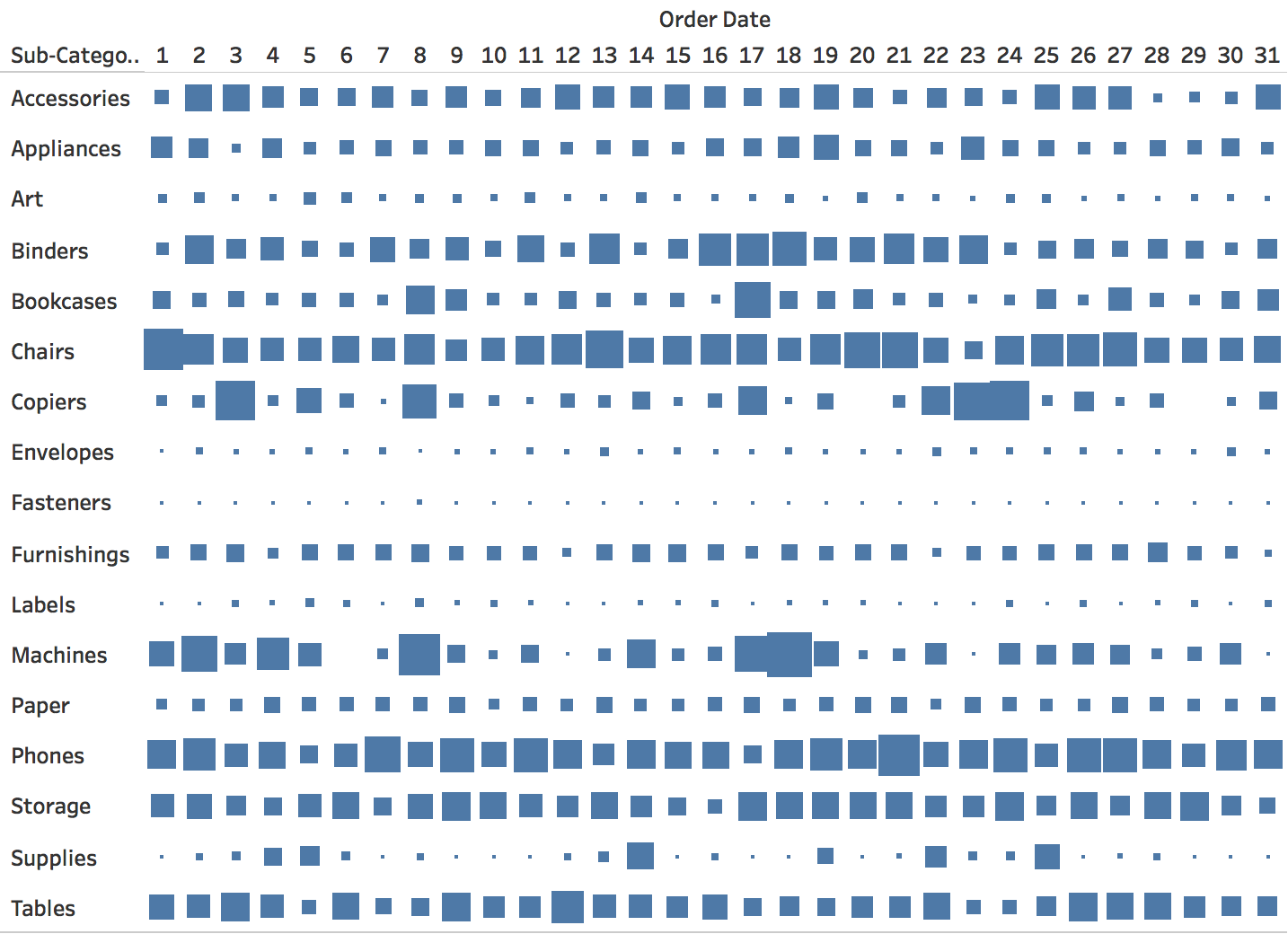 --- ## Example: FT European Football Visualization Goals scored over careers - heat map shows performance patterns across age/seasons 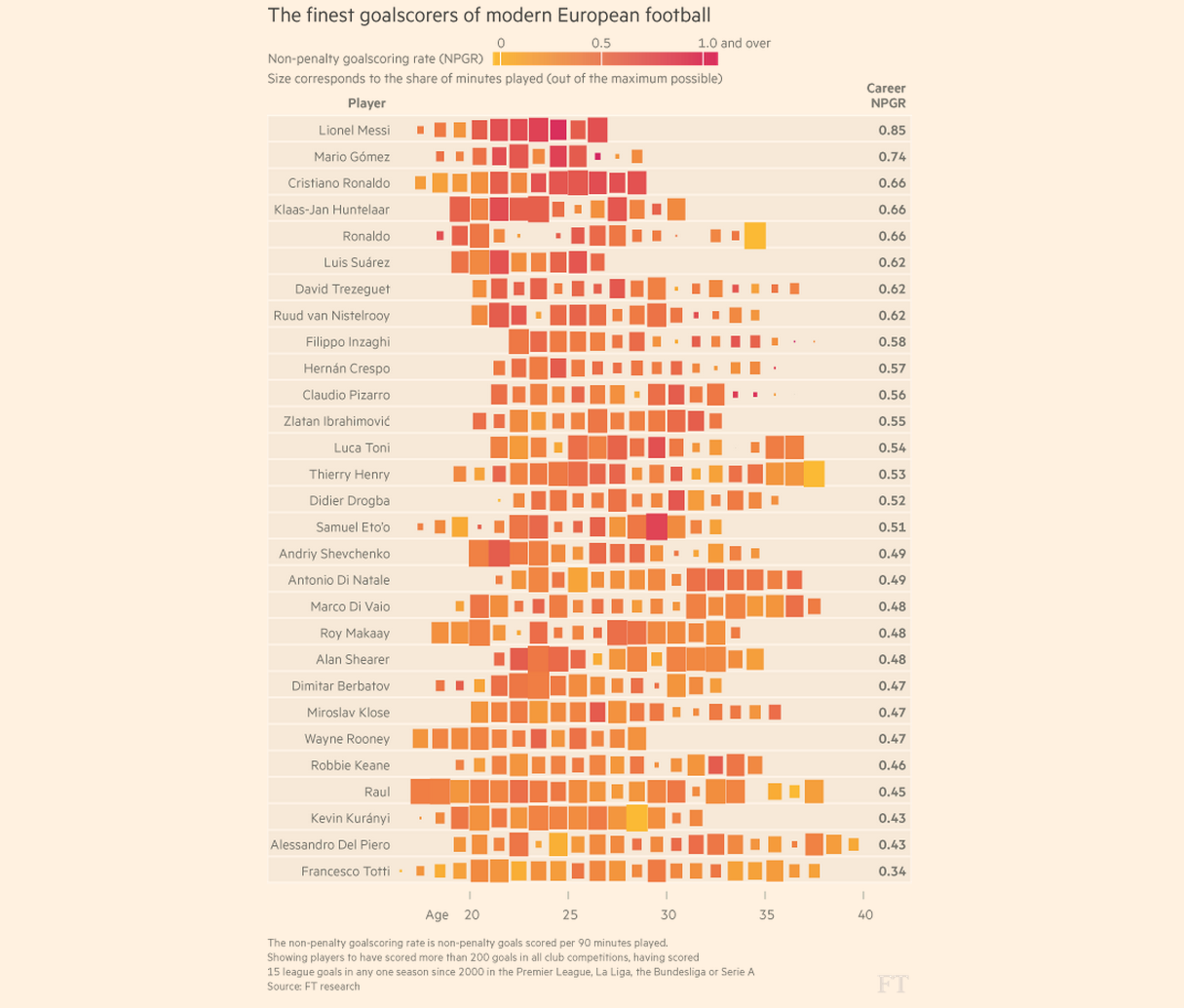 **How to read this visualization:** - **X-axis**: Player's age - **Y-axis**: Individual players (one row per player) - **Length**: Career duration - **Color**: Goal-scoring rate (darker = more goals) Dense but information-rich: shows career trajectories and productivity over time --- # Periodic Patterns Calendars, radial layouts, and spirals ::: notes **OPTIONAL SECTION** - If running short on time, you can skip spirals and cover calendars quickly (10 min) - Calendars are most practical for students - Radial layout warnings are important (5 min) - Spirals are interesting but not essential ::: --- ## Understanding Periodicity Often the focus is on investigating and presenting periodical patterns: - Yearly, seasonal, monthly - Weekly, daily, hourly --- ## Alternative Approaches Beyond line charts: What are other solutions for periodic data? 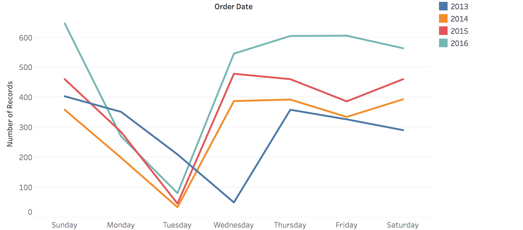 --- ## Calendar-Based Visualizations **Key difference from heat maps**: Time is laid out by day-of-week and month structure - **Heat maps**: Linear/vertical time progression - **Calendar views**: Explicit cyclic layout (7-day weeks, 12 months) - Better for revealing weekly/seasonal patterns  ::: notes - Calendar views leverage our familiarity with calendar structure - Key insight: Days of the week align vertically - easy to spot weekly patterns - Example: Website traffic calendar - weekend days align vertically, immediately see weekend dip - Difference from heat maps: - Heat maps: continuous time, arbitrary row breaks - Calendars: structured by weeks/months, meaningful breaks - When to use calendars: - Data with strong weekly patterns (work/weekend differences) - Data people think about in calendar terms (appointments, events, habits) - Limitations: - Only works for day-level or finer granularity - Months have different lengths - creates visual gaps - Not good for long time spans (multiple years gets unwieldy) - Real examples: GitHub contribution calendar, fitness tracking apps, habit trackers - Ask: "What apps use calendar views? Why does it work for them?" ::: --- ## Calendar Variations Different ways to encode values: size, color intensity, or position within cells   --- ## Radial Layouts for Periodic Data Periodic phenomena are cyclical. Radial layouts can reduce temporal discontinuities --- ## Spiral Plots **Key insight**: Spirals show BOTH cycles AND progression simultaneously - **Cycles**: Annual patterns repeat at the same angle - **Progression**: Long-term trend shows as spiral expanding/contracting outward  :::footer Weber, M., Alexa, M., & Müller, W. (2001). [*Visualizing time-series on spirals*](https://doi.org/10.1109/INFVIS.2001.963273). IEEE InfoVis. ::: ::: notes - **The brilliance of spirals**: They encode TWO temporal structures at once - **Cyclic structure**: Each complete rotation = one cycle (year, month, day) - **Sequential structure**: As you spiral outward = progression through time - Temperature example (next slide): - Angle = month of year (seasonal cycle) - Radius = which year (progression) - Can immediately see: seasonal patterns + long-term warming trend - Climate spiral makes this vivid: spiraling outward = getting warmer over time - Trade-off: Harder to read precise values (radial layout limitations) - Use when: The dual encoding (cycle + trend) is more important than precision ::: --- ## Spiral Example: Temperature Data Annual cycles spiral outward - revealing both seasonal patterns and long-term trends 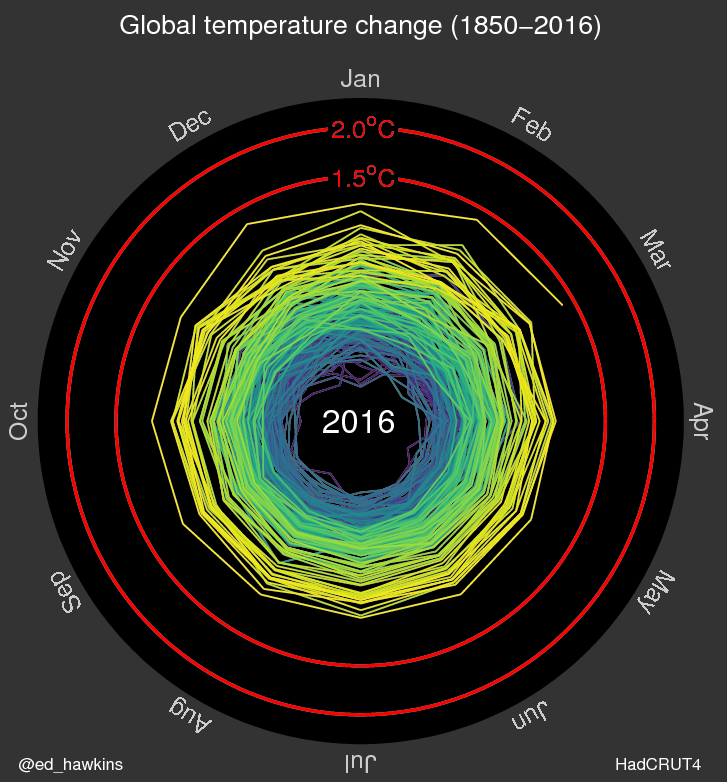 --- ## Climate Spiral Visualization Famous example: Global temperature anomalies spiraling toward crisis thresholds 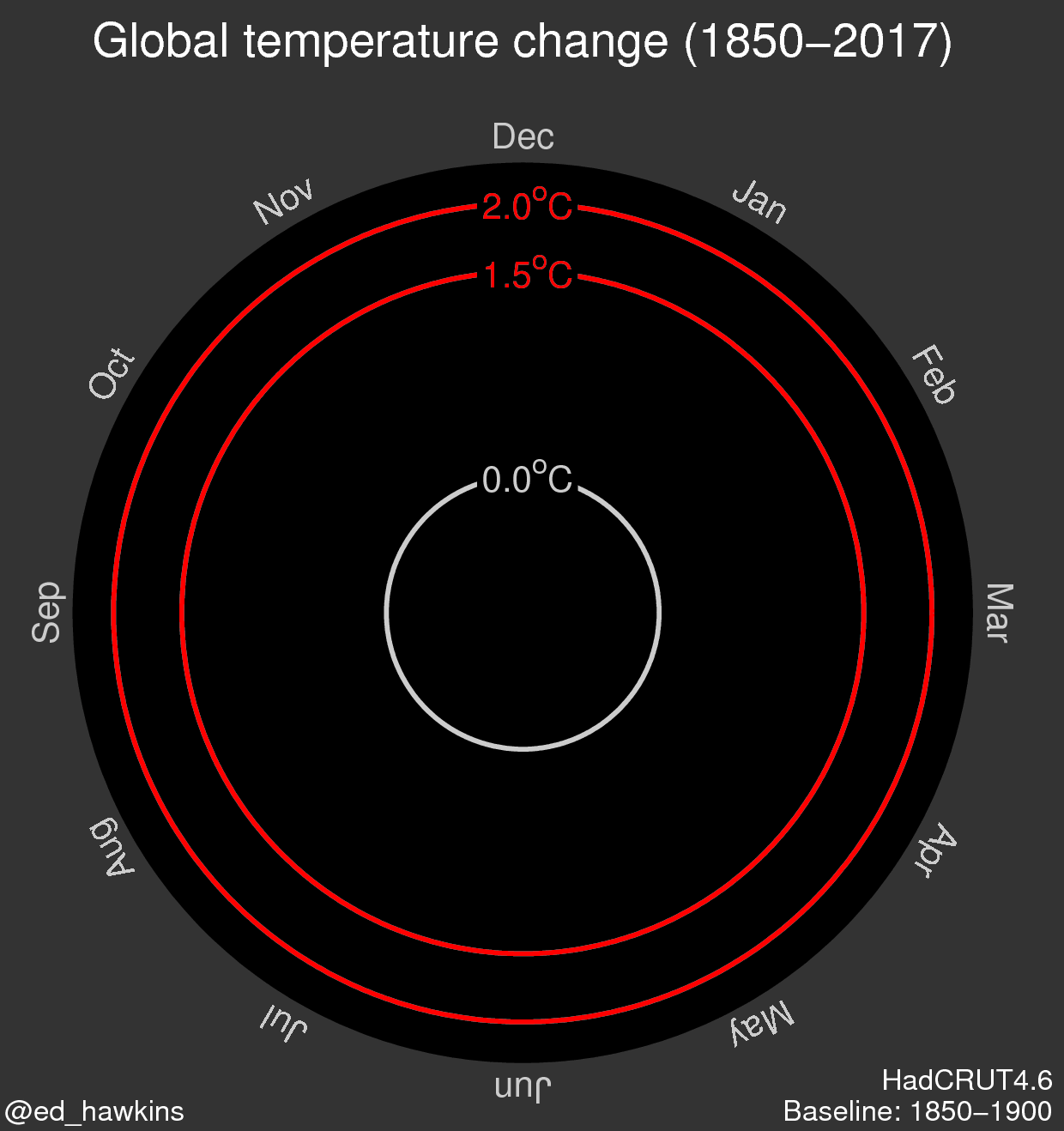 --- ## Caution: Radial Layout Limitations **Use circular layouts with care!** **Research finding**: Humans are significantly slower and less accurate at judging radial distances and angles compared to linear position Comparing values radially is harder than in Cartesian space - use only when cyclical nature is essential ::: notes - **CRITICAL WARNING** - radial layouts look cool but are perceptually problematic - Research shows 2-3x slower and less accurate judgments in radial vs linear layouts - Why are they harder? - Angles are harder to judge than horizontal/vertical distances - Outer rings have more space than inner rings (same value, different visual area) - Hard to compare values at different angles - When ARE they appropriate? When emphasizing cyclical nature is more important than precise reading - Example: 24-hour clock pattern - circular makes sense conceptually - Example: Climate spiral - the spiraling metaphor communicates urgency - But for most analytical tasks: stick to linear layouts! - Ask: "When have you seen radial visualizations in the wild? Were they effective?" - Common misuse: Corporate dashboards with radial charts just because they look fancy ::: --- ## Comparison: Linear vs Radial 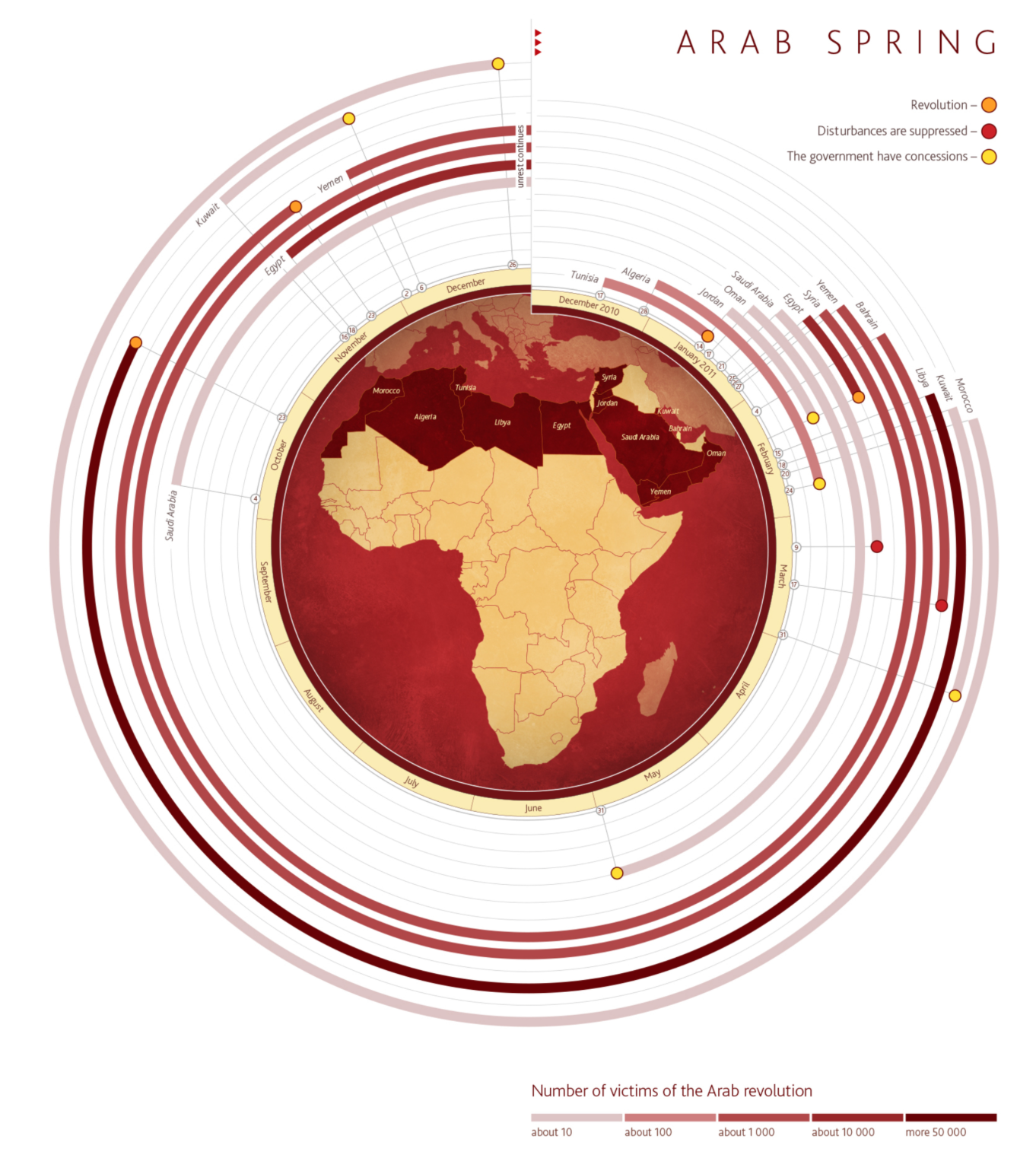 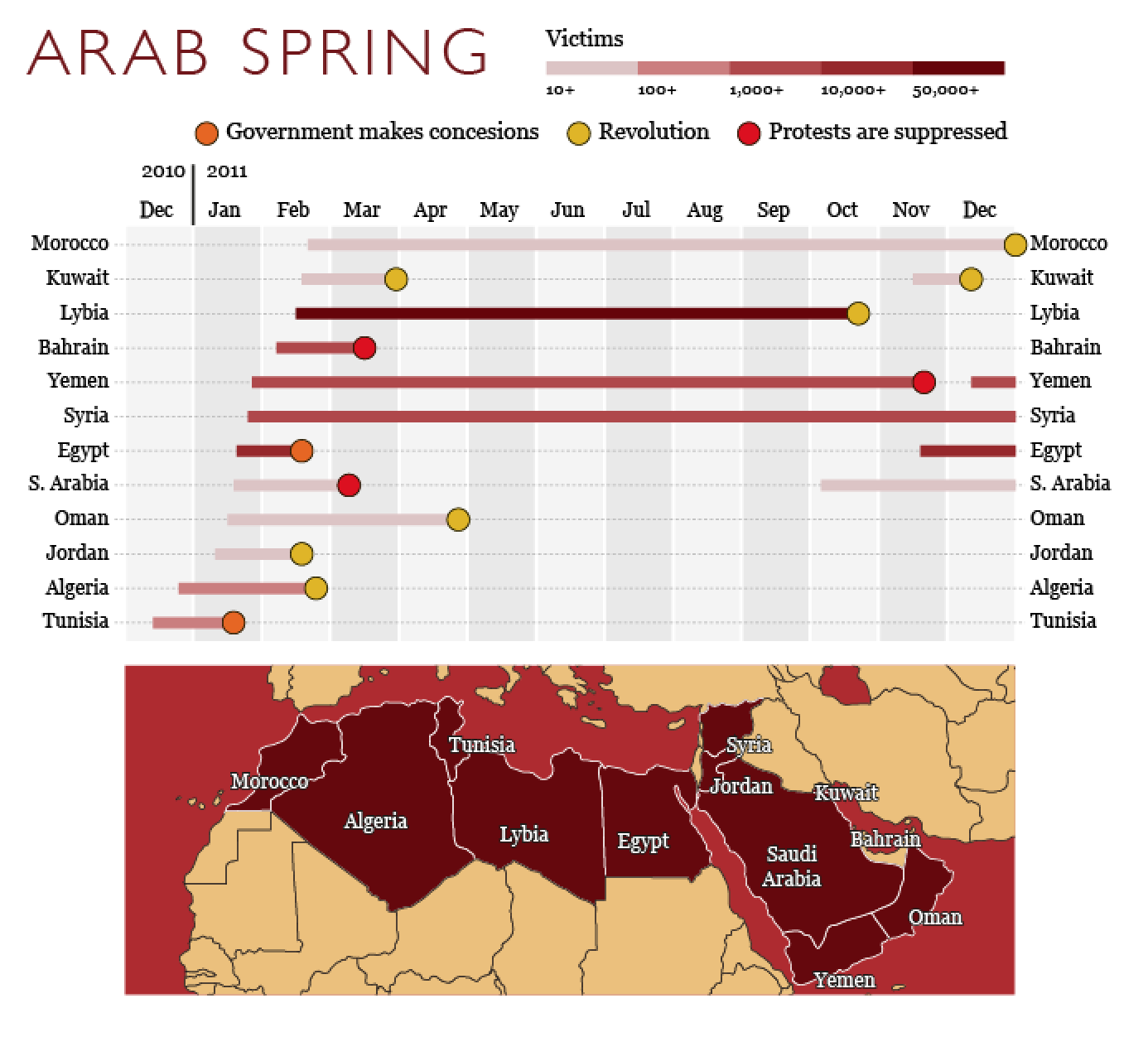 --- # Scalable Visualizations Horizon charts and sparklines for dense temporal data ::: notes **ADVANCED/OPTIONAL SECTION** - This can be assigned as reading if short on time - Horizon charts are complex and need 15 min to walk through properly - Sparklines are quick (5 min) and useful, show if you can - If pressed for time: Show the horizon chart concept but assign the step-by-step as reading - Students don't NEED to build horizon charts, but should know they exist ::: --- ## Horizon Charts **Purpose**: Maximum data density with minimal height Allows comparison of many time series in limited vertical space 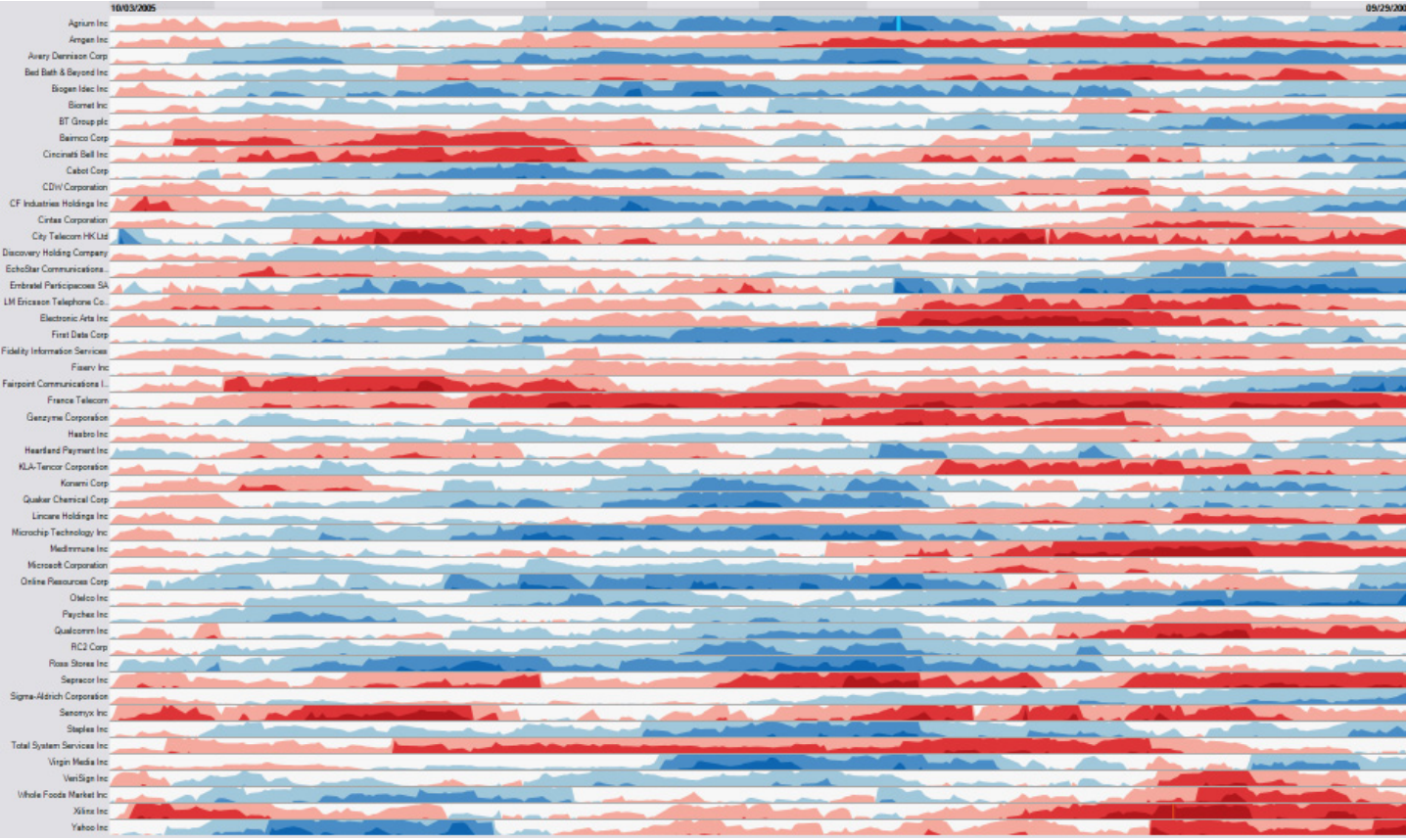 :::footer Heer, J., Kong, N., & Agrawala, M. (2009). [*Sizing the horizon: The effects of chart size and layering on the graphical perception of time series visualizations*](https://doi.org/10.1145/1518701.1518897). CHI. ::: ::: notes - **Advanced technique** - horizon charts solve a specific problem: showing MANY time series compactly - Problem: Line charts need vertical space - can only show ~10 series before running out of screen space - Horizon charts compress vertical space by 2-4x while maintaining readability - Used in: Server monitoring dashboards, financial data with hundreds of stocks, climate data arrays - Key innovation: Trade vertical space for color intensity - **CRITICAL**: This looks like "magic" unless you understand the construction - **Next slides walk through step-by-step**: This is NOT optional - you MUST show the construction process - Without understanding HOW it's built, students will just see a confusing colored chart - The 4-step process (area → bands → flip → collapse) demystifies it - Heer et al.'s paper/video has excellent animations of this - reference them - Takes practice to read - not intuitive at first glance - Heer et al.'s CHI paper showed horizon charts can be as accurate as line charts but in 1/4 the space - Real-world example: Cubism.js library for real-time dashboards - When to use: When you have >20 time series and need to see them all simultaneously ::: --- ## Horizon Charts: Multiple Series Dozens of time series in the space where only a few line charts would fit 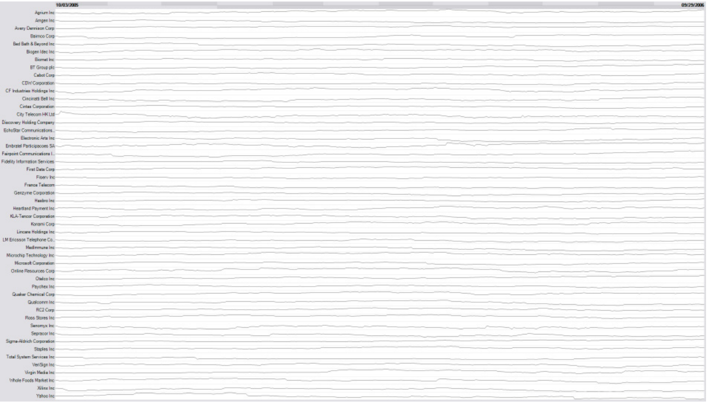 --- ## How Horizon Charts Work: Step 1 Start with a standard area chart 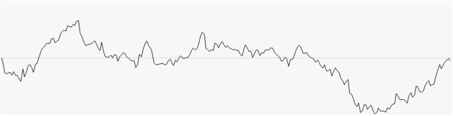 ::: notes - **SLOW DOWN**: Take your time with these construction slides - Step 1 is familiar - just a normal area chart - "This is what we know - a regular area chart. Now watch what happens..." - Make sure students understand this baseline before moving forward ::: --- ## Step 2: Discretizing into Bands Divide values into equal-height bands (e.g., 0-1, 1-2, 2-3) 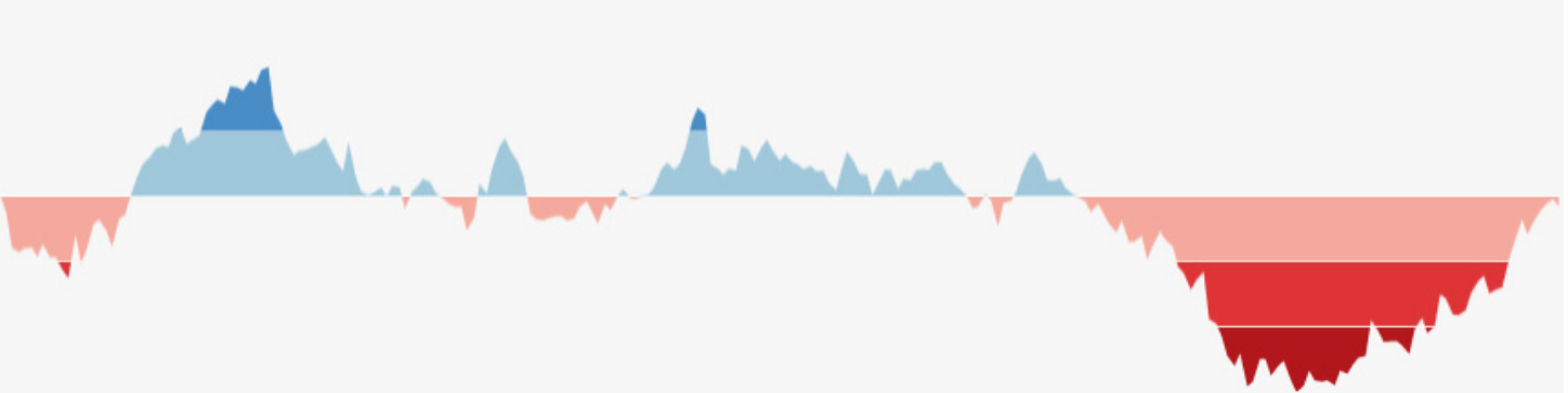 ::: notes - **Key transformation #1**: Chop the area into horizontal slices - "We're dividing the chart into bands of equal height" - Point to each band: "0-1 gets one color, 1-2 gets another, 2-3 gets a darker shade" - This is like creating a color scale for elevation on a topographic map - Make sure students see: Same data, just segmented into layers ::: --- ## Step 3: Flipping Negative Values Mirror negative values above the baseline (differentiated by color/saturation) 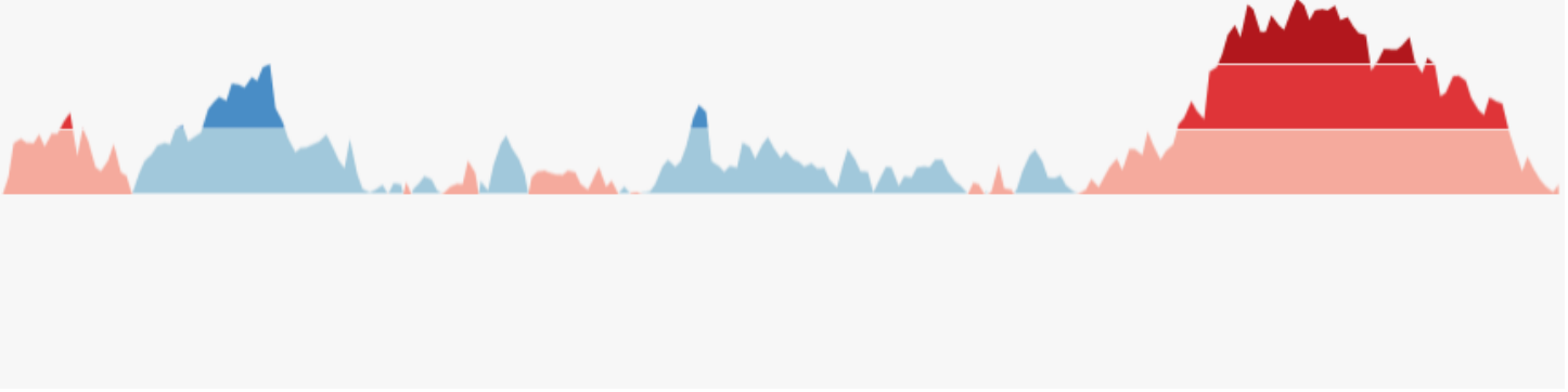 ::: notes - **Key transformation #2**: Handle negative values - "Notice negative values? We flip them UP above the baseline" - Use different color (or saturation) to distinguish positive from negative - "Red/orange for positive, blue for negative" is common convention - Why flip? Because next step collapses everything - we need both directions in same vertical space ::: --- ## Step 4: Collapsing Bands Stack all bands on top of each other using color intensity to show magnitude 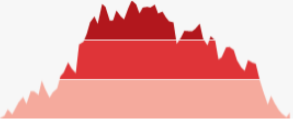 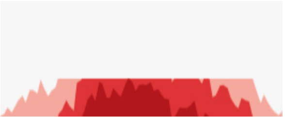 ::: notes - **THE MAGIC STEP**: Now we collapse all the bands into the same vertical space - "All those layers we created? We stack them on top of each other" - **This is the key insight**: Height → Color intensity - Band 1 (0-1): Light color - Band 2 (1-2): Medium color (stacked on top, shows darker) - Band 3 (2-3): Dark color (all three stacked) - The result: Same temporal patterns, but 1/3 the height - "Look at the before and after - same pattern, compressed vertically" - This is why color intensity = magnitude in horizon charts ::: --- ## Final Result: Horizon Chart Compact visualization preserving temporal patterns in minimal vertical space 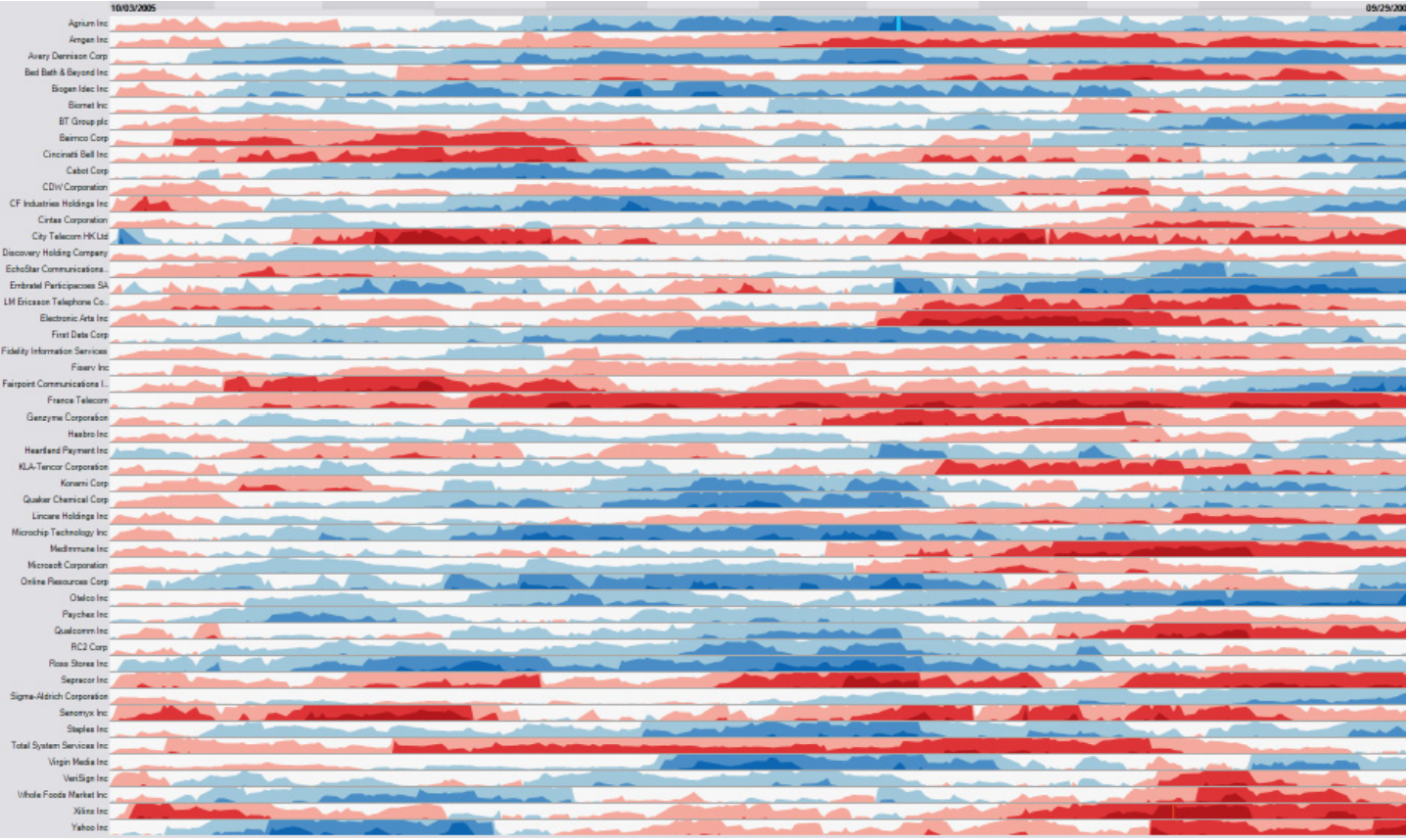 ::: notes - **Recap the transformation**: "We went from area chart → banded → flipped → collapsed" - Now students should understand WHY darker colors = higher values - "Without understanding the construction, this just looks like random colored bands" - "But now you know: it's a compressed area chart where height became color intensity" - Practical reading tip: Darker/more saturated = higher magnitude - Point out: You can still see the temporal patterns (peaks and valleys), just compressed - **Reference Heer's work**: "The original CHI paper and video show this animation - highly recommended" ::: --- ## Sparklines "Small, intense, word-sized graphics with typographic resolution. Sparklines can be placed anywhere that words or numbers can be: in sentences, maps, graphics, tables." ::: notes - **Edward Tufte's concept** - minimal, inline visualizations - Philosophy: Data should be integrated into text, not separated - Key characteristics: - No axes, no labels, no gridlines - just the trend - Fits inline with text (same height as text line) - Shows pattern at a glance, not precise values - "Data-intense, design-simple, word-sized" - When to use: Tables, dashboards, reports where you want to show trend alongside numbers - Example: Stock table showing current price + sparkline of last 30 days - Not for: Detailed analysis, precise reading, standalone charts - Implementation: Easy in modern tools (Excel, Tableau, D3, etc.) - Ask students: "Where have you seen sparklines? What made them effective?" - Common examples: Google Finance, Twitter analytics, GitHub contribution graphs ::: — Edward Tufte  :::footer Tufte, E. R. (2006). [*Beautiful Evidence*](http://www.edwardtufte.com/bboard/q-and-a-fetch-msg?msg_id=0001OR). Graphics Press. ::: --- ## Sparklines in Context Embedded in text and tables - data becomes part of the narrative 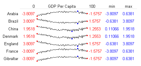 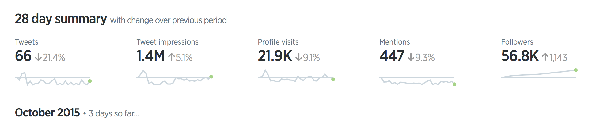 --- ## Sparkline Examples Real-world applications in dashboards and reports 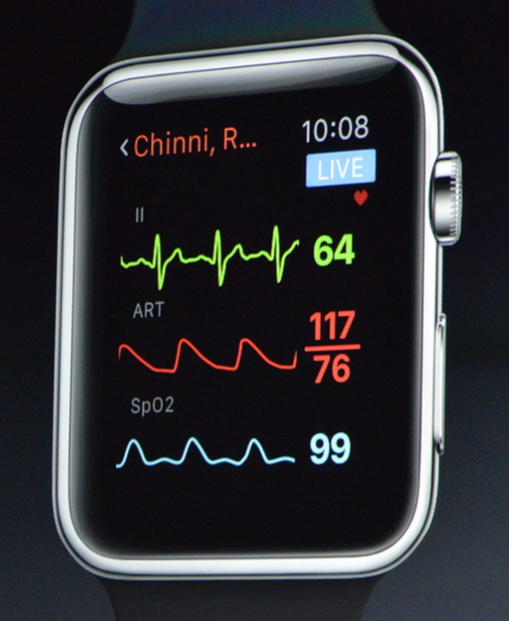 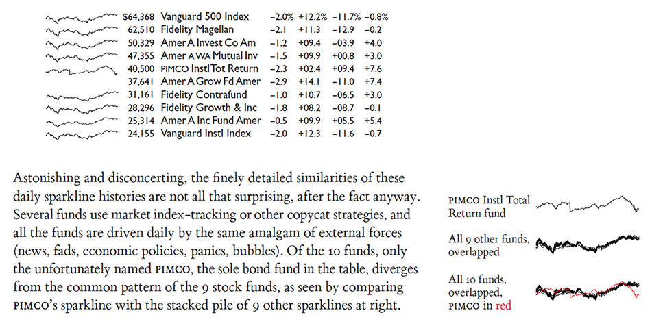 --- # Alternative Encodings Beyond position: animation, color, and trajectories --- ## When Position is Already Used All methods so far use **space** to represent time. What if position is already taken (e.g., maps)? --- ## Three Alternative Encodings ::: {.columns} ::: {.column width="33%"} **Animation** Show changes over time through motion ::: ::: {.column width="33%"} **Color** Use color/saturation to encode time ::: ::: {.column width="33%"} **Trajectories** Draw paths showing movement ::: ::: --- ## Caution: Animation Limitations While animation can be effective, it has significant drawbacks: **Cognitive Limitations:** - Limits working memory - hard to remember previous frames - Difficult to compare non-adjacent time points - Requires replay to catch missed details **Best Practices:** - Provide playback controls (pause, rewind, speed) - Keep animations short (< 10 seconds) - Combine with static "key frames" - Consider small multiples instead of animation --- # Summary --- ## Key Topics Covered 1. Structure of temporal data (linear, cyclic, hierarchical) 1. Line charts and variations (area charts, small multiples) 1. Heat maps/grids, calendars, circular layouts 1. Event data (dot/bubble charts, gantt) 1. Scalable visualizations: horizon, sparklines --- ## Key Takeaways **Design guidelines:** - Consider time structure (sequential, cyclic, hierarchical) - Be cautious with stacked designs (hard to read upper layers) - Test different aspect ratios for line charts - Use circular layouts carefully (harder to compare values) - Choose the right technique for the data density --- ## Key References (1/2) ::: {style="font-size: 0.7em;"} - Taxonomy of timeline visualizations - The TimeViz Browser - Visualizing time-oriented data—A systematic view - Visualizing pedestrian data - Cloudlines visualization method for event data - Banking to 45 degrees explained - Banking to 45 degrees: Aspect ratios for time series plots - The Shape Parameter of a Two-Variable Graph (original paper on banking to 45 degrees) - An Empirical Model of Slope Ratio Comparisons (follow-up work on banking to 45 degrees) - Quantitative Displays for Combining Time-Series and Part-to-Whole Relationships - Stacked area chart vs. Line chart – The great debate - The Fine Line In a Gray Area: When to Use Line vs Area Charts - Climate spirals (great example of use of spirals) - Enhanced interactive spiral display - Spirals for periodic data - Interactive Visualization of Serial Periodic Data - Visualizing Time-Series on Spirals - Explanation of Horizon charts - User study on effectiveness of Horizon Charts ::: --- ## Key References (2/2) ::: {style="font-size: 0.7em;"} - Visualizing Time with the Double-Time Bar Chart | Doug McCune - Visualizing Cyclical Time – Hour of Day Charts | Doug McCune - Visual analytics techniques for time series data - On the Benefits and Drawbacks of Radial Diagrams | SpringerLink - Visualizing Time with the Infinity Hour Chart | Doug McCune ::: --- ## Thank You!  --- 