Clustering and Dimensionality Reduction
## Agenda ::: incremental 1. **Clustering Visualization** - Introduction to clustering analysis - K-means and visual patterns - Comparing clustering methods 2. **Dimensionality Reduction for Visualization** - Why reduce dimensions? - Linear methods: PCA - Non-linear methods: t-SNE and UMAP - Critical visualization principles ::: ::: {.notes} Today we're covering two fundamental techniques for exploring and visualizing complex datasets: clustering and dimensionality reduction. These are unsupervised methods - they help us find structure in data without predefined labels. Clustering groups similar items together, while dimensionality reduction helps us visualize high-dimensional data in 2D or 3D. Both are essential tools for exploratory data analysis and create some of the most compelling visualizations in data science. ::: # Clustering Visualization ## What is Clustering? "... the goal of clustering is to separate a set of examples into groups called clusters" 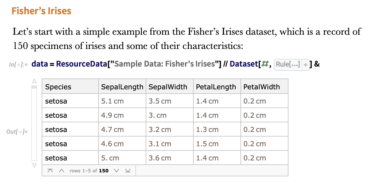 ::: {.notes} Clustering is an unsupervised learning task where we try to find natural groupings in data without having labeled examples. This is particularly useful for exploratory data analysis, customer segmentation, identifying patterns in urban data, and understanding the structure of your data. The IRIS dataset shown here is one of the classic examples - containing measurements of iris flowers from three different species. The challenge is: can we discover these groupings automatically? ::: ## Visualizing the IRIS Dataset ```{python} #| fig-width: 9 #| fig-height: 6 import seaborn as sns import matplotlib.pyplot as plt import pandas as pd from sklearn import datasets # Load iris dataset iris = datasets.load_iris() # Create DataFrame for easier plotting df = pd.DataFrame({ 'Petal Length (cm)': iris.data[:, 2], 'Sepal Width (cm)': iris.data[:, 1], 'Species': [iris.target_names[i] for i in iris.target] }) # Create high-quality plot with professional colors colors = ['#4477AA', '#EE6677', '#228833'] plt.figure(figsize=(9, 6), dpi=150) sns.scatterplot(data=df, x='Petal Length (cm)', y='Sepal Width (cm)', hue='Species', palette=colors, s=120, alpha=0.7, edgecolor='black', linewidth=0.8) plt.grid(True, alpha=0.3, linestyle='--') plt.legend(title='Species', frameon=True, loc='upper left', fontsize=11) plt.xlabel('Petal Length (cm)', fontsize=12, fontweight='bold') plt.ylabel('Sepal Width (cm)', fontsize=12, fontweight='bold') plt.tight_layout() plt.show() ``` ::: {.notes} This plot, colored by the true species labels, shows the structure we're trying to discover through clustering. Note the clear separation of the Setosa species (blue), but also the significant overlap between Versicolor (red) and Virginica (green). This overlap is why clustering isn't always perfect - and why visualization is crucial for understanding the results. We're looking at just 2 of the 4 dimensions here, which makes visualization possible. ::: ## Clustering Methods Comparison 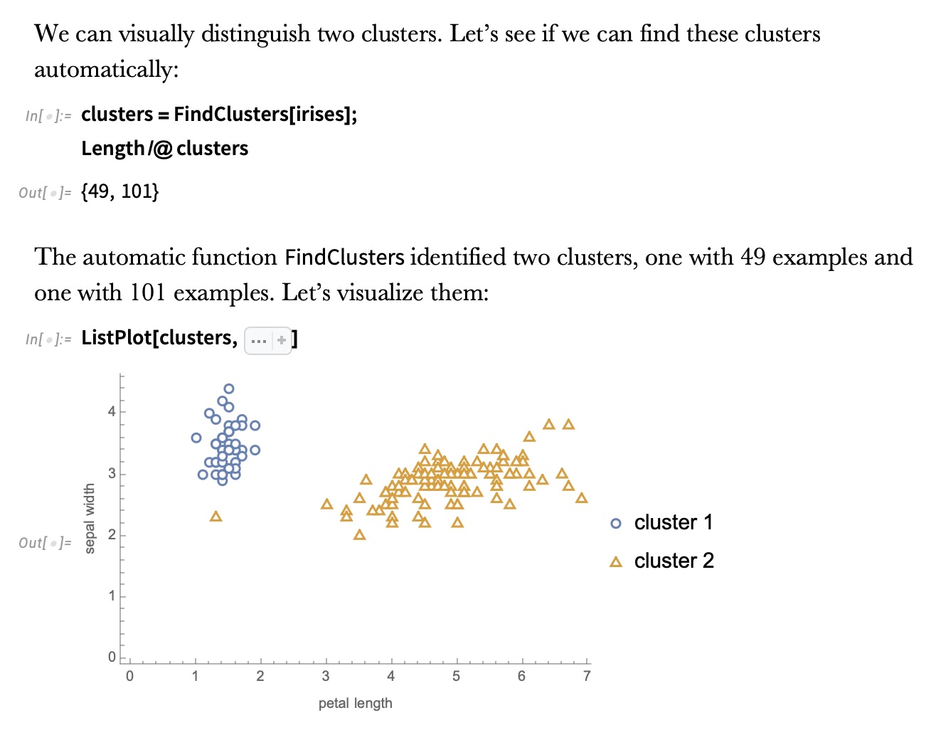 ::: {.notes} Different clustering algorithms will find different groupings based on their underlying assumptions about cluster shape, density, and separation. Some algorithms assume spherical clusters (like K-means), while others can find arbitrary shapes (like DBSCAN). The quality of clustering can be evaluated both visually and using metrics like silhouette score. For visualization purposes, understanding what each method emphasizes helps you choose the right approach for your data. ::: ## K-means Clustering 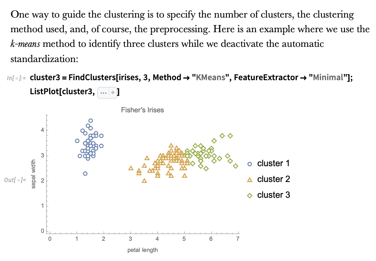 ::: {.notes} K-means is one of the most popular clustering algorithms due to its simplicity and efficiency. It works by iteratively assigning points to the nearest cluster center (centroid) and then recomputing the centroids. The algorithm requires you to specify K (the number of clusters) in advance. For IRIS with K=3, it does a reasonable job of recovering the three species. K-means works well when clusters are roughly spherical and similar in size, but can struggle with elongated or irregular-shaped clusters. ::: ## Clustering Method Zoo 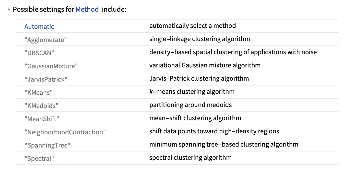 ::: {.notes} There are many clustering methods available, each with different strengths: K-means is fast and simple, hierarchical methods build tree structures of clusters (great for dendrograms), DBSCAN can find arbitrary shapes and identify outliers, spectral clustering works well with non-convex clusters. The choice of method depends on your data characteristics and what properties you want your clusters to have. In practice, it's often worth trying multiple methods and comparing results visually. ::: ## Visual Comparison of Methods 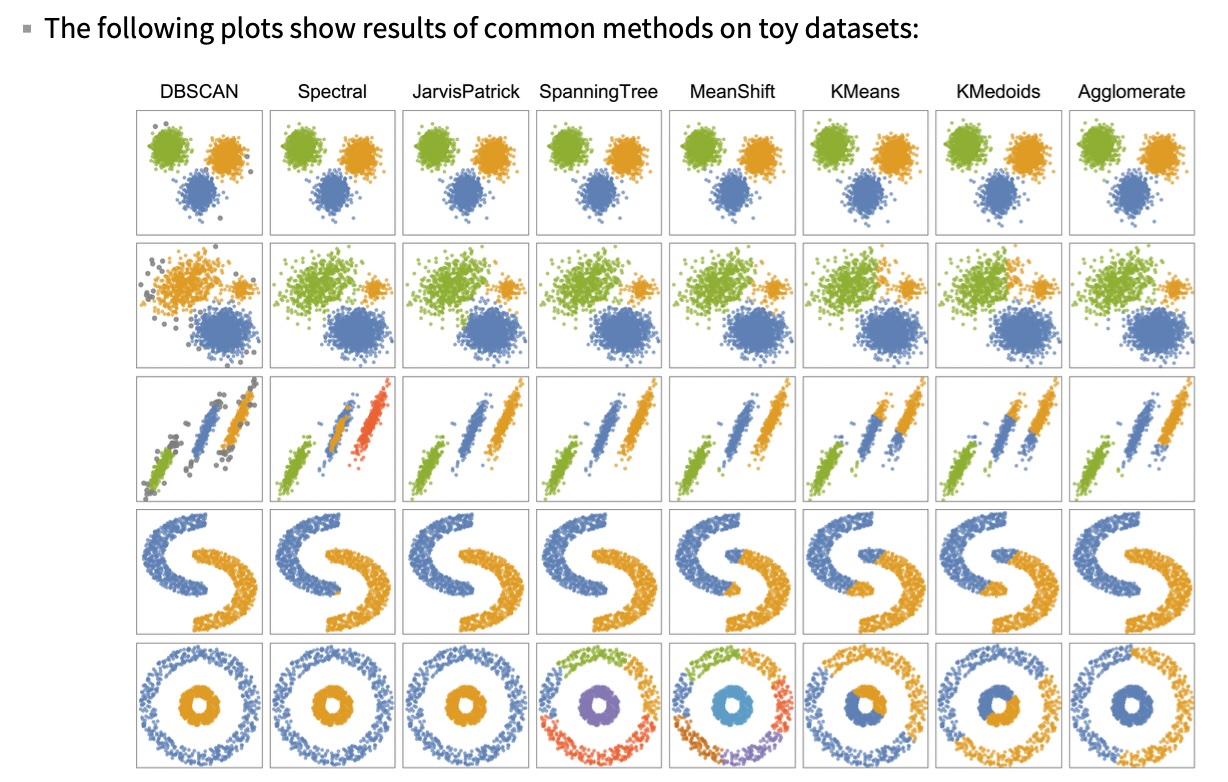 ::: {.notes} This slide shows visual examples of how different clustering methods partition the same dataset. Notice how they produce very different results! K-means creates roughly circular boundaries, hierarchical methods create nested groupings, DBSCAN identifies dense regions and can mark sparse areas as outliers. This illustrates an important point: there's no single "correct" clustering - the best method depends on what structure you're trying to discover. Visualization is crucial for understanding what each method is doing and whether the results make sense. ::: ## Ground Truth vs K-means :::: {.columns} ::: {.column width="50%"} ```{python} import matplotlib.pyplot as plt from sklearn import datasets iris = datasets.load_iris() _, ax = plt.subplots() scatter = ax.scatter(iris.data[:, 2], iris.data[:, 1], c=iris.target) ax.set(xlabel=iris.feature_names[2], ylabel=iris.feature_names[1]) _ = ax.legend( scatter.legend_elements()[0], iris.target_names, loc="lower right", title="Classes" ) ``` ::: ::: {.column width="50%"} 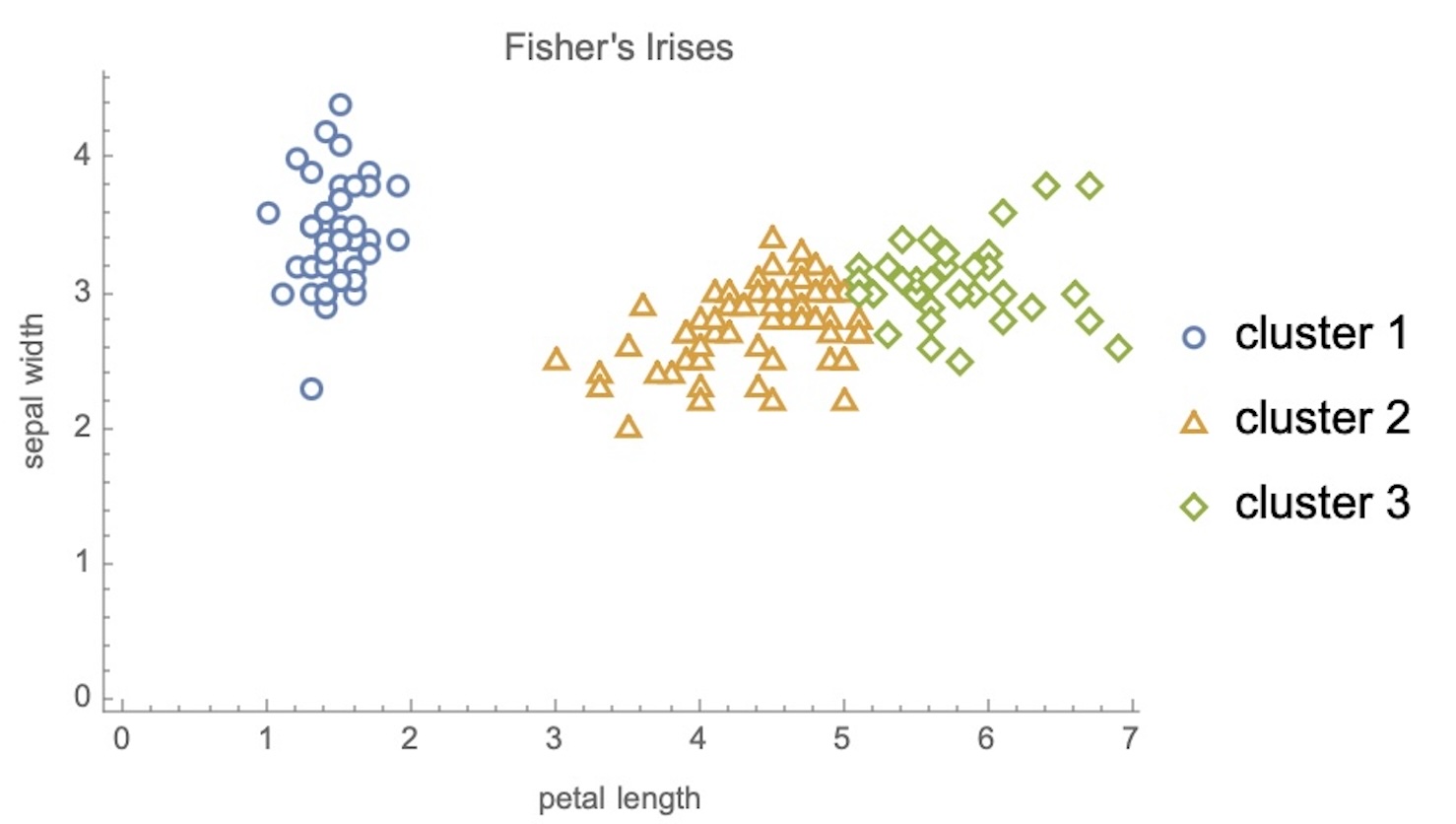 ::: :::: ::: {.notes} This side-by-side comparison helps us evaluate clustering performance. The left shows the ground truth (true labels), and the right shows the clusters discovered by K-means. While K-means accurately isolates the well-separated cluster, it struggles with the overlapped classes. This visually demonstrates an important principle: clustering discovers structure, but that structure may not perfectly match our preconceived categories. For visualization projects, showing multiple views like this helps users understand the reliability of clustering results. ::: # Dimensionality Reduction ## The Challenge: High-Dimensional Data * Real-world data often has hundreds or thousands of dimensions - Images: thousands of pixels - Text: thousands of words - Urban sensors: hundreds of measurements - Customer data: dozens to hundreds of features * **Problem**: We can only visualize 2D or 3D! ::: {.notes} This is the fundamental challenge in information visualization: we need to show high-dimensional data on 2D screens. Dimensionality reduction helps us create meaningful 2D or 3D visualizations from data with many more dimensions. This isn't just about compression - it's about revealing structure that's hidden in high dimensions. Good dimensionality reduction preserves the important relationships between data points while discarding less important variation. ::: ## The Manifold Hypothesis * **Key insight**: High-dimensional data often lies on lower-dimensional structures 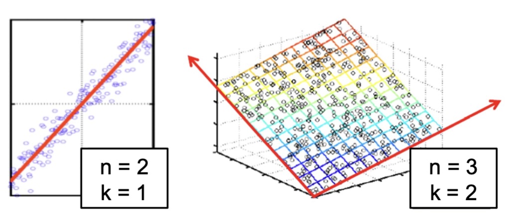 ::: {.notes} The manifold hypothesis: even though our data might be represented with thousands of features, it often lies on or near a much lower-dimensional manifold. Think about images of faces - each pixel is a dimension, so a 100x100 image is 10,000 dimensional. But faces don't fill that entire space - they have structure (two eyes, one nose, etc.). The actual degrees of freedom are much fewer. Dimensionality reduction tries to find these underlying degrees of freedom. This is what makes visualization of complex data possible. ::: ## Non-linear Manifolds  * Images of '3' transformed by rotation, scaling, translation * What's the intrinsic dimensionality? (~5-7 dimensions) * The underlying **manifold** is **non-linear** ::: {.notes} This example shows images of the digit "3" with various transformations. Each image might be 28x28 = 784 dimensions. But how many degrees of freedom do we really have? Rotation angle, x/y position, scale, and maybe a few shape parameters - perhaps 5-7 dimensions total. Notice these transformations are non-linear - small changes in rotation don't correspond to linear changes in pixel values. This is why we need non-linear dimensionality reduction methods like t-SNE and UMAP, not just linear methods like PCA. ::: ## Working Example: Digits Dataset ``` python from sklearn.datasets import load_digits digits = load_digits(n_class=6) X, y = digits.data, digits.target ``` * 8×8 pixel images = 64 dimensions * Can't visualize 64D directly * Goal: Create meaningful 2D visualization ::: {.notes} We'll use the digits dataset as our working example. It consists of 8x8 pixel images of handwritten digits (0-9). Each image is 64-dimensional, which is high enough that we can't visualize it directly, but small enough to compute quickly. Our challenge: how do we create a 2D visualization that preserves the similarity relationships between digits? ::: ## Digits Dataset Sample ```{python} from sklearn.datasets import load_digits digits = load_digits(n_class=6) X, y = digits.data, digits.target n_samples, n_features = X.shape n_neighbors = 30 import matplotlib.pyplot as plt fig, axs = plt.subplots(nrows=10, ncols=10, figsize=(6, 6)) for idx, ax in enumerate(axs.ravel()): ax.imshow(X[idx].reshape((8, 8)), cmap=plt.cm.binary) ax.axis("off") _ = fig.suptitle("A selection from the 64-dimensional digits dataset", fontsize=16) ``` ::: {.notes} Here's a grid showing 100 different digit images from our dataset. Notice the variety - different digits, different writing styles, different positions. Our goal with dimensionality reduction is to create a 2D representation where similar-looking digits are close together. This will help us visualize the structure of the data and see patterns that aren't obvious from looking at individual images. ::: # Principal Component Analysis (PCA) ## PCA: The Foundation ::: incremental - PCA finds directions of maximum variance in data - These directions are the eigenvectors of the covariance matrix - Projects data onto these principal directions - **Linear** method - assumes linear relationships ::: ::: {.notes} PCA is the most fundamental dimensionality reduction technique. It's a linear method that finds the directions where data varies the most. The first principal component points in the direction of maximum variance, the second is orthogonal and points to the next-most variance, and so on. While PCA can't capture complex non-linear structure, it's extremely fast, robust, well-understood, and often works surprisingly well as a first approach to visualization. ::: ## PCA: Geometric Intuition 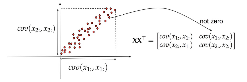 ::: {.notes} Here's the geometric intuition for PCA. Imagine you have a cloud of points in high-dimensional space. PCA finds the direction where the data varies the most (the first principal component), then the direction of next-most variation that's orthogonal to the first (second PC), and so on. Geometrically, we're finding the axes of the ellipsoid that best fits the data. Projecting onto the first few principal components gives us a lower-dimensional representation that captures most of the variance. ::: ## PCA: Another View  ::: {.notes} Another view: the red line shows the first principal component - the direction of maximum variance. If we project all points onto this line, we get a 1D representation. The key insight is that even though we're throwing away information (the perpendicular distance to the line), we're keeping the most important information (the spread along the line). This is why PCA works well for visualization - it discards the dimensions with least variance, which are often noise or redundancy. ::: ## PCA Applied to Digits ```{python} from sklearn.decomposition import PCA pca = PCA(n_components=2) data, labels = load_digits(return_X_y=True) reduced_data = pca.fit_transform(data) plt.figure(figsize=(8, 6)) plt.scatter(reduced_data[:, 0], reduced_data[:, 1], c=labels, cmap='tab10', alpha=0.6) plt.colorbar(label='Digit') plt.xlabel('First Principal Component') plt.ylabel('Second Principal Component') plt.title('PCA of Digits Dataset') plt.show() ``` ::: {.notes} Here's PCA applied to the full digits dataset (all 10 classes), reducing from 64 dimensions down to 2. With color labels showing the true digit classes, you can see that PCA captures some structure - there are some clusters corresponding to digit classes - but there's substantial overlap. The digit "1" is somewhat separated (probably because it's sparse), but most other digits are mixed together. This is a limitation of linear methods for non-linear data. But PCA is still valuable as a first exploration and as a baseline for comparison. ::: # Non-linear Methods: t-SNE ## t-SNE: A Revolution in Visualization * **t-SNE** (t-Distributed Stochastic Neighbor Embedding) - Preserves **local neighborhood structure** - Non-linear, adapts to different regions of data - Creates compelling cluster visualizations - **Warning**: Can be easily misread! ::: {.notes} t-SNE revolutionized high-dimensional data visualization when it was introduced. Unlike PCA, it's non-linear and focuses on preserving local neighborhood relationships rather than global variance. This makes it excellent at revealing cluster structure. However, t-SNE has important limitations and is easy to misinterpret - which is why we'll spend time on visualization principles for using it correctly. ::: ## How t-SNE Works :::: {.columns} ::: {.column width="50%"}  ::: ::: {.column width="40%"}  ::: :::: ::: {.notes} t-SNE creates probability distributions over pairs of points in high-dimensional space, where nearby points have high probability. It then tries to replicate these probabilities in low-dimensional space. The key innovation is using the Student's t-distribution (with heavy tails) in the low-dimensional space, which prevents the "crowding problem" where all points try to squeeze into the center. This creates the excellent separation between clusters that t-SNE is known for. ::: ## Critical Resource: "How to Use t-SNE Effectively"  https://distill.pub/2016/misread-tsne/ ::: {.notes} This Distill article by Wattenberg, Viégas, and Johnson is ESSENTIAL READING before using t-SNE. The authors demonstrate, using controlled experiments, which visual properties of t-SNE plots are meaningful and which are not. The main takeaway: t-SNE is a visualization tool that must be used carefully - its output is a suggestion of structure, not a definitive map of reality. We'll cover the key lessons from this article. ::: ## Key Warning: Parameters Matter! * t-SNE has a critical parameter: **perplexity** - Roughly the number of close neighbors each point has - Typical values: 5-50 - Different perplexities = different structures!  ::: {.notes} Look at these four perplexity values on the same dataset. At perplexity=2, everything breaks into tiny clusters - it's too local. At perplexity=30, we see nice separation. At perplexity=50, still looks good but slightly different structure. At perplexity=100, clusters start merging - it's too global. **Critical lesson: ALWAYS try multiple perplexity values (typically 5-50).** Don't trust a single t-SNE plot! This is essential for proper visualization practice. ::: ## Convergence: Run Enough Iterations!  ::: {.notes} This shows convergence over iterations. At 10 iterations, it's garbage - the algorithm hasn't had time to organize points. At 250 iterations, structure is emerging. At 500-1000 iterations, it's converged and stable. Lesson: run enough iterations! Modern implementations often need 1000-5000 iterations. Don't trust visualizations that haven't converged. You can often watch the iteration count and stop when the layout stabilizes. ::: ## Critical: Cluster Sizes Mean Nothing!  * **t-SNE equalizes cluster densities** * Large visual clusters ≠ large actual clusters * Size refers to spatial extent, not number of points ::: {.notes} This is crucial for visualization: cluster sizes in t-SNE plots are meaningless! The algorithm naturally expands dense clusters and contracts sparse ones to equalize visual density. This ensures all clusters are visible, but it means you can't compare cluster sizes visually. If you need to communicate cluster sizes, you must use other visual encoding (like point count labels) in addition to the t-SNE layout. ::: ## Critical: Distances Between Clusters Mean Nothing!  ::: {.notes} Another CRITICAL INSIGHT for visualization: Distances between clusters are unreliable! The left shows true data - two Gaussians close together, one far away. Middle and right show different t-SNE runs. The relative distances between clusters change dramatically! Why? t-SNE only cares about local neighborhoods - it doesn't preserve global distances. **You cannot say "these clusters are related because they're close" - that's wrong interpretation.** Only trust within-cluster structure. ::: ## Warning: Random Noise Can Look Structured 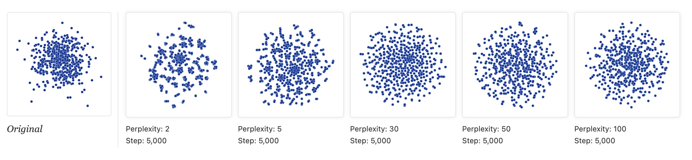 * Left: PCA of random data (correctly shows no structure) * Right: t-SNE of same data (shows apparent clusters!) * **Lesson**: Don't assume clusters in t-SNE are real! ::: {.notes} This is wild: pure random noise with no structure. Left is PCA - correctly shows a cloud with no clusters. Right is t-SNE - shows apparent clusters! This is because t-SNE emphasizes local structure so much that it can create apparent patterns from noise. Lesson for visualization: Don't assume clusters in t-SNE are real! Always validate with other methods, domain knowledge, or statistical tests. Show multiple views to your audience. ::: ## t-SNE Applied to Digits ```{python} import numpy as np from matplotlib import offsetbox from sklearn.preprocessing import MinMaxScaler def plot_embedding(X, title): _, ax = plt.subplots(figsize=(10, 8)) X = MinMaxScaler().fit_transform(X) for digit in digits.target_names: ax.scatter( *X[y == digit].T, marker=f"${digit}$", s=60, color=plt.cm.Dark2(digit), alpha=0.425, zorder=2, ) shown_images = np.array([[1.0, 1.0]]) for i in range(X.shape[0]): dist = np.sum((X[i] - shown_images) ** 2, 1) if np.min(dist) < 4e-3: continue shown_images = np.concatenate([shown_images, [X[i]]], axis=0) imagebox = offsetbox.AnnotationBbox( offsetbox.OffsetImage(digits.images[i], cmap=plt.cm.gray_r), X[i] ) imagebox.set(zorder=1) ax.add_artist(imagebox) ax.set_title(title) ax.axis("off") from sklearn.manifold import TSNE from time import time tsne = TSNE(n_components=2, max_iter=500, random_state=0) start_time = time() tsne_projection = tsne.fit_transform(X) timing = time() - start_time title = f"t-SNE embedding (time {timing:.3f}s)" plot_embedding(tsne_projection, title) plt.show() ``` ::: {.notes} Here's t-SNE applied to the digits dataset. Notice how it creates much cleaner, more separated clusters compared to PCA! Similar digits group together, and the clusters are well-separated. This is t-SNE's strength - revealing local neighborhood structure. But remember all the warnings: don't trust distances between clusters, don't trust cluster sizes, and always validate with multiple perplexity values. ::: # Non-linear Methods: UMAP ## UMAP: The Modern Alternative 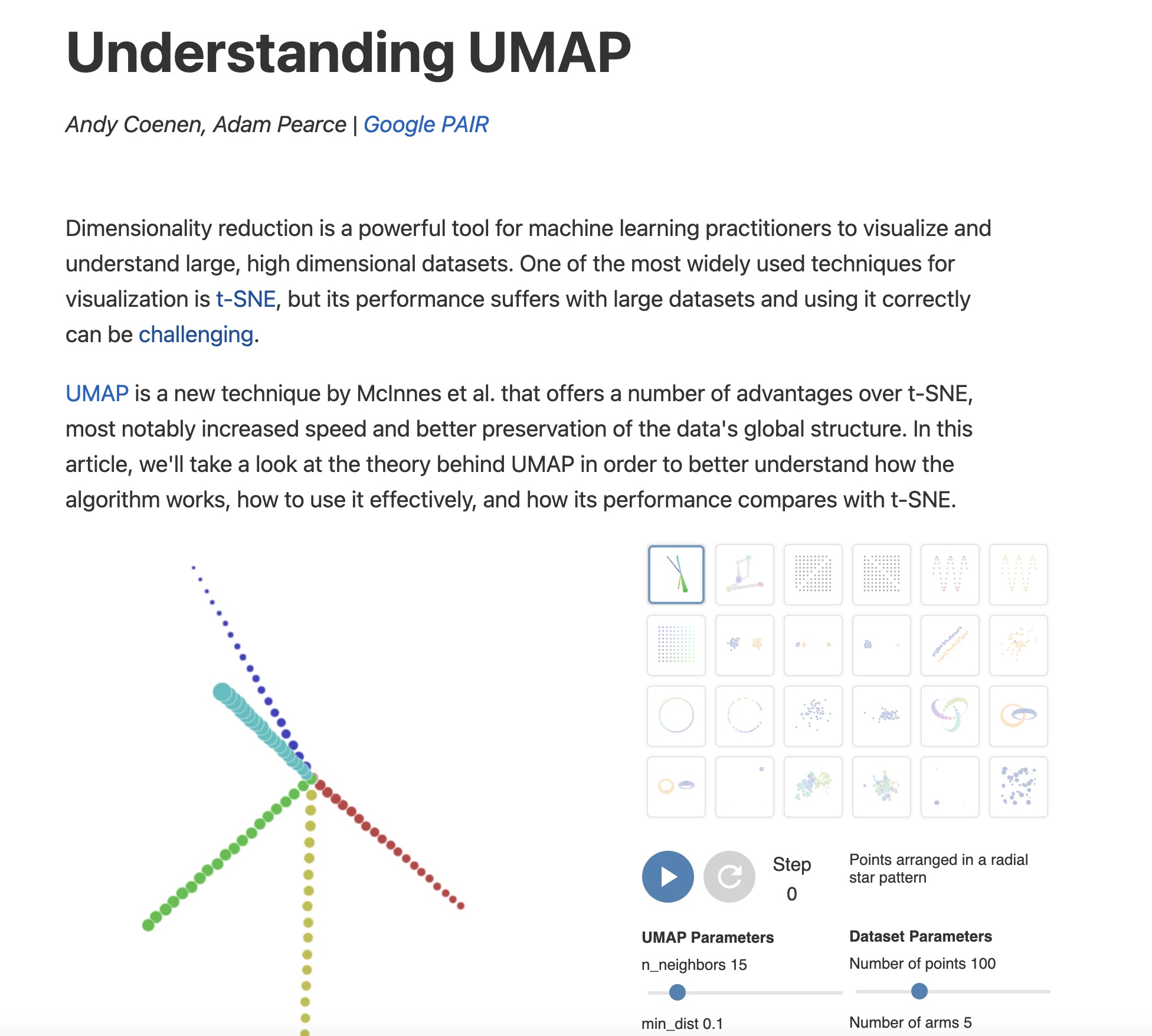 https://pair-code.github.io/understanding-umap/ ::: {.notes} UMAP (Uniform Manifold Approximation and Projection) has rapidly become the preferred alternative to t-SNE for many visualization tasks. It shares the same philosophy - preserving local neighborhood structure - but it's built on more rigorous mathematical foundations from topology. UMAP is typically faster, scales better, and often better preserves global structure. This interactive article from Google's PAIR team is THE best resource for understanding UMAP. ::: ## UMAP vs t-SNE: Speed and Structure * **Speed**: UMAP is 10-15x faster than t-SNE - MNIST (70K points, 784D): UMAP = 3 min, t-SNE = 45 min! * **Global structure**: UMAP better preserves relationships between clusters  ::: {.notes} Key advantages: UMAP is dramatically faster - on the MNIST dataset it's 15x faster than sklearn's t-SNE! This matters hugely when you want to try different parameters or work with larger datasets. Also notice the structure: UMAP tends to better preserve global manifold structure - digits that are similar (like 4 and 9) are closer together. For visualization projects, this often makes UMAP the better default choice. ::: ## How UMAP Works 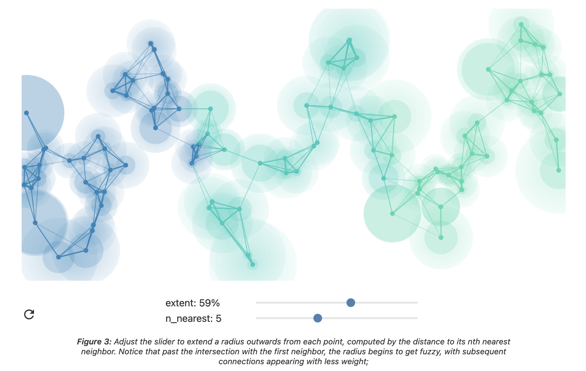 ::: {.notes} UMAP builds a "fuzzy topological representation" of the high-dimensional data. It creates a weighted graph where edges represent neighborhood relationships with probabilistic weights. Then it tries to find a similar graph structure in low dimensions. The theoretical foundation involves topology and manifolds - more sophisticated than t-SNE's probability distributions. But practically, you can think of it like advanced force-directed graph layout. ::: ## UMAP Parameters * **n_neighbors** - balances local vs global structure - Low (2-5): very local structure - High (50-200): more global structure - Similar to t-SNE's perplexity * **min_dist** - minimum spacing between points - Low (0.0): tight clusters - High (0.5-0.8): spread out points ::: {.notes} UMAP has two key parameters that control the visualization. n_neighbors works similarly to t-SNE's perplexity - it controls the local/global balance. min_dist controls how tightly points can pack, giving you extra control over cluster appearance. Unlike t-SNE's perplexity which can dramatically change results, UMAP parameters tend to be more stable and intuitive. Always try a few values to ensure your conclusions are robust. ::: ## UMAP: min_dist = 0.0 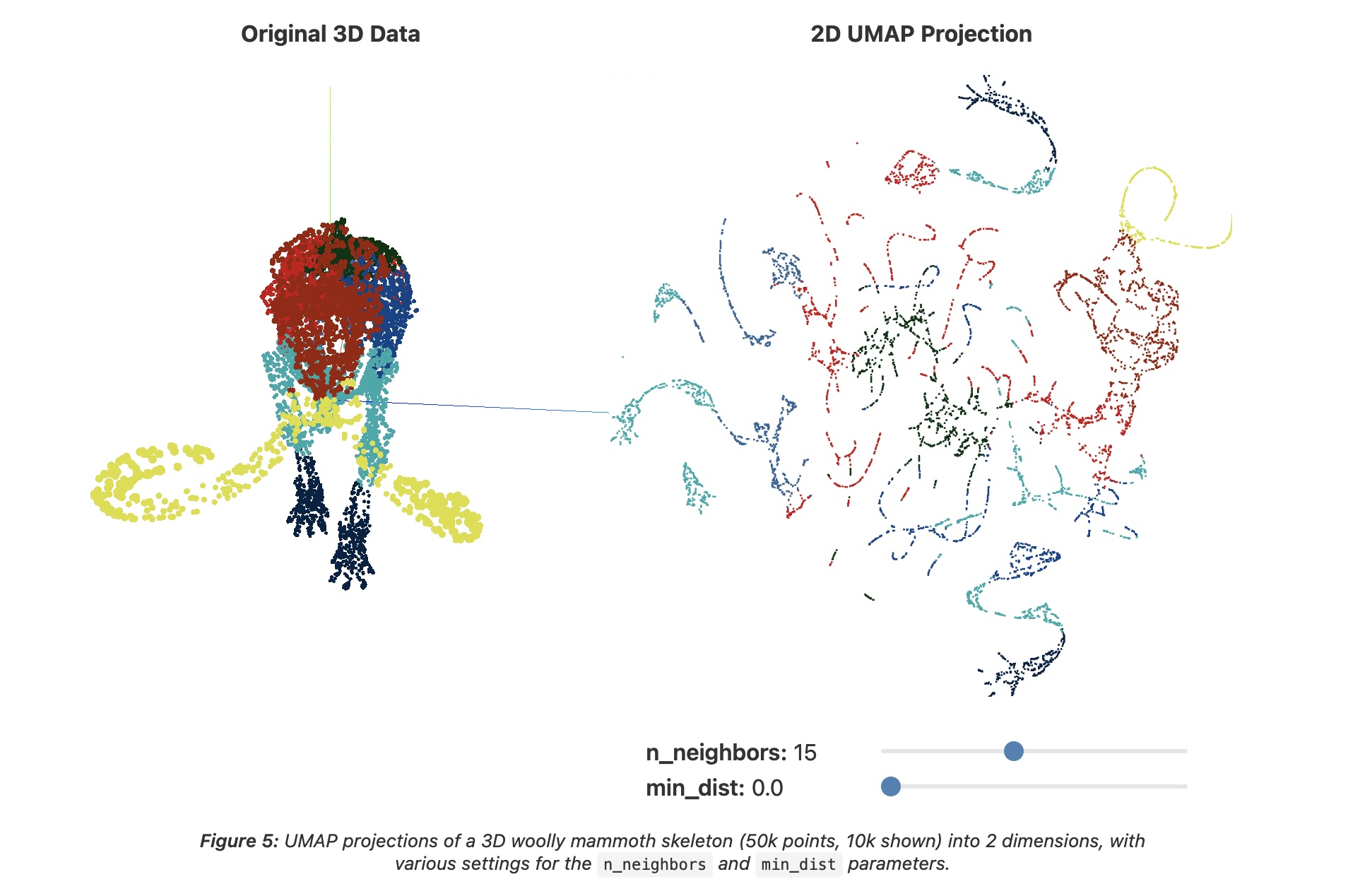 ::: {.notes} This shows min_dist=0.0, which allows points to be very tightly packed. You get very compact, distinct clusters. This is good for seeing fine structure within clusters but can make clusters appear to merge visually if they're truly close in high-dimensional space. Good for cluster analysis where you want to see internal structure. ::: ## UMAP: min_dist = 0.8  ::: {.notes} Here's min_dist=0.8 with the same data. Now points are spread out more - there's minimum spacing between them. This makes it easier to see individual points and prevents over-plotting, but tight clusters look artificially expanded. This is better for exploring individual data points or when you need to show labels. Typical visualization practice: try min_dist=0.1 for cluster analysis, 0.5 for point exploration. ::: ## UMAP: Critical Warnings Still Apply! * UMAP is non-linear like t-SNE * **Distances are not directly interpretable** * **Global positioning is better than t-SNE but still not perfect** * **Always try multiple parameter values** * **Validate findings with domain knowledge** ::: {.notes} Important: while UMAP is often better than t-SNE, the critical visualization warnings still apply! UMAP is non-linear and warps space, so distances aren't directly interpretable like in PCA. Global structure is better preserved than t-SNE, but you still can't fully trust distances between distant clusters. Always try multiple parameter values, compare with other methods, and validate with domain knowledge before drawing conclusions. ::: ## Parameter Comparison: t-SNE vs UMAP  ::: {.notes} This comparison shows how parameters affect both methods. t-SNE perplexity and UMAP n_neighbors serve similar roles - controlling local vs global balance. But notice UMAP is more stable - parameters don't change structure as drastically. Since UMAP is faster and more stable, it's often the recommended starting point for visualization projects. However, both methods are valuable tools, and showing multiple views (PCA + t-SNE + UMAP) gives the most complete picture. ::: # Visualization Best Practices ## Dimensionality Reduction: Visualization Guidelines 1. **Always show multiple views** - PCA (linear baseline) - t-SNE or UMAP (non-linear) - Try multiple parameters 2. **Don't over-interpret** - Cluster sizes may be misleading - Inter-cluster distances may be unreliable - Some structure may be artifacts 3. **Validate findings** - Check against domain knowledge - Use complementary analyses - Be transparent about limitations ::: {.notes} For professional visualization work, follow these guidelines: (1) Always show multiple views - comparing PCA, t-SNE, and UMAP helps viewers understand what's robust structure vs. method-specific artifacts. (2) Don't over-interpret - educate your audience about the limitations of non-linear methods. (3) Validate findings through domain knowledge and complementary analyses. Good visualization practice means being transparent about what the methods can and cannot tell us. ::: ## Interactive Dimensionality Reduction  ::: {.notes} An emerging area: interactive dimensionality reduction systems that let users guide the projection process. Users can add constraints (these points should be close), adjust parameters in real-time, and see results immediately. This combines algorithmic power (finding structure) with human insight (domain knowledge). For your projects, think about how interaction could help viewers explore and validate the dimensional reduction results. ::: ## Summary * **Clustering** helps discover natural groups in data - Multiple methods reveal different structures - Visualization is essential for interpretation * **Dimensionality Reduction** enables visualization of complex data - PCA: fast, interpretable, linear - t-SNE: excellent clusters, requires care - UMAP: faster, better global structure * **Critical**: Always validate, try multiple methods, understand limitations ::: {.notes} Today we covered two fundamental techniques for exploratory data visualization. Clustering helps us discover groups, while dimensionality reduction helps us visualize high-dimensional data. Both require careful application and interpretation. PCA is your reliable baseline, t-SNE and UMAP are powerful but need careful parameter tuning and interpretation. Always show multiple views, validate findings, and be transparent about limitations. These methods, used properly, are among the most powerful tools in information visualization. ::: ## Resources and Further Reading **Clustering:** * [Wolfram Clustering Tutorial](https://www.wolfram.com/language/introduction-machine-learning/clustering/) * [Cluster Analysis (Wikipedia)](https://en.wikipedia.org/wiki/Cluster_analysis) **Dimensionality Reduction:** * [How to Use t-SNE Effectively](https://distill.pub/2016/misread-tsne/) (Essential!) * [Understanding UMAP](https://pair-code.github.io/understanding-umap/) * [Dimensionality Reduction (Wikipedia)](https://en.wikipedia.org/wiki/Dimensionality_reduction) ::: {.notes} The Distill article on t-SNE and the PAIR article on UMAP are must-reads. They provide interactive visualizations that show exactly how these algorithms work and how they can be misinterpreted. The Wolfram clustering tutorial has excellent interactive examples. Take time to explore these resources - they'll make you much more effective at using these powerful visualization techniques. :::
