
Week 2: Analytical Questions and Data Transformation
Published:
Types provide guidance in selecting appropriate graphical encoding strategies... ::: :::{.notes} In visualization its important to think of attribute types because doing this simplifies the process of deciding how to graphically represent your data. ::: --- ## Visualization Examples by Attribute Type ### Line Charts: Appropriate for Ordered Data {width="100%"} :::{.notes} Line charts imply a continuity relationship, which does not exist in nominal data, but are suitable for ordinal data. ::: --- ### Categorical Data: Arbitrary Sorting 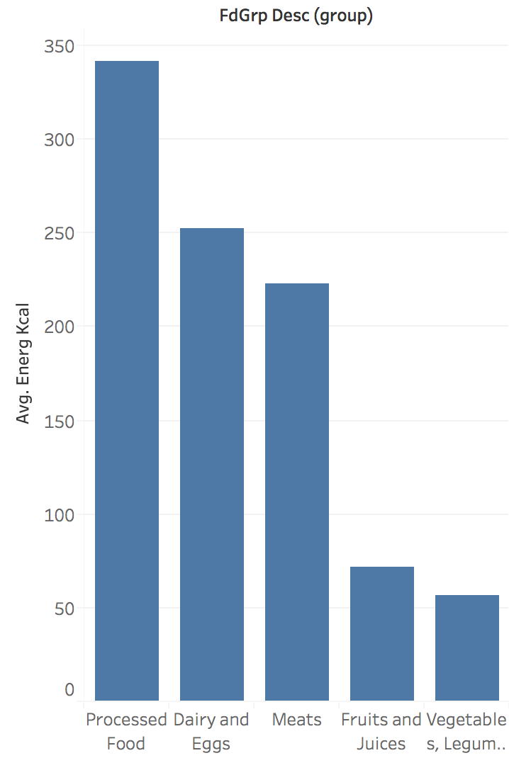{width="100%"} :::{.notes} Nominal or categorical attributes can usually be arranged arbitrarily. ::: --- ### Spatial Attributes: Use Spatial Metaphors 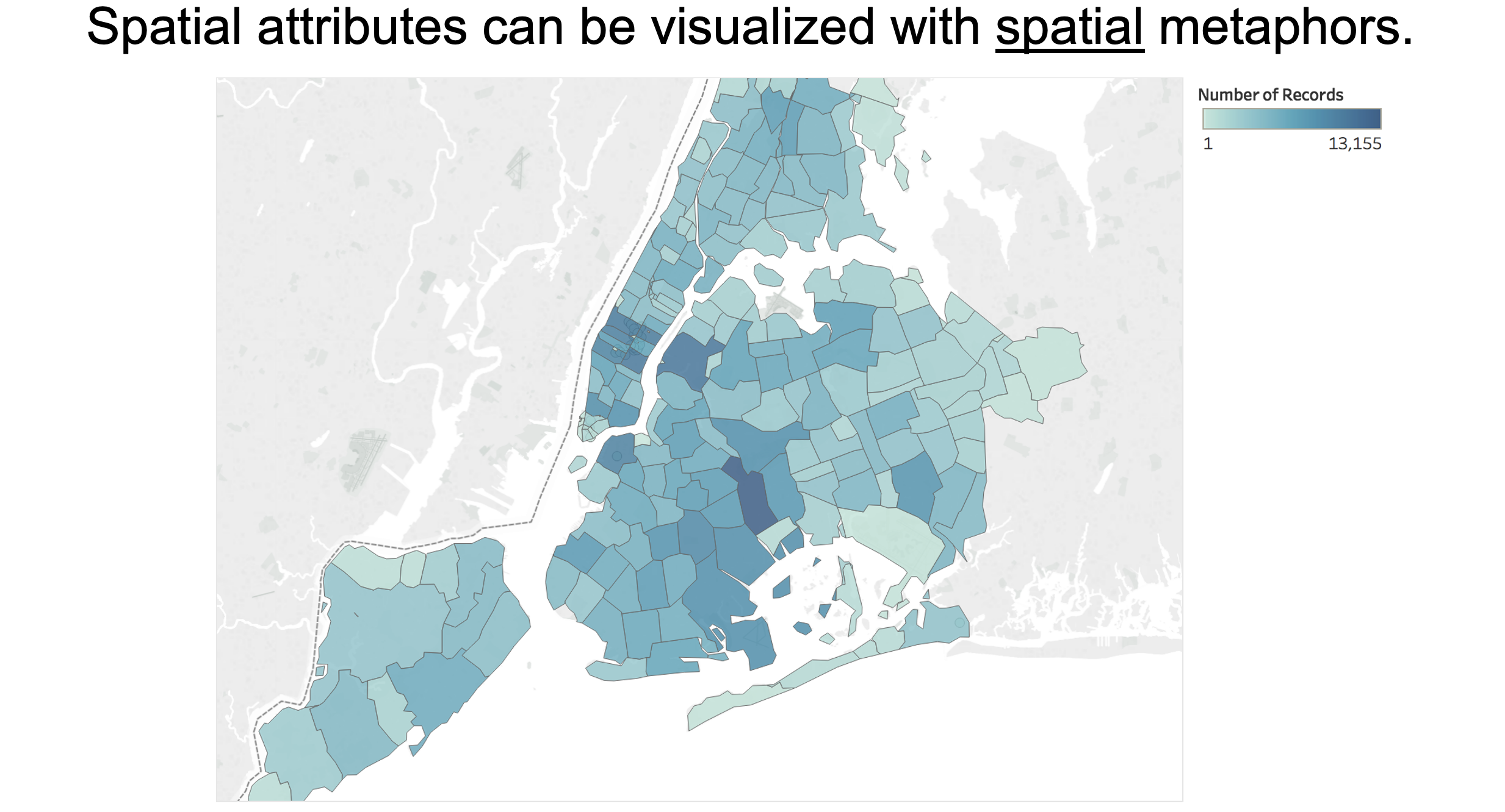{width="90%"} :::{.notes} If you have spatial data, you can use various spatial metaphors to represent it, here it's NYC neighboorhoods, so you visualize the data as a choropleth map. ::: --- ### Quantitative Data: Divergent Color Scales 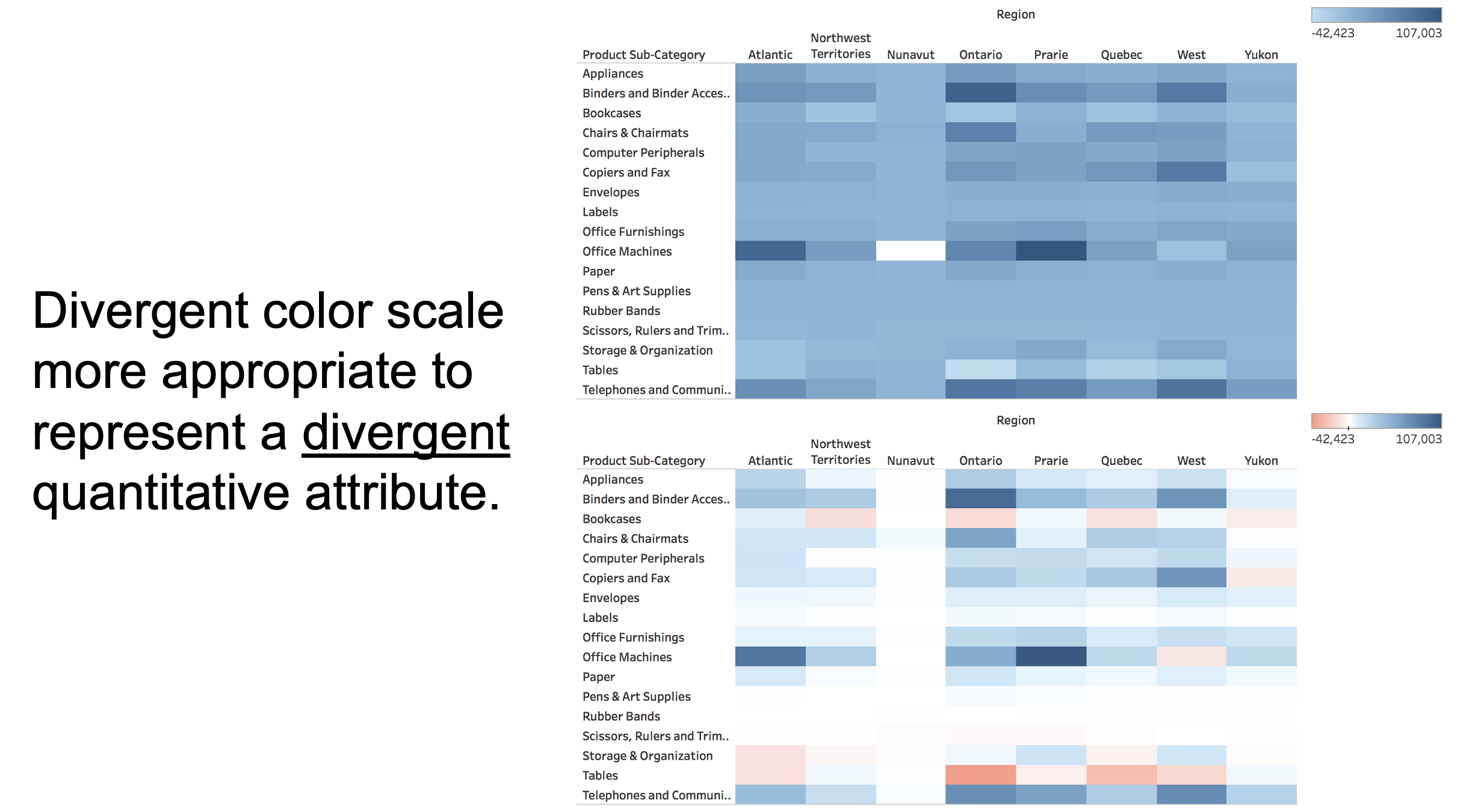{width="100%"} :::{.notes} If you have divergent quantitative data, i.e. some sort of itnerval, you can use a divergent color scale, with separate hues for negative values and separate ones for positive values. ::: --- ## (More) Ways of Characterizing Variables ### Physical Types - Characterized by storage format - Characterized by machine operations - *Example*: bool, int32, float, double, string ### Abstract Types - Provide descriptions of the data - May be characterized by methods/attributes - May be organized into a hierarchy - *Example*: plants, animals, metazoans ## Taxonomy of Data Types ### Shneiderman's Classification (1996) :::: {.columns} ::: {.column width="50%"} - **1D** (sets and sequences) - **Temporal** - **2D** (maps) - **3D** (shapes) ::: ::: {.column width="50%"} - **nD** (relational) - **Trees** (hierarchies) - **Networks** (graphs) ::: :::: *"The eyes have it: A task by data type taxonomy for information visualization"* ## Dimensions & Measures ### Dimensions (~ independent variables) - **Categorical variables** that describe and organize data (Nominal, Ordinal) - Examples: Categories, dates, regions, binned quantities - Used for: Grouping, filtering, splitting data ### Measures (~ dependent variables) - Quantitative values that can be aggregated (Q) - Examples: Sales revenue, temperature readings, counts - Used for: Sum, count, average, std. dev, min/max *Not a strict distinction. The same variable may be treated either way depending on the task. For example - Weather if described as - Hot/Cold(N) vs Temparature Values(Q)* :::{.notes} You can also classify attributes into either dimensions and measures, - dimensions are usually categorical values - which can be used for grouping, splitting, filtering purposes, meanwhile measures refer to any quantitative values that you can run aggregations and other operations on. Note that this is not a strict distinction, the same variable can be described both as a measure and dimension - for instance- temperature. ::: --- ## Data Models vs Conceptual Models ### Data models are formal descriptions - Focus on storage, computation, and manipulation - Example: Array of 32-bit floats [98.6, 101.2, 99.1] ### Conceptual models are mental constructions - Semantic, meaning-rich representations - Support reasoning, interpretation, and understanding - Example: Patient temperatures (normal, fever, recovering) ### Examples (data vs. conceptual) - Float array [1.2, -0.8, 2.1] vs. market volatility - 3D vector of floats vs. spatial location **Data models ask "How is it stored?" Conceptual models ask "What does it mean?"** ::: {.notes} From Jeff Heer's materials on distinguishing between formal data models and conceptual understanding ::: ## From Data Model to Stevens' Levels **Example: Temperature Data** ### Data Model - 32.5, 54.0, -17.3, ... - Floating point numbers ### Conceptual Model - Temperature (°C) ### Measurement Scales (Stevens' Levels): - Above/Below Freezing (Nominal) - Cold, Warm, Hot (Ordinal) - Actual Temperature Values (Quantitative - Interval) **Key Point**: Same data, different analytical possibilities depending on measurement scale --- # Part 2: Analytical Questions ## Visualization as a Tool to Answer Questions with Data {width="100%"} :::{.notes} The ultimate purpose of creating visualizations is to answer questions that you have about data. ::: --- ## Domain Questions vs. Data Questions {width="100%"} :::{.notes} However, the type of questions you can ask vary a lot, and can be broadly categorized as either a domain question or a data question. ::: --- ## From Domain to Data Questions {width="100%"} --- ## Example: NYC Flight Delays Data 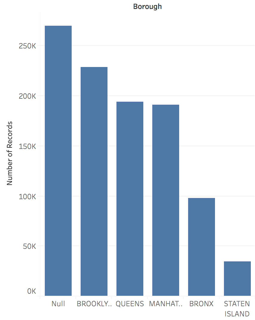{width="100%"} :::{.notes} This is a table showing the average flight delay for different airlines, for a given hour in the day. ::: --- ## Domain Questions: Flight Data 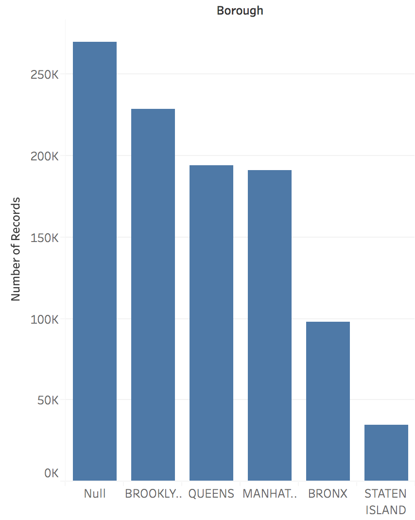{width="100%"} :::{.notes} You can ask a variety of questions from this, for instance - However, simply by looking at the table, it is really hard to answer these questions. ::: --- ## Visualization Answers All Questions 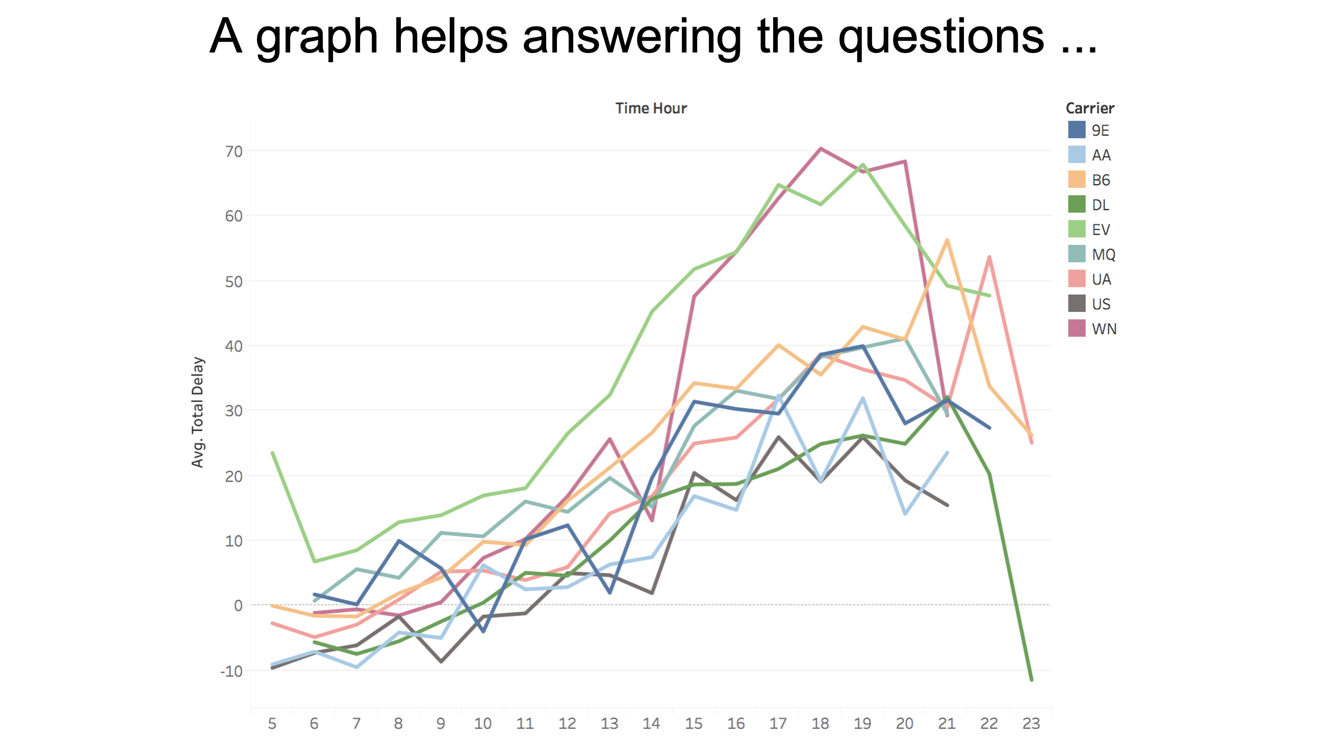{width="100%"} :::{.notes} But as soon as you visualize this data, you can find the answers to the questions easily, for instance, delays seem to be most common in the evenings, and WN and EV seem to be the worst. ::: --- ## Example: Vision Zero Initiative 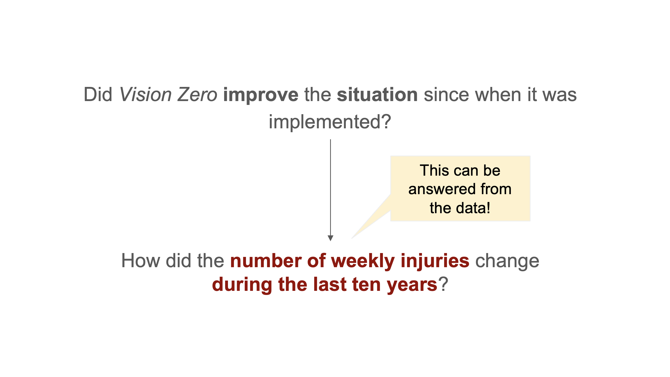{width="100%"} :::{.notes} Here, we have a domain question about vision zero which is - (read) But what you notice is that the question is vague - What do you mean by improve? What do you mean by situation - however when you specify what you mean - you can answer the question from the data. The question "(read)" is an example of a data q. It is specific, and answerable. ::: --- ## Multiple Data Questions from One Domain Question 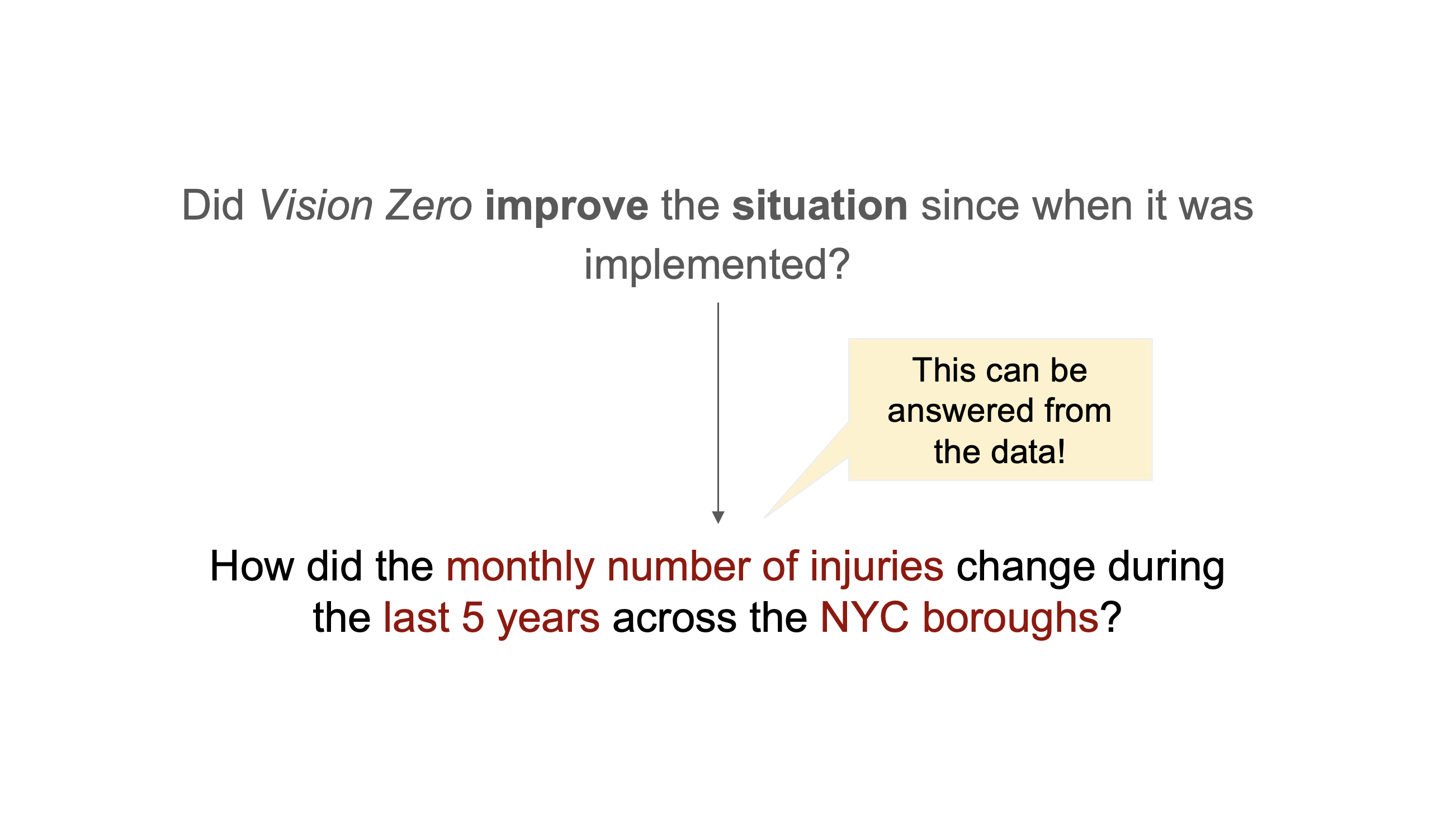{width="100%"} :::{.notes} You can start out with the same domain question and ask different data questions based on your interpretation, and the basis of a good visualization is to be able to do this translation from domain to data question well. ::: --- ## Key Insight: Specificity Matters **One domain question can lead to many data questions:** ::: {.incremental} - **Temporal granularity:** Weekly vs. monthly vs. yearly - **Temporal scope:** 5 years vs. 10 years vs. since implementation - **Spatial scope:** Citywide vs. by borough vs. by intersection - **Measure definition:** Total injuries vs. serious injuries vs. fatalities ::: :::{.notes} It's very important to be specific with data questions and to choose this wisely. The data questions you formulate can have varying temporal granularit, scope, spatial scope and measure different things. ::: --- ## Key Characteristics 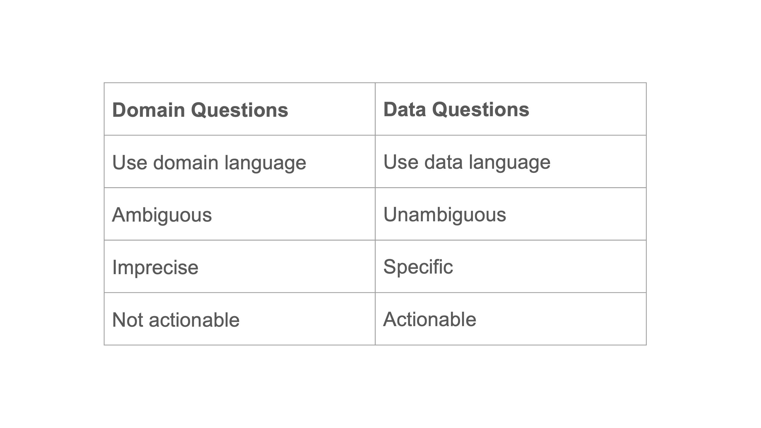{width="100%"} :::{.notes} To summarize, Domain Qs => Data Qs => ::: --- ## Assessment Questions Throughout the Pipeline 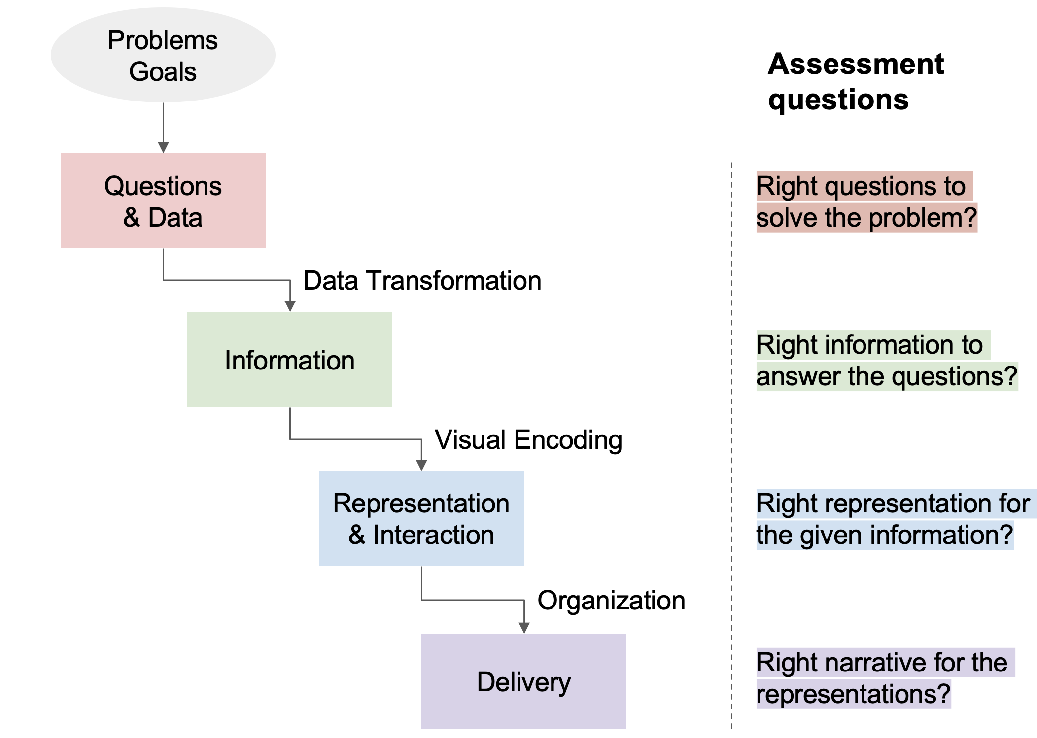{width="100%"} :::{.notes} At every stage of the data visualization pipeline, you can ask yourself some assessment questions to verify you're on the right track to build a good visualization. ::: --- ## What Types of Tasks Can We Do with Data? ### Shneiderman's Information Seeking Tasks (1996) ::: {.incremental} - **Overview**: What does the data look like? - **Zoom**: Focus on items of interest - **Filter**: Show me something conditionally - **Details-on-demand**: Show me more when I need it - **Relate**: How are items connected? - **History**: What has changed? - **Extract**: Let me save what I find ::: ::: {.notes} Shneiderman's Visual Information Seeking Mantra: Overview first, zoom and filter, then details-on-demand start with overview example - (ask class for other things they can think of ) ::: ## The Three Levels of Questions ### According to Bertin (1983) ::: {.incremental} 1. **Elementary**: What is the value of X for element Y? 2. **Intermediate**: What elements have value X? 3. **Overall**: What are the relationships among all elements? ::: ::: {.notes} Bertin classified data questions in three different levels => Elementary, intermediate and overall. Elementary Qs relate to individual values, Intermediate to groups of values and overall to the scale of the entire dataset. ::: ## Modern Task Frameworks - **Brehmer & Munzner (2013)**: Why - What - How - **Schulz et al. (2013)**: Goals - Means - Characteristics ::: {.notes} There are many task frameworks out there, which you can use to think of the same set of tasks in a different paradigm. Munzner proposed - The why what and how framework - essentially ... You can also think of tasks by thinking about the goals, means and characteristics and so on. ::: --- ## Types of Analytical Tasks ### Low-level Tasks (Amar et al., 2005) *"Low-Level Components of Analytic Activity in Information Visualization"* :::: {.columns} ::: {.column width="50%"} **Value Tasks** - **Retrieve Value**: What is the value of attribute X for case Y? - **Filter**: Which cases satisfy condition C? - **Compute Derived Value**: What is the value of function F given attribute X? - **Find Extremum**: What is the max/min value of attribute X? - **Sort**: What is the ordering of cases by attribute X? - **Determine Range**: What is the span of values of attribute X? ::: ::: {.column width="50%"} **Pattern Tasks** - **Find Anomalies**: Which cases are exceptional given their relation to others? - **Cluster**: Which cases are similar in value for attributes X, Y, Z? - **Correlate**: What is the relationship between attributes X and Y? - **Characterize Distribution**: What is the distribution of values of attribute X? ::: :::: ::: {.notes} You can broadly think of analytical tasks as value and pattern tasks- Where pattern tasks have a little more semantics attached to them , while value tasks relate to individual samples usually. ::: --- ## Why Task Frameworks? :::{.incremental} - **Choose appropriate visual encodings** - Match data types to suitable visual representations - **Support user tasks** - Ensure your visualization enables the analytical tasks users need - **Design systematic interactions** - Know what operations users expect to perform - **Avoid visualization pitfalls** - Understand when certain chart types mislead or fail - **Evaluate design decisions** - Test whether your visualization supports intended analytical goals - **Create complete tools** - Build systems that handle the full spectrum of data analysis tasks ::: ::: {.notes} All this might seem. a little theoretical, but thinking about tasks this way, helps a lot and streamlines the process of creating visualizations. Namely- ::: # Part 3: Data Wrangling and Transformation ## The Reality of Data Work > "I spend more than half of my time integrating, cleansing and transforming data without doing any actual analysis. Most of the time I'm lucky if I get to do any 'analysis' at all." > > — Anonymous Data Scientist (2012 interview study) ::: {.notes} If you have worked with data analytics in any capacity, you might also have a similar expereince - where you find that you're doing very little actual analysis and most work is actually data cleaning, transforming and so forth. ::: ## Visualization Reveals Data Problems > "The first sign that a visualization is good is that it shows you a problem in your data. Every successful visualization that I've been involved with has had this stage where you realize, 'Oh my God, this data is not what I thought it would be!' So already, you've discovered something." > > — Martin Wattenberg (ACM Queue '09) ::: {.notes} Visualizing data is not only helpful for final analysis but it also helps reveal problems in the analytics stage. So always generate some basic visualizations whenever you're trying to clean or process data. ::: --- ## Data Wrangling Pipeline {width="100%"} ::: {.notes} The Data wrangling pipleine consists of all stages of working with data, right from collection to delivery. Data transformation and cleaning can be thought of as big parts of this process. ::: ## Common Data Quality Issues :::{.fragment} :::: {.columns} ::: {.column width="50%"} ### Missing Data - Null values - Empty strings - Placeholder values (999, -1) - Incomplete records ### Inconsistent Data - Different formats - Duplicate records - Conflicting values - Unit mismatches ::: ::: {.column width="50%"} ### Incorrect Data - Data entry errors - Outliers - Wrong data types - Invalid relationships ### Structural Issues - Denormalized data - Wrong granularity - Mixed semantics - Schema violations ::: :::: ::: ::: {.notes} Interactive ::: ## Common Data Cleaning Techniques :::{.incremental} * ### Handling Missing Values - **Purpose**: Address incomplete data - **Methods**: Imputation, deletion, interpolation - **Example**: Fill missing ages with median value * ### Duplicate Removal - **Purpose**: Eliminate redundant records - **Types**: Exact matches, fuzzy matching, key-based * ### Outlier Detection - **Purpose**: Identify anomalous values - **Methods**: Statistical bounds, domain rules, clustering * ### Data Type Correction - **Purpose**: Ensure proper format consistency - **Methods**: Parsing, casting, validation rules ::: ::: {.notes} Interactive ::: ## Common Transformation Operations :::{.incremental} * ### Aggregation - **Purpose**: Summarize groups of data - **Methods**: Sum, mean, median, count, min, max - **Example**: Daily sales → Monthly totals * ### Filtering - **Purpose**: Focus on relevant subset - **Types**: Range, categorical, conditional * ### Binning - **Purpose**: Convert continuous to discrete - **Methods**: Equal width, equal frequency, custom _ **Example**: Dividing age into groups (<18, 18-65, >65) * ### Normalization - **Purpose**: Enable fair comparison - **Methods**: Min-max, z-score, percentage ::: ::: {.notes} Interactive ::: ## Transformation Pipeline Example 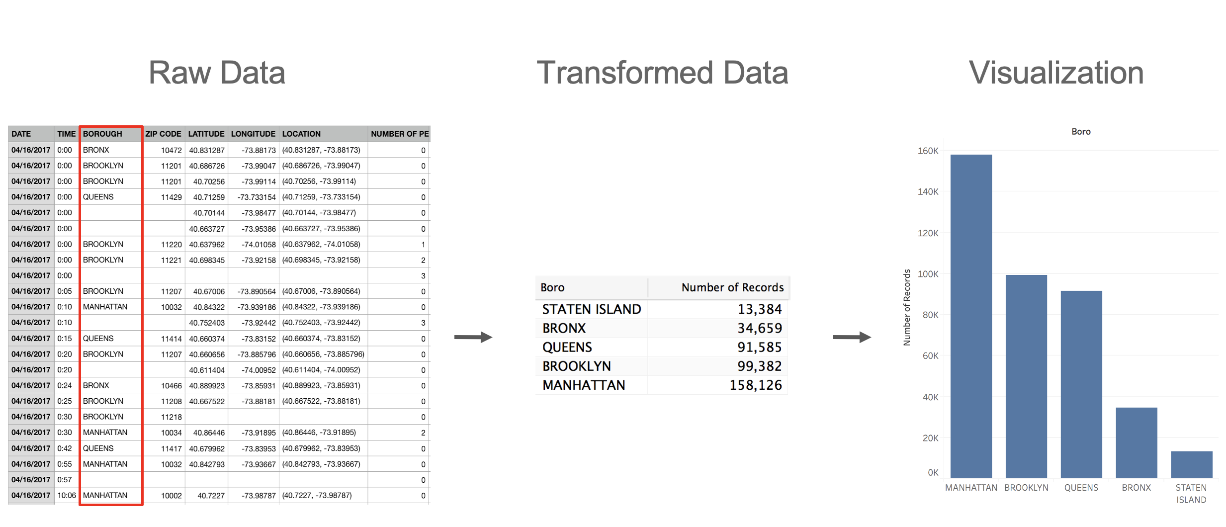{width="100%"} :::{.notes} You start with some raw dataset and a question you need to answer, then you decide the format that you need to answer the questions and transform the raw data into that format, which can then be visualized. Often, what visual metaphor you're using dictates what format you want to transform the data to. ::: ## Relational Data Model ### Represent data as a **table** (or relation) - Each **row** (or tuple) represents a record - Each record is a fixed-length tuple - Each **column** (or field) represents a variable - Each field has a name and a data type - A table's **schema** is the set of names and types - A **database** is a collection of tables (relations) :::{.notes} relational data model - used in sql. (Read) ::: ## Relational Algebra / SQL ### Operations on Data Tables: table(s) in, table out - **Project** (`SELECT`): select a set of columns - **Filter** (`WHERE`): remove unwanted rows - **Sort** (`ORDER BY`): order records - **Aggregate** (`GROUP BY`, `SUM`, `MIN`, `MAX`): partition rows into groups + summarize - **Combine** (`JOIN`, `UNION`): integrate data from multiple tables :::{.notes} SQL provides the framework for selection, sorting, filtering, aggregation and join operations. ::: ## SQL Operations: Project ```sql SELECT day, stock FROM prices ``` :::: {.columns} ::: {.column width="45%"} **Input:** | day | stock | price | |------|-------|--------| | 10/3 | AMZN | 957.10 | | 10/3 | MSFT | 74.26 | | 10/4 | AMZN | 965.45 | | 10/4 | MSFT | 74.69 | ::: ::: {.column width="10%"} → ::: ::: {.column width="45%"} **Output:** | day | stock | |------|-------| | 10/3 | AMZN | | 10/3 | MSFT | | 10/4 | AMZN | | 10/4 | MSFT | ::: :::: ## SQL Operations: Filter ```sql SELECT * FROM prices WHERE price > 100 ``` :::: {.columns} ::: {.column width="45%"} **Input:** | day | stock | price | |------|-------|--------| | 10/3 | AMZN | 957.10 | | 10/3 | MSFT | 74.26 | | 10/4 | AMZN | 965.45 | | 10/4 | MSFT | 74.69 | ::: ::: {.column width="10%"} → ::: ::: {.column width="45%"} **Output:** | day | stock | price | |------|-------|--------| | 10/3 | AMZN | 957.10 | | 10/4 | AMZN | 965.45 | ::: :::: ## SQL Operations: Aggregate ```sql SELECT stock, MIN(price) FROM prices GROUP BY stock ``` :::: {.columns} ::: {.column width="45%"} **Input:** | day | stock | price | |------|-------|--------| | 10/3 | AMZN | 957.10 | | 10/3 | MSFT | 74.26 | | 10/4 | AMZN | 965.45 | | 10/4 | MSFT | 74.69 | ::: ::: {.column width="10%"} → ::: ::: {.column width="45%"} **Output:** | stock | min(price) | |-------|------------| | AMZN | 957.10 | | MSFT | 74.26 | ::: :::: ## Roll-Up and Drill-Down 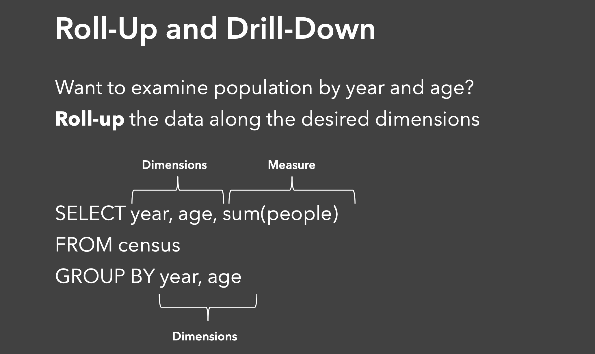{width="100%"} :::{.notes} Roll up and drill down are complementary data navigation techniques. Roll Up moves from detailed data to summarized, higher-level views. You're aggregating information to see broader patterns and trends. For example: aggregating individual census records into population totals by year and age group, transforming millions of personal data points into meaningful demographic summaries that reveal population trends over time. ::: --- ## Roll-Up and Drill-Down: Adding Dimensions 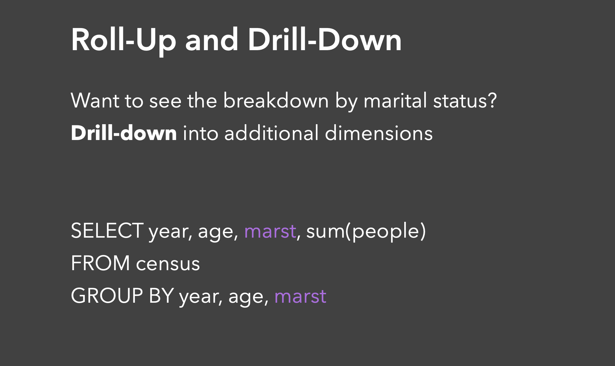{width="100%"} :::{.notes} Drill Down moves from summary data to more detailed, granular views. You're breaking down aggregated information to examine specific components. For example: This query demonstrates a drill-down operation by adding the marital status dimension to our previous year and age grouping. Starting from a two-dimensional view of population by year and age, we're now drilling down to include marital status as an additional dimension. This provides a more granular breakdown, allowing us to see not just how many people are in each age group per year, but also how they're distributed across different marital statuses—revealing deeper patterns like marriage trends across age groups over time. ::: --- ## Data Cube Visualization: Aggregation Operations 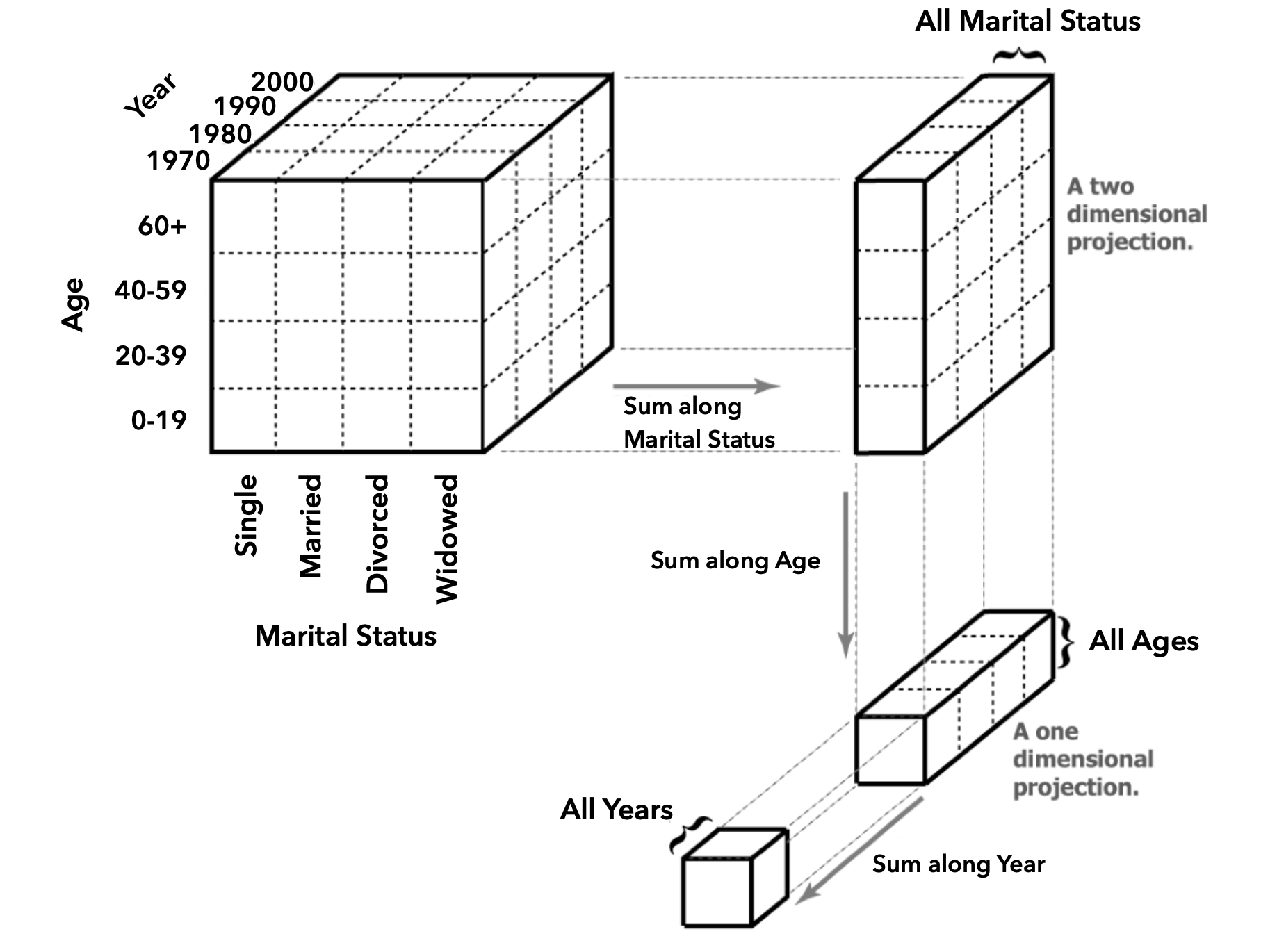{width="100%"} :::{.notes} This diagram illustrates how roll-up operations work with a three-dimensional data cube containing population data across Year, Age, and Marital Status dimensions. Starting with the full cube that shows detailed breakdowns by all three dimensions, we can roll up the data by summing along different dimensions to create simpler views. Rolling up along the Marital Status dimension collapses all marital categories into a two-dimensional projection showing just Year and Age. Rolling up along the Age dimension creates a view of just Year and Marital Status for all ages combined. Finally, rolling up along the Year dimension produces a one-dimensional view showing overall patterns by Marital Status across all years and ages. Each roll-up operation reduces complexity while preserving the aggregated totals, allowing analysts to examine the data from different perspectives and levels of detail. ::: --- ## Roll-Up vs. Drill-Down Operations 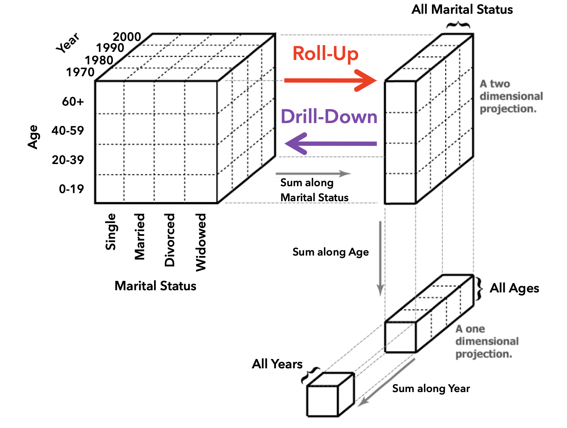{width="100%"} --- ## Creating Derived Attributes ### Calculated Fields ```python # Examples of derived attributes df['profit_margin'] = df['profit'] / df['revenue'] df['year'] = pd.to_datetime(df['date']).dt.year df['is_profitable'] = df['profit'] > 0 df['age_group'] = pd.cut(df['age'], bins=[0, 18, 65, 100], labels=['child', 'adult', 'senior']) ``` ### Feature Engineering - Ratios and percentages - Time-based features (day of week, season) - Categorical encoding (one-hot, ordinal) - Text processing (word counts, sentiment) --- ## Tidy Data: Organizing Data for Visualization **Goal:** Structuring data to make visualization and analysis easier 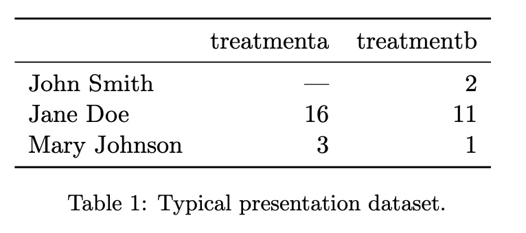{width="100%"} --- ## Alternative Data Structures 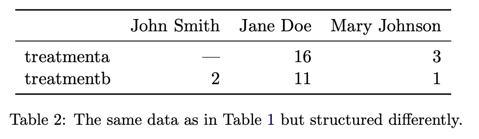{width="100%"} --- ## The Tidy Data Solution 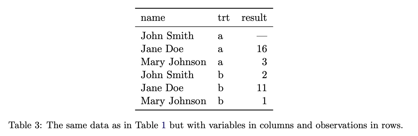{width="100%"} --- ## Tidy Data Definition In tidy data: ::: {.incremental} - **Each variable forms a column** - **Each observation forms a row** - **Each type of observational unit forms a table** ::: --- ## Tidy Data Example #1 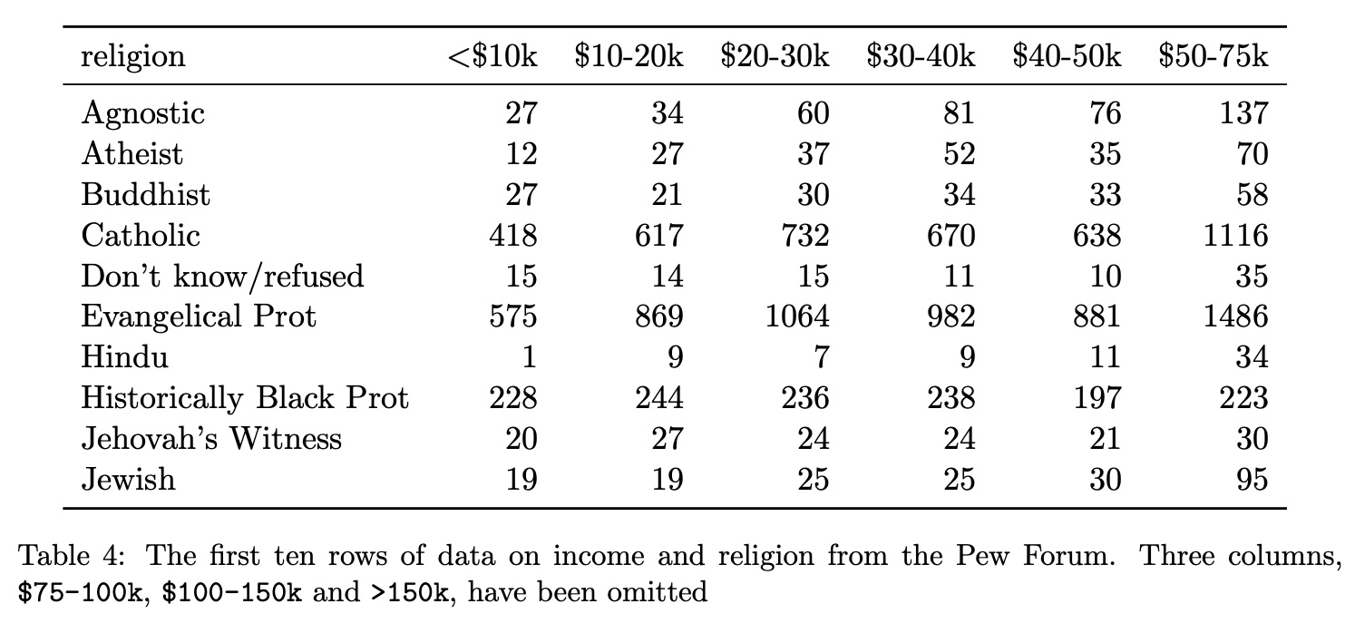{width="100%"} --- ## Transforming to Tidy Format 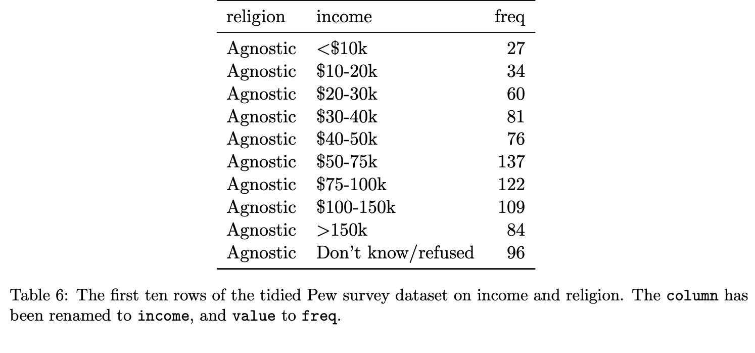{width="100%"} --- ## Tidy Data Example #2: Before 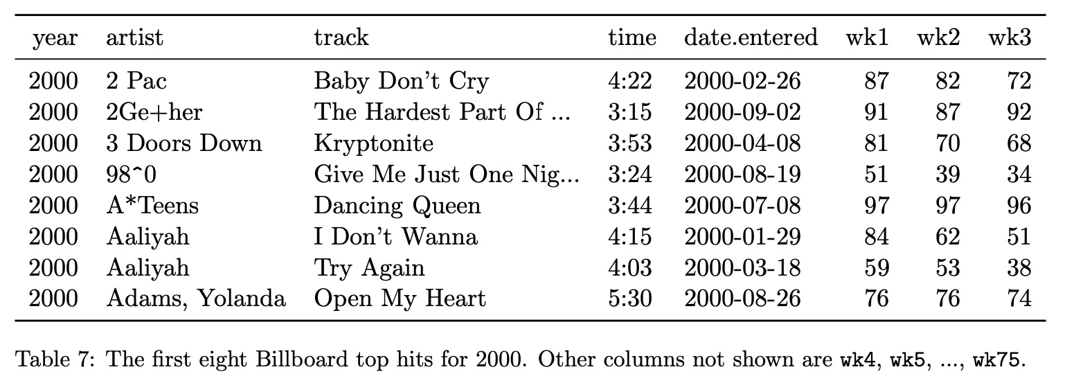{width="100%"} --- ## Tidy Data Example #2: After 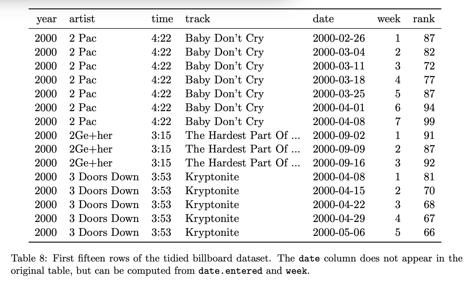{width="100%"} --- ## Tools for Data Transformation :::: {.columns} ::: {.column width="33%"} ### Programming - **Python**: pandas, numpy - **R**: dplyr, tidyr - **SQL**: CTEs, window functions ::: ::: {.column width="33%"} ### Visual Tools - **Tableau Prep** - **Power Query** - **OpenRefine** - **Trifacta** ::: ::: {.column width="34%"} ### Big Data - **Apache Spark** - **dbt** - **Alteryx** - **Apache Beam** ::: :::: ## Best Practices ### Data Wrangling Guidelines ::: {.incremental} 1. **Document transformations**: Keep track of all changes 2. **Preserve raw data**: Never modify original source 3. **Validate results**: Check for unexpected values 4. **Test edge cases**: Handle nulls, zeros, outliers 5. **Consider performance**: Optimize for large datasets 6. **Make it reproducible**: Script or save workflows 7. **Think about updates**: Design for new data ::: --- # Examples & Practice ## Data to Visualization Examples ### Categories → Bar Chart 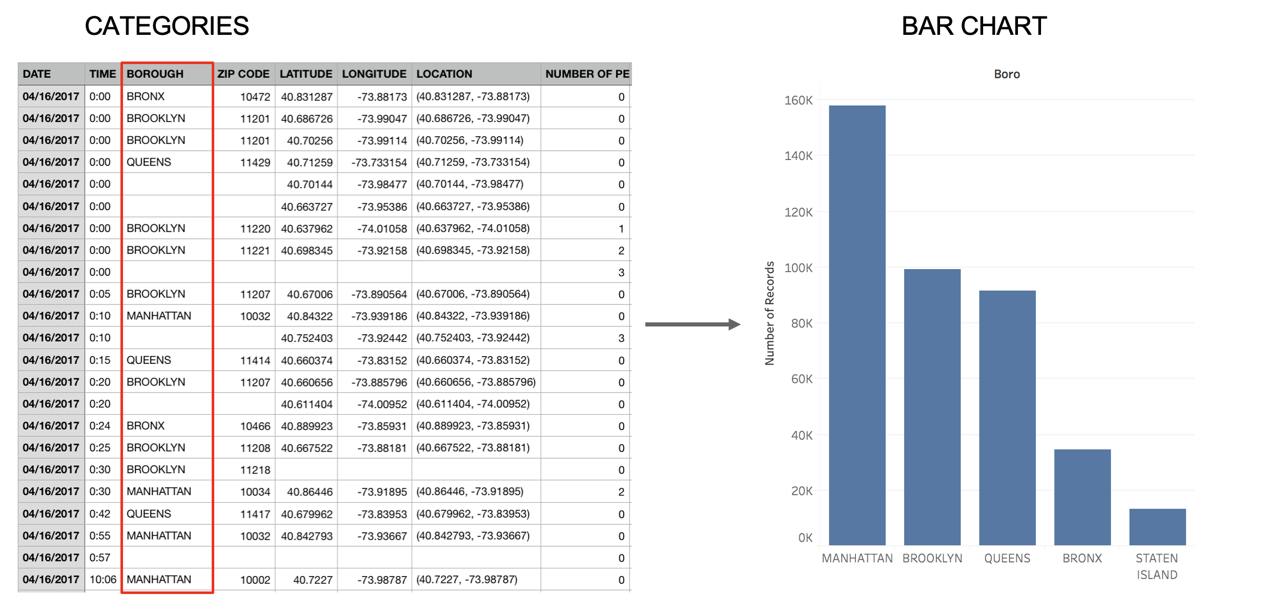{width="90%"} --- ### Spatial Information → Map 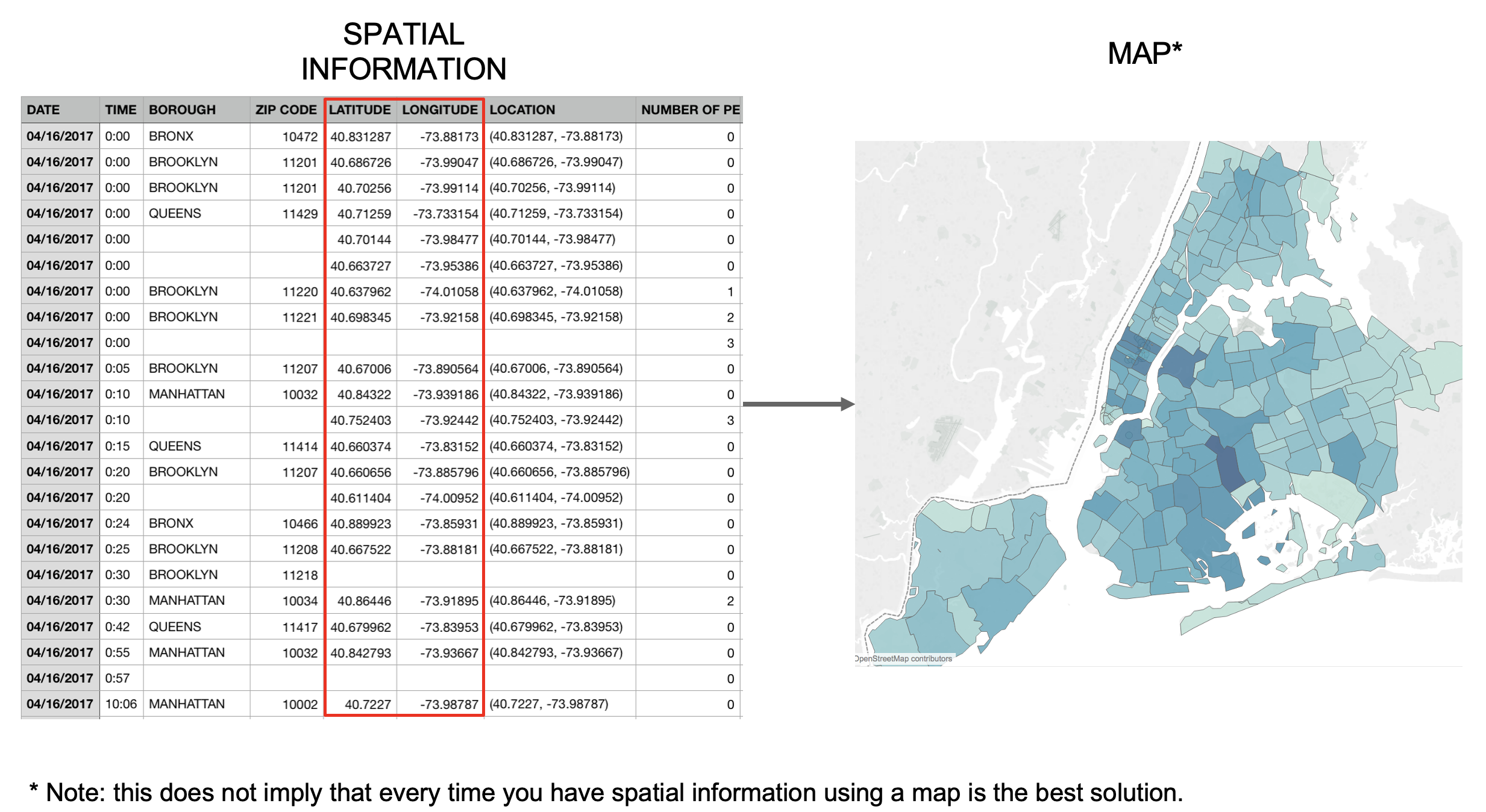{width="90%"} ## Example: U.S. Census Data ### Data Schema - **Year**: 1850-2000 (every decade) - **Age**: 0-90+ - **Sex**: Male, Female - **Marital Status**: Single, Married, Divorced, Widowed - **People Count**: Number in group ### Questions to Explore - How has population age distribution changed? - What are marriage patterns by age and year? - How do we handle the changing categories over time? ## Interactive Exercise: NYC Taxi Data ### Dataset Description Raw taxi trip data with these fields: ::: {.incremental} - **pickup_datetime, dropoff_datetime** - **pickup_location, dropoff_location** - **trip_distance, fare_amount** - **passenger_count** ::: --- ## Your Design Tasks Work in small groups to design a transformation pipeline: ::: {.incremental} 1. **What derived attributes would be useful?** 2. **How would you aggregate for daily patterns?** 3. **What filtering might reveal insights?** 4. **How would you handle outliers?** ::: ::: {.notes} Give groups 5-7 minutes, then discuss solutions ::: ## Common Data Formats ### Text Formats ```csv # CSV: Comma-Separated Values year,age,marital_status,sex,people 1850,0,0,1,1483789 ``` ```json // JSON: JavaScript Object Notation [ {"year":1850,"age":0,"marital_status":0,"sex":1,"people":1483789}, {"year":1850,"age":5,"marital_status":0,"sex":1,"people":1411067} ] ``` ### Binary Formats - **Arrow**: Columnar memory format - **Parquet**: Compressed columnar storage - **HDF5**: Hierarchical data format --- # Summary ## Key Takeaways ### Analytical Questions - Different levels of questions require different visualizations - Tasks range from elementary lookups to pattern discovery - Visual queries enable interactive exploration ### Data Models & Types - Distinguish between data models and conceptual models - Type (N/O/Q) determines appropriate encodings - Dimensions vs measures depends on analytical task ### Data Transformation - SQL/relational algebra provides fundamental operations - Tidy data principles enable consistent analysis - Roll-up and drill-down for multidimensional exploration ### Data Wrangling - Most time spent on data preparation, not analysis - Visualization helps identify data quality issues - Document and automate transformation pipelines ## Next Week ### Week 3: Marks, Channels, and Perception - Visual encoding principles - Perceptual effectiveness - Design guidelines ### Reading - Munzner Ch. 4-5 - Cleveland & McGill (1984) ### Lab (Sept 13) - Hands-on data transformation with pandas - Creating tidy datasets - Building transformation pipelines ## Questions? ### Resources - [Tidy Data Paper](https://www.jstatsoft.org/article/view/v059i10) - [pandas Documentation](https://pandas.pydata.org/) - [Data Transformation with dplyr](https://dplyr.tidyverse.org/) - [Jeff Heer's CSE 512 Course](https://courses.cs.washington.edu/courses/cse512/) - **Amar, R., Eagan, J., & Stasko, J.** (2005). Low-level components of analytic activity in information visualization. *IEEE Symposium on Information Visualization*, 111-117. - **Card, S. K., Mackinlay, J. D., & Shneiderman, B.** (1999). *Readings in Information Visualization: Using Vision to Think*. Morgan Kaufmann. - **Munzner, T.** (2014). *Visualization Analysis and Design*. CRC Press. - **Shneiderman, B.** (1996). The eyes have it: A task by data type taxonomy for information visualization. *Proceedings 1996 IEEE Symposium on Visual Languages*, 336-343. - **Stevens, S. S.** (1946). On the Theory of Scales of Measurement. *Science*, 103(2684), 677-680.