Fundamental Graphs and Visual Encoding

CS-GY 6313 - Information Visualization - Fall 2026

Claudio Silva

NYU Tandon School of Engineering

2026-09-18

Today’s Agenda

Learning Objectives:

  • Master the five fundamental graph types and when to use them
  • Apply expressiveness and effectiveness principles
  • Understand visual encoding theory (marks and channels)
  • Make informed chart selection decisions
  • Design effective scales and axes

Acknowledgments

Special thanks to:

Prof. Enrico Bertini NYU Tandon School of Engineering

  • Course materials and pedagogical insights
  • Visualization design principles
  • Interactive visualization expertise

Prof. Jeff Heer University of Washington

  • Fundamental visualization theory
  • Perceptual effectiveness research
  • Vega-Lite and D3.js frameworks

This course builds upon their foundational contributions to visualization education and research.

The Chart Selection Challenge

The central question: Given data and a task, which visualization technique will be most effective?

  • Chart type (bar, line, scatter, etc.)
  • Visual encoding (position, color, size)
  • Design choices (scales, axes, layout)

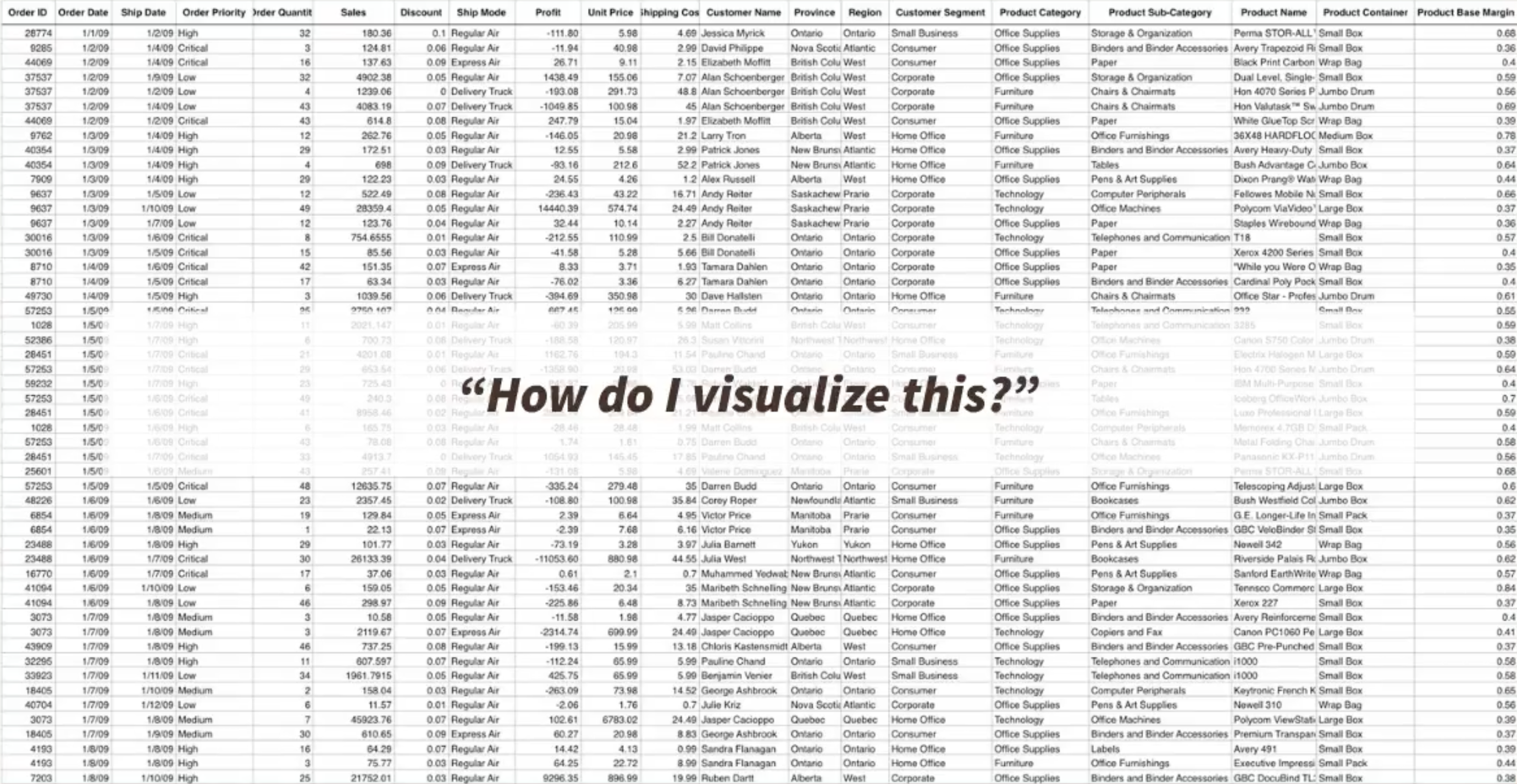
The fundamental question: How do I visualize this data?

Two-Step Process

  • Step1: Decide what to visualize.
    • Tipically, data is represented in a table and you must SELECT attributes to create your visualization
    • The selected attributes can also be TRANSFORMED in order to generated useful information to answer the question
  • Step2: Choose/Design your visualization.
    • Your visualization can be selected from a set of existing visualizations
    • Based on well-defined principles, a novel visualization can be designed to answer the question

Data Types Drive Design

Understanding your data:

  • Categorical (nominal, ordinal)
  • Quantitative (continuous, discrete)
  • Temporal (time-based ordering)
  • Spatial (geographic coordinates)

The type determines suitable encodings
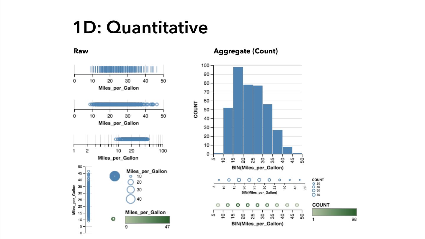
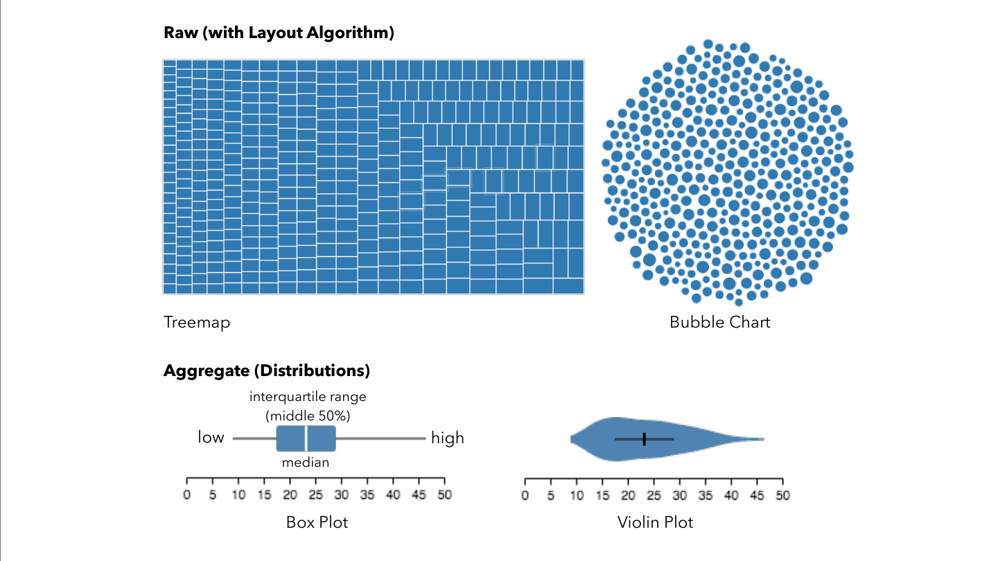
Example: Data types to visual mappings

Same Data, Multiple Options

Design decisions:

  • Which visual channels best represent your data?
  • How do you map data attributes to visual properties?
  • What design choices enhance clarity?
  • How do you avoid misleading representations?

Chart selection: The attribute types can guide the chart selection!
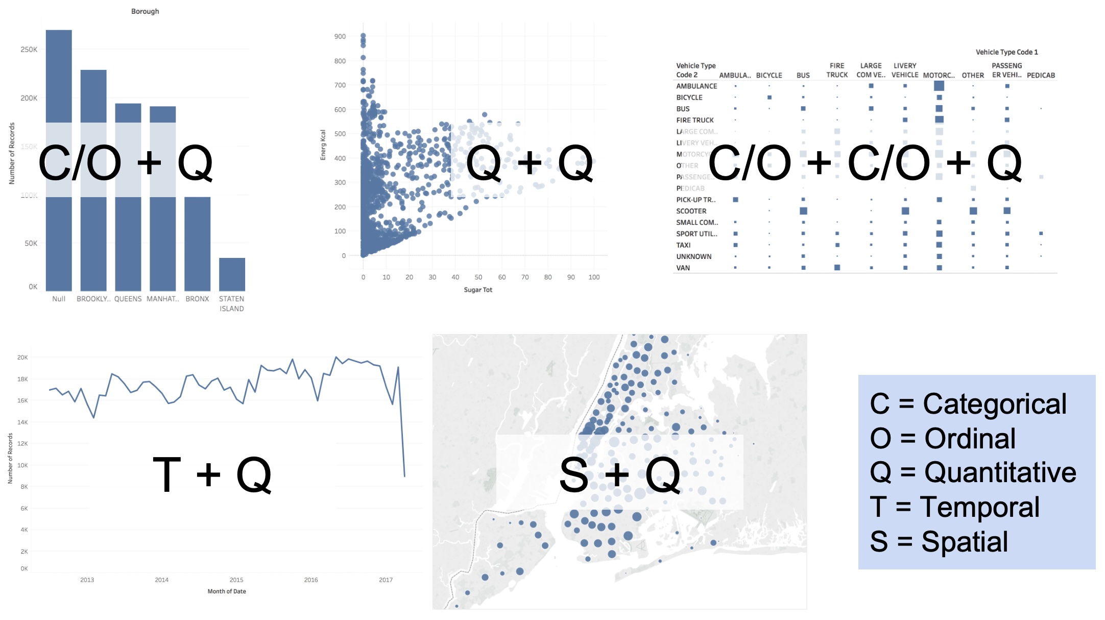
Example: Same data, different visual encodings

The Five Fundamental Graphs

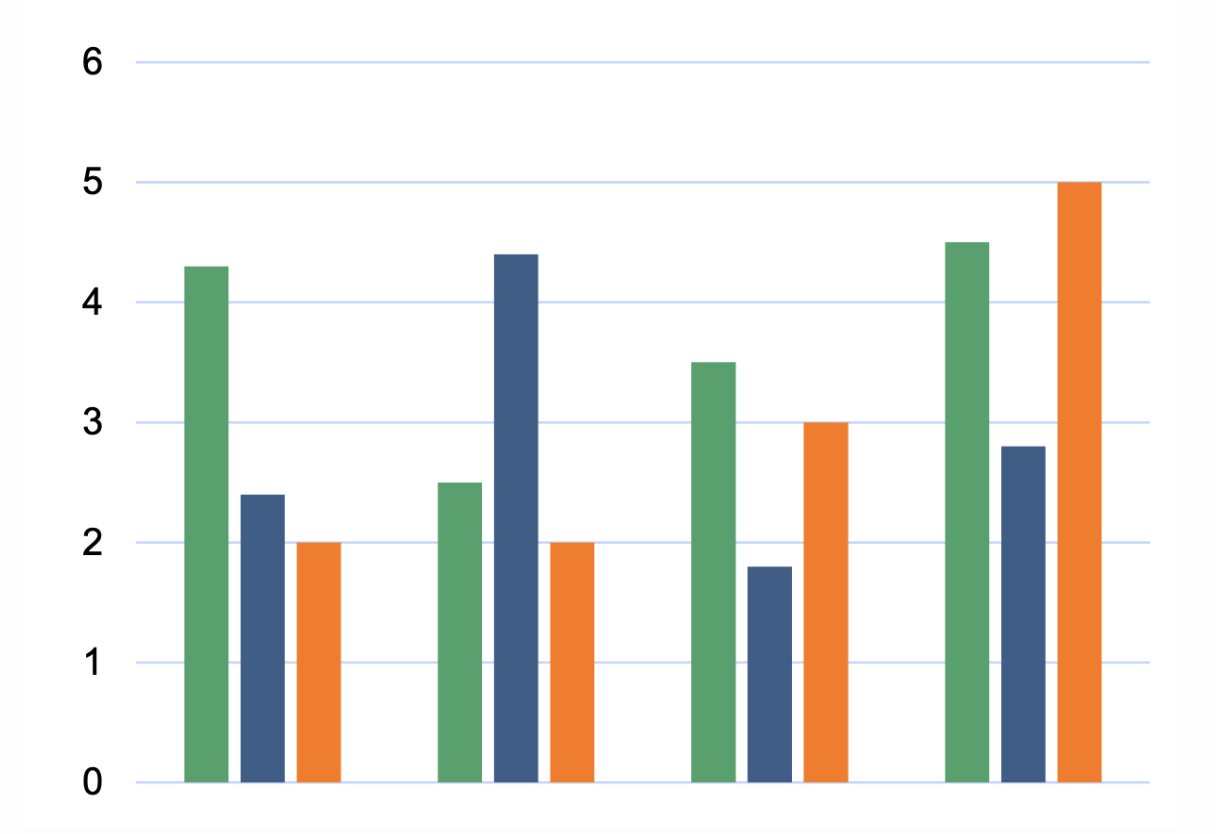
Bar Chart:
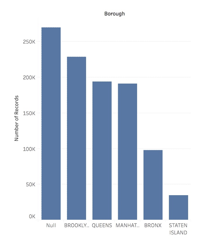
Bar Chart

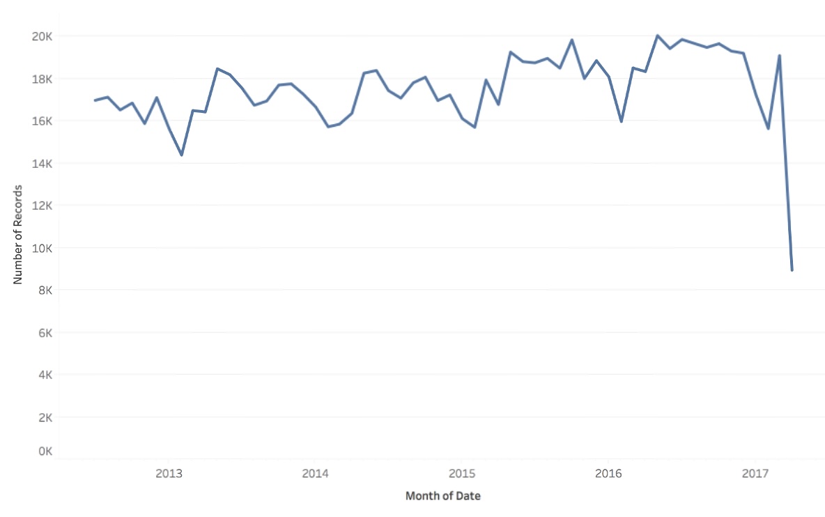
Line Chart:
Line Chart

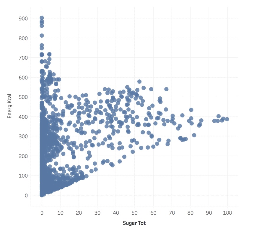
Scatterplot:
Scatter Plot

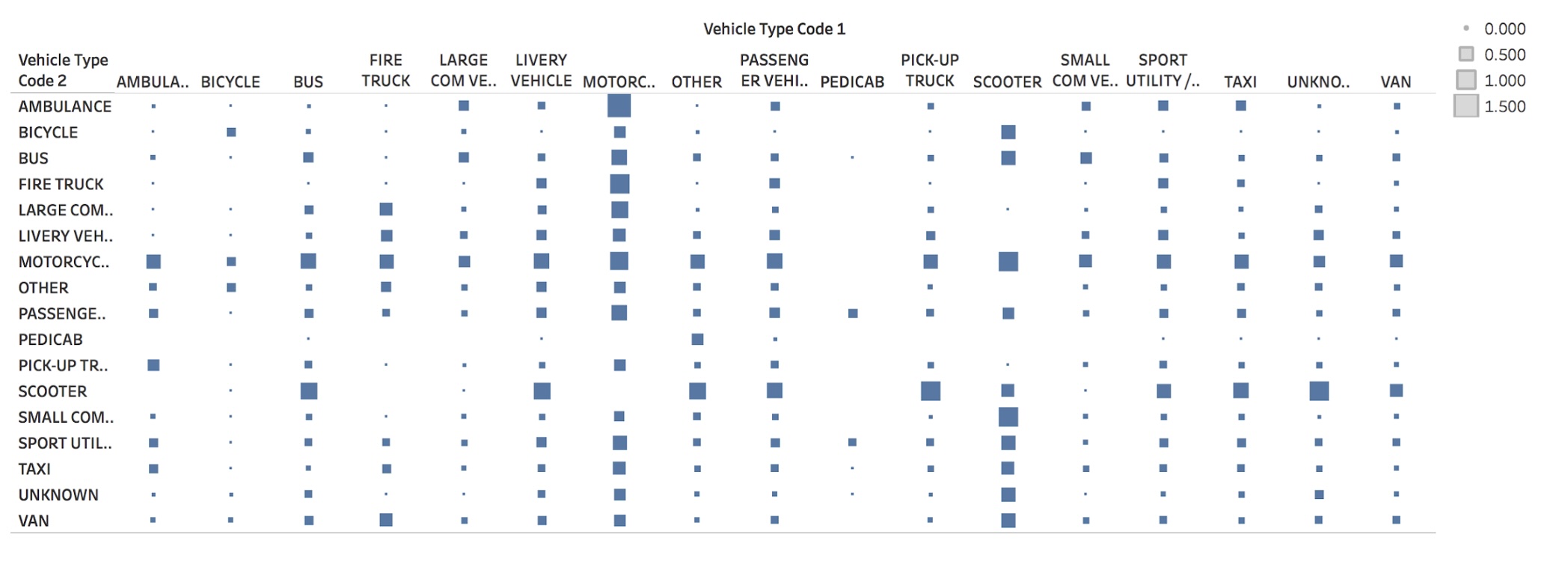
Matrix Chart:
Matrix

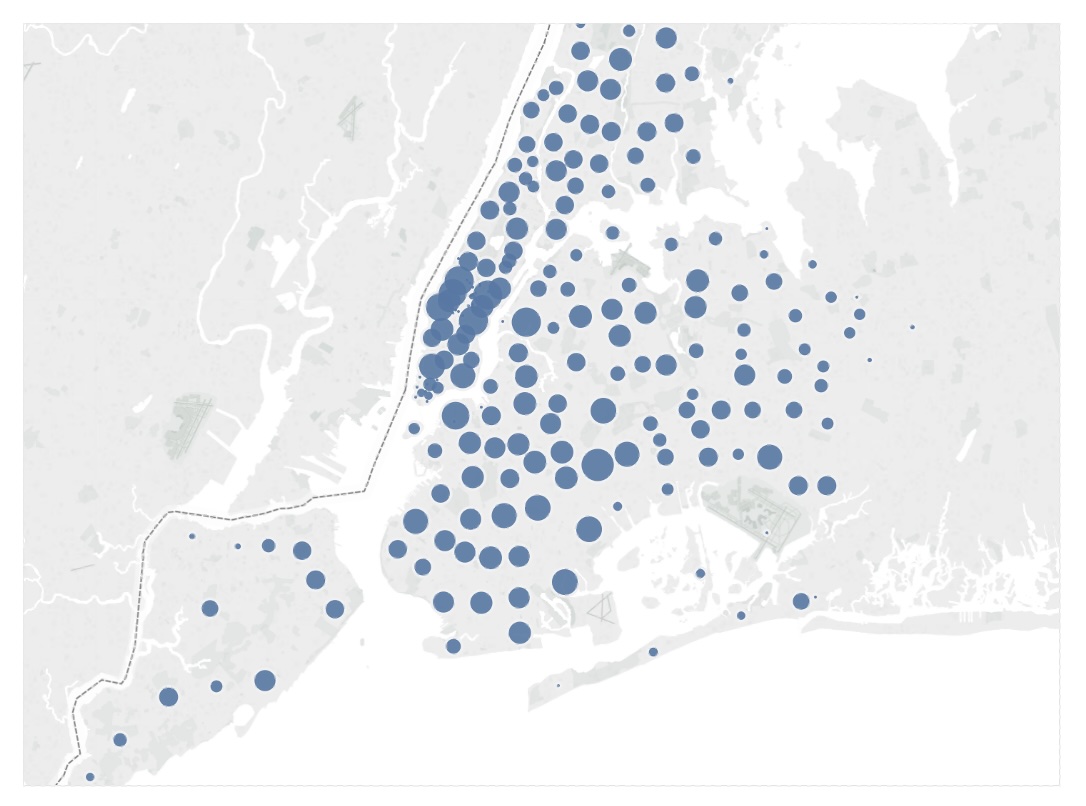
Symbol Map:
Symbol Map

Bar Chart: Categorical Comparisons

Purpose: Compare quantities across categories

Data Types:

  • Categorical/Ordinal + Quantitative
  • Example: Sales by product category

Best For:

  • Rankings and comparisons
  • Part-to-whole relationships

Key principle: Our visual system excels at comparing lengths along a common baseline.

Line Chart: Trends Over Time

Purpose: Show trends and changes over time

Data Types:

  • Temporal + Quantitative
  • Example: Stock prices over months

Best For:

  • Trends and patterns
  • Multiple series comparison

Key principle: Connecting lines imply continuity - use only for ordered data.

Scatter Plot: Relationships

Purpose: Explore relationships between variables

Data Types:

  • Quantitative + Quantitative
  • Example: Height vs. weight

Best For:

  • Correlation analysis
  • Outlier detection
  • Pattern recognition

Key principle: Reveals relationships that summary statistics might miss.

Matrix (Heatmap): Two-Way Comparisons

Purpose: Compare across two categorical dimensions

Data Types:

  • Categorical + Categorical + Quantitative
  • Example: Sales by month and region

Best For:

  • Cross-tabulations
  • Correlation matrices
  • Dense data display

Key principle: Color encoding allows rapid processing of many values.

Symbol Map: Spatial Distribution

Purpose: Show spatial distribution of data

Data Types:

  • Spatial coordinates + Quantitative
  • Example: Population by city

Best For:

  • Geographic patterns
  • Location-based analysis
  • Spatial clustering

Geographic distribution of quantities

Alternate representations

Question: Is it possible to create different representations of the same data?

It is. However, some representations might not follow the best design guidelines
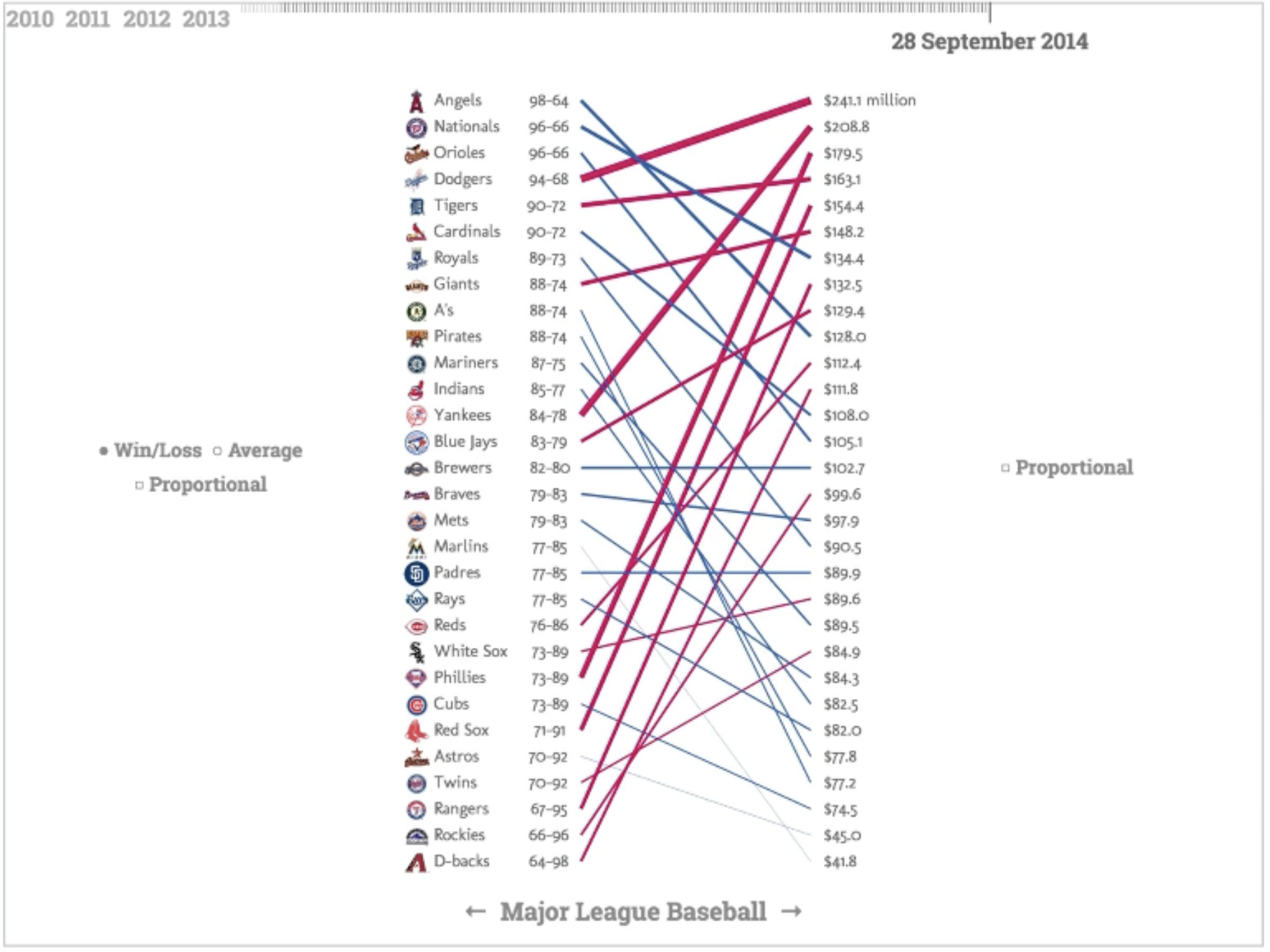
Slope charts can be an alternative to scatter plots

Chart Selection Examples

Scenario 1: Monthly sales data for different product categories

Answer: Line chart (multiple series) - shows trends over time by category

Scenario 2: Customer satisfaction ratings across departments

Answer: Bar chart - compares quantitative values across categories

Scenario 3: Relationship between advertising spend and sales revenue

Answer: Scatter plot - explores correlation between two quantitative variables

Decomposing a chart: Marks and Channels

Marks are the geometric primitives we use in a visualization. They are used to represent the items of a dataset.

Decomposing a chart: Marks and Channels

Channels:

  • Channels are the appearance of the marks
  • They are used to represent the attributes of a dataset
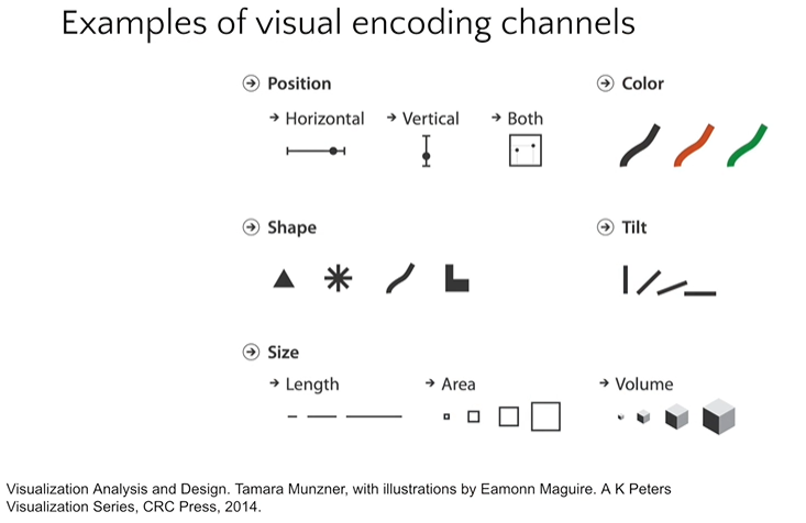
Channels encode data attributes

Principles: Expressiveness & Effectiveness

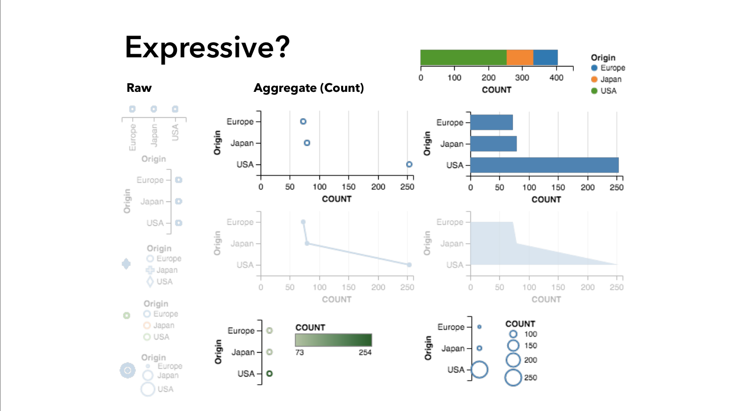
Expressiveness: The visual encodings must show all and only the facts in the data.

  • The most fundamental expression of this principle is that ordered data should be shown in a way that our perceptual system intrinsically senses as ordered. Conversely, unordered data should not be shown in a way that perceptually implies an ordering that does not exist. Violating this principle is a common beginner’s mistake in visualization.

Effectiveness: Information should be readily perceived

  • The importance of the attribute should match the salience of the channel; that is, its noticeability. In other words, the most important attributes should be encoded with the most effective channels in order to be most noticeable, and then decreasingly important attributes can be matched with less effective channels.

Expressiveness Violations

Line interpolates through missing periods, drawing collapses to zero that never happened

Problem: The line asserts continuity — and values — where the data is absent
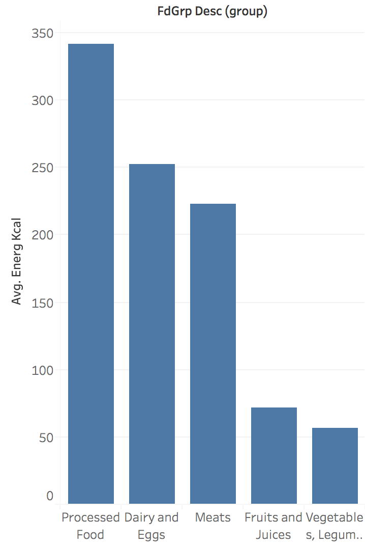
Bar chart ordering suggests ranking where none exists

Problem: Arbitrary ordering implies non-existent relationship

Effectiveness: A Quick Experiment

Which value is larger?
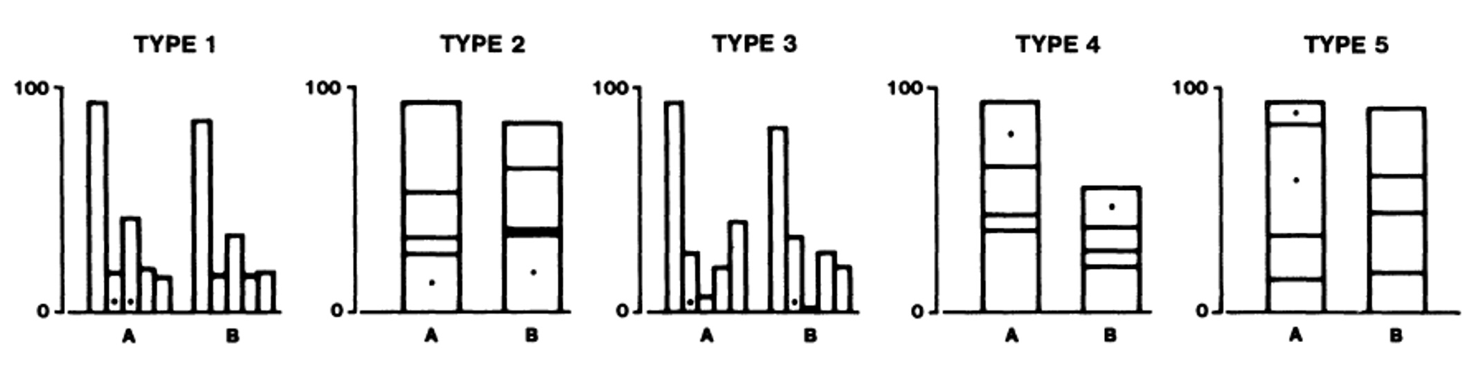
Cleveland & McGill stimuli: types 1-3 encode A and B by position on a common baseline, types 4-5 by length

Effectiveness: A Quick Experiment

Which value is larger?
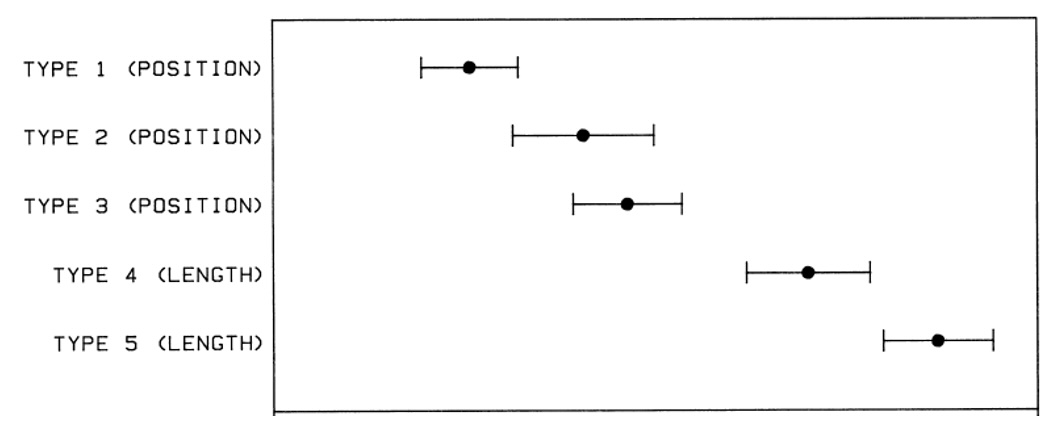
Log absolute error with 95% confidence intervals: position (types 1-3) beats length (types 4-5)

Result: Position on a common baseline is judged more accurately than length

Channel Effectiveness Rankings

Use the most effective channel for your most important data
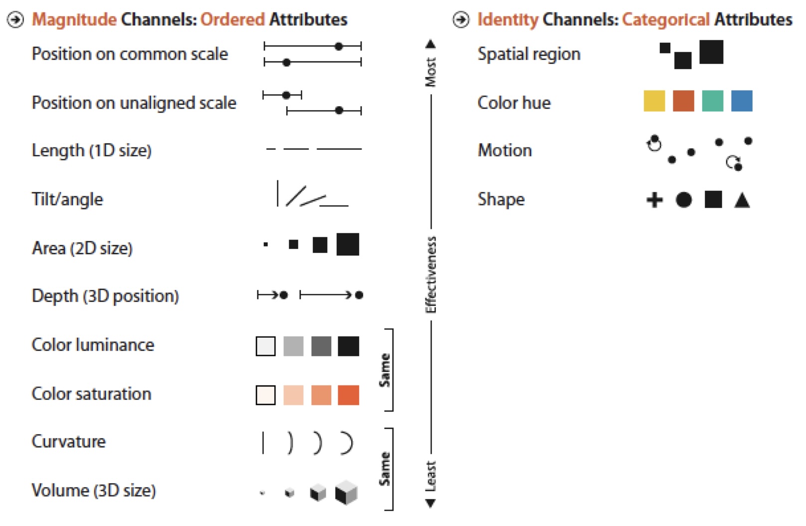
Ranking of visual channels by data type

Applying Channel Rankings

More Effective:
Bar chart using position enables accurate comparison

Position encoding enables accurate comparison

Less Effective:
Pie chart using area/angle makes comparison harder

Area and angle are harder to compare accurately

Exercise

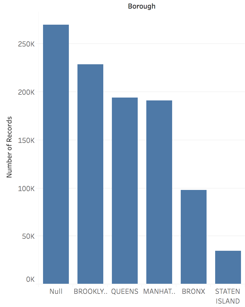
What are the marks?

  • Bars

What are the channels?

  • Size
  • Horizontal position

Bar Chart

Chart Selection Framework

How do you choose the right chart?

Ask these questions:

  1. What data types do I have?
    • Categorical vs. Quantitative
    • Temporal vs. Non-temporal
  2. What relationship am I showing?
    • Comparison, trend, correlation, distribution, composition
  3. How many variables?
    • 1D, 2D, 3D, multidimensional

Decision Tree:

  • Compare categories → Bar Chart
  • Show trends over time → Line Chart
  • Explore relationships → Scatter Plot
  • Cross-tabulate → Matrix/Heatmap
  • Show geographic distribution → Symbol Map

Rule of thumb: Start simple, add complexity only when needed

Scales and Axes: The Foundation

Scale: A function mapping data domain to visual range

Data Domain → Scale Function → Visual Range

  • Linear scales: Equal data differences = equal visual differences
  • Logarithmic scales: Equal ratios = equal visual differences
  • Ordinal scales: Preserve order, not magnitude

Linear vs. Logarithmic Scales

Choose scales based on whether absolute or relative change matters more.

Linear Scale:

  • Absolute differences
  • Additive changes
  • Most common choice
  • Large values dominate visually

Logarithmic Scale:

  • Relative differences (%)
  • Multiplicative changes
  • Wide data ranges
  • Equal growth rates appear as straight line

The Zero Baseline Rule

Bar charts encode data as length. Truncating the axis changes the ratios readers perceive.

Key insight: On the left, the fastball bar appears ~7× longer than the curveball. In reality, it’s only 20% faster.

When to Break the Rules

Context determines when breaking rules is acceptable. Understand the “why” before breaking them.

When to break zero baseline:

  • Line charts (position, not length)
  • Small changes in large values
  • When trend matters more than magnitude
  • Medical vitals, temperatures, etc.

When to use log scales:

  • Data spans orders of magnitude
  • Ratios matter more than absolute values
  • Exponential growth patterns
  • Never for bar charts!

Design Exercise: Scale Choices

Scenario: Visualizing country populations

Data range: 1,000 (Vatican) to 1.4 billion (China)

Questions:

  1. What scale would you choose?
  2. How would you handle the extreme range?
  3. What alternatives might you consider?

Consider: Log scale vs. filtering vs. grouping

Putting It All Together

The Visualization Design Process:

  1. Understand your question
  2. Transform data appropriately
  3. Choose effective visual encodings
  4. Select appropriate scales
  5. Test and iterate

Workflow: Question → Transform → Encode → Scale → Iterate
Design Process Workflow

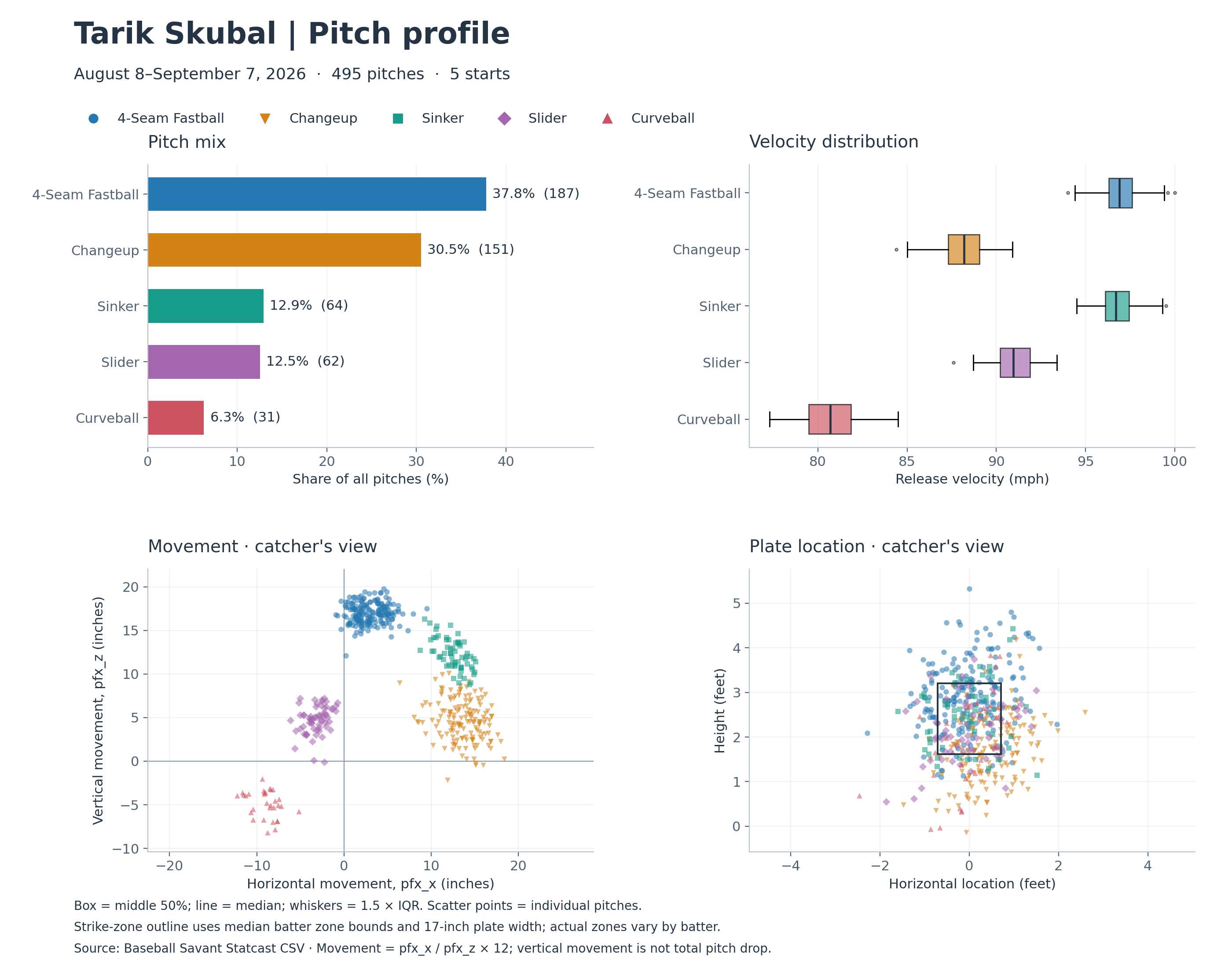
One Dataset, Four Fundamental Graphs

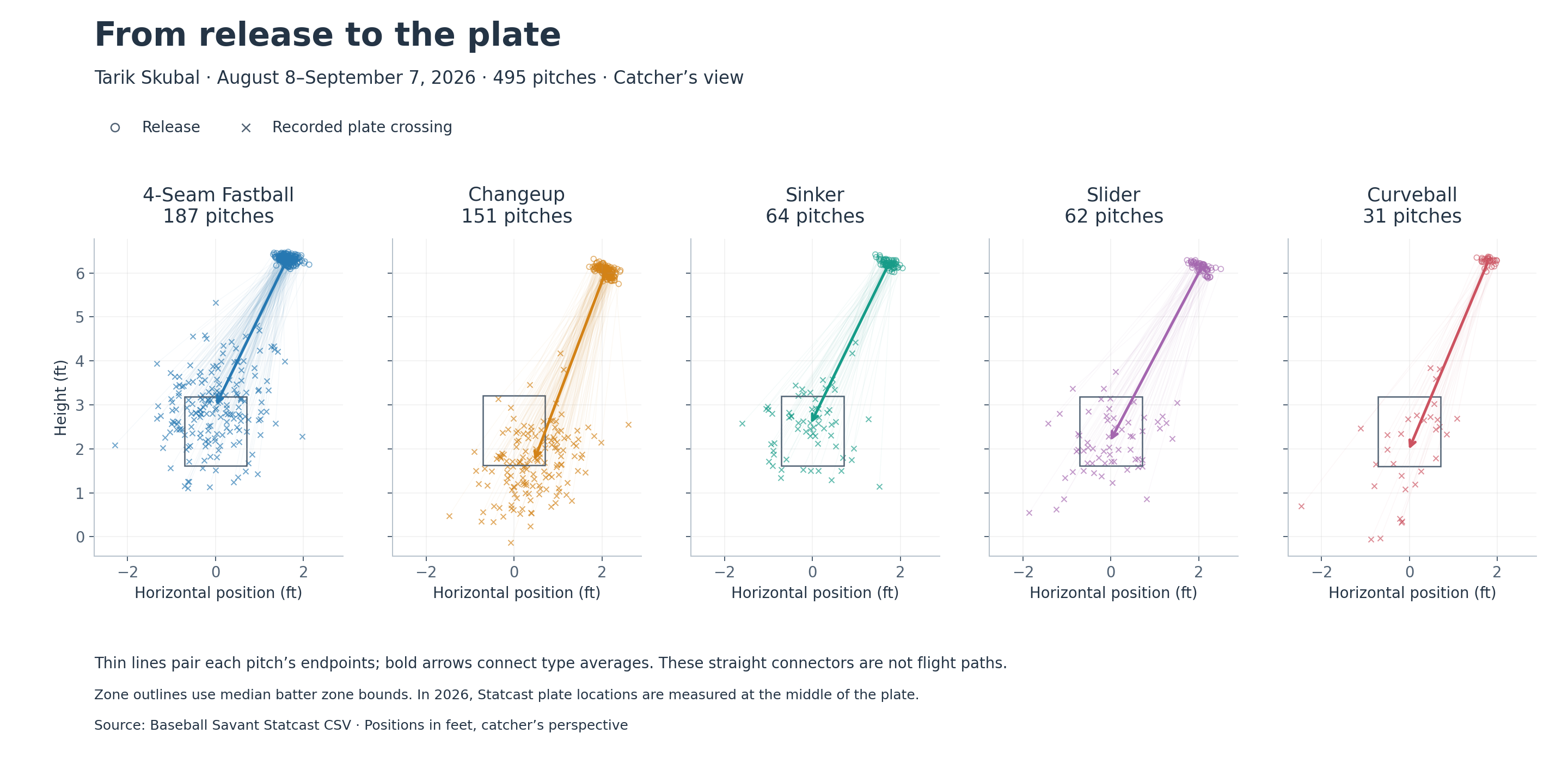
The same 495 pitches as a bar chart (mix), box plots (velocity), and two scatterplots (movement, location).
Small Multiples: One Panel per Category

Same axes, same scale, one panel per pitch type - the comparison happens across panels, by eye.
Common Pitfalls to Avoid

  • Skipping data exploration: Visualize without understanding the data
  • Chart junk: Adding visual elements that don’t encode information
  • Color overuse: Using color when position would be more effective
  • Ignoring scale effects: Not considering how scale choices affect perception
  • 3D when 2D suffices: Adding dimensions that don’t encode information

Specific Pitfalls to Avoid: Overplotting

Specific Pitfalls to Avoid: Missing Labels

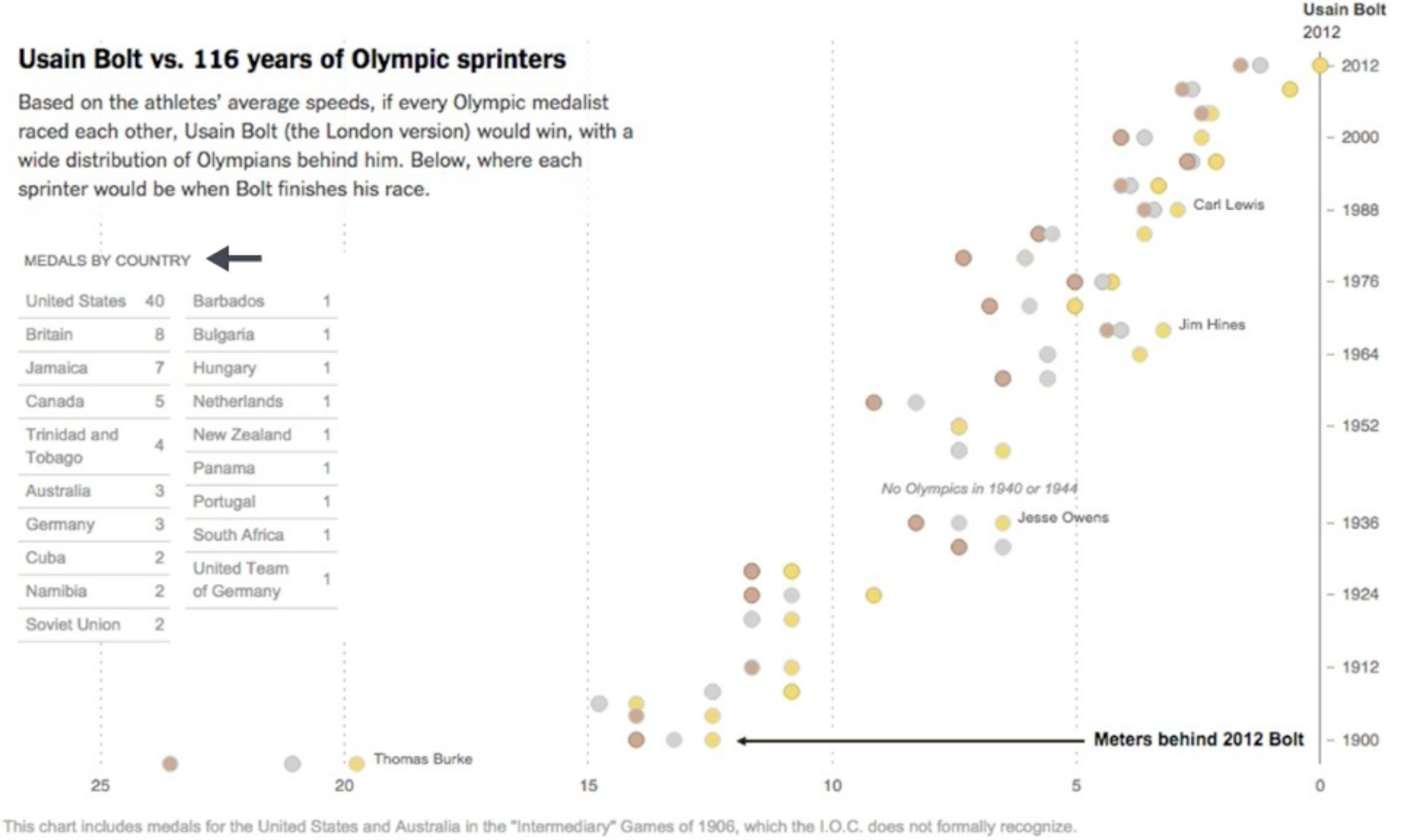
Chart decoding

Graph decoding

Best Practices Summary

Expressiveness: Match visual properties to data properties

Effectiveness: Use the most effective encoding for your most important data

Transformation: Prepare data to answer your specific questions

Scales: Choose scales that honestly represent relationships

Iteration: Test your designs with real users when possible

Interactive Quiz

Question 1: For comparing sales across product categories, which encoding is most effective?

  1. Color saturation
  2. Bar length
  3. Symbol size
  4. Line style

Answer: B) Bar length (position along common scale)

Why? Position is the most effective visual channel for quantitative comparison.

Interactive Quiz

Question 2: You have website traffic data spanning 5 years. For showing long-term growth trends, you should:

  1. Use a zero baseline always
  2. Use a log scale if growth is exponential
  3. Show only the most recent year
  4. Use a pie chart for each year

Answer: B) Use a log scale if growth is exponential

Why? Log scales reveal multiplicative relationships and growth rates.

Next Steps

For next class (Sept 25 - Visual Perception and D3 Foundations):

  • Read Franconeri et al., The Science of Visual Data Communication: What Works (2021)
  • Read Elliott, 39 Studies About Human Perception in 30 Minutes
  • Read Cleveland & McGill (1984), Graphical Perception - the paper behind today’s experiment
  • Practice chart selection with your own datasets
  • Complete Exercise 3: Chart design and encoding alternatives (due Sept 24)

Lab activities:

  • Build all five chart types with real data
  • Compare encoding choices for the same dataset
  • Apply the chart selection framework to new scenarios

Looking ahead:

  • Weeks 4-5: perception and colour - why the channel ranking looks the way it does
  • Week 6: group projects
  • Week 7: interaction

Key Takeaways

  • Five fundamental charts are your visualization toolkit
  • Data types determine appropriate chart selection
  • Visual encoding theory provides systematic design principles
  • Effectiveness rankings guide channel choices
  • Scale and axis design dramatically affects perception

Questions & Discussion

Think about:

  • What visualization challenges do you face in your work/research?
  • How might these principles apply to your domain?
  • What questions do you have about applying these techniques?

Next class (Sept 25): Visual perception and D3 foundations