Color Theory and D3 Scales
CS-GY 6313 - Fall 2026
Claudio Silva
NYU Tandon School of Engineering
2026-10-02
Color Theory and D3 Scales
Today’s Journey
Biology/Physics → Perception Theory → Design Principles → D3 Implementation → Best Practices
Part 1: Color Theory
Physics and physiology of color
How humans perceive color
Color spaces and models
Perceptual principles
Part 2: D3 Implementation
Color scales in D3
Sequential, diverging, categorical
Interpolation methods
Accessibility and best practices
This lecture bridges the gap between the science of color perception and practical implementation in D3. We follow a logical progression: First understanding the biology and physics (WHY colors work the way they do), then perception theory (HOW humans process color), then design principles (WHAT makes effective color choices), then D3 implementation (HOW to code it), and finally best practices (WHEN to use each approach). This foundation is crucial - without understanding how humans perceive color, you’ll make poor design decisions.
Color in Nature
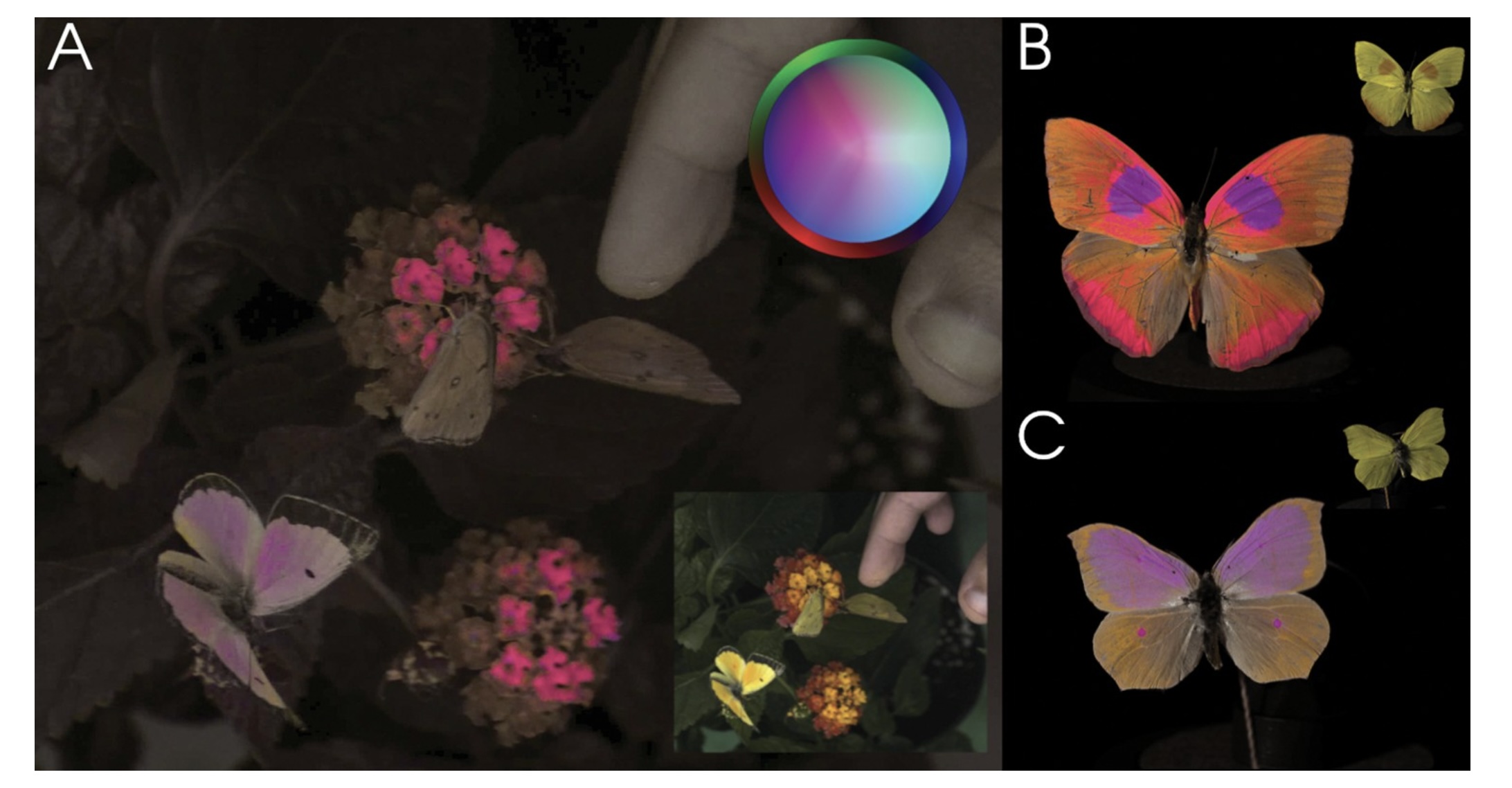
Vasas et al., PLOS Biology 2024: the same flowers and butterflies imaged in a false-colour rendering of insect vision. Panel A is the scene as a bee would have it, with the small inset showing what we see; B and C are two butterflies, human view in the corner. Open with the claim this proves: colour is not a property of the object. It is what a particular visual system does with a spectrum. Change the system and the pink flowers disappear. Everything in the first half of today is about the particular system we happen to have.
The Visible Spectrum
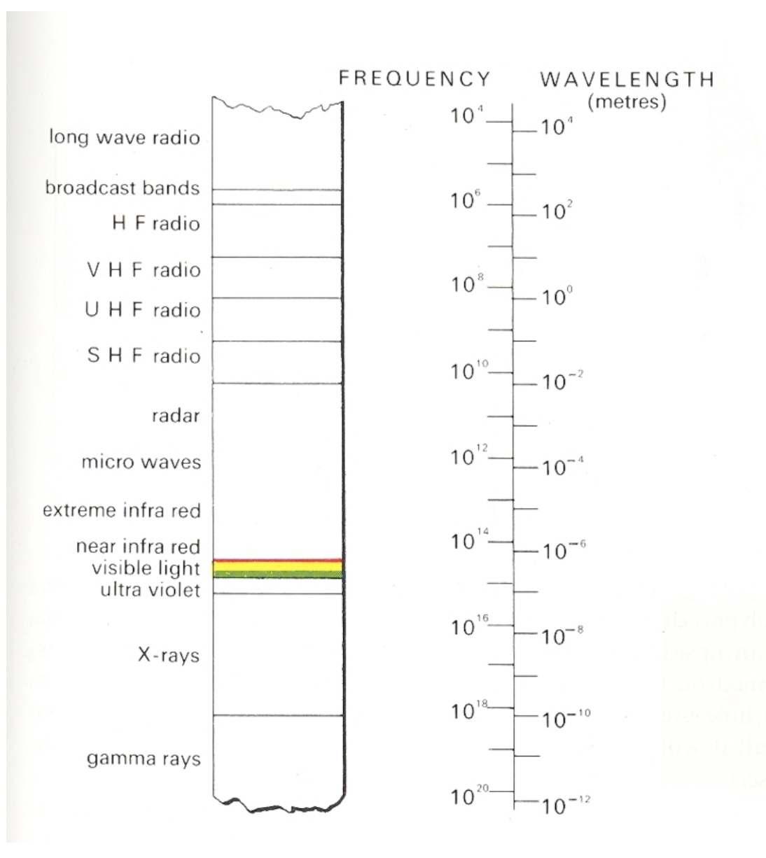
Humans perceive wavelengths from roughly 390 to 700 nm
Shorter (UV) is scattered by the atmosphere; longer (IR) is absorbed by water
Peak sensitivity near 555 nm, the peak of sunlight at the surface
Every colour you have ever seen is a position on this strip, or a mixture of positions
Roughly 390 to 700 nanometres, a narrow band. The limits are environmental: shorter wavelengths (UV) are scattered by the atmosphere, longer ones (IR) are absorbed by water and heat molecules rather than exciting electrons. Peak sensitivity sits near 555 nm in the green-yellow, which is the peak of the solar spectrum at the surface. Evolution tuned the receiver to the available light. Every colour anyone has ever seen lives on this strip or is a mixture of positions on it.
Properties of Light
Key insight: Our eyes handle an enormous dynamic range (100,000:1) through adaptation. This is why absolute luminance values aren’t as important as relative contrasts in visualization. The three properties (hue, lightness, saturation) form the basis of the HLS color model, which is more intuitive than RGB for design work. Note that computer screens can only display about 1000:1 contrast ratio, far less than what we can perceive.
Physiology of the Eye
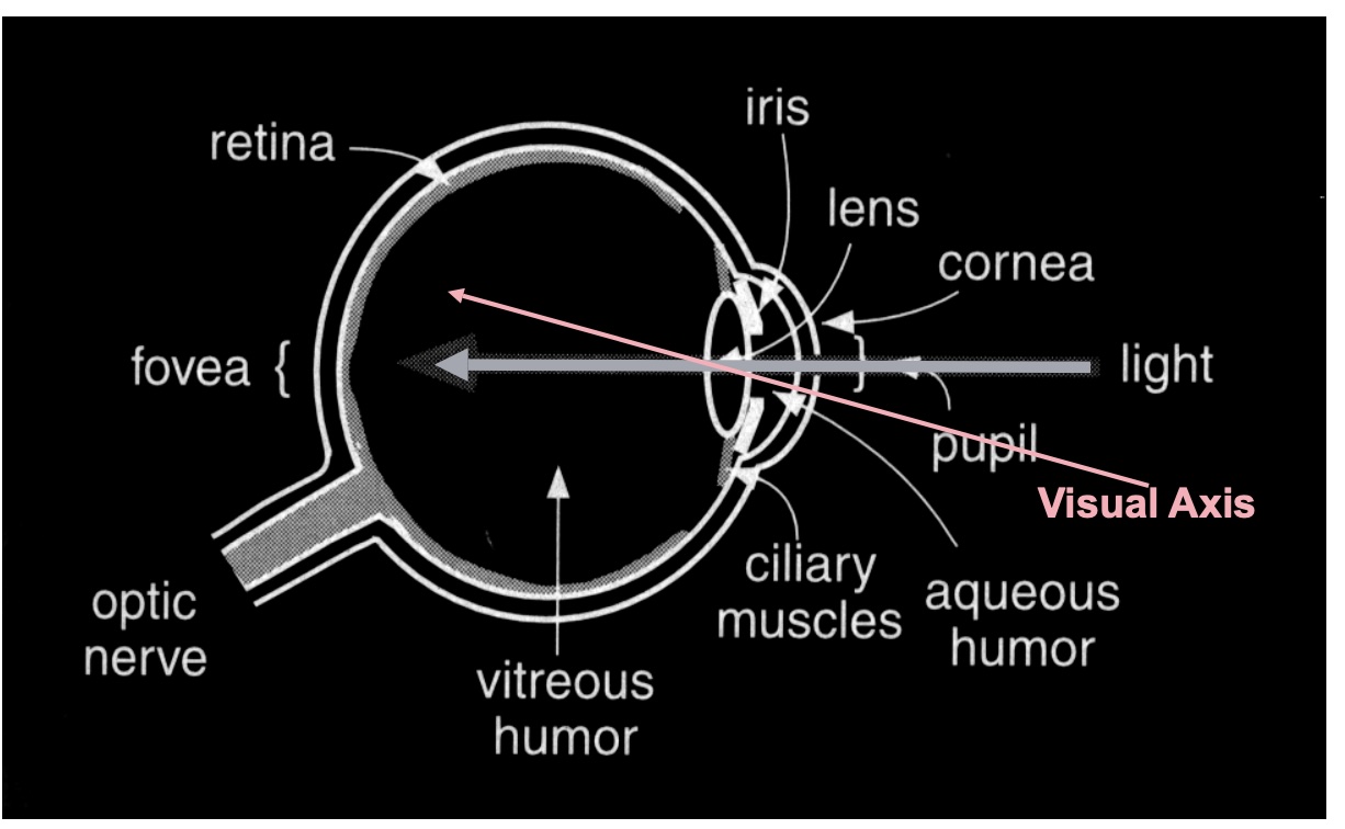
Light is focused through cornea, pupil and lens onto the retina, where photons become signals
Standard cross-section from Gregory’s Eye and Brain. The only parts we need today: light enters through the cornea and pupil, the lens focuses it on the retina at the back, and the retina is where photons become signals. Everything interesting about colour happens from the retina onward, so the next slide zooms in there.
The Retina Structure
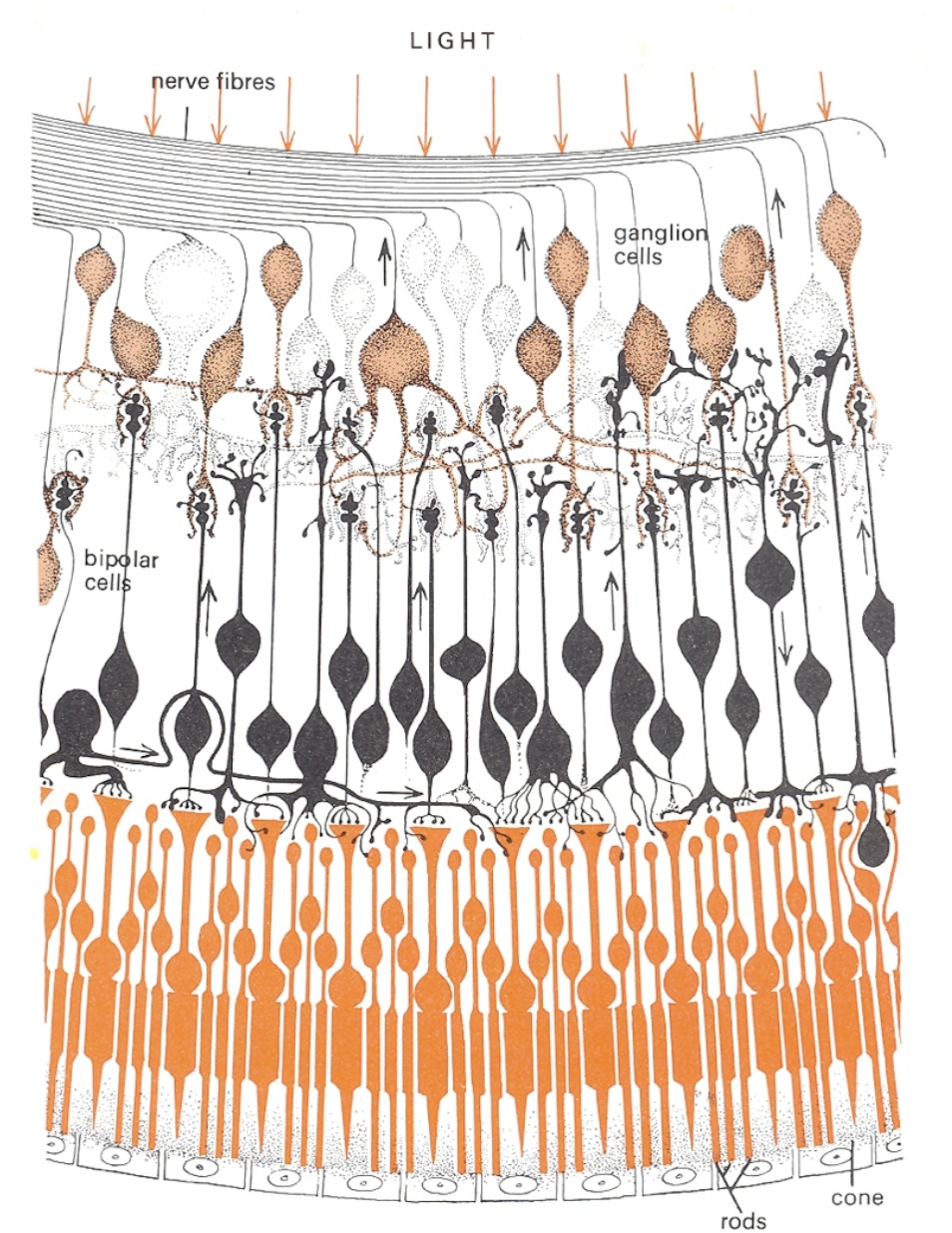
Wired upside down: light passes the nerve fibres, ganglion and bipolar cells before reaching the photoreceptors
Signals run back the other way: photoreceptor, bipolar, ganglion, optic nerve
~100 million receptors converge on ~1 million ganglion axons: contrast and opponent differences are computed here, before anything leaves the eye
In the fovea the overlying layers are pushed aside so light hits the cones directly
Cross-section of the retina, and it is wired upside down from what you would design. Light arrives at the top of the drawing, passes through the nerve fibres, past the ganglion cells and the bipolar cells, and only then reaches the photoreceptors, the rods and the one labelled cone, at the bottom, backed by the pigment epithelium. The signal then runs the other way, up the small arrows: photoreceptor to bipolar to ganglion cell, whose axons are the nerve fibres at the top that bundle into the optic nerve. Where that bundle leaves the eye there are no receptors: the blind spot on the density plot three slides on.
Two things to take from the wiring. Compression: on the order of a hundred million receptors converge onto about a million ganglion axons, so what leaves the eye is not a pixel array but a processed signal. Contrasts, edges, and the opponent differences on the Opponent Process slide are computed right here. And this is peripheral retina: rods dominate and there is a single cone in frame. In the fovea it inverts, cones only, and the overlying layers are pushed aside so light hits them directly. Detail and colour live where you look and nowhere else.
Photoreceptors: Rods and Cones
Rods
Active at low light levels (scotopic vision)
Only one wavelength-sensitivity function
~120 million in human eye
Cones
Active at normal light levels (photopic vision)
Three types with different peak sensitivities
~6 million in human eye
Concentrated in fovea
Two receptor types, and the split matters more than the counts. Rods: on the order of a hundred million, one photopigment peaking near 500 nm, sensitive enough to work by starlight, but they saturate in daylight, so in any lit room they contribute almost nothing. With one pigment they cannot signal colour at all: a rod cannot distinguish a dim green from a bright red, only how many photons arrived. Cones: a few million, three types with three sensitivity curves on the next slide, active at normal light levels. All of colour is a comparison between their three outputs.
One fact for your pocket: the ratio of L to M cones varies several-fold between people with normal colour vision, yet their colour judgements agree. The later stages normalise. First hint that colour is computed, not sensed.
Cone Sensitivity Curves
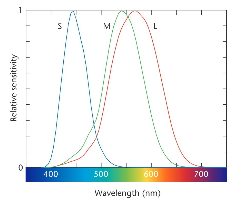
Three cone types: S (short, peak ~445 nm), M (medium, ~545 nm), L (long, ~565 nm)
The curves overlap, so no wavelength excites one cone type alone
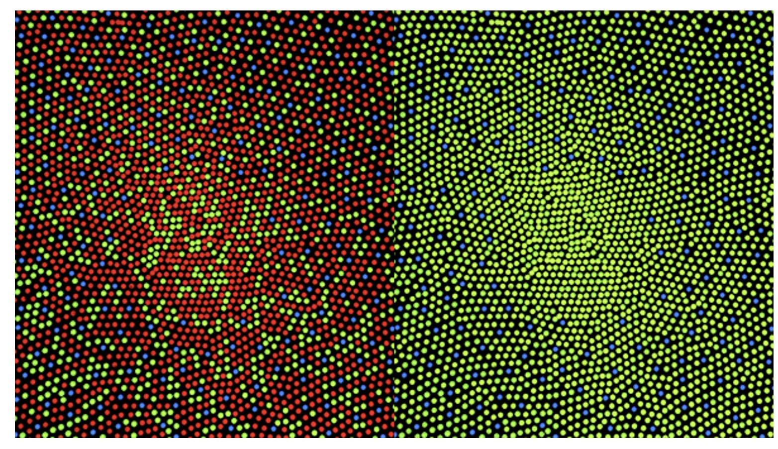
M and L are only ~20 nm apart, which is why red-green deficiency is the common one
S cones are sparse and far from the others: blue carries the least detail
Critical slide! This is the foundation of trichromatic color theory. Note the overlapping sensitivity curves - this is why we can’t see “pure” wavelengths. The brain interprets the relative activation of all three cone types. Point out that the L and M curves are very close, which is why red-green colorblindness is most common.
Density of Cones Across Retina
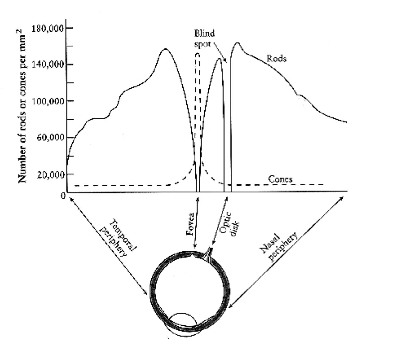
Cones (dashed) are packed into the fovea, the central ~2°, at up to ~150,000 per mm²
Rods (solid) peak about 20° out and are absent from the fovea
The gap at the optic disk is the blind spot
You have colour vision only where you are looking: peripheral colour coding does not work
Emphasize the importance of the fovea (the central 2° of vision). This is where acuity and color discrimination are highest - cone density reaches 150,000 per mm². This biological fact explains why legends and critical information should be placed centrally or made salient enough to attract foveal attention. Teaching Point: When the visualization requires reading fine detail or discerning subtle color differences, the viewer must consciously shift their gaze. This is why we can’t rely on peripheral vision for detailed color work - the cone density drops dramatically outside the fovea. Practical implication: Don’t put critical color-coded information in the periphery of a visualization.
Rods vs. Cones Sensitivity
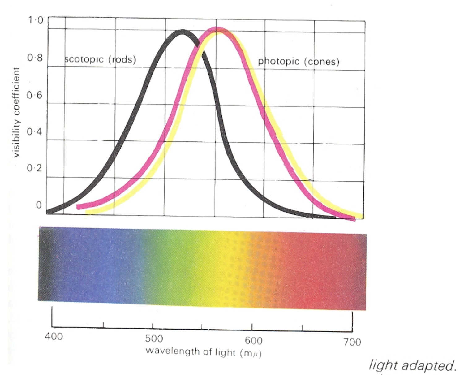
Rods (scotopic) peak near 507 nm and see no colour; cones (photopic) peak near 555 nm and carry it
Spectral sensitivity of the two systems, each normalised to its own peak, so the curves show shape, not absolute sensitivity; in absolute terms rods are far more sensitive. Scotopic is rod vision, peaking near 507 nm in the blue-green. Photopic is cone vision, light-adapted, peaking near 555 nm in the yellow-green. The horizontal offset is the Purkinje shift: as light falls and vision hands over from cones to rods, sensitivity slides toward the blue end. Reds go dark first; blue-greens hold on longest. A red flower at dusk looks black while the leaves still look grey-green.
Three design consequences. A red alert is the worst possible choice for a dimmed or night-time environment; it is the first hue to vanish. Dark-mode dashboards behave differently in a bright office and at night because the viewer’s adaptation state changed, not the pixels. And a projector room is closer to the dim mesopic range than your laptop is: small hue differences and desaturated palettes that look fine at your desk disappear on the wall. Test on the projector.
How We Perceive Color
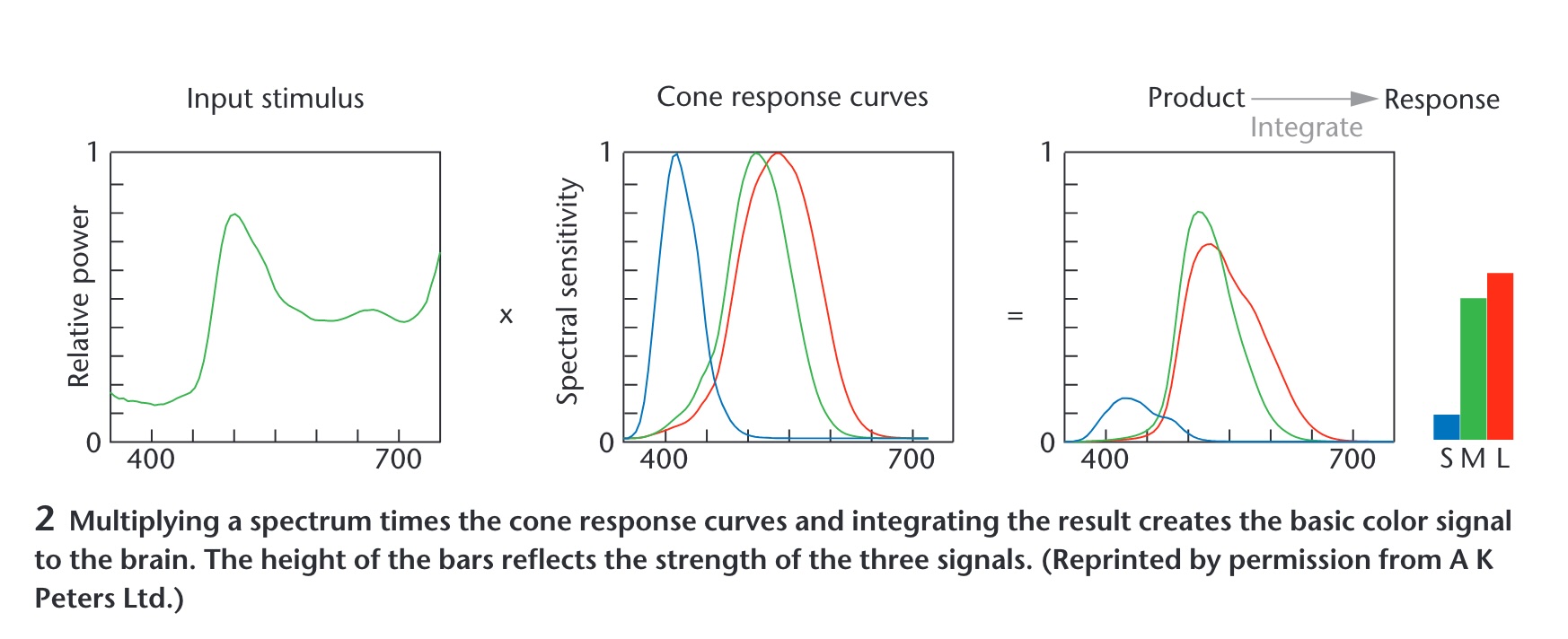
A spectrum is reduced to three cone responses; spectra with the same three numbers look identical (metamers)
Maureen Stone’s figure, and the most important slide in the first half. A spectrum, an entire curve, is multiplied by the three cone curves and integrated. Out come three numbers: S, M, L. Everything about the curve that is not captured by those three integrals is gone. Consequence: infinitely many different spectra produce the same three numbers, so they look identical. Those are metamers, and they are the reason a screen with three primaries can show you a colour at all. It is also why ‘colour’ is three-dimensional, which is where every colour space in the second half comes from.
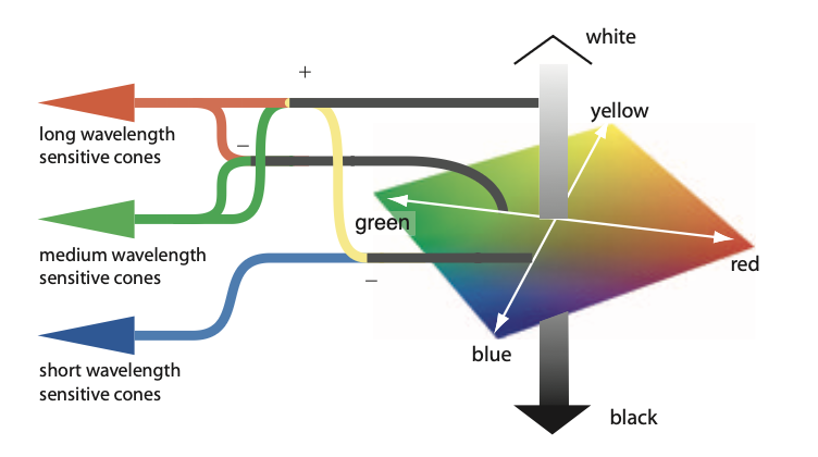
Opponent Process Theory
Three Opponent Channels
Color Opposition:
🔴 Red ↔︎️ Green 🟢 (cannot see “reddish-green”)
🔵 Blue ↔︎️ Yellow 🟡 (cannot see “yellowish-blue”)
⚫ Black ↔︎️ White ⚪ (luminance channel)
Key Insights:
Explains why we see afterimages in complementary colors
Processed in retinal ganglion cells and LGN
Some cells excited by red, inhibited by green (and vice versa)
Explains unique hues: red, green, blue, yellow
This is THE theory that bridges trichromatic theory (3 cone types) with how we actually experience color. The opponent channels are why we have four unique hues (red, green, blue, yellow) even though we have three cone types. Modern color spaces like LAB are built on this principle - L for luminance, A for red-green, B for blue-yellow.
The Neural Processing: In V1 (primary visual cortex), the raw signals from the cones in the retina are transformed. Some neurons compute differences between red- and green-sensitive cone signals. Some neurons compute the sum of red- and green-sensitive cones. Still others compute yellow-blue differences. The result is three kinds of color signals that are called color-opponent channels. This transformation happens early in visual processing - starting in retinal ganglion cells and continuing through the lateral geniculate nucleus (LGN) to V1.
Opponent Process Applications
Practical Impact:
Color space design : LAB uses opponent channels (A = red-green, B = blue-yellow)Categorical perception : Explains why we naturally group colors into categoriesAccessible color choices : Understanding oppositions guides colorblind-safe palettes
Demonstrations you can run in class:
Afterimage - stare at a red square for 30 s, look at white, see greenImpossible colours - try to picture a reddish green or a yellowish blue
Demo: Have students stare at a red square for 30 seconds, then look at white - they’ll see green! This isn’t a “trick” - it’s fundamental to how our visual system works. Fun fact: some people claim they can see “impossible colors” like reddish-green using special viewing conditions, but this is controversial.
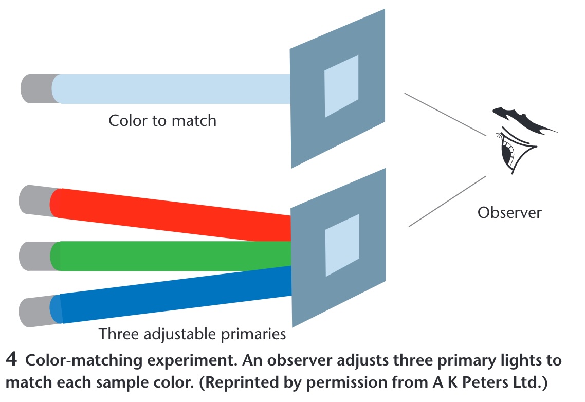
Color Matching Experiments
Any colour can be matched by adjusting three primaries: the empirical basis of trichromacy
Explain that this is the empirical basis for all modern color spaces. The key finding from these experiments (starting with Thomas Young in 1801 and refined by Maxwell and others) is that the human visual system is 3-dimensional (trichromatic). This confirms that any physical color can be replicated by mixing three primary lights, leading directly to the RGB model used in computers. Important: Some colors require “negative” amounts of a primary (subtracting light), which is why no three real primaries can produce all visible colors - this led to the development of the CIE XYZ color space with imaginary primaries.
Color Models for Visualization
Trichromacy
Humans perceive colors through three channels
Most useful color description for visualization:
Hue : What color (red, blue, green…)Saturation : Purity of colorLuminance/Lightness : Brightness
This is where we transition from biology to design principles. These three dimensions map to how we actually think about color. Luminance is the strongest channel for ordered data (we easily see light-to-dark progression). Hue is best for categorical distinctions (red vs blue vs green). Saturation is the weakest channel - hard to judge precise values. This hierarchy guides our encoding choices.
Just Noticeable Difference (JND)
The smallest detectable difference in a stimulus
For Color:
Luminance : ~1-2%Hue : Varies by wavelength (most sensitive in blue-green)Saturation : ~5-10%
Implications for Visualization:
Need sufficient steps between colors in a scale
Can’t encode too many distinct values
Background affects perception (simultaneous contrast)
JND is fundamental to color scale design. It determines how many distinct values you can encode. For continuous scales, you want steps larger than JND to be clearly distinguishable. This is why we can only reliably encode about 5-7 distinct colors, or about 7-10 distinct luminance levels. The background color affects JND - a color that’s distinguishable on white might not be on gray. Ware’s book provides the definitive treatment of JND in visualization contexts.
How Do We Use Color in Visualization?
Two primary purposes:
1. Quantify
Show numerical values
2. Label
Distinguish categories
Two jobs, and each wants the opposite kind of scale. Quantify: the attribute is ordered, so vary a magnitude channel, luminance and secondarily saturation, and hold hue fixed. Label: the attribute is categorical, so vary the identity channel, hue, and hold luminance roughly constant so no category shouts. That is the magnitude-versus-identity split from the perception lecture applied to colour, and it is the single most useful sentence in this half of the lecture.
Almost every colour mistake you will grade this semester is a cross-use. A rainbow on a quantity, hue carrying magnitude, has no perceptual order, so the viewer cannot tell more from less without the legend. A light-to-dark ramp on categories invents an order that is not in the data and makes the darkest category look most important. Before advancing, ask the room to call out which job each of the next two slides is doing.
Color to Quantify
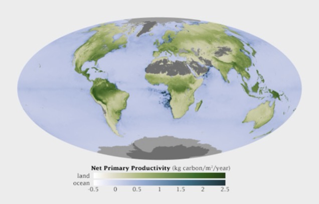
Quantify: luminance carries the number, light means low and dark means high
NASA net primary productivity, kilograms of carbon fixed per square metre per year. Read the legend: two sequential ramps, white through green for land and white through blue for ocean, both monotone in luminance so higher is darker everywhere. That is the whole recipe for quantify: one hue family per quantity, luminance carries the number, light means low and dark means high.
Two subtleties. There are two hues here, green and blue, and that is not a violation: hue is doing the label job, land versus ocean, while luminance does the quantify job within each. And the grey, deserts, ice sheets, Antarctica, is missing or not-applicable data, placed outside the ramp in a neutral that cannot be mistaken for a low value. Never encode ‘no data’ as the bottom of the scale. One to argue about: the legend runs from -0.5 to 2.5, so strictly this is a diverging quantity around zero drawn with a sequential ramp. Defensible, because the negatives are small and rare. Hold that for the Diverging slide.
Color to Label
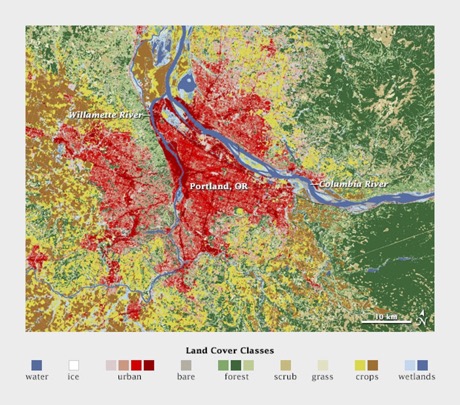
Label: distinct hues at similar lightness, no implied order
Land cover around Portland: water, ice, urban, forest, scrub, grass, crops, wetlands
Semantically resonant choices (blue water, green forest) make the legend almost unnecessary
Keep saturation consistent, or one category will dominate
Land cover around Portland: water, ice, urban, bare, forest, scrub, grass, crops, wetlands. Distinct hues at similar lightness, and there is no ordering among them because there is no ordering among the categories. The palette is not arbitrary either: the semantically resonant choices, blue for water and green for forest, make the legend almost unnecessary. Common mistake to name now: mixing bright and pastel colours in one categorical palette. The bright ones will dominate attention, so keep saturation consistent unless you mean to highlight. The image is a small file and is shown below full column height on purpose.
Quantitative Color Scales
Desired Properties:
Uniformity : Value difference = Perceived differenceDiscriminability : As many distinct values as possible
Challenge:
Human perception is non-linear!
This is a key insight students often miss. Equal steps in RGB values don’t produce equal perceptual steps. This is why we need perceptually uniform color spaces like LAB or HCL. Use the example of yellow appearing brighter than blue even at the same RGB intensity.
Single Hue Sequential Scales
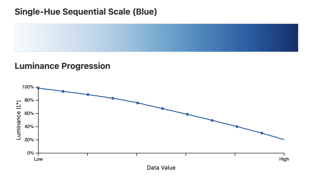
**The luminance (L*) channel falls monotonically from light to dark; that ordering, not the blueness, encodes the value**
This visualization perfectly demonstrates why single-hue sequential scales work. The top shows the actual color scale, while the bottom graph reveals the underlying mechanism: a steady, monotonic decrease in luminance from ~100% to ~20%. This is what our visual system interprets as “less to more” or “low to high”. The other channels (hue and saturation) remain relatively constant. Students should understand that it’s the luminance change, not the “blueness,” that encodes the data values.
Categorical Color Scales
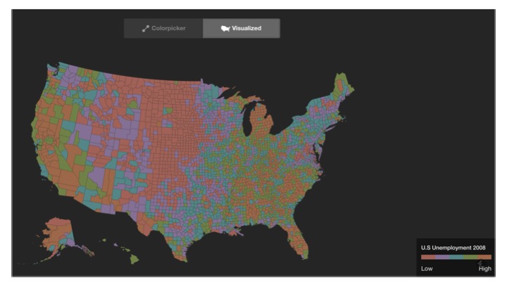
U.S. county unemployment, a quantity , drawn with a categorical palette: nothing reads as high or low
Categorical palettes want uniform saliency : nothing stands out unintentionally
And maximum discriminability : each category clearly distinct
The right tool for labels, the wrong tool for a quantity
Read the legend before saying anything: this is U.S. county unemployment, a quantitative variable, drawn with a categorical palette. Nothing reads as high or low; the map is noise. The two properties on the slide, uniform saliency and discriminability, are exactly right for labels and exactly wrong for a quantity. Use this as the negative example: this is what the quantify job looks like when handed the label tool. Then state the positive rule: for real categories, distinct hues, similar lightness and saturation, and stop at the limit on the next slide.
Categorical Scale Limits
How many distinct colors can we use effectively?
Research suggests: 5-10 distinct categories maximum
Beyond this limit:
Colors become confusable
Need additional encoding (shape, pattern)
Consider grouping categories
Reference the Magic Number 7 ± 2 rule (Miller’s Law, 1956) for cognitive load. Beyond 5-7 categories, users stop instantly recognizing differences (pre-attentive processing) and must rely on a legend, which slows down analysis dramatically. Healey’s research confirmed this specifically for color. Alternatives when you have too many categories: (1) Group data into super-categories with related sub-hues, (2) Use interactivity - show only relevant categories on demand (filtering/highlighting), (3) Apply texture or shape as redundant encoding, (4) Use “focus + context” - highlight important categories and gray out others, (5) Consider if all categories really need to be shown simultaneously. Remember: Every time users look at the legend, they break their analysis flow.
Diverging Color Scales
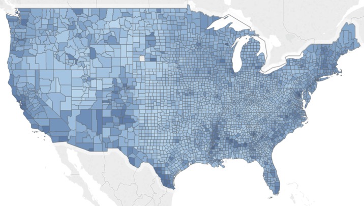
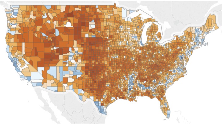
For data with meaningful midpoint (zero, average, neutral)
Sequential scale obscures the critical 50% threshold
Diverging scale clearly shows above/below threshold
Perfect example of why choosing the right scale matters! The left map makes it hard to see which counties voted majority Republican vs Democrat. The diverging scale immediately reveals the pattern. Other good use cases: temperature anomalies (above/below average), profit/loss, survey responses (agree/disagree). Key insight: the midpoint should be meaningful, not arbitrary.
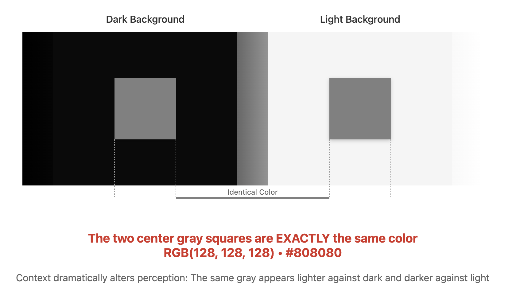
Color Context Effects
Simultaneous Contrast
The same color appears different depending on surrounding colors
Key Effects:
Colors appear lighter on dark backgrounds
Colors appear more saturated next to gray
Complementary colors enhance each other
Design Implications:
Test colors in context, not isolation
Be consistent with backgrounds
Use borders/whitespace to separate regions
Consider the whole visualization, not just the palette
This is why color palettes that look good in a swatch panel might fail in your visualization. The classic example: a gray square looks yellowish on a blue background and bluish on a yellow background. For maps, this means adjacent regions can affect color perception. Solution: add thin white borders between regions, or test your palette with actual data patterns. Albers’ classic work and Adelson’s checker shadow illusion are foundational demonstrations of these effects.
Semantic Color Associations
Cultural and Contextual Meanings
Universal Associations:
Red : Heat, danger, stop 🔥 🛑Blue : Cold, water, calm 💧 ❄️Green : Nature, growth, go 🌱 ✅Yellow : Caution, energy ⚠️ ⚡
Domain-Specific:
Finance : Red = loss (↓), Green = profit (↑)Politics : Red/Blue = parties (varies by country!)Temperature : Blue = cold ❄️, Red = hot 🌡️Health : Red = critical 🚨, Yellow = warning ⚠️, Green = normal ✅
Leverage semantic associations when they help, but be aware they’re not universal. In China, red means prosperity. In finance, Western markets use red for losses, but East Asian markets use red for gains! Always consider your audience. Sometimes you should intentionally break conventions - use blue for hot if you’re showing cooling needs, not temperature. Lin et al.’s research provides empirical data on color-concept associations.
Color Blindness Considerations
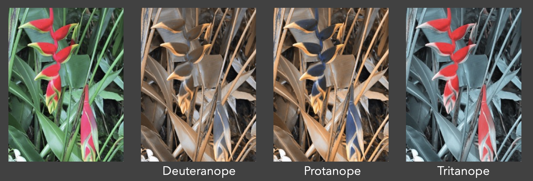
About 8% of men and 0.5% of women have a colour vision deficiency, mostly red-green
Emphasize that this means in a typical classroom, 2-3 students likely have some form of color vision deficiency. Red-green is most common (deuteranopia and protanopia). Always design with this in mind - use redundant encoding (shape, pattern) and test with simulators. The Viridis colormap was specifically designed to be perceptually uniform AND colorblind-safe.
Color Vision Simulators
Tools for Testing Accessibility
Browser Extensions:
Design Software Plugins:
Adobe Photoshop: View → Proof Setup → Color Blindness
Sketch: Stark plugin for accessibility testing
Figma: Able plugin for color vision simulation
Online Simulators:
Best Practice: Always test your visualizations with simulators during development, not after
Demo one of these tools live if possible! Show how a seemingly clear red/green encoding becomes indistinguishable. Point out that deuteranopia (missing green cones) affects ~6% of males, protanopia (missing red cones) ~2%, and tritanopia (missing blue cones) is rare (~0.01%). The tools are free and take seconds to use - there’s no excuse for not testing. Emphasize: “If you’re not testing for colorblindness, you’re excluding 8% of your male audience.”
Color Spaces
RGB (Red, Green, Blue)
Device-oriented
Not perceptually uniform
Common in programming
HSL/HSV (Hue, Saturation, Lightness/Value)
More intuitive for humans
Better for color selection
Still not perceptually uniform
LAB/LCH
Perceptually uniform
Better for interpolation
Used in professional design
Critical concept: RGB is how devices work, but not how humans perceive. Equal steps in RGB space don’t produce equal perceptual steps - this is why RGB interpolation looks muddy. HSL is better for picking colors manually but still has issues (yellow appears brighter than blue at same L value). LAB/LCH are based on human perception studies and produce smooth gradients. Always use LAB or HCL for color interpolation in visualizations.
Perceptual Color Spaces
Why Perceptual Uniformity Matters
In RGB space, equal numerical steps ≠ equal perceptual steps
// RGB interpolation can produce muddy colors . interpolateRgb ("red" , "blue" )// LAB interpolation maintains perceptual uniformity . interpolateLab ("red" , "blue" )// HCL even better for many visualizations . interpolateHcl ("red" , "blue" )
Demo this live if possible! RGB interpolation between red and blue passes through muddy purple. LAB maintains brightness consistency. HCL (Hue-Chroma-Luminance) follows the color wheel, producing vibrant intermediates. For diverging scales, HCL is often best. For sequential scales, LAB works well. The key is that perceptual uniformity means your data differences map linearly to perceived color differences.
Design Implications of Color Processing
From Biology to Design
Our visual system’s structure creates constraints and opportunities:
Three Opponent Channels Process Color:
Luminance (Black-White) : Best for detail and patternsRed-Green : Categorical distinctionsYellow-Blue : Categorical distinctions (weaker than red-green)
Key Biological Facts:
Far fewer blue-sensitive cones (~2% of total)
Blue cones less sensitive than red/green
Chromatic channels cannot convey fine detail
This bridges the gap between understanding the biology and applying it to design. The three opponent channels have very different capabilities - luminance is king for detail, while chromatic channels are better for categorical coding. The scarcity of blue cones explains why blue is problematic for fine detail.
Luminance Contrast is Critical for Detail
Text and Fine Details Require Strong Luminance Contrast
ISO Standard Recommendation:
Minimum 3:1 luminance ratio between text and backgroundChromatic channels (red-green, yellow-blue) cannot convey fine detail
Common Mistakes:
❌ Blue text on dark backgrounds (illegible - lacks luminance contrast)
❌ Red text on green background (relies only on chromatic contrast)
✅ Black text on white (maximum luminance contrast)
✅ High-contrast text with color used sparingly for emphasis
This is one of the most practical design guidelines. Many students think “red on green should work because they’re opposite” - but if the luminance values are similar, it fails for small text. Demo if possible: show red text on green background with matched luminance - it’s nearly unreadable. Blue on dark is particularly bad because blue cones are scarce and less sensitive.
Color Coding Limitations
How Many Colors Can Users Distinguish?
Research Finding: Only 6-12 colors work reliably as codes
Best Practice - Use Unique Hues First:
🔴 Red
🟢 Green
🟡 Yellow
🔵 Blue
⚫ Black
⚪ White
Why These Work Best:
Most easily learned and identified
Correspond to opponent channel structure
Universal across cultures (mostly)
Beyond 6 categories? Add redundant encoding (shape, pattern, labels)
The 6-12 limit is empirically validated. The unique hues are special because they align with our opponent process channels - they’re the “purest” examples of each channel. After these 6, you can add orange, purple, brown, pink, etc., but discriminability drops. This is why Tableau and other tools default to 6-10 color palettes. Real-world tip: If you have 20 categories, color alone won’t work - consider grouping or interactive filtering.
Size-Dependent Color Choices
Small Symbols vs. Large Areas
Small Symbols/Text
Requirements:
Strong, saturated colors
High luminance contrast with background
Avoid subtle color differences
Examples:
Points on scatter plots
Line graphs
Small icons
Text labels
Large Areas
Requirements:
Subdued, low-saturation colorsAvoid overwhelming the design
Prevent contrast effects on smaller elements
Examples:
Background fills
Map regions
Area charts
Dashboard panels
This is counterintuitive for many students. Bright saturated colors work great for small elements but become overwhelming for large areas. Large saturated areas also create strong simultaneous contrast effects that distort perception of smaller elements. Think of heatmaps - the cells should be relatively muted, while outliers or highlights can be saturated. Geographic maps are a classic example: countries should be pastel/muted, while city markers can be bright and saturated.
Simultaneous Contrast & Design Practice
Context Affects Color Perception
Simultaneous Contrast Effects:
Backgrounds affect small color patches more than vice versa
Same color appears different on different backgrounds
Critical for visualization design
Highlighting Best Practices:
✅ Maintain or increase luminance contrast for emphasis
❌ Common mistake: Reducing contrast (e.g., light text on light highlight)
✅ Dark text on light highlight, or light text on dark highlight
Shape and Color Together:
Light-colored patterns interfere less with shape perception
Dark saturated patterns dominate and obscure 3D shape
PowerPoint’s default highlighting (yellow background) often reduces contrast by making black text appear lighter - this is exactly wrong! Good highlighting increases luminance difference. For 3D visualizations colored by data values, use light colors so shading cues for shape remain visible. The simultaneous contrast demo (gray squares on different backgrounds) should be shown if available - it’s a powerful demonstration that context is everything in color perception.
D3 Color Scales
Sequential Scales
// Single hue const blueScale = d3. scaleSequential (). domain ([0 , 100 ]). interpolator (d3. interpolateBlues ); // Multi-hue const viridisScale = d3. scaleSequential (). domain ([0 , 100 ]). interpolator (d3. interpolateViridis ); Built-in Color Schemes:
Blues, Greens, Reds, Purples, Oranges, Greys
Viridis, Inferno, Magma, Plasma (perceptually uniform)
The D3 half starts here. scaleSequential takes a domain and an interpolator, a function from [0,1] to a colour, and d3-scale-chromatic ships dozens of them. Two families: the single-hue Brewer ramps (Blues, Greens and so on) and the multi-hue perceptually uniform ones from matplotlib (Viridis, Inferno, Magma, Plasma). Both increase luminance monotonically, which is the property from the Single Hue slide. Point out that interpolateBlues is exactly the ramp whose L* curve we plotted earlier. Live demo if the network is up: the Observable colour schemes notebook shows every one of these side by side.
D3 Diverging Scales
// Diverging scale with custom midpoint const divergingScale = d3. scaleDiverging (). domain ([- 50 , 0 , 100 ]) // min, midpoint, max . interpolator (d3. interpolateRdBu ); // Common diverging schemes: // RdBu (red-blue), RdYlGn (red-yellow-green), // BrBG (brown-green), PuOr (purple-orange) Perfect for:
Temperature anomalies
Election results
Profit/loss
Any data with meaningful zero
Guide students to choose an interpolator like d3.interpolateRdBu because it is perceptually uniform around the critical midpoint, preventing the muddy gray region that RGB interpolation creates. The domain([min, midpoint, max]) structure is critical - the midpoint should be meaningful (0 for anomalies, average for deviations, 50% for proportions). Common mistake: Using diverging scales when data doesn’t have a meaningful midpoint. If your data is all positive (e.g., 0-100%), use sequential instead. The midpoint in the interpolator gets white/neutral color, so it must represent a true neutral value in your data.
D3 Categorical Scales
// Ordinal scale with color scheme const categoryScale = d3. scaleOrdinal (). domain (["A" , "B" , "C" , "D" ]). range (d3. schemeCategory10 ); // Available categorical schemes: // schemeCategory10 - 10 distinct colors // schemeSet1 - 9 saturated colors (NOT colorblind-safe) // schemeSet2 - 8 muted colors (print friendly) // schemeDark2 - 8 colors, the safest Brewer set for CVD // schemeTableau10 - 10 colors, Tableau default // schemeSet3 - 12 colors (pastel) // schemePaired - 12 colors (paired)
Important: schemeSet1 is colorblind-safe but has very saturated colors that can be overwhelming. schemeSet2 is better for professional presentations. schemePaired is great when you have natural pairs in your data (e.g., before/after, male/female). Always test your chosen scheme with actual data - what looks good in isolation may not work with your specific visualization.
Color Scale Best Practices
Sequential Data
✅ Use single or multi-hue sequential
❌ Don’t use rainbow scales
Categorical Data
✅ Use distinct hues with similar saturation/lightness
❌ Don’t use more than ~8 categories
Diverging Data
✅ Use when there’s a meaningful midpoint
❌ Don’t use for purely positive data
Accessibility
✅ Test with colorblind simulators
✅ Provide redundant encoding when possible
Use this slide to review common student errors. Sequential Data: Rainbow maps are the #1 mistake—they create false edges where the color suddenly shifts (e.g., yellow band appears as a boundary). Show example: weather maps where rainbow creates artificial storm boundaries. Categorical Data: Reiterate that Saturation should be kept consistent across categories to avoid unintended emphasis. If one category is bright red and another is pale blue, the red will dominate. Diverging: Students often use these for data without true midpoints. Accessibility: Not optional - in any professional setting, colorblind-safe design is required, not suggested.
D3 Data Transformation Scales (Beyond Color)
Time Scales
const timeScale = d3. scaleTime (). domain ([new Date (2020 , 0 , 1 ), new Date (2025 , 0 , 1 )]). range ([0 , width]); Log Scales
const logScale = d3. scaleLog (). domain ([1 , 1000 ]). range ([0 , width]); Power Scales
const sqrtScale = d3. scaleSqrt () // same as scalePow().exponent(0.5) . domain ([0 , 100 ]). range ([0 , width]);
Important distinction: These scales transform your data space, not color space. They map data values to positions, sizes, or other visual properties. Time scales understand JavaScript dates and create nice tick marks at meaningful intervals (days, months, years). Log scales are essential for data with large ranges - use when data spans multiple orders of magnitude (e.g., population, income). Square root scales are crucial for encoding data as area - since area grows with radius squared, sqrt scale makes the area proportional to data value, not the radius.
Quantized Scales
Transform continuous domains into discrete ranges
// Quantize scale - equal intervals const quantizeScale = d3. scaleQuantize (). domain ([0 , 100 ]). range (["low" , "medium" , "high" ]); // Quantile scale - equal quantities const quantileScale = d3. scaleQuantile (). domain (data). range (["Q1" , "Q2" , "Q3" , "Q4" ]); // Threshold scale - custom breakpoints const thresholdScale = d3. scaleThreshold (). domain ([30 , 70 ]). range (["cold" , "comfortable" , "hot" ]);
Critical for choropleth maps and binned visualizations. Quantize creates equal-width bins (like a histogram). Quantile creates bins with equal numbers of data points - useful for skewed distributions. Threshold gives you complete control over breakpoints - use for meaningful boundaries like freezing point, poverty line, etc. Always show the binning method in your legend!
Color Interpolation
D3 provides multiple interpolation methods:
// RGB interpolation (can be muddy) . interpolateRgb ("red" , "blue" )(0.5 ); // HSL interpolation (follows hue wheel) . interpolateHsl ("red" , "blue" )(0.5 ); // LAB interpolation (perceptually uniform) . interpolateLab ("red" , "blue" )(0.5 ); // HCL interpolation (best for many cases) . interpolateHcl ("red" , "blue" )(0.5 ); // Cubehelix (multi-hue with monotonic luminance) . interpolateCubehelix ("red" , "blue" )(0.5 );
Same two endpoints, red to blue, five interpolation spaces, and the midpoints differ. RGB averages the channels and lands on a dull purple with lower perceived lightness than either end. HSL walks the hue wheel, so you pass through magenta or through yellow and green depending on direction. Lab and HCL keep perceived lightness on a straight line, which is what a sequential scale needs. Cubehelix is Dave Green’s scheme for astronomy: it rotates through hues while luminance climbs monotonically, so it prints in greyscale. Rule for the lab: interpolate in Lab or HCL, never RGB, and never HSL for quantities.
Creating Custom Color Scales
// Custom sequential scale const customSequential = d3. scaleSequential (). domain ([0 , 100 ]). interpolator (t => d3. interpolateHcl ("#e8f4f8" , "#004c6d" )(t)); // Custom diverging scale const customDiverging = d3. scaleDiverging (). domain ([- 1 , 0 , 1 ]). interpolator (t => t < 0.5 ? d3. interpolateHcl ("#67001f" , "#f7f7f7" )(t * 2 ): d3. interpolateHcl ("#f7f7f7" , "#053061" )((t - 0.5 ) * 2 )); // Piecewise scale const piecewise = d3. scaleLinear (). domain ([0 , 50 , 100 ]). range (["#2166ac" , "#f7f7f7" , "#b2182b" ]);
Three ways to build a scale that does not come in the box. Custom sequential: pick two endpoints and an HCL interpolator. Custom diverging: two half-ramps glued at a neutral, which is exactly how the built-in RdBu is constructed. Piecewise linear: a plain scaleLinear with three domain stops and three range colours, and D3 interpolates between neighbouring stops; note the default interpolation there is RGB unless you set .interpolate(d3.interpolateHcl). The Unicode minus signs that used to be in this code have been replaced with ASCII hyphens; the snippet is now copy-pasteable.
Practical Color Guidelines
For Print
Consider grayscale reproduction
Use ColorBrewer schemes
Test on actual printer
For Screen
Consider monitor variations
Use sufficient contrast
Test on different devices
For Accessibility
Use colorblind-safe palettes
Provide alternative encodings
Test with simulators
Three deployment targets, three checks. Print: will it survive greyscale? Photocopiers still exist, and so do black-and-white PDF printers. ColorBrewer marks schemes that are print-friendly. Screen: monitors vary in gamut and calibration, projectors wash out saturation, so contrast that is generous on your laptop is barely adequate on the wall. Accessibility: colourblind-safe palettes, a second encoding, and a simulator run. The common thread is: the palette you see is not the palette they see.
Color Tools and Resources
The three you actually need bookmarked: ColorBrewer for choosing a scheme, Coblis or Sim Daltonism for checking it, and the D3 colour schemes notebook for the code. The Harrower and Brewer paper behind ColorBrewer is short and worth a read. The viridis talk is the SciPy 2015 presentation where Smith and van der Walt explain why matplotlib abandoned jet; twenty minutes, and it covers perceptual uniformity, colour blindness and greyscale printing in one go.
Common Color Mistakes
1. Don’t Use Rainbow Scales
Why: Perceptually non-uniform, creates false boundaries Instead: Use Viridis or single-hue sequential
2. Don’t Exceed 7-8 Categories
Why: Colors become indistinguishable Instead: Group data or use interactive filtering
3. Don’t Ignore Cultural Context
Why: Red = profit in Asia, loss in West Instead: Know your audience, test assumptions
4. Don’t Use Poor Contrast
Why: Fails WCAG accessibility standards Instead: Test contrast ratios (4.5:1 minimum)
Show real examples: (1) Rainbow map - point out the artificial yellow band that appears as a boundary but isn’t in the data. (2) Too many categories - show a 20-category pie chart where you can’t distinguish colors. (3) Context - red in Western culture means “stop/bad” but in Chinese culture can mean “prosperity/good”. (4) Poor contrast - show light yellow on white background, fails WCAG standards.
Lab Preview: Color and Scales in D3
Today’s Lab Activities:
Implement different scale types (linear, log, time)
Create color scales for different data types
Build a choropleth map with sequential colors
Design accessible categorical palettes
Test colorblind safety
Key Concepts to Practice:
Scale domains and ranges
Color interpolation methods
Legends for color scales
Interactive scale adjustments
The lab will be hands-on with Observable notebooks. Students will see the immediate impact of different color choices. The choropleth exercise is particularly important - it combines everything: data binning, color scales, and geographic visualization. Make sure students test their palettes with the colorblind simulator. Common mistakes to watch for: using too many colors, poor contrast, and forgetting to add legends.
Putting It All Together
Example: Temperature Visualization
// Temperature data with anomalies const tempScale = d3. scaleDiverging (). domain ([- 10 , 0 , 10 ]) // Anomaly in degrees . interpolator (d3. interpolateRdBu ). clamp (true ); // Prevent extrapolation // Apply to data . selectAll ("rect" ). data (temperatureData). enter (). append ("rect" ). attr ("fill" , d => tempScale (d. anomaly )). attr ("opacity" , 0.8 ); // Slight transparency // Add legend (d3-svg-legend plugin, not core d3) const legend = d3. legendColor (). scale (tempScale). title ("Temperature Anomaly (°C)" );
One complete example that uses everything. A diverging scale for temperature anomalies: the domain is [-10, 0, 10] because zero is the meaningful midpoint, RdBu puts the neutral at zero, and clamp(true) stops values outside the domain from extrapolating to colours that are not in the legend. The join binds one rect per observation and the fill is the scale applied to the anomaly. Note the legend line uses d3-svg-legend, a separate plugin by Susie Lu; core D3 has no legend helper, and the lab shows how to draw one by hand. Ask the room what would go wrong if the domain were [-10, 5, 10].
Color Gamut and Display Limitations
Not All Colors Are Equal
Display Constraints:
sRGB : Standard web/monitor gamut (most limited)Adobe RGB : Wider gamut for professional displaysP3 : Modern displays (iPhone, Mac)Print CMYK : Different gamut than screens
Practical Implications:
Highly saturated colors may not reproduce
Test on target devices
Provide fallbacks for older displays
Consider print requirements early
Use the analogy: “Color gamut is the vocabulary of the display.” P3 has a richer vocabulary than sRGB - about 25% more colors. A color defined in P3 might be “out of gamut” for an sRGB display and will be clamped to the nearest available color, potentially changing your carefully designed palette. This is essential for professional design where a visualization might be seen on a high-end monitor (designer’s machine) but needs to be accessible on standard web displays (user’s machine). Action: Always work in or constrain colors to the sRGB space for maximum web compatibility. Test on different devices. For print, convert to CMYK early and adjust - never trust screen colors for print work. Modern CSS supports color-gamut media queries to provide fallbacks.
Summary: Key Concepts
Vision & Perception
Trichromatic vision : 3 cone types → 3D color spaceNon-uniform perception : JND varies by channelFoveal concentration : Color discrimination best in center
Color Uses in Visualization
Sequential : Ordered data (light → dark)Diverging : Data with meaningful midpointCategorical : Distinct groups (max 5-8)
Accessibility is Essential
~8% of men, 0.5% of women have a colour vision deficiency (mostly red-green)Always provide redundant encoding Test with simulators before deployment
These are the foundational concepts that explain WHY we make certain color choices. The biology constrains what’s possible; the use case determines what’s appropriate; accessibility ensures what’s ethical and professional.
Summary: Implementation & Practices
D3 Color Implementation
Perceptual spaces : Use LAB/HCL for interpolationBuilt-in schemes : Viridis, ColorBrewer, etc.Scale types : Sequential, diverging, ordinal
Critical Best Practices
Avoid rainbow scales for continuous dataMaintain uniform saliency in categoriesConsider display gamut (sRGB for web)
Testing Checklist
✓ Colorblind safe? ✓ Prints in grayscale? ✓ Works on different displays? ✓ Context effects considered?
These are the practical guidelines for implementation. Remember: Less is often more with color. When in doubt, test with real users and real data. Color should enhance understanding, not dominate the visualization.
Next Week (Oct 9): Group Projects and Design Ethics
Topics:
Group project overview, timeline and the five milestones
Team formation and choosing a topic (NYC urban data)
Example projects and evaluation criteria
Deceptive visualization and design ethics
Due:
Exercise 5 - Color design with D3 scales (Oct 8 )Form teams by Oct 16
Required reading:
Tufte, The Visual Display of Quantitative Information , Chapter 2: Graphical Integrity
Misinformed by Visualization - Lo, Gupta & Shigyo, EuroVis 2022
Optional:
Next week is the group projects session: the project timeline, the five milestones, how to form a team and choose an NYC dataset, and a discussion of deceptive visualization and design ethics. The reading is Tufte’s Graphical Integrity chapter plus Lo, Gupta and Shigyo’s EuroVis paper; Correll’s truncated-axis paper and Lee et al.’s viral visualizations paper are optional. Two dates: Exercise 5 is due Oct 8, and teams must be formed by Oct 16. Fall Break is Monday Oct 12 and does not affect Friday sessions.
Required Readings
Core Papers & Resources
Which Color Scale to Use Lisa Charlotte Rost, Datawrapper Blog
Practical guide to choosing color scales
Covers sequential, diverging, and categorical palettes
Real-world examples from data journalism
Interactive examples you can modify
Modeling Color Difference Szafir, D.A. (2018). IEEE TVCG
Empirical study of color perception in visualization
Shows RGB interpolation problems
Proposes perceptually-uniform color models
Critical for understanding why we use LAB/HCL
D3 Scale Chromatic Observable Interactive Notebook
Live code examples of all D3 color schemes
Interactive comparisons between scales
Copy-paste ready code snippets
Includes accessibility information
These three readings form the foundation: Rost gives practical advice, Szafir provides the science behind perceptual uniformity, and the Observable notebook gives hands-on practice. Students should spend most time on the Observable notebook - actually trying the code.
Optional Readings
Advanced Color Theory
Somewhere Over the Rainbow Liu, Y. & Heer, J. (2018). CHI 2018
Large-scale empirical study (n=9,871 participants)
Quantifies effectiveness of different color scales
Proves why rainbow colormaps are problematic
Recommendations: single-hue and multi-hue scales outperform rainbow
Color Use Guidelines for Mapping Brewer, C.A. (1994). Cartography and GIS
Foundation of ColorBrewer tool
Systematic approach to color selection
Addresses print, screen, and colorblind considerations
Still the definitive reference 30 years later
The Viridis Color Palettes Garnier et al. (2021)
Story behind the most popular scientific colormap
Perceptually uniform, colorblind-safe, print-friendly
Mathematical derivation and testing methodology
Color Naming Models for Color Selection Heer, J. & Stone, M. (2012). IEEE CG&A
Data-driven approach to color selection using natural language
Based on XKCD color survey with 3.5 million judgments
Probabilistic model for color naming and selection
Foundation for many modern color tools
Visual Thinking for Information Design (2nd Edition) Colin Ware (Morgan Kaufmann, 2022)
Comprehensive coverage of color perception
Practical design guidelines
Chapters on color theory and visual encoding
Optional, in order of usefulness for this course. Liu and Heer is the large-scale study behind the ‘no rainbow’ rule, with nearly ten thousand participants. Brewer 1994 is the cartographic origin of the sequential, diverging, qualitative taxonomy we used all lecture. The viridis vignette tells the design story. Heer and Stone’s colour-naming model is the basis for tools that pick nameable palettes. Ware’s book is the reference for everything in the first half.