# Part 1: The "Why" of Interaction {background-color="#2c5f77"} ::: {.notes} Welcome everyone. Today, we're diving into one of the most exciting aspects of information visualization: interactivity. So far, we've mostly treated visualizations as static images, like Minard's map or Florence Nightingale's charts. These are masterpieces, no doubt, but they are presentations. Today, we'll learn how to turn a presentation into a conversation, a dialogue with data. ::: ## Beyond Static Pictures ::: {.columns} ::: {.column width="50%"} **So far, we've treated visualizations as static images.** - They are powerful... - But they only answer the questions the designer thought to ask **Interaction changes this:** - Turns visualization from a **presentation** into an **exploration tool** - Enables a **dialogue with data** ::: ::: {.column width="50%"} 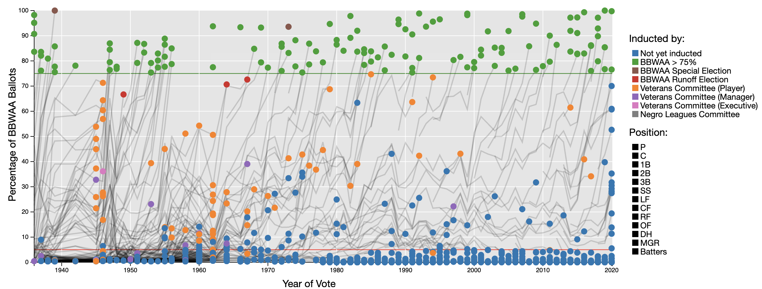{fig-align="center"} ::: {.fragment} **Question:** What questions can you answer? What questions *can't* you answer without touching it? ::: ::: ::: ::: {.notes} A static picture, no matter how well designed, can only answer the questions the designer thought to ask. But what about your questions? What happens when you want to dig deeper, challenge an assumption, or explore a tangent? That's where interaction comes in. It transforms the visualization from a monologue into an exploration tool, allowing you to ask your own questions directly. ::: ## Bridging the Gulfs ::: {.columns} ::: {.column width="40%"} **Key HCI Concept:** Donald Norman's Gulfs **Gulf of Execution** - "How do I make the visualization do what I want?" - User's challenge to specify intent to the system **Gulf of Evaluation** - "What did the visualization just do?" - "What does this view mean?" - User's challenge to understand system response ::: ::: {.column width="60%"} 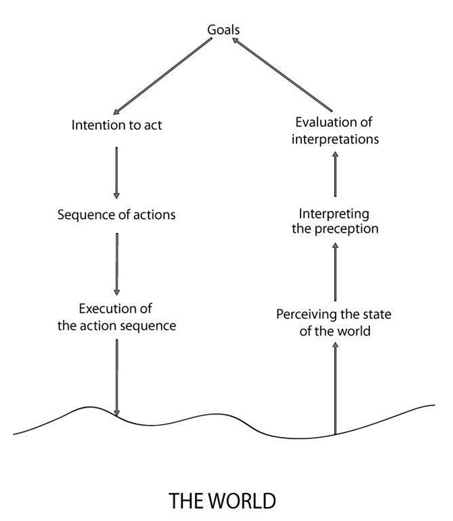{fig-align="center"} ::: ::: ::: {.fragment} **Good interaction design bridges these gulfs** - making the tool feel like an extension of your thought process. ::: ::: {.notes} To understand why interaction is so critical, let's borrow a core concept from Human-Computer Interaction: Don Norman's 'Gulfs'. The Gulf of Execution is that gap between your thought—'I want to see sales from only the West region'—and figuring out how to make the computer do it. The Gulf of Evaluation is the challenge of understanding what the computer shows you in return. Great interaction design builds a bridge over these gulfs. It makes the tool feel like an extension of your own mind. ::: ## The Information Visualization Pipeline ::: {.columns} ::: {.column width="35%"} **Interaction isn't one thing** - it's a set of manipulations at different stages: 1. **Manipulating Data** - Filtering, deriving new fields 2. **Manipulating Visual Mapping** - Swapping axes, changing color scales 3. **Manipulating the View** - Panning, zooming, rotating ::: ::: {.column width="65%"} 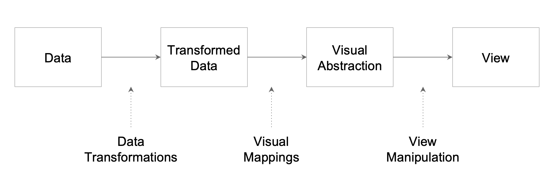{fig-align="center"} ::: ::: ::: {.notes} So where does interaction fit in? It can happen at any stage of the visualization pipeline. We can manipulate the raw Data itself, for example, by filtering out everything but a specific year. We can manipulate the Visual Mapping, like changing a bar chart to a line chart. Or we can manipulate the View, which is the simplest form—just panning and zooming around, like on a map. We'll see examples of all three. ::: ## Lecture Objectives & Outline **Learning Objectives:** 1. Understand why interaction is essential for data exploration 2. Master foundational frameworks (Shneiderman's Mantra, Task Taxonomy) 3. Apply the 12 interactive dynamics from Heer & Shneiderman 4. Analyze current research in reusable interaction design **Today's Outline:** - Part 1: The "Why" of Interaction (15 min) - Part 2: Foundational Frameworks (20 min) - Part 3: A Taxonomy of Interactive Dynamics (35 min) - Part 4: Advanced Topic & Case Study (15 min) - Part 5: Conclusion & Discussion (5 min) ::: {.notes} Here's our plan for today. We'll start with the foundational principles that got the field started. Then, we'll spend the bulk of our time on a comprehensive taxonomy that gives us a shared language for all types of interaction. Finally, we'll look at where the field is heading with a case study from very recent research. By the end, you'll have a robust framework for both analyzing and designing interactive visualizations. ::: # Part 2: Foundational Frameworks {background-color="#2c5f77"} ## The Visual Information Seeking Mantra ::: {.columns} ::: {.column width="50%"} **Ben Shneiderman (1996)** *"The Eyes Have It: A Task by Data Type Taxonomy for Information Visualizations"* A foundational moment for interactive visualization design. ::: ::: {.column width="50%"} ::: {.r-fit-text} **"Overview first,** **zoom and filter,** **then details-on-demand"** ::: ::: ::: ::: {.incremental} - **Overview:** Most valuable first step - provides context, shows big picture - **Zoom and Filter:** Core of exploration - focus on what's interesting, remove what's not - **Details-on-demand:** Get raw numbers and underlying attributes for specific items ::: :::footer Shneiderman, B. (1996). [*The Eyes Have It*](../refs/Shneiderman_1996_The_Eyes_Have_It.pdf). IEEE VIS. ::: ::: {.notes} This mantra has endured for nearly 30 years because it captures the essence of visual exploration. You can't start by looking at details - you'll get lost. You need the overview to orient yourself, to see where the interesting patterns are. Then you drill down, filter out noise, and finally examine the specifics. ::: ## Mantra in Action: FilmFinder ::: {.columns} ::: {.column width="50%"} ::: {.fragment fragment-index=1} **Overview** - All films shown as dots - Full view of the database - Color-coded by genre ::: ::: {.fragment fragment-index=2} **Zoom and Filter** - Dynamic query sliders (year, rating, length) - **Real-time visual feedback** - Immediate filtering on the display ::: ::: {.fragment fragment-index=3} **Details-on-demand** - Click on a film - Full details appear (title, actors, director) ::: ::: ::: {.column width="50%"} ::: {.r-stack} 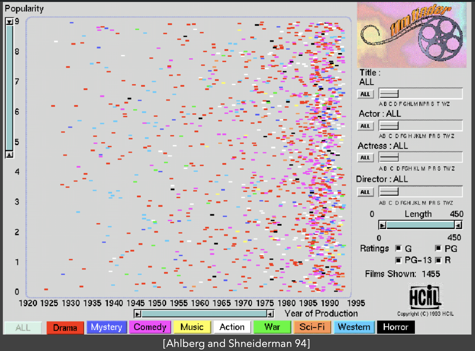{.fragment fragment-index=1 fig-align="center" width="100%"} 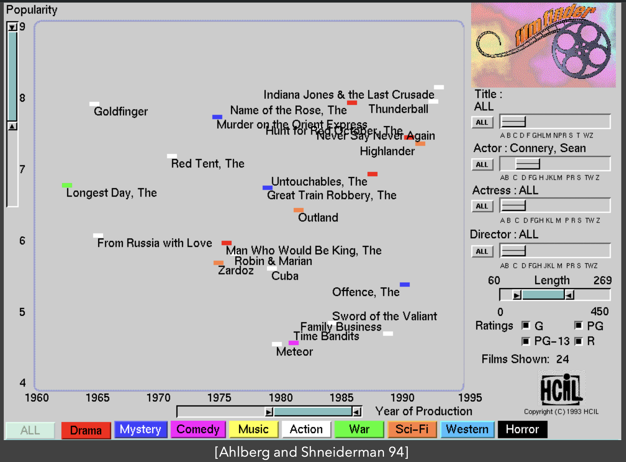{.fragment fragment-index=2 fig-align="center" width="100%"} 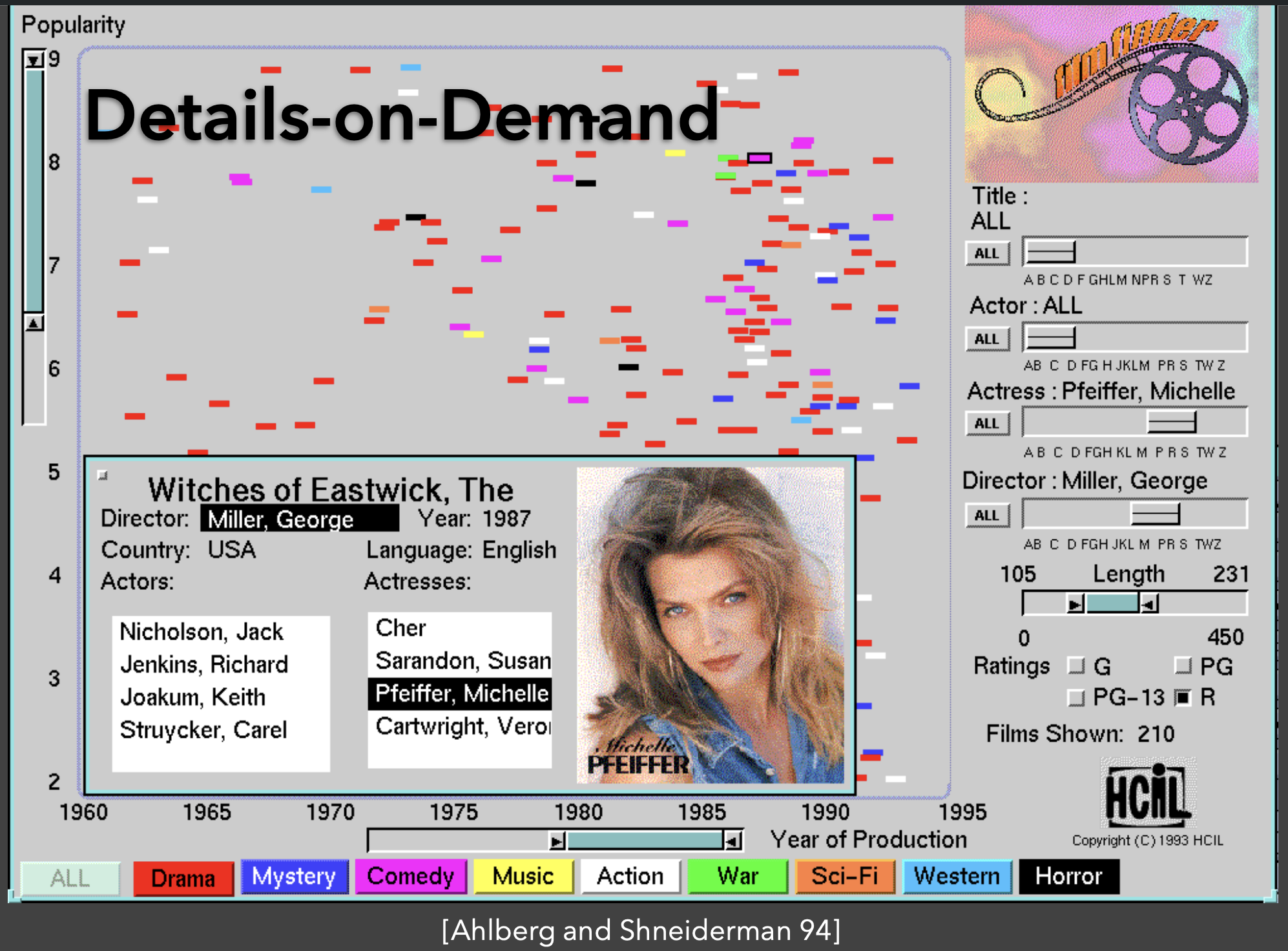{.fragment fragment-index=3 fig-align="center" width="100%"} ::: ::: ::: ::: {.fragment fragment-index=4} **Key Innovation:** Dynamic queries - immediate visual feedback as you adjust sliders. ::: :::footer Shneiderman, B. (1996). [*The Eyes Have It*](../refs/Shneiderman_1996_The_Eyes_Have_It.pdf). IEEE VIS. ::: ::: {.notes} This is the FilmFinder from 1994. It might look dated, but I want you to appreciate how revolutionary this was. Before this, if you wanted to query a movie database, you'd probably have to ask a specialist to write an SQL query. You'd wait, get back a long table of text, and have to start over if it wasn't what you wanted. Here, for the first time, you could just move a slider for 'year' or 'rating' and watch the films on screen update instantly. It made data exploration feel fluid, immediate, and even fun. This is the mantra in action: you get the overview of all films, you zoom and filter with sliders, and you click for details-on-demand. ::: ## Evolving the Mantra: Shneiderman's 7 Tasks ::: {.columns} ::: {.column width="50%"} **From the same 1996 paper:** A fuller "Task by Data Type Taxonomy" **The Original 4:** 1. **Overview** - Get big picture 2. **Zoom** - Focus on items of interest 3. **Filter** - Remove uninteresting items 4. **Details-on-demand** - Get info on specific items ::: ::: {.column width="50%"} **Three New Tasks:** 5. **Relate** - View relationships between items - *Example: See all books by same author* 6. **History** - Keep trail of actions - *Support undo, replay, progressive refinement* 7. **Extract** - Save subset of data - *Export in desired format* ::: ::: ::: {.fragment} This shows a move towards a more **comprehensive understanding** of the analysis process. ::: :::footer Shneiderman, B. (1996). [*The Eyes Have It*](../refs/Shneiderman_1996_The_Eyes_Have_It.pdf). IEEE VIS. ::: ## A Modern Framework **Jeffrey Heer & Ben Shneiderman (2012)** *"Interactive Dynamics for Visual Analysis"* ::: {.columns} ::: {.column width="50%"} **Three High-Level Categories:** 1. **Data & View Specification** - *Controlling what you see* 2. **View Manipulation** - *Controlling how you see it* 3. **Process & Provenance** - *Supporting the analysis process itself* ::: ::: {.column width="50%"} 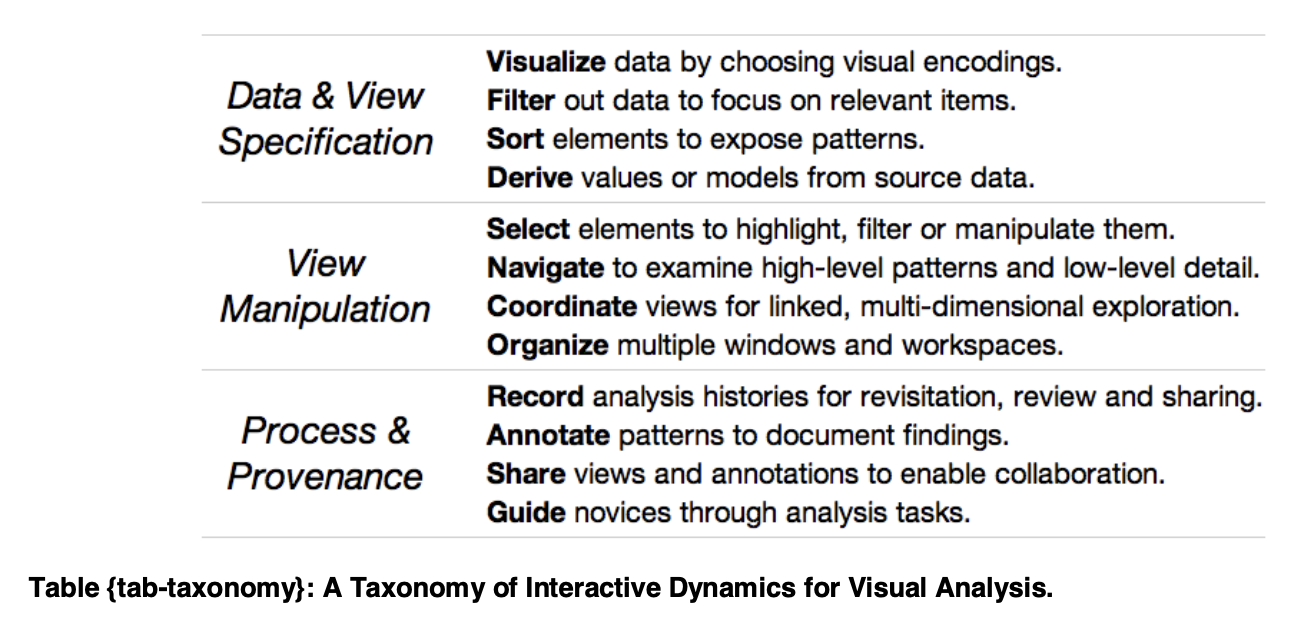{fig-align="center"} ::: ::: ::: {.fragment} **12 specific interaction techniques** - our focus for the rest of the lecture. ::: :::footer Heer, J. & Shneiderman, B. (2012). [*Interactive Dynamics for Visual Analysis*](../refs/Heer_Shneiderman_2012_Interactive_Dynamics_Visual_Analysis.pdf). ACM Queue. ::: # Part 3: A Taxonomy of Interactive Dynamics {background-color="#2c5f77"} ## Category 1: Data & View Specification **Controlling *what* you see** ## 1. Visualize ::: {.columns} ::: {.column width="40%"} **Choosing visual encodings** - The most fundamental step - Mapping data to visual properties - Creating the initial representation **Example: Building in Tableau** ::: {.incremental} - Start with data - Drag dimensions/measures to shelves - Assign variables to axes - Choose mark types and encodings ::: ::: ::: {.column width="60%"} ::: {.r-stack} 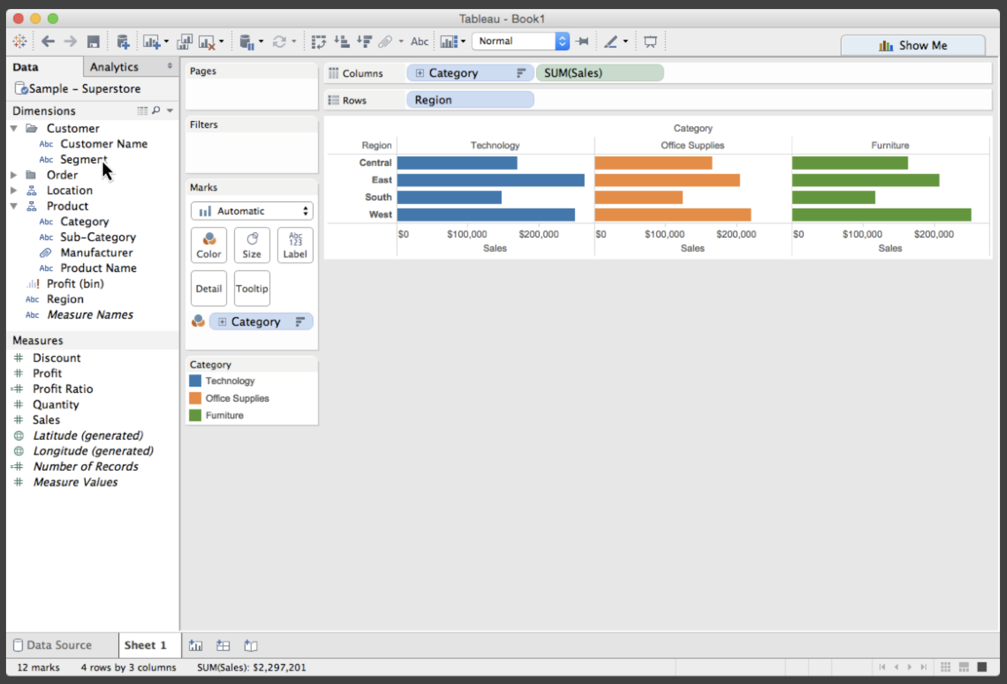{.fragment fig-align="center" width="100%"} 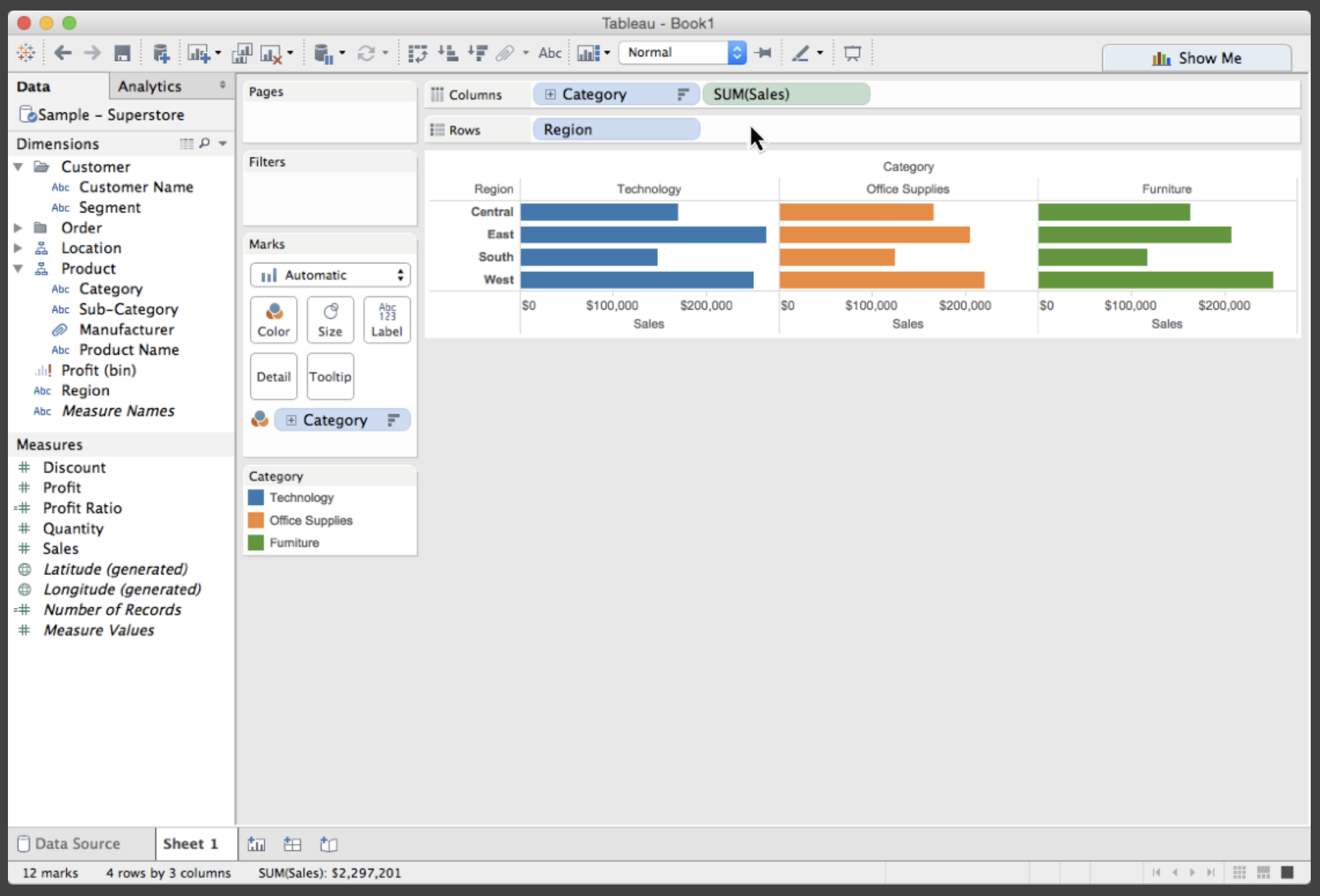{.fragment fig-align="center" width="100%"} 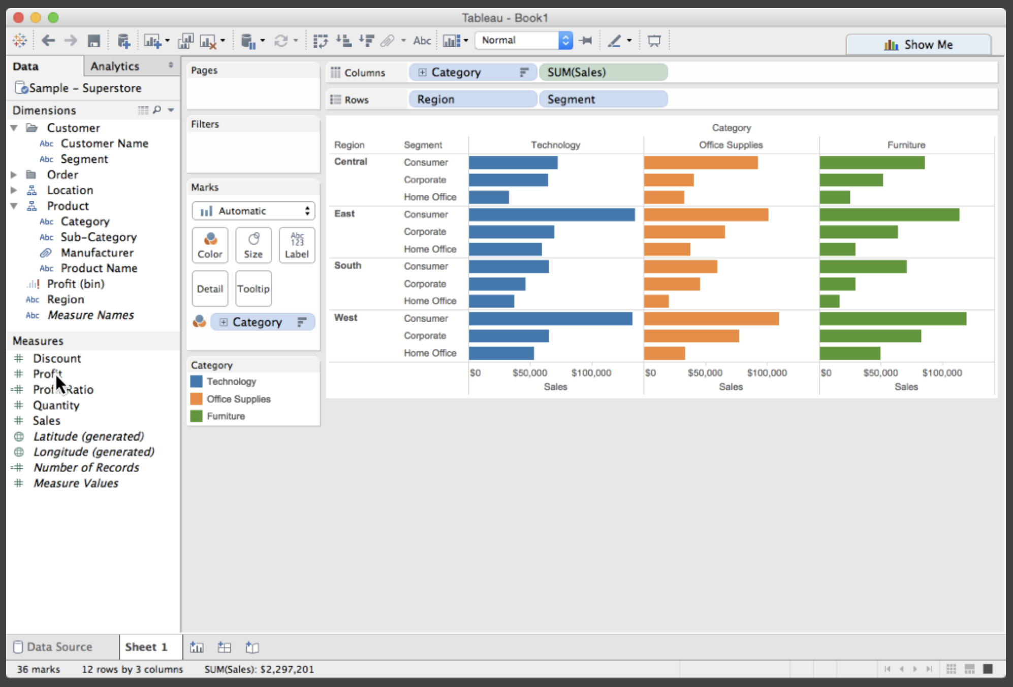{.fragment fig-align="center" width="100%"} 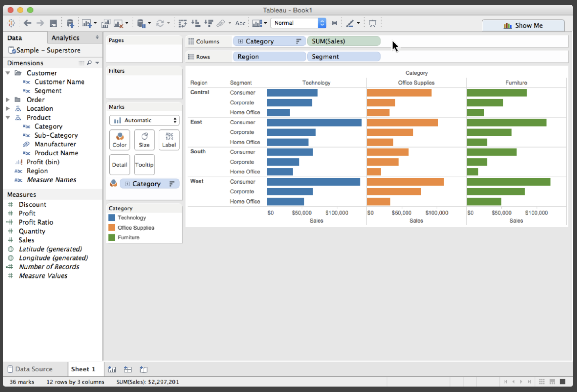{.fragment fig-align="center" width="100%"} 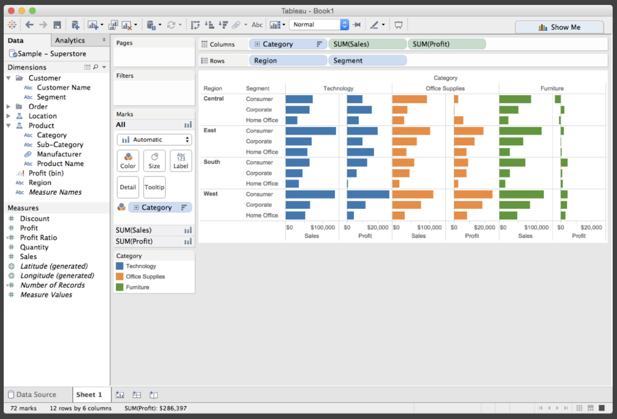{.fragment fig-align="center" width="100%"} ::: ::: ::: ::: {.notes} This is where you decide: "I want a scatterplot with GDP on the x-axis and life expectancy on the y-axis, with color encoding region." It's the transition from data to visual form. Walk through each step showing how Tableau builds the visualization progressively - starting with the data, then adding dimensions and measures, and finally refining the visual encoding. Every tool handles this differently, but the core concept is the same. ::: ## 2. Filter ::: {.columns} ::: {.column width="35%"} **Reducing the data set based on conditions** - Remove items that don't meet criteria - Focus on subset of interest - Can be applied at data or view level **Example:** - Dynamic query widgets - Sliders for continuous values - Check boxes for categories - Real-time visual feedback ::: ::: {.column width="65%"} {fig-align="center" width="100%"} ::: ::: ::: {.notes} Filtering is about reducing the data to what's relevant. You do this all day, every day. Quick poll: what's a filter you've used today? On Amazon, filtering by 'Prime' and '4 stars & up'? On Netflix, filtering by 'Comedy'? It's the same principle. You're removing the noise to focus on the signal. The key distinction is between filtering at the data level (the data is actually removed before visualization) versus filtering at the view level (data is still there, just not shown). ::: ## 3. Sort ::: {.columns} ::: {.column width="35%"} **Ordering the data** - Exposes rankings - Reveals patterns - Makes comparisons easier **Example:** - Clicking column header in table - Sorting bars by value - Ordering timeline by magnitude - Reordering categorical axes ::: ::: {.column width="65%"} {fig-align="center" width="100%"} ::: ::: ::: {.notes} Sorting is about imposing order. It's one of the simplest, yet most powerful, interactions. When you land on a product page, what's the first thing you sort by? Price low-to-high? Average customer rating? That single click instantly helps you find patterns and priorities in the data. A sorted list immediately answers "what's the biggest?" or "what's the trend?" It's also a great example of how a simple interaction can completely change the story a visualization tells. ::: ## 4. Derive ::: {.columns} ::: {.column width="35%"} **Creating new data from existing data** - Compute new fields - Transform variables - Aggregate or summarize **Examples:** - Profit per sale = profit ÷ sales - Year-over-year change - Moving averages - Binning continuous variables - String manipulations ::: ::: {.column width="65%"} {fig-align="center" width="100%"} ::: ::: ::: {.notes} This is where analysis happens. You're not just viewing the data; you're transforming it to answer new questions. Modern BI tools make this easy with calculated fields, but the concept applies anywhere you're doing data transformation within a visualization tool. ::: ## Category 2: View Manipulation **Controlling *how* you see it** ## 5. Select ::: {.columns} ::: {.column width="35%"} **Marking items as having special interest** - Prerequisite for many other actions - Can be single or multiple items - Visual feedback is crucial **Interaction Patterns:** - **Hover** - Temporary highlight - **Click** - Single item selection - **Lasso/Brush** - Group selection - **Shift-click** - Add to selection ::: ::: {.column width="65%"} {fig-align="center" width="85%"} ::: ::: ::: {.notes} Selection is foundational. Once you've selected items, you can delete them, annotate them, filter to show only them, or - most powerfully - see how they appear in other views. This is the first step in the "brushing and linking" interaction we'll discuss next. ::: ## 6. Navigate ::: {.columns} ::: {.column width="35%"} **Changing the viewpoint** *The "zoom" in Shneiderman's mantra* **Three primary operations:** - **Pan** - Moving camera side-to-side - **Zoom** - Increasing/decreasing magnification - **Rotate** - For 3D views ::: {.fragment} **Key distinction:** Geometric vs. Semantic Zoom - *Geometric:* Just magnification - *Semantic:* Level of detail changes ::: ::: ::: {.column width="65%"} ::: {.r-stack} 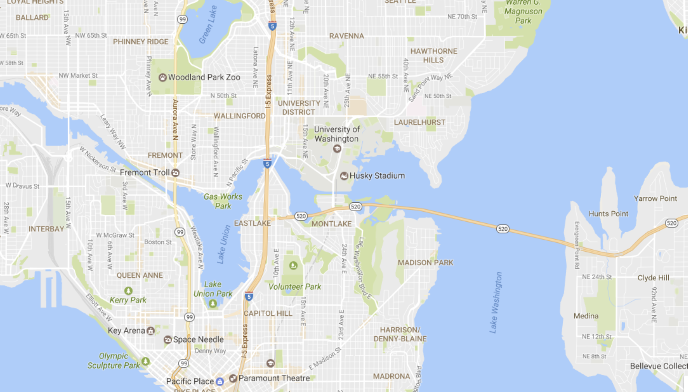{.fragment fig-align="center" width="85%"} 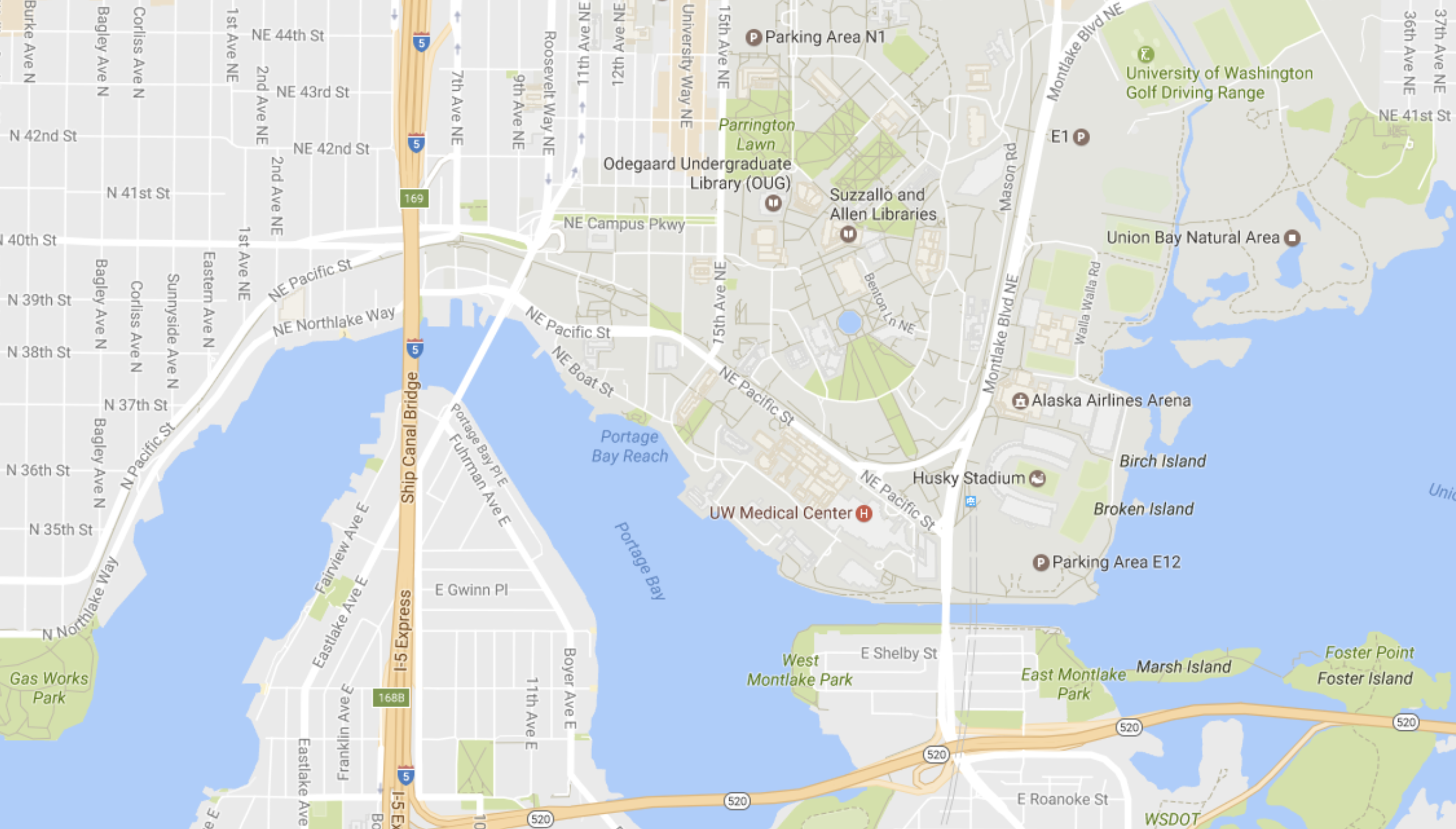{.fragment fig-align="center" width="85%"} ::: ::: ::: ::: {.notes} Navigation is what makes large datasets tractable. You can show an overview of a million points, then zoom in to see detail. Semantic zoom is particularly interesting - think of Google Maps, where zooming in doesn't just make things bigger, it reveals new information like street names and building outlines. Here we see two different views showing how navigation changes what you can see in the visualization. ::: ## 7. Coordinate ::: {.columns} ::: {.column width="35%"} **Linking multiple views** *This is critical!* **Actions in one view are reflected in others** **Brushing and Linking:** 1. Select items in one view (e.g., scatterplot) 2. They are instantly highlighted in all other views (e.g., map, bar chart) 3. Enables multi-perspective exploration **Why powerful?** Each view shows different aspects of the same data. ::: ::: {.column width="65%"} 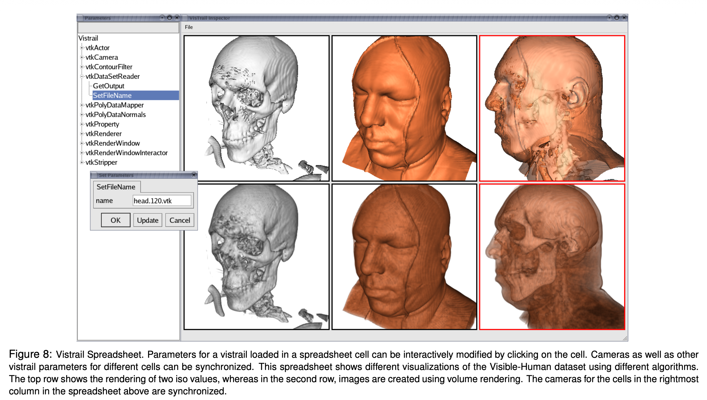{fig-align="center" width="85%"} 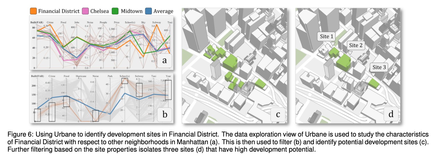{fig-align="center" width="85%"} ::: ::: ::: {.notes} Now, coordination is a critical concept, and it's what makes dashboards so powerful. It's the idea of linking multiple views together. The magic here is called brushing and linking. When I 'brush' or select a set of dots in the scatterplot, notice how they instantly light up in the bar chart and the map. The views are talking to each other. This lets you explore relationships across different dimensions of your data simultaneously. This is where interaction becomes truly powerful for analysis - this is how you discover multi-dimensional patterns. ::: ## 8. Organize ::: {.columns} ::: {.column width="35%"} **Arranging the workspace** - Resizing windows - Reordering views in a dashboard - Creating custom layouts - Collapsing/expanding panels **Goal:** Optimize screen real estate for the current task ::: ::: {.column width="65%"} 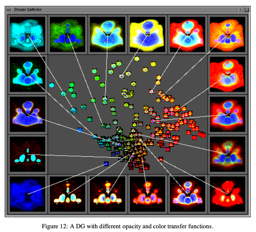{fig-align="center" width="85%"} 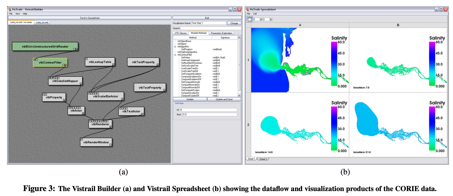{fig-align="center" width="85%"} ::: ::: ::: {.notes} This seems mundane, but it's essential for real analysis work. Different tasks need different layouts. When you're comparing views, you want them side-by-side. When one view is primary, you maximize it. Good tools make this easy to adjust on the fly. The Design Gallery and VisTrails examples show different approaches to organizing multiple views in a workspace. ::: ## Category 3: Process & Provenance **Supporting the analysis process itself** ## 9. Record ::: {.columns} ::: {.column width="35%"} **Capturing the history of interaction** **Why?** - Support undo - Enable replay - Show analysis path - Facilitate review **Examples:** - History panel (like Photoshop) - Action log - Version control for visualizations - Movie generation from interactions ::: ::: {.column width="65%"} 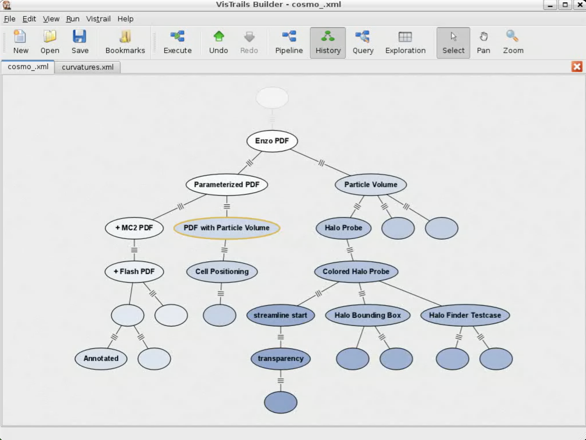{fig-align="center" width="85%"} 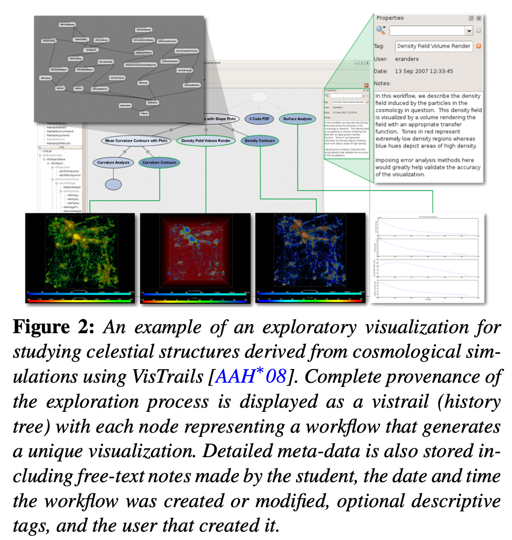{fig-align="center" width="85%"} ::: ::: ::: {.notes} Think about your last serious data analysis session. You probably took 20 different paths, most of which were dead ends. Recording history means you can backtrack without starting over. It also creates a record of your analytical process, which is crucial for reproducibility. The cosmology and VisTrails examples show different approaches to history visualization and workflow tracking. ::: ## Record: VisTrails Movie Generation **VisTrails for ParaView:** Recorded interactions can be replayed to generate movies of the analysis process. ::: {.notes} This video demonstrates how VisTrails records all interactions and can replay them to automatically generate movies showing the entire analysis workflow. This is invaluable for creating presentations, tutorials, and documenting scientific processes. ::: ## 10. Annotate ::: {.columns} ::: {.column width="35%"} **Adding notes to views** **Why?** - Capture insights as they occur - Communicate findings to others - Mark important features - Ask questions for later **Examples:** - Drawing arrows on a chart - Adding text boxes - Highlighting regions - Tagging interesting points ::: ::: {.column width="65%"} 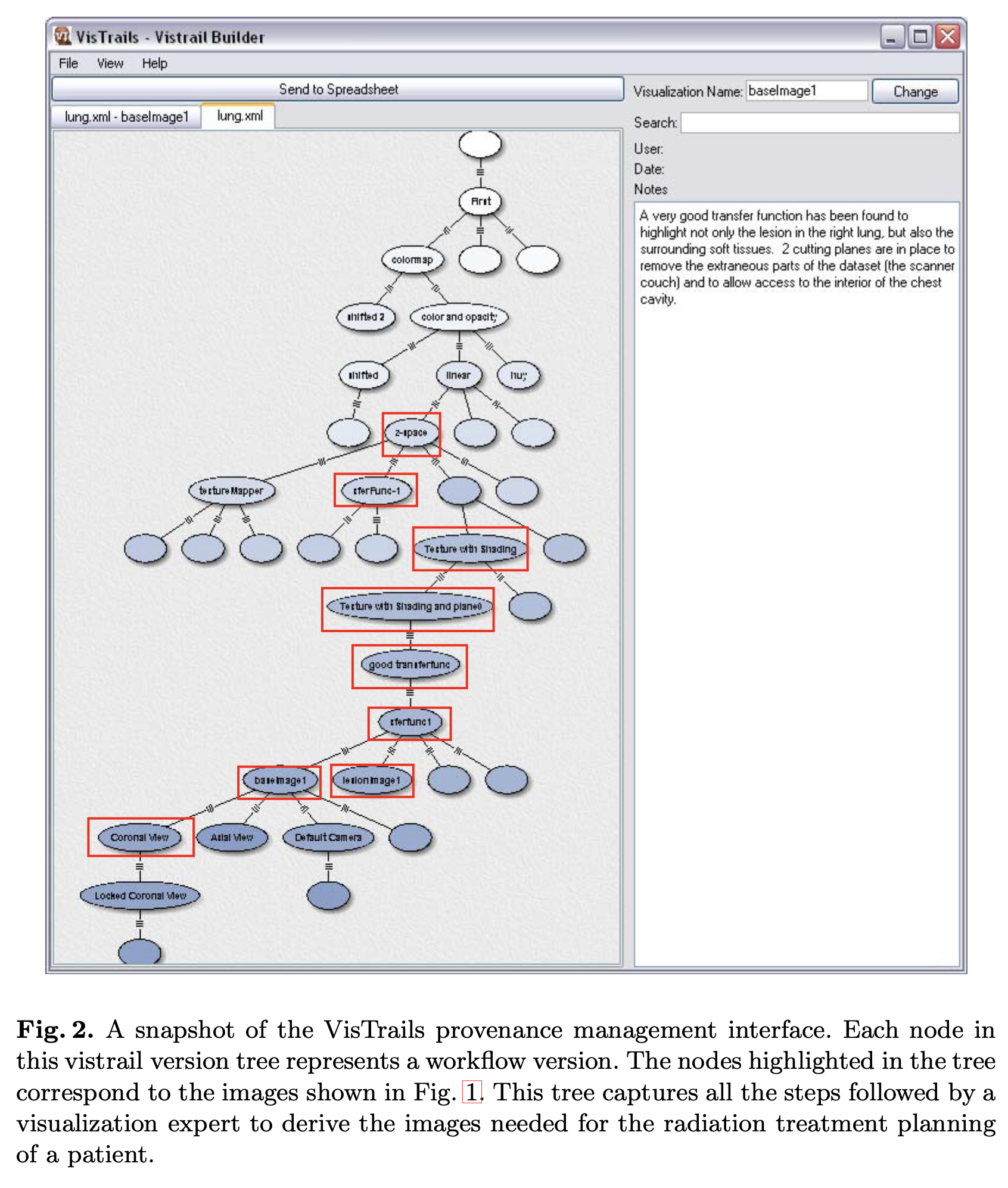{fig-align="center" width="85%"} ::: ::: ::: {.notes} Annotation is the bridge between analysis and communication. When you spot something interesting, you want to mark it immediately before you forget. These annotations then become the building blocks of your final presentation or report. VisTrails allows annotations directly on workflow nodes and visualizations. ::: ## 11. Share ::: {.columns} ::: {.column width="35%"} **Sharing views and analysis sessions** **Why?** - Enable collaboration - Disseminate findings - Get feedback - Support team analysis **Examples:** - Shareable links to interactive dashboards - Embedded visualizations - Exporting views with interaction intact - Collaborative workspaces ::: ::: {.column width="65%"} 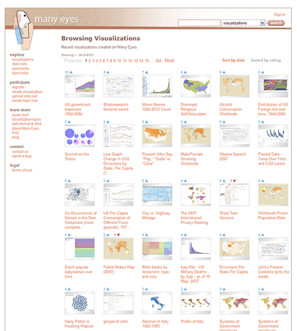{fig-align="center" width="85%"} ::: ::: ::: {.notes} Modern visualization is inherently collaborative. You're rarely analyzing data in isolation. You need to share what you've found, ideally preserving the interactivity so others can explore further. This is a huge shift from the static-chart-in-PowerPoint era. ManyEyes was an early example of a social visualization platform that enabled sharing and collaborative exploration. ::: ## 12. Guide ::: {.columns} ::: {.column width="35%"} **Leading an audience through a story** **Examples:** - **Scrollytelling websites** - New York Times interactive articles - Animated, progressive revelation - **Guided tutorials** - Step-by-step walkthroughs - Tooltips and contextual help - Progressive disclosure of features **Balance:** Author-driven narrative ↔ Reader-driven exploration ::: ::: {.column width="65%"} 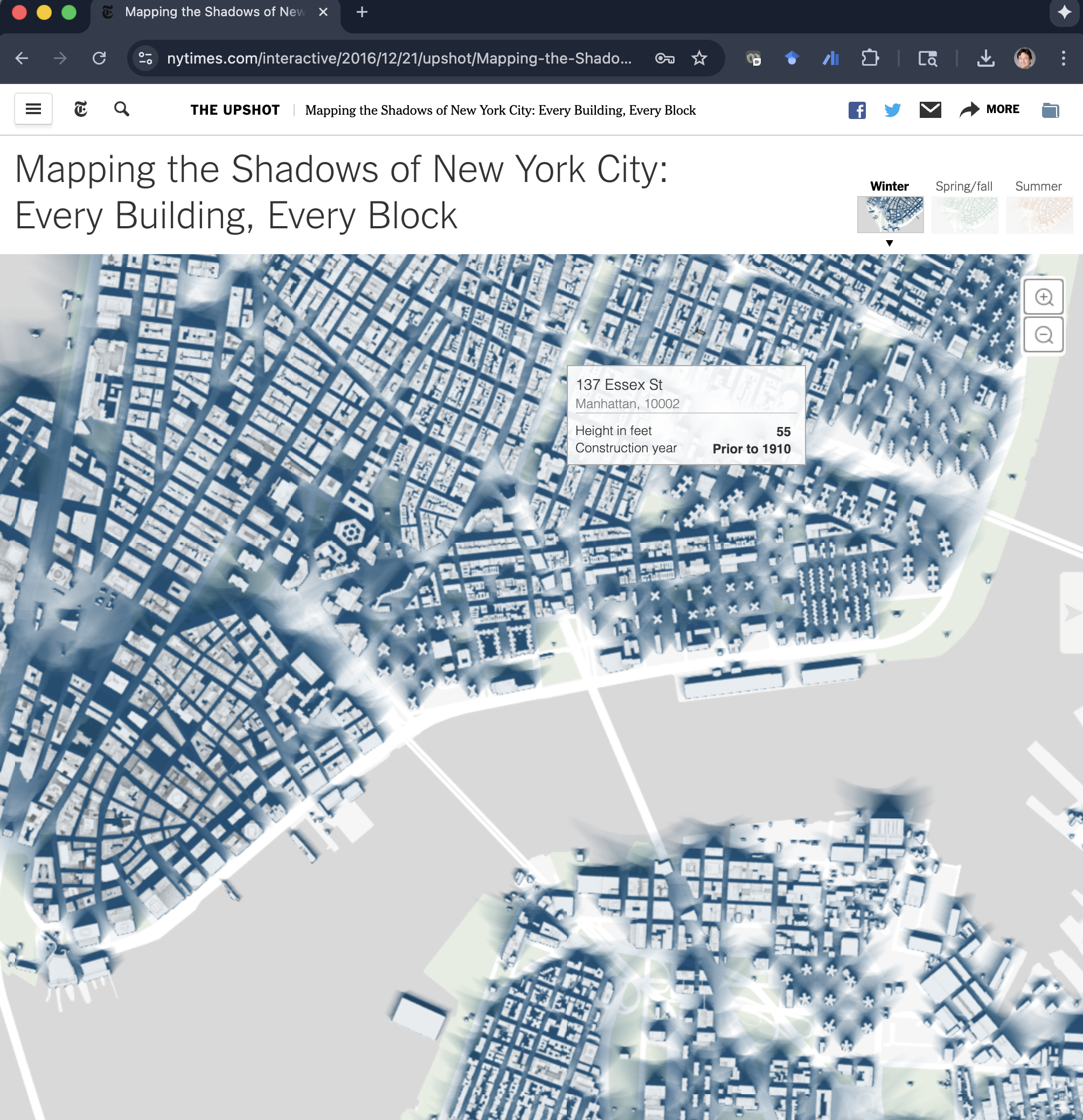{fig-align="center" width="85%"} [NYT: Mapping the Shadows of New York City](https://www.nytimes.com/interactive/2016/12/21/upshot/Mapping-the-Shadows-of-New-York-City.html){.center} ::: ::: ::: {.notes} The Guide dynamic is about turning an exploration into an explanation. Instead of letting the user explore freely, you take them by the hand and lead them through a pre-defined path to tell a story. This is the technique behind 'scrollytelling'. Think of the best interactive articles from The New York Times or The Pudding. As you scroll, the visualizations animate and change to support the narrative. It's a powerful way to communicate specific findings. This is about finding the sweet spot between a static presentation (full author control) and a completely open exploration tool (full reader control). ::: # Part 4: Advanced Topic & Case Study {background-color="#2c5f77"} ## The Challenge of Reusable Interactions ::: {.columns} ::: {.column width="50%"} **We have amazing libraries for reusing visualizations:** - D3.js - Vega/Vega-Lite - Plotly - Observable Plot **But reusing interactions is incredibly hard.** ::: ::: {.column width="50%"} **The Problem:** Every developer ends up rewriting the same logic for: - Selection - Brushing and linking - Zooming and panning - Tooltips - Filtering ::: ::: ::: {.fragment} **Result:** A chasm between novel interaction research and what's available in practical tools. ::: ::: {.notes} This is a real pain point in the field. We have declarative grammars for specifying visualizations - you can create complex charts with just a few lines of JSON. But for interactions, you're still writing imperative event handlers and managing state. It's tedious, error-prone, and not reusable across projects. ::: ## Case Study: The Libra Interaction Model **Zhao et al., CHI 2025** ::: {.columns} ::: {.column width="50%"} **The Goal:** - Separate interaction logic from visualization rendering - Create a "grammar of interaction" - Just like we have a "grammar of graphics" **The Core Idea:** Break interactions down into reusable components: - **Instruments:** Basic user inputs (Hover, Click, Drag) - **Services:** Data operations (Filter, Select, Transform) ::: ::: {.column width="50%"} 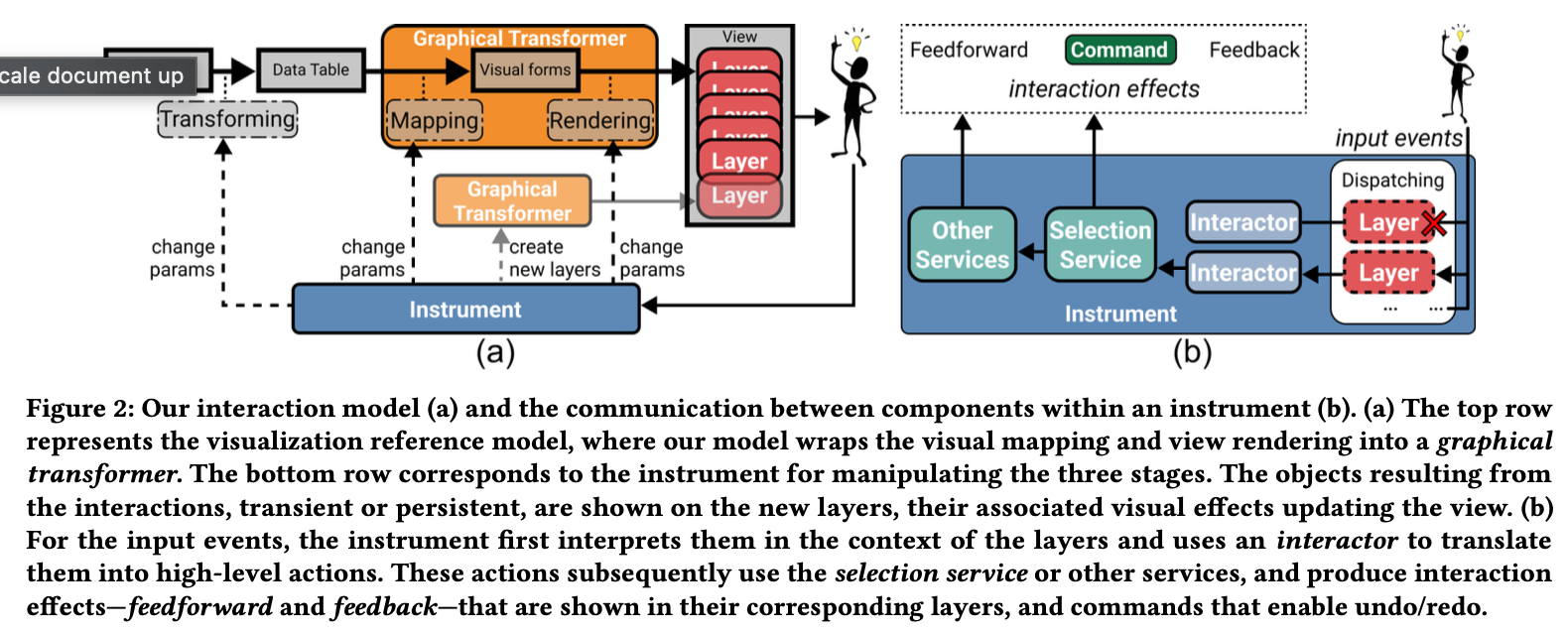{fig-align="center"} ::: ::: :::footer Zhao, J. et al. (2025). [*Libra: Composable Interactions*](../refs/Zhao_2025_Libra_Composable_Interactions.pdf). CHI. ::: ::: {.notes} Libra's key insight is that most interactions can be decomposed into a small set of primitive operations. Instead of writing custom code for each interaction, you compose these primitives. It's like building with LEGO blocks instead of carving each piece from scratch. ::: ## Libra Example: Building Interactions 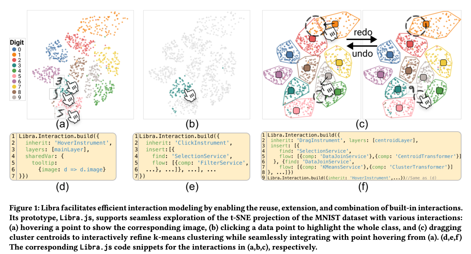{fig-align="center" width="90%"} ::: {.incremental} - **Step 1 (Fig 1d):** Simple `HoverInstrument` shows tooltip with digit image - **Step 2 (Fig 1e):** Add `ClickInstrument` + `SelectionService` to highlight clicked points - **Step 3 (Fig 1f):** Add `DragInstrument` + `KMeansService` for complex cluster analysis - **Result:** Complex interaction built by combining simple, reusable parts ::: :::footer Zhao, J. et al. (2025). [*Libra: Composable Interactions*](../refs/Zhao_2025_Libra_Composable_Interactions.pdf). CHI. ::: ::: {.notes} This brings us to the cutting edge. We've just learned this great 12-part taxonomy. The problem is, in the real world, developers have to code these interactions from scratch every single time. The Libra project asks: can we create a 'grammar of interaction' just like we have a 'grammar of graphics'? Look at their example. They start with a simple HoverInstrument. Then, they compose it with a ClickInstrument that uses a SelectionService—that's a direct implementation of the Select dynamic we just discussed. Finally, they add a DragInstrument which uses a KMeansService—a powerful way to implement the Derive dynamic, creating new cluster information on the fly. By breaking interactions into reusable blocks, they're making it easier for everyone to build sophisticated, novel interactive systems. This is how research builds on the foundational concepts we've learned today. ::: ## Why This Matters **A model like Libra could lead to:** ::: {.incremental} - **More rapid prototyping** of novel interactions - Test ideas quickly without reimplementing basics - **More consistency** for users across different tools - Click means click, drag means drag, everywhere - **A richer ecosystem** of shared interactive components - GitHub for interaction patterns - Mix and match from community libraries ::: ::: {.fragment} **The future:** Interaction design as composition, not programming. ::: ::: {.notes} We're at an inflection point. Just as D3 and Vega transformed how we build visualizations, models like Libra could transform how we build interactions. Imagine a world where adding brushing-and-linking to your dashboard is as easy as adding a scatterplot. That's the promise. ::: # Part 5: Conclusion & Discussion {background-color="#2c5f77"} ## Summary & Key Takeaways **Foundational Frameworks:** ::: {.columns} ::: {.column width="50%"} **Shneiderman's Mantra** *A timeless design heuristic* "Overview first, zoom and filter, then details-on-demand" ✓ Start with context ✓ Enable focused exploration ✓ Provide details when needed ::: ::: {.column width="50%"} **Heer & Shneiderman's Taxonomy** *A comprehensive vocabulary* - **Data & View Specification:** Visualize, Filter, Sort, Derive - **View Manipulation:** Select, Navigate, Coordinate, Organize - **Process & Provenance:** Record, Annotate, Share, Guide ::: ::: ::: {.fragment} **Central Theme:** Interaction enables a true **dialogue with data**, moving beyond passive viewing to active exploration. ::: ## Further Reading **Foundational Papers:** - Shneiderman, B. (1996). [*The Eyes Have It: A Task by Data Type Taxonomy*](../refs/Shneiderman_1996_The_Eyes_Have_It.pdf). IEEE VIS. - Card, Mackinlay & Shneiderman (1999). [*Readings in Information Visualization: Using Vision to Think*](../refs/Card_Mackinlay_Shneiderman_1999_Using_Vision_to_Think_Chapter1.pdf). **Interaction Theory & Practice:** - Heer, J. & Shneiderman, B. (2012). [*Interactive Dynamics for Visual Analysis*](../refs/Heer_Shneiderman_2012_Interactive_Dynamics_Visual_Analysis.pdf). ACM Queue. - Yi, J. S. et al. (2007). [*Toward a Deeper Understanding of the Role of Interaction*](../refs/Yi_2007_Toward_Deeper_Understanding_Interaction.pdf). IEEE TVCG. - Pike, W. A. et al. (2009). [*The Science of Interaction*](../refs/Pike_2009_Science_of_Interaction.pdf). Information Visualization. **Recent Research:** - Zhao, J. et al. (2025). [*Libra: Composable Interactions*](../refs/Zhao_2025_Libra_Composable_Interactions.pdf). CHI. ## Questions? ## {background-image="figs/vida.jpg" background-size="cover"} ::: {.r-fit-text} Thank you! :::
