# Foundations of Geovisualization {background-color="#2c5f77"} ## The 2D Map ::: {.notes} Welcome. Today we're starting a three-part series on geovisualization. Before we can get to the complex 3D and interactive systems, we *must* understand the fundamentals. We'll be focusing on the most common and, as we'll see, the most *misused* form of visualization: the 2D static map. Our goal today is to learn how to read and create these maps *critically*. ::: --- # Part 1: The Power of Spatial Analysis {background-color="#2c5f77"} ## John Snow's 1854 Cholera Map ::: {.columns} ::: {.column width="50%"} **What is a map for?** - Analysis - Communication **Snow's Innovation:** - He didn't just plot data - He used spatial relationships to solve a problem - Deaths clustered around the Broad Street pump - Had the handle removed → outbreak stopped ::: ::: {.column width="50%"} {fig-align="center" width="100%"} ::: ::: ::: {.notes} This is the foundational story of geovisualization. In 1854, cholera was a mystery. John Snow plotted the deaths (the black bars) on a map of London. He saw they clustered around one water pump—the Broad Street pump. He had the handle removed, and the outbreak stopped. This is the "why" of what we do. He didn't just make a picture; he used the spatial relationship between deaths and pumps to form a hypothesis and take action. ::: ## Historical Milestones in Cartography ::: {.columns} ::: {.column width="50%"} ### Ptolemy's Geographica (c. 150 AD) - Foundation of modern cartography - Latitude and longitude coordinate system - Over 2000 years of influence 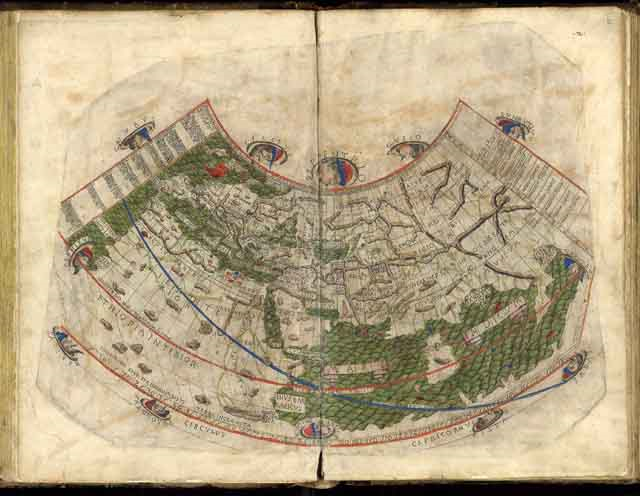{fig-align="center"} ::: ::: {.column width="50%"} ### Minard's Flow Map (1869) - Multiple variables in one visualization: - Troop size (width) - Temperature (bottom scale) - Location (geography) - Direction (color: tan = advance, black = retreat) 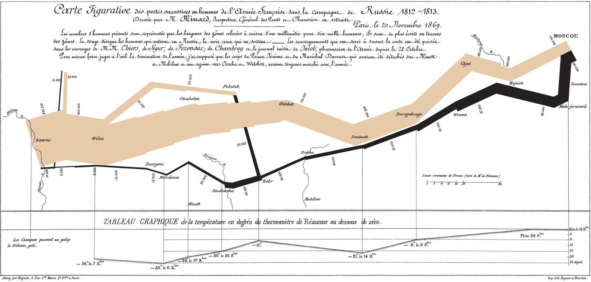{fig-align="center"} ::: ::: ::: {.notes} Maps are not new. Ptolemy laid the groundwork for using latitude and longitude over 2000 years ago. On the right is one of the most famous visualizations ever, by Charles Joseph Minard. It shows the devastating losses of Napoleon's army in Russia. The thick tan band shows the army size shrinking on the way to Moscow, and the thin black line shows its utter collapse on the retreat, plotted against temperature. This is a brilliant *flow map*. ::: --- # Part 2: When to Use a Map? {background-color="#2c5f77"} ## The Critical Question ::: {.r-fit-text} **"Not all geographical data should be on a map."** ::: ::: {.fragment} ### When is the bar chart better? - For **ranking** and **lookup** tasks - "Which state has the highest sales?" - "What are the top 5 states?" ::: ::: {.fragment} ### When is the map better? - For finding **spatial patterns** - For identifying **clusters** - For understanding **geographic relationships** - "Are sales clustered in the Midwest?" ::: ::: {.notes} This is the *most important* question you must ask every time. Just because you have spatial data (like states) doesn't mean you *must* use a map. ::: ## Map vs. Bar Chart: The Same Data ::: {.columns} ::: {.column width="50%"} 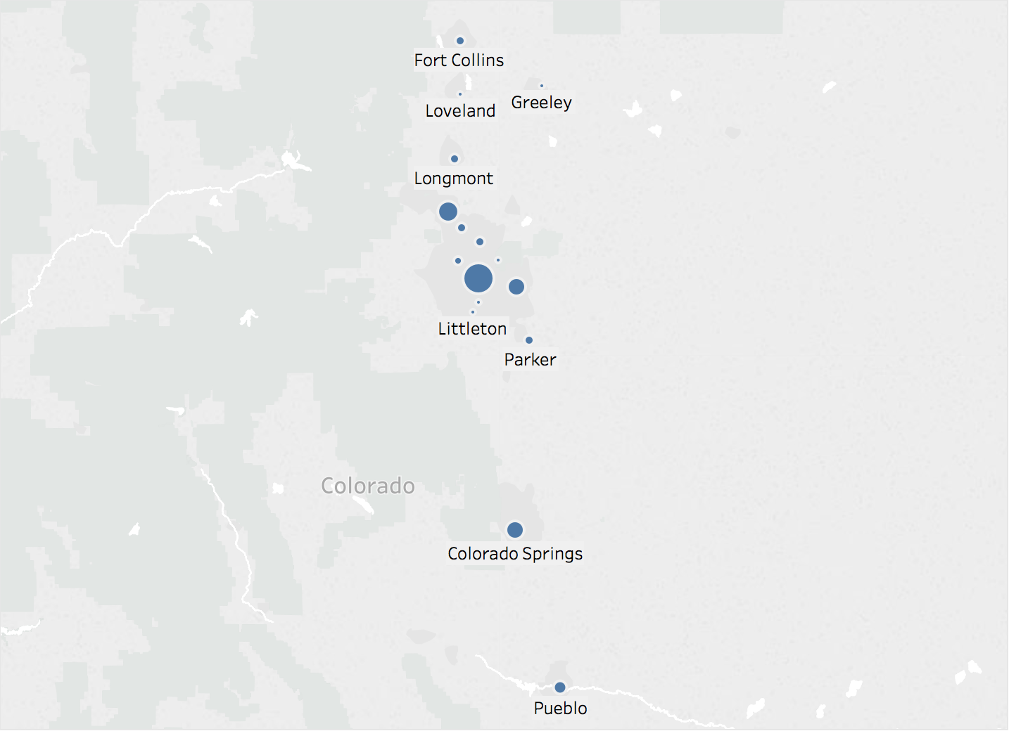{fig-align="center"} **Better for:** Spatial patterns, regional clustering ::: ::: {.column width="50%"} 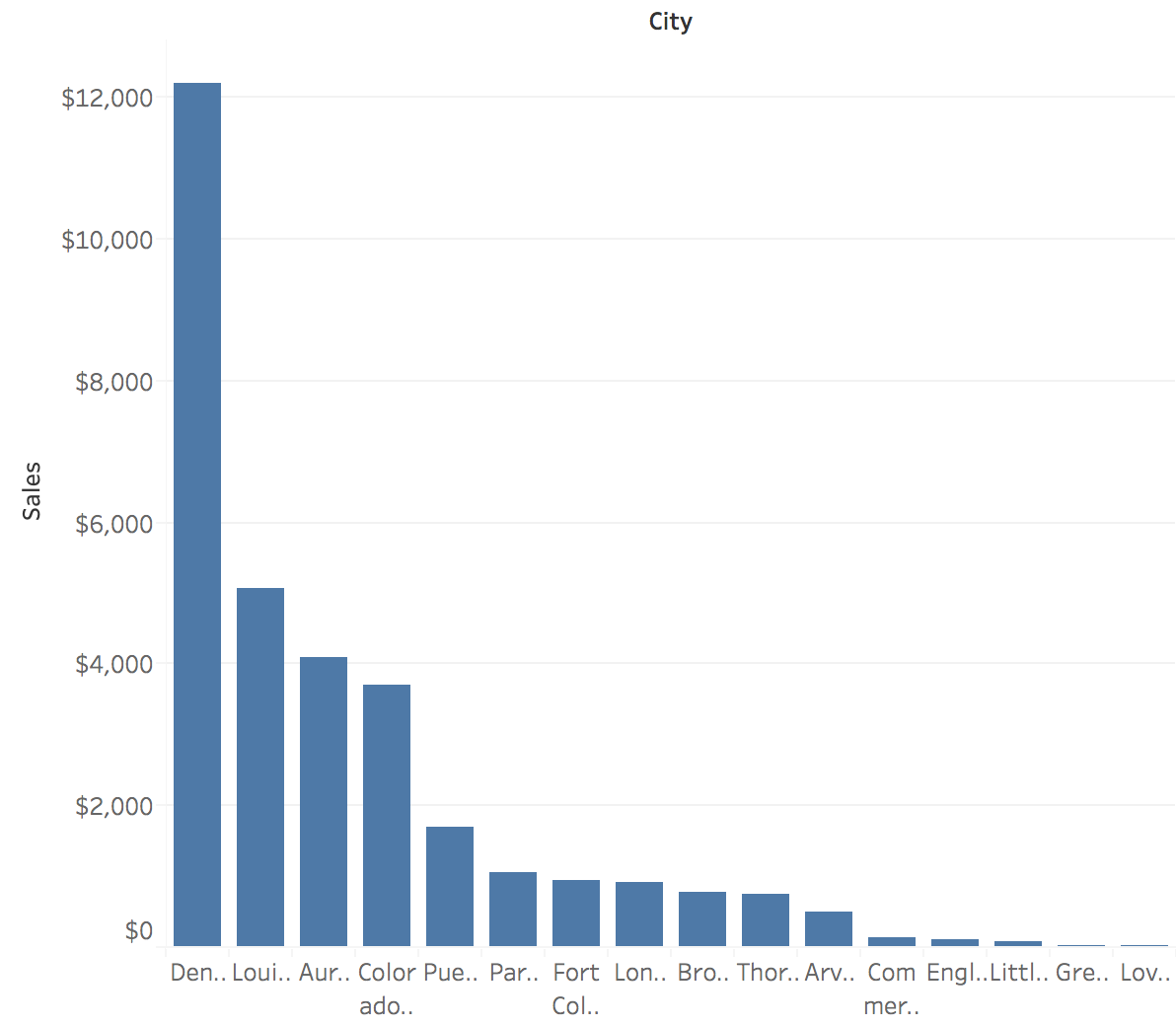{fig-align="center"} **Better for:** Ranking, exact value lookup ::: ::: ::: {.notes} Look at these two charts. If my question is, "Which state has the highest sales?" or "What are the top 5 states?" the bar chart is *infinitely* better. If my question is, "Are sales clustered? Is there a pattern in the Midwest?" the map is the only way to see that. ::: --- # Part 3: The Fundamental Problem {background-color="#2c5f77"} ## Projections: Mapping 3D to 2D ::: {.columns} ::: {.column width="50%"} **The Challenge:** - Earth is a 3D sphere - Screens and paper are 2D planes - You **cannot** flatten a sphere without distortion ::: {.fragment} **You must choose what to distort:** - Shape - Area - Distance ::: ::: ::: {.column width="50%"} {fig-align="center"} ::: ::: ::: {.r-fit-text .fragment} **Any 2D map is a lie. The question is: what kind of lie?** ::: ::: {.notes} This is the fundamental challenge of all cartography. The Earth is a sphere (well, an oblate spheroid). A screen or piece of paper is flat. Any 2D map *is a lie*. It's a distorted view of reality. The question is, what *kind* of "lie" (distortion) are you choosing, and is it appropriate for your task? ::: ## Projection Types: What They Preserve ::: {.columns} ::: {.column width="33%"} ### Conformal *Preserves shape & angles* 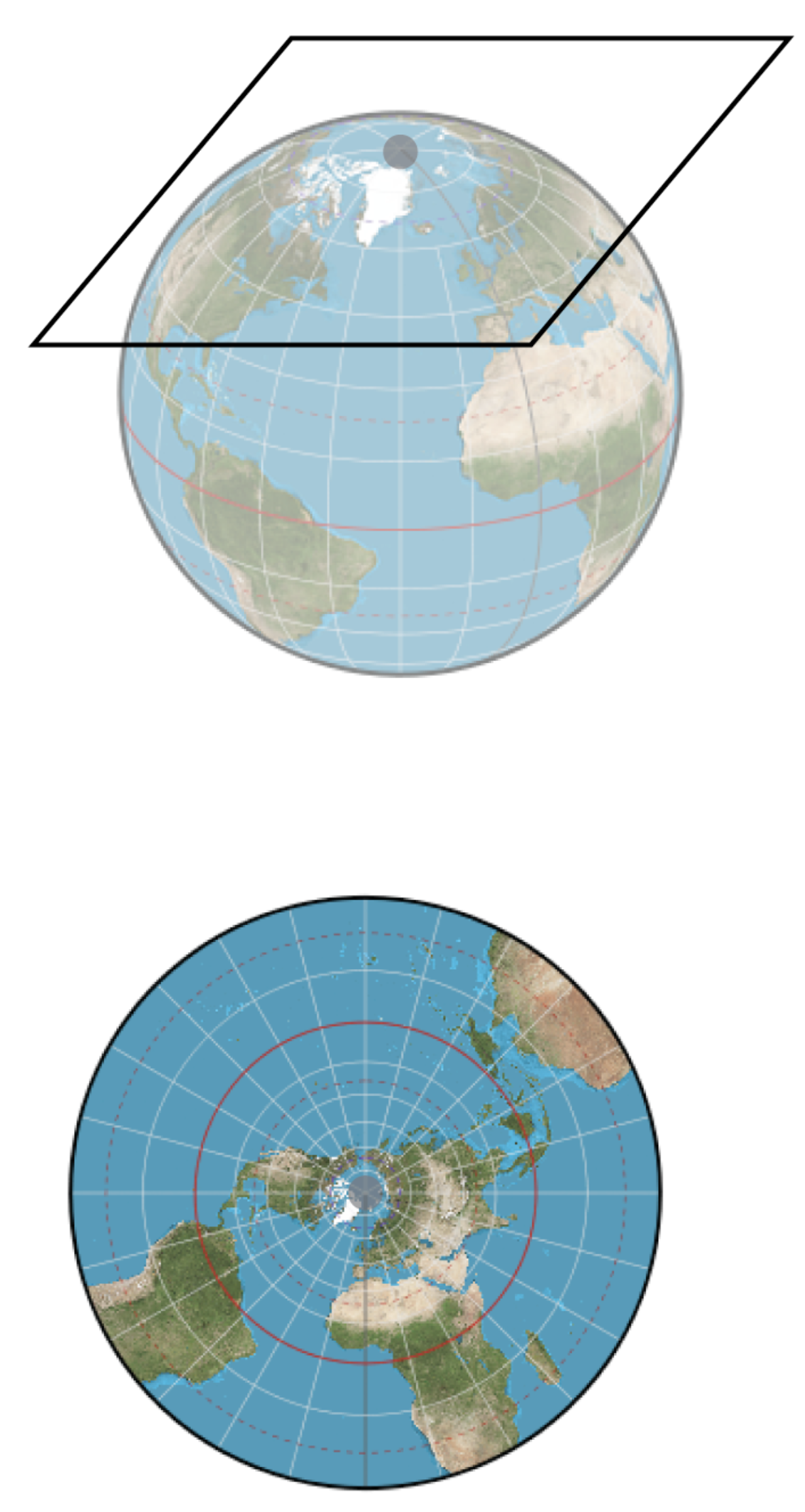{fig-align="center"} **Use:** Navigation (constant compass bearing) ::: ::: {.column width="33%"} ### Equal-Area *Preserves relative area* 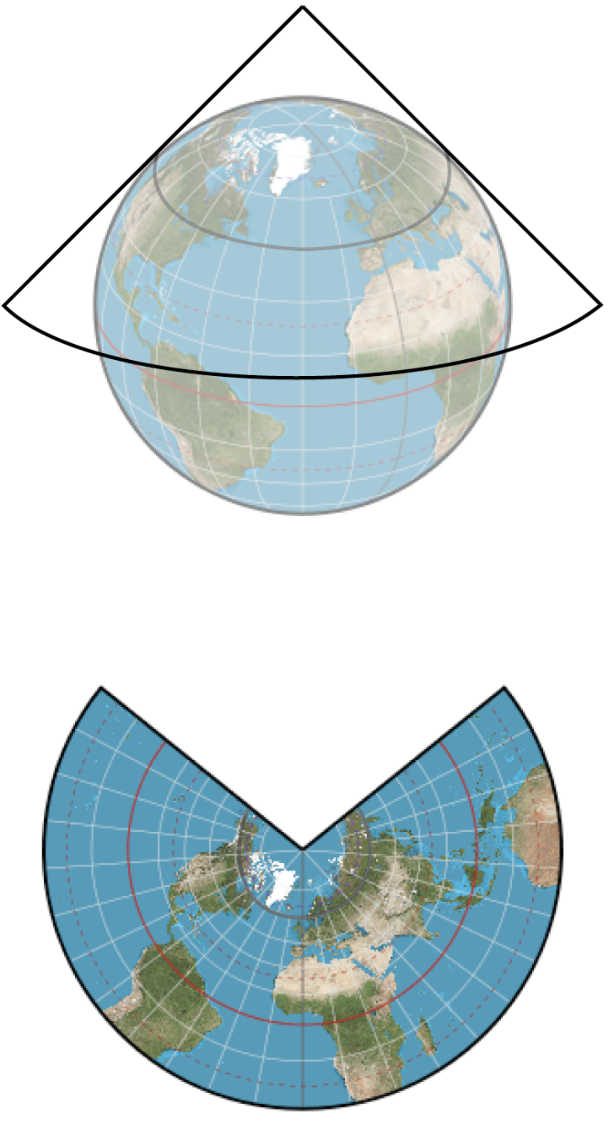{fig-align="center"} **Use:** Thematic maps (choropleths) ::: ::: {.column width="33%"} ### Equidistant *Preserves distance from center* 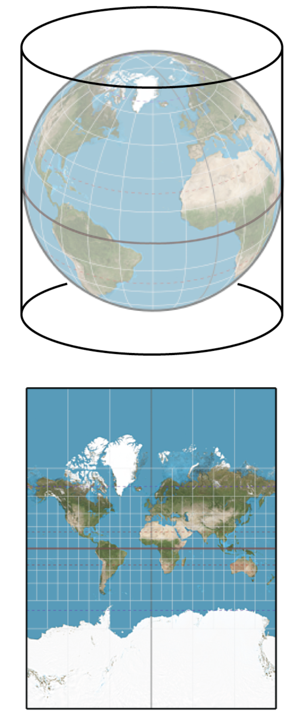{fig-align="center"} **Use:** Distance calculations ::: ::: ::: {.notes} These are the three main categories of projections, each preserving different properties. Conformal projections preserve shape and angles, which is why Mercator was great for sailing. Equal-area projections preserve relative sizes, which is critical for thematic maps. Equidistant projections preserve distances from a center point. ::: ## Tissot's Indicatrix: Visualizing Distortion ::: {.columns} ::: {.column width="50%"} ### Mercator (Conformal) 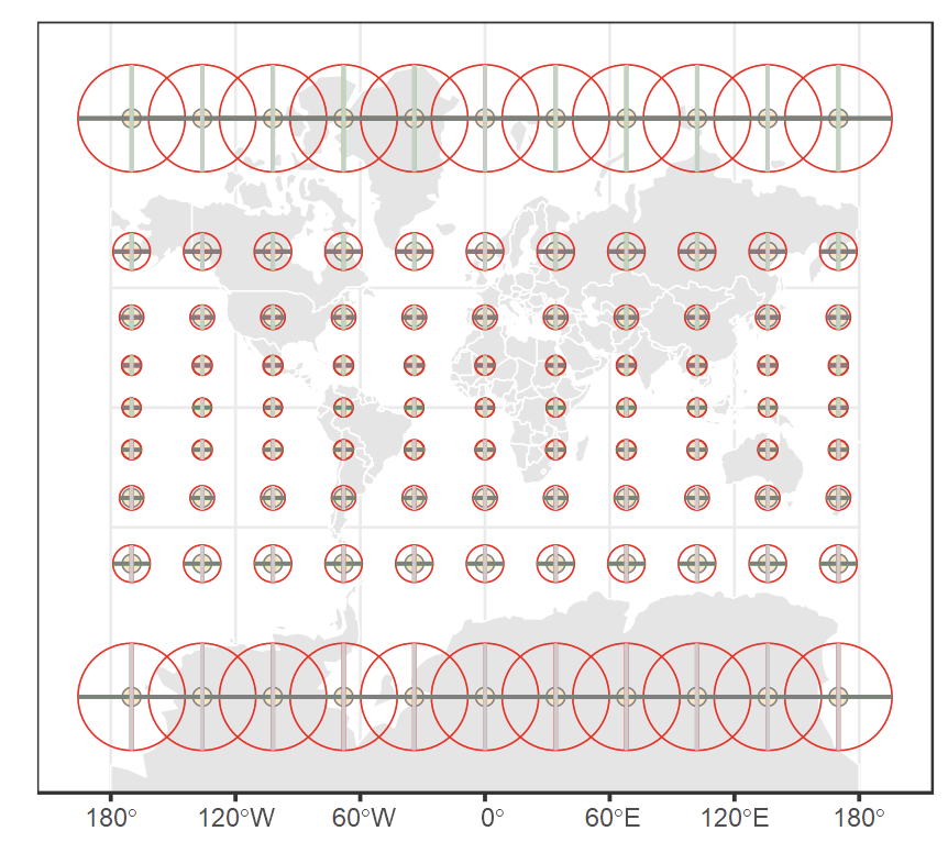{fig-align="center"} - Circles remain circles (shape preserved) - But circles get **huge** near poles (area distorted) ::: ::: {.column width="50%"} ### Equal-Area 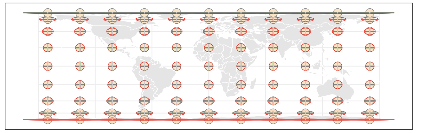{fig-align="center"} - Circles become ellipses (shape distorted) - But all have **same area** (area preserved) ::: ::: :::footer Interactive Tissot tool: [mgimond.github.io/tissot](https://mgimond.github.io/tissot/) ::: ::: {.notes} These are the tradeoffs. The Mercator projection, on the left, preserves *shape*. This is why it was great for sailing—a straight line on the map is a constant compass bearing. But look at the area distortion. The projection on the right is *equal-area*. It preserves the *size* of regions, which is critical for the maps we're about to discuss, but it has to distort the shapes. ::: ## Projection Hall of Shame/Fame ::: {.columns} ::: {.column width="50%"} ### Mercator: The Infamous Example 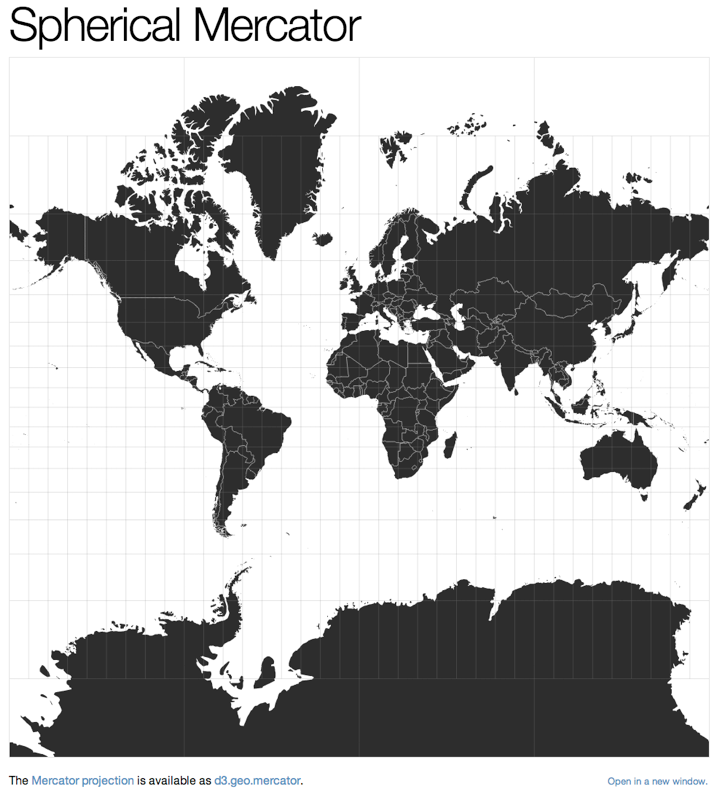{fig-align="center"} **The Problem:** Greenland looks bigger than Africa **Reality:** Africa is **14× larger** than Greenland ::: ::: {.column width="50%"} ### Albers Equal-Area: The Fix 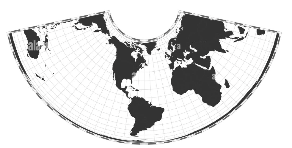{fig-align="center"} **The Solution:** Use equal-area for thematic maps ::: ::: ::: {.r-fit-text .fragment} **Rule: If you shade areas, you MUST use an equal-area projection.** ::: ::: {.notes} This is the classic, infamous example. On the Mercator projection, Greenland looks massive, larger than Africa. In reality, Africa is 14 times larger than Greenland. This is fine for sailing, but if you make a choropleth map of "GDP" on a Mercator projection, you are visually lying, giving far too much prominence to countries near the poles. **If you are making a choropleth map, you must use an equal-area projection.** ::: ## The True Size of Countries VIDEO ::: {.notes} This video demonstrates an interactive tool that lets you drag countries around on the Mercator projection and watch them change size as they move to different latitudes. It's a powerful demonstration of how dramatically the Mercator projection distorts area. Watch how Greenland shrinks when you drag it to the equator, or how Africa expands when moved northward. This is why choosing the right projection for your data visualization task is so critical. ::: ## Understanding Mercator Distortion 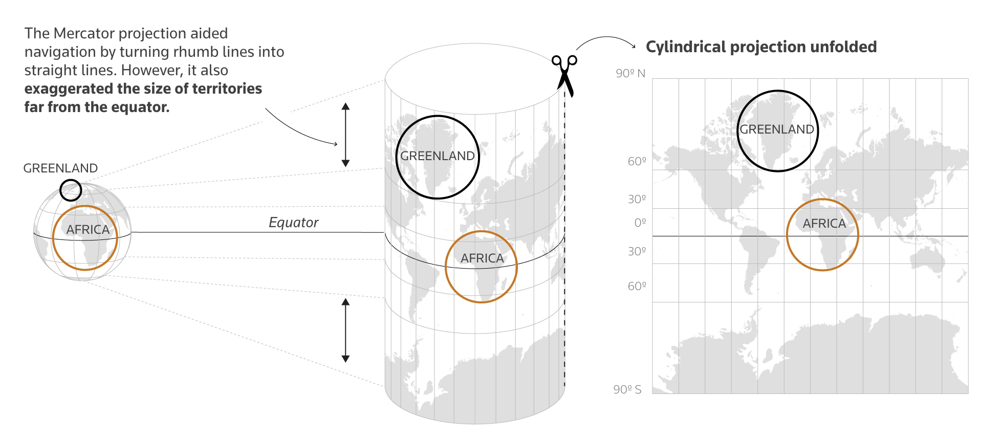{fig-align="center" width="90%"} :::footer Source: [Reuters Graphics - The True Size of Africa](https://www.reuters.com/graphics/AFRICA-MAP/lgpdaqrdyvo/) ::: ::: {.notes} This beautiful diagram from Reuters shows exactly how the Mercator projection works and why it distorts size. On the left, you see the globe with Africa and Greenland in their true relative sizes. In the middle, the cylindrical projection process is shown—the globe is "unrolled" onto a cylinder. On the right, you see the flat map result. Notice how Greenland, being far from the equator, gets stretched enormously, while Africa, which straddles the equator, maintains a size closer to reality. This is not a flaw for navigation—Mercator was designed for this purpose. But it becomes a serious problem when we use it for data visualization. ::: --- # Part 4: Taxonomy of Thematic Maps {background-color="#2c5f77"} ## Type 1: Choropleth Map ::: {.columns} ::: {.column width="60%"} 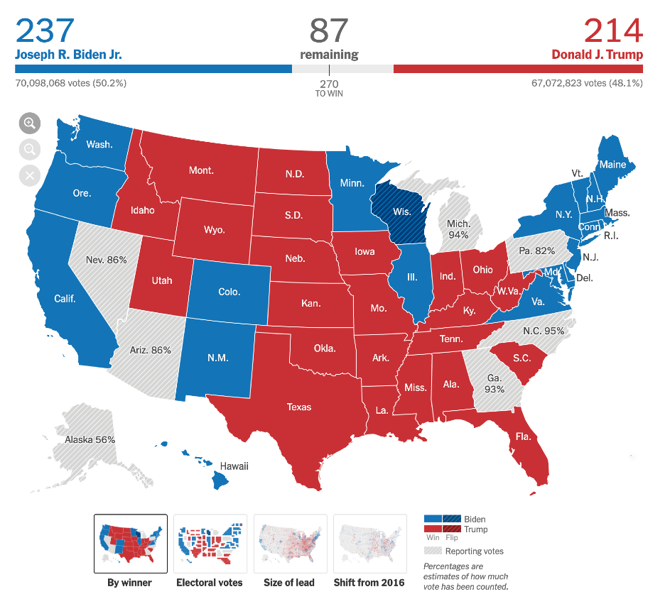{fig-align="center"} ::: ::: {.column width="40%"} **Definition:** Regions are shaded based on a value **Use Cases:** - Categorical data (winner/loser) - Rates and percentages - Density measures **Good for:** Seeing broad regional patterns ::: ::: ::: {.notes} This is a **choropleth**. Each county is shaded by *who won*. This is good for seeing broad regional patterns. The NYT is a master of this type of visualization. Note that this is a *categorical* choropleth—it shows categories (red vs blue, winner vs loser). The pitfalls we're about to discuss in Part 5 apply primarily to *quantitative* choropleths, where you're shading by a numerical value or rate. Those are far more common and much easier to get wrong. ::: ## Type 2: Proportional Symbol Map ::: {.columns} ::: {.column width="60%"} 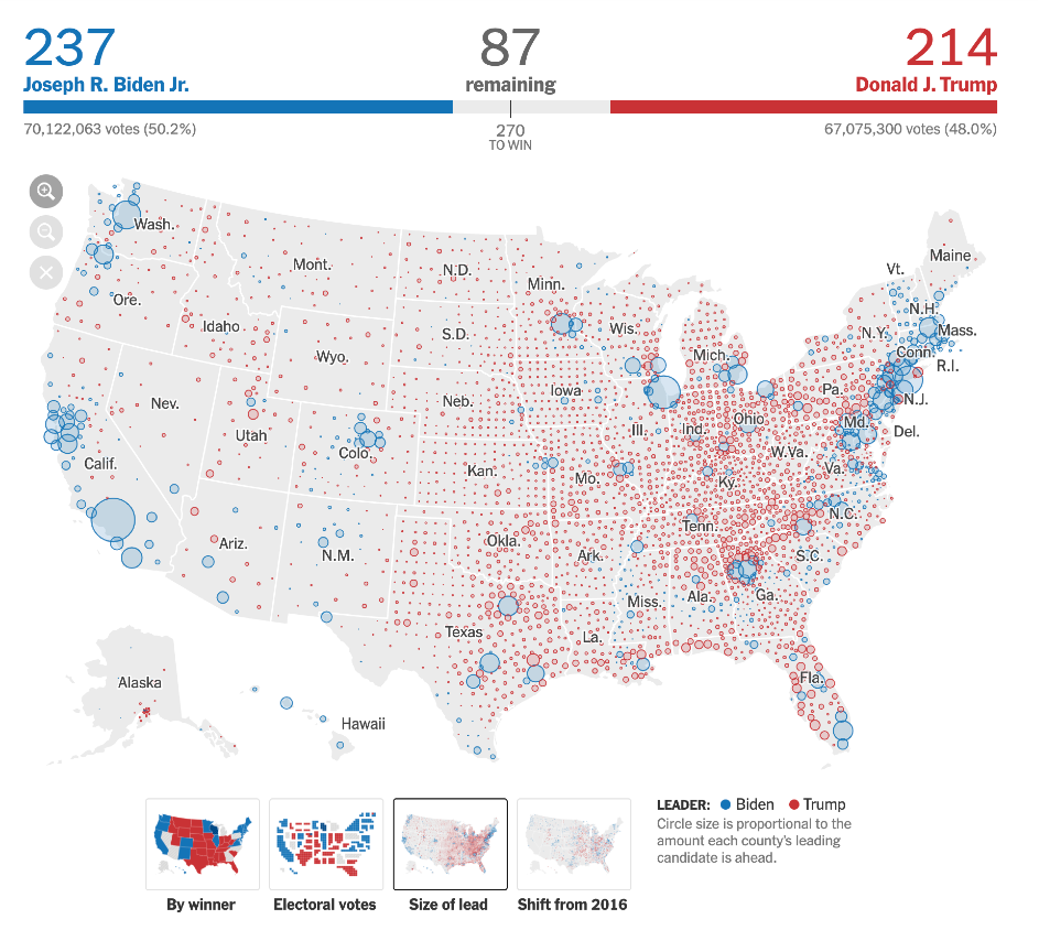{fig-align="center"} ::: ::: {.column width="40%"} **Definition:** Symbols (e.g., circles) are scaled based on a value **Use Cases:** - Absolute quantities - Magnitude comparisons - Population distributions **Good for:** Showing *where* the values are, not just the land area ::: ::: ::: {.notes} This is a **proportional symbol map**. Each circle is scaled by the *size of the lead*. This is a very different story—it shows *where* the votes are, not just *land area*. Pay close attention to this technique. We'll see it again later as a powerful solution to one of the major pitfalls of choropleth maps. ::: ## Type 3: Cartogram ::: {.columns} ::: {.column width="60%"} 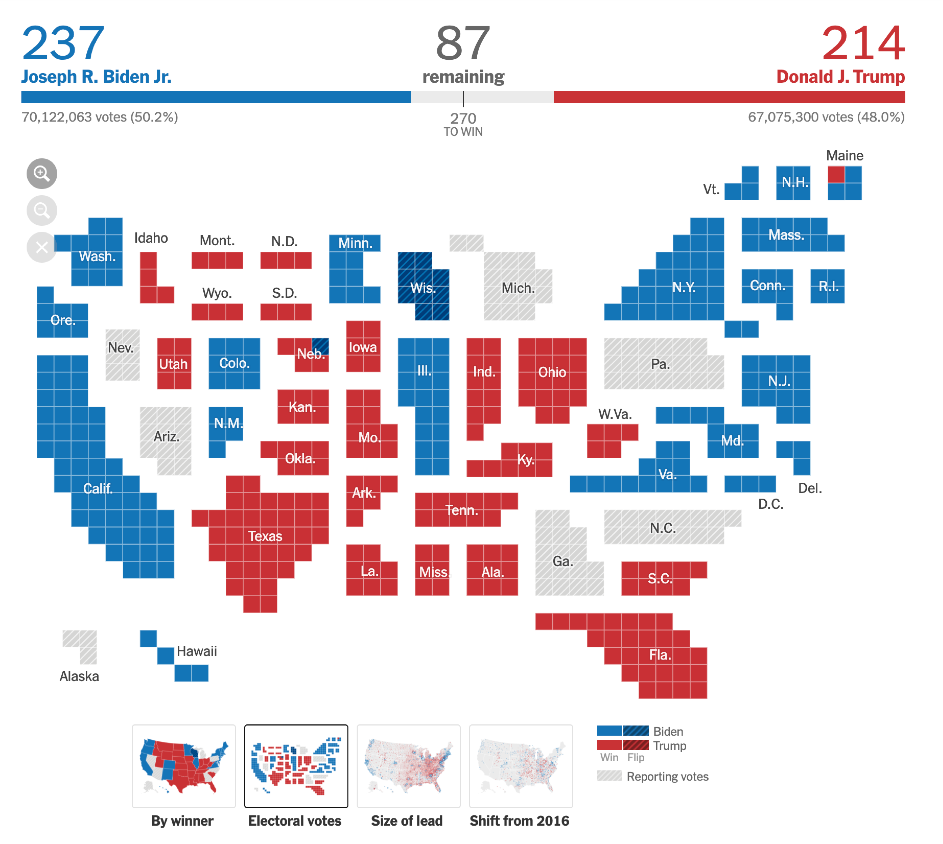{fig-align="center"} ::: ::: {.column width="40%"} **Definition:** Geometry (area) is distorted to represent a quantity **Use Cases:** - Population-based metrics - Electoral votes - Economic measures **Good for:** De-emphasizing misleading land area ::: ::: ::: {.notes} This is a **cartogram**. This is a brilliant solution to the election map problem. It *abandons* true geography and instead sizes each state by its electoral votes. Like the proportional symbol map we just saw, this technique will reappear later when we discuss how to fix misleading choropleths. ::: ## Type 4: Flow Map ::: {.columns} ::: {.column width="60%"} 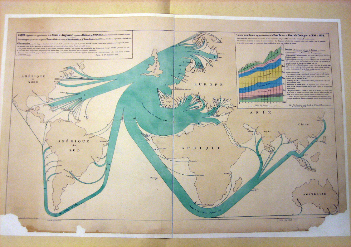{fig-align="center"} ::: ::: {.column width="40%"} **Definition:** Shows movement or connections between regions **Use Cases:** - Trade routes - Migration patterns - Transportation networks **Visual encoding:** Line width ∝ quantity flowing ::: ::: ::: {.notes} This is a **flow map** by Minard again, showing coal exports. The width of the line is proportional to the amount of coal being exported along each route. ::: --- # Part 5: Four Critical Pitfalls {background-color="#2c5f77"} ::: {.notes} We're going to spend the next few minutes on how *not* to lie with maps. Most of the "bad" maps you see are choropleths that fall into one of these four traps. ::: ## Choropleth Maps: Handle with Care ::: {.r-fit-text} Choropleth maps are the most **common** and most **misused** type of map. ::: ### Four Major Pitfalls: ::: {.incremental} 1. **Normalization** (Base Rate Bias) 2. **Classification** (Binning) 3. **Color** 4. **Geography** (MAUP) ::: ::: {.fragment} ::: {.r-fit-text} ⚠️ Avoid these traps to create honest visualizations ⚠️ ::: ::: --- # Pitfall 1: Normalization {background-color="#c23b22"} ## The Base Rate Bias Problem ::: {.r-fit-text} **NEVER USE RAW COUNTS ON A CHOROPLETH MAP** ::: ::: {.fragment} A map of "Total Crimes" is just a map of "Total People" ::: ::: {.fragment} ### You MUST normalize your data: - **Per Capita** (e.g., crimes per 1,000 people) - **Density** (e.g., crimes per square mile) - **Rate** (e.g., unemployment rate, percentage) ::: ## Projection Distortion: An Example ::: {.columns} ::: {.column width="50%"} ### Equirectangular Projection 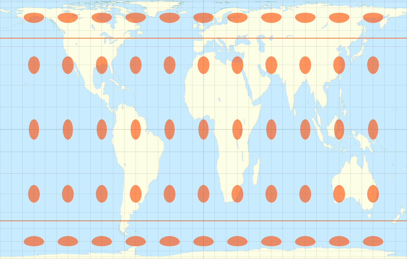{fig-align="center"} **What we expect:** Regular grid, equal-sized circles ::: ::: {.column width="50%"} ### After Projection 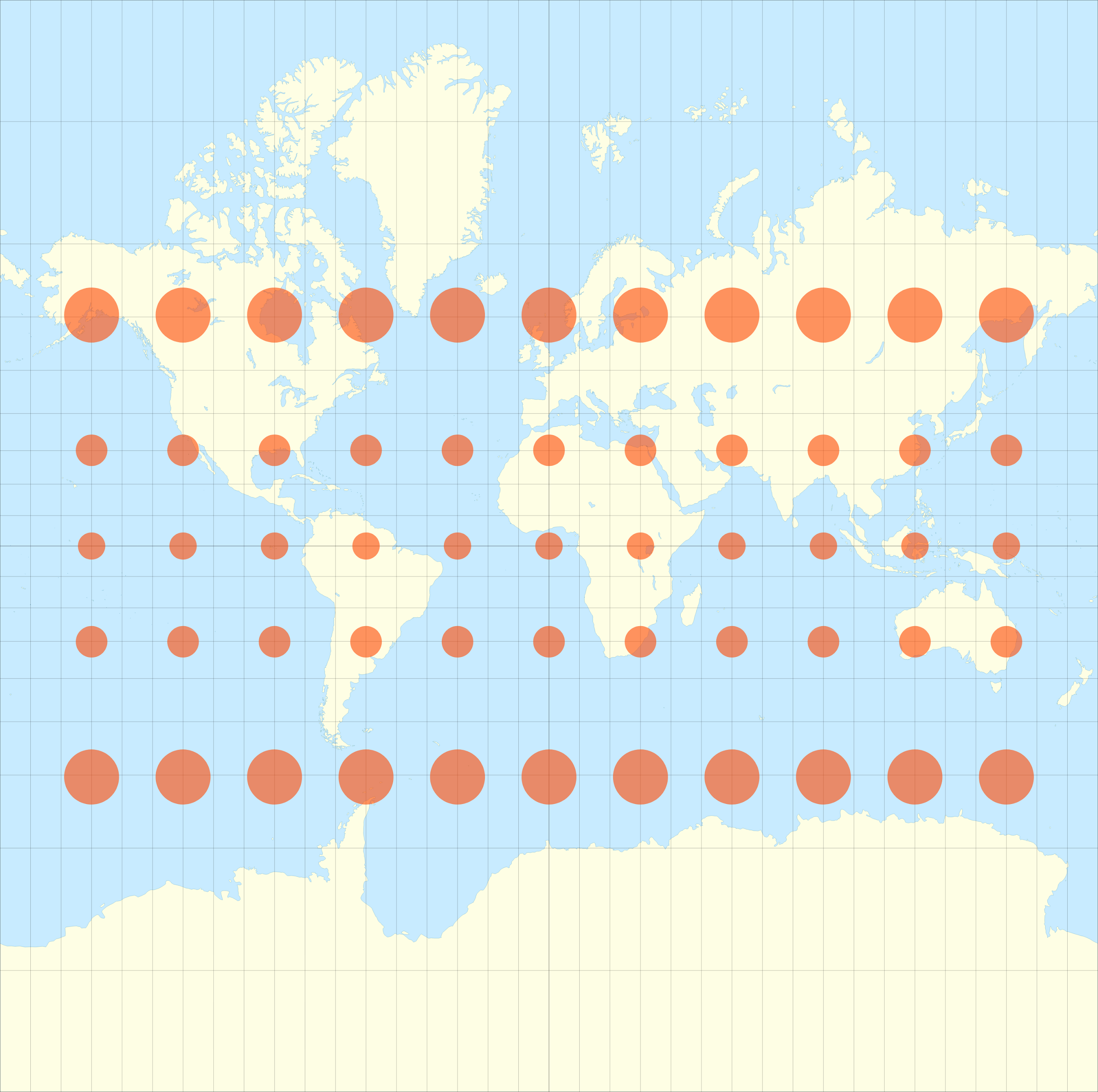{fig-align="center"} **What we see:** Circle sizes vary dramatically by latitude ::: ::: ::: {.r-fit-text .fragment} **The same principle applies to data: you must normalize to avoid misleading comparisons.** ::: ::: {.notes} Here's a perfect demonstration of why normalization matters. These maps show the exact same data—equal-sized circles at regular intervals. But on different projections, they appear vastly different in size. The circles near the poles look enormous compared to those at the equator. This is exactly what happens when you plot raw counts on a map: you're showing population density, not the phenomenon you actually care about. Just as these circles need to be "normalized" for the projection, your data needs to be normalized (per capita, density, rate) to show meaningful patterns. ::: --- # Pitfall 2: Classification (Binning) {background-color="#c23b22"} ## How You Bin Changes the Story ::: {.columns} ::: {.column width="40%"} **Same data, different binning methods:** ### Equal Interval Divides range into equal steps - Prone to outliers - Can leave bins empty ### Quantile Same number of items per bin - Good for ranking - Can be misleading if data is clustered ### Natural Breaks (Jenks) Finds "natural" clusters - Minimizes within-class variance - More complex to compute ::: ::: {.column width="60%"} 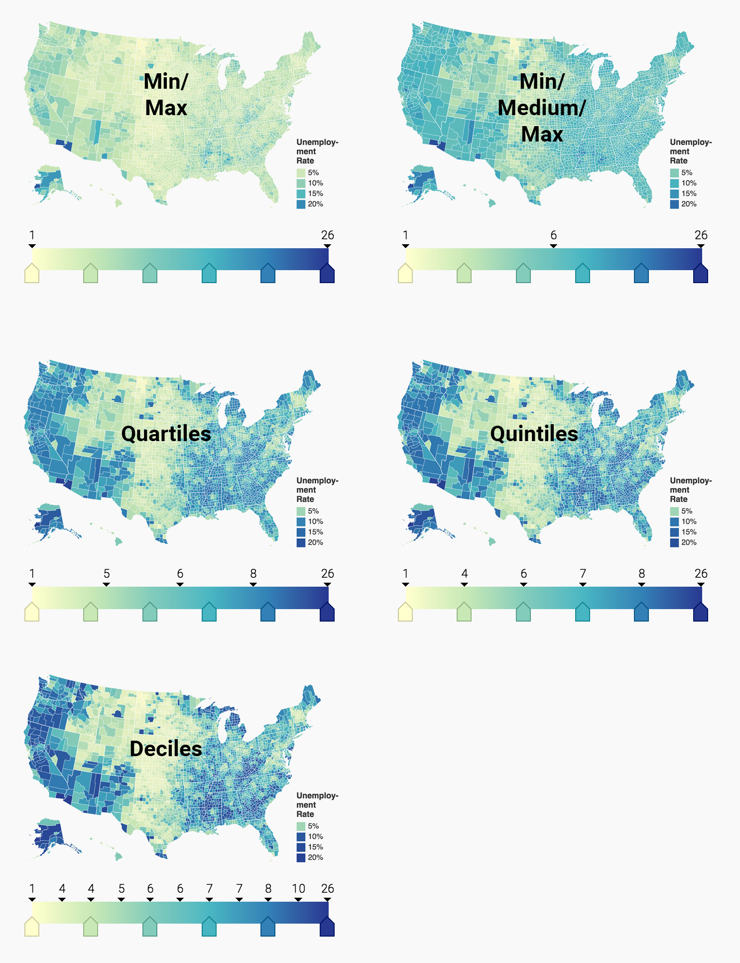{fig-align="center"} ::: ::: ::: {.notes} Look at these three maps. They show the *exact same data*. The only difference is how we defined the cut-off points for the colors. Equal Interval is skewed by outliers like California. Quantile forces an equal number of states into each color. Natural Breaks uses an algorithm to find "natural" gaps in the data. There is no single "right" answer, but you *must* be aware of your choice and be able to defend it. ::: ## Classification Methods Compared | Method | Best For | Pitfall | |--------|----------|---------| | **Equal Interval** | Evenly distributed data | Dominated by outliers | | **Quantile** | Ranking & comparison | Hides natural clustering | | **Natural Breaks** | Data with natural groups | Can be arbitrary with uniform data | | **Manual** | Expert knowledge | Subjective, hard to defend | ::: {.fragment} ::: {.callout-important} ## Key Takeaway There is no single "right" method, but you must be **aware** of your choice and able to **defend** it. ::: ::: --- # Pitfall 3: Color {background-color="#c23b22"} ## Stop Using Rainbow Color Scales ::: {.columns} ::: {.column width="50%"} ### ❌ BAD: Rainbow {fig-align="center"} **Problems:** - Not perceptually uniform - No intuitive order (is yellow > green?) - Creates false boundaries - Misleading visual jumps ::: ::: {.column width="50%"} ### ✓ GOOD: Perceptual Scales {fig-align="center"} {fig-align="center"} ::: ::: ::: {.notes} Rainbows are bad for data. Why? They aren't perceptually ordered. Is yellow "more" or "less" than green? The jump from yellow to green *looks* more dramatic than the jump from blue to purple, even if the data change is the same. ::: ## Choose the Right Color Scale ### Sequential (Light → Dark) For data from **low to high** with no meaningful middle: - Population density - Income levels - Temperature (0-100°F) **Examples:** Viridis, Blues, YlOrRd ### Diverging (Color A → Neutral → Color B) For data with a **meaningful midpoint**: - Above/below average - Gain/loss - Pro/con **Examples:** RdBu (Red-White-Blue), BrBG, PiYG ::: {.fragment} ::: {.callout-tip} ## Use ColorBrewer [colorbrewer2.org](https://colorbrewer2.org) provides perceptually-uniform, colorblind-safe palettes ::: ::: --- # Pitfall 4: Geography (MAUP) {background-color="#c23b22"} ## The Modifiable Areal Unit Problem ::: {.r-fit-text} **Large, sparse regions visually dominate small, dense regions** ::: ::: {.columns} ::: {.column width="50%"} 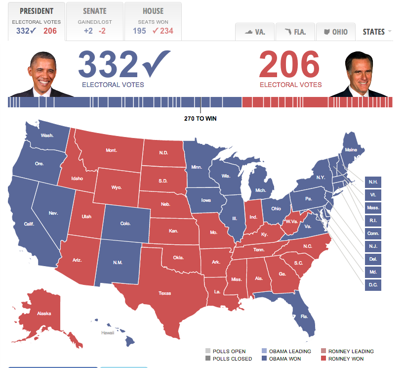{fig-align="center"} ::: ::: {.column width="50%"} **The Problem:** - Your eyes are drawn to **area**, not **value** - Rural counties: few people, huge land area - Urban counties: millions of people, tiny area - This map shows **land area** colored by votes, not **votes** ::: ::: ::: {.notes} This is the fundamental *problem with geography itself*. Our eyes are drawn to *area*, not *value*. This map of the 2016 election is famously misleading. It looks "all red." Why? Because Republican-leaning counties, while sparsely populated, take up a *ton* of land area. The tiny, dense, blue urban counties are almost invisible but contain millions more people. This map isn't a map of *votes*; it's a map of *land area* colored by votes. ::: ## Solutions to the Geography Problem ::: {.columns} ::: {.column width="33%"} ### ❌ Misleading 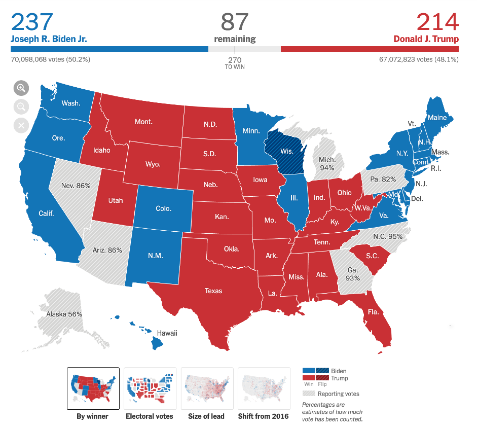{fig-align="center"} Land area dominates ::: ::: {.column width="33%"} ### ✓ Solution 1: Symbols 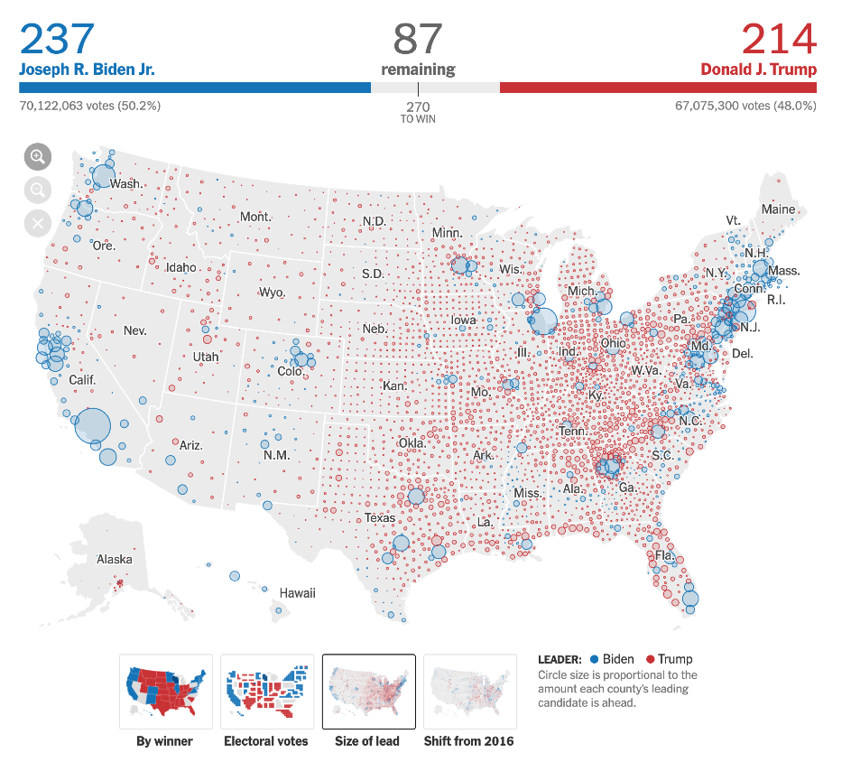{fig-align="center"} Shows where votes are ::: ::: {.column width="33%"} ### ✓ Solution 2: Cartogram 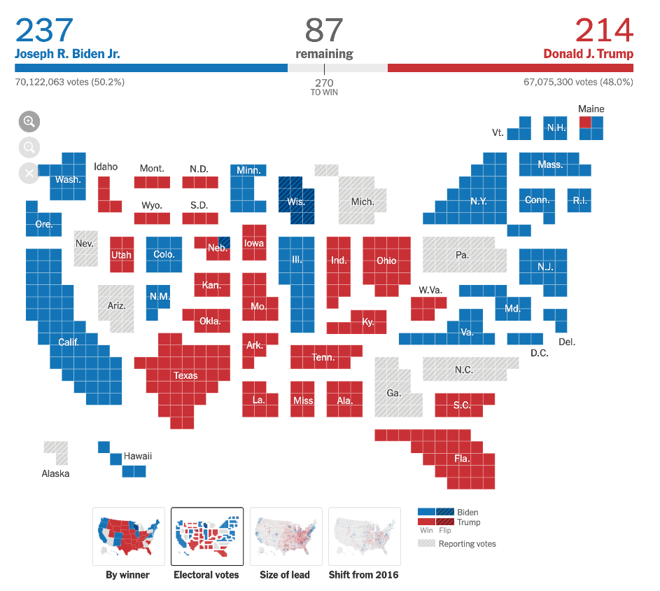{fig-align="center"} Distorts geography by value ::: ::: ::: {.notes} How do we *honestly* show the election data? The NYT has great solutions. The symbol map shows *where* the votes are and *how big* the leads are, ignoring the land area. The cartogram *distorts* the geography to make each state's size proportional to its actual power (its electoral votes). Both of these are arguably more "truthful" representations of the election than the standard map. ::: --- # Part 6: Beyond Geographic Accuracy {background-color="#2c5f77"} ## Sometimes, the Best Map Abandons Geography ::: {.columns} ::: {.column width="50%"} ### Beck's London Tube Diagram (1933) 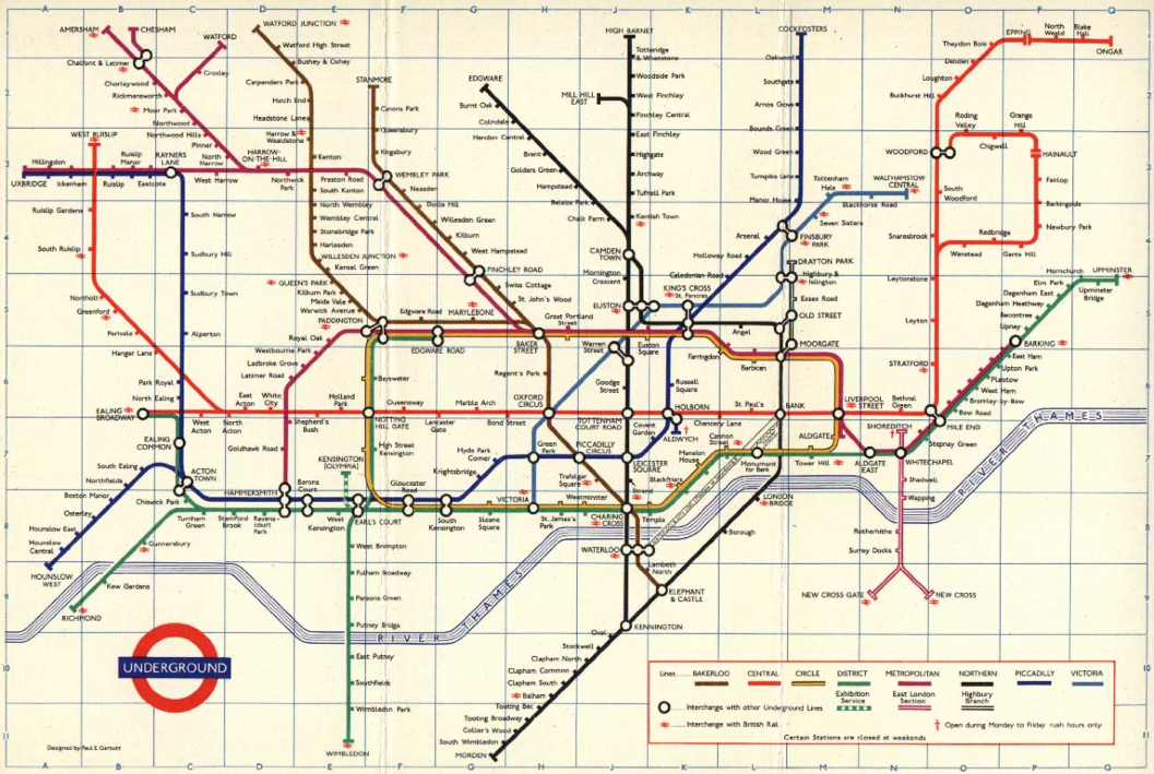{fig-align="center"} ::: ::: {.column width="50%"} **Geographically "wrong" but topologically "right"** **What Beck realized:** - For subway riders, exact geographic paths don't matter - What matters: sequence of stops and where to transfer **His innovations:** - Straightened lines - Regularized angles (45° or 90°) - Even spacing between stations - Prioritized **topology** over **geography** ::: ::: ::: {.notes} I want to end today by bridging to our next lecture. This is one of the most famous and successful visualizations ever made. And it's almost completely *wrong*, geographically. Beck, an engineer, realized that for a subway rider, the *exact* geographic path doesn't matter. What matters is the *sequence of stops* and *where to transfer*. He straightened the lines, regularized the angles, and spaced the stations evenly. He prioritized *topological* accuracy over *geographic* accuracy. This is a classic *urban* visualization, which is where we'll pick up next time. ::: ## Bridge to Next Lecture: Urban Visualization ::: {.incremental} - Today: **Geographic maps** (accurate spatial representation) - Next week: **Urban visualizations** (prioritize usability and patterns) - Week 10: **3D & Interactive geo-spatial systems** (combining both) ::: ::: {.fragment} The tube map is our bridge: it shows that **sometimes the most effective visualization deliberately distorts reality** to better serve the user's task. ::: --- # Summary & Key Takeaways {background-color="#2c5f77"} ## Five Critical Lessons ::: {.incremental} 1. **Use a map only when the spatial question matters** - Bar charts are better for ranking and lookup 2. **Projections always distort—choose wisely** - Equal-area for choropleths (if you shade areas) 3. **NEVER use raw counts on choropleths** - Always normalize: per capita, density, or rate 4. **Choose classification and colors carefully** - Binning method changes the story - Sequential vs. diverging scales 5. **Geography itself can mislead (MAUP)** - Consider symbols, cartograms, or other encodings ::: ## Be a Critical Consumer ::: {.columns} ::: {.column width="50%"} **When you see a map, ask:** - What's the projection? - Is it normalized? - What's the classification method? - What's the color scale? - Is land area misleading the message? ::: ::: {.column width="50%"} **When you make a map, remember:** - Is a map the right choice? - Have I used equal-area projection? - Have I normalized my data? - Are my bins defensible? - Are my colors perceptually uniform? ::: ::: ::: {.fragment} ::: {.r-fit-text} **Next Time:** Urban Visualization & Network-Geographic Hybrids ::: ::: ::: {.notes} So, to recap: be skeptical. When you see a map, ask these questions. What's the projection? Is it normalized? What's the binning? What's the color scale? Next time, we'll take these fundamentals and apply them to the complex, dynamic world of urban data, where interactivity becomes essential. Questions? ::: --- # Further Reading {background-color="#2c5f77"} ## Essential Resources ### Choropleth Map Best Practices - [**Datawrapper Guide to Choropleth Maps**](https://www.datawrapper.de/blog/choroplethmaps) - Comprehensive guide to creating effective choropleth maps - Covers normalization, classification, and color choices - Practical examples and common pitfalls ### When Not to Use Maps - [**When Maps Shouldn't Be Maps**](https://www.ericson.net/content/2011/10/when-maps-shouldnt-be-maps/) by Matthew Ericson (NYT) - Critical discussion of map vs. alternative visualizations - Real-world examples from data journalism - Decision framework for choosing visualization types ### Interactive Tools - [Tissot's Indicatrix Explorer](https://mgimond.github.io/tissot/) - Interactive projection distortion - [The True Size Of...](https://thetruesize.com/) - Drag countries to see size changes --- # Acknowledgments {background-color="#2c5f77"} ## Course Materials This lecture was developed using materials from: - **Prof. Enrico Bertini** (NYU Tandon) - Visualizing Geographical Data lecture slides - Information Visualization course materials - **Prof. Jeff Heer** (University of Washington) - CSE512: Data Visualization course - Maps and Cartography lecture materials ::: {.notes} Special thanks to Professors Bertini and Heer for their excellent foundational materials on geovisualization, which served as the basis for this lecture. ::: --- # SUPPLEMENTAL MATERIAL {background-color="#4a5568"} ## Implementation & Tooling ::: {.notes} The following slides provide supplemental material on data formats, classification methods, and practical coding examples. These bridge the theoretical concepts we've covered with real-world implementation. ::: --- # Part 7: When to Use a Map? {background-color="#2c5f77"} ## The Fundamental Question ::: {.r-fit-text} **Not all geographical data needs a map.** ::: ::: {.fragment} ### The Trade-off Maps use the `x` and `y` spatial dimensions to encode **geography**. This means `x` and `y` **cannot** be used to encode other data variables (unlike a bar chart or scatterplot). ::: ::: {.fragment} **So when is a map the right choice?** ::: ::: {.notes} This is the most fundamental question in geovisualization. Just because your data has geographic attributes doesn't mean you must use a map. Remember: maps lock up your two most powerful visual channels—position x and position y—for geography alone. ::: ## When to Use a Map: Decision Framework ::: {.columns} ::: {.column width="50%"} ### ✓ Good Use: Spatial Questions ::: {.incremental} - "How are these phenomena **clustered**?" - "What is **near** this location?" - "How does this value change **continuously** over a region?" - "Where is the **path** from A to B?" - "What are the **boundaries** between regions?" ::: **Use a map when:** The spatial relationship is the question. ::: ::: {.column width="50%"} ### ✗ Bad Use: Aggregate Comparisons ::: {.incremental} - "Which state has the **highest** value?" - "What are the **top 5** regions?" - "How do these **rank**?" ::: **Use a bar chart when:** You need precise comparisons or rankings. **Why?** Maps introduce **area bias**—Montana looks more "important" than Rhode Island simply due to land area. ::: ::: ::: {.notes} Ask yourself: Is the user trying to understand WHERE something happens, or HOW MUCH? If it's purely "how much," a sorted bar chart will almost always be clearer and more honest than a map. ::: --- # Part 8: Geographic Data Formats {background-color="#2c5f77"} ## GeoJSON: The Web Standard **GeoJSON** is the *lingua franca* of web mapping. ::: {.incremental} - It's a JSON format that describes geographic features - Human-readable and machine-parsable - Supported by nearly all modern mapping libraries ::: ::: {.fragment} ### Key Components - `FeatureCollection`: A list of all features - `Feature`: A single geographic "thing" (park, city, road) - `geometry`: The shape (`Point`, `LineString`, `Polygon`) - `properties`: Non-spatial data (name, population, ID) ::: ::: {.notes} GeoJSON has become the de facto standard for web mapping because it's simple, readable, and works seamlessly with JavaScript. You'll see it everywhere in modern geovisualization. ::: ## GeoJSON Structure: Example ```{.json code-line-numbers="|2|5|9-12|18-24|30-37"} { "type": "FeatureCollection", "features": [ { "type": "Feature", "properties": { "name": "NYU Bobst Library", "type": "Library" }, "geometry": { "type": "Point", "coordinates": [-73.997421, 40.729454] } }, { "type": "Feature", "properties": { "name": "W 4th Street", "type": "Street" }, "geometry": { "type": "LineString", "coordinates": [ [-74.000277, 40.731868], [-73.997873, 40.731557] ] } }, { "type": "Feature", "properties": { "name": "Washington Square Park" }, "geometry": { "type": "Polygon", "coordinates": [ [ [-73.999, 40.732], [-73.996, 40.732], [-73.996, 40.730], [-73.999, 40.730], [-73.999, 40.732] ] ] } } ] } ``` ::: {.notes} Notice the three geometry types here: Point for a location, LineString for a path or street, and Polygon for an area. Each feature has properties that store the actual data you want to visualize. ::: ## TopoJSON: Optimized Geography **TopoJSON** is an optimized version of GeoJSON. ::: {.columns} ::: {.column width="50%"} ### Key Advantages - **Compressed**: Much smaller file sizes - **Topology-aware**: Stores shared boundaries only once - **Better for web**: Faster downloads and parsing ### The Insight Instead of storing the border between Colorado and Utah **twice**, TopoJSON stores the arc **once** and notes it's shared by both states. ::: ::: {.column width="50%"} ### When to Use - Large geographic datasets (countries, states) - Web applications (file size matters) - When features share boundaries ### Tools - **MapShaper**: Convert, simplify, and edit - **topojson-client**: Convert back to GeoJSON ::: ::: ::: {.notes} TopoJSON can reduce file sizes by 80% or more for datasets like US state boundaries. The trade-off is that you need to convert it back to GeoJSON before most libraries can use it, but this is trivial with tools like topojson-client. ::: --- # Part 9: Data Classification Methods {background-color="#2c5f77"} ## The Binning Problem For **choropleth maps**, how you "bin" your data into color classes can **completely change the story**. ::: {.fragment} {fig-align="center" width="80%"} ::: ::: {.fragment} ::: {.r-fit-text} **Same data. Different bins. Different conclusions.** ::: ::: ::: {.notes} This is one of the most critical decisions you'll make when creating a choropleth map, yet it's often done automatically by software with no thought. Let's understand the three main methods. ::: ## Classification Methods Compared ### Equal Interval Divides the **range** into equal-sized steps (e.g., 0-10, 10-20, 20-30). - ✓ Easy to understand and explain - ✗ **Problem:** Outliers can skew all data into one or two bins ### Quantile (Equal Count) Puts the **same number** of data points in each bin. - ✓ Good for showing relative **ranking** - ✗ **Problem:** Can be misleading if values are naturally clustered ### Jenks Natural Breaks Finds "natural" clusters/gaps in the data using statistical optimization. - ✓ Often the most **honest** default - ✗ **Problem:** Can be arbitrary if data is uniformly distributed ::: {.notes} There is no single "right" method. Equal Interval is good for data with a meaningful zero and regular intervals (like temperature). Quantile is good for highly skewed data where you want to emphasize differences. Jenks tries to find natural groupings and is a good starting point for most cases. ::: ## Choosing Your Classification | Method | Best For | Watch Out For | |--------|----------|---------------| | **Equal Interval** | Evenly distributed data; meaningful intervals | Outliers dominating the map | | **Quantile** | Ranking; highly skewed data | Hiding natural clustering; arbitrary bin edges | | **Jenks Natural Breaks** | Data with natural groups/gaps | Uniform data; hard to explain to audience | | **Manual** | Expert knowledge; specific breakpoints | Subjectivity; cherry-picking | ::: {.callout-important} ## Key Takeaway Always **justify** your choice. Show the data distribution (histogram) and explain why your classification makes sense for your story. ::: --- # Part 10: Practical Implementation with Leaflet.js {background-color="#2c5f77"} ## Leaflet.js: Simple Web Mapping **Leaflet** is a lightweight, open-source JavaScript library for interactive maps. ::: {.incremental} - **Simple API**: Easy to learn, powerful results - **Tile-based**: Handles the "slippy map" (zoom, pan) automatically - **Extensible**: Plugins for everything from clustering to heat maps - **Perfect for**: Adding interactive maps to web applications ::: ::: {.fragment} **Let's build a simple example using our NYU GeoJSON data.** ::: ::: {.notes} Leaflet is probably the most popular web mapping library for good reason—it's simple, well-documented, and "just works." We're going to walk through a minimal example that you can adapt for your own projects. ::: ## Leaflet: HTML Setup ```{.html code-line-numbers="|2-3|6-8|11-13"}
``` ::: {.notes} That's it for the HTML. Three simple steps: include the library, style your container, and create a div. The library will take care of the rest. ::: ## Leaflet: Initialize the Map ```{.javascript code-line-numbers="|2|5-8"} // 1. Initialize the map and set view [lat, long], zoom const map = L.map('map').setView([40.7308, -73.9973], 14); // 2. Add a tile layer (the base map) L.tileLayer('https://{s}.tile.openstreetmap.org/{z}/{x}/{y}.png', { attribution: '© OpenStreetMap contributors', maxZoom: 19 }).addTo(map); ``` ::: {.notes} Line 2 creates the map object and centers it on NYU's campus at zoom level 14. Lines 5-8 add the base map tiles from OpenStreetMap. These tiles are the actual street map imagery you see. ::: ## Leaflet: Add GeoJSON Data ```{.javascript code-line-numbers="|2|5-14|16-22"} // 3. Define our GeoJSON data const myGeoJSON = { /* ... from example.geojson ... */ }; // 4. Add GeoJSON layer to the map L.geoJSON(myGeoJSON, { // For each feature, bind a popup with its name onEachFeature: function (feature, layer) { if (feature.properties && feature.properties.name) { let popup = '' + feature.properties.name + ' '; popup += '' + feature.properties.description + '
'; layer.bindPopup(popup); } } }).addTo(map); // Points, lines, and polygons are automatically styled // Click any feature to see its popup // Pan and zoom the map to explore ``` ::: {.notes} The magic happens here. L.geoJSON takes our GeoJSON data and automatically renders it—points become markers, lines become paths, polygons become shapes. We're using onEachFeature to bind a popup to each feature so users can click to see details. ::: ## Live Demo ::: {.r-fit-text} **Let's see it in action!** ::: Open: `examples/leaflet_example.html` ::: {.incremental} - Base map tiles loading - Pan and zoom controls - GeoJSON features rendered: - **Point**: NYU Bobst Library (red circle) - **LineString**: W 4th Street (blue line) - **Polygon**: Washington Square Park (green area) - Click any feature to see its popup ::: ::: {.notes} Instructor should open the HTML file in a browser now. Show: (1) the base tiles, (2) pan/zoom, (3) the three geometry types rendered, (4) click a feature to show popup. Emphasize how little code this took—maybe 30 lines total. ::: 