# From Static Maps to Dynamic Urban Systems {background-color="#2c5f77"} ## The Yellow Blob Problem ::: {.columns} ::: {.column width="50%"} **What happens when we apply static techniques to massive urban datasets?** ::: {.fragment} This is 140 million NYC taxi trips visualized as a static heatmap. ::: ::: {.fragment} **What can you learn from this?** Nothing. It's a "yellow blob." ::: ::: ::: {.column width="50%"} 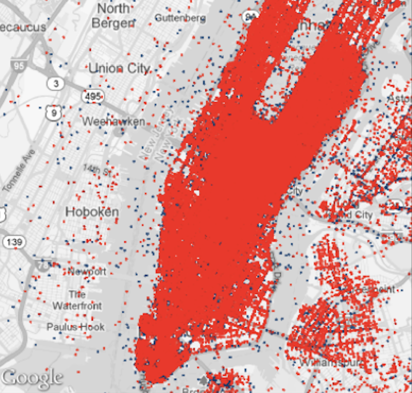{fig-align="center" width="100%"} ::: ::: ::: {.notes} Welcome back. Last time, we learned the rules of static 2D maps. Today, we're diving into *urban* data. This is what happens when you try to apply a static technique (like a heatmap) to a massive, dynamic dataset. This is 140 million taxi trips. What can you learn from this? Nothing. It's a "yellow blob." The problem isn't the data. It's the *lack of interactivity*. Today is about how we move from static pictures to *exploratory tools*. ::: ## Today's Goal ::: {.r-fit-text} Learn to visualize urban **dynamics**—movement and time—using interactive, linked views ::: ::: {.incremental} - **Challenge:** Urban data is massive, dense, and dynamic - **Solution:** Turn visualization into an exploration tool - **Case Study:** TaxiVis—a system for exploring NYC taxi flows ::: ::: {.fragment} We'll learn how to move from this "yellow blob" to meaningful insights about urban mobility patterns. ::: --- # Part 1: The Urban Context {background-color="#2c5f77"} ## Why This Matters ::: {.columns} ::: {.column width="50%"} ### The Urban Challenge: - Over 50% of world's population in cities - **+2.5 billion more by 2050** - Cities = centers of innovation - But also: sprawl, pollution, inequality ::: {.fragment} **How do we make better decisions about urban development?** ::: ::: ::: {.column width="50%"} ### The Data Opportunity: ::: {.incremental} - We can now collect, store, and **open** massive urban datasets - Benefits: - **Government:** Operations & planning - **Science:** Discovery - **Residents:** Participation - **Industry:** Innovation ::: ::: ::: ::: {.notes} Before we get into the "how," let's establish the "why." Urban data analysis isn't just an academic exercise—it has real impact on how cities operate and plan. The trend toward open data means we have unprecedented access to understand cities. But this opportunity comes with a challenge: the data is massive and complex. ::: ## What Makes Urban Data Unique? ::: {.columns} ::: {.column width="50%"} ### Three Interacting Components: 1. **Residents** - People and their behavior 2. **Infrastructure** - Physical systems and policies 3. **Environment** - Natural and built surroundings ::: {.fragment} To understand a city, we must explore how these interact over **space** and **time**. ::: ::: ::: {.column width="50%"} ### Four Key Characteristics: ::: {.incremental} 1. **Scale** - Human-level to metro-level - Millions of individual events 2. **Density** - Massive overplotting - Traditional techniques fail 3. **Complexity** - Interconnected systems - Transit, traffic, social networks 4. **Dynamism** - Cities defined by time & movement - Static snapshots miss the essence ::: ::: ::: ::: {.notes} Urban data isn't just "big data"—it has unique properties. To understand a city, we must explore how residents, infrastructure, and environment interact over space and time. ::: ## Hägerstrand's Space-Time Cube (1970) ::: {.columns} ::: {.column width="40%"} **The Classic Framework for Movement Analysis** - X, Y dimensions: Geographic space - Z dimension: Time - Each person's life: a line through the cube ::: {.fragment} **The Urban Challenge:** Understanding *millions* of these paths, all interacting simultaneously ::: ::: ::: {.column width="60%"} 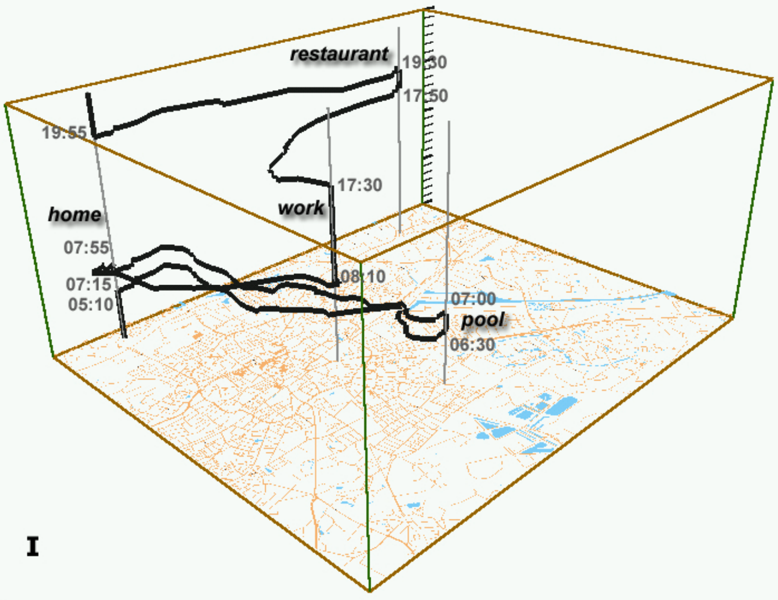{fig-align="center" width="100%"} ::: ::: ::: {.notes} The classic framework for thinking about movement in space is Hägerstrand's "Space-Time Cube" from the 1970s. It plots an individual's path in 3D: X, Y, and Time. Your life is a line in this cube. Urban visualization is about understanding *millions* of these paths, all interacting. This is why a static 2D map fails. ::: --- # Part 2: Why Traditional Analysis Fails {background-color="#2c5f77"} ## The Old Workflow (Confirmatory Data Analysis) ::: {.columns} ::: {.column width="60%"} 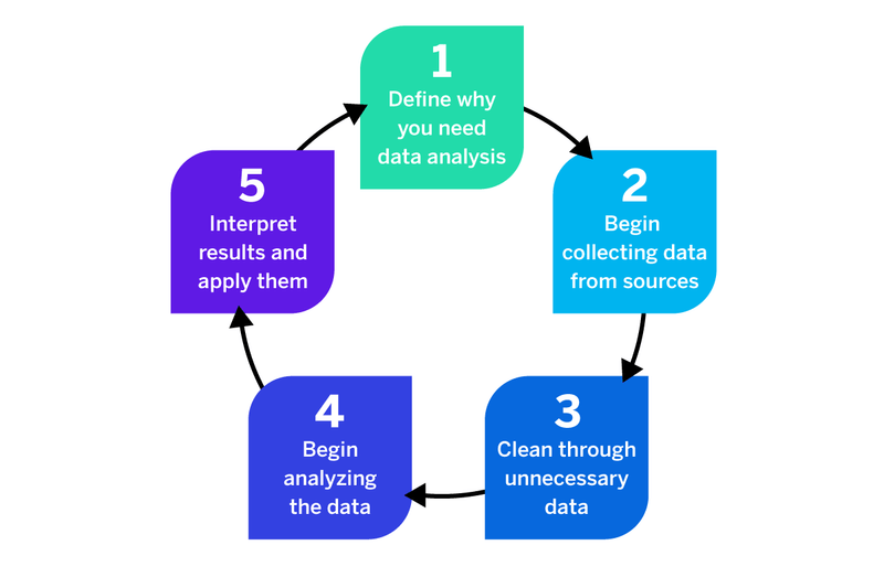{fig-align="center"} ::: ::: {.column width="40%"} ### The Process: 1. Domain experts formulate hypotheses 2. Data scientists select data 3. Run analyses (SQL, R, Python) 4. Domain experts inspect results 5. Repeat... ::: ::: ## The Problems with Traditional Workflows ::: {.incremental} ❌ **Cognitive overload** - Generates overwhelming numbers of plots/tables ❌ **Batch-oriented** - No exploration, just predetermined queries ❌ **Distances experts from data** - Requires intermediary (data scientist) ❌ **Cannot scale** - Modern data volumes overwhelm traditional tools ❌ **Result:** The "yellow blob" problem ::: ::: {.fragment} ::: {.r-fit-text} **Even simple questions require generating dozens of individual plots, each manually programmed** ::: ::: ::: {.notes} This is how urban data analysis has traditionally worked—and why it doesn't work anymore. Even simple questions require generating dozens of individual plots, each manually programmed. The lack of interactivity means you can't follow up on interesting patterns. Domain experts who understand cities are separated from the data by data scientists. This process simply cannot scale to 140 million trips. ::: ## The Problem with Current Tools ::: {.columns} ::: {.column width="50%"} ### Current practice for domain experts: - Load small slices into R, MATLAB, Stata, ArcGIS, Excel - Write SQL queries or code to analyze subsets - Generate individual plots manually - Repeat for each new question ::: {.fragment} **This is tedious, slow, and limiting** ::: ::: ::: {.column width="50%"} ### Why this fails: ❌ Tools can't handle 170M trips ❌ Requires programming/database expertise ❌ Time-consuming and frustrating ❌ Distances experts from the data ❌ Hard to explore, compare, or follow up on patterns ::: ::: ::: {.notes} Domain experts (traffic engineers, economists) know cities but not necessarily coding. They're forced to pre-select tiny slices without knowing what's interesting. This is exactly the problem we talked about earlier - confirmatory analysis when you need exploratory analysis. ::: --- # Part 3: The Need for Interactivity {background-color="#2c5f77"} ## The Paradigm Shift ::: {.columns} ::: {.column width="50%"} ### Static Visualization **Role:** Presentation - Answers questions the designer anticipated - Fixed perspective - One-way communication ::: {.fragment} **Limitation:** Cannot handle 140 million data points ::: ::: ::: {.column width="50%"} ### Interactive Visualization **Role:** Exploration - Enables users to ask their own questions - Dynamic perspectives - **"Dialogue with data"** ::: {.fragment} **Power:** Query and filter to reveal patterns ::: ::: ::: ## The Visual Information Seeking Mantra ::: {.r-fit-text} **"Overview first, Zoom and Filter, then Details-on-Demand"** ::: ::: {.fragment} — Ben Shneiderman (1996) ::: ::: {.columns .fragment} ::: {.column width="33%"} ### 1. Overview 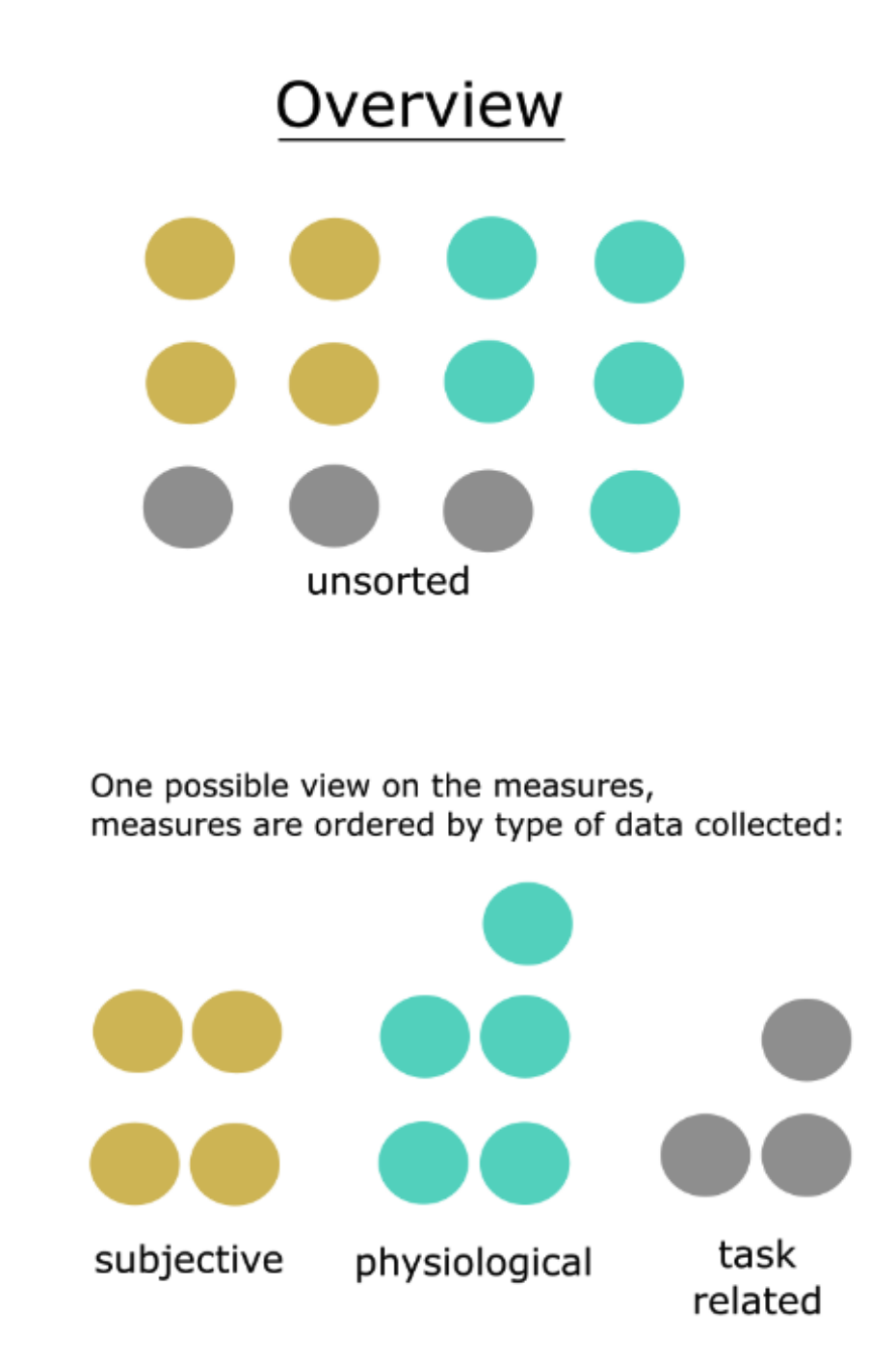{fig-align="center" width="40%"} Start with the big picture (even if it's a "yellow blob") ::: ::: {.column width="33%"} ### 2. Zoom & Filter 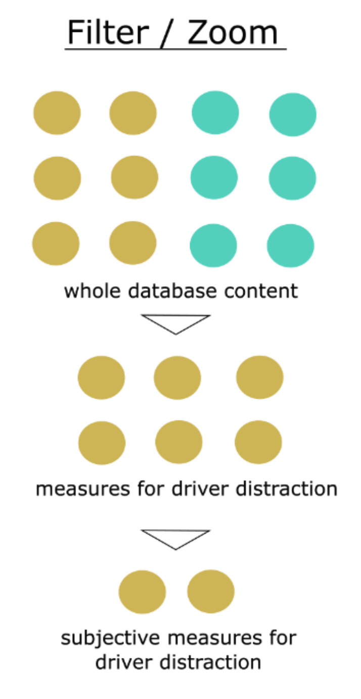{fig-align="center" width="40%"} Focus on items of interest ::: ::: {.column width="33%"} ### 3. Details-on-Demand 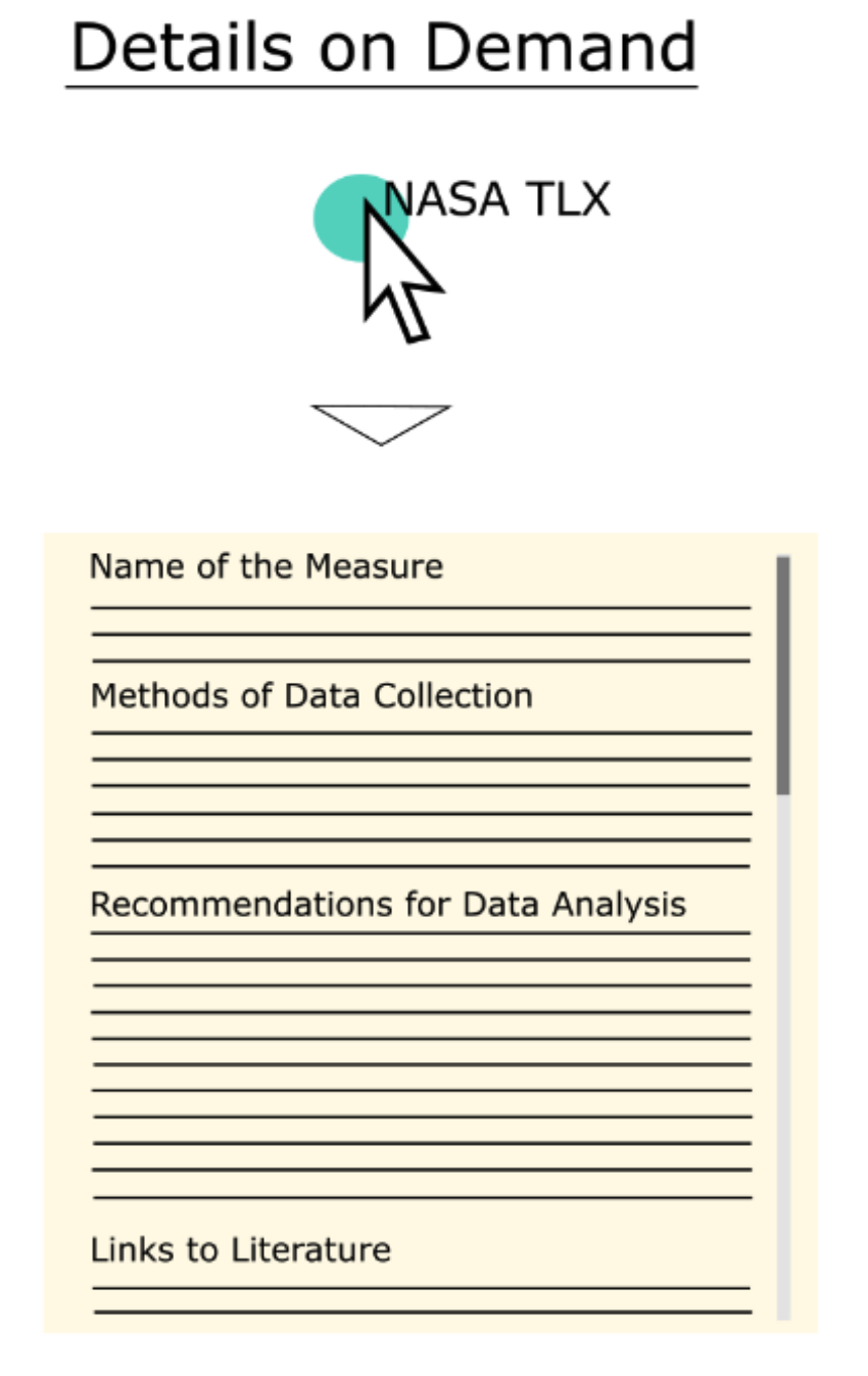{fig-align="center" width="40%"} Get specifics when needed ::: ::: ::: {.notes} The "yellow blob" is our *overview*. It's not useless; it's just the first step. To get insight, we need to *zoom and filter*. We need to ask questions: "Show me just rush hour." "Show me just trips to the airport." "Show me just Saturdays." This requires turning the visualization from a static *presentation* into an *exploratory tool*. ::: ## Why Interactivity Matters ::: {.incremental} 1. **Performance is critical** - Even **500ms latency** significantly reduces exploration, observations, and hypothesis generation - Sub-second response enables iterative analysis 2. **Perception over cognition** - Well-designed systems let you **see** patterns rather than calculate them - Visual queries are faster than SQL 3. **Empowers domain experts** - No programming required - Direct manipulation of visualizations - Experts can explore data themselves ::: ::: {.fragment} Research shows that even a half-second delay dramatically impacts analysis quality. ::: --- # Part 4: Enter TaxiVis {background-color="#2c5f77"} ## The NYC Taxi Dataset ::: {.columns} ::: {.column width="50%"} ### The Data: - **13,000 taxis** - **500,000 trips/day** - **170 million trips/year** ### Each trip includes: - Pickup/dropoff locations & times - Distance traveled - Fare amount - Tip amount ::: ::: {.column width="50%"} ### What can taxi data tell us? ::: {.incremental} - Economic activity and human behavior - Mobility patterns across the city - Response to major events (hurricanes, holidays) - Social inequalities in service ::: ::: {.fragment} **Challenge:** How do we make sense of this data? ::: ::: ::: ## Taxi Patterns and Anomalies 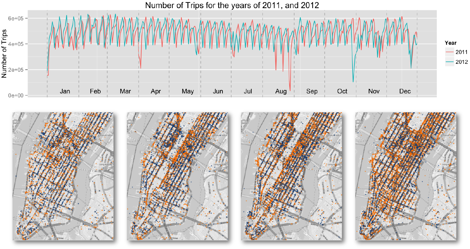{fig-align="center" width="85%"} ::: {.incremental} - **Regular patterns:** Thanksgiving, Christmas drops in activity - **Anomalies:** Hurricane Irene, Hurricane Sandy disruptions - **Events:** Five Boro Bike Tour (taxis disappeared along 6th Avenue) ::: ::: {.notes} Taxis are valuable sensors of city life. This is a perfect example of urban data that's too complex for traditional analysis. Notice the regularity (Thanksgiving, Christmas drops) and anomalies (Hurricane Irene, Hurricane Sandy). The bottom maps show how taxis disappeared along 6th Avenue during the Five Boro Bike Tour. ::: --- # Part 5: Design Requirements {background-color="#2c5f77"} ## What We Need (From Domain Experts) ::: {.columns} ::: {.column width="50%"} ### Query Needs: ::: {.incremental} 1. **Understand dynamics** - "How do patterns vary over space and time?" 2. **Explore events** - "What happened during Hurricane Sandy?" 3. **Compare regions** - "Midtown vs. Harlem taxi frequency?" 4. **Study movement** - "Where do people go from JFK?" ::: ::: ::: {.column width="50%"} ### System Requirements: ::: {.incremental} - **Interactive** - Sub-second response times - **Expressive** - Support complex spatio-temporal queries - **Usable** - No SQL or programming required - **Scalable** - Handle all 170M trips, not samples - **Comparative** - Easy to compare regions and time periods ::: ::: ::: ::: {.notes} These requirements came from actual domain experts—traffic engineers and urban economists. Note the tension: needs to be simple enough for non-programmers but powerful enough for complex analysis. This is the design challenge we need to solve. ::: --- # Part 6: The Visual Query Model {background-color="#2c5f77"} ## Core Idea: Direct Manipulation ::: {.r-fit-text} **Let users query data through direct manipulation of visualizations** ::: ::: {.columns .fragment} ::: {.column width="33%"} ### Spatial **Where?** - Pickup regions - Dropoff regions - Draw polygons on map ::: ::: {.column width="33%"} ### Temporal **When?** - Time ranges - Recurrence patterns - Day of week ::: ::: {.column width="33%"} ### Attribute **What?** - Fare amount - Distance - Trip duration ::: ::: ::: {.fragment} Instead of writing `SELECT * FROM trips WHERE...`, you **draw on a map** ::: ## Visual Representation of Queries 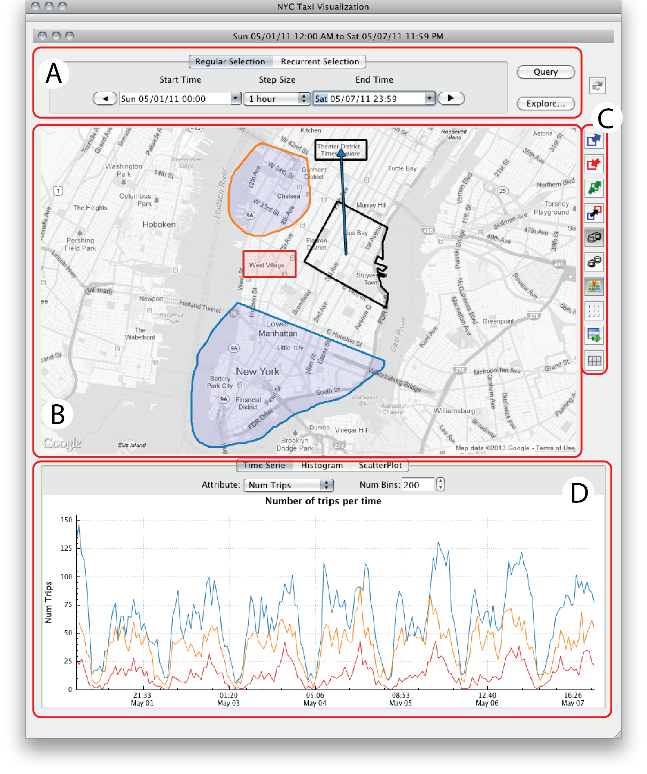{height="500px"} ::: {.incremental} - **Blue polygons** on map = pickup regions - **Orange polygons** = dropoff regions - **Arrows** = origin-destination queries - **Time widgets** = temporal constraints - **Histograms** = attribute constraints ::: ::: {.notes} The key is that queries are visual and direct—you're manipulating the map and visualizations, not writing code. Each query returns a set of trips that can be further refined. ::: --- # Part 7: TaxiVis Interface {background-color="#2c5f77"} ## The Complete System 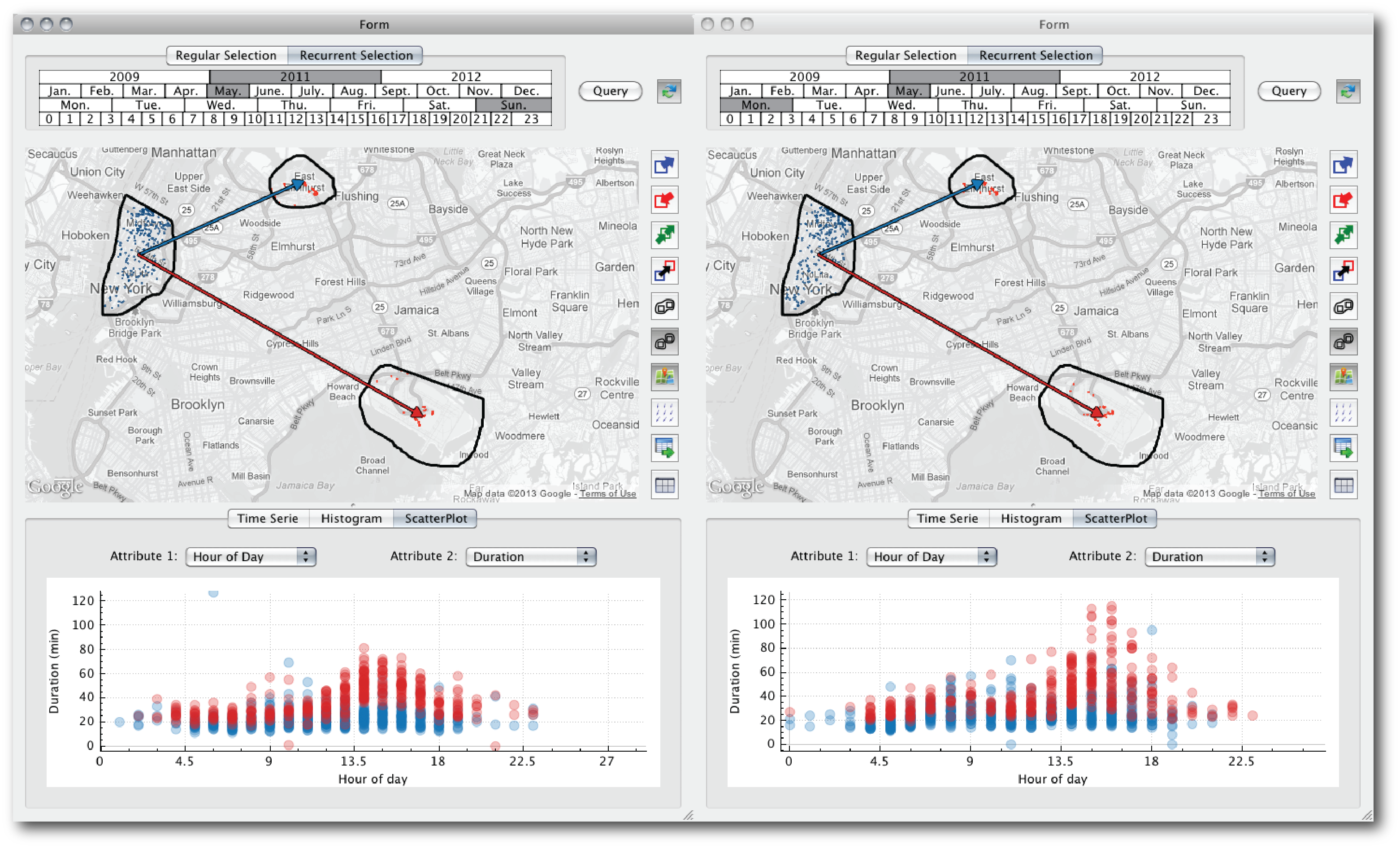{fig-align="center" width="85%"} ::: {.notes} This is our main case study for today. It looks complex, but it's just a set of simple components linked together. We have our map, a control panel for time, and a set of 2D charts for showing temporal patterns. The *magic* is not in any one of these charts; it's in how they are connected. ::: ## Interface Components {fig-align="center"} ::: {.columns} ::: {.column width="33%"} ### 1. Map View - Geographic visualization - Interactive region selection - Origin-destination flows ::: ::: {.column width="33%"} ### 2. Control Panel - Time range selection - Query type controls - Data aggregation settings ::: ::: {.column width="33%"} ### 3. Temporal Views - Time series plots - Histograms - Daily/weekly patterns ::: ::: --- # Part 8: Visual Queries in Action {background-color="#2c5f77"} ## Example: Airport Comparison ::: {.columns} ::: {.column width="50%"} ### The Question: "How do trips to JFK vs. LGA differ on Sundays vs. Mondays?" ### The Visual Query: 1. Draw region around Lower Manhattan (pickup) 2. Draw regions around JFK and LGA (dropoffs) 3. Connect with arrows (directional constraints) 4. Select Sunday vs. Monday (temporal constraints) ::: ::: {.column width="50%"} 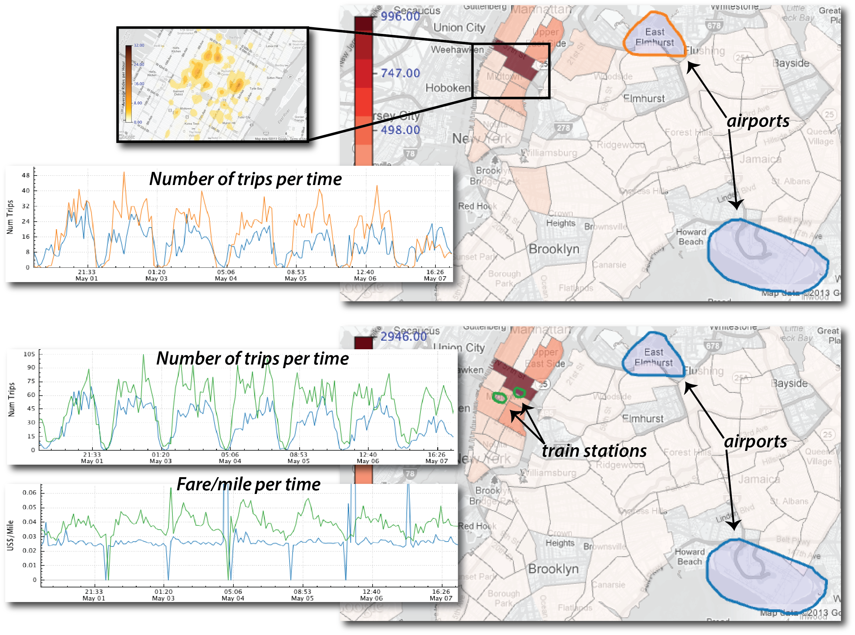{fig-align="center"} ::: ::: ## The Results & Discovery {fig-align="center" width="100%"} ::: {.incremental} - Side-by-side map comparison - Scatter plots: hour of day vs. trip duration - **Discovery:** Monday trips 3-5PM take much longer (rush hour!) - **Implication:** Creates economic disincentive for drivers to accept airport trips ::: ::: {.notes} This query would be painful to write in SQL. But visually? Draw two regions, connect them, select the days. The system handles the complexity—you just express your question visually. ::: --- # Part 9: Query Expressiveness {background-color="#2c5f77"} ## Peuquet's Triad Framework ::: {.r-fit-text} **All three fundamental spatio-temporal query types:** ::: ::: {.columns} ::: {.column width="33%"} ### when + where → what "What taxis were in Midtown at rush hour?" ::: ::: {.column width="33%"} ### when + what → where "Where were high-fare trips on New Year's Eve?" ::: ::: {.column width="33%"} ### where + what → when "When do trips to airports peak?" ::: ::: ::: {.fragment} ### Plus: Query Composition - Queries can be **refined, combined, compared** - Results can be visualized multiple ways - Supports both atomic queries and complex queries (unions) ::: ::: {.notes} This is more than just a pretty interface—it's mathematically expressive. The model can express queries that would be difficult even for database experts. And it does so through simple visual operations. ::: --- # Part 10: Making It Interactive {background-color="#2c5f77"} ## The Performance Challenge ::: {.columns} ::: {.column width="50%"} ### The Problem: - 170M trips = traditional databases too slow - **PostgreSQL:** 24 seconds for 100k-trip query - **SQLite:** 85 seconds for same query - **Goal:** Sub-second response ::: ::: {.column width="50%"} ### The TaxiVis Solution: ::: {.incremental} - Custom **k-d tree index** - 30GB vs. 200GB for PostgreSQL - Build time: 28 min vs. 13 hours - **Query time:** - 2 seconds for 100k trips - 0.2s for 1k trips - Adaptive level-of-detail rendering - Smart heat maps and aggregation ::: ::: ::: ::: {.notes} This is critical—without interactive performance, the visual model doesn't work. You can't explore if you're waiting 30 seconds for every query. The system achieves interactivity through specialized indexing and rendering. ::: --- # Part 11: Visualization Techniques {background-color="#2c5f77"} ## The "Yellow Blob" Rendering Problem ::: {.columns} ::: {.column width="50%"} ### The Challenge: - 500,000 trips/day as point cloud = complete clutter - Can't see patterns, just noise - Traditional scatter plots fail at this scale ::: ::: {.column width="50%"} 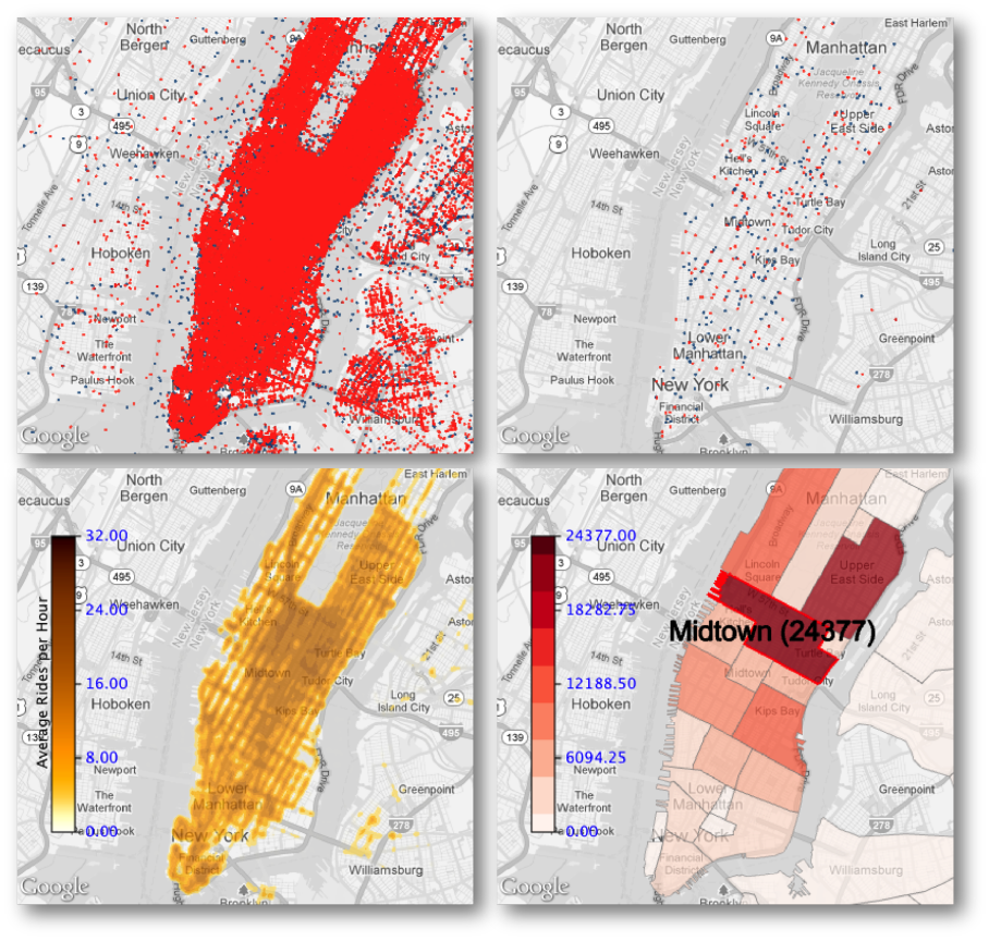{fig-align="center" width="80%"} **We need multiple visualization strategies** ::: ::: ::: {.notes} Remember our opening slide? This is what happens when you render all the data naively. Every pixel is covered—you learn nothing. This is a fundamental challenge in big data visualization. We need multiple visualization strategies to handle different scales and questions. ::: ## Solution 1: Adaptive Level of Detail (LOD) ::: {.columns} ::: {.column width="50%"} ### Strategy: Render only what you can see **How it works:** - Z-order curve hierarchical sampling - Sort points spatially, build binary tree - First *n* elements = hierarchical subsample of size *n* - *n* scales with zoom level **Result:** Clear visualization at every zoom level ::: ::: {.column width="50%"} 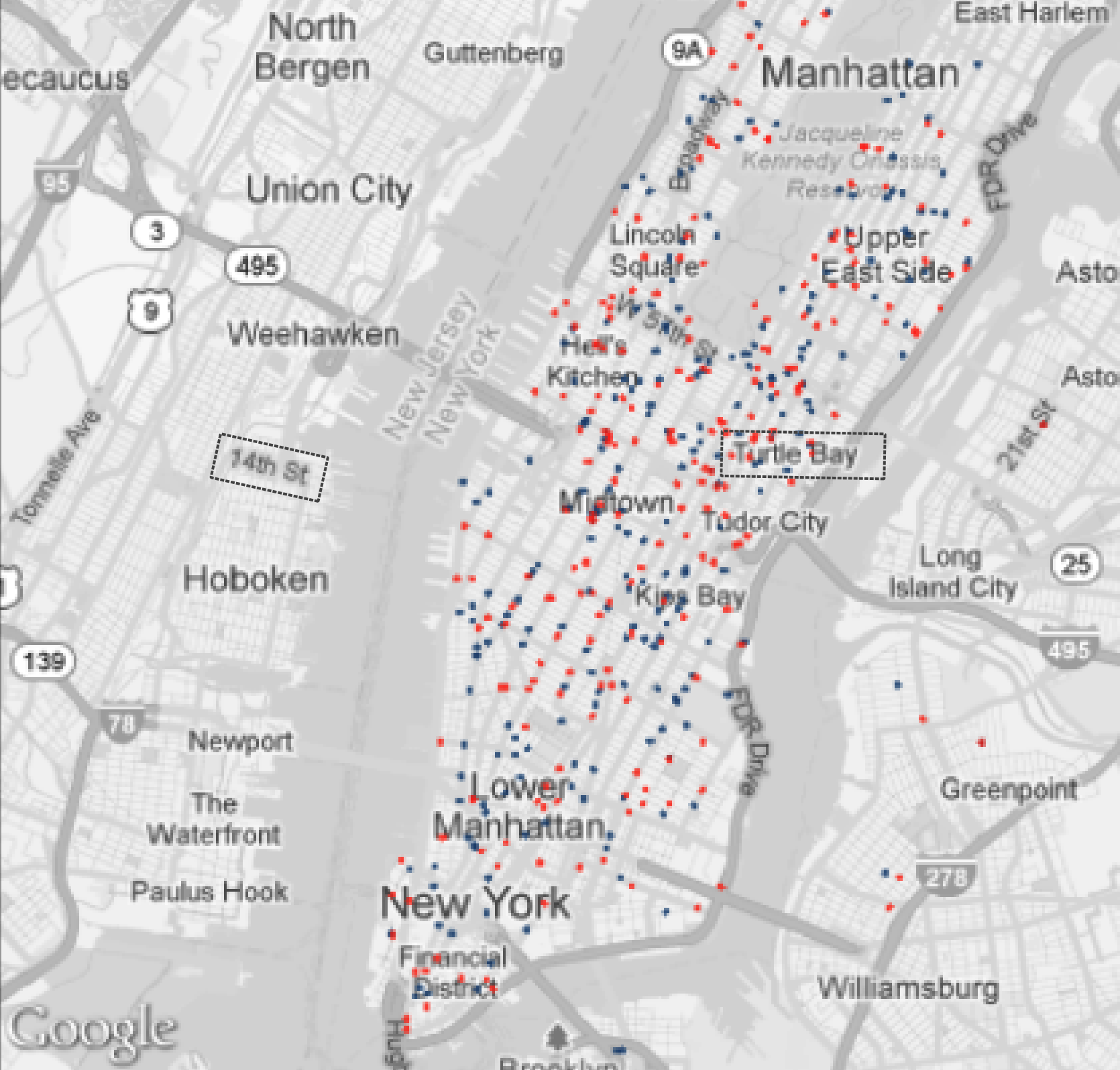{fig-align="center" width="80%"} As you zoom in, you see more detail. As you zoom out, you see a representative sample. ::: ::: ::: {.notes} The key is "hierarchical"—it's not random sampling, it preserves spatial structure. This runs in real-time as you interact with the map. ::: ## Solution 2: Heat Maps ::: {.columns} ::: {.column width="50%"} ### Continuous Heat Maps 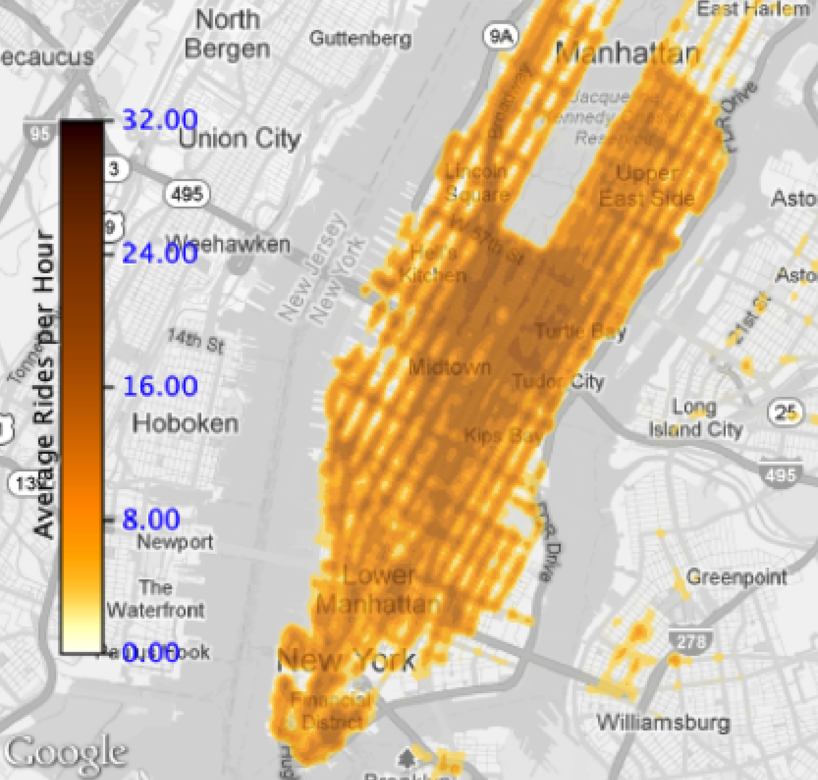{fig-align="center" width="50%"} - Pixel-based density - Darker = more activity - Shows overall distribution patterns ::: ::: {.column width="50%"} ### Grid Maps {fig-align="center" width="50%"} - Aggregate by meaningful regions - Neighborhoods, zip codes, boroughs - Hover for exact counts ::: ::: ::: {.fragment} **When to use:** Heat maps for overview and patterns, LOD for specific trip details, Grid maps for comparing defined regions ::: ## Solution 3: Multiple Coordinated Views ::: {.columns} ::: {.column width="40%"} ### The Comparison Problem: - "How do Sundays differ from Mondays?" - "JFK vs. LGA patterns?" - "This year vs. last year?" ### Solution: - Side-by-side views - Each view = one query (color-coded) - Synchronized spatial extent - Linked plots and summaries - Interactive refinement ::: ::: {.column width="60%"} {fig-align="center"} ::: ::: ::: {.notes} This is where the visual query model really shines. You're not just looking at data—you're comparing queries side by side. All views stay synchronized as you explore. This would be extremely difficult with traditional tools. ::: --- # Part 12: Linked Views & Brushing {background-color="#2c5f77"} ## Core Concept: Brushing and Linking ::: {.r-fit-text} **Actions in one view are reflected in all other views** ::: ::: {.fragment} This creates a "dialogue" where you can ask questions by interacting with any visualization component, and all views update to answer your question. ::: ::: {.fragment} ### Example: Spatial Selection → Temporal Pattern "What is the temporal pattern for trips from JFK Airport?" ::: ## Linked Views in Action: Step 1 ### Default View: All Data {fig-align="center" width="80%"} ::: {.fragment} The map shows the "yellow blob"—all trips. The time series shows aggregate patterns for the entire city. ::: ::: {.notes} This is the default view. The map shows all 140 million trips—our yellow blob. The time series on the right shows the aggregate temporal pattern for the entire city. It's an overview, but we need to dig deeper. ::: ## Linked Views in Action: Step 2 ### User Brushes a Region (JFK Airport) {fig-align="center" width="80%"} ::: {.fragment} By clicking and dragging, the user selects a geographic region. In this case, the area around JFK Airport. ::: ::: {.notes} This is the fundamental interaction. I select a region *on the map*. I'm essentially asking, "Tell me about this area." The system is now ready to filter all data to just this region. ::: ## Linked Views in Action: Step 3 ### All Views Update Automatically {fig-align="center" width="80%"} ::: {.fragment} The time series and histograms now show the temporal pattern for *only* trips from the JFK area. ::: ::: {.notes} Now I can see the daily pickup pattern for *just* the JFK area. Notice the peaks—probably corresponding to flight arrival times. This is a powerful visual query that I performed in one click, turning my "yellow blob" into a targeted insight. This is what we mean by "linked views"—my action in the map view immediately updated all other views. ::: ## The Power of Bidirectional Linking ::: {.r-fit-text} **The linking works in both directions** ::: ::: {.incremental} - **Spatial → Temporal:** Select a region → see temporal patterns - **Temporal → Spatial:** Select a time range → see spatial patterns ::: ::: {.fragment} This bidirectional dialogue enables exploratory analysis that would be impossible with static visualizations. ::: --- # Part 13: Temporal Queries {background-color="#2c5f77"} ## Temporal Slicing: Time → Space ::: {.columns} ::: {.column width="50%"} ### The Question: "Where do trips go during morning rush hour?" ### The Interaction: 1. Select time range on the time series (8am-10am) 2. Map updates to show *only* trips from that time period ### The Insight: Reveals spatial patterns specific to that time slice ::: ::: {.column width="50%"} {fig-align="center"} 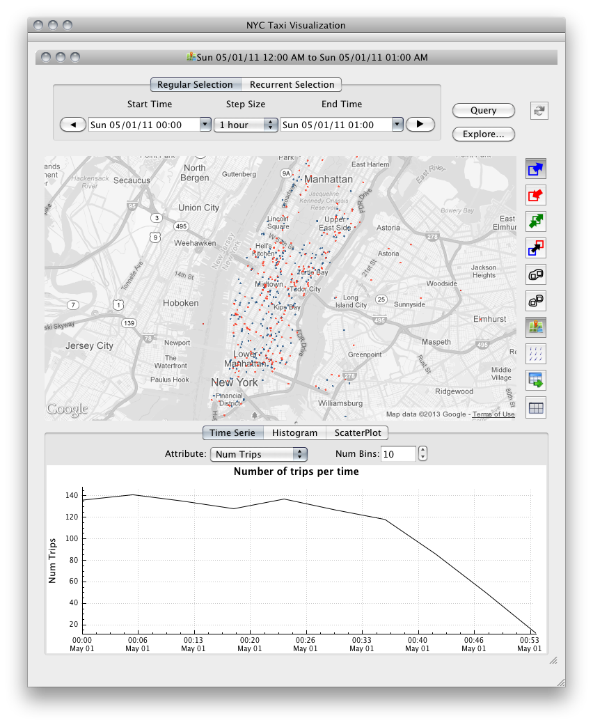{fig-align="center" width="50%"} ::: ::: ::: {.notes} This is the reverse query. Now I want to ask, "Where do trips go during morning rush hour?" I select that time range on the line chart, and the *map* updates. This "dialogue" between the spatial and temporal views is what enables analysis. ::: ## Advanced Temporal Queries: Recurrent Selection ::: {.columns} ::: {.column width="40%"} ### The Challenge: What if I want to see a **pattern**, not just a single time slice? ::: {.fragment} ### The Solution: Recurrent Selection Select recurring time periods: - All Mondays, 8am-10am - Every Saturday night - Weekday rush hours only ::: ::: {.fragment} This reveals **periodic behavior**—the heartbeat of the city ::: ::: ::: {.column width="60%"} {fig-align="center" width="100%"} ::: ::: ::: {.notes} This is a much more powerful query. Instead of just one time slice, I can ask for a *periodic pattern*. "Show me all Saturday nights." "Show me every Monday-Friday rush hour for the whole month." This lets us find and analyze weekly, daily, or hourly periodic behavior, which is the heartbeat of the city. ::: ## Recurrent Selection Example ### Question: "How do weekend nights differ from weekday mornings?" ::: {.columns} ::: {.column width="50%"} **Weekday Mornings (Mon-Fri, 7-9am)** 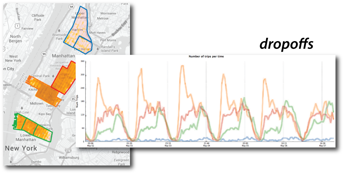{fig-align="center"} Inbound commuter patterns ::: ::: {.column width="50%"} **Weekend Nights (Sat-Sun, 10pm-2am)** 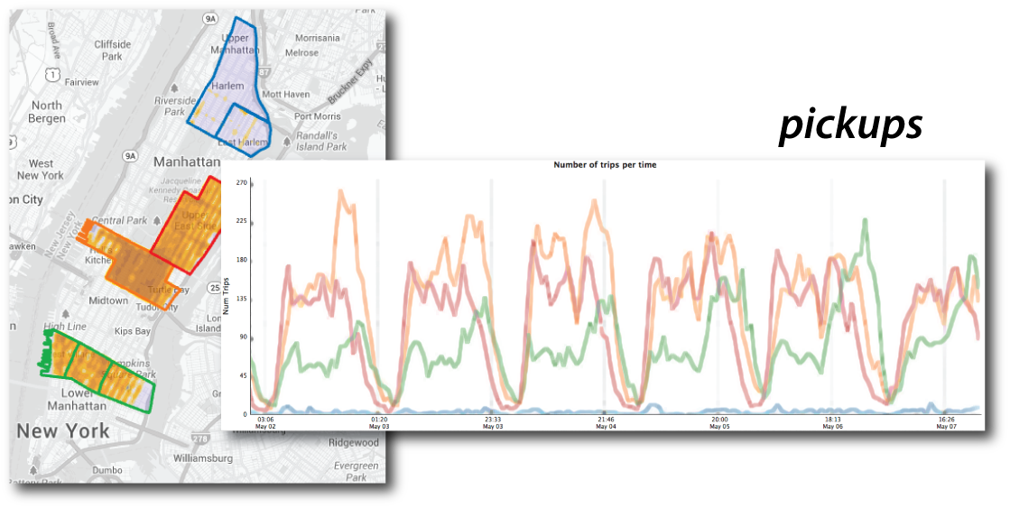{fig-align="center"} Entertainment district activity ::: ::: ::: {.fragment} Recurrent selection reveals systematic differences in urban activity patterns. ::: --- # Part 15: Origin-Destination Queries {background-color="#2c5f77"} ## The Most Powerful Query: Flows ::: {.r-fit-text} **Asking about movement between specific locations** ::: ::: {.columns .fragment} ::: {.column width="50%"} ### Traditional Approach: ```sql SELECT * FROM trips WHERE origin = 'JFK' AND destination = 'LGA' AND time BETWEEN '8:00' AND '10:00' ``` Complex, requires knowing SQL and field names ::: ::: {.column width="50%"} ### TaxiVis Approach: **Draw an arrow** Simple, visual, intuitive ::: ::: ::: {.fragment} This is what we mean by **"visual query"**—you draw your question, the system answers. ::: ## The Arrow Tool: Step 1 ### Select the Arrow Tool {fig-align="center" width="80%"} ::: {.fragment} The arrow tool lets you create origin-destination (OD) queries by drawing directly on the map. ::: ## The Arrow Tool: Step 2 ### Draw Arrow from Origin to Destination {fig-align="center" width="80%"} ::: {.fragment} Example: Draw an arrow from JFK Airport to LaGuardia Airport to ask: **"Show me all trips that went from JFK to LGA"** ::: ## The Arrow Tool: Step 3 ### All Views Update to Show Only That Flow {fig-align="center" width="80%"} ::: {.fragment} - Map highlights the origin-destination pair - Time series shows when these trips occur - Histograms reveal patterns in this specific flow ::: ## Visual Queries: Why They Matter ::: {.incremental} 1. **Lower cognitive load** - No need to remember field names or syntax - Direct manipulation of the data representation 2. **Immediate feedback** - See results instantly as you interact - Iterate quickly through hypotheses 3. **Support exploration** - Encourages "what if" questions - Makes serendipitous discovery possible 4. **Democratize analysis** - Analysts without SQL/programming skills can explore - Domain experts can directly investigate questions ::: ::: {.fragment} **The visualization *is* the interface.** ::: --- # Part 16: Case Study 1 - Social Inequality {background-color="#2c5f77"} ## Question: "Are some neighborhoods underserved by taxis?" ::: {.columns} ::: {.column width="50%"} ### The Analysis: - Compare taxi activity across neighborhoods - Midtown, Upper East Side, Greenwich Village, Harlem - Look at pickups and dropoffs over one week ::: ::: {.column width="50%"} {fig-align="center"} {fig-align="center"} ::: ::: ## The Discovery: Over 10x Difference {fig-align="center" width="80%"} ::: {.incremental} - Harlem has very few pickups despite many dropoffs - People can take taxis **TO** Harlem but can't get one **FROM** there - Over one order of magnitude difference from Midtown ::: ::: {.notes} This analysis confirmed what Harlem residents had been saying for years. But now there's data to back it up. ::: ## Follow-Up Investigation ### The exploration followed a natural path: ::: {.incremental} 1. **Initial pattern:** Harlem has fewer pickups 2. **Hypothesis:** Is this an economic issue? 3. **Investigation 1:** "Are tips different in Harlem?" - **Discovery:** Yes! Higher tips 4. **Investigation 2:** "Is fare/mile different?" - **Discovery:** Yes! Lower fare/mile 5. **Insight:** Less economic incentive for drivers to go to Harlem, despite higher tips ::: ::: {.fragment} 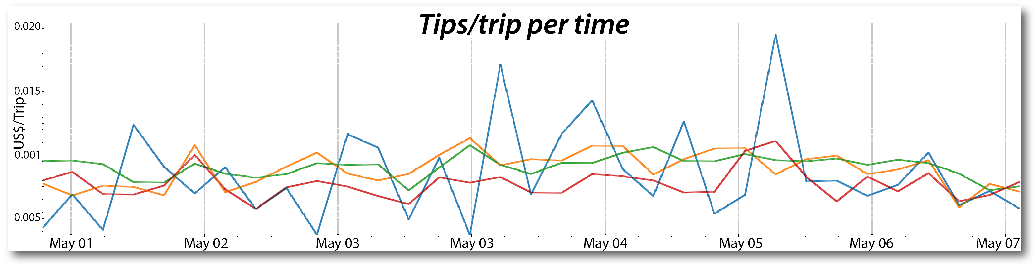{fig-align="center" width="50%"} 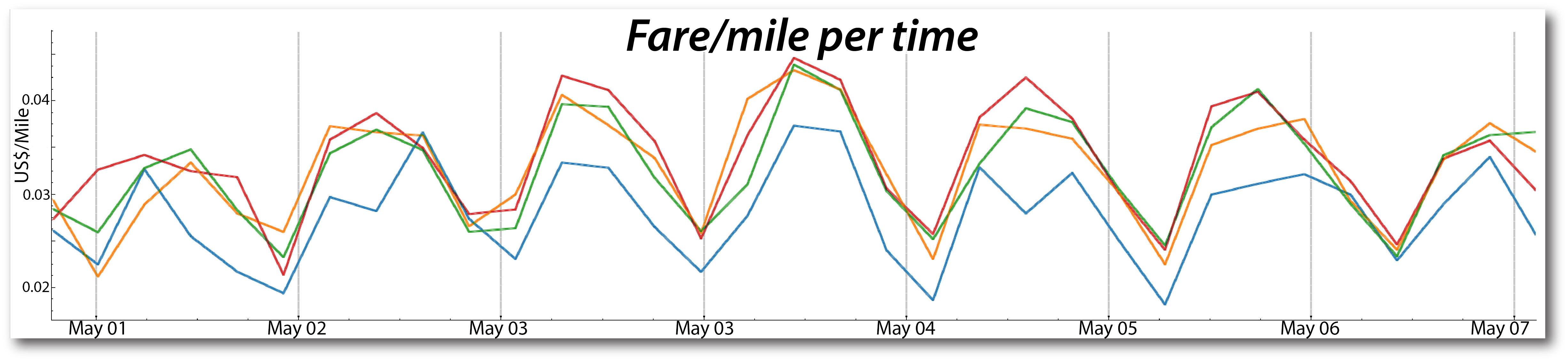{fig-align="center" width="40%"} ::: ::: {.notes} Notice how the exploration followed a natural path: overview → pattern → hypothesis → investigation. This is exploratory data analysis in action. ::: --- # Part 17: Case Study 2 - Transportation Hubs {background-color="#2c5f77"} ## Question: "How do people move through NYC's transportation infrastructure?" ::: {.columns} ::: {.column width="50%"} ### The Setup: - Compare JFK, LGA, Penn Station, Grand Central - Use grouping to combine regions - Examine pickup patterns over one week ::: ::: {.column width="50%"} {fig-align="center"} ::: ::: ## Key Findings ::: {.incremental} 1. **More pickups at LGA than JFK** (most days) 2. **Train stations >> airports** for pickups 3. **Weekday pattern:** Train station pickups constant Mon-Thu, drop Fri-Sat - Reflects commuter behavior 4. **Rush hour problem:** Airport trips take much longer 3-5PM - Creates economic disincentive for drivers - Explains why taxis illegally refuse airport trips ::: ::: {.notes} Started with simple question, led to deeper insights about taxi economics. The visual query model made it easy to group regions and compare. Could instantly switch between pickups and dropoffs with one button click. ::: --- # Part 18: Case Study 3 - Temporal Exploration {background-color="#2c5f77"} ## Time-Space Exploration ::: {.columns} ::: {.column width="50%"} ### Feature: - Select multiple time slices automatically - Compare same time across different days/weeks/months - Each slice gets its own map and plot line (color-coded) ### Example: Memorial Day Analysis - All Mondays in May 2011 and May 2012 ::: ::: {.column width="50%"} 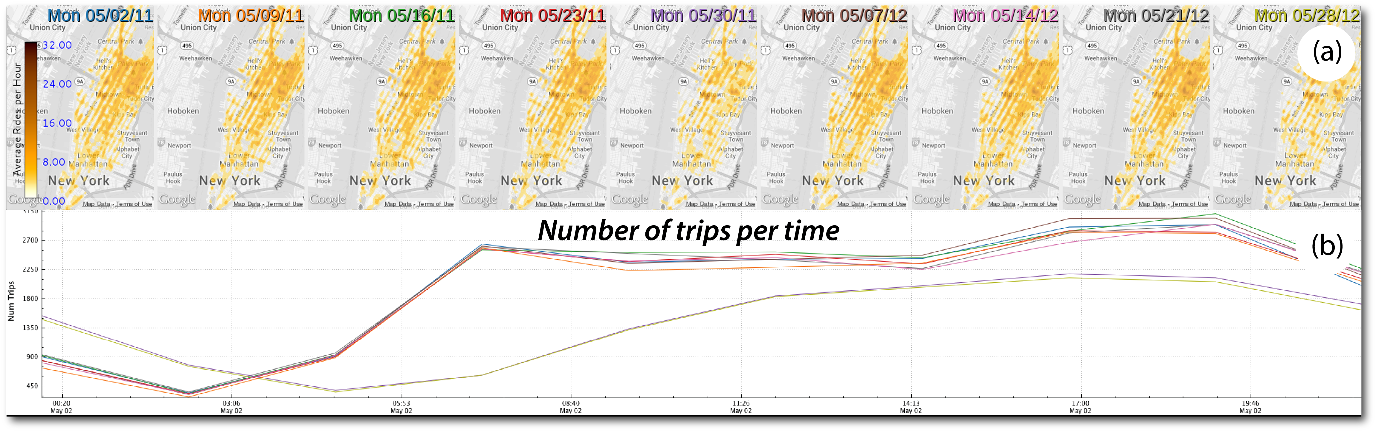{fig-align="center"} ::: ::: ## Discovery: Memorial Day Pattern {fig-align="center" width="80%"} ::: {.incremental} - **Discovery:** Memorial Day has significantly fewer trips than regular Mondays - **Implication:** Could reduce fleet size on holidays to save costs ::: ::: {.notes} This is the recurrent time selection widget in action. Would be tedious to set up manually: "give me the 5/2, 5/9, 5/16, 5/23, 5/30..." Instead: "give me all Mondays in May." The system generates the views automatically. ::: --- # Part 19: Case Study 4 - Hurricane Sandy {background-color="#2c5f77"} ## Question: "How did Hurricane Sandy affect NYC?" ::: {.columns} ::: {.column width="50%"} ### The Analysis: - One week of taxi activity - Sunday before through Saturday after - Heat maps for each day - Compare spatial patterns ::: ::: {.column width="50%"} ### The Timeline: - **Sunday (before):** Normal activity - **Monday (hurricane hits):** Virtually no taxis citywide - **Tuesday-Friday:** Activity returns everywhere **EXCEPT Lower Manhattan** - **Saturday:** Finally returns to normal ::: ::: ## The Story the Data Tells {fig-align="center" width="85%"} ::: {.fragment} **Why?** Lower Manhattan had a **5-day power outage** You can literally see the power outage on the map. ::: ## Comparison to Hurricane Irene 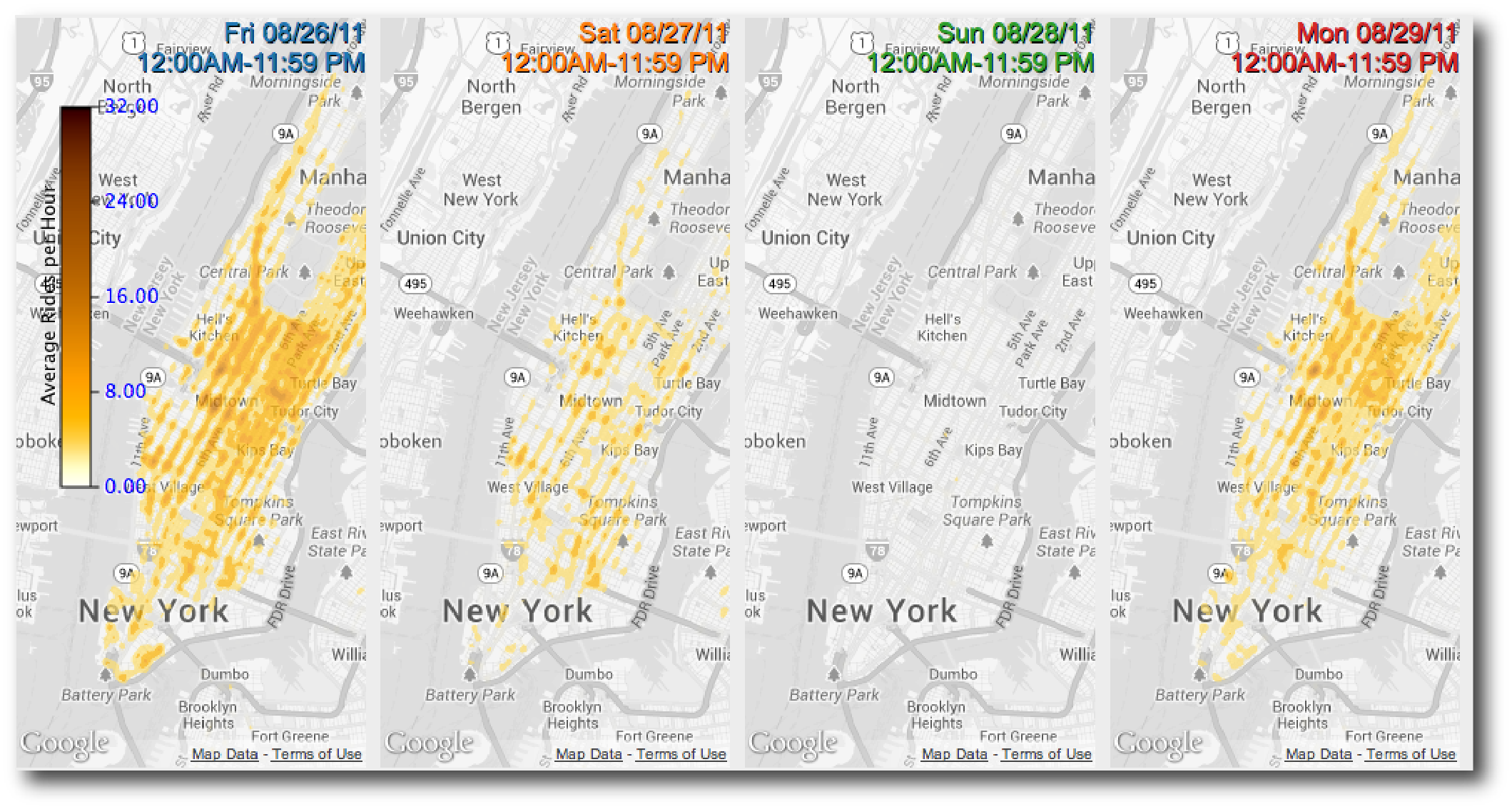{fig-align="center" width="70%"} ::: {.incremental} - Shorter disruption but more complete - Only **1,076 trips** on hurricane day (vs. average 500,000) - Faster recovery ::: ::: {.notes} The heat maps make the story immediately visible. This kind of event analysis would be very difficult without spatial visualization. Shows how urban data can capture and explain major events. ::: --- # Part 20: What We Learned {background-color="#2c5f77"} ## Design Insights from Building TaxiVis ::: {.incremental} 1. **Visual queries work** - Domain experts could use it without training - No SQL, no programming required 2. **Performance is non-negotiable** - Sub-second response enables exploration - Adaptive rendering essential for large results 3. **Multiple views are essential** - Comparison is core to analysis - Side-by-side queries, synchronized views - Linked plots and maps 4. **Query composition is powerful** - Build complex queries from simple ones - Grouping, refinement, generalization ::: --- # Part 21: Real-World Impact {background-color="#2c5f77"} ## Who's Using TaxiVis? ::: {.columns} ::: {.column width="50%"} ### Users: - NYC Department of Transportation - NYC Taxi & Limousine Commission - Traffic engineers and urban planners - Economists studying urban mobility ::: ::: {.column width="50%"} ### What They've Learned: - Social inequalities in taxi service (Harlem) - Economic incentives affecting driver behavior - Impact of major events on city mobility - Transportation hub usage patterns ::: ::: ::: {.fragment} ### Beyond Taxis: - Model applies to other origin-destination data - Generalizes to other spatio-temporal datasets - Principles useful for any urban data exploration ::: ::: {.notes} This isn't just an academic exercise—it's being used by actual city agencies. The insights have informed policy discussions. The visual query model has influenced other urban data tools. ::: --- # Part 22: Key Takeaways {background-color="#2c5f77"} ## The Big Ideas ::: {.incremental} 1. **Urban data is fundamentally spatio-temporal** - Space, time, and attributes all matter - Need to explore interactions, not just individual dimensions 2. **Static visualization is not enough** - Interactivity transforms presentation into exploration - "Dialogue with data" through visual queries 3. **Design for domain experts, not data scientists** - Visual operations instead of code - Direct manipulation over programming - But don't sacrifice expressiveness 4. **Performance enables exploration** - Sub-second response changes how people think - Specialized systems beat general solutions - Trade generality for interactivity ::: --- # Part 23: From TaxiVis to Urban Analytics {background-color="#2c5f77"} ## The Broader Vision ::: {.columns} ::: {.column width="50%"} ### TaxiVis is One Example Other urban data: - Bikeshare systems - 311 service calls - Building permits - Transit ridership - Crime reports - Traffic sensors **Same challenges:** Scale, complexity, spatio-temporal nature ::: ::: {.column width="50%"} ### The Visual Analytics Framework {fig-align="center"} 1. **Visualization:** Multiple representations and query models 2. **Data Analysis:** Topology, ML, pattern detection 3. **Data Management:** Specialized indices, GPU acceleration ::: ::: ## Moving to 3D ::: {.r-fit-text} **Cities are vertical, not just horizontal** ::: ::: {.incremental} - Shadow analysis - Views and sight lines - Sky exposure - Building massing ::: ::: {.fragment} ### Next Lecture: We'll extend these ideas to **3D urban visualization** and the **Urbane** framework Same principles apply: **interactive, visual, scalable** ::: --- # Summary {background-color="#2c5f77"} ## The Visual Analytics Pipeline for Urban Data ### What We've Covered Today: ::: {.columns} ::: {.column width="50%"} **The Problem:** - Urban data is big, complex, spatio-temporal - Traditional tools don't scale - Confirmation vs. exploration gap ::: ::: {.column width="50%"} **The Solution:** - Visual query models for direct manipulation - Interactive performance through specialized systems - Multiple visualizations for different questions - Comparison through coordinated views ::: ::: ::: {.fragment} **The Result:** - Domain experts can explore without programming - Discoveries about social inequality, economics, events - Real impact on city operations and policy ::: ## Try It Yourself - Exploration Exercise ::: {.r-fit-text} **If you had access to TaxiVis, what would you explore?** ::: Think about: ::: {.incremental} - A neighborhood you're curious about - A time pattern (weekday vs. weekend, holidays, events) - A comparison (this year vs. last year, two locations) - A hypothesis about urban behavior ::: ::: {.fragment} **Discussion:** - What question would you ask? - What spatial regions would you select? - What time slices would you compare? - What would you expect to find? ::: ## Questions? ::: {.r-fit-text} Next week: **3D & Immersive Urban Visualization** ::: ::: {.fragment} ### Preview: - Urbane framework for 3D urban planning - Interactive impact analysis (shadows, views, sky exposure) - Performance-driven architectural design - When to use 3D (and when not to) ::: ::: {.notes} So, we've solved our "yellow blob" problem. By adding interactivity and linked views, we've turned a useless picture into a powerful exploratory tool. But... this is all still 2D. We're looking at the city as a flat map. What about the 3D *form* of the city? The buildings, the streets, the skyline? That's what we'll cover in our final lecture. ::: 