## Lab Overview * Today: Interpreting Black Box Models with LIME and SHAP * Also: Principal Component Analysis (PCA) if time permits * Next week: Deep Learning Visualization ::: {.notes} Today’s lab is all about understanding black box models — models that make accurate predictions but are hard to interpret. We’ll focus on two popular techniques, LIME and SHAP, to explain model predictions. If time allows, we’ll also look at Principal Component Analysis, and next week we’ll move into visualizing deep learning models. ::: ## Interpreting Black Box Models * Not as intuitive as white box models, can be hard to define a model’s decision boundary in a human-understandable manner * However there are ways to analyze what factors affect model outputs! * LIME * SHAP ::: {.notes} When we talk about black box models, we mean models like random forests or neural networks where it’s hard to understand why they make certain predictions. Unlike white box models, they don’t offer simple rules or equations. But we do have techniques to peek inside — tools like LIME and SHAP help us understand which features are influencing the model’s decisions. ::: ## Local Interpretable Model-Agnostic Explanations (LIME) * What is LIME? * LIME is a method that explains the prediction of any classifier by learning an interpretable model locally around the prediction ::: {.notes} LIME, or Local Interpretable Model-Agnostic Explanations, is a method for understanding individual predictions made by complex models. The key idea is that instead of trying to explain the entire model, LIME focuses locally — it builds a simple, interpretable model around one specific prediction to show which features influenced it the most. ::: ## LIME * Why is LIME a good model explainer? * Interpretable by non-experts * Local fidelity (replicates the model’s behavior in the vicinity of the instance being predicted) * Model agnostic (does not make any assumptions about the model) * Global perspective (when used on a representative set, LIME can provide a global intuition of the model) ::: footer Ref: @Sharma_2020 ::: ::: {.notes} LIME is useful because it balances interpretability and flexibility. It’s easy for non-experts to understand since it explains predictions with a simple, local model. It also maintains local fidelity, meaning it closely mimics the black box model’s behavior near the instance of interest. Plus, it’s model-agnostic, so it works with any classifier. And when applied across many samples, it can even give a global sense of how the model behaves overall. ::: ## LIME * How does LIME work? * For an in depth explanation of the math, see @Sharma_2020 * Fidelity-Interpretability Tradoff * We want an explainer that is faithful (replicates our model’s behavior locally) and interpretable. To achieve this, LIME minimizes  ::: footer Ref: @Sharma_2020 ::: ## LIME {fig-align="center"} f: an original predictor x: original features g: explanation model which could be a linear model, decision tree, or falling rule lists Pi: proximity measure between an instance of z to x to define locality around x. It weighs z’ (perturbed instances) depending upon their distance from x. First Term: the measure of the unfaithfulness of g in approximating f in the locality defined by Pi. This is termed as locality-aware loss in the original paper Last term: a measure of model complexity of explanation g (e.g. if your explanation model is a decision tree it can be the depth of the tree) ::: footer Ref: @Sharma_2020 ::: ::: {.notes} We start with our original model f, and an instance x that we want to explain. LIME generates many perturbed samples around x, called z', and uses a proximity function πₓ to assign higher weights to samples that are closer to x—ensuring we stay local. Next, we train an interpretable model g—like a linear model or a shallow decision tree—on this neighborhood. The goal is for g to mimic the behavior of f around x, while remaining easy to understand. This process is captured in the equation shown: Here: L(f,g,πx)\mathcal{L}(f, g, \pi_x)L(f,g,πx) is the local fidelity loss, which measures how well g approximates f near x, weighted by the proximity function πₓ. Ω(g)\Omega(g)Ω(g) is a complexity penalty on the explanation model g, encouraging simpler explanations—for example, by penalizing deeper trees or more complex models. So, LIME is all about balancing two objectives: Fidelity: staying true to the original model's predictions locally, and Interpretability: keeping the explanation simple enough for humans to understand. ::: ## LIME Example in Python We first import the relevant libraries: ``` {python} import pandas as pd, numpy as np from IPython.display import display, HTML from sklearn import datasets from sklearn.decomposition import PCA from matplotlib import pyplot as plt from sklearn.ensemble import RandomForestClassifier from sklearn.metrics import accuracy_score, precision_score, recall_score from sklearn.model_selection import train_test_split import lime, lime.lime_tabular, shap ``` ## LIME Example in Python Recall the Iris dataset, which contains flowers that can be sorted into 3 subspecies classes based on 4 features: ``` {python} data = datasets.load_iris() X = pd.DataFrame(data.data, columns=data.feature_names) y = data.target X[0:3] ``` ## LIME Example in Python We ignore Class 0 for now (we will see why shortly), and split the data into a training set (80%) and test set (20%): ``` {python} #Ignoring one of the three classes X = X[y != 0] y = y[y != 0] X_train, X_test, y_train, y_test = train_test_split(X, y, test_size=0.20, random_state=42) ``` ## LIME Example in Python We train a random forest classifier on our training set, and generate predictions for our test set: ``` {python} classifier = RandomForestClassifier(random_state=42) classifier.fit(X_train, y_train) predicted = classifier.predict(X_test) pre = precision_score(y_test, predicted) rec = recall_score(y_test, predicted) acc = accuracy_score(y_test, predicted) print("Precision: ", pre) print("Recall: ", rec) print("Accuracy: ", acc) ``` ## LIME Example in Python We use lime to create an explainer based on our training set, and generate an explanation for the 10th sample in our test set: ``` {python} explainer1 = lime.lime_tabular.LimeTabularExplainer(X_train.values, feature_names=X_train.columns.values.tolist(), class_names=['class 1', 'class 2'], verbose=True, mode='classification', random_state=42) lime_values = explainer1.explain_instance(X_test.values[10], classifier.predict_proba, num_features=4) ##some lime_values properties intercept, local_pred, score ``` ## LIME Example in Python- We see that this explanation has three parts:
- On the left, we see that the classifier estimated there was a 78% chance the sample was from Class 1, and a 22% chance the sample was from Class 2
- In the center, we see that petal length and width increased the proability that the sample was from Class 1, while sepal length and width increased the proability that the sample was from Class 2. Petal length and width also had greater influence on their respective increase than sepal length and width
- On the right, we see the actual LIME values for each feature. The color of each row corresponds to the class that feature is "voting for"
``` {python} display(HTML(lime_values.as_html())) ``` ## Shapley Values (SHAP) * A method from coalitional game theory that tells us how to fairly distribute the “payout” among the features * The “game” is the prediction task for a single instance of the dataset * The “gain” is the actual prediction for this instance minus the average prediction for all instances * The “players” are the feature values of the instance that collaborate to receive the gain (= predict a certain value) * Useful for debugging models, explaining individual model predictions, and data ::: footer Refs: @Molnar_2023, @ADataOdyssey_2023 ::: ::: {.notes} SHAP is based on the concept of Shapley values from game theory — it treats each feature as a player contributing to the final prediction. The idea is to fairly distribute credit among features for how much each one influences the output. In this setup, the game is the prediction task, and the gain is how much the prediction differs from the average. SHAP is powerful for debugging models and explaining individual predictions in a consistent, mathematically grounded way. ::: ## SHAP Example * Suppose the HR dept of your company has asked you to build a model that predicts the annual bonus for each of the company’s employees * We are given a dataset with 1000 employees and the following 5 features: * Experience (continuous) * Degree (binary) * Sales (continuous) * Performance (continuous) * Days Late (continuous) ::: footer Ref: @ADataOdyssey_2023 ::: ## SHAP Example :::: {.columns} ::: {.column width="40%"} We can use feature importance to understand how important each feature is to model predictions in general, but it cannot tell us
1. Feature affect on individual predictions
2. If a feature tends to increase or decrease the prediction
3. (For classification) if a feature changes the probability of a positive prediction ::: ::: {.column width="60%"} 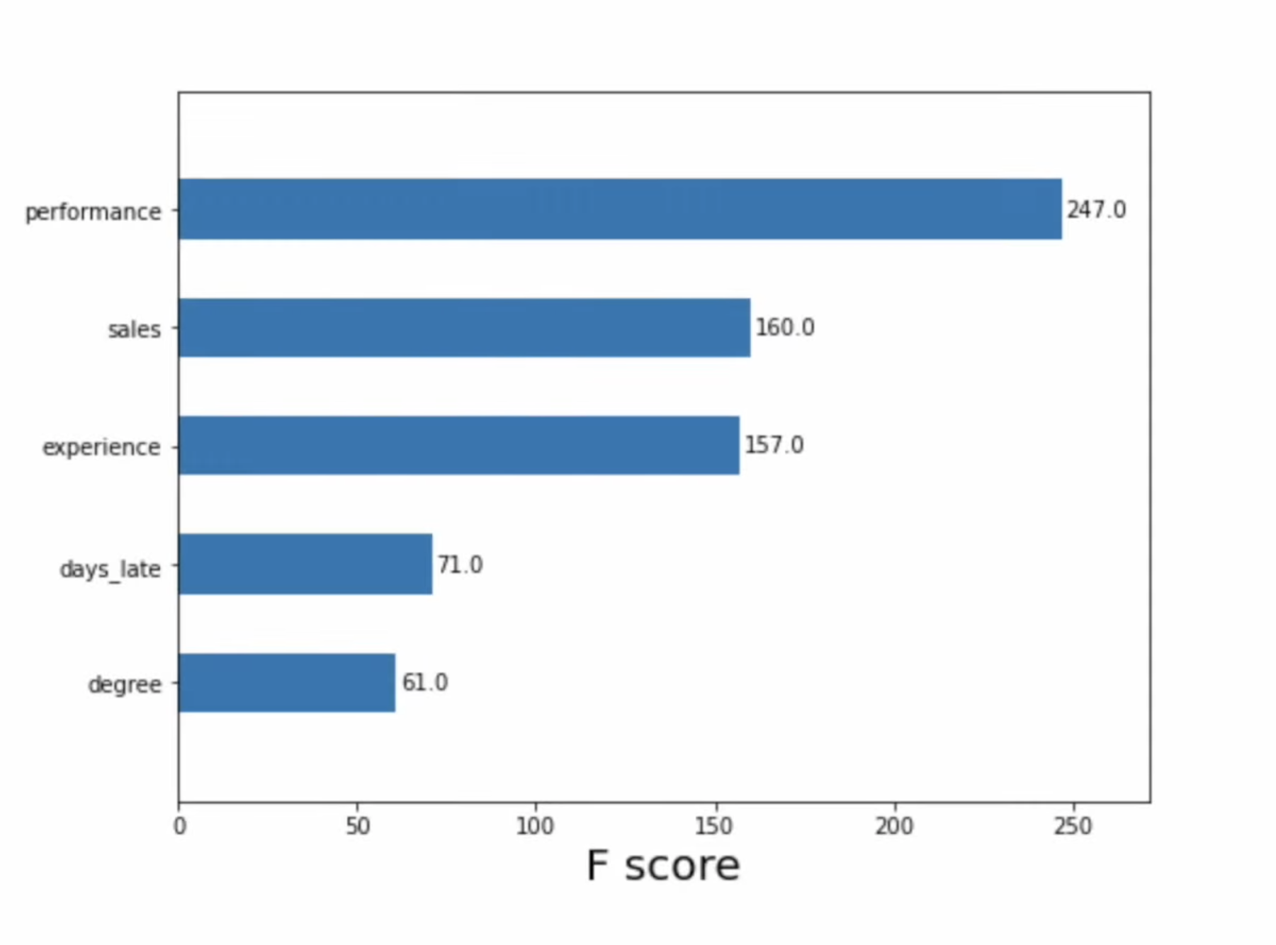 ::: :::: ::: footer Ref: @ADataOdyssey_2023 ::: ::: {.notes} Traditional feature importance tells us which features matter most overall, but it misses key details. It doesn’t explain how a feature affects individual predictions, whether it tends to increase or decrease the output, or how it influences class probabilities in classification tasks. That’s where SHAP comes in — it fills these gaps by showing both the direction and magnitude of each feature’s impact. ::: ## SHAP Example (Waterfall Plot) 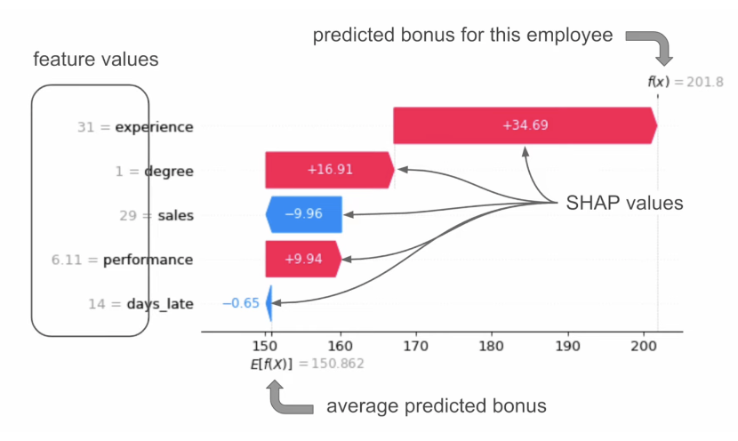“When an employee has a degree, the predicted bonus is $16.91 higher than the average.” = “Degree has increased the prediction”
::: footer Ref: @ADataOdyssey_2023 ::: ::: {.notes} This waterfall plot shows how SHAP values explain a single prediction — in this case, the predicted bonus for an employee. We start at the average predicted bonus, shown on the left, and then each feature pushes the prediction up or down. For example, having a degree increases the predicted bonus by about $16.9, while sales slightly decreases it. The final prediction on the right combines all these contributions, giving us a transparent view of how each feature influenced the outcome. ::: ## SHAP Example (Classification) :::: {.columns} ::: {.column width="28%"}- Suppose we have a classification model that predicts whether mushrooms are poisonous (class 1) or edible (class 0)
- Use log odds (the logarithm of the odds ratio - odds are likelihood ratios, and tell us how likely it is that an event will happen)
::: ::: {.column width="72%"} 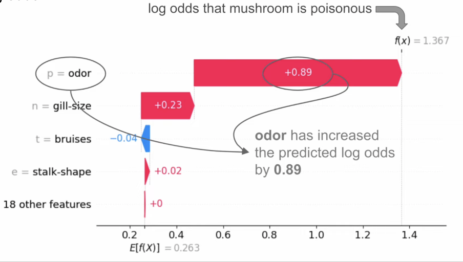 ::: :::: ::: footer Ref: @ADataOdyssey_2023 ::: ## Other SHAP Plots (for model as a whole)  ::: footer Ref: @ADataOdyssey_2023 ::: ## SHAP Examples in Python We create a SHAP explainer and generate SHAP values for our test set: ``` {python} explainer2 = shap.TreeExplainer(classifier) shap_values = explainer2.shap_values(X_test) ``` ## SHAP Examples in Python- We can visualize these SHAP values as a beeswarm plot:
- Each dot is a row of the dataset
- Features (y-axis) are ranked from top to bottom by their mean absolute SHAP values for the entire dataset
- X-axis position corresponds to each dot's SHAP value
- Color corresponds to the raw feature value
``` {python} class_idx = 0 # or 1, depending on which class you want to explain shap.summary_plot(shap_values[:, :, class_idx], X_test, plot_type="dot") ``` ## SHAP Examples in Python- Dependence plots show the relationship between SHAP and raw values for a specific feature
- Vertical dispersion in SHAP values seen for fixed variable values is due to interaction effects with other features
- Dependence plots are often coloured by the values of a strongly interacting feature (in this case, sepal width)
``` {python} feature_name = "petal length (cm)" interaction = "sepal width (cm)" shap_values_class_0 = shap_values[:, :, 0] # Get SHAP values for class 0 shap.dependence_plot(feature_name, shap_values_class_0, X_test, interaction_index=interaction) ``` ## SHAP Examples in Python Finally, force plots can be thought of as a condensed waterfall plot: ``` {python} sample_idx = 10 # Extract SHAP values for class 0 shap_values_class_0 = shap_values[:, :, 0] # shape: (20, 4) # Now everything matches in shape shap.initjs() shap.force_plot(explainer2.expected_value[0], shap_values_class_0[sample_idx], X_test.iloc[sample_idx]) ``` ## SHAP Examples in Python ``` {python} shap.initjs() sample_idx = 10 # choose a valid sample index class_idx = 1 # class index (0 or 1 for binary classification) # Slice SHAP values correctly: get SHAP values for the specified class shap_values_for_class = shap_values[:, :, class_idx] # shape: (20, 4) # Now plot for a single sample shap.force_plot( explainer2.expected_value[class_idx], # base value for class 1 shap_values_for_class[sample_idx], # SHAP values for that sample X_test.iloc[sample_idx] # feature values for that sample ) ``` ## Further SHAP Reading See [this article](https://www.aidancooper.co.uk/a-non-technical-guide-to-interpreting-shap-analyses/) for a more in-depth breakdown of how to read each type of SHAP plot. ::: footer Ref: @Cooper_2023 ::: ## Principal Component Analysis (PCA) :::: {.columns} ::: {.column width="40%"}- Dimensionality reduction technique that allows us to find clusters of similar data points based on many features (which we boil down to two “principal components” PC1 and PC2)
- PC1 and PC2 represent the directions in the data space with the highest and second-highest variances, respectively
- Way to bring out strong patterns from large and complex datasets
::: ::: {.column width="60%"} 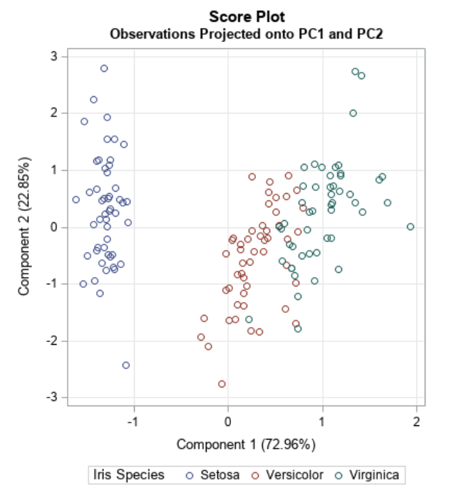 ::: :::: ::: footer Ref: @Team_2018a ::: ## Video Intro ::: footer Ref: @Starmer_2017 ::: ## PCA Example :::: {.columns} ::: {.column width="40%"}- Suppose we have a dataset that measures the expression of 15 genes from 60 mice
- How do you know which mice are similar to one another, and which ones are different?
- How do you know which genes are responsible for such similarities or differences?
- Let’s start by plotting the data for two genes against each other:
::: ::: {.column width="60%"} 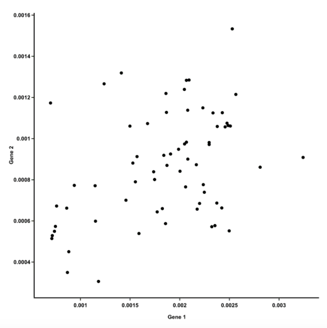 ::: :::: ::: footer Ref: @Team_2018a ::: ## PCA Example :::: {.columns} ::: {.column width="40%"}- The first principal component is the line of best fit for this data. It is a line that, if you project the original dots on it, two things happen:
- The total distance among the projected points is maximized. This means they can be distinguished from one another as clearly as possible.
- The total distance from the original points to their corresponding projected points is minimized. This means we have a representation that is as close to the original data as possible.
- AKA PC1 must convey the maximum variation among data points AND contain minimum error (these are actually achieved at the same time)
::: ::: {.column width="60%"} 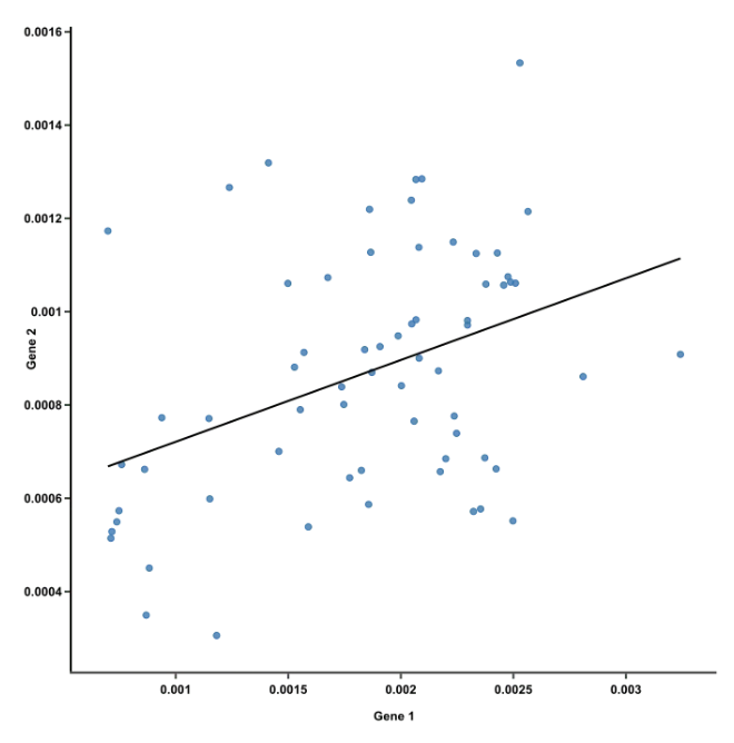 ::: :::: ::: footer Ref: @Team_2018a ::: ## PCA Example :::: {.columns} ::: {.column width="60%"}- But we have more than 2 genes! And we can’t reasonably make a plot with 15 axes
- To create PC1 for all 15 genes,
- A line is anchored at the center of the 15-D cloud of dots and rotated in 15 directions, all the while acting as a “mirror,” on which the original 60 dots are projected
- This rotation continues until the total distance among projected points is maximum
- The rotating line now describes the most variation among 60 mice, and is fit to be PC1
::: ::: {.column width="40%"} ::: :::: ::: footer Ref: @Team_2018a ::: ## PCA Example :::: {.columns} ::: {.column width="40%"} * PC2 is the second line that meets PC1, perpendicularly, at the center of the cloud, and describes the second most variation in the data ::: ::: {.column width="60%"} 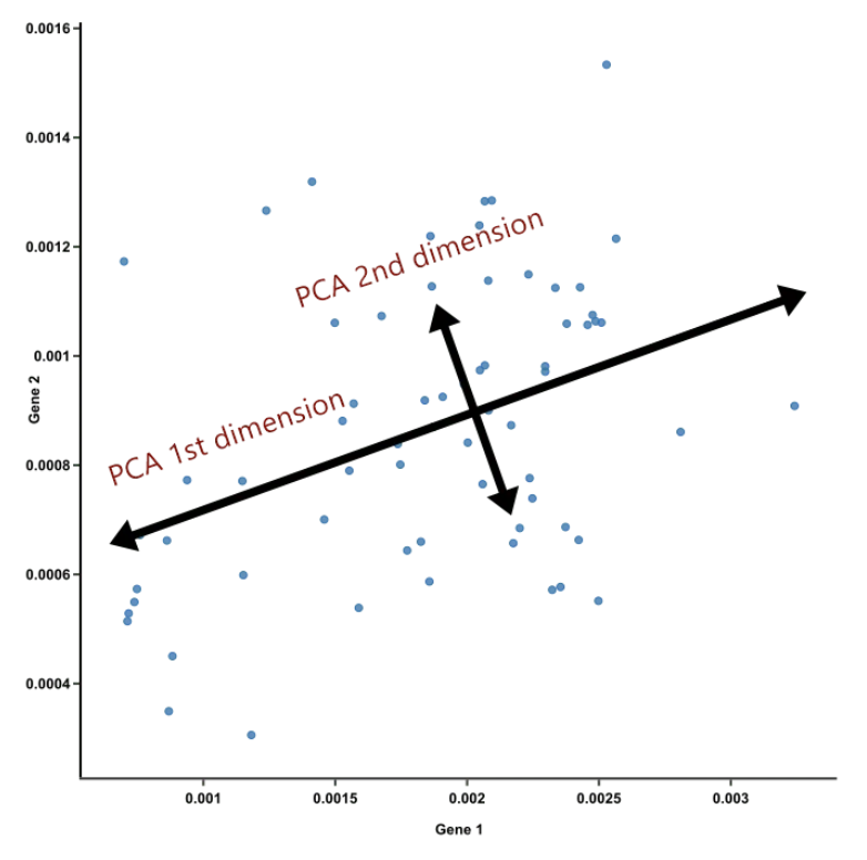 ::: :::: ::: footer Ref: @Team_2018a ::: ## PCA Example- If PCA is suitable for your data, just the first 2 or 3 principal components should convey most of the information of the data already. This is nice because:
- Principal components help reduce the number of dimensions down to 2 or 3, making it possible to see strong patterns.
- Yet we didn’t have to throw away any genes in doing so. Principal components take all dimensions and data points into account.
- Since PC1 and PC2 are perpendicular to each other, we can rotate them and make them straight. These are the axes of our PCA plot.
::: footer Ref: @Team_2018a ::: ## PCA Example in Python ``` {python} data = datasets.load_iris() X = pd.DataFrame(data.data, columns=data.feature_names) y = data.target pca = PCA(n_components = 2) projection = pca.fit_transform(X) plt.xticks([]) plt.yticks([]) plt.scatter(projection[:, 0], projection[:, 1], c = y) ``` ## Code from Today [This Jupyter notebook](https://colab.research.google.com/drive/1naKHMtKmXsy-BAtmCWTUZpWrD39T1HuY?usp=sharing ) collates the code from today's lab. ## References 