## Lab Overview * Today: Clustering and Dimensionality Reduction * Various methods of projecting data into low-dimensional space * Next week: Deep Learning Visualization ::: {.notes} Today we'll explore how to visualize high-dimensional data by projecting it into lower dimensions. We'll apply various dimensionality reduction techniques to the MNIST dataset and compare their effectiveness. ::: ## Dimensionality Reduction * Various methods of projecting data into a low-dimensional space while preserving the clusters from the high-dimensional space * Principal Component Analysis (PCA) * Multidimensional Scaling (MDS) * Sparse Random Projection * Locally Linear Embedding * t-Distributed Stochastic Neighbor Embedding (t-SNE) * Uniform Manifold Approximation and Projection (UMAP) ::: {.notes} These methods help us understand complex high-dimensional data by creating meaningful 2D or 3D visualizations. Each technique has different strengths in preserving either local neighborhood structure or global geometric relationships. ::: ## MNIST Dataset * Dataset of 28x28 pixel images of handwritten digits 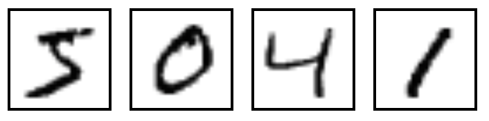 ::: footer Ref: @Olah_2014 ::: ::: {.notes} MNIST contains 70,000 images of handwritten digits from 0-9. Each 28x28 pixel grayscale image will serve as our test case for dimensionality reduction techniques. ::: ## MNIST Dataset- Every MNIST image can be thought of as a 28x28 array of numbers describing how dark each pixel is:
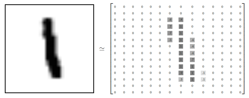- We can flatten each array into a 28 * 28 = 784 dimensional vector, where each component of the vector is a value between zero and one describing the intensity of the pixel
- We can think of MNIST as a collection of 784-dimensional vectors
::: footer Ref: @Olah_2014 ::: ::: {.notes} Each image is represented as a matrix of pixel intensities from 0 to 1. By flattening this matrix, we transform each image into a single 784-dimensional vector. ::: ## MNIST Dataset * But not all vectors in this 784-dimensional space are MNIST digits! Typical points in this space are very different * To get a sense of what a typical point looks like, we can randomly pick a few random 28x28 images – each pixel is randomly black, white or some shade of gray. These random points look like noise: 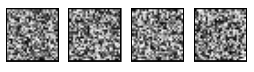 ::: footer Ref: @Olah_2014 ::: ::: {.notes} Random 784-dimensional vectors produce noise, not digits. This demonstrates that meaningful digit images occupy only a tiny, structured subset of the possible 784-dimensional space. ::: ## MNIST Dataset- 28x28 images that look like MNIST digits are very rare - they make up a very small subspace of 784-dimensional space
- With some slightly harder arguments, we can see that they occupy a lower (than 748) dimensional subspace
- Many theories about lower-dimensional structure of MNIST (and similar data)
- Manifold hypothesis (popular among ML researchers): MNIST is a low dimensional manifold curving through its high-dimensional embedding space
- Another hypothesis (rooted in topological data analysis) is that data like MNIST consists of blobs with tentacle-like protrusions sticking out into the surrounding space
- But no one actually knows for sure!
::: footer Ref: @Olah_2014 ::: ::: {.notes} MNIST digits likely exist on a lower-dimensional manifold within the 784-dimensional space. While several theories attempt to explain this structure, the true geometric nature remains an open question. ::: ## MNIST Cube- Imagine the MNIST data points as points suspended in a 784-dimensional cube
- Each dimension of the cube corresponds to a particular pixel
- The data points range from zero to one according to pixel intensity
- On one side of the dimension, there are images where that pixel is white. On the other side of the dimension, there are images where it is black. In between, there are images where it is gray.
- What does this cube look like if we look at a particular two-dimensional face? Let's look at Olah's visualizations.
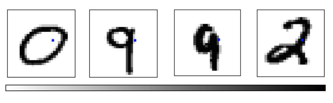 ::: footer Ref: @Olah_2014 ::: ::: {.notes} Visualizing MNIST as points in a 784-dimensional hypercube helps us understand the challenge. Each dimension represents one pixel, and digit images occupy specific regions based on their visual patterns. ::: ## MNIST Cube * What qualities would the ‘perfect’ visualization of MNIST have? What should our goal be? * What is the best way to cluster MNIST data? * We can try what we learned last week... ::: footer Ref: @Olah_2014 ::: ::: {.notes} We want visualizations that preserve meaningful relationships between digits while separating distinct classes. Let's apply the clustering techniques from last week to see how well they work. ::: ## Principal Component Analysis Recap :::: {.columns} ::: {.column width="40%"}- Dimensionality reduction technique that allows us to find clusters of similar data points based on many features (which we boil down to two “principal components” PC1 and PC2)
- PC1 and PC2 represent the directions in the data space with the highest and second-highest variances, respectively
- Way to bring out strong patterns from large and complex datasets
::: ::: {.column width="60%"} 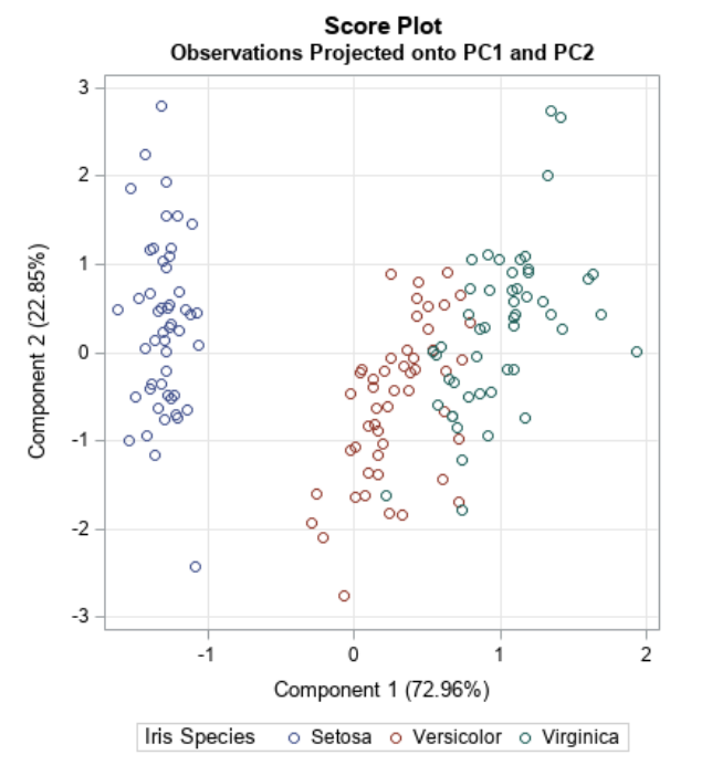 ::: :::: ::: footer Ref: @Team_2018a ::: ::: {.notes} PCA finds the directions of maximum variance in high-dimensional data. By projecting onto the top principal components, we can visualize complex datasets while retaining the most important information. ::: ## PCA on MNIST Import libraries: ``` {python} import numpy as np import matplotlib.pyplot as plt import sklearn from sklearn.datasets import load_digits from sklearn.decomposition import TruncatedSVD from sklearn.discriminant_analysis import LinearDiscriminantAnalysis from sklearn.ensemble import RandomTreesEmbedding from sklearn.manifold import (Isomap, LocallyLinearEmbedding, MDS, SpectralEmbedding, TSNE) from sklearn.neighbors import NeighborhoodComponentsAnalysis from sklearn.pipeline import make_pipeline from sklearn.random_projection import SparseRandomProjection from sklearn.decomposition import PCA import plotly.graph_objects as go from umap import UMAP ``` ::: {.notes} We'll use scikit-learn for dimensionality reduction algorithms and plotly for interactive 3D visualizations. These tools provide efficient implementations of all the methods we'll explore today. ::: ## PCA on MNIST Define helper functions for visualizing clusters in 2D and 3D: ``` {python} # Authors: Gael Varoquaux # License: BSD 3 clause (C) INRIA 2014 def plot_clustering(X_red, labels, title=None): x_min, x_max = np.min(X_red, axis=0), np.max(X_red, axis=0) X_red = (X_red - x_min) / (x_max - x_min) plt.figure(figsize=(6, 6)) for digit in digits.target_names: plt.scatter( *X_red[y == digit].T, marker=f"${digit}$", s=50, # c=plt.cm.nipy_spectral(labels[y == digit] / 10), alpha=0.5, ) plt.xticks([]) plt.yticks([]) if title is not None: plt.title(title, size=17) plt.axis("off") plt.tight_layout(rect=[0, 0.03, 1, 0.95]) ``` ::: {.notes} This helper function creates a 2D scatter plot where each digit is displayed as its numeric character. This makes it easy to visually assess how well the dimensionality reduction separates different digit classes. ::: ## PCA on MNIST Define helper functions for visualizing clusters in 2D and 3D: ``` {python} def plot_3d_clustering(X_red, labels, title=None): component0 = X_red[:, 0] component1 = X_red[:, 1] component2 = X_red[:, 2] indices = list(range(X_red.shape[0])) labels = list (map(lambda x: "label:" + str(y[x]) + ", id:" + str(x),indices)) fig = go.Figure(data=[go.Scatter3d( x=component0, y=component1, z=component2, mode='markers', marker=dict( size=10, color=y, # set color to an array/list of desired values colorscale='Rainbow', # choose a colorscale opacity=1, line_width=1, ), text = labels )]) # tight layout fig.update_layout(margin=dict(l=50,r=50,b=50,t=50),width=520,height=520) fig.layout.template = 'plotly_dark' fig.show() ``` ::: {.notes} The 3D visualization uses color-coding and interactive rotation to explore cluster structure. Hovering over points reveals both the true digit label and data point index. ::: ## PCA on MNIST Load the MNIST dataset: ``` {python} digits = load_digits(n_class=6) X, y = digits.data, digits.target n_samples, n_features = X.shape n_neighbors = 30 print("Samples: " + str(n_samples)) print("Features: " + str(n_features)) ``` ::: {.notes} We're loading a subset with 6 digit classes for clearer visualization. With 1,083 samples and 64 features each, this gives us a manageable dataset to explore. ::: ## PCA on MNIST Peform PCA: ``` {python} pca = PCA(n_components=2) pca.fit(X) X_trans = pca.transform(X) print("Singular values: " + str(pca.singular_values_)) ``` ::: {.notes} We fit PCA to reduce from 64 dimensions down to 2. The singular values indicate how much variance each principal component explains in the original data. ::: ## PCA on MNIST We see that we are able to reasonbly cluster the data by digit using PCA:
``` {python} plt.scatter(X_trans[:,0],X_trans[:,1]) ``` ::: {.notes} This basic scatter plot shows the data projected onto the first two principal components. We can already see some clustering structure emerging, though the digit classes aren't labeled yet. ::: ## PCA on MNIST We see that we are able to reasonbly cluster the data by digit using PCA:
``` {python} plot_clustering(X_trans, "", "PCA") ``` ::: {.notes} With digit labels displayed, we see PCA achieves reasonable separation between some classes. However, there's still significant overlap, particularly between visually similar digits. ::: ## PCA on MNIST We can also visualize this in 3D:
``` {python} pca_3d = PCA(n_components=3) X_trans_3d = pca_3d.fit_transform(X) plot_3d_clustering(X_trans_3d, "", "PCA") ``` ::: {.notes} Adding a third principal component provides additional separation between clusters. The interactive 3D view lets us explore the data from different angles to better understand the cluster structure. ::: ## Optimization-Based Dimensionality Reduction- What if the distances between points in our visualization were the same as the distances between points in the original space?
- This captures the global geometry of the data
- In this case, we say that for any two MNIST data points, xi and xj, there are two notions of distance between them:
- d*i,j denotes the distance between xi and xj in the original space
- di,j denotes the distance between xi and xj in our visualization.
- Now we can define a cost:
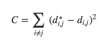 ::: footer Ref: @Olah_2014 ::: ::: {.notes} Instead of maximizing variance, we can optimize to preserve distances between points. This cost function penalizes differences between original high-dimensional distances and visualization distances. ::: ## Multidimensional Scaling (MDS)  * If these distances are similar, the cost is low (and vice versa). So a cost of zero is optimal (though we can never actually reach this) * We can solve this as an optimization problem - we start with a random point and apply gradient descent * This is called multidimensional scaling (MDS) ::: footer Ref: @Olah_2014 ::: ::: {.notes} MDS uses gradient descent to minimize the distance preservation cost function. Starting from random positions, it iteratively adjusts point locations to match original distances as closely as possible. ::: ## MDS on MNIST ``` {python} mds = MDS(n_components=2, n_init=1, max_iter=120, n_jobs=1) X_mds = mds.fit_transform(X) plot_clustering(X_mds, "", "MDS") ``` ::: {.notes} MDS creates a different projection than PCA, often better preserving global structure. Notice how the relative positions of digit clusters reflect their relationships in the original high-dimensional space. ::: ## MDS on MNIST ``` {python} mds_3d = MDS(n_components=3, n_init=1, max_iter=120, n_jobs=1) mds_3d.fit(X) X_mds_3d = mds_3d.fit_transform(X) plot_3d_clustering(X_mds_3d, "", "MDS") ``` ::: {.notes} The 3D MDS embedding provides clearer separation between some digit classes. However, MDS can be computationally expensive for large datasets since it must consider all pairwise distances. ::: ## Sammon's Mapping- There are many variations of MDS
- Common theme is to use a cost function that emphasizes local structure as more important to maintain than global structure
- One version of this is Sammon's Mapping, which uses the cost function:
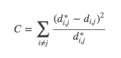- In Sammon’s mapping, we try harder to preserve the distances between nearby points than between those which are far apart. If two points are twice as close in the original space as two others, it is twice as important to maintain the distance between them.
::: footer Ref: @Olah_2014 ::: ::: {.notes} Sammon's Mapping modifies MDS to emphasize preserving local structure over global structure. By dividing by original distances, it prioritizes maintaining relationships between nearby points. ::: ## Sparse Random Projection- Reduces the dimensionality by projecting the original input space using a sparse random matrix
- Alternative to dense Gaussian random projection matrix - guarantees similar embedding quality while being much more memory efficient and allowing faster computation of the projected data
- If we define s = 1 / density, the elements of the random matrix are drawn from
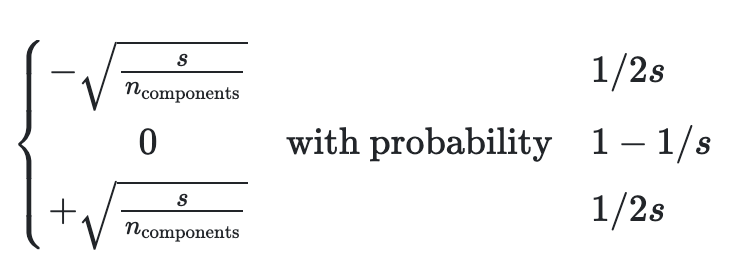{width=50%} where ncomponents is the size of the projected subspace.- By default the density of nonzero elements is set to the minimum density as recommended by Ping Li et al: 1 / (nfeatures)
::: footer Ref: @scikit ::: ::: {.notes} This method projects data through a sparse random matrix, providing computational efficiency. The sparsity reduces memory requirements while theoretical guarantees ensure the projection preserves distances with high probability. ::: ## Sparse Random Projection on MNIST ``` {python} srp=SparseRandomProjection(n_components=2, random_state=42) X_srp=srp.fit_transform(X) plot_clustering(X_srp, "", "Sparse Random Projection") ``` ::: {.notes} Random projection surprisingly preserves cluster structure despite its simplicity. While not as refined as optimization-based methods, it runs much faster and scales well to large datasets. ::: ## Sparse Random Projection on MNIST ``` {python} srp_3d=SparseRandomProjection(n_components=3, random_state=42) X_srp_3d=srp_3d.fit(X) X_srp_3d=srp_3d.fit_transform(X) plot_3d_clustering(X_srp_3d, "", "Sparse Random Projection") ``` ::: {.notes} The 3D random projection shows reasonable digit separation with minimal computational cost. This makes it useful for quick exploratory analysis before applying more sophisticated methods. ::: ## Locally Linear Embedding * First we find the k-nearest neighbors of each data point * One advantage of the LLE algorithm is that there is only one parameter to tune (K). If K is chosen to be too small or too large, it will not be able to accomodate the geometry of the original data. Here, for each data point that we have we compute the K nearest neighbours. * Next, we approximate each data vector as a weighted linear combination of its k-nearest neighbors to construct new points. We try to minimize the cost function, where j’th nearest neighbour for point Xi. 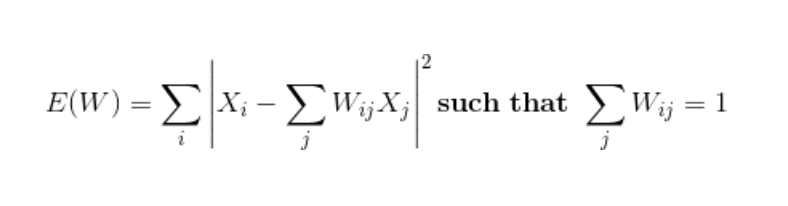{width=50%} ::: footer Ref: @Mihir_2024 ::: ::: {.notes} LLE assumes the manifold is locally linear, approximating each point as a weighted combination of neighbors. The key parameter K determines neighborhood size and must balance local geometry preservation. ::: ## Locally Linear Embedding * Finally, it computes the weights that best reconstruct the vectors from its neighbors, then produce the low-dimensional vectors best reconstructed by these weights. * In other words, we define the new vector space Y such that we minimize the cost for Y as the new points: ::: footer Ref: @Mihir_2024 ::: ::: {.notes} After computing weights that reconstruct each point from its neighbors, LLE finds a low-dimensional embedding that preserves these reconstruction relationships. This maintains local neighborhood structure in the visualization. ::: ## Locally Linear Embedding 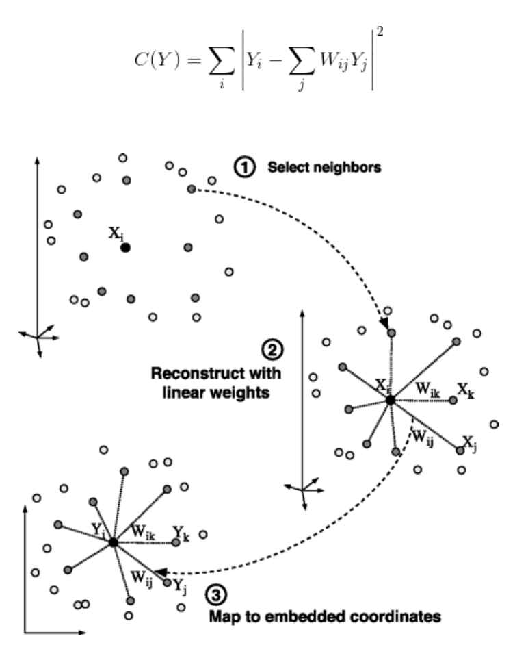 ::: footer Ref: @Mihir_2024 ::: ::: {.notes} The algorithm preserves local geometric relationships while unfolding the global manifold structure. Points that were neighbors in high dimensions remain neighbors in the low-dimensional embedding. ::: ## LLE on MNIST ``` {python} lle=LocallyLinearEmbedding(n_neighbors=5, n_components=2, method="standard") X_lle=lle.fit(X) X_lle=lle.fit_transform(X) plot_clustering(X_lle, "", "LLE") ``` ::: {.notes} LLE often creates more tightly clustered digit groups compared to PCA or MDS. The focus on local structure can better separate classes that differ in fine details. ::: ## LLE on MNIST ``` {python} lle_3d=LocallyLinearEmbedding(n_neighbors=n_neighbors, n_components=3, method="standard") X_lle_3d=lle_3d.fit(X) X_lle_3d=lle_3d.fit_transform(X) plot_3d_clustering(X_lle_3d, "", "LLE") ``` ::: {.notes} The 3D LLE embedding shows distinct digit clusters with clear boundaries. The neighborhood parameter significantly affects results, so experimentation is often needed for optimal visualization. ::: ## t-Distributed Stochastic Neighbor Embedding (t-SNE) * Very popular for deep learning * Tries to optimize for preserving the topology of the data * For every point, t-SNE constructs a notion of which other points are its ‘neighbors,’ trying to make all points have the same number of neighbors. Then it tries to embed them so that those points all have the same number of neighbors. ::: footer Ref: @Olah_2014 ::: ::: {.notes} t-SNE has become extremely popular for visualizing deep learning embeddings. It constructs probability distributions over neighbors and optimizes the low-dimensional embedding to match these distributions. ::: ## t-SNE ::: footer Ref: @Starmer_2017a ::: ::: {.notes} t-SNE has become extremely popular for visualizing deep learning embeddings. It constructs probability distributions over neighbors and optimizes the low-dimensional embedding to match these distributions. ::: ## t-SNE on MNIST ``` {python} tsne = sklearn.manifold.TSNE() X_tsne = tsne.fit_transform(X) plot_clustering(X_tsne, "", "T-SNE") ``` ::: {.notes} t-SNE typically produces very clean, well-separated clusters for MNIST. The distinct digit groups emerge naturally from the algorithm's focus on preserving local neighborhood topology. ::: ## t-SNE on MNIST ``` {python} tsne_3d = sklearn.manifold.TSNE(3) X_tsne_3d = tsne_3d.fit_transform(X) plot_3d_clustering(X_tsne_3d, "", "T-SNE") ``` ::: {.notes} Even in 3D, t-SNE creates visually striking cluster separation. However, remember that hyperparameters like perplexity strongly influence the results and must be tuned carefully. ::: ## Using t-SNE Effectively * t-SNE plots are popular and can be useful, but only if you avoid common misreadings * Beware of hyperparameter values * Remember cluster sizes in a t-SNE plot mean nothing * Know that distances BETWEEN clusters may not mean anything either * Random noise doesn't always look random * You may need multiple plots for topology * See @Wattenberg_Viégas_Johnson_2016 for more details ::: footer Ref: @Wattenberg_Viégas_Johnson_2016 ::: ::: {.notes} While t-SNE plots are visually appealing, they can be misleading if misinterpreted. Cluster sizes and inter-cluster distances don't necessarily reflect true relationships in the original high-dimensional space. ::: ## Uniform Manifold Approximation and Projection (UMAP) * Similar to t-SNE, but with some advantages: * Increased speed * Better preservation of the data's global structure ::: footer Ref: @Coenen_Pearce ::: ::: {.notes} UMAP has emerged as a strong alternative to t-SNE with faster runtime and better global structure preservation. It's becoming increasingly popular in single-cell genomics and other fields. ::: ## Uniform Manifold Approximation and Projection (UMAP)- UMAP constructs a high dimensional graph representation of the data then optimizes a low-dimensional graph to be as structurally similar as possible
- Starts with "fuzzy simplicial complex," a representation of a weighted graph with edge weights representing the likelihood that two points are connected.
- To determine connectedness, UMAP extends a radius outwards from each point, connecting points when those radii overlap.
- Choice of radius matters! Too small = small, isolated clusters. Too large = everything is connected. UMAP overcomes this challenge by choosing a radius locally, based on the distance to each point's nth nearest neighbor.
- The graph is made "fuzzy" by decreasing the likelihood of connection as the radius grows
- By stipulating that each point must be connected to at least its closest neighbor, UMAP ensures that local structure is preserved in balance with global structure
::: footer Ref: @Coenen_Pearce ::: ::: {.notes} UMAP builds a fuzzy topological representation using local connectivity radii. By ensuring each point connects to its nearest neighbor, it balances local and global structure preservation. ::: ## UMAP on MNIST ``` {python} ump=UMAP() ump.fit(X) X_umap=ump.fit_transform(X) plot_clustering(X_umap, "not used", "UMAP") ``` ::: {.notes} UMAP creates clean cluster separation similar to t-SNE but runs significantly faster on large datasets. The visualization often better preserves relationships between clusters compared to t-SNE. ::: ## References (Good for Further Reading) 