## What is Information Visualization? Why Use It? ::: columns ::: {.column width="50%"} “The use of computer-supported, interactive, visual representations of abstract data to amplify cognition.” ::: ::: {.column width="40%"} 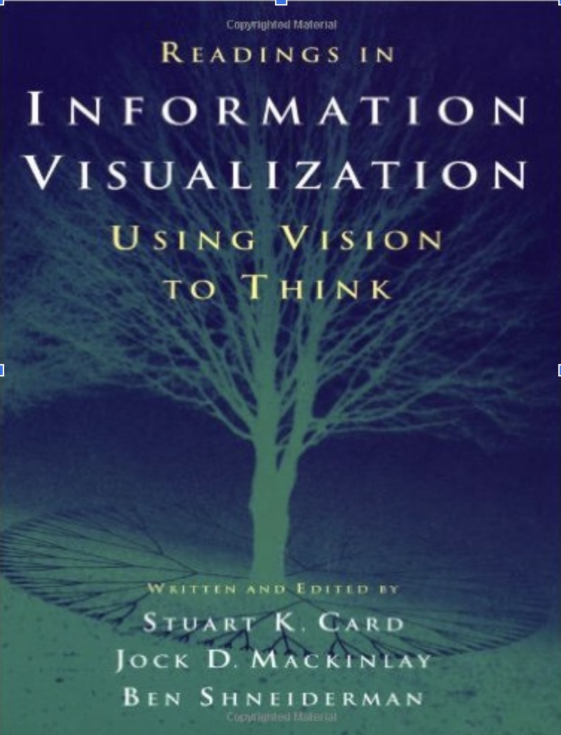 ::: ::: ::: footer Slides based on material from Prof. Enrico Bertini ::: ## Key Concepts ::: {style="font-size: 1.4em; margin-top: 60px; line-height: 2.0;"} * 💻 **Computer-Based** * 👁️ **Visual Representation** * 📊 **Abstract Data** * 🔄 **Interactive** * 🧠 **Amplify Cognition** ::: ::: footer Slides based on material from Prof. Enrico Bertini ::: ## Abstract Data ::: columns ::: {.column width="50%"} Data with no obvious/natural visual representation ::: ::: {.column width="50%"} 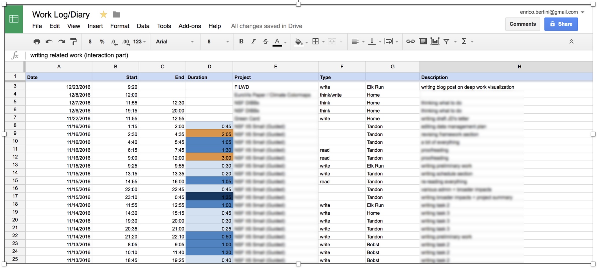 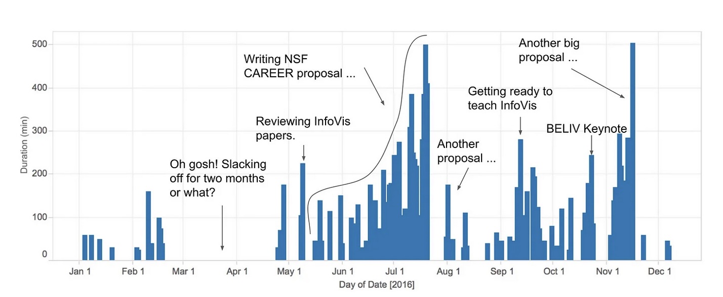 ::: ::: ::: footer Slides based on material from Prof. Enrico Bertini ::: ## Abstract Data ::: columns ::: {.column width="50%"} Data with no obvious/natural visual representation ::: ::: {.column width="40%"} 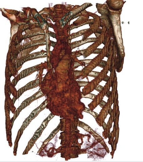 ::: ::: ::: footer Slides based on material from Prof. Enrico Bertini ::: ## Interactive Users can change what is visualized and how it is visualized. ::: {style="text-align: center; margin-top: 20px; font-size: 1.1em;"} **TaxiVis** - Ferreira et al., IEEE TVCG 2013 ::: ::: footer Slides based on material from Prof. Enrico Bertini ::: ## Amplify Cognition ::: {style="font-size: 1.5em; margin-top: 80px; line-height: 2.0;"} ::: incremental * Solve problems with data with **less effort**, in a **shorter time**, and more **accurately**. * … or even be able to do things it would be **impossible** to do without a computer and a graphical representation. ::: ::: ::: footer Slides based on material from Prof. Enrico Bertini ::: ## Cognitive artifacts: tools that help us think! :::: {.columns} ::: {.column width="50%"} ::: {style="font-size: 1.3em; margin-top: 50px;"} ::: incremental * Try to multiply **34 x 72** using exclusively your mind ... * … now do it again using **pen and paper**. ::: ::: ::: ::: {.column width="50%"} ::: {.fragment}  ::: ::: :::: ::: footer Slides based on material from Prof. Enrico Bertini ::: ## Why is it easier? :::: {.columns} ::: {.column width="45%"} ### 🧠 Memory in Head ::: {style="font-size: 1.2em;"} ::: incremental - **Limited capacity** (~7 items) - **Decays quickly** - **Requires effort** to maintain - **Error-prone** ::: ::: ::: ::: {.column width="10%"} ::: ::: {.column width="45%"} ### 📝 Memory in World ::: {style="font-size: 1.2em;"} ::: incremental - **Unlimited storage** - **Persistent** information - **External** processing - **Reliable** reference ::: ::: ::: :::: ::: {.fragment style="text-align: center; margin-top: 30px; font-size: 1.1em;"} **Key Insight:** Visualization offloads cognitive work from your mind to the visual system ::: ::: footer Slides based on material from Prof. Enrico Bertini ::: ## Let’s play the “game of 15” ... ::: incremental * The "pieces" for the game are the nine digits: 1, 2, 3, 4, 5, 6, 7, 8, 9. Each player takes a digit in turn. Once a digit is taken, it cannot be used by the other player. The first player to get three digits that sum to 15 wins. * Here is a sample game: Player A takes 8. Player B takes 2. Then A takes 4, and B takes 3. A takes 5. * Question 1: Suppose you are now to step in and play for B. What move would you make? ::: ::: footer Slides based on material from Prof. Enrico Bertini ::: ## Let's play a different game: tic-tac-toe ::: columns ::: {.column width="70%"} Players alternately place an O or a X in one of nine spaces arranged in a rectangular array. Once a space has been taken, it cannot be changed by either player. The first player to get three symbols in a straight line wins. Suppose player A is X and B is O, and the game has reached the state on the right. Question 2: Suppose you are now to step in and play an O for B. What move would you make? ::: ::: {.column width="20%"}  ::: ::: ::: footer Slides based on material from Prof. Enrico Bertini ::: ## Problem Isomorphs :::: {.columns} ::: {.column width="70%"} ### Herbert Simon's Insight ::: incremental * The two problems are **isomorphic** - structurally identical! * Same problem, different **representation** * The tic-tac-toe representation makes the solution **obvious** * **Key insight:** The right representation can dramatically simplify problem solving ::: [Learn more about Herbert Simon](https://en.wikipedia.org/wiki/Herbert_A._Simon) ::: ::: {.column width="30%"} {width="60%"} *Pioneer in cognitive psychology, artificial intelligence, and decision-making* ::: :::: ::: footer Slides based on material from Prof. Enrico Bertini ::: ## Why use visualization? :::: {.columns} ::: {.column width="33%"} ### 📢 Explanatory ::: {style="font-size: 1.1em;"} **Show insights to others** - Present findings - Tell data stories - Communicate clearly ::: ::: ::: {.column width="33%"} ### 🔍 Exploratory ::: {style="font-size: 1.1em;"} **Find patterns yourself** - Discover unknowns - Generate hypotheses - Understand data ::: ::: ::: {.column width="33%"} ### ✅ Confirmatory ::: {style="font-size: 1.1em;"} **Validate hypotheses** - Test assumptions - Verify patterns - Support decisions ::: ::: :::: ::: footer Slides based on material from Prof. Enrico Bertini ::: ## The Power of Visualization: Discovery :::: {.columns} ::: {.column width="45%"} ### John Snow's Cholera Map (1854) - Mapped cholera deaths in London - Revealed cluster around Broad Street water pump - Visual evidence stopped the outbreak ::: {.callout-tip} **Takeaway:** Visualization is a powerful tool for discovery and finding patterns invisible in raw data. ::: ::: ::: {.column width="55%"} {fig-alt="John Snow's Cholera Map"} ::: :::: ## The Power of Visualization: Storytelling :::: {.columns} ::: {.column width="45%"} ### Charles Minard's Map of Napoleon's March (1869) - Widely considered one of the best statistical graphics ever created - Shows six variables simultaneously: - Army size - Location & direction - Temperature - Distance & time ::: {.callout-tip} **Takeaway:** Visualization is a powerful medium for dense, high-impact storytelling. ::: ::: ::: {.column width="55%"} {fig-alt="Charles Minard's Map of Napoleon's March"} ::: :::: ## The Power of Visualization: Exploration :::: {.columns} ::: {.column width="45%"} ### NYT: "How Y'all, Youse and You Guys Talk" (2013) - Modern, interactive visualization - Built with web technologies (like D3.js!) - Allows personal exploration of dialect data - Engages users through personalized results **Try it yourself:** [NYT Dialect Quiz](https://www.nytimes.com/interactive/2014/upshot/dialect-quiz-map.html) ::: {.callout-tip} **Takeaway:** Visualization can be a dynamic interface for personal data exploration. ::: ::: ::: {.column width="55%"} {fig-alt="New York Times Dialect Map"} ::: :::: ## Great Explanatory Visualizations * NYT: https://flowingdata.com/tag/new-york-times/ * Washington Post: http://postgraphics.tumblr.com/ * Gregor Aisch: https://driven-by-data.net/ * Nicky Case/Explorable Explanations: http://explorabl.es/ * Polygraph: http://polygraph.cool/ & https://pudding.cool/ * ProPublica: https://www.propublica.org/ ::: footer Slides based on material from Prof. Enrico Bertini ::: ## Why use a graphical representation? * Large parts of our brain are devoted to spatial processing ::: {style="text-align: center;"}  ::: ::: footer Via Wikipedia, By OpenStax College - Anatomy & Physiology, Connexions Web site., Jun 19, 2013., CC BY 3.0 ::: ## Why use a computer to visualize data? :::: {.columns} ::: {.column width="50%"} ### 📊 Scale ::: {style="font-size: 1.2em;"} Handle **millions** of data points efficiently ::: ### 🔄 Interactivity ::: {style="font-size: 1.2em;"} **Explore** data dynamically with zoom, filter, details ::: ::: ::: {.column width="50%"} ### ⚡ Real-time ::: {style="font-size: 1.2em;"} **Live updates** as data changes continuously ::: ### 🧮 Computation ::: {style="font-size: 1.2em;"} **Complex calculations** and transformations on-the-fly ::: ::: :::: ::: footer Slides based on material from Prof. Enrico Bertini ::: ## Why use interaction? * Each visualization can only answer a subset of questions. * With interaction the user can change what is visualized and how to answer a multitude of questions. * Also one cannot visualize everything at once. ::: footer Slides based on material from Prof. Enrico Bertini ::: ## How do you assess the quality of a visualization? * Isn’t it subjective? Some people like A, whereas some others like B. ::: incremental * Some visual representations are better than others at solving particular problems ... ::: ::: footer Slides based on material from Prof. Enrico Bertini ::: ## Digression: Graphical Perception ::: columns ::: {.column width="50%"}  ::: ::: {.column width="50%"}  ::: ::: ::: footer Slides based on material from Prof. Enrico Bertini ::: ## Graphical Perception Experiment 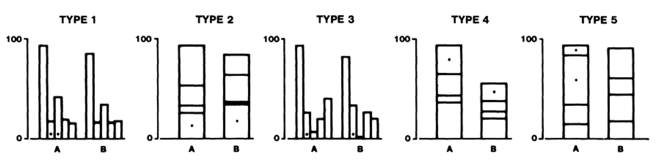 ::: footer Slides based on material from Prof. Enrico Bertini ::: ## Graphical Perception Results  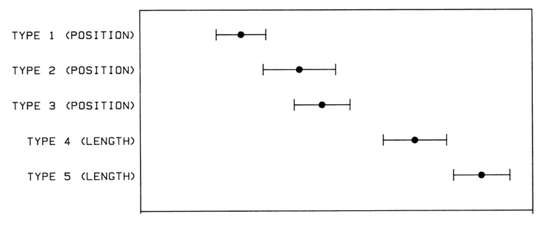 ::: footer Slides based on material from Prof. Enrico Bertini ::: ## Designing effective visualizations requires ::: {style="font-size: 1.3em; margin-top: 50px;"} ::: incremental * 🎨 **Knowing the design space** *What visual encodings and techniques are available?* * ⚖️ **Being able to compare solutions** *Which design best serves the intended purpose?* * 👁️ **Understanding human perception** *How do people actually see and interpret visual information?* ::: ::: ::: footer Slides based on material from Prof. Enrico Bertini ::: ## Data Types * The first ingredient in effective visualization is the input data. Data values can represent different forms of measurement. * What kinds of comparisons do those measurements support? * What kinds of visual encodings then support those comparisons? ::: footer Slides based on material from Prof. Jeffrey Heer [link](https://observablehq.com/@uwdata/data-types-graphical-marks-and-visual-encoding-channels) ::: ## Nominal (N) or Categorical (C) * Nominal data — also called categorical data — consist of category names. * With nominal data we can compare the equality of values: is value A the same or different than value B? (A = B), supporting statements like “A is equal to B” or “A is not equal to B”. * When visualizing nominal data we should readily perceive if values are the same or different: position, color hue (blue, red, green, etc.), and shape are all reasonable options. ::: footer Slides based on material from Prof. Jeffrey Heer [link](https://observablehq.com/@uwdata/data-types-graphical-marks-and-visual-encoding-channels) ::: ## Ordinal (O) * Ordinal data consist of values that have a specific ordering. * With ordinal data we can compare the rank-ordering of values: does value A come before or after value B? (A < B), supporting statements like “A is less than B” or “A is greater than B”. * When visualizing ordinal data, we should perceive a sense of rank-order. Position, size, or color value (brightness) might be appropriate, whereas color hue (which is not perceptually ordered) would be less appropriate. ::: footer Slides based on material from Prof. Jeffrey Heer [link](https://observablehq.com/@uwdata/data-types-graphical-marks-and-visual-encoding-channels) ::: ## Quantitative (Q) * With quantitative data we can measure numerical differences among values. * There are multiple sub-types of quantitative data: - For interval data we can measure the distance between points: (A - B). - For ratio data we can also measure proportions or scale factors: (A / B). * Quantitative values can be visualized using position, size, or color value, among other channels. An axis with a zero baseline is essential for proportional comparisons of ratio values, but can be safely omitted for interval comparisons. ::: footer Slides based on material from Prof. Jeffrey Heer [link](https://observablehq.com/@uwdata/data-types-graphical-marks-and-visual-encoding-channels) ::: ## Temporal (T) * Temporal values measure time points or intervals. This type is a special case of quantitative values (timestamps) with rich semantics and conventions (i.e., the Gregorian calendar). * Example temporal values include date strings such as “2019-01-04” and “Jan 04 2019”, as well as standardized date-times such as the ISO date-time format: “2019-01-04T17:50:35.643Z”. There are no temporal values in our global development dataset above, as the year field is encoded as an integer. ::: footer Slides based on material from Prof. Jeffrey Heer [link](https://observablehq.com/@uwdata/data-types-graphical-marks-and-visual-encoding-channels) ::: ## Spatial (S) * Data that can be shown in a map * Also known as geospatial data, refers to information that identifies the geographic location and characteristics of natural or constructed features and boundaries on the Earth. [https://atlan.com/spatial-data/](https://atlan.com/spatial-data/) ## Data Types Summary * These data types are not mutually exclusive, but rather form a hierarchy: ordinal data support nominal (equality) comparisons, while quantitative data support ordinal (rank-order) comparisons. * Moreover, these data types do not provide a fixed categorization. For example, just because a data field is represented using a number doesn't mean we have to treat it as a quantitative type! We might interpret a set of ages (10 years old, 20 years old, etc.) as nominal (underage or overage), ordinal (grouped by year), or quantitative (calculate average age). ::: footer Slides based on material from Prof. Jeffrey Heer [link](https://observablehq.com/@uwdata/data-types-graphical-marks-and-visual-encoding-channels) ::: ## Fundamental Charts * Widely adopted, effective, useful. * Solve very large percentage of vis problems. * Training ground for more sophisticated graphs. ::: footer Slides based on material from Prof. Enrico Bertini ::: ## Bar Chart ::: columns ::: {.column width="40%"} ### 📊 Definition ::: {style="font-size: 1.1em;"} Visualizes how a **quantity** distributes across **categories** ::: ### When to Use ::: {style="font-size: 1.0em;"} - Compare values across groups - Show rankings or order - Display part-to-whole relationships ::: ### Key Features ::: {style="font-size: 1.0em;"} - Length encodes value - Categories on one axis - Best for 5-20 categories ::: ::: ::: {.column width="60%"} 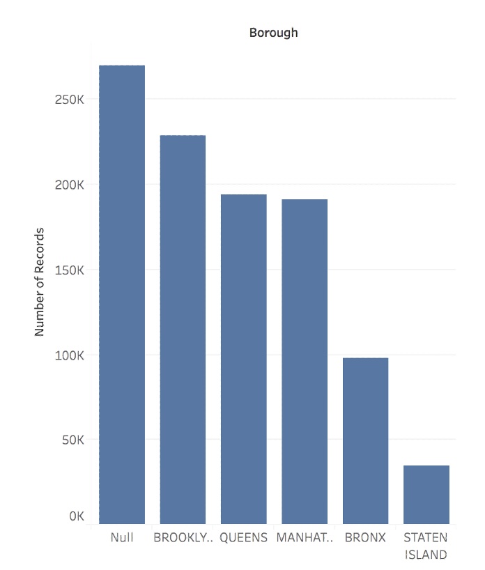{width="90%"} ::: ::: ::: footer Slides based on material from Prof. Enrico Bertini ::: ## Line Chart ::: columns ::: {.column width="40%"} ### 📈 Definition ::: {style="font-size: 1.1em;"} Shows how **quantities change** in relation to another variable (typically **time**) ::: ### When to Use ::: {style="font-size: 1.0em;"} - Track trends over time - Compare multiple time series - Identify patterns and cycles ::: ### Key Features ::: {style="font-size: 1.0em;"} - Position encodes value - Lines connect data points - Emphasizes continuity ::: ::: ::: {.column width="60%"} 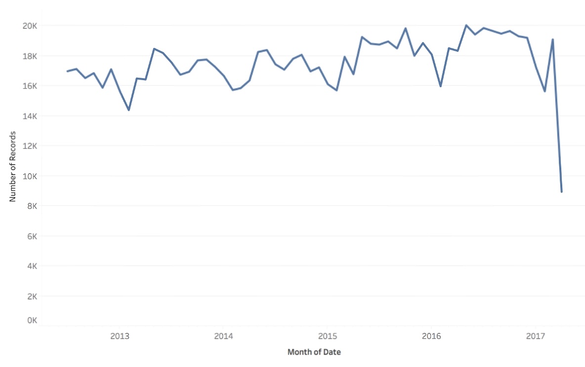{width="90%"} ::: ::: ::: footer Slides based on material from Prof. Enrico Bertini ::: ## Scatter Plot ::: columns ::: {.column width="40%"} ### 🔵 Definition ::: {style="font-size: 1.1em;"} Shows how one **quantity relates** to another **quantity** ::: ### When to Use ::: {style="font-size: 1.0em;"} - Show correlations - Identify clusters or outliers - Compare distributions ::: ### Key Features ::: {style="font-size: 1.0em;"} - X/Y position encode values - Each point = one observation - Reveals patterns in data ::: ::: ::: {.column width="60%"} 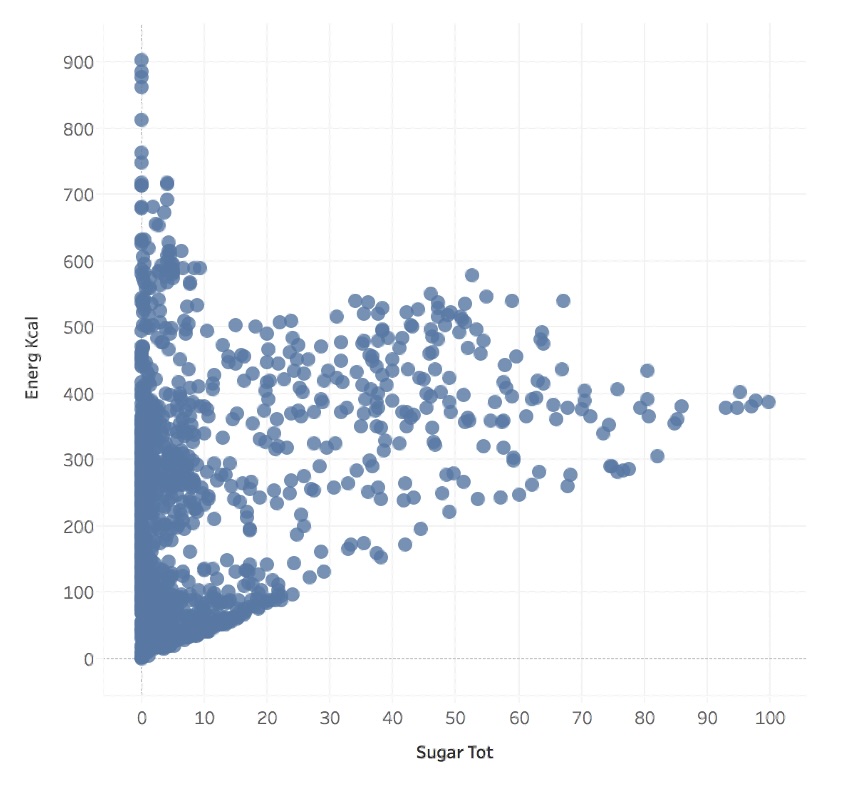{width="90%"} ::: ::: ::: footer Slides based on material from Prof. Enrico Bertini ::: ## Matrix ::: columns ::: {.column width="40%"} ### 🔲 Definition ::: {style="font-size: 1.1em;"} Shows how **quantities distribute** across **two categories** ::: ### When to Use ::: {style="font-size: 1.0em;"} - Show relationships between categories - Display correlation matrices - Visualize adjacency/similarity ::: ### Key Features ::: {style="font-size: 1.0em;"} - Color/size encode values - Row/column structure - Compact representation ::: ::: ::: {.column width="60%"} 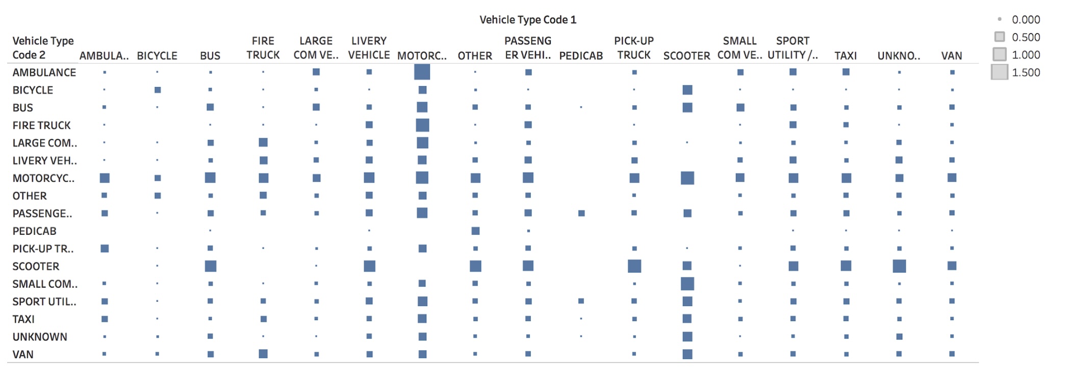{width="90%"} ::: ::: ::: footer Slides based on material from Prof. Enrico Bertini ::: ## Symbol Map ::: columns ::: {.column width="40%"} ### 📍 Definition ::: {style="font-size: 1.1em;"} Shows how **quantities distribute** across **spatial coordinates** ::: ### When to Use ::: {style="font-size: 1.0em;"} - Display geographic data - Show spatial distributions - Compare locations ::: ### Key Features ::: {style="font-size: 1.0em;"} - Position = location - Size/color = magnitude - Geographic context ::: ::: ::: {.column width="60%"} 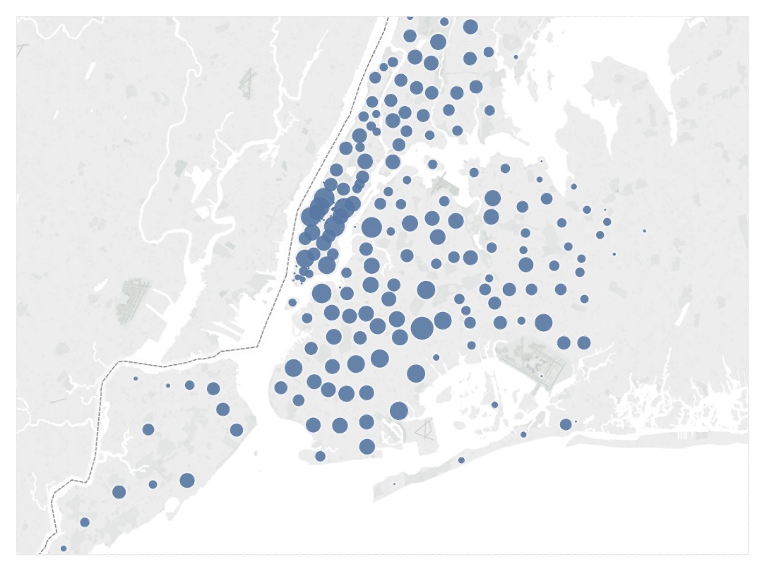{width="90%"} ::: ::: ::: footer Slides based on material from Prof. Enrico Bertini ::: ## Fundamental Graphs Summary ::: {style="text-align: center;"} 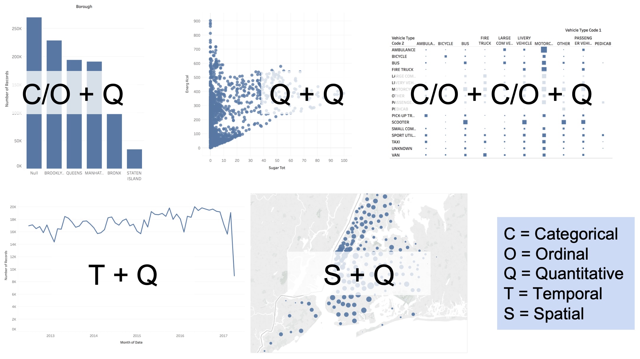 ::: ::: footer Slides based on material from Prof. Enrico Bertini ::: ## Scatter Plots + Faceting (without) ::: {style="text-align: center;"} 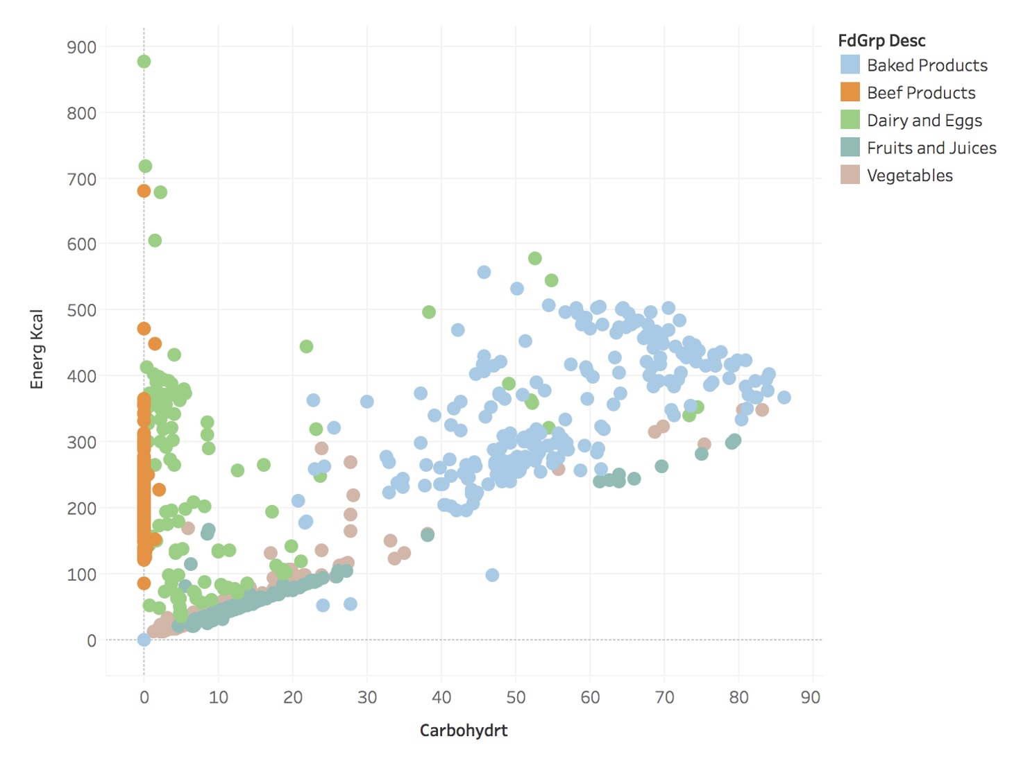 ::: ::: footer Slides based on material from Prof. Enrico Bertini ::: ## Scatter Plots + Faceting (with) 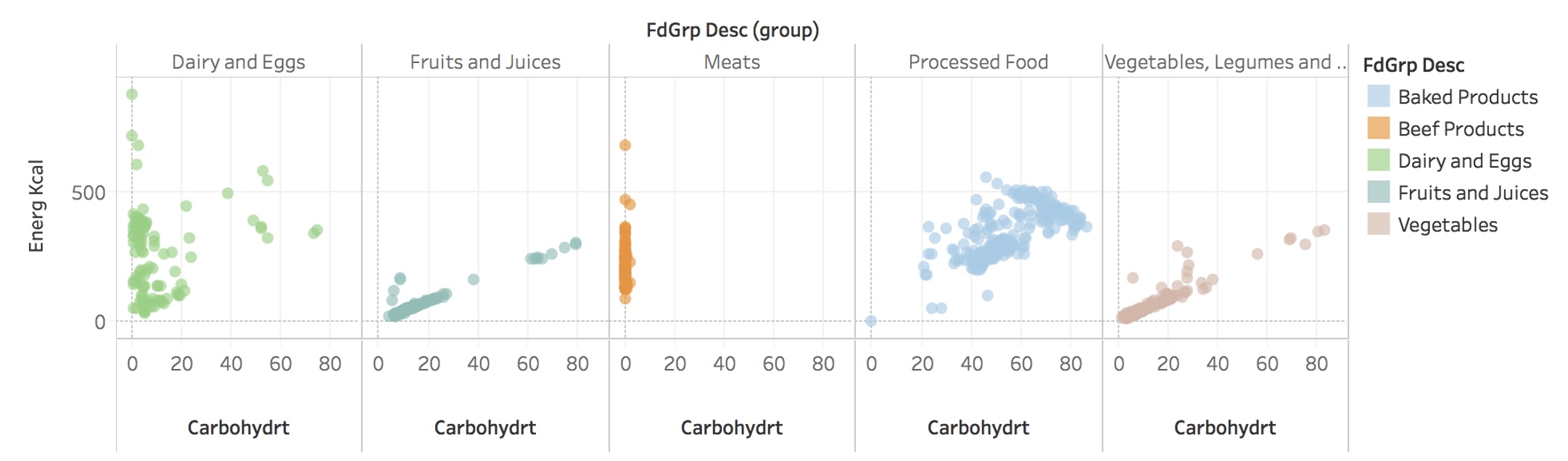 ::: footer Slides based on material from Prof. Enrico Bertini ::: ## Tidy Data :::: {.columns} ::: {.column width="50%"} ::: {style="font-size: 1.3em; margin-top: 50px;"} **Goal:** organizing data to make visualization easier [Link to paper](https://vita.had.co.nz/papers/tidy-data.pdf) ::: ::: ::: {.column width="50%"} 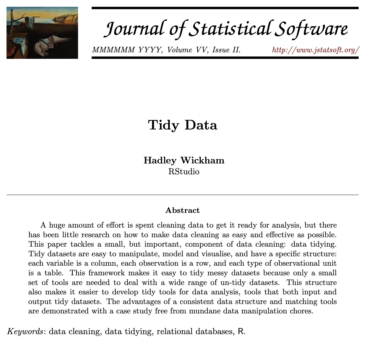 ::: :::: ::: footer Slides based on material from Hadley Wickham ::: ## Tidy Data 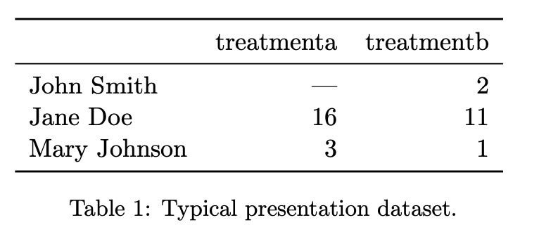 ::: footer Slides based on material from Hadley Wickham ::: ## Tidy Data  ::: footer Slides based on material from Hadley Wickham ::: ## Tidy Data  ::: footer Slides based on material from Hadley Wickham ::: ## Tidy Data: Definition ::: {style="font-size: 1.3em; margin-bottom: 30px;"} In tidy data: * Each **variable** forms a **column** * Each **observation** forms a **row** * Each type of **observational unit** forms a **table** ::: ::: footer Slides based on material from Hadley Wickham ::: ## Tidy Data: Example #1  ::: footer Slides based on material from Hadley Wickham ::: ## Tidy Data  ::: footer Slides based on material from Hadley Wickham ::: ## Tidy Data: Example #2  ::: footer Slides based on material from Hadley Wickham ::: ## Tidy Data  ::: footer Slides based on material from Hadley Wickham ::: ## Graphical Encoding Every visualization can be described in terms of: * its basic graphical components * mapping strategy between data and graphics * more precisely, a set of mappings between: - data items --- visual marks - data attributes --- visual channels ::: footer Slides based on material from Hadley Wickham ::: ## Graphical Marks  ::: footer Slides based on material from Prof. Enrico Bertini ::: ## Visual Encoding Channels ::: {style="text-align: center;"}  ::: ::: footer Slides based on material from Prof. Enrico Bertini ::: ## Visualization Decoding * Marks --- Data Items * Channels --- Data Attributes ::: footer Slides based on material from Prof. Enrico Bertini ::: ## Examples ::: {style="text-align: center;"}  ::: [NYT link](http://www.nytimes.com/interactive/2012/08/05/sports/olympics/the-100-meter-dash-one-race-every-medalist-ever.html?_r=0) ::: footer Slides based on material from Prof. Enrico Bertini ::: ## Expressiveness Principle The visual representation should express the type of information that exists in the data. * Ordered data should not appear as unordered. * Unordered data should not appear as ordered. ## Effectiveness Principle Relevance of information should match the effectiveness of the channels used. - Represent important information with more effective channels ## Effectiveness Effect ::: {style="text-align: center;"}  ::: ## Summary * Visual Encoding/Decoding * Graphical Marks and Channels * Expressiveness and Effectiveness * Channels Appropriateness and Ranking * Evaluation and Design * Contextual Components - Labels, legends and annotations - Axes, grids and trend lines ::: footer Slides based on material from Prof. Enrico Bertini ::: ## Neo: Interactive Confusion Matrices Great example of research in VisML! [video link](https://www.youtube.com/watch?v=LmsJJDHfGlI) ---
