Model Assessment and Evaluation

DS-GA 3001 - Fall 2026

Claudio Silva

NYU Center for Data Science

2026-09-22

Model Assessment

Agenda


  1. Confusion Matrices and ROC Curves

  2. Visual Analytics Systems for Model Performance

  3. Calibration

Confusion Matrices, ROC Curves

Scenario: Disease Prediction

  • Consider a disease prediction model. Suppose the hypothetical disease has a 5% prevalence in the population

  • The given model converges on the solution of predicting that nobody has the disease (i.e., the model predicts “0” for every observation)

  • Our model is 95% accurate

  • Yet, public health officials are stumped

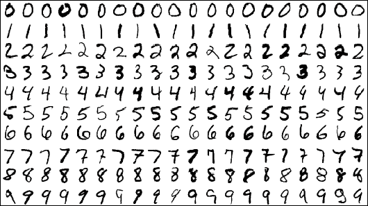
Scenario: Handwritten Digits

  • Consider a model to identify handwritten digits. All digits are equally probable and equally represented in the training and test datasets.

  • The model correctly identifies all of the digits, except for digit \(5\), classifying half of the \(5\)s samples as \(6\) and the other half is correctly identified

  • The accuracy of this model is \(95\%\). Is this information enough to determine whether the model is good or not?
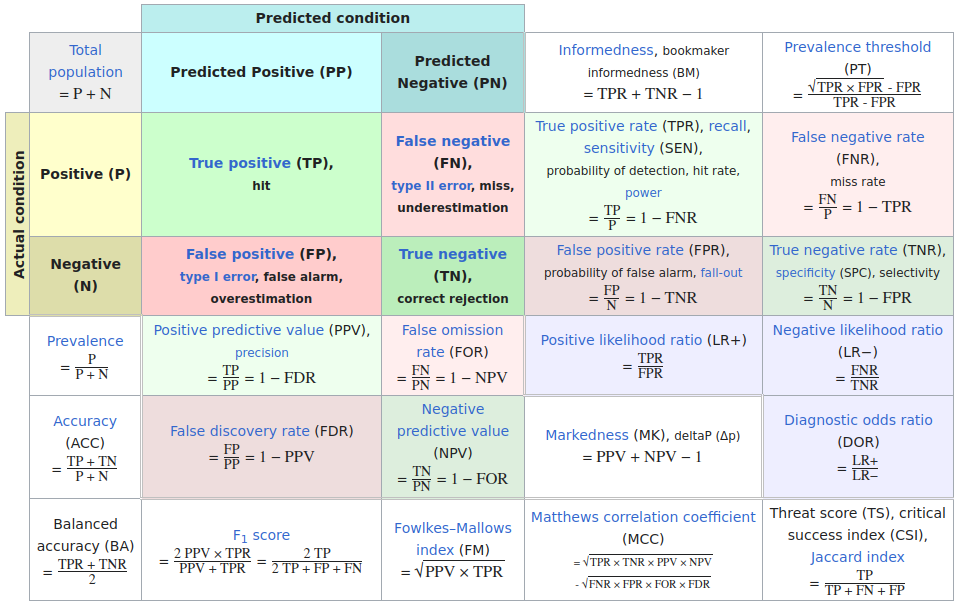
Extended Confusion Matrix
Confusion Matrices: A Deeper Look
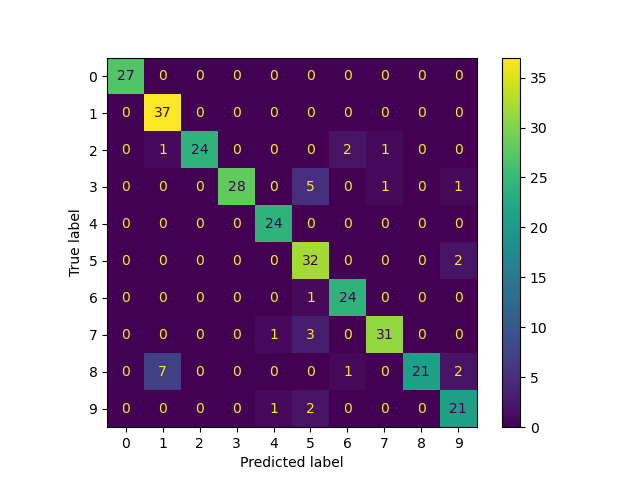
scikit-learn digits: label spreading trained on 40 labelled images, tested on 300 (accuracy 90%)

Reading it: rows are the true label, columns the predicted label. The diagonal is correct.

Pros

  • Shows which classes are confused, not just how many errors
  • Precision, recall and F1 for every class can be read off it

Cons

  • Scales badly: 100 classes means 10,000 cells
  • Drops the scores: “barely wrong” and “confidently wrong” count the same
  • Hides the instances behind each count

Squares, Neo and the confusion wheel, later today, each attack one of these.

Confusion Matrices: Spend the Colour on the Errors

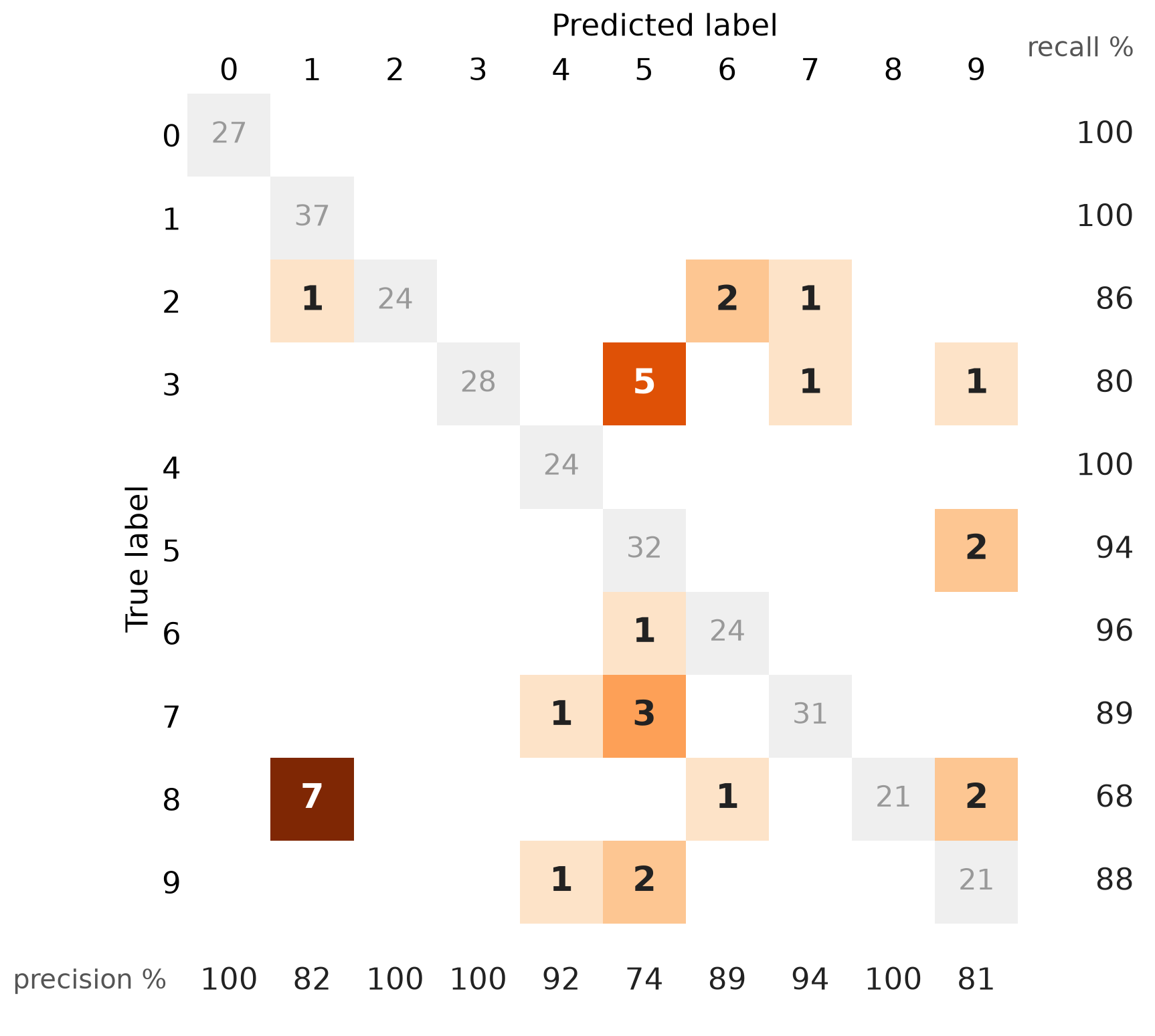
  • Same matrix. The diagonal is now grey: colour is spent only on mistakes
  • Right margin: recall per true class. Bottom margin: precision per predicted class
  • 8 is the weakest class (68% recall); 5 is a sink that absorbs 3s, 7s, 9s and a 6 (74% precision)

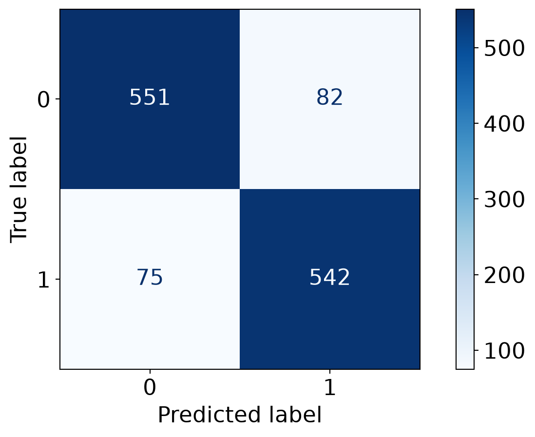
Confusion Matrices in sklearn

from sklearn import datasets
from sklearn.linear_model import LogisticRegression
from sklearn.model_selection import train_test_split

X,y = datasets.make_classification(5000, 10, random_state=42)
X_train, X_test, y_train, y_test = train_test_split(X, y, random_state=42)
clf = LogisticRegression(random_state=0)
import matplotlib.pyplot as plt
from sklearn.metrics import ConfusionMatrixDisplay

clf.fit(X_train, y_train)

ConfusionMatrixDisplay.from_estimator(clf, X_test, y_test, cmap=plt.cm.Blues)
plt.show()

Neo: Hierarchical Confusion Matrix

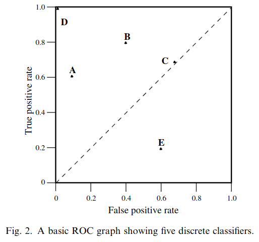
Receiver Operating Characteristic (ROC)

  • ROC analysis is another way to assess a classifier’s output

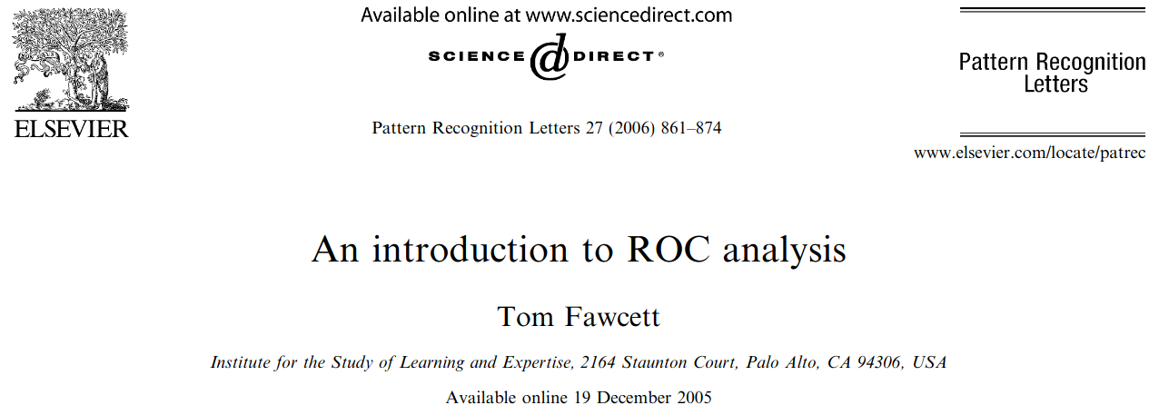
  • ROC analysis developed out of radar operation in the second World War, where operators were interested in detecting signal (enemy aircraft) versus noise

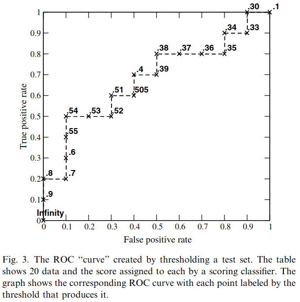
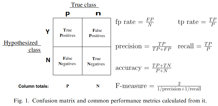
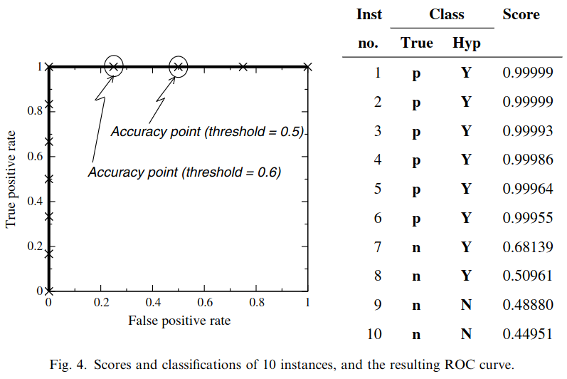
  • We create an ROC curve by plotting the true positive rate (TPR) against the false positive rate (FPR) at various thresholds

    • True Positive Rate (TPR), also known as Recall or Sensitivity, is the proportion of actual positives that are correctly identified as such (TP / (TP + FN)).

    • False Positive Rate (FPR) is the proportion of actual negatives that are incorrectly identified as positive (FP / (FP + TN)).
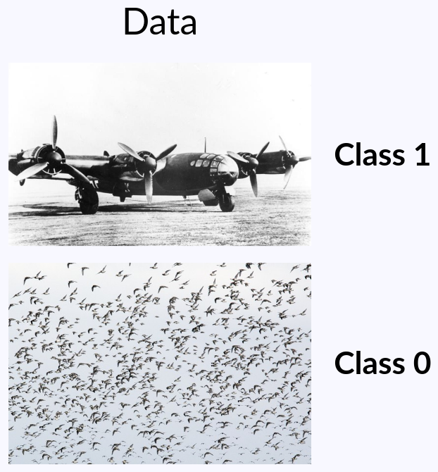
ROC Curve
ROC Curve
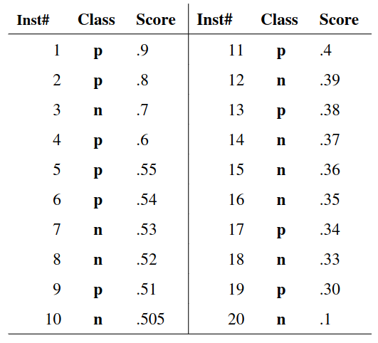
ROC Curve
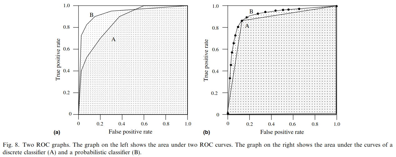
Area under an ROC curve (AUC)
ROC curve in sklearn
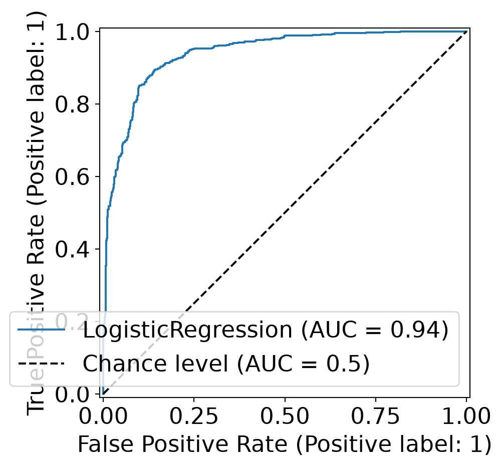
import matplotlib.pyplot as plt
from sklearn.metrics import RocCurveDisplay

RocCurveDisplay.from_estimator(clf, X_test, y_test, plot_chance_level=True)
plt.show()

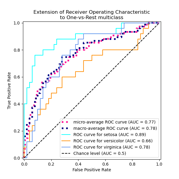
Multiclass ROC curve


Micro-average: Pool every one-vs-rest decision into a single curve. Each sample counts equally, so the large classes dominate.

Macro-average: Compute a curve per class, then average them. Each class counts equally, so a small, badly served class still shows up.

ROC Curves: Strengths and Limitations

  • What they show: True Positive Rate (TPR) vs. False Positive Rate (FPR)
  • Insensitive to class balance: by design, since TPR and FPR each stay within one true class. The curve is the same whatever the prevalence
  • Limitation: it never shows precision. At low prevalence a tiny FPR still means most positive predictions are wrong, and the plot gives no warning

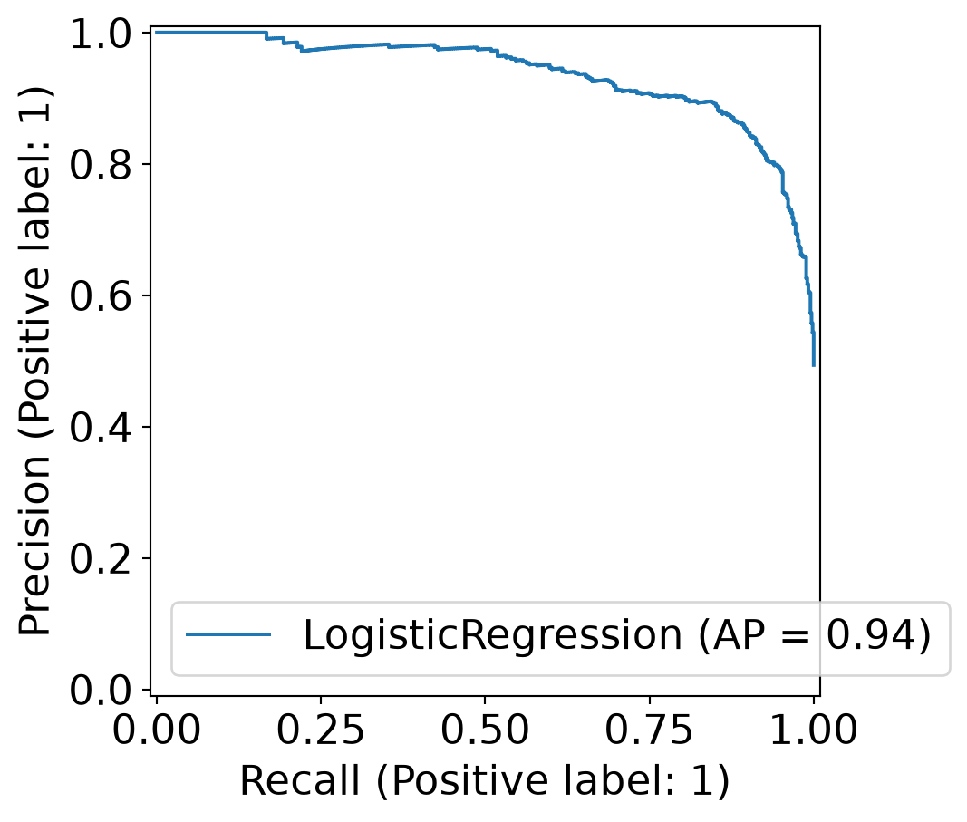
Precision-Recall (PR) Curves

  • What they show: Precision (TP / predicted positive) against Recall (TP / actual positive), as the threshold sweeps
  • Three cells, not four: PR uses TP, FP and FN, and ignores the true negatives. It describes the positive class only
  • Chance is not the diagonal: the baseline is a horizontal line at the positive rate, so it drops as positives get rarer
  • Summary number: average precision (AP), the area under the curve
  • Advantage: high precision and high recall really is a good model: it finds the positives and most of what it flags is right

Precision-Recall curve in sklearn

import matplotlib.pyplot as plt
from sklearn.metrics import PrecisionRecallDisplay

PrecisionRecallDisplay.from_estimator(clf, X_test, y_test)
plt.show()

Visual Analytics Systems for Model Performance

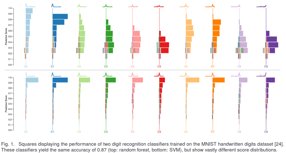
Squares (2016)

Alsallakh et al. (2014)
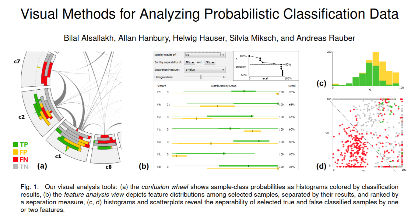
Alsallakh et al. (2014)
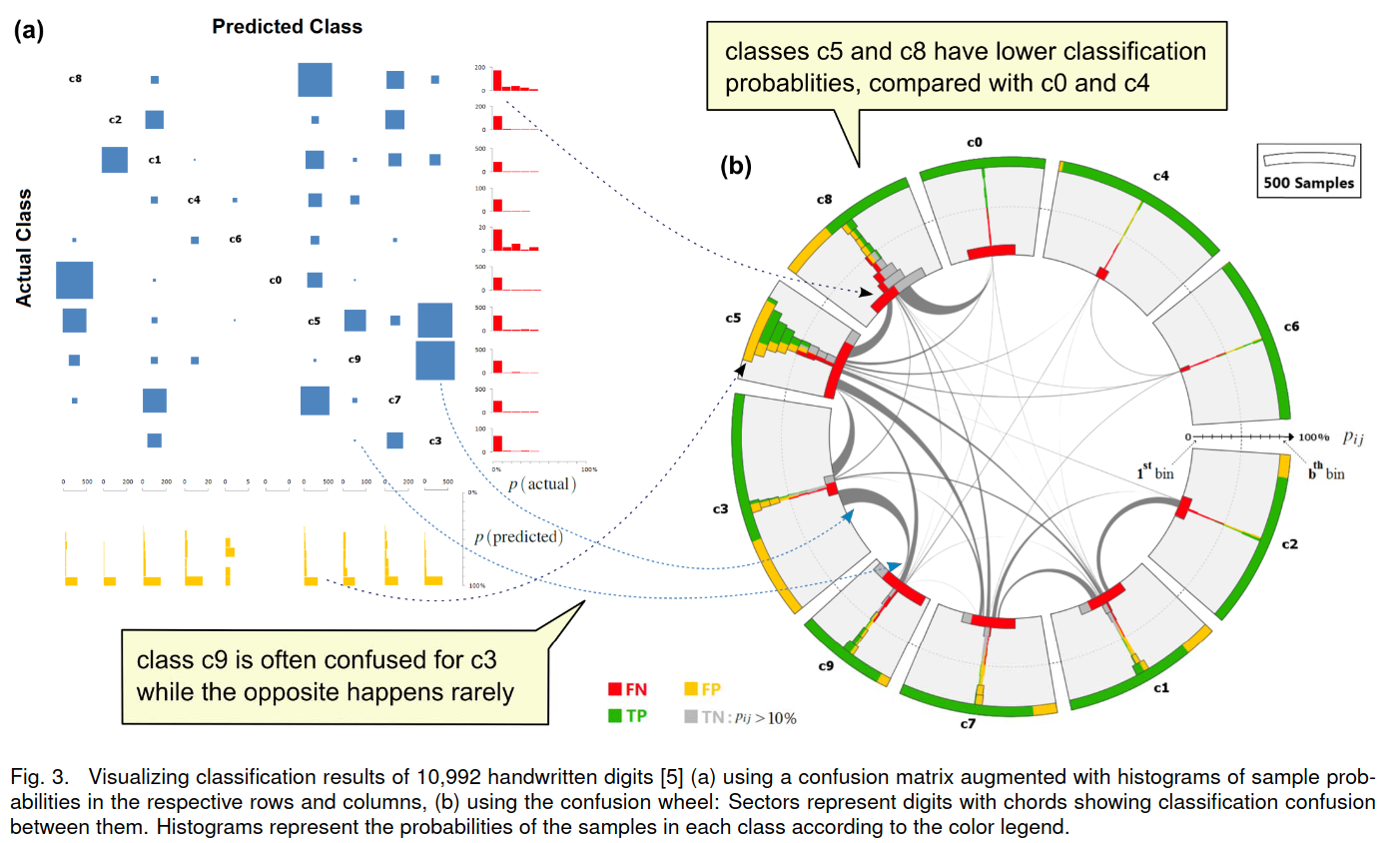
Beauxis-Aussalet and Hardman (2014)
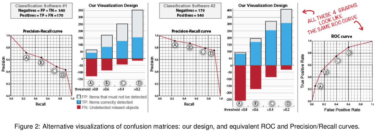
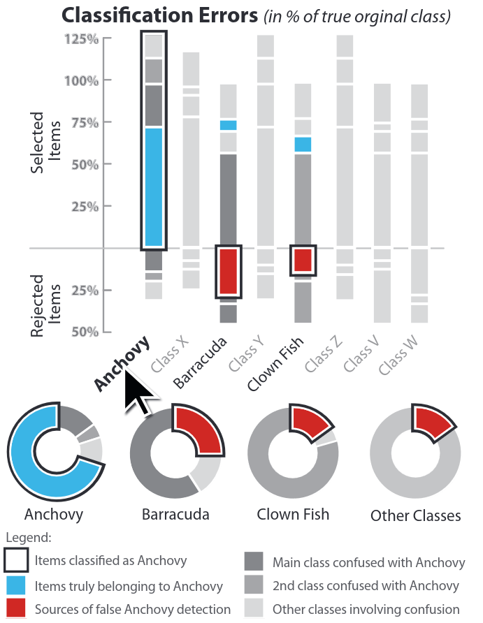
Beauxis-Aussalet and Hardman (2014)
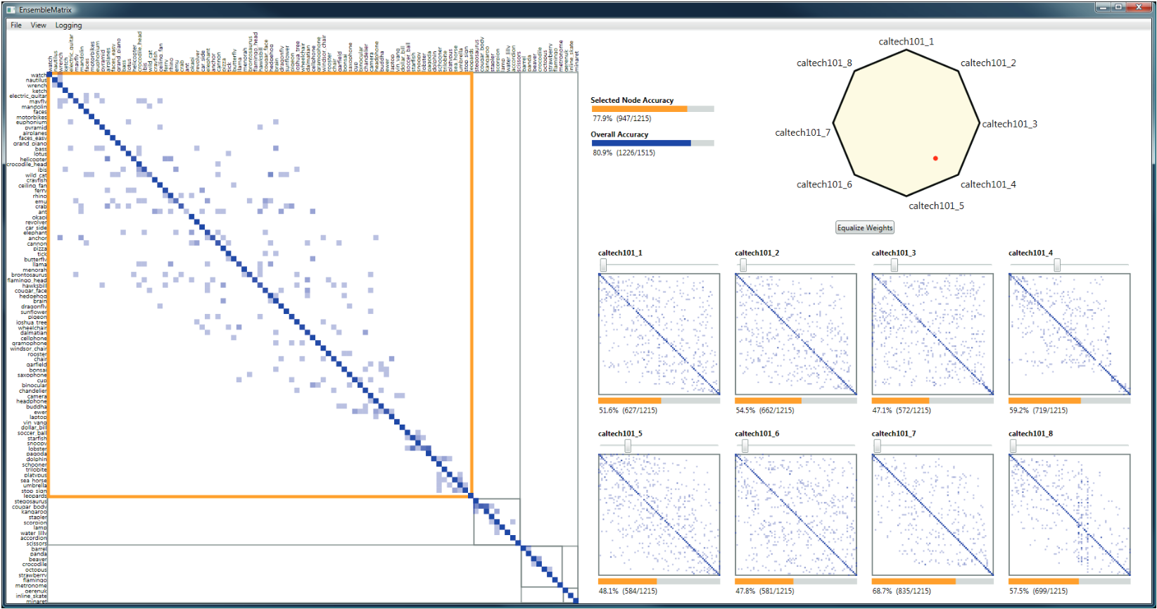
EnsembleMatrix (2009)
Calibration

What is calibration?

  • When performing classification, we often are interested not only in predicting the class label, but also in the probability of the output

  • This probability gives us a kind of confidence score on the prediction

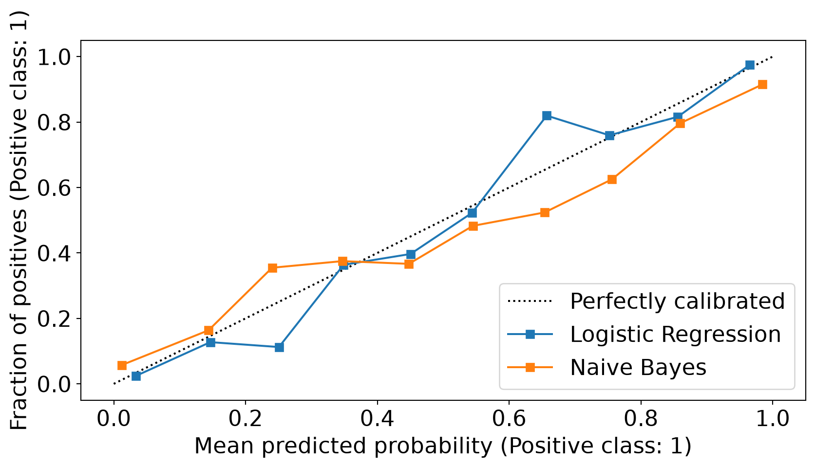
  • However, a model can separate the classes well (having a good accuracy/AUC), but be poorly calibrated. In this case, the estimated class probabilities are far from the true class probabilities

  • We can calibrate the model, changing the scale of the predicted probabilities

Calibration - Forecast Example

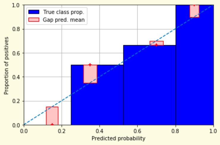
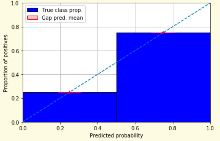
Weather forecasters started thinking about calibration a long time ago (Brier, 1950): a forecast of “70% chance of rain” should be followed by rain 70% of the time. Let’s consider a small toy example:
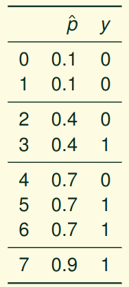
This forecast is doing well at predicting the rain:

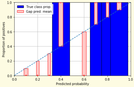
  • “10% chance of rain” was a slight over-estimate: \((\bar{y} = 0/2 = 0\%)\)
  • “40% chance of rain” was a slight under-estimate: \((\bar{y} = 1/2 = 50\%)\)
  • “70% chance of rain” was a slight over-estimate: \((\bar{y} = 2/3 = 67\%)\)
  • “90% chance of rain” was a slight under-estimate: \((\bar{y} = 1/1 = 100\%)\)

Visualizing forecasts - The Reliability Diagram
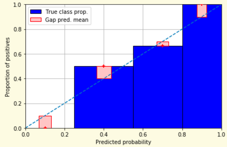
Reliability diagram - Changing values
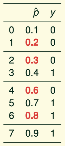
Reliability diagram - Changing grouping
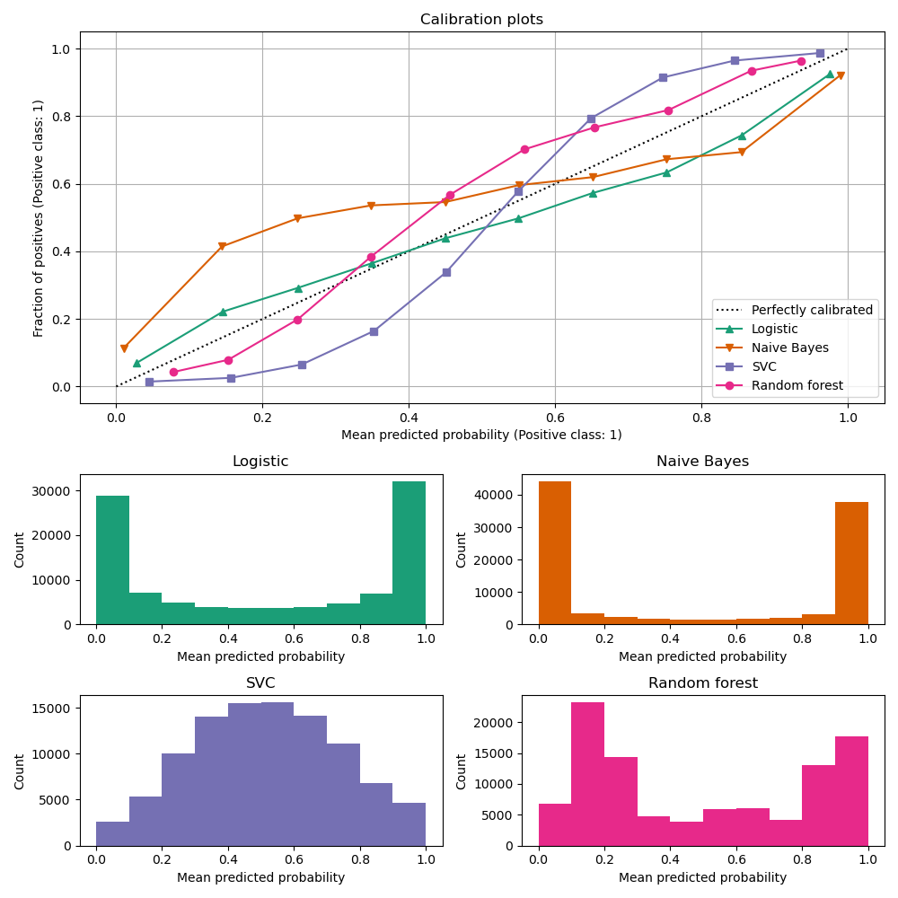
Reliability Diagram in sklearn

import matplotlib.pyplot as plt
from sklearn.calibration import CalibrationDisplay

fig = plt.figure()
ax = fig.add_subplot(111)

CalibrationDisplay.from_estimator(lg, X_test, y_test, n_bins=10, ax=ax,
                                  label='Logistic Regression')
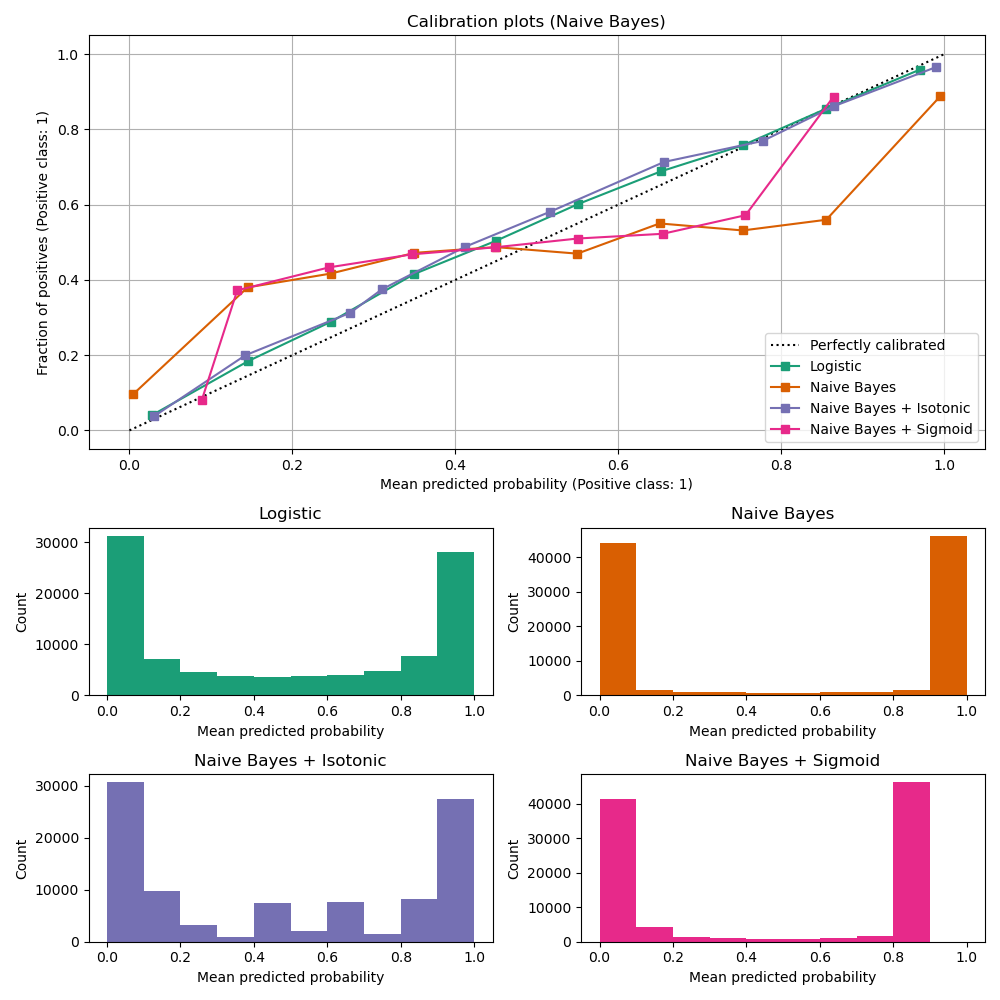
CalibrationDisplay.from_estimator(nb, X_test, y_test, n_bins=10, ax=ax,
                                  label='Naive Bayes')
Common sources of miscalibration

  • Underconfidence: a classifier thinks it’s worse at separating classes than it actually is.

    • Underconfidence typically gives sigmoidal distortions
    • To calibrate these means to pull predicted probabilities away from the centre
  • Overconfidence: a classifier thinks it’s better at separating classes than it actually is

    • Here, distortions are inverse-sigmoidal
    • Calibrating these means to push predicted probabilities toward the centre

A classifier can be overconfident for one class and underconfident for the other

Reliability Diagram in sklearn

Calibration metrics

Let \(N\) be the total number of samples, \(B\) the number of bins, \(n^b\) the samples in bin \(b\), \(acc(b)\) the fraction of positives in bin \(b\), and \(conf(b)\) the average predicted probability in bin \(b\).

  • Expected Calibration Error:

\(ECE = \sum_{b=1}^B \frac{n^b}{N}|acc(b) - conf(b)|\)

  • Maximum Calibration Error:

\(MCE = \underset{b \in \{1,2,\dots,B\}}{\text{max}} |acc(b) - conf(b)|\)

Perfectly Calibrated, and Useless

  • Predict the base rate for everyone: “there is a 5% chance you have the disease”, for every patient alike

  • Every group’s observed frequency matches its prediction, so ECE = 0 and the reliability diagram sits on the diagonal

  • Yet it ranks nobody above anybody: AUC = 0.5, and it never identifies a single patient

  • Calibration is being right on average; sharpness is committing to a prediction. A useful model needs both

  • Recalibration can repair a sharp but miscalibrated model. Nothing repairs an unsharp one

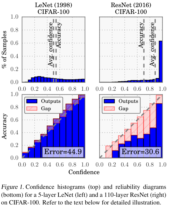
Calibration of modern models

Calibration of modern models
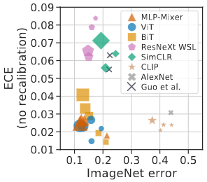
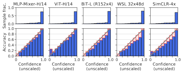
Architecture and pre-training, not size, drive calibration: ViT and MLP-Mixer are both the most accurate and among the best calibrated. In-distribution, calibration degrades slightly with size; under distribution shift the effect reverses

Is the 2017 Story Still True?

  • The observation held: those CNNs really were overconfident, and temperature scaling really does fix them cheaply

  • The extrapolation did not. A benchmark over 117,000 architectures finds no universal accuracy-calibration trade-off, and attributes “calibration decreases with model size” to survivorship bias in the 2017 model grid

  • The direction has flipped for foundation models: ConvNeXt, EVA and BEiT come out underconfident in-distribution, though better calibrated under distribution shift

  • For LLMs: pre-trained next-token probabilities are close to calibrated; SFT and RLHF degrade that. For RLHF’d models, asking for a stated confidence often beats the token probabilities

  • So: measure calibration for your model on your distribution. Do not inherit a trend from a paper

Proper Scoring Rules

  • Proper scoring rules are calculated at the observation level, whereas ECE is binned

  • Think of them as putting each item in its separate bin, then computing the average of some loss for each predicted probability and its corresponding observed label
What Makes a Scoring Rule Proper?

  • You believe \(q\), you report \(p\). Your expected score is \(\ q\,S(p,1) + (1-q)\,S(p,0)\)

  • Proper: \(p = q\) is optimal. Strictly proper: \(p = q\) is the only optimum, so honesty is uniquely best

  • Accuracy is not strictly proper. Believing 0.6, claiming \(1.0\) scores exactly the same: every report above \(0.5\) ties. It cannot tell \(0.51\) from \(0.99\)

  • Absolute error \(|p - y|\) is worse: its expectation \(q + p(1 - 2q)\) is linear in \(p\), so the unique optimum is \(p = 0\) or \(1\). It pays you to overclaim

  • A metric that is indifferent to your uncertainty, or rewards overstating it, cannot judge probabilities. Next: two that do neither

Proper Scoring Rules

  • Brier Score/Quadratic error/Euclidean distance:

\[BS = \frac{1}{N} \sum_{i=1}^N (\hat{y}_i - y_i)^2\]

  • Log-loss/Cross entropy:

    • Frequently used as the training loss of machine learning methods, such as neural networks

    • Only penalises the probability given to the true class

\[LL = -\frac{1}{N} \sum_{i=1}^N [y_i \text{log}(\hat{y}_i) + (1-y_i)\text{log}( 1 - \hat{y}_i)]\]

Proper Scoring Rules

An intuitive way to decompose proper scoring rules is into refinement and calibration losses

  • Refinement loss: is the loss due to producing the same probability for instances from different classes

  • Calibration loss: is the loss due to the difference between the probabilities predicted by the model and the proportion of positives among instances with the same output

Calibration Techniques

Parametric calibration involves modelling the score distributions within each class

  • Platt scaling: Logistic calibration can be derived by assuming that the scores within both classes are normally distributed with the same variance (Platt, 2000)

  • Beta calibration: employs Beta distributions instead, to deal with scores already on a [0, 1] scale (Kull et al., 2017)

  • Dirichlet calibration for more than two classes (Kull et al., 2019)

Non-parametric calibration often ignores scores and employs ranks

  • Isotonic regression fits a non-parametric isotonic regressor, which outputs a step-wise non-decreasing function

Platt scaling

  • Assumes the calibration curve can be corrected by applying a sigmoid to the raw predictions. This means finding \(\mathbf{A}\) and \(\mathbf{b}\) via MLE:

\(p(y_i = 1 | \hat{y}_i) = \frac{1}{1 + exp(\mathbf{A}\hat{y}_i + \mathbf{b})}\)

  • Works best if the calibration error is symmetrical (classifier output for each binary class is normally distributed with the same variance)

  • This can be a problem for highly imbalanced classification problems, where outputs do not have equal variance

  • In general it is most effective when the un-calibrated model is under-confident and has similar calibration errors for both high and low outputs

Isotonic regression

  • Fits a non-parametric isotonic regressor, which outputs a step-wise non-decreasing function

  • Isotonic regression is more general when compared to Platt scaling, as the only restriction is that the mapping function is monotonically increasing

  • Is more powerful as it can correct any monotonic distortion of the un-calibrated model

  • However, it is more prone to overfitting, especially on small datasets

Temperature Scaling

  • Guo et al.’s fix for a modern network: divide the logits by a single learned scalar \(T\) before the softmax

\[\hat{q}_i = \max_k \ \sigma_{SM}(z_i / T)^{(k)}\]

  • \(T > 1\) softens the distribution (raises its entropy); \(T = 1\) leaves the network unchanged; \(T \to \infty\) gives uniform

  • \(T\) is fitted by minimising NLL on a held-out validation set. The network’s weights are never touched

  • Dividing every logit by the same number cannot change which one is largest, so accuracy is unchanged

  • One parameter, so it rarely overfits: the special case of Platt scaling used for deep nets today

Calibration in sklearn

Calibration in sklearn
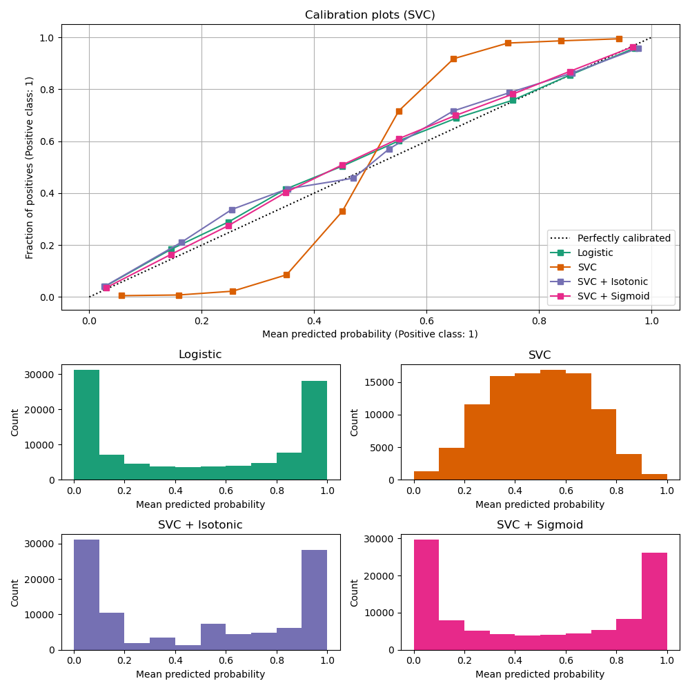
Calibration Takeaways

  • Reliability diagrams are a standard way to visualize calibration

  • ECE is a summary of what reliability diagrams show

  • Proper scoring rules (Log loss, Brier score) measure different aspects of probability correctness

  • However, proper scoring rules cannot tell us where a model is miscalibrated

  • Calibration is not quality: the base-rate predictor scores ECE 0. Always report it beside AUC or a proper scoring rule

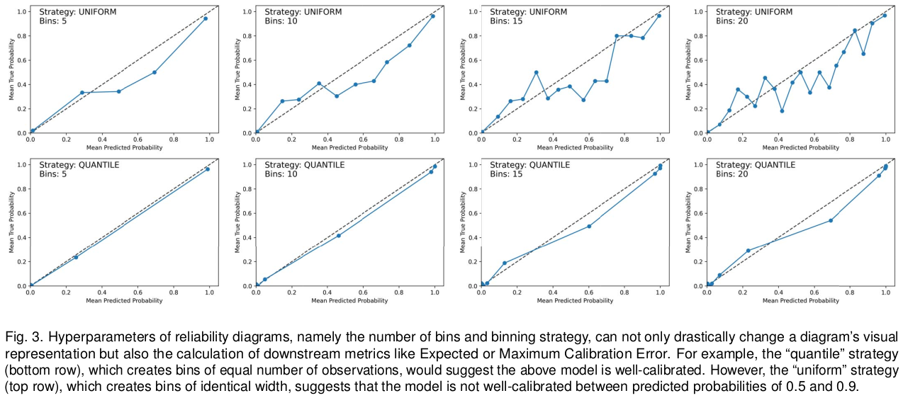
  • Every number here depends on the binning, which papers rarely report. The rest of this section is about that

Hyperparameters of reliability diagrams
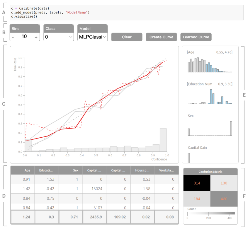
Calibrate (2023)
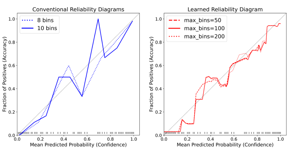
Calibrate (2023) - Learned Reliability Diagram
Calibrate (2023)

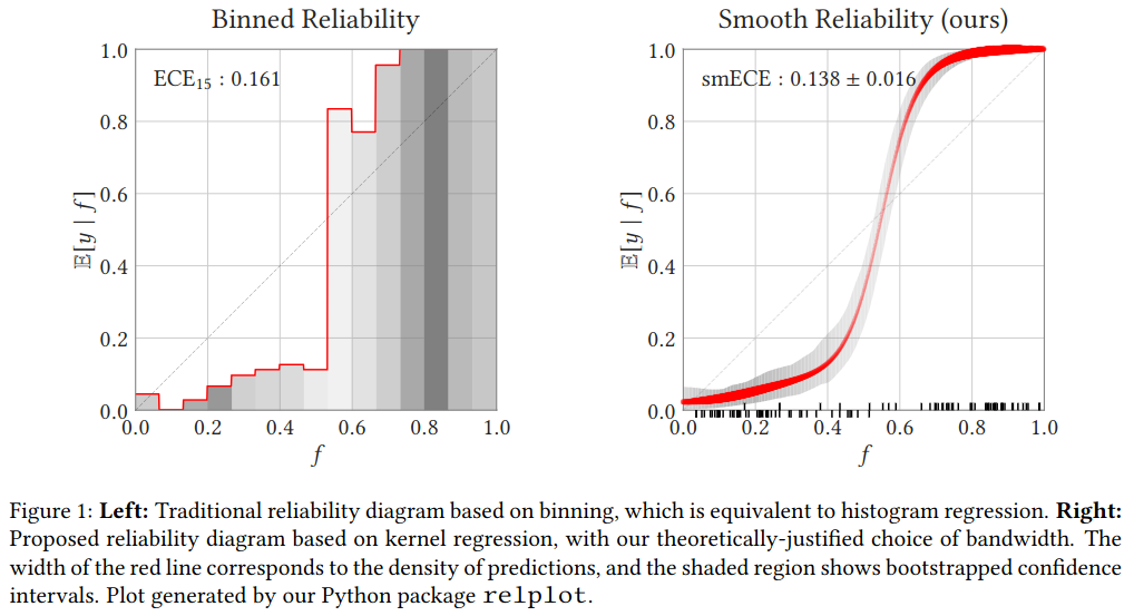
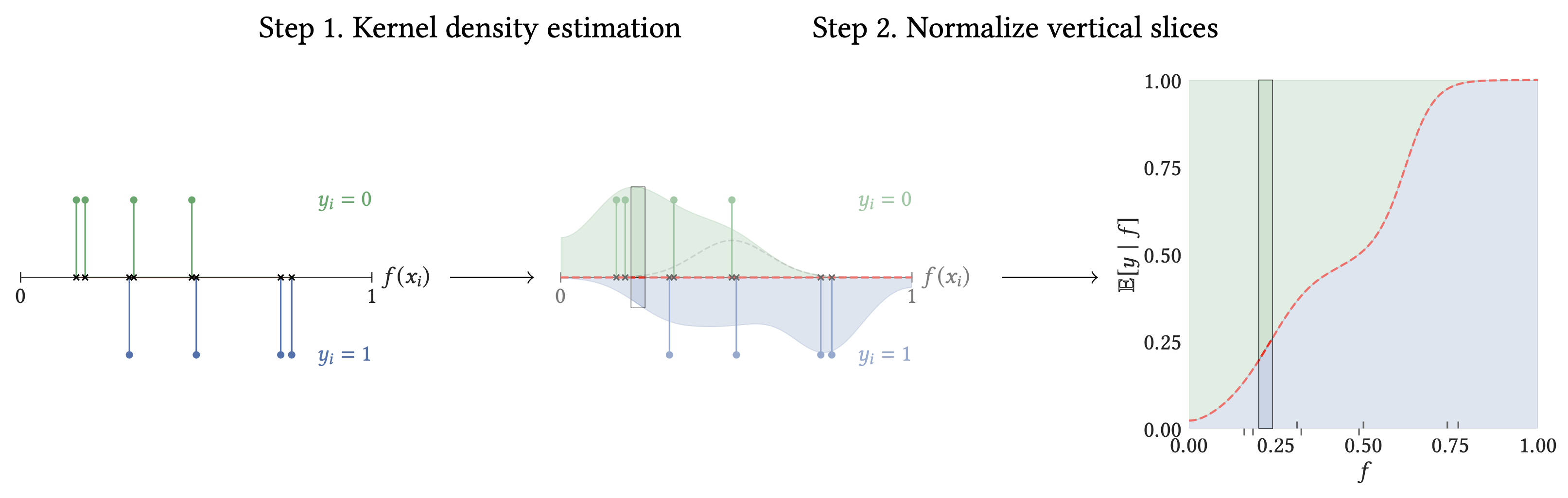
Smooth ECE (2023)

Smooth ECE (2023)

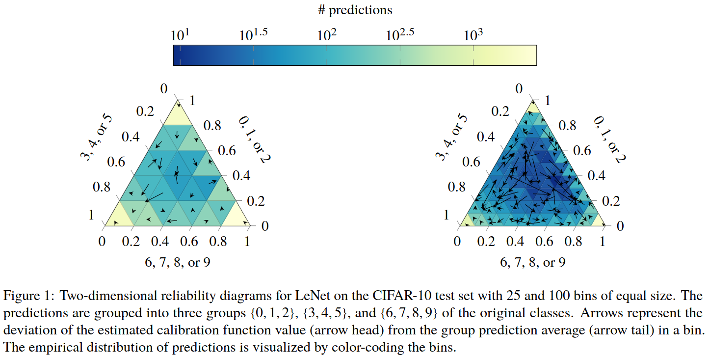
Visualizing Calibration for Multi-Class Problems
Suggested Calibration Literature

Suggested Calibration Literature