# Model Assessment ## Agenda \ 1. Confusion Matrices and ROC Curves 2. Visual Analytics Systems for Model Performance 3. Calibration ::: {.notes} Today we're going to talk about model assessment and evaluation. We'll start with some of the most common tools: confusion matrices and ROC curves. Then we'll look at some more advanced visual analytics systems for evaluating model performance. Finally, we'll do a deep dive into the concept of calibration, which is becoming increasingly important in modern machine learning. ::: # Confusion Matrices, ROC Curves ## Scenario: Disease Prediction * Consider a disease prediction model. Suppose the hypothetical disease has a 5% prevalence in the population * The given model converges on the solution of predicting that nobody has the disease (i.e., the model predicts "0" for every observation) * Our model is 95% accurate * Yet, public health officials are stumped ::: {.notes} This scenario illustrates a common problem with using a single metric like accuracy to evaluate a model, especially with imbalanced datasets. A model can achieve high accuracy by simply predicting the majority class, but it will be useless in practice. This is why we need more sophisticated evaluation methods. ::: ## Scenario: Handwritten Digits * Consider a model to identify handwritten digits. All digits are equally probable and equally represented in the training and test datasets. * The model correctly identifies all of the digits, except for digit $5$, classifying half of the $5$s samples as $6$ and the other half is correctly identified * The accuracy of this model is $95\%$. Is this information enough to determine whether the model is good or not? ::: {.notes} This is another example of how accuracy can be misleading. The model is 95% accurate, but it has a specific, systematic error: it confuses the digit 5 with 6. A single accuracy number hides this important information. We need tools that can show us *what* kinds of errors the model is making. ::: {fig-align="center"} ::: {.notes} This slide shows examples of handwritten digits from the MNIST dataset, which is a widely used benchmark for image classification models. As we just discussed, even with a high accuracy of 95%, there can be underlying issues with how specific digits are classified. ::: ## Extended Confusion Matrix 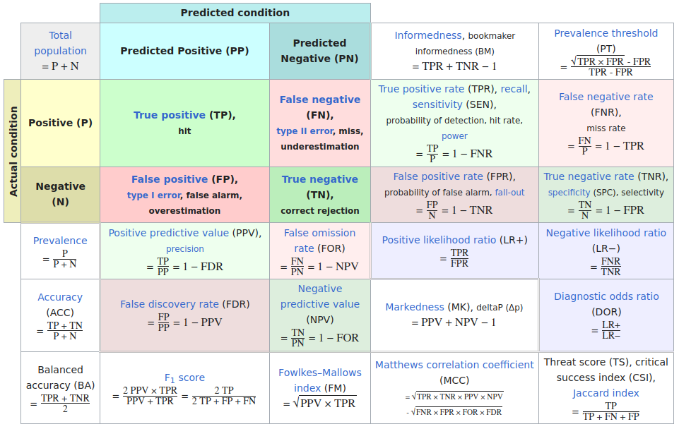{fig-align="center"} ::: {.notes} Here is a more detailed view of a confusion matrix. It shows the number of true positives, true negatives, false positives, and false negatives. From these four numbers, we can calculate many other metrics, such as precision, recall, and F1-score. It also shows the per-class precision and recall. ::: ## Confusion Matrices: A Deeper Look ::::::: {.columns} ::: {.column} 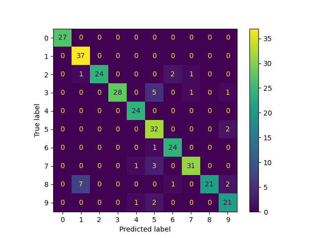 ::: ::: {.column} **Pros** - **Intuitive:** Easy to understand the concept of correct and incorrect classifications. - **Standardized Metrics:** Forms the basis for many standard evaluation metrics like precision, recall, and F1-score. - **Error Analysis:** Helps to identify which classes are being confused with each other. **Cons** - **Scalability:** Can be hard to visualize and interpret for a large number of classes. The matrix becomes a large, dense grid. - **Probabilistic Output:** Doesn't directly show the model's confidence in its predictions. A prediction that was 'barely wrong' is treated the same as one that was 'very wrong'. - **Instance-level Detail:** Hides instance-level details. You can't see individual errors. - **The "Squares" paper by Ren et al. (2016) points out that confusion matrices can obscure important patterns in model behavior and make it hard to prioritize what to fix.** ::: :::: ::: {.notes} This slide provides a balanced view of confusion matrices. While they're one of our most fundamental tools for understanding classification performance, they have important limitations. The key insight here is that confusion matrices treat all errors equally - they don't show the confidence of predictions or instance-level details. This is why we'll look at more advanced visualization systems like Squares later, which address these limitations by showing the distribution of instances within each cell. ::: ::: {.notes} This slide summarizes the pros and cons of using confusion matrices. While they are intuitive and provide the basis for many metrics, they have limitations in terms of scalability and the insights they provide for probabilistic outputs. The 'Squares' paper, which we will discuss later, addresses some of these limitations. ::: ## Confusion Matrices in sklearn ```{python} #| echo: true from sklearn import datasets from sklearn.linear_model import LogisticRegression from sklearn.model_selection import train_test_split X,y = datasets.make_classification(5000, 10, random_state=42) X_train, X_test, y_train, y_test = train_test_split(X, y, random_state=42) clf = LogisticRegression(random_state=0) ``` ```{python} #| echo: true import matplotlib.pyplot as plt from sklearn.metrics import ConfusionMatrixDisplay clf.fit(X_train, y_train) ConfusionMatrixDisplay.from_estimator(clf, X_test, y_test, cmap=plt.cm.Blues) plt.show() ``` ::: {.notes} Here's the practical implementation using scikit-learn. The code is straightforward - we generate synthetic data, train a logistic regression classifier, and visualize the results. The ConfusionMatrixDisplay class makes it very easy to generate these visualizations. Notice how the diagonal shows correct predictions while off-diagonal elements show different types of errors. The color intensity helps quickly identify where most errors occur. ::: ::: {.notes} Here we see how to generate a confusion matrix using the scikit-learn library in Python. The code is straightforward. We first define and split the data, then we fit a logistic regression classifier. The `ConfusionMatrixDisplay` function then takes the classifier and the test data as input to plot the matrix. ::: ## Neo: Hierarchical Confusion Matrix ::: {.notes} Neo is a research project that introduces a hierarchical confusion matrix. This is particularly useful when you have a large number of classes that have a natural hierarchy. For example, if you are classifying animals, you might have a hierarchy of mammals, birds, reptiles, etc. A hierarchical confusion matrix can help you see if your model is making errors at a high level (e.g., confusing a mammal for a bird) or at a low level (e.g., confusing a cat for a dog). ::: ## Receiver Operating Characteristic (ROC) :::: {.columns} ::: {.column width="60%"} * ROC analysis is another way to assess a classifier's output * ROC analysis developed out of radar operation in the second World War, where operators were interested in detecting signal (enemy aircraft) versus noise * We create an ROC curve by plotting the true positive rate (TPR) against the false positive rate (FPR) at various thresholds * **True Positive Rate (TPR)**, also known as Recall or Sensitivity, is the proportion of actual positives that are correctly identified as such (TP / (TP + FN)). * **False Positive Rate (FPR)** is the proportion of actual negatives that are incorrectly identified as positive (FP / (FP + TN)). ::: ::: {.column width="35%"} 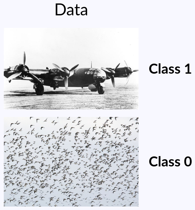 ::: :::: ::: {.notes} ROC curves have a fascinating history rooted in signal detection theory during WWII. Radar operators needed to distinguish between enemy aircraft (signal) and birds or weather phenomena (noise). This same principle applies to any binary classification problem. The key insight is that by varying the decision threshold, we can trade off between catching more true positives (higher TPR) at the cost of more false positives (higher FPR). The ROC curve visualizes all these trade-offs simultaneously. ::: ::: {.notes} We are now moving on to another important tool for model evaluation: the Receiver Operating Characteristic, or ROC curve. The concept of ROC analysis has its roots in signal detection theory, and it has been widely adopted in machine learning. It provides a way to visualize the performance of a classifier at all classification thresholds. ::: ## ROC Curve :::: {.columns} ::: {.column width="60%"}  ::: {.fragment} 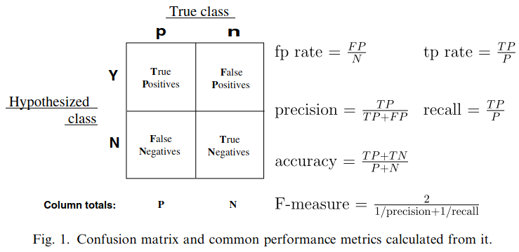 ::: ::: ::: {.column width="40%"} ::: {.fragment} 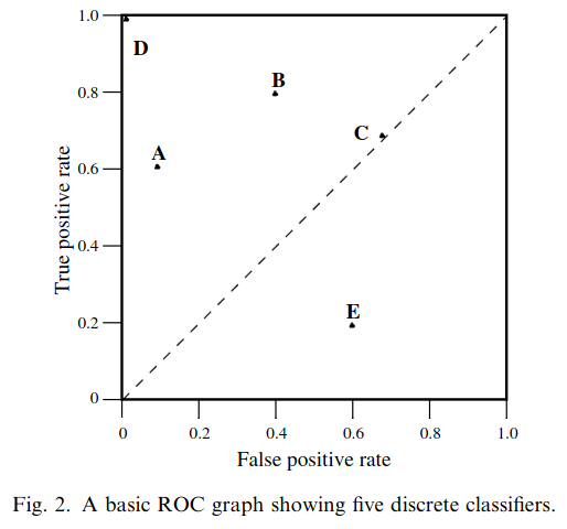 ::: ::: :::: ::: {.notes} This slide shows the relationship between confusion matrices and ROC curves. Each point on the ROC curve corresponds to a different threshold setting and thus a different confusion matrix. The ideal classifier would reach the top-left corner (TPR=1, FPR=0), meaning it perfectly identifies all positives without any false positives. The diagonal line represents random guessing - any classifier below this line is performing worse than random. ::: ::: {.notes} An ROC curve shows the trade-off between the true positive rate and the false positive rate for a binary classifier as the discrimination threshold is varied. The top-left corner of the plot is the ideal point - a false positive rate of 0, and a true positive rate of 1. This is not always possible in practice, but it is the goal. ::: ## ROC Curve :::: {.columns} ::: {.column width="45%"} 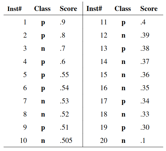 ::: ::: {.column width="55%"}  ::: :::: ::: {.notes} Here we see how the ROC curve is constructed. We have a set of predictions from a model, and we can vary the threshold for what we consider a positive prediction. For each threshold, we can calculate the TPR and FPR and plot a point on the ROC curve. Connecting these points gives us the full curve. ::: ## ROC Curve {fig-align="center"} ::: {.notes} Setting the threshold equal to 0.5, we get an accuracy of 80%. However, the curve indicates a perfect classification performance on this test set. Why is there a discrepancy? The model is not properly calibrated. A threshold of 0.7 has perfect accuracy. We will talk more about calibration later in the lecture. ::: ## Area under an ROC curve (AUC) \ {fig-align="center"} ::: {.notes} The Area Under the Curve (AUC) is a single number summary of the ROC curve. It represents the probability that a randomly chosen positive instance will be ranked higher than a randomly chosen negative instance. An AUC of 1 represents a perfect model, while an AUC of 0.5 represents a model that is no better than random chance. ::: ## ROC curve in sklearn ```{python} #| echo: false # Setup code - hidden from slides from sklearn import datasets from sklearn.linear_model import LogisticRegression from sklearn.model_selection import train_test_split X,y = datasets.make_classification(5000, 10, random_state=42) X_train, X_test, y_train, y_test = train_test_split(X, y, random_state=42) clf = LogisticRegression(random_state=0) clf.fit(X_train, y_train) print() ``` ```{python} #| echo: true import matplotlib.pyplot as plt from sklearn.metrics import RocCurveDisplay RocCurveDisplay.from_estimator(clf, X_test, y_test, plot_chance_level=True) plt.show() ``` ::: {.notes} Scikit-learn makes it easy to generate ROC curves. The diagonal "chance level" line shows the performance of a random classifier. The further the blue curve is above this diagonal, the better the classifier. The AUC (Area Under Curve) score of 0.97 indicates excellent performance. Remember that ROC curves are most appropriate for balanced datasets - for imbalanced data, precision-recall curves may be more informative. ::: ::: {.notes} Similar to the confusion matrix, scikit-learn provides a simple way to generate ROC curves. The `RocCurveDisplay` function can be used to plot the ROC curve for a trained classifier. The `plot_chance_level` argument is useful to visualize the performance of a random classifier. ::: ## Multiclass ROC curve :::: {.columns} ::: {.column width="65%"} {fig-align="center" height=100%} ::: ::: {.column width="35%"} \ **Micro-average:** Aggregate contributions of all classes to calculate the metric. Useful if there is class imbalance. **Macro-average:** Compute the metric for each class separately, then take average (treats all classes equally) ::: :::: ::: {.notes} For multiclass classification problems, we can't directly plot a single ROC curve. Instead, we can use techniques like one-vs-rest or one-vs-one to create a curve for each class. We can then average these curves. The micro-average is useful when there is class imbalance, as it aggregates the contributions of all classes. The macro-average treats all classes equally. ::: :::footer [code](https://scikit-learn.org/stable/auto_examples/model_selection/plot_roc.html) ::: ## ROC Curves: Strengths and Limitations * **What they show:** True Positive Rate (TPR) vs. False Positive Rate (FPR) * **Best for:** Balanced datasets * **Limitation:** Can be misleading on imbalanced datasets because the FPR can be very small, even with a large number of false positives ::: {.notes} ROC curves are widely used and intuitive, but they have an important limitation. On imbalanced datasets, the false positive rate can appear very small even when the model is making many false positive errors, simply because the denominator (total negatives) is very large. This can make a poor model appear better than it actually is. ::: ## Precision-Recall (PR) Curves * **What they show:** Precision vs. Recall (TPR) * **Best for:** Imbalanced datasets * **Advantage:** A model that has high precision and high recall is truly a good model * **Research insight:** As mentioned in "Visual methods for analyzing probabilistic classification data" by Alsallakh et al. (2014), PR curves are more informative than ROC curves when dealing with imbalanced datasets ::: {.notes} Precision-Recall curves are often more informative than ROC curves, especially for imbalanced datasets. They focus directly on the performance for the positive class, which is usually the class of interest in imbalanced problems. The Alsallakh paper provides an excellent discussion on when to use PR curves over ROC curves. ::: ```{python} #| echo: false # Setup code - hidden from slides from sklearn import datasets from sklearn.linear_model import LogisticRegression from sklearn.model_selection import train_test_split X,y = datasets.make_classification(5000, 10, random_state=42) X_train, X_test, y_train, y_test = train_test_split(X, y, random_state=42) clf = LogisticRegression(random_state=0) clf.fit(X_train, y_train) print() ``` ```{python} #| echo: true #| fig-cap: "Precision-Recall Curve" import matplotlib.pyplot as plt from sklearn.metrics import PrecisionRecallDisplay PrecisionRecallDisplay.from_estimator(clf, X_test, y_test) plt.show() ``` ::: {.notes} And here is how you can generate a Precision-Recall curve in scikit-learn. The `PrecisionRecallDisplay` works similarly to the other display objects we've seen. It takes a classifier and test data to generate the curve. ::: # Visual Analytics Systems for Model Performance ## Squares (2016) 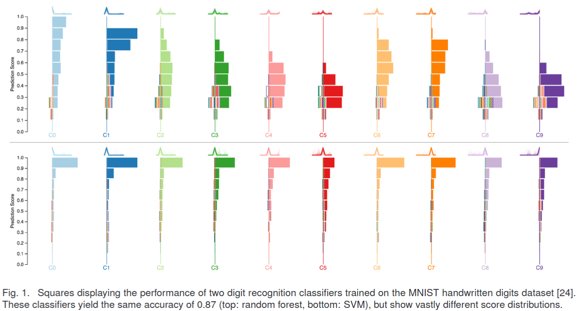{fig-align="center"} ::: {.notes} Squares is a visual analytics tool designed to make it easier to analyze the performance of multiclass classifiers. The authors argue that traditional confusion matrices can be hard to interpret, especially when there are many classes. Squares provides a more intuitive and effective way to see not just which classes are being confused, but also the distribution of instances within each cell of the confusion matrix. This helps users to quickly identify the most important errors and prioritize their efforts. ::: :::footer Ren, D., Amershi, S., Lee, B., Suh, J., & Williams, J. D. (2016). *Squares: Supporting interactive performance analysis for multiclass classifiers*. IEEE transactions on visualization and computer graphics. ::: --- ::: {.notes} This video demonstrates the Squares system in action. Pay attention to how the interactive nature of the tool allows for a more in-depth analysis of the classifier's performance compared to a static confusion matrix. ::: ## Alsallakh et. al. (2014) 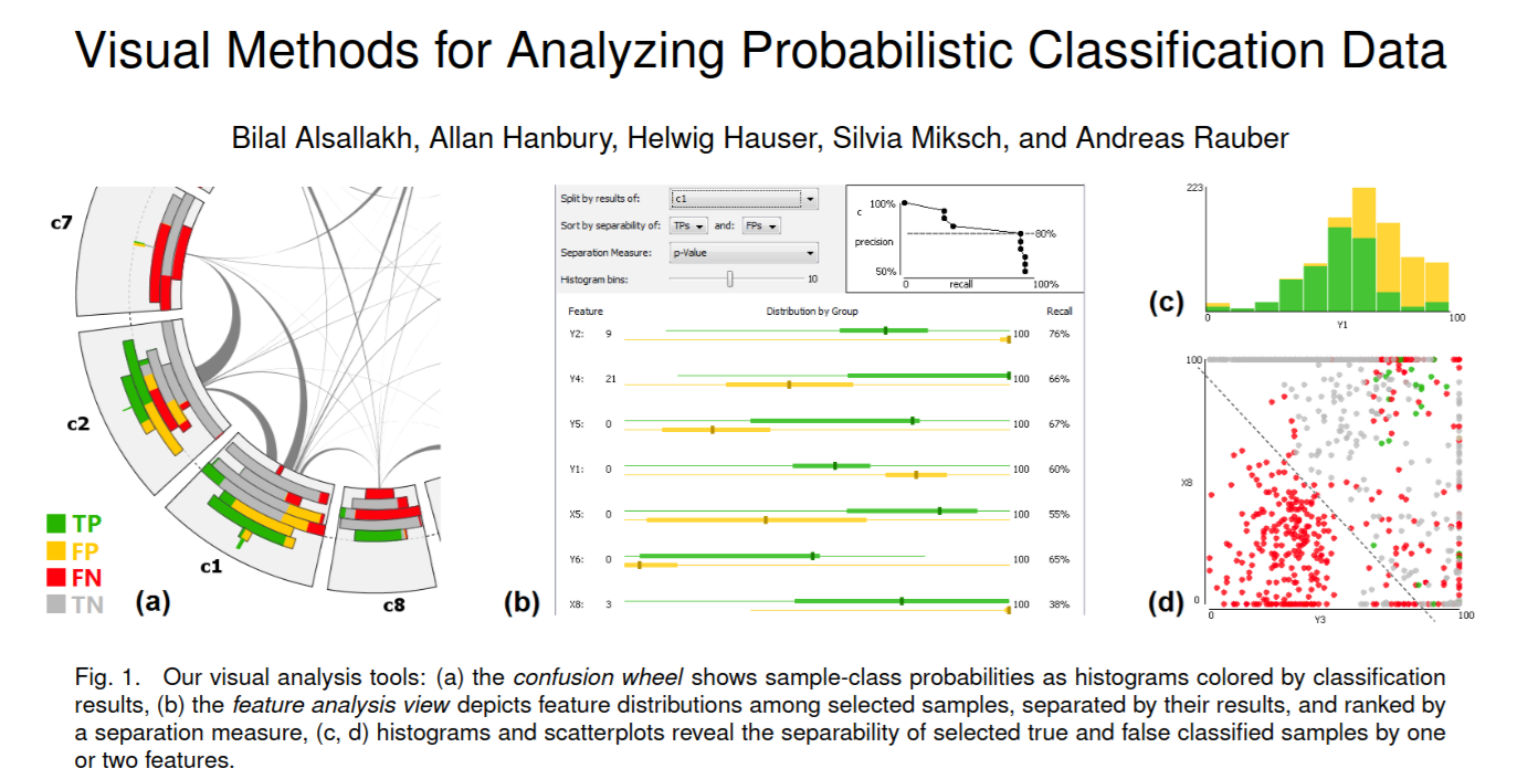{fig-align="center"} ::: {.notes} This paper by Alsallakh and his colleagues presents a set of visual methods for analyzing probabilistic classification data. They go beyond simple accuracy metrics to look at the model's discriminative power and calibration. The key idea is to provide a suite of linked visualizations that allow users to explore the model's behavior from different perspectives. This includes visualizations of the confusion matrix, feature distributions, and the predicted probabilities themselves. ::: :::footer Alsallakh, B., Hanbury, A., Hauser, H., Miksch, S., & Rauber, A. (2014). [*Visual methods for analyzing probabilistic classification data*](../refs/Alsallakh_Hanbury_Hauser_Miksch_Rauber_2014_Visual_Methods_Analyzing_Probabilistic_Classification.pdf). IEEE TVCG. ::: ## Alsallakh et. al. (2014) 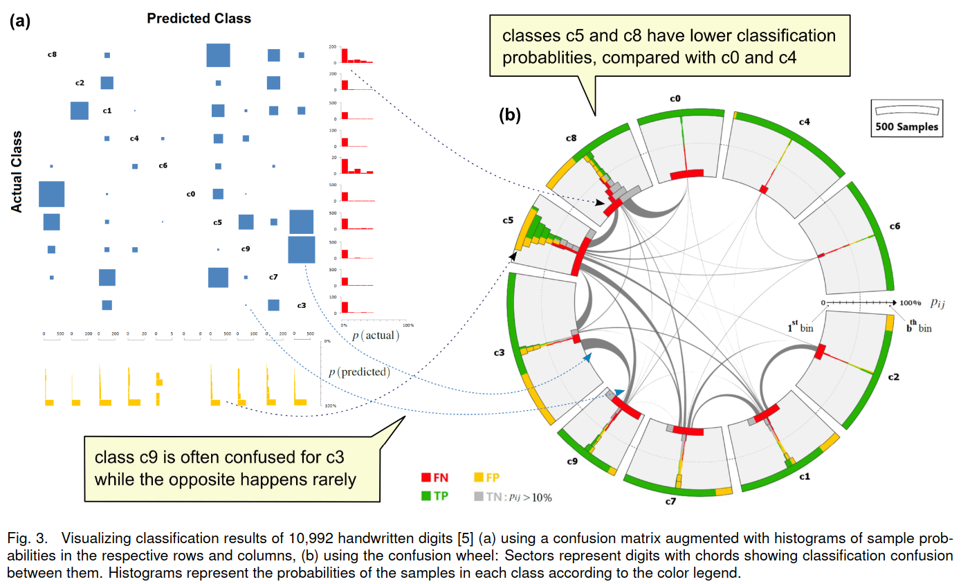{fig-align="center"} ::: {.notes} Here is an example from the Alsallakh paper, showing how their system can be used to analyze a digit recognition model. You can see the confusion matrix on the left, and on the right, you can see the distribution of instances for a selected class. This allows you to drill down into the data and understand why the model is making certain errors. ::: :::footer Alsallakh, B., Hanbury, A., Hauser, H., Miksch, S., & Rauber, A. (2014). [*Visual methods for analyzing probabilistic classification data*](../refs/Alsallakh_Hanbury_Hauser_Miksch_Rauber_2014_Visual_Methods_Analyzing_Probabilistic_Classification.pdf). IEEE TVCG. ::: ## Beauxis-Aussalet and Hardman (2014) \ \ 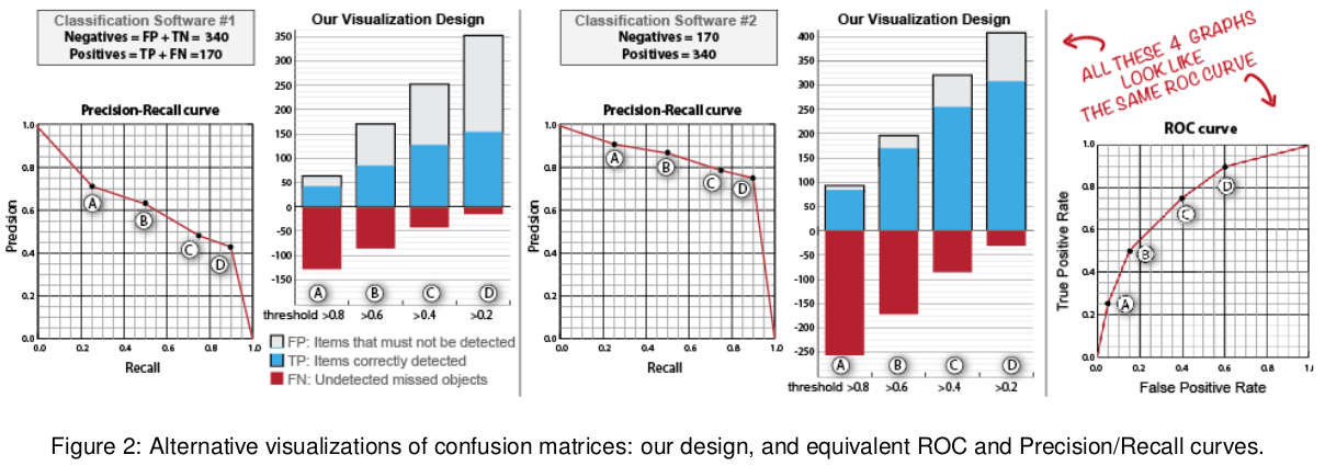{fig-align="center"} ::: {.notes} This paper focuses on the problem of making confusion matrices more accessible to non-expert users. The authors propose a set of design principles for visualizing confusion matrices in a way that is both informative and easy to understand. They emphasize the use of clear labels, intuitive color schemes, and direct display of counts and percentages. ::: :::footer Beauxis-Aussalet, E., & Hardman, L. (2014). [*Visualization of confusion matrix for non-expert users*](../refs/Beauxis_Aussalet_Hardman_2014_Visualization_Confusion_Matrix_Non_Expert_Users.pdf). IEEE VAST. ::: ## Beauxis-Aussalet and Hardman (2014) 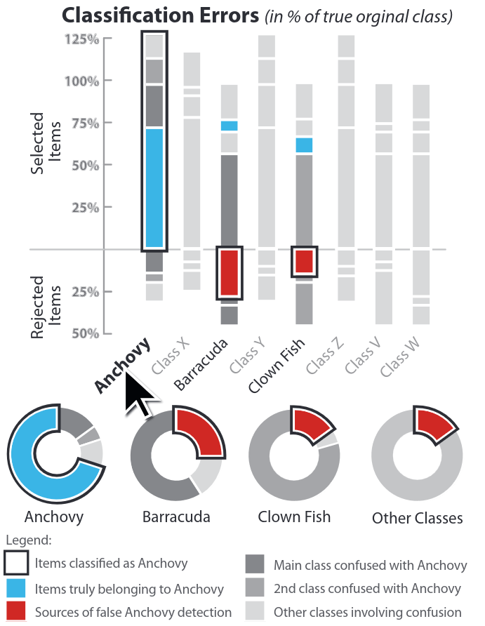{fig-align="center"} ::: {.notes} Here is an example of the kind of visualization proposed by Beauxis-Aussalet and Hardman. It uses a combination of color, size, and text to convey the information in the confusion matrix in a way that is easy to grasp, even for someone who is not an expert in machine learning. ::: :::footer Beauxis-Aussalet, E., & Hardman, L. (2014). [*Visualization of confusion matrix for non-expert users*](../refs/Beauxis_Aussalet_Hardman_2014_Visualization_Confusion_Matrix_Non_Expert_Users.pdf). IEEE VAST. ::: ## EnsembleMatrix (2009) 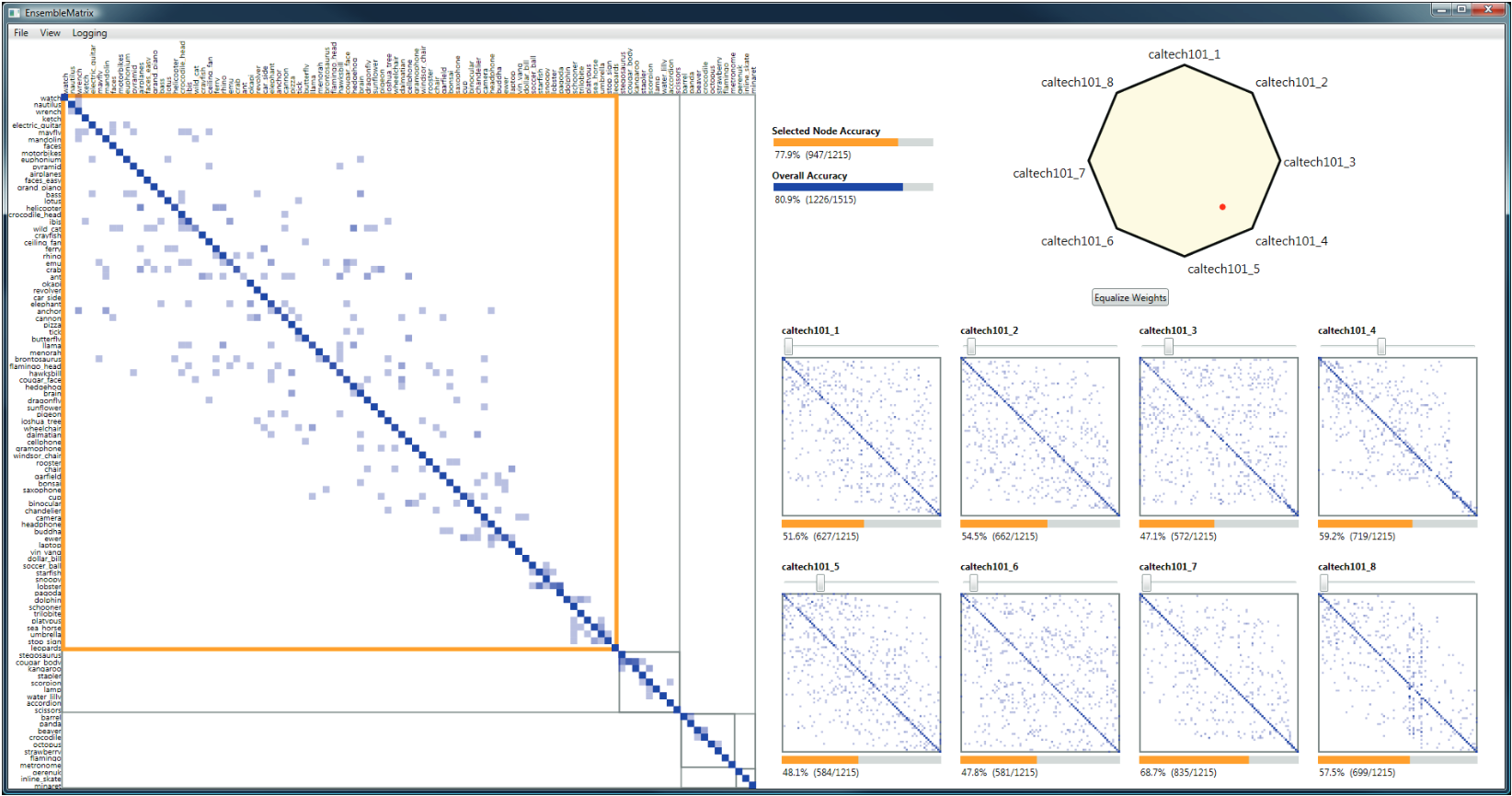{fig-align="center"} ::: {.notes} EnsembleMatrix is an interactive visualization tool for working with multiple classifiers. In many real-world applications, you might want to combine the predictions of several different models to get a better result. EnsembleMatrix helps you to understand the strengths and weaknesses of each individual classifier and how they can be combined effectively. It provides a graphical view of the confusion matrices of multiple classifiers, allowing you to compare them and build combination models interactively. ::: :::footer Talbot, J., Lee, B., Kapoor, A., & Tan, D. S. (2009). [*EnsembleMatrix: interactive visualization to support machine learning with multiple classifiers*](../refs/Talbot_Lee_Kapoor_Tan_2009_EnsembleMatrix_Interactive_Visualization_Multiple_Classifiers.pdf). CHI. ::: # Calibration ## What is calibration? * When performing classification, we often are interested not only in predicting the class label, but also in the probability of the output * This probability gives us a kind of confidence score on the prediction * However, a model can separate the classes well (having a good accuracy/AUC), but be poorly **calibrated**. In this case, the estimated class probabilities are far from the true class probabilities * We can calibrate the model, changing the scale of the predicted probabilities ::: {.notes} Now we are moving to the third part of our lecture: calibration. Calibration is about whether the probabilities predicted by a model are reliable. For example, if a model predicts a 70% probability of rain, it should rain 70% of the time. A model can be very accurate in its predictions, but still be poorly calibrated. This is a subtle but important point that we will explore in this section. ::: ## Calibration - Forecast Example Weather forecasters started thinking about calibration a long time ago (Brier, 1950): a forecast of "70% chance of rain" should be followed by rain 70% of the time. Let's consider a small toy example: :::: {.columns} ::: {.column width="30%"} 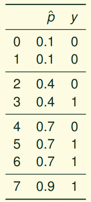{fig-align="center"} ::: ::: {.column width="70%"} This forecast is doing at predicting the rain: - "10% chance of rain" was a slight over-estimate: $(\bar{y} = 0/2 = 0\%)$ - "40% chance of rain" was a slight under-estimate: $(\bar{y} = 1/2 = 50\%)$ - "70% chance of rain" was a slight over-estimate: $(\bar{y} = 2/3 = 67\%)$ - "90% chance of rain" was a slight under-estimate: $(\bar{y} = 1/1 = 100\%)$ ::: :::: ::: {.notes} This weather forecast example perfectly illustrates calibration. When we say "70% chance of rain," it should actually rain about 70% of the time we make that prediction. Notice that this forecaster is pretty well calibrated - their predictions are close to the actual frequencies. This concept extends directly to machine learning: when a model outputs a probability, we want that probability to be reliable and meaningful. ::: ::: {.notes} This is a classic example used to explain calibration. We have a weather forecaster who gives probabilistic predictions of rain. We can check how well calibrated these predictions are by looking at the actual outcomes. For example, for all the days the forecaster predicted a 10% chance of rain, did it actually rain 10% of the time? In this case, the forecaster is not perfectly calibrated, but they are not too far off. ::: ::: footer Slides based on [classifier-calibration.github.io](https://classifier-calibration.github.io/) ::: ## Visualizing forecasts - The Reliability Diagram \ :::: {.columns} ::: {.column width="30%"} {fig-align="center"} ::: ::: {.column width="70%"} 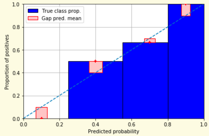{fig-align="center"} ::: :::: ::: {.notes} A reliability diagram is a standard way to visualize calibration. It plots the observed frequency of an event against the predicted probability of that event. A perfectly calibrated model would have a reliability diagram that is a straight line from (0,0) to (1,1). Deviations from this line indicate miscalibration. ::: ::: footer Slides based on [classifier-calibration.github.io](https://classifier-calibration.github.io/) ::: ## Reliability diagram - Changing values \ :::: {.columns} ::: {.column width="30%"} {fig-align="center"} ::: ::: {.column width="70%"} {fig-align="center"} ::: :::: ::: {.notes} In this slide, we see the effect of changing the forecast values on the reliability diagram. Notice how the points on the diagram shift as the forecasts are updated. This provides a direct visual feedback on how changes in the model's predictions affect its calibration. ::: ::: footer Slides based on [classifier-calibration.github.io](https://classifier-calibration.github.io/) ::: ## Reliability diagram - Changing grouping \ :::: {.columns} ::: {.column width="30%"} {fig-align="center"} ::: ::: {.column width="70%"} {fig-align="center"} ::: :::: ::: {.notes} Here, we see another aspect of reliability diagrams: the effect of binning. The way we group the predictions can influence the appearance of the diagram. It's important to be aware of this and to choose a reasonable number of bins when creating these plots. ::: ::: footer Slides based on [classifier-calibration.github.io](https://classifier-calibration.github.io/) ::: ## Reliability Diagram in sklearn ```{python} #| echo: false from sklearn import datasets from sklearn.linear_model import LogisticRegression from sklearn.naive_bayes import GaussianNB from sklearn.model_selection import train_test_split X,y = datasets.make_classification(5000, 10, random_state=42) X_train, X_test, y_train, y_test = train_test_split(X, y, random_state=42) lg = LogisticRegression(random_state=0) nb = GaussianNB() lg.fit(X_train, y_train) nb.fit(X_train, y_train) print() ``` ::: {.notes} Here we're setting up two different classifiers - Logistic Regression and Gaussian Naive Bayes - to compare their calibration. Logistic Regression is often well-calibrated by design, while Naive Bayes can suffer from poor calibration despite having good discrimination ability. We'll see this difference clearly in the reliability diagram on the next slide. ::: ::: {.notes} Scikit-learn also provides tools for calibration analysis. Here we are setting up two classifiers, Logistic Regression and Gaussian Naive Bayes, to compare their calibration. We will plot their calibration curves on the next slide. ::: ```{python} #| echo: true #| panel: center import matplotlib.pyplot as plt from sklearn.calibration import CalibrationDisplay fig = plt.figure() ax = fig.add_subplot(111) CalibrationDisplay.from_estimator(lg, X_test, y_test, n_bins=10, ax=ax, label='Logistic Regression') CalibrationDisplay.from_estimator(nb, X_test, y_test, n_bins=10, ax=ax, label='Naive Bayes') ``` ::: {.notes} This code generates the calibration plot, also known as a reliability diagram. We use the `CalibrationDisplay` from scikit-learn. It plots the predicted probabilities against the true frequency of the positive class. A perfectly calibrated model would follow the diagonal line. ::: ## Common sources of miscalibration * **Underconfidence:** a classifier thinks it's worse at separating classes than it actually is. - Underconfidence typically gives sigmoidal distortions - To calibrate these means to pull predicted probabilities away from the centre * **Overconfidence:** a classifier thinks it's better at separating classes than it actually is - Here, distortions are inverse-sigmoidal - Calibrating these means to push predicted probabilities toward the centre A classifier can be overconfident for one class and underconfident for the other ::: {.notes} Miscalibration can occur in two main ways: underconfidence and overconfidence. Underconfident models produce probabilities that are too close to 0.5, while overconfident models produce probabilities that are too close to 0 or 1. The shape of the reliability diagram can help us diagnose which of these problems is occurring. ::: ::: footer Slides based on [classifier-calibration.github.io](https://classifier-calibration.github.io/) ::: ## Reliability Diagram in sklearn {fig-align="center"} ::: {.notes} This is an example of a calibration plot from the scikit-learn documentation. It compares the calibration of a Logistic Regression model with a Gaussian Naive Bayes model. You can see that the Logistic Regression model is better calibrated than the Naive Bayes model, as its curve is closer to the diagonal. ::: :::footer [code](https://scikit-learn.org/stable/modules/calibration.html) ::: ## Calibration metrics Let $N$ be the total of samples, $B$ the number of binds, $n^b$ the samples in bin $b$, and $conf(b)$ the average predicted probability in bin $b$. - Expected Calibration Error: $ECE = \sum_{b=1}^B \frac{n^b}{N}|acc(b) - conf(b)|$ - Maximum Calibration Error: $MCE = \underset{m \in \{1,2,\dots,|B|\}}{\text{max}} |acc(b) - conf(b)|$ ::: {.notes} Besides visualizing calibration with reliability diagrams, we can also quantify it using metrics like Expected Calibration Error (ECE) and Maximum Calibration Error (MCE). ECE gives an overall measure of miscalibration, while MCE tells us the worst-case deviation. ::: ## Calibration of modern models 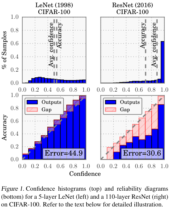{fig-align="center"} ::: {.notes} This landmark paper by Guo et al. (2017) revealed a surprising finding: modern neural networks, despite their impressive accuracy, are often poorly calibrated. As networks have gotten deeper and more complex, they've become increasingly overconfident in their predictions. This graph shows how calibration error has increased with model capacity over the years. This is why calibration has become such an important topic in modern machine learning. ::: :::footer Guo, C., Pleiss, G., Sun, Y., & Weinberger, K. Q. (2017). [*On calibration of modern neural networks*](../refs/Guo_Pleiss_Sun_Weinberger_2017_Calibration_Modern_Neural_Networks.pdf). ICML. ::: ## Calibration of modern models 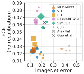{.absolute top="180" left="0" width="330" height="330"} 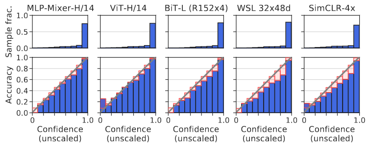{.absolute top="170" left="330" width="800" height="350"} :::footer Image taken from Minderer, Matthias, et al. (2021). *Revisiting the calibration of modern neural networks*. Advances in Neural Information Processing Systems. ::: ## Proper Scoring Rules * Proper scoring rules are calculated at the observation level, where as ECE is binned * Think of them as putting each item in its separate bin, then computing the average of some loss for each predicted probability and its corresponding observed label 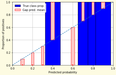{fig-align="center"} ::: {.notes} Proper scoring rules are a more principled way to evaluate probabilistic predictions. Unlike ECE which requires binning (and thus loses information), proper scoring rules evaluate each prediction individually. They're called "proper" because they incentivize the model to output its true belief - a model can't game the system by outputting different probabilities than what it actually believes. ::: ::: footer Slides based on [classifier-calibration.github.io](https://classifier-calibration.github.io/) ::: ## Proper Scoring Rules * Brier Score/Quadratic error/Euclidean distance: $$BS = \frac{1}{N} \sum_{i=1}^N (\hat{y}_i - y_i)^2$$ * Log-loss/Cross entropy: - Frequently used to as the training loss of machine learning methods, such as neural networks - Only penalises the probability given to the true class $$LL = -\frac{1}{N} \sum_{i=1}^N [y_i \text{log}(\hat{y}_i) + (1-y_i)\text{log}( 1 - \hat{y}_i)]$$ ::: {.notes} These are the two most common proper scoring rules. The Brier Score is the mean squared error of probabilistic predictions - simple and interpretable. Log-loss (cross-entropy) is what most neural networks optimize during training. An important distinction: log-loss can be infinite if you predict probability 0 for something that happens, while Brier Score is bounded between 0 and 2. Both encourage well-calibrated predictions but in slightly different ways. ::: ::: footer Slides based on [classifier-calibration.github.io](https://classifier-calibration.github.io/) ::: ## Proper Scoring Rules An intuitive way to decompose proper scoring rules is into refinement and calibration losses * **Refinement loss:** is the loss due to producing the same probability for instances from different classes * **Calibration loss:** is the loss due to the difference between the probabilities predicted by the model and the proportion of positives among instances with the same output ::: footer Slides based on [classifier-calibration.github.io](https://classifier-calibration.github.io/) ::: ## Calibration Techniques **Parametric** calibration involves modelling the score distributions within each class - **Platt scaling:** Logistic calibration can be derived by assuming that the scores within both classes are normally distributed with the same variance (Platt, 2000) - **Beta calibration:** employs Beta distributions instead, to deal with scores already on a [0, 1] scale (Kull et al., 2017) - **Dirichlet calibration** for more than two classes (Kull et al., 2019) **Non-parametric** calibration often ignores scores and employs ranks - **Isotonic regression** fits a non-parametric isotonic regressor, which outputs a step-wise non-decreasing function ::: footer Slides based on [classifier-calibration.github.io](https://classifier-calibration.github.io/) ::: ## Platt scaling * Assumes the calibration curve can be corrected by applying a sigmoid to the raw predictions. This means finding $\mathbf{A}$ and $\mathbf{b}$ via MLE: $p(y_i = 1 | \hat{y}_i) = \frac{1}{1 + exp(\mathbf{A}\hat{y}_i + \mathbf{b})}$ * Works best if the calibration error is symmetrical (classifier output for each binary class is normally distributed with the same variance) * This can be a problem for highly imbalanced classification problems, where outputs do not have equal variance * In general it is most effective when the un-calibrated model is under-confident and has similar calibration errors for both high and low outputs ::: {.notes} Platt scaling is a simple and widely used calibration method. It learns a logistic regression model on the outputs of the original model. This method is most effective when the calibration error is symmetric, but it can be less effective for imbalanced datasets. ::: ## Isotonic regression * Fits a non-parametric isotonic regressor, which outputs a step-wise non-decreasing function * Isotonic regression is more general when compared to Platt scaling, as the only restriction is that the mapping function is monotonically increasing * Is more powerful as it can correct any monotonic distortion of the un-calibrated model * However, it is more prone to overfitting, especially on small datasets ::: {.notes} Isotonic regression is a more powerful, non-parametric calibration method. It can correct any monotonic distortion in the model's outputs. However, because it is more flexible, it is also more prone to overfitting, especially when the dataset is small. ::: ## Calibration in sklearn {fig-align="center"} ::: {.notes} This example shows calibration in action. The Naive Bayes classifier (orange) shows the characteristic S-curve of poor calibration - it's overconfident for low probabilities and underconfident for high probabilities. After calibration using isotonic regression, the curve becomes much closer to the diagonal, meaning the probabilities are now more reliable. Notice how calibration improves the Brier score significantly. ::: :::footer [code](https://scikit-learn.org/stable/auto_examples/calibration/plot_calibration_curve.html) ::: ## Calibration in sklearn {fig-align="center"} :::footer [code](https://scikit-learn.org/stable/auto_examples/calibration/plot_calibration_curve.html) ::: ## Calibration Takeaways * Reliability diagrams are a standard way to visualize calibration * ECE is a summary of what reliability diagrams show * Proper scoring rules (Log loss, Brier score) measure different aspects of probability correctness * However, proper scoring rules cannot tell us where a model is miscalibrated ::: {.notes} To summarize the key points on calibration: reliability diagrams are the primary tool for visualizing calibration. ECE and MCE are metrics to quantify it. Proper scoring rules like Brier score and log-loss provide a more detailed view of the correctness of the predicted probabilities. And finally, there are different techniques to calibrate a model, each with its own trade-offs. ::: ## Hyperparameters of reliability diagrams \ {fig-align="center"} ::: {.notes} An important but often overlooked point: reliability diagrams depend heavily on hyperparameters like the number of bins and binning strategy. Different choices can lead to very different visual interpretations of the same model's calibration. This figure from the Calibrate paper shows how the same model can look well-calibrated or poorly calibrated depending on these choices. This is why tools like Calibrate that provide interactive exploration are so valuable. ::: :::footer Image taken from Xenopoulos, P., Rulff, J., Nonato, L. G., Barr, B., & Silva, C. (2022). *Calibrate: Interactive analysis of probabilistic model output*. IEEE Transactions on Visualization and Computer Graphics. ::: ## Calibrate (2023) {fig-align="center"} :::footer Xenopoulos, P., Rulff, J., Nonato, L. G., Barr, B., & Silva, C. (2022). [*Calibrate: Interactive analysis of probabilistic model output*](../refs/Xenopoulos_Rulff_Nonato_Barr_Silva_2022_Calibrate_Interactive_Analysis_Probabilistic_Output.pdf). IEEE TVCG. ::: ## Calibrate (2023) - Learned Reliability Diagram 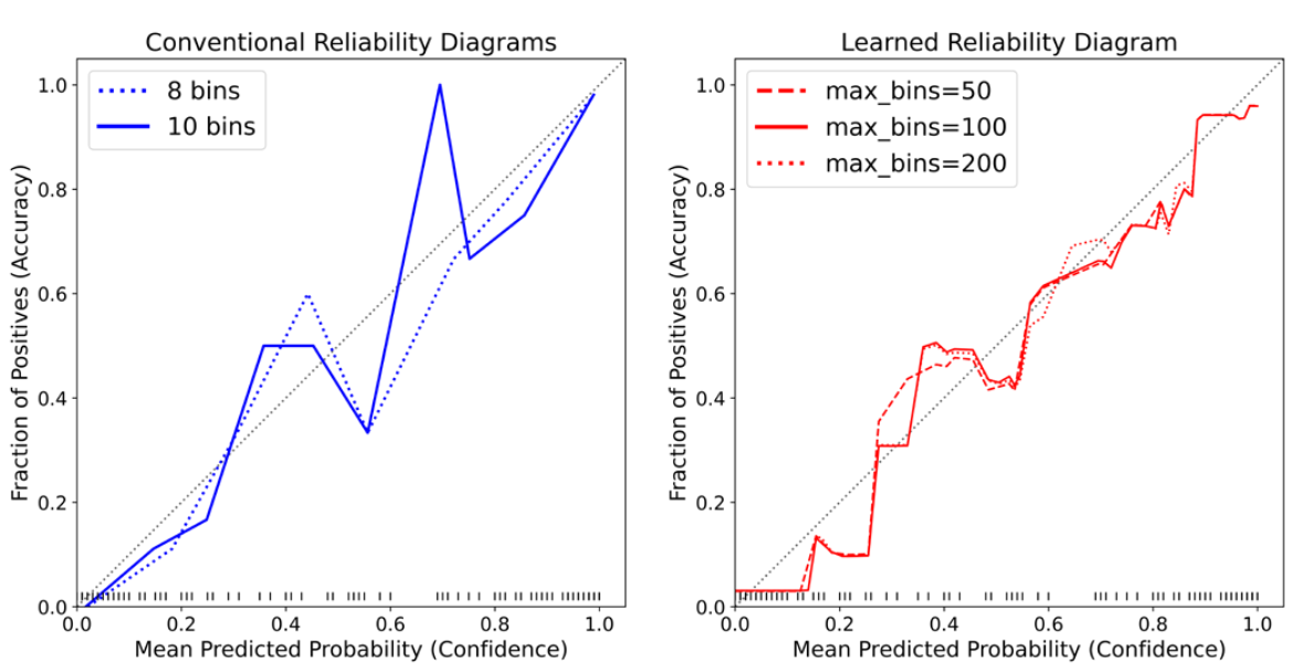{fig-align="center"} ::: {.notes} The Calibrate system introduces a learned reliability diagram that avoids the binning problem entirely. Instead of fixed bins, it uses kernel density estimation to create a smooth, continuous reliability curve. This gives a more accurate picture of calibration without the artifacts introduced by arbitrary binning choices. The shaded regions show uncertainty in the calibration estimate. ::: :::footer Xenopoulos, P., Rulff, J., Nonato, L. G., Barr, B., & Silva, C. (2022). [*Calibrate: Interactive analysis of probabilistic model output*](../refs/Xenopoulos_Rulff_Nonato_Barr_Silva_2022_Calibrate_Interactive_Analysis_Probabilistic_Output.pdf). IEEE TVCG. ::: ## Calibrate (2023) :::footer Xenopoulos, P., Rulff, J., Nonato, L. G., Barr, B., & Silva, C. (2022). [*Calibrate: Interactive analysis of probabilistic model output*](../refs/Xenopoulos_Rulff_Nonato_Barr_Silva_2022_Calibrate_Interactive_Analysis_Probabilistic_Output.pdf). IEEE TVCG. ::: ## Smooth ECE (2023) \ 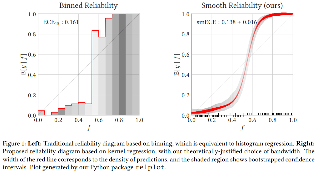{fig-align="center"} ::: {.notes} Smooth ECE is a recent advancement that addresses the fundamental problem with traditional ECE: the arbitrary choice of bins. By using kernel smoothing instead of hard binning, it provides a more principled and stable measure of calibration error. This visualization shows how different binning choices can give wildly different ECE values for the same model, while Smooth ECE provides a consistent estimate. ::: :::footer Błasiok, J., & Nakkiran, P. (2023). *Smooth ECE: Principled Reliability Diagrams via Kernel Smoothing*. arXiv preprint arXiv:2309.12236. ::: ## Smooth ECE (2023) \ 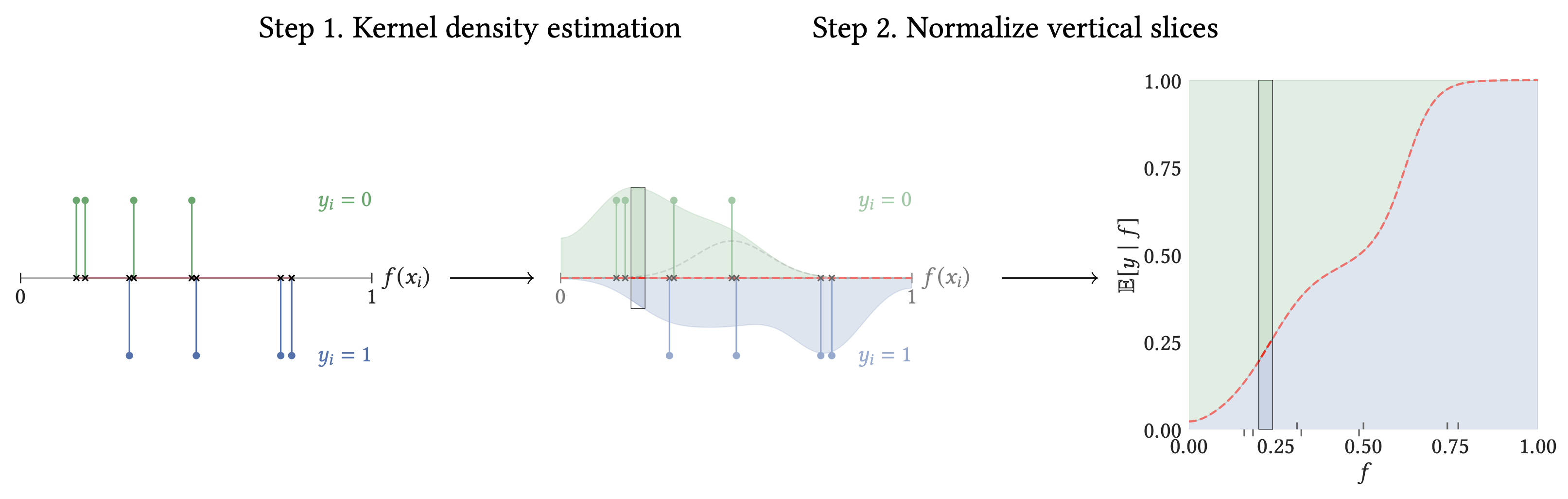{fig-align="center"} :::footer Błasiok, J., & Nakkiran, P. (2023). *Smooth ECE: Principled Reliability Diagrams via Kernel Smoothing*. arXiv preprint arXiv:2309.12236. ::: ## Visualizing Calibration for Multi-Class Problems 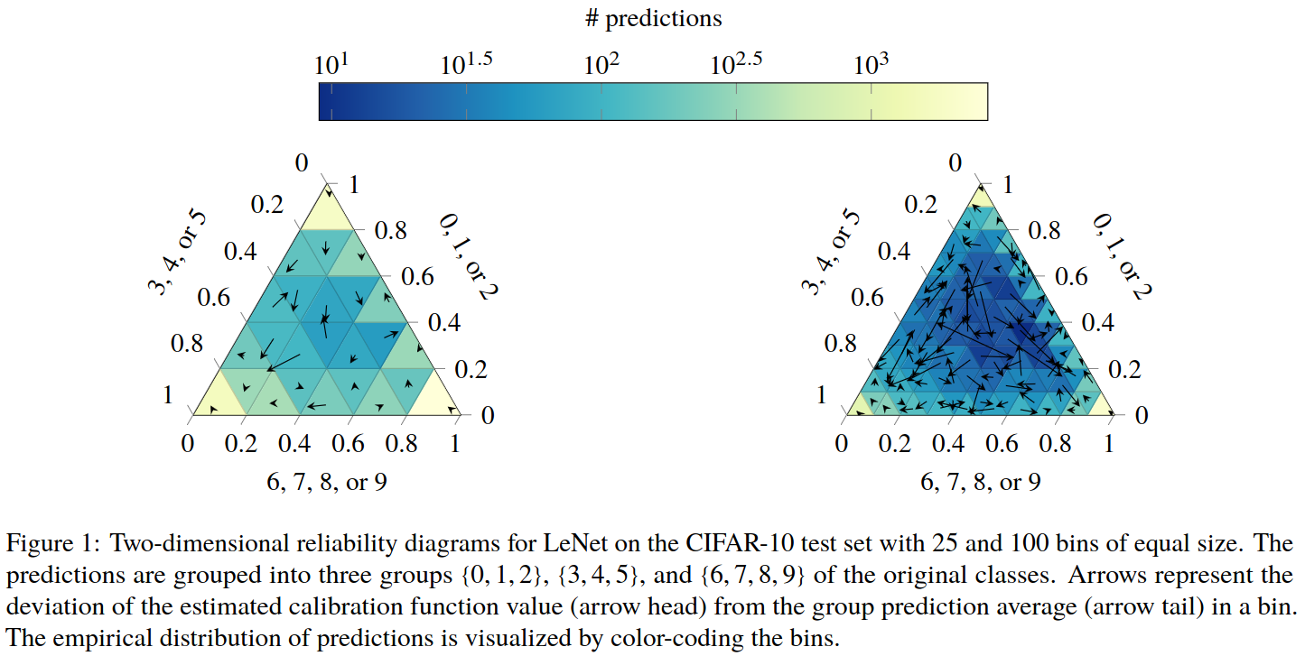{fig-align="center"} :::footer Vaicenavicius, J., Widmann, D., Andersson, C., et al. (2019). [*Evaluating model calibration in classification*](../refs/Vaicenavicius_Widmann_Andersson_Lindsten_Roll_Schon_2019_Evaluating_Model_Calibration.pdf). AISTATS. ::: ## Suggested Calibration Literature * Niculescu-Mizil, A., & Caruana, R. (2005). [Predicting good probabilities with supervised learning](../refs/Niculescu_Mizil_Caruana_2005_Predicting_Good_Probabilities_Supervised_Learning.pdf). ICML. * Nixon, J., Dusenberry, M. W., Zhang, L., Jerfel, G., & Tran, D. (2019, June). [Measuring Calibration in Deep Learning](http://openaccess.thecvf.com/content_CVPRW_2019/papers/Uncertainty%20and%20Robustness%20in%20Deep%20Visual%20Learning/Nixon_Measuring_Calibration_in_Deep_Learning_CVPRW_2019_paper.pdf). In CVPR Workshops (Vol. 2, No. 7). * Guo, C., Pleiss, G., Sun, Y., & Weinberger, K. Q. (2017). [On calibration of modern neural networks](../refs/Guo_Pleiss_Sun_Weinberger_2017_Calibration_Modern_Neural_Networks.pdf). ICML. * Vaicenavicius, J., Widmann, D., Andersson, C., Lindsten, F., Roll, J., & Schön, T. (2019, April). [Evaluating model calibration in classification](http://proceedings.mlr.press/v89/vaicenavicius19a/vaicenavicius19a.pdf). In The 22nd International Conference on Artificial Intelligence and Statistics (pp. 3459-3467). PMLR. ::: {.notes} This slide provides a list of important papers on calibration. The Niculescu-Mizil and Caruana paper is a classic in this area. The other papers discuss more recent work on calibration, especially in the context of deep learning. ::: ## Suggested Calibration Literature * Kull, M., & Flach, P. (2015). [Novel decompositions of proper scoring rules for classification](../refs/Kull_Flach_2015_Novel_Decompositions_Proper_Scoring_Rules.pdf). ECML-PKDD. * [ECML/PKDD 2020 Tutorial: Evaluation metrics and proper scoring rules](../refs/Silva_Filho_2020_ECML_PKDD_Tutorial_Evaluation_Metrics.pdf) * [Google Colab notebook for calibration curves](https://colab.research.google.com/drive/1mqDVJICMBg2eoIr2VPaDjQFUzlDT3grc?usp=sharing) * Kull, M., & Flach, P. (2015, September). [Novel decompositions of proper scoring rules for classification: Score adjustment as precursor to calibration](https://link.springer.com/content/pdf/10.1007/978-3-319-23528-8_5.pdf). In Joint European Conference on Machine Learning and Knowledge Discovery in Databases (pp. 68-85). Springer, Cham. * [ECML/PKDD 2020 Tutorial: Evaluation metrics and proper scoring rules](https://classifier-calibration.github.io/assets/slides/clacal_tutorial_ecmlpkdd_2020_evaluation.pdf) ::: {.notes} Here are a few more resources for those interested in diving deeper into calibration. The ECML/PKDD tutorial is a great starting point, and the Google Colab notebook provides a hands-on introduction to calibration curves. ::: 