
Black-box Model Interpretation
Published:
**2D PDP (Interaction Plots):** For **two features**, PDP generates a **heatmap** showing interactions.
::: :::: ::: footer Friedman, J. H. (2001). [*Greedy function approximation: A gradient boosting machine*](https://doi.org/10.1214/aos/1013203451). Annals of Statistics. ::: ::: {.notes} PDPs are one of the oldest and most intuitive model-agnostic interpretation methods. The key idea: marginalize over all other features to isolate the effect of one (or two) features on the prediction. Here we see bike rentals vs temperature - notice the non-linear relationship with a sweet spot around 20-25°C. The visualization immediately reveals this pattern that might be hidden in model coefficients. For two features, PDP generates a 2D plot (heatmap) showing interactions - the more complex the contour lines, the stronger the interaction between features. For example, a 2D PDP of temperature × humidity might show that high temperature increases rentals only when humidity is low. PDPs answer: "On average, how does changing this feature affect predictions?" ::: ## PDP Visualization: Interpreting Feature Effects :::: {.columns} ::: {.column width="33%"} **1. Monotonic/Linear** 🟦🟦🟨🟧🟧
🟦🟦🟨🟧🟧
🟩🟩🟨🟨🟨
🟩🟩🟨🟨🟨
**Complex contours** = strong feature interaction🟦🟦🟨🟧🟧
🟩🟩🟨🟨🟨
🟩🟩🟨🟨🟨
↗
↗
↗
Straight diagonal line ↑ Feature → ↑ Prediction Feature has consistent positive (or negative) effect ::: ::: {.column width="33%"} **2. Non-linear/Sweet Spot**↗
↗
╱‾╲
╱ ╲
╱ ╲
Curve peaks and drops Optimal range exists (like temperature example) ::: ::: {.column width="33%"} **3. Flat Line**╱ ╲
╱ ╲
━━━━━━━
**The Problem:** PDP shows the **average effect** across all instances. But what if the effect differs between: - Cold days vs. warm days? - New customers vs. loyal customers? - Low-income vs. high-income applicants? **PDP cannot tell you!**
::: ::: {.column width="50%"} **The Solution:** Move from **global** to **local** explanations. Instead of asking: > "How does temperature affect rentals **on average**?" Ask: > "Why did the model predict **this specific value** for **this particular day**?" **→ Enter LIME**
::: :::: ::: {.notes} This slide bridges the conceptual gap between PDP and LIME. PDP's key limitation - "hidden heterogeneous effects from averaging" - means we lose important information about how features affect different types of instances differently. For example, temperature might increase bike rentals on sunny days but decrease them on rainy days, and PDP would just show the average. This motivates the need for local explanations that focus on individual instances. LIME addresses this by building interpretable surrogate models around specific predictions, allowing us to understand "why THIS prediction for THIS instance?" rather than just global averages. ::: ## Local Interpretable Model-agnostic Explanations (LIME) Training local surrogate models to explain *individual* predictions :::: {.columns} ::: {.column width="60%"} 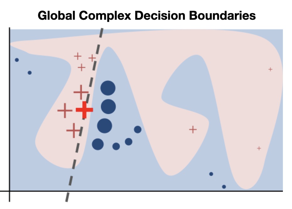 ::: ::: {.column width="40%"} 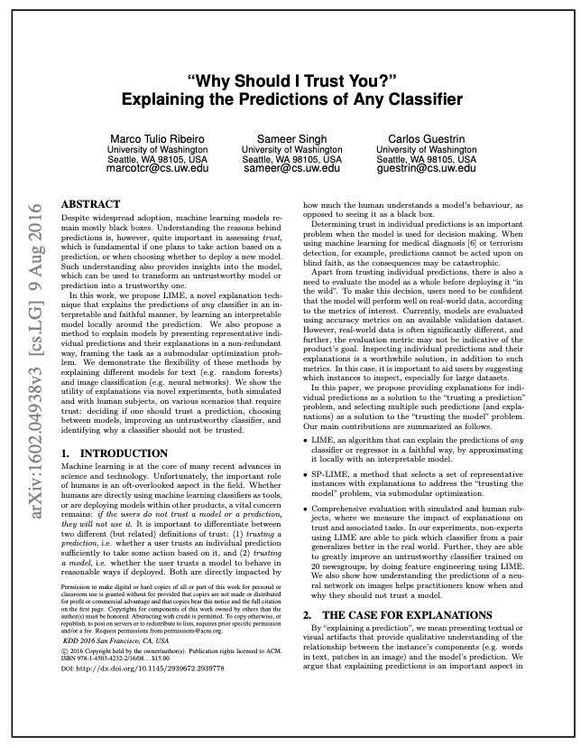 ::: :::: ::: footer Ribeiro, M. T., Singh, S., & Guestrin, C. (2016). [*"Why Should I Trust You?" Explaining the Predictions of Any Classifier*](https://arxiv.org/pdf/1602.04938.pdf). KDD. ::: ::: {.notes} LIME represents a paradigm shift from global to local explanations. The key insight: even if the global decision boundary is complex (left image shows a highly non-linear boundary), we can approximate it LOCALLY with a simple linear model. Think of it like approximating a curve with a tangent line - it only works near the point of tangency. The title "Why Should I Trust You?" captures the motivation: users need to understand individual predictions to build trust. LIME became hugely influential because it's model-agnostic, produces human-interpretable explanations, and works for any data type (tabular, text, images). ::: ## Training local surrogate models to explain individual predictions The idea is quite intuitive. **First, forget about the training data and imagine you only have the black box model where you can input data points and get the predictions of the model. You can probe the box as often as you want. Your goal is to understand why the machine learning model made a certain prediction. LIME tests what happens to the predictions when you give variations of your data into the machine learning model.** **LIME generates a new dataset consisting of perturbed samples and the corresponding predictions of the black box model.** **On this new dataset LIME then trains an interpretable model, which is weighted by the proximity of the sampled instances to the instance of interest.** The interpretable model can be anything from the interpretable models chapter, for example Lasso or a decision tree. **The learned model should be a good approximation of the machine learning model predictions locally, but it does not have to be a good global approximation. This kind of accuracy is also called *local fidelity*.** Mathematically, local surrogate models with interpretability constraint can be expressed as follows: $$\text{explanation}(x) = \arg\min_{g \in G} L(f, g, \pi_x) + \Omega(g)$$ ::: footer Section 9.2, on Molnar's book. ::: ## Local Interpretable Model-agnostic Explanations (LIME) ### Algorithm 1. Pick an input that you want an explanation for. 2. Sample the neighbors of the selected input (i.e. perturbation). 3. Train a linear classifier on the neighbors. 4. The weights on the linear classifier is the explanation. ## Local Interpretable Model-agnostic Explanations (LIME) :::: {.columns} ::: {.column width="60%"} 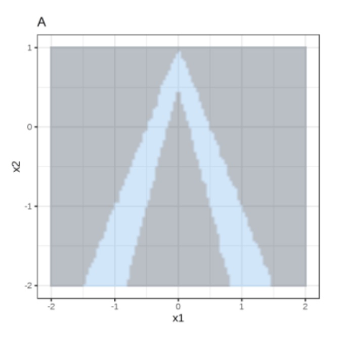 ::: ::: {.column width="40%"} Random forest predictions given features x1 and x2. Predicted classes: 1 (dark) or 0 (light). ::: :::: ## Local Interpretable Model-agnostic Explanations (LIME) :::: {.columns} ::: {.column width="60%"} 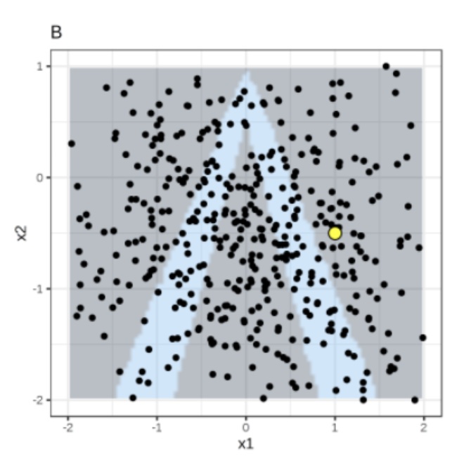 ::: ::: {.column width="40%"} Instance of interest (big yellow dot) and data sampled from a normal distribution (small dots). ::: :::: ## Local Interpretable Model-agnostic Explanations (LIME) :::: {.columns} ::: {.column width="60%"} 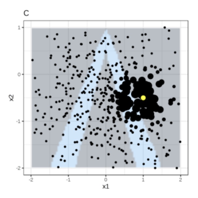 ::: ::: {.column width="40%"} Assign higher weight to points near the instance of interest. I.e., $weight(p) = \sqrt{\frac{e^{-d^2}}{w^2}}$ where $d$ is the distance between $p$ and the instantce of interest, and $w$ is the kernel width (self-defined). ::: :::: ## Local Interpretable Model-agnostic Explanations (LIME) :::: {.columns} ::: {.column width="60%"} 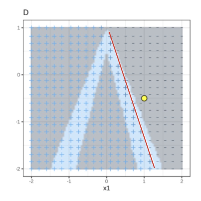 ::: ::: {.column width="40%"} Use both the samples and sample weights to train a linear classifier. Signs of the grid show the classifications of the locally learned model from the weighted samples. The red line marks the decision boundary (P(class=1) = 0.5). The official implementation uses a Ridge Classifier as the linear model for explanation. ::: :::: ## Training local surrogate models to explain individual predictions :::: {.columns} ::: {.column width="50%"}  $s_i$ = sample weight, $\lambda$ = regularization term ::: ::: {.column width="50%"} **Ridge Classifier** $$minimize \sum_{i=1}^{M} s_i(y_i - \hat{y}_i)^2$$ $$= \sum_{i=1}^{M} s_i(y_i - \sum_{j=0}^{p} w_j \times x_{ij})^2 + \lambda \sum_{j=0}^{p} w_j^2$$ $w_j$ = trained weight to explain the importance of feature j The higher the $\lambda$, the more sparse the $w$ (more zeros) will become. ::: :::: ::: footer Ribeiro, M. T., Singh, S., & Guestrin, C. (2016). [*"Why Should I Trust You?" Explaining the Predictions of Any Classifier*](https://arxiv.org/pdf/1602.04938.pdf). KDD. ::: ## LIME Visualization: Bar Charts for Local Explanations **Primary LIME Output: Sparse Bar Charts** :::: {.columns} ::: {.column width="50%"} **Case 1: High Rental Day** *Prediction: ABOVE Trend* ▬▬▬▬▬▬▬▬▬▬ Temp > 20°C
▬▬▬▬▬▬▬ Windspeed Low
▬▬▬ Holiday = False
✓ Warm temperature strongly supports high rentals ✓ Low wind moderately supports ✗ Non-holiday slightly opposes
::: ::: {.column width="50%"} **Case 2: Low Rental Day** *Prediction: BELOW Trend* ▬▬▬▬▬▬▬▬▬▬▬▬ Weather: Rain
▬▬▬▬▬▬▬▬ Temp < 5°C
▬▬ Weekday = True
✗ Rain strongly opposes high rentals ✗ Cold temperature opposes ✓ Weekday weakly supports
::: :::: ::: {.notes} Emphasize the visualization: **Color** (Green supports the prediction, Red opposes it), **Length of Bar** (magnitude of influence), and **Sparsity** (only a few features are shown—this makes it easy for a non-expert to trust). The bar chart is the key deliverable of LIME - it provides a contrastive explanation showing which features push toward vs away from the prediction. Compare the two cases: Case 1 is dominated by green (supporting features), while Case 2 is dominated by red (opposing features). This visual contrast makes the explanation immediately understandable. ::: ## Local Surrogate (LIME): Bike Rental Example **Task:** Predict if bike rentals will be above or below trend ```{python} #| echo: false #| output: false import pandas as pd import numpy as np from sklearn.ensemble import RandomForestClassifier import lime import lime.lime_tabular import matplotlib.pyplot as plt # Load bike sharing dataset url = "https://archive.ics.uci.edu/ml/machine-learning-databases/00275/Bike-Sharing-Dataset.zip" import urllib.request import zipfile import io # Download and extract response = urllib.request.urlopen(url) zip_file = zipfile.ZipFile(io.BytesIO(response.read())) zip_file.extractall("/tmp/bike_data") # Load day.csv bike_df = pd.read_csv("/tmp/bike_data/day.csv") # Create features feature_names = ['season', 'weathersit', 'temp', 'hum', 'windspeed', 'workingday'] X = bike_df[feature_names].values y = (bike_df['cnt'] > bike_df['cnt'].median()).astype(int) # Above/below median # Train random forest rf_model = RandomForestClassifier(n_estimators=100, random_state=42) rf_model.fit(X, y) # Create LIME explainer explainer = lime.lime_tabular.LimeTabularExplainer( training_data=X, feature_names=feature_names, class_names=['BELOW trend', 'ABOVE trend'], mode='classification', random_state=42 ) # Find a high rental day (warm, good weather) high_idx = bike_df[(bike_df['temp'] > 0.7) & (bike_df['weathersit'] == 1)].index[0] high_instance = X[high_idx] exp_high = explainer.explain_instance(high_instance, rf_model.predict_proba, num_features=5) # Find a low rental day (cold, bad weather) low_idx = bike_df[(bike_df['temp'] < 0.3) & (bike_df['weathersit'] == 3)].index[0] low_instance = X[low_idx] exp_low = explainer.explain_instance(low_instance, rf_model.predict_proba, num_features=5) # Store predictions pred_high = rf_model.predict_proba([high_instance])[0] pred_low = rf_model.predict_proba([low_instance])[0] ``` :::: {.columns} ::: {.column width="50%"} **High Rental Day** Prediction: **{python} f"{pred_high[1]:.2f}"** probability ABOVE trend ```{python} #| echo: false #| fig-width: 6.5 #| fig-height: 4.5 fig = exp_high.as_pyplot_figure(label=1) ax = fig.gca() ax.set_xlabel('Feature Contribution to ABOVE Trend', fontsize=13) ax.tick_params(labelsize=12) ax.set_title('LIME Explanation', fontsize=15, fontweight='bold') fig.tight_layout() fig ``` ✓ High temperature strongly supports
✓ Good weather condition supports
::: ::: {.column width="50%"} **Low Rental Day** Prediction: **{python} f"{pred_low[0]:.2f}"** probability BELOW trend ```{python} #| echo: false #| fig-width: 6.5 #| fig-height: 4.5 # For low rental, also explain label=1 (ABOVE) to show negative contributions fig = exp_low.as_pyplot_figure(label=1) ax = fig.gca() ax.set_xlabel('Feature Contribution to ABOVE Trend', fontsize=13) ax.tick_params(labelsize=12) ax.set_title('LIME Explanation', fontsize=15, fontweight='bold') fig.tight_layout() fig ```✓ Good weather condition supports
✗ Bad weather strongly opposes
✗ Low temperature opposes
::: :::: ::: {.notes} This slide shows actual LIME explanations for bike rental predictions. The bar charts display feature contributions - green bars indicate features supporting the prediction, orange/red bars indicate features opposing it. Notice how the high rental day is dominated by positive contributions (warm temp, good weather), while the low rental day is dominated by negative contributions (bad weather, cold temp). The model predictions are shown at the top - one instance has high probability of being ABOVE trend, the other BELOW trend. This is exactly the kind of local explanation LIME provides - understanding which features matter most for each specific prediction. ::: ::: footer Bike Sharing Dataset from UCI Machine Learning Repository. Fanaee-T, H., & Gama, J. (2014). Event labeling combining ensemble detectors and background knowledge. Progress in Artificial Intelligence, 2(2-3), 113-127. ::: ## Local Surrogate (LIME) **Training local surrogate models to explain individual predictions** 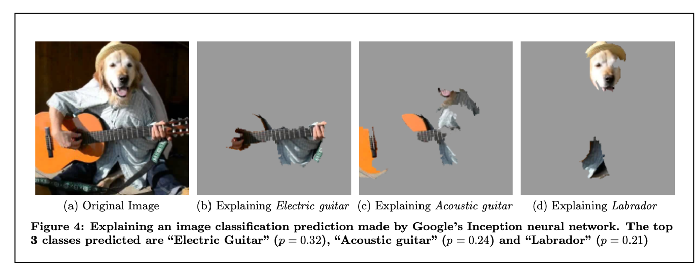{width=90%} ::: footer Ribeiro, M. T., Singh, S., & Guestrin, C. (2016). [*"Why Should I Trust You?" Explaining the Predictions of Any Classifier*](https://arxiv.org/pdf/1602.04938.pdf). KDD. Figure 4. ::: ::: {.notes} This figure demonstrates LIME's model-agnostic nature applied to image classification with Google's Inception neural network. The key adaptation for images is using superpixels (coherent image regions) as interpretable features instead of individual pixels. Notice how LIME provides instance-specific explanations: when explaining "Electric guitar" (p=0.32), it highlights the guitar; when explaining "Acoustic guitar" (p=0.24), it highlights acoustic features; when explaining "Labrador" (p=0.21), it highlights the dog's face. This shows that different predictions for the same image get different explanations - LIME adapts to explain what matters for each specific prediction. The gray regions are turned off (superpixels not contributing to that prediction), while colored regions are what the local linear model identifies as most important. ::: ## Local Surrogate (LIME) **Raw data and explanation of a bad model's prediction in the "Husky vs Wolf" task** 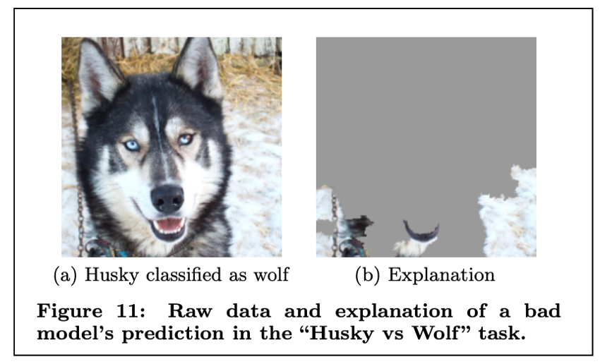{width=70%} ::: footer Ribeiro, M. T., Singh, S., & Guestrin, C. (2016). [*"Why Should I Trust You?" Explaining the Predictions of Any Classifier*](https://arxiv.org/pdf/1602.04938.pdf). KDD. Figure 11. ::: ::: {.notes} This is one of the most famous examples from the LIME paper, demonstrating its value for model debugging. A husky is incorrectly classified as a wolf. The LIME explanation reveals why: the model is focusing on the background snow rather than the animal's features. This exposes a serious flaw - the model learned a spurious correlation between wolves and snowy backgrounds in the training data, rather than learning actual wolf features. Without LIME, this model might have seemed accurate on test data, but would fail catastrophically in the real world when encountering wolves without snow or huskies with snow. This illustrates LIME's critical role in building trust and identifying when NOT to trust a model. The explanation shows which superpixels the model is using - and in this case, it's using the wrong ones. ::: ## LIME: Code Example **Dataset:** California Housing (same model as PDP example) ```{python} #| echo: true #| output: false import lime import lime.lime_tabular import numpy as np # Reload California Housing data for this example housing = fetch_california_housing() X_housing, y_housing = housing.data, housing.target # Retrain model on California Housing model = GradientBoostingRegressor( n_estimators=100, max_depth=4, learning_rate=0.1, random_state=0 ).fit(X_housing, y_housing) # Create LIME explainer using training data explainer = lime.lime_tabular.LimeTabularExplainer( training_data=X_housing, feature_names=housing.feature_names, mode='regression', random_state=0 ) # Select an instance to explain (e.g., instance 0) instance_idx = 0 instance = X_housing[instance_idx] # Generate explanation for this instance # predict_fn should return predictions exp = explainer.explain_instance( instance, model.predict, num_features=5 # Show top 5 features ) ``` ::: footer [LIME Documentation](https://lime-ml.readthedocs.io/) ::: ::: {.notes} LIME provides local explanations by training a simple interpretable model around a specific instance. The LimeTabularExplainer is initialized with the training data to understand feature distributions. The key parameter is `num_features` which controls sparsity - we only show the top 5 most important features for this prediction. Unlike PDP which gives global effects, LIME explains why the model made this specific prediction for this specific instance. The `predict` function is passed to LIME so it can probe the model with perturbed versions of the instance. ::: ## LIME: Output Visualization ```{python} #| echo: false #| fig-width: 12 #| fig-height: 7 # Get the explanation as a matplotlib figure # Increase font sizes for better readability fig = exp.as_pyplot_figure() ax = fig.gca() for text in ax.texts: text.set_fontsize(14) ax.tick_params(labelsize=14) ax.set_xlabel(ax.get_xlabel(), fontsize=16) ax.set_title(ax.get_title(), fontsize=18) fig.tight_layout() fig ``` ::: {style="font-size: 1.3em;"} **Explanation for Instance 0:** Predicted value: `{python} f"{model.predict([instance])[0]:.2f}"` (in units of $100k) The bar chart shows which features push the prediction higher (positive) or lower (negative) for this specific house. ::: ::: {.notes} The output shows a horizontal bar chart with the most important features for this specific prediction. Positive bars (pointing right) indicate features that increase the predicted house value, while negative bars (pointing left) decrease it. The length of each bar represents the magnitude of the feature's contribution. Notice this is a LOCAL explanation - it only applies to this one house. If we explained a different house, we'd likely get different important features. This is the key difference from PDP which shows global average effects. The sparse representation (only 5 features) makes it easy for users to understand and trust the prediction. ::: ## Local Interpretable Model-agnostic Explanations (LIME) ::: {.fragment} **Pros** - Explanations are short (= selective) and possibly contrastive. * we can control the sparsity of weight coefficients in the regressions method. - Very easy to use. ::: ::: {.fragment} **Cons** - Unstable results due to sampling. - Hard to weight similar neighbors in a high dimensional dataset. - Many parameters for data scientists to hide biases. ::: ## SHAP (SHapley Additive exPlanations) :::: {.columns} ::: {.column width="60%"} 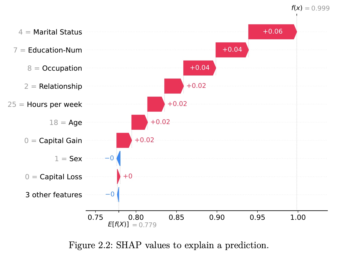 ::: ::: {.column width="40%"} SHAP (Lundberg and Lee 2017a) is a game-theory-inspired method created to explain predictions made by machine learning models. SHAP generates one value per input feature (also known as SHAP values) that indicates how the feature contributes to the prediction of the specified data point. ::: :::: ::: footer Lundberg, S. M., & Lee, S. I. (2017). [*A Unified Approach to Interpreting Model Predictions*](https://proceedings.neurips.cc/paper/2017/file/8a20a8621978632d76c43dfd28b67767-Paper.pdf). NeurIPS. | Molnar, C. (2024). [*SHAP Book*](https://christophmolnar.com/books/shap/). ::: ::: {.notes} SHAP brings rigorous game theory to ML interpretability. The key innovation: apply Shapley values from cooperative game theory to feature attribution. This provides a principled answer to "how much did each feature contribute?" with mathematical guarantees (efficiency, symmetry, dummy, additivity axioms). SHAP unified several existing methods under one framework. The image shows a typical SHAP force plot - red pushes prediction higher, blue pushes lower. Unlike LIME which is heuristic, SHAP has strong theoretical foundations. Trade-off: computational cost is higher, but you get provably fair attributions. ::: ## A Short History of Shapley Values and SHAP **Three key milestones:** * **1953**: The introduction of Shapley values in game theory * **2010**: The initial steps toward applying Shapley values in machine learning * **2017**: The advent of SHAP, a turning point in machine learning ## Lloyd Shapley's Pursuit of Fairness (1953) :::: {.columns} ::: {.column width="60%"} **Lloyd Shapley** - "The greatest game theorist of all time" - PhD at Princeton (post-WWII): "Additive and Non-Additive Set Functions" - 1953 paper: "A Value for n-Person Games" - **2012 Nobel Prize in Economics** (with Alvin Roth) for work in market design and matching theory **The Problem:** How to fairly divide payouts among players who contribute differently to a cooperative game? **The Solution:** Shapley values provide a mathematical method for fair distribution based on marginal contributions ::: ::: {.column width="40%"} **Applications of Shapley values:** - Political science - Economics - Computer science - Dividing profits among shareholders - Allocating costs among collaborators - Assigning credit in research projects✗ Low temperature opposes
**Key insight**: By 1953, Shapley values were well-established in game theory, but machine learning was still in its infancy.
::: :::: ::: footer Shapley, L. S. (1953). A value for n-person games. Contributions to the Theory of Games, 2(28), 307-317. ::: ## Early Days in Machine Learning (2010) **2010: Erik Štrumbelj and Igor Kononenko propose using Shapley values for ML** - Paper: "An efficient explanation of individual classifications using game theory" - 2014 follow-up: Further methodology development **Why didn't it gain immediate traction?** :::: {.columns} ::: {.column width="50%"} ❌ **Barriers to adoption:** 1. Explainable AI/Interpretable ML not widely recognized yet 2. **No code released** with the papers 3. Estimation method too slow for images/text 4. Limited awareness outside specialized communities ::: ::: {.column width="50%"} ✅ **What was needed:** 1. Growing demand for interpretability 2. Open-source implementation 3. Faster computation methods 4. High-profile publication venue 5. Integration with popular ML frameworks ::: :::: ::: footer Štrumbelj, E., & Kononenko, I. (2010). An efficient explanation of individual classifications using game theory. JMLR, 11, 1-18. ::: ## The SHAP Cambrian Explosion (2017) **2016: LIME paper catalyzes the field** Ribeiro et al. introduce Local Interpretable Model-Agnostic Explanations → growing interest in model interpretability **2017: Lundberg and Lee publish SHAP at NeurIPS** "A Unified Approach to Interpreting Model Predictions" **Key contributions beyond 2010 work:** 1. **Kernel SHAP**: New estimation method using weighted linear regression 2. **Unification framework**: Connected SHAP to LIME, DeepLIFT, and Layer-Wise Relevance Propagation 3. **Open-source `shap` package**: Wide range of features and plotting capabilities 4. **High-profile venue**: Published at major ML conference (NIPS/NeurIPS) ## Why SHAP Gained Popularity :::: {.columns} ::: {.column width="50%"} **Critical success factors:** ✓ Published at prestigious venue (NeurIPS) ✓ Pioneering work in rapidly growing field ✓ **Open-source Python package** - enabled integration ✓ Ongoing development by original authors ✓ Strong community contributions ✓ Comprehensive visualization tools **2020 breakthrough:** TreeSHAP - Efficient computation for tree-based models - Enabled SHAP for state-of-the-art models - Made global interpretations possible ::: ::: {.column width="50%"} **Naming conventions:** - **Shapley values**: Original game theory method (1953) - **SHAP**: Application to machine learning (2017) - **SHAP values**: Resulting feature importance values - **`shap`**: The Python library implementation "SHAP" became a brand name like Post-it or Band-Aid - well-established in the community and distinguishes game theory from ML application.
::: :::: ::: footer Lundberg, S. M., & Lee, S. I. (2017). A unified approach to interpreting model predictions. NeurIPS. | Lundberg, S. M., et al. (2020). From local explanations to global understanding with explainable AI for trees. Nature Machine Intelligence, 2(1), 56-67. ::: ## Theory of Shapley Values **Who's going to pay for that taxi?** Alice, Bob, and Charlie have dinner together and share a taxi ride home. **The total cost is $51.** **The question is: How should they divide the costs fairly?** :::: {.columns} ::: {.column width="50%"} | Passengers | Cost | Note | |------------|------|------| | ∅ | $0 | No taxi, no costs | | {Alice} | $15 | Standard fare | | {Bob} | $25 | Luxury taxi | | {Charlie} | $38 | Lives further away | | {Alice, Bob} | $25 | Bob gets his way | | {Alice, Charlie} | $41 | Drop Alice first | | {Bob, Charlie} | $51 | Drop Bob first | | {Alice, Bob, Charlie} | $51 | Full fare | ::: ::: {.column width="50%"} **Key observations:** - Alice alone: $15 - Bob alone: $25 (insists on luxury) - Charlie alone: $38 (lives farther) - All three: $51 **Naive approach:** $51 ÷ 3 = $17 each **Problem:** Is this fair? Alice is subsidizing the others! We need a principled way to divide costs based on **marginal contributions**.
::: :::: ::: {.notes} The taxi example beautifully illustrates why Shapley values are "fair". A naive split ($17 each) is unfair - Alice subsidizes the others. Shapley values compute each person's marginal contribution across all possible orderings of joining the taxi. This ensures: (1) Total cost is exactly split, (2) Symmetric players pay equally, (3) Non-contributors pay nothing, (4) Values are additive. The same logic applies to features in ML: how much does each feature "contribute" to the prediction, measured fairly across all possible feature coalitions? ::: ## Calculating Marginal Contributions **Marginal Contribution** = Value with player − Value without player
**Example:** Charlie joining Bob's taxi = $51 - $25 = **$26** | Addition | To Coalition | Cost Before | Cost After | Marginal Contribution | |----------|--------------|-------------|------------|---------------------| | Alice | ∅ | $0 | $15 | **$15** | | Alice | {Bob} | $25 | $25 | **$0** | | Alice | {Charlie} | $38 | $41 | **$3** | | Alice | {Bob, Charlie} | $51 | $51 | **$0** | | Bob | ∅ | $0 | $25 | **$25** | | Bob | {Alice} | $15 | $25 | **$10** | | Bob | {Charlie} | $38 | $51 | **$13** | | Bob | {Alice, Charlie} | $41 | $51 | **$10** | | Charlie | ∅ | $0 | $38 | **$38** | | Charlie | {Alice} | $15 | $41 | **$26** | | Charlie | {Bob} | $25 | $51 | **$26** | | Charlie | {Alice, Bob} | $25 | $51 | **$26** | ## Weighted Average via Permutations **How to weight these marginal contributions?** Consider all possible permutations (orderings) of passengers joining the taxi: :::: {.columns} ::: {.column width="50%"} **All 3! = 6 permutations:** 1. Alice, Bob, Charlie 2. Alice, Charlie, Bob 3. Bob, Alice, Charlie 4. Bob, Charlie, Alice 5. Charlie, Alice, Bob 6. Charlie, Bob, Alice Each permutation defines which players are "already in the taxi" when each player joins. ::: ::: {.column width="50%"} **For Alice:** - **2 times** added to ∅ (empty taxi) - **1 time** added to {Bob} - **1 time** added to {Charlie} - **2 times** added to {Bob, Charlie} **Weights determined by permutation frequency!** Coalition size matters: smaller coalitions get higher weight.
::: :::: ## Averaging Marginal Contributions **Alice's Shapley value:** $$\phi_{Alice} = \frac{1}{6}(2 \cdot \$15 + 1 \cdot \$0 + 1 \cdot \$3 + 2 \cdot \$0) = \$5.50$$ **Bob's Shapley value:** $$\phi_{Bob} = \frac{1}{6}(2 \cdot \$25 + 1 \cdot \$10 + 1 \cdot \$13 + 2 \cdot \$10) = \$15.50$$ **Charlie's Shapley value:** $$\phi_{Charlie} = \frac{1}{6}(2 \cdot \$38 + 1 \cdot \$26 + 1 \cdot \$26 + 2 \cdot \$26) = \$30.00$$ **Verification:** $5.50 + $15.50 + $30.00 = **$51.00** ✓
## General Shapley Value Formula **Game Theory Notation:** | Term | Math | Taxi Example | |------|------|--------------| | Player | $j \in \{1, \ldots, N\}$ | Alice, Bob, Charlie | | Coalition | $S \subseteq N$ | {Alice, Bob} | | Value Function | $v(S)$ | Cost of coalition | | Shapley Value | $\phi_j$ | Fair share for player $j$ | **The Formula:** $$\phi_j = \sum_{S \subseteq N \setminus \{j\}} \frac{|S|!(N - |S| - 1)!}{N!} \left( v(S \cup \{j\}) - v(S) \right)$$ **The Shapley value is the weighted average of a player's marginal contributions to all possible coalitions.**
## The Four Axioms Behind Shapley Values :::: {.columns} ::: {.column width="50%"} **1. Efficiency** The contributions sum to the total payout: $$\sum_{j \in N} \phi_j = v(N)$$ *In taxi: $5.50 + $15.50 + $30 = $51* ✓
**2. Symmetry** If players have identical marginal contributions, they get equal payouts: If $v(S \cup \{j\}) = v(S \cup \{k\})$ for all $S$, then $\phi_j = \phi_k$ *If Bob didn't need luxury taxi, he'd pay same as Alice*
::: ::: {.column width="50%"} **3. Dummy (Null Player)** Players who contribute nothing get nothing: If $v(S \cup \{j\}) = v(S)$ for all $S$, then $\phi_j = 0$ *If Dora the dog rides free, her share = $0*
**4. Additivity** For two games with value functions $v_1$ and $v_2$: $$\phi_{j,v_1+v_2} = \phi_{j,v_1} + \phi_{j,v_2}$$ *Can split taxi + ice cream costs separately, then add*
::: :::: **These four axioms uniquely determine the Shapley value formula** (Shapley, 1953)
## From Shapley Values to SHAP **A Machine Learning Example** You have trained a model $f$ to predict apartment prices. **For a specific apartment $x^{(i)}$:** - Area: 50 m² (538 sq ft) - Floor: 2nd floor - Park: Nearby - Cats: Banned **Predictions:** - $f(x^{(i)}) = \text{€}300,000$ (this apartment) - $\mathbb{E}[f(X)] = \text{€}310,000$ (average) - **Difference: -€10,000** **Goal:** Explain how each feature value contributed to the -€10,000 difference from average.
## Viewing a Prediction as a Coalitional Game **Key insight:** Each feature value is a "player" in a game where the "payout" is the prediction. | Game Theory Concept | Machine Learning Translation | Notation | |---------------------|------------------------------|----------| | Player | Feature index | $j$ | | Coalition | Set of features | $S \subseteq \{1, \ldots, p\}$ | | Not in coalition | Features not in $S$ | $C = \{1, \ldots, p\} \setminus S$ | | Coalition size | Number of features in $S$ | $\|S\|$ | | Total players | Number of features | $p$ | | **Total payout** | **Prediction - Average** | $f(x^{(i)}) - \mathbb{E}[f(X)]$ | | **Value function** | **Prediction for coalition** | $v_{f,x^{(i)}}(S)$ | | **Shapley value** | **SHAP value (contribution)** | $\phi_j^{(i)}$ | We translate concepts from game theory to machine learning predictions → **SHAP**
## The SHAP Value Function **How do we handle "absent" features in a coalition?** $$v_{f,x^{(i)}}(S) = \int f(x_S^{(i)} \cup X_C) d\mathbb{P}_{X_C} - \mathbb{E}[f(X)]$$ :::: {.columns} ::: {.column width="50%"} **Key components:** 1. $x_S^{(i)}$: Known feature values (in coalition $S$) 2. $X_C$: Unknown features (random variables) 3. $\int \ldots d\mathbb{P}_{X_C}$: **Marginalization** - integrate over distribution 4. $-\mathbb{E}[f(X)]$: Ensures $v(\emptyset) = 0$ **Marginalization:** Treat absent features as random variables, weight predictions by their likelihood ::: ::: {.column width="50%"} **Apartment example:** For coalition $S = \{\text{park}, \text{floor}\}$: $$v(\{park, floor\}) = \int f(x_{park}, X_{cat}, X_{area}, x_{floor}) d\mathbb{P}_{cat,area}$$ - $x_{park} = \text{nearby}$ (known) - $x_{floor} = 2$ (known) - $X_{cat}$, $X_{area}$ (random - integrated over) **Present** features input directly; **absent** features marginalized out
::: :::: ## SHAP Visualization: Force Plot **Visualizing the Efficiency Axiom** **Base Value** (E[f(x)]) = $300K **Output Value** f(x) = $450K
::: {.notes} This visualization directly maps the Efficiency Axiom from the theory section: the contributions (φᵢ) of all features (red/blue blocks) must sum up exactly from the Base Value (average prediction) to the Final Output (instance prediction). This is a powerful, rigorous local explanation. Red blocks push the prediction higher; blue blocks push it lower. The horizontal layout shows the additive nature - each feature's contribution stacks to reach the final prediction. This is fundamentally different from LIME which uses sampling; SHAP provides exact attributions based on game theory. ::: ## Putting It All Together: The SHAP Formula **Combining all terms into the SHAP equation:** $$\phi_j^{(i)} = \sum_{S \subseteq \{1,\ldots,p\} \setminus j} \frac{|S|! (p - |S| - 1)!}{p!} \cdot \left( \int f(x_{S \cup j}^{(i)} \cup X_{C \setminus j}) d\mathbb{P}_{X_{C \setminus j}} - \int f(x_S^{(i)} \cup X_C) d\mathbb{P}_{X_C} \right)$$ ▬▬▬▬▬▬ **+$80K** Area=85m² (high pushes price up)
▬▬▬▬ **+$45K** Location=Downtown
▬▬▬ **+$30K** Year=2020 (new)
▬▬ **-$15K** Cat-banned=True
▬ **-$10K** Floor=1 (ground floor)
**Sum: $300K + $80K + $45K + $30K - $15K - $10K = $450K ✓**▬▬▬▬ **+$45K** Location=Downtown
▬▬▬ **+$30K** Year=2020 (new)
▬▬ **-$15K** Cat-banned=True
▬ **-$10K** Floor=1 (ground floor)
**In words:** The SHAP value $\phi_j^{(i)}$ of feature $j$ is the **weighted average marginal contribution** of feature value $x_j^{(i)}$ across all possible coalitions of features.
**This is Shapley values with an ML-specific value function!** ::: {.notes} This formula looks complex but it's the same Shapley formula we saw before, just with the ML-specific value function plugged in. The integral handles absent features through marginalization. In practice, we can't compute this exactly (we don't know the true distribution), so we estimate it. ::: ## Interpreting SHAP Values Through Axioms **Since SHAP values are Shapley values, they satisfy the four axioms:** :::: {.columns} ::: {.column width="50%"} **1. Efficiency** $$\sum_{j=1}^p \phi_j^{(i)} = f(x^{(i)}) - \mathbb{E}[f(X)]$$ **Implications:** - SHAP values sum to deviation from average - Attributions on same scale as output - Unlike gradients, which don't sum to prediction - Enables force plot visualizations **2. Symmetry** Features with equal contributions get equal SHAP values **Implications:** - Feature order doesn't matter - Essential for feature importance ranking - Unlike breakdown method which depends on order ::: ::: {.column width="50%"} **3. Dummy** Unused features get SHAP value of zero **Implications:** - If feature doesn't affect prediction → $\phi_j = 0$ - Makes sense for sparse models - E.g., Lasso with $\beta_j = 0$ → $\phi_j^{(i)} = 0$ for all $i$ **4. Additivity** For ensemble models: $\phi_j(v_1 + v_2) = \phi_j(v_1) + \phi_j(v_2)$ **Implications:** - For random forest: compute SHAP per tree, then average - For additive ensembles: sum individual SHAP values - Enables TreeSHAP efficiency ::: :::: ::: footer Štrumbelj & Kononenko (2010, 2014); Lundberg & Lee (2017) ::: ## Key Differences: LIME vs. SHAP :::: {.columns} ::: {.column width="50%"} **LIME** - Heuristic local approximation - Sparse explanations (few features) - Faster to compute - Good for lay audiences - No theoretical guarantees Best when: You want **simple**, **sparse** explanations with only most important features highlighted
::: ::: {.column width="50%"} **SHAP** - Rigorous game-theoretic foundation - Always uses **all features** - Computationally expensive - Satisfies fairness axioms - Unique solution Best when: You need **complete**, **theoretically grounded** feature attributions with fairness guarantees
::: :::: **Important:** SHAP values measure contribution to deviation from average, NOT the effect of removing features from training. ::: footer Source: Molnar, C. (2024). Interpretable Machine Learning. ::: ## SHAP Visualization: Global Feature Analysis (Summary Plot) **From Local to Global: Understanding Feature Importance Across All Predictions** :::: {.columns} ::: {.column width="60%"} **Feature Importance** (Y-axis) ↓
::: ::: {.column width="40%"} **Dual Interpretation:** 1. **Feature Importance** (Y-Axis vertical spread) - Wider spread = more important - Area has largest impact 2. **Direction of Effect** (Color) - Red (high) on right = positive impact - Blue (low) on left = negative impact **Example Reading:** - High area (red) → strong positive SHAP - Low area (blue) → negative SHAP - Clear correlation! ::: :::: ::: {.notes} Explain the dual interpretation of this plot: (1) **Feature Importance (Y-Axis)**: Vertical spread/density of points indicates a feature's overall importance (like traditional feature importance). Features at the top matter more globally across all predictions. (2) **Correlation (Color)**: The color coding (Red for high feature value, Blue for low) shows the relationship. For example, 'Red points on the far right' means high feature values are associated with high positive impact on the prediction. Area shows both high importance AND clear directionality - bigger apartments cost more. Compare this to cat-banned which has mixed effects and lower importance. This plot aggregates SHAP values across many instances to give a global view. ::: ## SHAP (SHapley Additive exPlanations) ::: {.fragment} **Pros** - Fairly distributed feature importance to a prediction - Contrastive explanations (can compare an instance to a subset or even to a single data point) - Solid theory ::: ::: {.fragment} **Cons** - A lot of computing time - Not sparse explanations (every feature is important) ::: ## SHAP (SHapley Additive exPlanations) 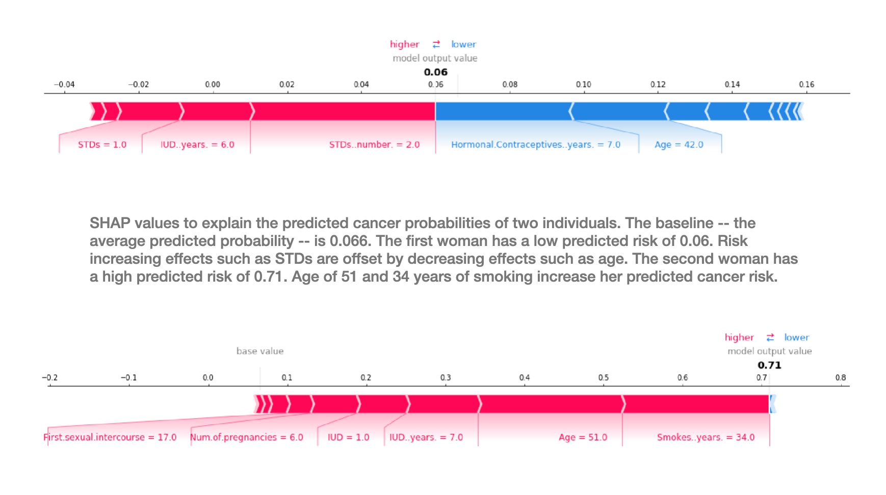 ## SHAP limitations :::: {.columns} ::: {.column width="50%"}  ::: ::: {.column width="50%"} **Key Limitations:** - **Computational Cost**: Exponential complexity O(2^n) for exact calculation - **Feature Independence Assumption**: Unrealistic in correlated datasets - **Interpretation Challenges**: Values represent marginal contributions, not causal effects - **Instability**: Small perturbations can lead to different explanations ::: :::: ::: footer Kumar, I. E., et al. (2020). [*Problems with Shapley-value-based explanations as feature importance measures*](http://proceedings.mlr.press/v119/kumar20e/kumar20e.pdf). ICML. ::: ::: {.notes} Despite SHAP's theoretical elegance, it has important limitations that practitioners must understand. The Kumar et al. paper provides crucial critiques: (1) SHAP assumes features can be independently varied, but real features are often correlated (e.g., house size and bedrooms), (2) SHAP values show associative, not causal relationships - they tell you "what" contributes but not "why", (3) Computational cost grows exponentially with features (though approximations like TreeSHAP and KernelSHAP help), (4) Explanations can be unstable under small data perturbations. Bottom line: SHAP is a powerful tool but not a magic bullet. Always validate explanations against domain knowledge. ::: ## SHAP Limitations: Not Always Human-Friendly :::: {.columns} ::: {.column width="50%"} **What Makes Explanations Human-Friendly?** *(Miller 2019)* Human-friendly explanations should be: 1. **Concise**: Focus on key factors (2-3 features) 2. **Contrastive**: Compare to specific alternatives 3. **Abnormal**: Highlight unusual causes **But SHAP:** - ❌ **Not concise**: Always uses ALL features - ❌ **Not strongly contrastive**: Averages over many coalitions, diluting contrast - ❌ **Doesn't highlight abnormal**: Treats all features equally **Area (m²)** ●●●●●●●●●●●●●●
**Location** ●●●●●●●●●●
**Year Built** ●●●●●●●●●
**Cat-banned** ●●●●●
**Floor** ●●●●●
← Negative Impact **SHAP Value** Positive Impact → ● Blue = Low feature value ● Red = High feature value**Location** ●●●●●●●●●●
**Year Built** ●●●●●●●●●
**Cat-banned** ●●●●●
**Floor** ●●●●●
**⚠️ Warning**: Don't present SHAP values to end-users as straightforward information. They require explanation and training to understand properly.
::: ::: {.column width="50%"} **SHAP Doesn't Enable User Actions** **Example: Corn Yield Prediction** - Model predicts low yield for a field - SHAP: "Fertilizer use had +0.3 positive impact" - Farmer asks: **"Should I add more fertilizer?"** - SHAP: 🤷 **Cannot answer!** SHAP explains the **current state** vs. average, not **how to change** outcomes.
**For Actionable Recommendations:** - Use **counterfactual explanations**: "If fertilizer increased by 20%, yield would increase by 5%" - Design models with **causal relationships** - Use **representative training data** ::: :::: ::: footer Miller, T. (2019). [*Explanation in artificial intelligence: Insights from the social sciences*](https://www.sciencedirect.com/science/article/pii/S0004370218305988). Artificial Intelligence, 267, 1-38. ::: ::: {.notes} This slide addresses critical usability limitations of SHAP. Research on human cognition shows that good explanations are concise (2-3 key factors), contrastive (compared to specific alternatives), and focus on abnormal causes. SHAP fails on all three: it always attributes to ALL features (not concise), averages over many coalitions which dilutes contrastiveness, and treats all features equally without highlighting what's unusual. The corn yield example illustrates another major limitation: SHAP doesn't enable action. It tells you fertilizer had a positive contribution compared to the average field, but doesn't answer "should I add more?" This is because SHAP measures deviation from background data, not causal effects of changes. For actionable insights, you need counterfactual explanations that explicitly model "what if" scenarios. Bottom line: SHAP is a technical tool for ML practitioners, not an end-user explanation method. ::: ## SHAP Limitations: Misinterpretation and Adversarial Risks :::: {.columns} ::: {.column width="50%"} **Common Misinterpretations** **❌ Wrong Interpretation:** "SHAP value = difference in prediction if feature removed from training" **✓ Correct Interpretation:** "SHAP value = contribution to deviation from mean prediction, given current feature values"
**SHAP Is NOT:** - ❌ A **surrogate model** (unlike LIME) - Cannot predict effects of feature changes - Example: "If salary increases €300, credit score increases 5 points" ← SHAP can't do this! - ❌ **Training-data independent** - Requires background data for computation - Privacy/access concerns in production ::: ::: {.column width="50%"} **Adversarial Risk: You Can Fool SHAP** *(Slack et al. 2020)* Unscrupulous data scientists can create **intentionally misleading** SHAP explanations to conceal biases: **Attack Scenario:** 1. Train a **biased model** (e.g., using race for loan decisions) 2. Add **decoy features** that appear important to SHAP 3. Manipulate **background data** distribution 4. Result: SHAP shows "fair" explanations for discriminatory predictions!
**Philosophical Issue: No Consensus** - What should "feature importance" mean? - Are SHAP axioms the "right" definition? - Process is backwards: method → interpretation "We use a mathematically coherent method that generates an 'explanation' and then attempt to decipher its meaning." - Molnar (2024)
::: :::: ::: footer Slack, D., et al. (2020). [*Fooling LIME and SHAP*](https://arxiv.org/abs/1911.02508). AIES. | Molnar, C. (2024). *Interpretable Machine Learning*. ::: ::: {.notes} This slide covers critical risks in deploying SHAP. FIRST, misinterpretation is common and dangerous. SHAP values are NOT the effect of removing features from training - they're contributions to deviation from the mean prediction given current values. This subtle distinction matters for correct interpretation. SHAP also isn't a surrogate model like LIME - you can't use it to simulate "what if" changes. SECOND, adversarial risk: Slack et al. demonstrated that malicious data scientists can intentionally create misleading SHAP explanations. They can add decoy features, manipulate background data, and train models that appear fair to SHAP while being discriminatory. This is particularly dangerous for auditing AI systems - you can't blindly trust SHAP explanations without deeper investigation. THIRD, philosophical issue: there's no consensus in the field about what "feature importance" should mean. SHAP defines it through axioms, but are these the right axioms? For linear/additive models, SHAP aligns with coefficients, which validates the approach. But for complex interactions, interpretation becomes murky. The field often works backwards: we apply mathematically elegant methods and then try to understand what they mean, rather than defining what we want first. ::: ## Deep Dive: The Correlation Problem **Why Correlated Features Break SHAP's Independence Assumption** :::: {.columns} ::: {.column width="55%"} **The Core Issue:** SHAP simulates feature absence by replacing them with **sampled values from background data** (marginal distribution) **Problems with Correlated Features:** 1. **Unrealistic data points**: Combining features independently creates impossible combinations - Example: 2-meter tall person weighing 10 kg - Example: Rain without clouds 2. **Extrapolation**: Model evaluated on data it never saw during training 3. **Misleading explanations**: SHAP values based on unrealistic scenarios ::: ::: {.column width="45%"} **Philosophical Question:** If two features share information (e.g., rainfall ↔ cloudiness), can we truly isolate the effect of one while ignoring the other?
**The Trade-off:** - **Marginal sampling**: True to the **model** - **Conditional sampling**: True to the **data** Your choice depends on interpretation goals! ::: :::: ::: footer Molnar, C. (2024). *Interpretable Machine Learning*. Chapter 11: The Correlation Problem. ::: ::: {.notes} The correlation problem is subtle but critical. SHAP's marginal sampling strategy assumes features can be varied independently, but this assumption fails when features are correlated. When we replace a feature value with one sampled from the background data without considering correlations, we create data points that may never occur in reality. For example, if apartment size and number of rooms are correlated, SHAP might evaluate a 20m² apartment with 5 bedrooms - physically impossible. The model was never trained on such data and might produce unreliable predictions. This raises a philosophical question: what does "feature importance" even mean when features share information? The rainfall/cloudiness example illustrates this perfectly - if it rained, it must have been cloudy, so how do we isolate rain's effect? ::: ## Visualizing the Correlation Problem ```{python} #| echo: true #| output: true #| fig-width: 14 #| fig-height: 6 import numpy as np import matplotlib.pyplot as plt np.random.seed(42) # Create two highly correlated features (ρ = 0.9) p = 0.9 mean = [0, 0] cov = [[1, p], [p, 1]] n = 100 x1, x2 = np.random.multivariate_normal(mean, cov, n).T # Point to explain point = (-1.7, -1.7) m = 15 # number of samples # Marginal sampling: sample x2 independently (ignores correlation) x2_marg = np.random.choice(x2, size=m) # Conditional sampling: sample x2 given x1 (respects correlation) x2_cond = np.random.normal(loc=p*point[0], scale=np.sqrt(1-p**2), size=m) # Create side-by-side plots fig, (ax1, ax2) = plt.subplots(1, 2, figsize=(14, 6)) # Left: Marginal sampling (SHAP default) ax1.scatter(x1, x2, color='black', alpha=0.2, s=50, label='Training data') ax1.scatter(np.repeat(point[0], m), x2_marg, color='blue', s=100, alpha=0.7, label='Marginal samples') ax1.scatter(point[0], point[1], color='red', s=200, marker='*', label='Point to explain', zorder=10) ax1.set_xlabel('Feature X₁', fontsize=14) ax1.set_ylabel('Feature X₂', fontsize=14) ax1.set_title('Marginal Sampling (SHAP Default)\n⚠️ Creates unrealistic data points', fontsize=16, fontweight='bold') ax1.legend(fontsize=12) ax1.grid(alpha=0.3) ax1.set_xlim(-2.5, 2.5) ax1.set_ylim(-2.5, 2.5) # Right: Conditional sampling ax2.scatter(x1, x2, color='black', alpha=0.2, s=50, label='Training data') ax2.scatter(np.repeat(point[0], m), x2_cond, color='green', s=100, alpha=0.7, label='Conditional samples') ax2.scatter(point[0], point[1], color='red', s=200, marker='*', label='Point to explain', zorder=10) ax2.set_xlabel('Feature X₁', fontsize=14) ax2.set_ylabel('Feature X₂', fontsize=14) ax2.set_title('Conditional Sampling P(X₂|X₁)\n✓ Respects feature correlation', fontsize=16, fontweight='bold') ax2.legend(fontsize=12) ax2.grid(alpha=0.3) ax2.set_xlim(-2.5, 2.5) ax2.set_ylim(-2.5, 2.5) plt.tight_layout() plt.show() ``` ::: {.notes} This visualization demonstrates the correlation problem concretely. We simulate two features with high correlation (ρ=0.9) - notice the diagonal cloud of training data points. The red star is the point we want to explain at (-1.7, -1.7). LEFT PLOT shows marginal sampling (SHAP's default): when computing SHAP for X₁, we fix it at -1.7 and sample X₂ independently from the background data (blue points). Notice these blue points spread across the entire range of X₂, creating data points far outside the training distribution - these are unrealistic! RIGHT PLOT shows conditional sampling: we sample X₂ given X₁=-1.7, respecting their correlation. Green points cluster near the red star, staying within the training distribution. Marginal sampling evaluates the model on out-of-distribution data, potentially yielding misleading SHAP values. Conditional sampling avoids this but changes the interpretation (no longer pure Shapley values). ::: ## Solutions to the Correlation Problem :::: {.columns} ::: {.column width="50%"} **Solution 1: Reduce Correlation in Model** - **Feature selection**: Remove redundant correlated features - **Feature engineering**: Transform features to decorrelate - Example: "rent" + "rooms" → "rent per m²" - **Combine features**: Daily rainfall vs. morning/afternoon rain - **Dimensionality reduction**: PCA (but loses interpretability) **✓ Benefit**: Improves both model performance AND interpretability
::: ::: {.column width="50%"} **Solution 2: Use Conditional Sampling** Available in SHAP library: ```python # Linear models explainer = shap.LinearExplainer( model, X_train, feature_perturbation='correlation_dependent' ) # Tree models explainer = shap.TreeExplainer( model, feature_perturbation='tree_path_dependent' ) ``` **⚠️ Warning**: Changes the value function - no longer pure Shapley values! Use when goal is to understand **data** rather than audit **model**.
::: :::: ::: footer Aas, K., et al. (2021). [*Explaining individual predictions when features are dependent*](https://www.jmlr.org/papers/volume22/20-1223/20-1223.pdf). JMLR, 22(213), 1-34. ::: ::: {.notes} There are two main approaches to handle the correlation problem. SOLUTION 1: Prevent the problem by reducing feature correlations during model development. This is the cleanest approach - use feature selection methods that identify and remove correlated features, apply feature engineering to decorrelate (e.g., instead of absolute rent and size, use rent per square meter), or combine redundant features. This not only helps SHAP but often improves model generalization. SOLUTION 2: Use conditional sampling when computing SHAP values. The SHAP library provides feature_perturbation options for this. However, understand the trade-off: conditional sampling changes the underlying game-theoretic foundation. The resulting values aren't true Shapley values anymore, and interpretation changes. Marginal sampling (default) is "true to the model" - it shows what the model learned, including potential artifacts from correlation. Conditional sampling is "true to the data" - it respects real-world distributions. Choose based on your goal: model auditing → marginal; data understanding → conditional. ::: ## SHAP in Practice: Wine Quality Prediction **A Complete Example with Linear Models** :::: {.columns} ::: {.column width="50%"} **Dataset: UCI Wine Quality** - White wine physicochemical properties - Target: Quality score (0-10) - 11 features: alcohol, acidity, sugar, etc. - 4,898 samples **Why Linear Models?** - Inherently interpretable (coefficients) - SHAP values simplify elegantly - Perfect for teaching SHAP concepts ::: ::: {.column width="50%"} **Learning Objectives:** 1. Load and explore wine dataset 2. Train linear regression model 3. Compute SHAP values efficiently 4. Create three key visualizations: - Waterfall plot (local) - Summary plot (global) - Dependence plot (relationships) 5. Verify SHAP = coefficients ::: :::: ::: footer Cortez, P., et al. (2009). Modeling wine preferences by data mining from physicochemical properties. *Decision Support Systems*, 47(4), 547-553. ::: ::: {.notes} We'll now work through a complete SHAP example using the UCI Wine Quality dataset. This example is ideal for teaching because: (1) Linear models are inherently interpretable, making it easier to understand what SHAP is computing, (2) SHAP has efficient exact computation for linear models (no approximation needed), (3) We can verify our understanding by comparing SHAP values to model coefficients. The dataset predicts wine quality from physicochemical properties - a realistic regression task with clear feature interpretations. ::: ## Loading the Wine Quality Dataset ```{python} #| echo: true #| output: true import pandas as pd import numpy as np from sklearn.model_selection import train_test_split from sklearn.linear_model import LinearRegression import shap # Load wine quality dataset url = 'https://archive.ics.uci.edu/ml/machine-learning-databases/wine-quality/winequality-white.csv' wine = pd.read_csv(url, sep=";") print(f"Dataset shape: {wine.shape}") print(f"\nFeatures: {list(wine.columns[:-1])}") print(f"\nQuality distribution:\n{wine['quality'].value_counts().sort_index()}") print(f"\nFirst few rows:\n{wine.head(3)}") ``` ::: {.notes} We load the white wine quality dataset directly from UCI. Notice the dataset has 4,898 wines with 11 physicochemical features (fixed acidity, volatile acidity, citric acid, residual sugar, chlorides, free sulfur dioxide, total sulfur dioxide, density, pH, sulphates, alcohol) and one target variable (quality). The quality scores range from 3 to 9, with most wines scoring 5-6. This is a real-world regression problem with interpretable features. ::: ## Training a Linear Regression Model ```{python} #| echo: true #| output: true # Prepare features and target X = wine.drop('quality', axis=1) y = wine['quality'] # Split data X_train, X_test, y_train, y_test = train_test_split( X, y, test_size=0.2, random_state=42 ) # Train linear regression model model = LinearRegression() model.fit(X_train, y_train) # Evaluate model train_score = model.score(X_train, y_train) test_score = model.score(X_test, y_test) print(f"Train R² score: {train_score:.3f}") print(f"Test R² score: {test_score:.3f}") print(f"\nModel coefficients:") for feature, coef in zip(X.columns, model.coef_): print(f" {feature:25s}: {coef:+.4f}") print(f" Intercept: {model.intercept_:.4f}") ``` ::: {.notes} We split the data 80/20 and train a simple linear regression model. The R² scores (~0.28) indicate moderate predictive power - typical for wine quality prediction. The coefficients show interpretable relationships: alcohol has the strongest positive effect (+0.28), volatile acidity has a strong negative effect (-1.86), and density has a large negative coefficient (-32.67). These coefficients represent the linear relationship between each feature and quality. Soon we'll see how SHAP values relate to these coefficients. ::: ## Computing SHAP Values with LinearExplainer ```{python} #| echo: true #| output: true # Create SHAP explainer for linear models explainer = shap.LinearExplainer(model, X_train) # Compute SHAP values for test set shap_values = explainer(X_test) print(f"SHAP values shape: {shap_values.values.shape}") print(f"Base value (average prediction): {shap_values.base_values[0]:.3f}") print(f"\nSHAP values for first test instance:") for feature, value in zip(X.columns, shap_values.values[0]): print(f" {feature:25s}: {value:+.4f}") print(f"\nPrediction for first instance: {model.predict(X_test.iloc[[0]])[0]:.3f}") print(f"Sum: base_value + sum(shap_values) = {shap_values.base_values[0] + shap_values.values[0].sum():.3f}") ``` ::: {.notes} We use SHAP's LinearExplainer, which computes exact SHAP values efficiently for linear models. The explainer is initialized with the model and training data (to compute the base value). For each test instance, SHAP returns: (1) base_value: the average prediction across training data, (2) shap_values: the contribution of each feature to deviation from base_value. Notice that base_value + sum(shap_values) equals the model's prediction - this is the additivity property. For linear models, SHAP values have a simple form: shap_i = coef_i × (x_i - mean(x_i)). This makes linear models perfect for understanding SHAP. ::: ## SHAP Waterfall Plot: Local Explanation ```{python} #| echo: true #| output: true #| fig-width: 12 #| fig-height: 8 # Select an interesting wine (high quality prediction) idx = np.argmax(model.predict(X_test)) print(f"Selected wine index: {idx}") print(f"Predicted quality: {model.predict(X_test.iloc[[idx]])[0]:.2f}") print(f"Actual quality: {y_test.iloc[idx]}") # Create waterfall plot shap.plots.waterfall(shap_values[idx]) ``` ::: {.notes} The waterfall plot shows how SHAP builds up from the base value (average prediction ~5.88) to the final prediction for a specific wine. Read from bottom to top: we start at E[f(X)], then each feature either pushes the prediction higher (red, right) or lower (blue, left). For this high-quality wine, alcohol content adds the most positive contribution, followed by density and volatile acidity. The sum of all contributions equals f(x) - E[f(X)]. This visualization answers: "Why did the model predict THIS value for THIS wine?" It's perfect for explaining individual predictions to stakeholders. ::: ## SHAP Summary Plot: Global Feature Importance ```{python} #| echo: true #| output: true #| fig-width: 12 #| fig-height: 8 # Create summary plot (beeswarm) shap.plots.beeswarm(shap_values) ``` ::: {.notes} The summary plot (also called beeswarm plot) aggregates SHAP values across ALL test instances to show global patterns. The Y-axis shows features ranked by importance (vertical spread). The X-axis shows SHAP values (impact on prediction). Color indicates feature value (red = high, blue = low). Key insights: (1) Alcohol is most important - high values (red) consistently push predictions higher (right), (2) Volatile acidity is second most important - high values push predictions lower (left), (3) Density shows strong negative relationship when high. Compare this to feature importance from tree models - SHAP provides the same ranking but with directionality. This plot answers: "Which features matter most GLOBALLY across all wines?" ::: ## SHAP Dependence Plot: Feature Relationships ```{python} #| echo: true #| output: true #| fig-width: 12 #| fig-height: 8 # Create dependence plot for alcohol shap.plots.scatter(shap_values[:, 'alcohol']) ``` ::: {.notes} The dependence plot shows the relationship between feature value (X-axis) and SHAP value (Y-axis) for a specific feature. For alcohol, we see a clear LINEAR relationship - as alcohol increases, SHAP value increases proportionally. This makes perfect sense for a linear model! The color indicates interaction effects with another feature (automatically selected by SHAP). The vertical spread at each X value shows variance across instances. This plot answers: "HOW does this feature affect predictions?" For linear models, you'll always see straight lines. For non-linear models (trees, neural networks), these plots reveal non-linear patterns, thresholds, and interactions. ::: ## Verifying SHAP Values for Linear Models ```{python} #| echo: true #| output: true # For linear models: SHAP = coefficient × (x - mean(x)) # Let's verify this relationship print("Verification: SHAP values = coefficient × (feature - mean)") print("\nFor the first test instance:") print(f"{'Feature':<25} {'Coefficient':>12} {'Value':>10} {'Mean':>10} {'(Val-Mean)':>12} {'SHAP Value':>12} {'Match?':>8}") print("-" * 105) for i, feature in enumerate(X.columns): coef = model.coef_[i] value = X_test.iloc[0][feature] mean = X_train[feature].mean() expected_shap = coef * (value - mean) actual_shap = shap_values.values[0][i] match = "✓" if np.isclose(expected_shap, actual_shap, rtol=1e-3) else "✗" print(f"{feature:<25} {coef:>12.4f} {value:>10.2f} {mean:>10.2f} {value-mean:>12.2f} {actual_shap:>12.4f} {match:>8}") ``` ::: {.notes} This verification slide demonstrates the elegant simplicity of SHAP for linear models. For each feature, SHAP value equals: coefficient × (feature_value - mean_feature_value). This shows that: (1) SHAP respects the linear model's coefficients (direction and magnitude), (2) SHAP measures deviation from the mean (why predictions differ from average), (3) Features with large coefficients AND large deviations have high SHAP values. This is why linear models are perfect for teaching SHAP - you can directly see what SHAP computes. For non-linear models, SHAP still satisfies the same axioms, but the computation is more complex. The key insight: SHAP provides feature attributions that respect the model's actual behavior. ::: ## Comparative Trade-offs: Choosing the Right XAI Tool | **Criterion** | **PDP***Partial Dependence Plot* | **LIME**
*Local Interpretable Model-agnostic Explanations* | **SHAP**
*SHapley Additive exPlanations* | |--------------|---------|----------|----------| | **Scope** | Global (feature-level) | Local (instance-level) | Both (local + global) | | **Primary Visualization** | Line plot (2D curve) | Bar chart (sparse) | Force plot, Summary plot | | **Interpretability** | ★★★★★ Intuitive | ★★★★☆ Easy to understand | ★★★☆☆ Requires training | | **Computational Cost** | ★★★★☆ Moderate | ★★★☆☆ Fast sampling | ★★☆☆☆ Expensive | | **Theoretical Foundation** | Statistical (marginal effects) | Heuristic (local approximation) | Game theory (Shapley values) | | **Feature Coverage** | One at a time | Sparse (selected) | All features (dense) | | **Best For** | Understanding global trends | Quick local explanations | Rigorous feature attribution | | **Key Limitation** | Assumes independence | Unstable (sampling) | Computational cost | ::: {.notes} This table provides a decision guide for practitioners. **Choose PDP** when you need to understand how a feature affects predictions globally - great for presentations to stakeholders. **Choose LIME** when you need fast, interpretable explanations for individual predictions - ideal for production systems where speed matters. **Choose SHAP** when you need theoretically grounded attributions and can afford the computational cost - best for research or high-stakes decisions. In practice, use multiple methods: PDP for global insights, LIME for quick checks, SHAP for final validation. Remember: no method is perfect - always validate against domain knowledge and use visualizations to communicate effectively. :::