## Agenda ::: incremental 1. **Clustering** - Introduction to unsupervised learning - K-means clustering on IRIS dataset - DBSCAN and other clustering methods 2. **Dimensionality Reduction** - The manifold hypothesis and intrinsic dimensionality - Principal Component Analysis (PCA) - Eigenvectors, eigenvalues, and covariance matrices - Singular Value Decomposition (SVD) - Local Linear Embedding (LLE) - Preview: Non-linear Manifold Learning (t-SNE, UMAP) ::: ::: {.notes} Today we're covering two fundamental unsupervised learning techniques that are crucial for understanding and visualizing machine learning models. First, we'll explore clustering - finding natural groupings in data without labels. We'll use the classic IRIS dataset to demonstrate K-means and discuss other methods like DBSCAN. Then we'll dive deep into dimensionality reduction, starting with the mathematical foundations of PCA (eigenvectors, covariance matrices), moving to computational techniques like SVD, and exploring non-linear methods like LLE. This sets the foundation for next week's advanced dimensionality reduction techniques including t-SNE and UMAP. ::: ## Clustering Etienne Bernard: "... the goal of clustering is to separate a set of examples into groups called clusters" 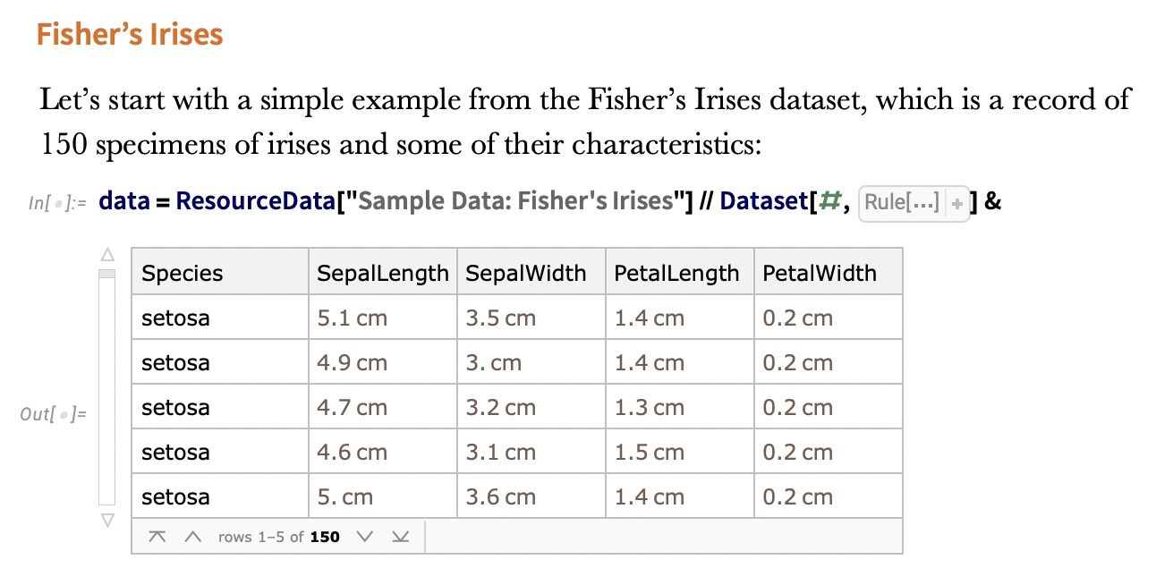 ::: {.notes} Clustering is an unsupervised learning task where we try to find natural groupings in data without having labeled examples. Unlike classification, where we know the classes ahead of time, clustering discovers structure in the data. This is particularly useful for exploratory data analysis, customer segmentation, anomaly detection, and understanding the structure of your data before applying supervised learning methods. The IRIS dataset shown here is one of the classic examples in machine learning, containing measurements of iris flowers from three different species. ::: ## IRIS ``` python # Code source: Gaël Varoquaux # Modified for documentation by Jaques Grobler # License: BSD 3 clause # import matplotlib.pyplot as plt from sklearn import datasets iris = datasets.load_iris() _, ax = plt.subplots() scatter = ax.scatter(iris.data[:, 2], iris.data[:, 1]) ax.set(xlabel=iris.feature_names[2], ylabel=iris.feature_names[1]) _ = ax.legend( scatter.legend_elements()[0], iris.target_names, loc="lower right", title="Classes" ) ``` ::: {.notes} Here's the code to load and visualize the IRIS dataset. The IRIS dataset has 4 features (sepal length, sepal width, petal length, petal width) and 3 species classes. We're plotting just two dimensions here (petal width vs sepal width) to make it easy to visualize. Notice we're using sklearn's built-in datasets module which makes it very easy to load standard benchmark datasets. ::: ## IRIS ```{python} import matplotlib.pyplot as plt from sklearn import datasets iris = datasets.load_iris() _, ax = plt.subplots() scatter = ax.scatter(iris.data[:, 2], iris.data[:, 1]) ax.set(xlabel=iris.feature_names[2], ylabel=iris.feature_names[1]) _ = ax.legend( scatter.legend_elements()[0], iris.target_names, loc="lower right", title="Classes" ) ``` ::: {.notes} This unlabeled visualization highlights the core challenge of unsupervised learning. While some structure exists in this 2D projection, the full structure in the 4D space is harder to discern. Our goal with clustering is to algorithmically discover these natural groupings that are not visually obvious without labels. Notice that without color coding by species, it's not immediately obvious that there are three distinct groups. This is where clustering algorithms come in - they can help us discover these natural groupings automatically. ::: ## IRIS -- another look ```{python} #| fig-width: 9 #| fig-height: 6 import seaborn as sns import matplotlib.pyplot as plt import pandas as pd from sklearn import datasets # Load iris dataset iris = datasets.load_iris() # Create DataFrame for easier plotting df = pd.DataFrame({ 'Petal Length (cm)': iris.data[:, 2], 'Sepal Width (cm)': iris.data[:, 1], 'Species': [iris.target_names[i] for i in iris.target] }) # Create high-quality plot with colors similar to DarkRainbow colors = ['#4477AA', '#EE6677', '#228833'] # Professional color palette plt.figure(figsize=(9, 6), dpi=150) sns.scatterplot(data=df, x='Petal Length (cm)', y='Sepal Width (cm)', hue='Species', palette=colors, s=120, alpha=0.7, edgecolor='black', linewidth=0.8) plt.grid(True, alpha=0.3, linestyle='--') plt.legend(title='Species', frameon=True, loc='upper left', fontsize=11) plt.xlabel('Petal Length (cm)', fontsize=12, fontweight='bold') plt.ylabel('Sepal Width (cm)', fontsize=12, fontweight='bold') plt.tight_layout() plt.show() ``` ::: {.notes} This plot, now colored by the true species labels, confirms the inherent structure we are looking to discover. Note the clear separation of the Setosa species (blue), but also the significant overlap between Versicolor (red) and Virginica (green). This overlap explains why even simple clustering methods like K-means will struggle to achieve 100% agreement with the true labels, demonstrating the practical limits of clustering even on 'simple' data. The visualization uses petal length and sepal width, which provide good separation between species while still showing the challenging overlap between two classes. ::: ## IRIS -- clustering 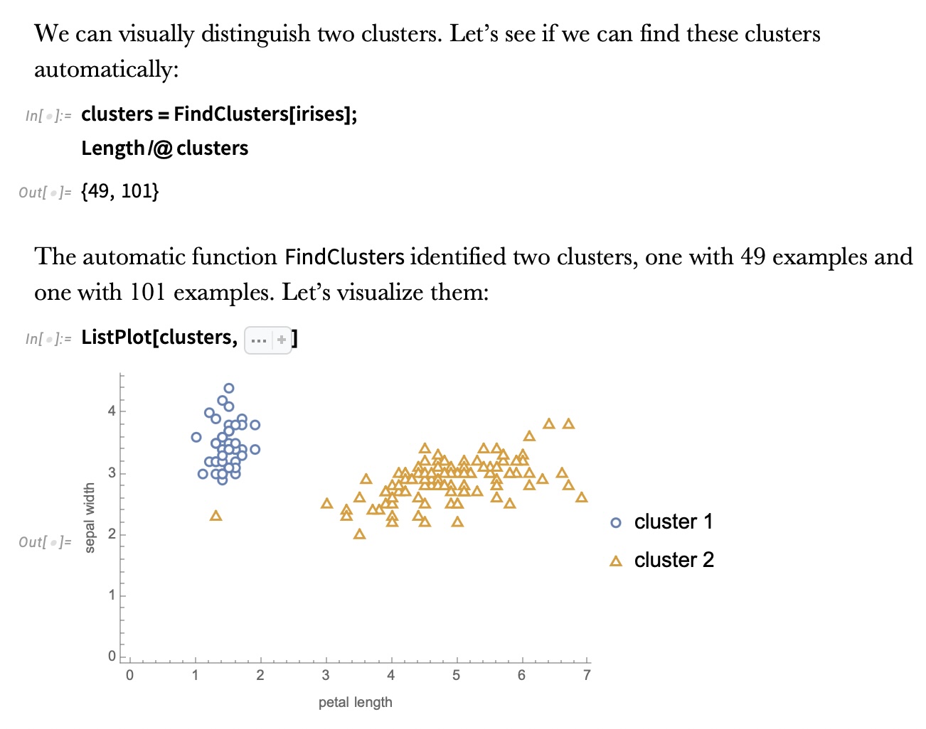 ::: {.notes} This slide shows different clustering results on the IRIS dataset. Different clustering algorithms will find different groupings based on their underlying assumptions about cluster shape, density, and separation. Some algorithms assume spherical clusters (like K-means), while others can find arbitrary shapes (like DBSCAN). The quality of clustering can be evaluated both visually and using metrics like silhouette score or within-cluster sum of squares. ::: ## IRIS -- k-means 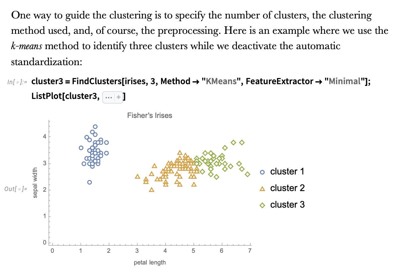 ::: {.notes} K-means is one of the most popular clustering algorithms due to its simplicity and efficiency. It works by iteratively assigning points to the nearest cluster center (centroid) and then recomputing the centroids. The algorithm requires you to specify K (the number of clusters) in advance. For IRIS with K=3, it does a reasonable job of recovering the three species. K-means works well when clusters are roughly spherical and similar in size, but can struggle with elongated or irregular-shaped clusters. The algorithm is also sensitive to initialization, though techniques like K-means++ help address this. ::: ## Wolfram Mathematica FindClusters 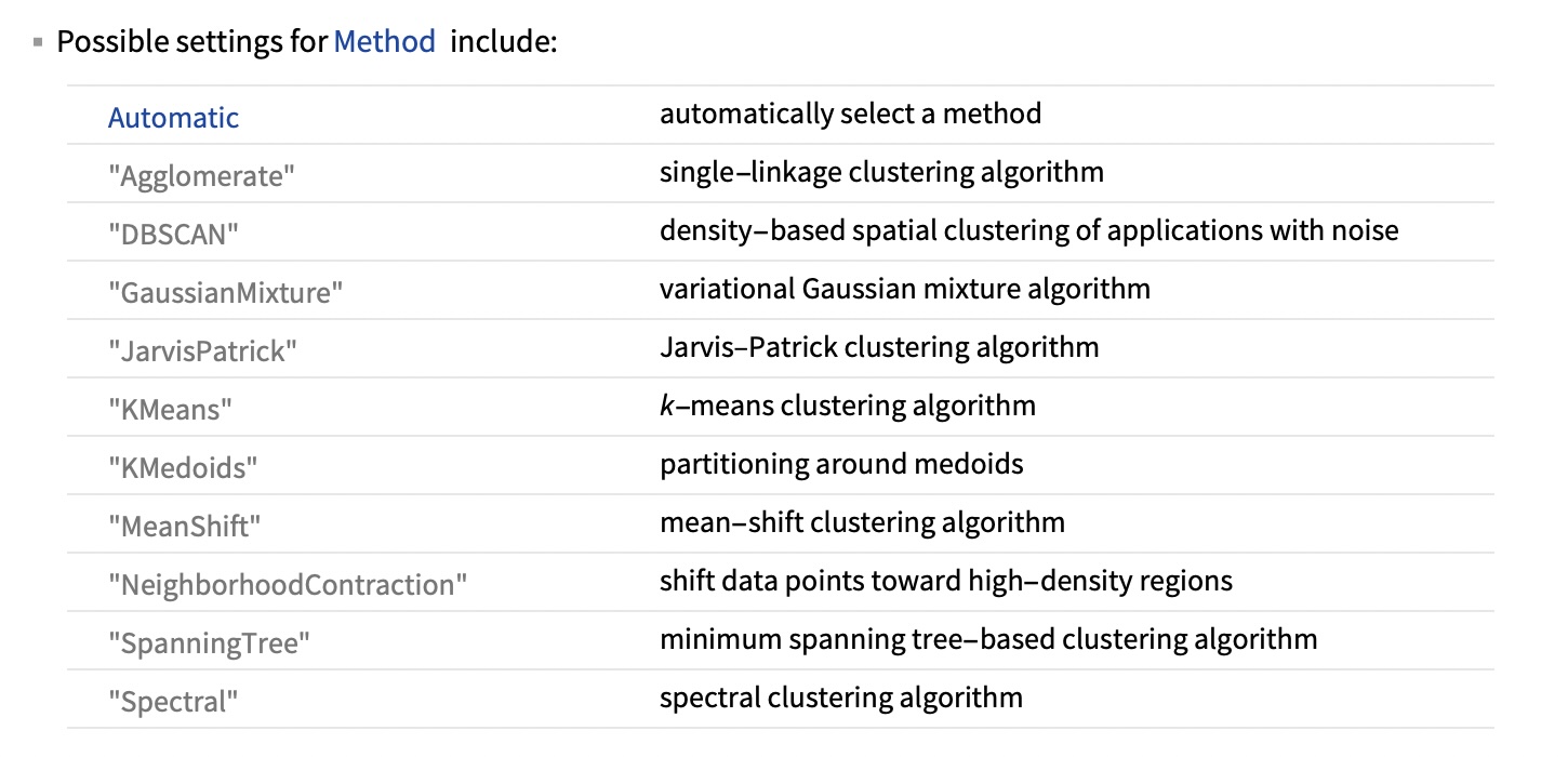 ::: {.notes} Wolfram Mathematica's FindClusters function provides a nice overview of different clustering methods available. Each method has different strengths: K-means is fast and simple, hierarchical methods build tree structures of clusters, DBSCAN can find arbitrary shapes and identify outliers, spectral clustering works well with non-convex clusters. The choice of method depends on your data characteristics, domain knowledge, and what properties you want your clusters to have. In practice, it's often worth trying multiple methods and comparing results. ::: ## Wolfram Mathematica FindClusters  ::: {.notes} This slide shows visual examples of how different clustering methods partition the same dataset. Notice how they produce very different results! K-means creates roughly circular boundaries, hierarchical methods create nested groupings, DBSCAN identifies dense regions and can mark sparse areas as outliers. This illustrates an important point: there's no single "correct" clustering - the best method depends on what structure you're trying to discover in your data. Visualization is crucial for understanding what each method is doing and whether the results make sense for your application. ::: ## IRIS - classes :::: {.columns} ::: {.column width="50%"} ```{python} import matplotlib.pyplot as plt from sklearn import datasets iris = datasets.load_iris() _, ax = plt.subplots() scatter = ax.scatter(iris.data[:, 2], iris.data[:, 1], c=iris.target) ax.set(xlabel=iris.feature_names[2], ylabel=iris.feature_names[1]) _ = ax.legend( scatter.legend_elements()[0], iris.target_names, loc="lower right", title="Classes" ) ``` ::: ::: {.column width="50%"}  ::: :::: ::: {.notes} This side-by-side comparison is essential for understanding clustering performance. The left shows the ground truth (true labels), and the right shows the clusters discovered by K-means. While K-means accurately isolates the well-separated cluster, it struggles with the overlapped classes, often resulting in label-switching or mixing of points. This visually demonstrates the difference between classification (predicting known labels) and clustering (discovering structure). Remember, in real clustering scenarios, you often don't have labels - this comparison is primarily for pedagogical purposes and algorithm evaluation. ::: ## Recommended reading * **Required** https://www.wolfram.com/language/introduction-machine-learning/clustering/ [link](https://www.wolfram.com/language/introduction-machine-learning/clustering/) * https://en.wikipedia.org/wiki/Cluster_analysis * https://en.wikipedia.org/wiki/K-means_clustering * https://en.wikipedia.org/wiki/DBSCAN ::: {.notes} The Wolfram tutorial is required reading - it provides excellent interactive examples of different clustering methods. The Wikipedia articles provide good mathematical background. I particularly recommend the DBSCAN article as it introduces density-based clustering, which can find clusters of arbitrary shape unlike K-means. For your projects, understanding multiple clustering approaches will help you choose the right tool for your data. ::: ## Dimensionality Reduction * Input data may have thousands or millions of dimensions! * **Dimensionality Reduction** represents data with fewer dimensions - easier learning -- fewer parameters - visualization -- show high-dimensional data in 2D or 3D - discover "intrinsic dimensionality" of the data ::: {.notes} Now we transition to dimensionality reduction, which is closely related to clustering but serves a different purpose. While clustering groups similar items, dimensionality reduction finds lower-dimensional representations of high-dimensional data. This is crucial in machine learning because: 1) it helps us visualize data that otherwise couldn't be plotted, 2) it reduces computational cost and memory requirements, 3) it can improve model performance by removing noise and redundant features (curse of dimensionality), and 4) it helps us understand the intrinsic structure of the data. Many real-world datasets live on lower-dimensional manifolds embedded in high-dimensional space - DR helps us find these manifolds. ::: ## Dimensionality Reduction * Assumption: data lies on a lower dimensional space  :::: footer Slides based on material from Prof. Yi Zhang ::: ::: {.notes} This is the key insight: even though our data might be represented with thousands of features, it often lies on or near a much lower-dimensional manifold. Think about images of faces - each pixel is a dimension, so a 100x100 image is 10,000 dimensional. But faces don't fill that entire space - they have structure (two eyes, one nose, etc.). The actual degrees of freedom are much fewer - perhaps orientation, expression, lighting, identity. Dimensionality reduction tries to find these underlying degrees of freedom. This is the manifold hypothesis that underlies much of machine learning. ::: ## Visualizing the Manifold Hypothesis: Images of '3' Perturbed by Non-linear Operations  * What operations did we perform? What's the intrinsic dimensionality? * Here the underlying **manifold** is **non-linear** :::: footer Slides based on material from Christopher Bishop ::: ::: {.notes} This is a great example from Christopher Bishop's book. These images of the digit "3" are all different - they're rotated, translated, scaled, and slightly deformed. Each image might be 28x28 = 784 dimensions. But how many degrees of freedom do we really have? We have rotation angle, x/y position, scale, and maybe a few shape parameters. So perhaps 5-7 dimensions really capture the variation. This is what we mean by intrinsic dimensionality. Crucially, notice these transformations are non-linear - small changes in rotation don't correspond to linear changes in pixel values. This is why we need non-linear dimensionality reduction methods like t-SNE and UMAP, not just linear methods like PCA. ::: ## Digits ``` python from sklearn.datasets import load_digits digits = load_digits(n_class=6) X, y = digits.data, digits.target ``` ::: {.notes} Now we'll work with the digits dataset, which is a great playground for dimensionality reduction. It consists of 8x8 pixel images of handwritten digits (0-9). Each image is 64-dimensional (8x8), which is small enough to work with quickly but high enough dimensional that we can't visualize it directly. We'll load just 6 classes to keep visualization cleaner. ::: ## Digits - 0 ```{python} from sklearn.datasets import load_digits digits = load_digits(n_class=6) digits.images[0] ``` ::: {.notes} This is what a single digit image looks like as an 8x8 array of pixel intensities. Each value represents the grayscale intensity at that pixel. This array gets flattened into a 64-dimensional vector for machine learning algorithms. Even though we show it as a 2D grid, the algorithm sees it as a point in 64D space. ::: ## Digits - 1 ```{python} from sklearn.datasets import load_digits digits = load_digits(n_class=6) digits.images[1] ``` ::: {.notes} Here's another digit. Notice the variation in writing style even within the same digit class. Dimensionality reduction should ideally map similar digits close together in the low-dimensional space, regardless of these minor variations. ::: ## Digits ```{python} from sklearn.datasets import load_digits digits = load_digits(n_class=6) X, y = digits.data, digits.target n_samples, n_features = X.shape n_neighbors = 30 import matplotlib.pyplot as plt fig, axs = plt.subplots(nrows=10, ncols=10, figsize=(6, 6)) for idx, ax in enumerate(axs.ravel()): ax.imshow(X[idx].reshape((8, 8)), cmap=plt.cm.binary) ax.axis("off") _ = fig.suptitle("A selection from the 64-dimensional digits dataset", fontsize=16) ``` ::: {.notes} Here's a grid showing 100 different digit images from our dataset. Notice the variety - different digits, different writing styles, different positions. Our goal with dimensionality reduction is to create a 2D or 3D representation where similar-looking digits are close together. This will help us visualize the structure of the data and understand how well different algorithms capture the similarity relationships. ::: ## Digits ```{python} import numpy as np from matplotlib import offsetbox from sklearn.preprocessing import MinMaxScaler def plot_embedding(X, title): _, ax = plt.subplots() X = MinMaxScaler().fit_transform(X) for digit in digits.target_names: ax.scatter( *X[y == digit].T, marker=f"${digit}$", s=60, color=plt.cm.Dark2(digit), alpha=0.425, zorder=2, ) shown_images = np.array([[1.0, 1.0]]) # just something big for i in range(X.shape[0]): # plot every digit on the embedding # show an annotation box for a group of digits dist = np.sum((X[i] - shown_images) ** 2, 1) if np.min(dist) < 4e-3: # don't show points that are too close continue shown_images = np.concatenate([shown_images, [X[i]]], axis=0) imagebox = offsetbox.AnnotationBbox( offsetbox.OffsetImage(digits.images[i], cmap=plt.cm.gray_r), X[i] ) imagebox.set(zorder=1) ax.add_artist(imagebox) ax.set_title(title) ax.axis("off") from sklearn.decomposition import TruncatedSVD from sklearn.discriminant_analysis import LinearDiscriminantAnalysis from sklearn.ensemble import RandomTreesEmbedding from sklearn.manifold import ( MDS, TSNE, Isomap, LocallyLinearEmbedding, SpectralEmbedding, ) from sklearn.neighbors import NeighborhoodComponentsAnalysis from sklearn.pipeline import make_pipeline from sklearn.random_projection import SparseRandomProjection embeddings = { "Random projection embedding": SparseRandomProjection( n_components=2, random_state=42 ), "Truncated SVD embedding": TruncatedSVD(n_components=2), "Linear Discriminant Analysis embedding": LinearDiscriminantAnalysis( n_components=2 ), "Isomap embedding": Isomap(n_neighbors=n_neighbors, n_components=2), "Standard LLE embedding": LocallyLinearEmbedding( n_neighbors=n_neighbors, n_components=2, method="standard" ), "Modified LLE embedding": LocallyLinearEmbedding( n_neighbors=n_neighbors, n_components=2, method="modified" ), "Hessian LLE embedding": LocallyLinearEmbedding( n_neighbors=n_neighbors, n_components=2, method="hessian" ), "LTSA LLE embedding": LocallyLinearEmbedding( n_neighbors=n_neighbors, n_components=2, method="ltsa" ), "MDS embedding": MDS(n_components=2, n_init=1, max_iter=120, n_jobs=2), "Random Trees embedding": make_pipeline( RandomTreesEmbedding(n_estimators=200, max_depth=5, random_state=0), TruncatedSVD(n_components=2), ), "Spectral embedding": SpectralEmbedding( n_components=2, random_state=0, eigen_solver="arpack" ), "t-SNE embedding": TSNE( n_components=2, max_iter=500, n_iter_without_progress=150, random_state=0, ), "NCA embedding": NeighborhoodComponentsAnalysis( n_components=2, init="pca", random_state=0 ), } from time import time projections, timing = {}, {} for name, transformer in embeddings.items(): if name.startswith("Linear Discriminant Analysis"): data = X.copy() data.flat[:: X.shape[1] + 1] += 0.01 # Make X invertible else: data = X print(f"Computing {name}...") start_time = time() projections[name] = transformer.fit_transform(data, y) timing[name] = time() - start_time for name in timing: if name=="t-SNE embedding": title = f"{name} (time {timing[name]:.3f}s)" plot_embedding(projections[name], title) plt.show() ``` ::: {.notes} This slide lists many popular dimensionality reduction algorithms. The figure (populated by the results) is a powerful tool for comparison. It demonstrates that the choice of algorithm—linear (like PCA/SVD) vs. non-linear (like t-SNE/LLE)—radically changes the resulting low-dimensional structure. This comparison motivates why we need to understand the underlying math and assumptions of each method. Notice how t-SNE creates distinct, well-separated clusters of digits, which is characteristic of non-linear manifold learning methods that preserve local neighborhood structure. ::: ## Principal Component Analysis ::: incremental - PCA is directly related to the eigenvectors and eigenvalues of covariance matrices. - Lets so make a quick review of eigenvectors, eigenvalues, and covariance matrices. ::: :::: footer Slides based on material from Prof. Luis Gustavo Nonato ::: ::: {.notes} Now we'll dive deep into PCA, which is the most fundamental dimensionality reduction technique. PCA is a linear method - it finds the best linear projection of the data. While it can't capture complex non-linear structure like t-SNE can, it's extremely fast, robust, well-understood mathematically, and often works surprisingly well. Plus understanding PCA gives you the foundation for understanding more complex methods. These slides are from Luis Gustavo Nonato's excellent lectures. We'll review the linear algebra foundations first. ::: ## Eigenvectors and Eigenvalues Given a $d \times d$ matrix $A$, a pair $(\lambda, u)$ that satisfies $A u = \lambda u$ is called eigenvalue $\lambda$ and corresponding eigenvector $u$ of $A$. ::: {.notes} Quick linear algebra review: An eigenvector is a special vector that, when you multiply it by a matrix, just gets scaled - it doesn't change direction. The scaling factor is the eigenvalue. This is crucial for PCA because the eigenvectors of the covariance matrix tell us the directions of maximum variance in the data, and the eigenvalues tell us how much variance there is in each direction. The largest eigenvectors become our principal components. ::: ## Symmetric Matrices - $\lambda \in \mathbb{R}$ and $u \in \mathbb{R}^d$ (no complex numbers involved) - The eigenvectors are orthogonal  ::: {.notes} Covariance matrices are symmetric, which is great news! It means all eigenvalues are real (not complex), and the eigenvectors are orthogonal to each other. This orthogonality is why principal components form a nice coordinate system - each component is independent. The spectral decomposition shown here is how we can decompose any symmetric matrix into its eigenvectors and eigenvalues. ::: ## Covariance Matrix  ::: {.notes} The covariance matrix captures how features vary together. The diagonal elements are variances (how much each feature varies), and the off-diagonal elements are covariances (how pairs of features vary together). A large positive covariance means when one feature is large, the other tends to be large. A large negative covariance means they vary in opposite directions. Zero covariance means they're uncorrelated. ::: ## Covariance Matrix :::: {.columns} ::: {.column width="50%"}  ::: ::: {.column width="50%"}  ::: :::: ::: {.notes} Visual intuition: On the left, we see highly correlated data - when X increases, Y tends to increase too. This shows up as a large covariance. On the right, the features are uncorrelated - knowing X tells you nothing about Y. The covariance is near zero. PCA finds directions that maximize variance, which means it finds the directions where data spreads out the most. ::: ## Covariance Matrix  ::: {.notes} Summary slide showing the mathematical formula for covariance. Remember that we typically center the data (subtract the mean) before computing PCA, which is why we see (x-μ) terms here. The covariance matrix is the average of the outer product of centered data points. ::: ## Principal Component Analysis: intuition  ::: {.notes} Here's the geometric intuition for PCA. Imagine you have a cloud of points in high-dimensional space. PCA finds the direction where the data varies the most (the first principal component), then the direction of next-most variation that's orthogonal to the first (second PC), and so on. Geometrically, we're finding the axes of the ellipsoid that best fits the data. Projecting onto the first few principal components gives us a lower-dimensional representation that captures most of the variance. ::: ## Principal Component Analysis: intuition  ::: {.notes} Another view: the red line shows the first principal component - the direction of maximum variance. If we project all points onto this line, we get a 1D representation. The key insight is that even though we're throwing away information (the perpendicular distance to the line), we're keeping the most important information (the spread along the line). This is why PCA works well for compression and visualization - it discards the dimensions with least variance, which are often noise. ::: ## Principal Component Analysis  ::: {.notes} The formal algorithm: 1) Center the data by subtracting the mean, 2) Compute the covariance matrix, 3) Find its eigenvectors and eigenvalues, 4) Sort eigenvectors by eigenvalue (largest first), 5) Project data onto the top k eigenvectors. The eigenvectors are your principal components, and the eigenvalues tell you how much variance each component explains. You can plot the cumulative explained variance to decide how many components to keep. ::: ## Principal Component Analysis  ::: {.notes} PCA can also be viewed as a filtering operation - keeping the signal (high variance directions) and removing noise (low variance directions). This is why PCA is used for denoising. You project into PCA space, keep only the top components, and project back. The assumption is that noise is spread across many dimensions while signal is concentrated in a few. This works surprisingly well for many types of data. ::: ## PCA of digits ```{python} from sklearn.decomposition import PCA pca = PCA(n_components=2) data, labels = load_digits(return_X_y=True) reduced_data=pca.fit_transform(data) plt.scatter(reduced_data[:, 0], reduced_data[:, 1]) plt.show() ``` ::: {.notes} Here's PCA applied to the full digits dataset (all 10 classes). We're reducing from 64 dimensions down to 2. Notice there's some structure - the points aren't randomly scattered - but it's not super clean. Without the color labels, it's hard to see the digit classes. PCA is a linear method, so it can't capture the complex non-linear structure of digit manifolds. But it's fast and gives us a reasonable starting point. ::: ## PCA of digits ```{python} from sklearn.decomposition import PCA pca = PCA(n_components=2) data, labels = load_digits(return_X_y=True) reduced_data=pca.fit_transform(data) plt.scatter(reduced_data[:, 0], reduced_data[:, 1], c=labels) plt.show() ``` ::: {.notes} Now with color labels showing the true digit classes. You can see that PCA does capture some structure - there are some clusters corresponding to digit classes - but there's substantial overlap. The digit "1" is somewhat separated (probably because it's sparse - lots of empty space), but most other digits are mixed together. This is a limitation of linear methods for non-linear data. We'll see that t-SNE does much better. ::: ## Scaling Up * Covariance matrix can be really big! - $\Sigma$ is $n$ by $n$ - 10000 features are not uncommon - computing eigenvectors is slow... * Solution: Singular Value Decomposition (SVD) - Finds the $k$ largest eigenvectors - Widely implemented robustly in major packages ::: {.notes} A practical issue: for high-dimensional data, computing the full covariance matrix and all its eigenvectors is computationally expensive. For 10,000 features, the covariance matrix has 100 million entries! SVD provides an efficient alternative - it can directly compute the top k principal components without forming the covariance matrix. Furthermore, SVD is generally more numerically stable than computing the eigenvalues of the covariance matrix directly, especially in the presence of noise or highly correlated features. This is why SVD is the practical computational backbone for PCA in modern machine learning libraries like scikit-learn. In practice, sklearn's PCA uses randomized SVD for efficiency, making PCA tractable even for very high-dimensional data. ::: ## Singular Value Decomposition (SVD) * https://en.wikipedia.org/wiki/Singular_value_decomposition  ::: {.notes} SVD decomposes any matrix into three matrices: U (left singular vectors), Sigma (singular values), and V (right singular vectors). For PCA, the right singular vectors V are the principal components, and the singular values squared are the eigenvalues. SVD is more numerically stable than computing eigenvalues of the covariance matrix directly. It's the standard way to compute PCA in practice. ::: ## Dimensionality Reduction Techniques * https://en.wikipedia.org/wiki/Dimensionality_reduction - Principal component analysis (PCA) - Non-negative matrix factorization (NMF) - Linear discriminant analysis (LDA) - t-SNE - UMAP - **many others** ::: {.notes} There are many dimensionality reduction techniques beyond PCA. Linear methods like LDA consider class labels. Non-negative matrix factorization (NMF) constrains components to be non-negative, which is useful for parts-based representations. t-SNE and UMAP are non-linear methods that can capture complex manifold structure. Each has different strengths and use cases. For visualization, t-SNE and UMAP are popular because they preserve local neighborhood structure well. ::: ## Local Linear Embedding  ::: {.notes} LLE is a non-linear dimensionality reduction technique that's designed to preserve local neighborhoods. The idea is simple but powerful: each point should be reconstructible as a weighted sum of its neighbors, and this reconstruction should be preserved in the low-dimensional space. This means if points are close in high-dimensional space, they'll be close in low-dimensional space. LLE can "unfold" non-linear manifolds in a way that linear PCA cannot. ::: ## Preserving Local Manifold Neighborhoods  ::: {.notes} Non-linear dimensionality reduction, particularly methods like LLE, relies on the assumption that the local geometry of the high-dimensional data is a good proxy for the global structure. As illustrated here, the goal is to find a mapping that preserves the local neighborhood relationships (who is connected to whom) in the low-dimensional space, effectively 'unrolling' the manifold without tearing it apart. This is fundamentally different from PCA which only preserves global variance. ::: ## LLE  https://www.science.org/doi/10.1126/science.290.5500.2323 ::: {.notes} Local Linear Embedding (LLE) works by first finding the set of weights that best reconstructs each data point from its neighbors in the high-dimensional space. The algorithm then searches for a low-dimensional embedding where these same reconstruction weights hold true. Unlike PCA, LLE is not based on maximizing variance; it's based entirely on preserving these local linear dependencies. This makes LLE powerful for unrolling non-linear manifolds while maintaining neighborhood structure. ::: ## PCA vs LLE {height="600"} ::: {.notes} This figure is the canonical example illustrating the difference between linear (PCA) and non-linear (LLE) methods. PCA finds the direction of maximum variance, but since it is a straight line projection, it cannot 'unroll' the curved 'Swiss Roll' dataset, resulting in heavy overlap. LLE, by preserving local relationships, successfully unrolls the manifold into a clean 2D representation, demonstrating the power of non-linear methods when the intrinsic data manifold is curved. This is why we need both linear and non-linear methods in our toolkit. ::: ## Beyond PCA: Non-linear Methods * **t-SNE** (t-Distributed Stochastic Neighbor Embedding) - Preserves local neighborhood structure - Great for visualization of clusters - Non-linear, adapts to different regions of data * **UMAP** (Uniform Manifold Approximation and Projection) - Faster than t-SNE, scales better - Better preserves global structure - Based on topological data analysis ::: {.notes} We've covered PCA and LLE in detail. There are two other extremely popular non-linear methods worth knowing about: t-SNE and UMAP. t-SNE has become the go-to method for visualizing high-dimensional data, especially in biology and machine learning. It's excellent at revealing local cluster structure. UMAP is newer and addresses some of t-SNE's limitations - it's faster and better at preserving global structure. We'll cover both in much more detail next week, including important caveats about how to use them properly and avoid common pitfalls. ::: ## Next Week: Advanced Dimensionality Reduction * Deep dive into t-SNE - How it works (probability distributions, KL divergence) - Critical parameters (perplexity) - Common pitfalls and how to avoid them * UMAP in detail - Comparison with t-SNE - Parameter tuning (n_neighbors, min_dist) * Interactive dimensionality reduction ::: {.notes} Next week we'll go deep on t-SNE and UMAP. We'll cover the theory, practical considerations, and most importantly, how to interpret the results correctly. There's a fantastic Distill article on t-SNE that we'll discuss - it shows common ways people misread t-SNE plots and how to avoid those mistakes. We'll also look at UMAP's advantages and when to choose it over t-SNE. Finally, we'll discuss interactive approaches that let you guide the projection process. ::: 