## Recap: Last Week * Covered clustering (K-means, DBSCAN, hierarchical) * Introduced dimensionality reduction motivation * Deep dive into PCA (eigenvectors, covariance, SVD) * Introduced non-linear methods (LLE) * Brief mention of t-SNE and UMAP ::: {.notes} Last week we covered the fundamentals of clustering and dimensionality reduction. We went deep on PCA, understanding the linear algebra behind it. We also introduced LLE as an example of a non-linear method that can unfold manifolds. Today we're going to do a deep dive into t-SNE and UMAP - the two most popular non-linear dimensionality reduction methods for visualization. These are incredibly powerful but also easy to misuse, so we'll focus on how to use them correctly. ::: ## Graph Layout using force based approach [video link](https://www.youtube.com/watch?v=_Oidv5M-fuw) ::: {.notes} Before diving into t-SNE, let's watch this video on force-directed graph layout. This is important because t-SNE and UMAP work on similar principles - they treat your data points as nodes in a graph and use attractive/repulsive forces to arrange them in 2D. Understanding force-directed layout gives you intuition for how these algorithms work. The key idea: similar points attract each other, dissimilar points repel, and we run a physics simulation until things settle into a stable configuration. ::: ## SNE and t-SNE :::: {.columns} ::: {.column width="50%"} 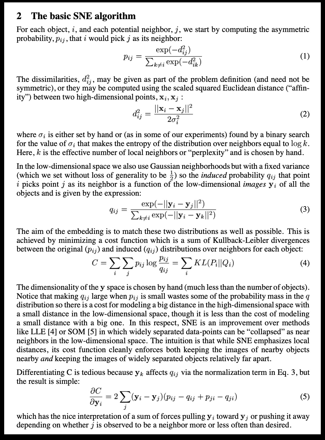 ::: ::: {.column width="40%"} 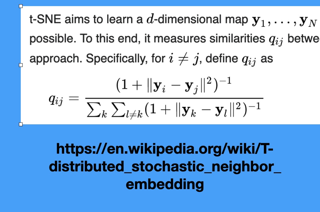 ::: :::: ::: {.notes} SNE (Stochastic Neighbor Embedding), the predecessor, defines probability distributions over the high-dimensional data, where neighbors have high probability. It then tries to replicate these probabilities in low-dimensional space. The key addition of t-SNE is using the Student's t-distribution in the low-dimensional space. This distribution has a 'heavy tail,' which means it allows points that are far apart in the low-dimensional space to still model moderately small distances in the high-dimensional space. This heavy-tail property is what creates the excellent separation between clusters compared to SNE. It prevents the "crowding problem" where all points try to squeeze into the center. ::: HERE is an excellent talk by t-SNE creator: [video link](https://www.youtube.com/watch?v=RJVL80Gg3lA&list=UUtXKDgv1AVoG88PLl8nGXmw) ## Digression: Point Set Surfaces :::: {.columns} ::: {.column width="50%"} 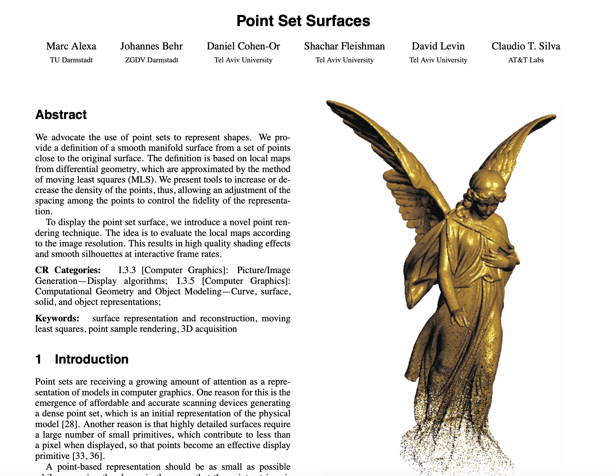 ::: ::: {.column width="40%"} 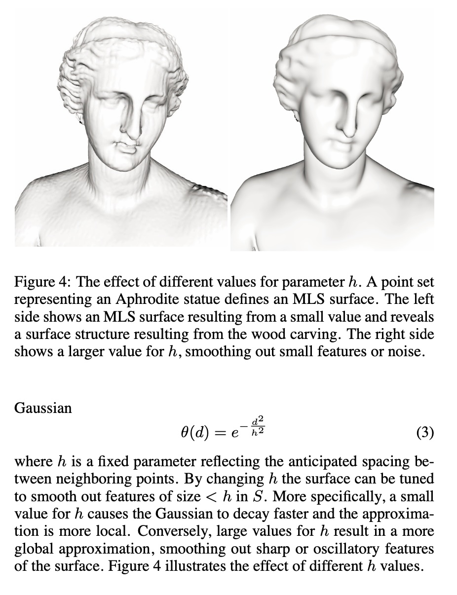 ::: :::: ::: {.notes} This digression relates back to the concept of the manifold hypothesis from last week. Manifold learning, which includes LLE, t-SNE, and UMAP, is essentially trying to reconstruct a lower-dimensional surface (like this Point Set Surface) from high-dimensional points. Understanding how local geometry (the neighborhood around a point) can define a surface helps build intuition for why these non-linear methods focus on preserving local connections, rather than global distances or overall shape. Just as we reconstruct surfaces from point clouds using local neighborhoods, these algorithms reconstruct low-dimensional manifolds using local neighborhood relationships. ::: ## Wattenberg, Viégas, and Johnson, 2016  https://distill.pub/2016/misread-tsne/ ::: {.notes} This article, 'How to Use t-SNE Effectively,' is essential reading. It represents a pivot point in the visualization community, moving from simply celebrating t-SNE's results to critically analyzing its pitfalls. The authors demonstrate, using controlled experiments, which visual properties are meaningful and which are not. The main takeaway is that t-SNE is a visualization tool, not a clustering tool—its output must be treated as a suggestion of structure, not a definitive map of reality. This paper should be required reading for anyone using t-SNE in their work. ::: ## t-SNE * Wattenberg et al writes "A popular method for exploring high-dimensional data is something called t-SNE... it has an almost magical ability to create compelling two-dimensonal “maps” from data with hundreds or even thousands of dimensions. Although impressive, these images can be tempting to misread." * Wattenberg: "The algorithm is **non-linear** and adapts to the underlying data, performing **different transformations on different regions**. Those differences can be a major source of confusion." * Watternberg: "A second feature of t-SNE is a tuneable parameter, **“perplexity,”** which says (loosely) how to balance attention between local and global aspects of your data. The parameter is, in a sense, a guess about the number of close neighbors each point has. The perplexity value has a complex effect on the resulting pictures." ::: {.notes} This is THE critical article to read before using t-SNE. Wattenberg, Viégas, and Johnson from Google Brain systematically explore how t-SNE can be misread. Key point #1: t-SNE is non-linear and does different transformations in different regions - you can't directly compare distances. Key point #2: perplexity is crucial - it's roughly the number of close neighbors each point should have. Too low and you get disconnected clusters, too high and everything merges. We'll see concrete examples next. ::: ## t-SNE * "Those hyperparameters really matter"  * "The image for perplexity 100, with merged clusters, illustrates a pitfall: for the algorithm to operate properly, the perplexity really should be smaller than the number of points." ::: {.notes} Look at these four perplexity values on the same dataset. At perplexity=2, everything breaks into tiny clusters - it's too local. At perplexity=30, we see nice separation. At perplexity=50, still looks good but slightly different structure. At perplexity=100, clusters start merging - it's too global. The lesson: ALWAYS try multiple perplexity values (typically 5-50 works well). Don't trust a single t-SNE plot! Also, perplexity should be much smaller than the number of points - here they correctly use perplexity < 300 for 300 points. ::: ## t-SNE * "Each of the plots above was made with 5,000 iterations with a learning rate (often called “epsilon”) of 10, and had reached a point of stability by step 5,000. How much of a difference do those values make?"  ::: {.notes} This shows convergence. At 10 iterations, it's garbage - the algorithm hasn't had time to organize the points. At 250 iterations, structure is emerging. At 500 iterations, it looks stable. At 1000 iterations, roughly the same - it's converged. Lesson: run enough iterations! Modern implementations often need 1000-5000 iterations. Thelearning rate (epsilon) also matters - too high and it won't converge, too low and it's slow. The defaults in sklearn are usually reasonable (epsilon=200, max_iter=1000). ::: ## t-SNE * "Cluster sizes in a t-SNE plot mean nothing"  * "Size refers to spatial extent/area, not the number of points in the cluster." * "The t-SNE algorithm adapts its notion of "distance" to regional density variations in the data set. As a result, it naturally expands dense clusters, and contracts sparse ones, evening out cluster sizes." ::: {.notes} The reason t-SNE expands dense clusters and contracts sparse ones is due to its cost function, specifically the use of the heavy-tailed t-distribution, which is designed to resolve points within a cluster clearly. If a cluster is naturally dense, t-SNE must push points further apart in the low-dimensional embedding to satisfy the local probability distribution, effectively equalizing the density of the clusters in 2D space. Therefore, the area or size of a cluster in a t-SNE plot is not proportional to the cluster's density or variance in the original space. This is a feature, not a bug - it ensures all clusters are visible, but it means you can't compare cluster sizes visually. ::: ## t-SNE * "Distances between clusters might not mean anything" * "The next diagrams show three Gaussians of 50 points each, one pair being 5 times as far apart as another pair."  ::: {.notes} Another CRITICAL INSIGHT: Distances between clusters mean NOTHING! The left shows true data - two Gaussians close together, one far away. Middle shows one t-SNE run, right shows another run with different random initialization. The relative distances between clusters change! Sometimes the far cluster looks close, sometimes not. Why? t-SNE only cares about local neighborhoods - it doesn't preserve global distances. You can't say "these two clusters are related because they're close" - that's wrong. Only trust within-cluster structure. ::: ## t-SNE * "Random noise doesn’t always look random." * "The next diagrams show genuinely random data, 500 points drawn from a unit Gaussian distribution in 100 dimensions. The left image is a projection onto the first two coordinates."  ::: {.notes} This is wild: pure random noise, no structure whatsoever. Left is PCA - correctly shows a cloud with no clusters. Right is t-SNE - shows apparent clusters! This is because t-SNE emphasizes local structure SO much that it can create apparent clusters from noise. Lesson: Don't assume clusters in t-SNE are real! Always validate with other methods or domain knowledge. This is why we need multiple perplexity values and comparison with PCA/UMAP. ::: ## t-SNE * "For topology, you may need more than one plot" * "The plots below show two groups of 75 points in 50 dimensional space. Both are sampled from symmetric Gaussian distributions centered at the origin, but one is 50 times more tightly dispersed than the other. The “small” distribution is in effect contained in the large one."  ::: {.notes} Complex topological relationships may not be preserved. Here two Gaussians of different sizes - one contained in the other. Different perplexity values give completely different topologies! Low perplexity breaks them apart, high perplexity merges them. The true containment relationship is lost. This is a fundamental limitation - t-SNE is designed for local structure, not global topology. Methods like Topomap (next slide) try to address this by explicitly preserving topological features. ::: ## Topomap (Doraiswamy et al)  * Topomap preserves the 0-dimensional persistence diagram of the Rips filtration of the high-dimensional data. ::: {.notes} Topomap aims to provide topological guarantees that t-SNE and UMAP lack. It uses Topological Data Analysis (TDA), specifically persistent homology, to extract 'topological features' like the number of connected components or holes in the high-dimensional data. The algorithm then minimizes a cost function that forces the low-dimensional embedding to have the same persistent features, making it ideal for datasets where the connectivity, holes, or overall shape of the manifold is important. For example, if your high-D data has 3 connected components at a certain scale, Topomap ensures the 2D embedding also has 3 components. It's more computationally expensive than t-SNE but provides mathematical guarantees about topological structure preservation. ::: ##  https://pair-code.github.io/understanding-umap/ ::: {.notes} We transition now to UMAP (Uniform Manifold Approximation and Projection). UMAP has rapidly replaced t-SNE as the go-to default for many visualization tasks. It shares the same philosophy as t-SNE—preserving local neighborhood structure—but it is built on a more rigorous theoretical foundation derived from Riemannian geometry and algebraic topology. This foundation is why UMAP is typically faster, scales better, and is often cited as better at preserving global data structure. This interactive article from Google's PAIR team is THE best resource for understanding UMAP, with interactive visualizations showing exactly how the algorithm works. ::: ## UMAP * Coenen and Pearce: "UMAP is fast, scaling well in terms of both dataset size and dimensionality. ... UMAP can project the 784-dimensional, 70,000-point MNIST dataset in less than 3 minutes, compared to 45 minutes for scikit-learn's t-SNE implementation. Additionally, UMAP tends to better preserve the global structure of the data."  ::: {.notes} Key performance comparison: MNIST dataset (70K points, 784 dimensions). UMAP: 3 minutes. sklearn t-SNE: 45 minutes! That's 15x faster. This matters hugely when you want to try different parameters or work with larger datasets. Also notice the structure: UMAP tends to show cleaner separation of digit classes and better preserves the global manifold structure - digits that are similar (like 4 and 9) are closer together. t-SNE also works but the global layout is less meaningful. ::: ## UMAP * "UMAP, at its core, works very similarly to t-SNE - both use graph layout algorithms to arrange data in low-dimensional space."  ::: {.notes} How UMAP works: it builds a "fuzzy topological representation" of the high-dimensional data. Essentially, it creates a weighted graph where edges represent neighborhood relationships, but the weights are "fuzzy" (probabilistic) rather than binary. Then it tries to find a similar graph structure in low dimensions. The theoretical foundation involves category theory and Riemannian geometry - much more sophisticated than t-SNE's probability distributions. But practically, you can think of it like force-directed graph layout with better math. ::: ## UMAP parameters * **n_neighbors** - the number of approximate nearest neighbors used to construct the initial high-dimensional graph. * **min_dist** - the minimum distance between points in low-dimensional space. ::: {.notes} The two core UMAP parameters, n_neighbors and min_dist, allow precise control over the resulting visualization. n_neighbors dictates the local/global balance (high value = more global view, lower value = more local focus). min_dist acts as a repulsion force, ensuring a minimum separation between points. These two parameters are typically tuned together to find an embedding that maximizes the visualization of the data's inherent structure. Unlike t-SNE's perplexity which can dramatically change results, UMAP parameters tend to be more stable and intuitive. ::: ## UMAP parameters * **n_neighbors** - the number of approximate nearest neighbors used to construct the initial high-dimensional graph. * **min_dist** - the minimum distance between points in low-dimensional space.  ::: {.notes} UMAP has two key parameters. n_neighbors (similar to perplexity in t-SNE): controls how many neighbors to consider when building the graph. Low values (2-5) emphasize very local structure, high values (50-200) capture more global structure. This slide shows min_dist=0, which allows points to be very tightly packed. You can see very tight clusters. This is good for seeing fine structure but can make clusters merge visually. ::: ## UMAP parameters * **n_neighbors** - the number of approximate nearest neighbors used to construct the initial high-dimensional graph. * **min_dist** - the minimum distance between points in low-dimensional space.  ::: {.notes} Here's min_dist=0.8 with the same data. Now points are spread out more - there's minimum spacing between them. This makes it easier to see individual points and prevents over-plotting, but tight clusters look artificially expanded. Typical values: min_dist=0.1 for cluster analysis, min_dist=0.5 for exploring individual points. Like t-SNE's perplexity, you should try a few values. But unlike t-SNE, UMAP is fast enough that trying multiple parameters is practical! ::: ## UMAP * "However, it's important to note that, because UMAP and t-SNE both necessarily warp the high-dimensional shape of the data when projecting to lower dimensions, **any given axis or distance in lower dimensions still isn’t directly interpretable in the way of techniques such as PCA.**" * Suggested reading: https://pair-code.github.io/understanding-umap/supplement.html - "Most dimensionality reduction algorithms fit into either one of two broad categories: Matrix factorization (such as PCA) or Graph layout (such as t-SNE)." - "At its core, UMAP is a graph layout algorithm, very similar to t-SNE, but with a number of key theoretical underpinnings that give the algorithm a more solid footing." ## UMAP  ::: {.notes} Nice comparison showing how parameters affect both methods. t-SNE perplexity and UMAP n_neighbors serve similar roles - controlling local vs global balance. But notice UMAP is more stable - parameters don't change the structure as dramatically. Also UMAP min_dist gives you extra control over cluster "tightness" that t-SNE lacks. The choice between the two often comes down to: Speed and Global Structure Preservation (choose UMAP) vs. Familiarity or Maximum Local Separation (t-SNE). Since UMAP is faster and its parameters are more stable and interpretable, it is highly recommended as the starting point for most high-dimensional visualization projects. However, t-SNE is still valuable and the Distill article's lessons about misinterpretation apply to both methods. ::: ## What about user interaction?  ::: {.notes} Final topic: interactive dimensionality reduction. All the methods we've discussed compute a static embedding. But what if you want to guide the process? What if you know certain points should be close together? This system lets users add constraints, adjust parameters interactively, and see results in real-time. This combines algorithmic power (finding structure) with human insight (domain knowledge). Active research area with systems like iPCA, linear-projection, and various constraint-based approaches. For your projects, think about how interaction could help refine your visualizations. ::: 